Ingredients For A Cozy November (2024 Wallpapers Edition)

Featured Imgs 23

When the days are gray and misty as they are in many parts of the world in November, there’s no better remedy than a bit of colorful inspiration. To bring some good vibes to your desktops this month, artists and designers from across the globe once again tickled their creative ideas and designed unique and inspiring wallpapers that are bound to sweeten up your November.

The wallpapers in this post come in versions with and without a calendar for November 2024 and can be downloaded for free — as it has been a monthly tradition here at Smashing Magazine for more than 13 years already. As a little bonus goodie, we also added a selection of November favorites from our wallpapers archives to the post. Maybe you’ll spot one of your almost-forgotten favorites in here, too?

A huge thank-you to everyone who shared their wallpapers with us this month — this post wouldn’t exist without you. Happy November!

  • You can click on every image to see a larger preview.
  • We respect and carefully consider the ideas and motivation behind each and every artist’s work. This is why we give all artists the full freedom to explore their creativity and express emotions and experience through their works. This is also why the themes of the wallpapers weren’t anyhow influenced by us but rather designed from scratch by the artists themselves.
  • Submit your wallpaper design! 👩‍🎨
    Feeling inspired? We are always looking for creative talent and would love to feature your desktop wallpaper in one of our upcoming posts. We can’t wait to see what you’ll come up with!
Honoring the Sound of Jazz And Soul

“Today, we celebrate the saxophone, an instrument that has added its signature sound to jazz, rock, classical, and so much more. From smooth solos to bold brass harmonies, the sax has shaped the soundtrack of our lives. Whether you’re a seasoned player or just love its iconic sound, let’s show some love to this musical marvel!” — Designed by PopArt Studio from Serbia.

Snow Falls In The Alps

“The end of the year is approaching, and winter is just around the corner, so we’ll spend this month in the Alps. The snow has arrived in the mountains, and we can take advantage of it to ski or have a hot coffee while we watch the flakes fall.” — Designed by Veronica Valenzuela from Spain.

The Secret Cave

Designed by Ricardo Gimenes from Spain.

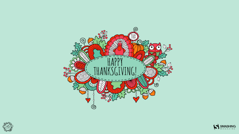
Happy Thanksgiving Day

Designed by Cronix from the United States.

Space Explorer

“A peaceful, minimalist wallpaper of a lone cartoon astronaut floating in space surrounded by planets and stars.” — Designed by Reethu from London.

The Sailor

Designed by Ricardo Gimenes from Spain.

Happy Diwali

Designed by Cronix from the United States.

Elimination Of Violence Against Women

“November 25th is the “International Day for the Elimination of Violence Against Women.” We wanted to create a wallpaper that can hopefully contribute to building awareness and support.” — Designed by Friendlystock from Greece.

Square Isn’t It

“When playing with lines, which were at the beginning displaying a square, I finally arrived to this drawing, and I was surprised. I thought it would make a nice wallpaper for one’s desktop, doesn’t it?” — Designed by Philippe Brouard from France.

Transition

“Inspired by the transition from autumn to winter.” — Designed by Tecxology from India.

Sunset Or Sunrise

“November is autumn in all its splendor. Earthy colors, falling leaves, and afternoons in the warmth of the home. But it is also adventurous and exciting and why not, different. We sit in Bali contemplating Pura Ulun Danu Bratan. We don’t know if it’s sunset or dusk, but… does that really matter?” — Designed by Veronica Valenzuela Jimenez from Spain.

Cozy Autumn Cups And Cute Pumpkins

“Autumn coziness, which is created by fallen leaves, pumpkins, and cups of cocoa, inspired our designers for this wallpaper. — Designed by MasterBundles from Ukraine.

A Jelly November

“Been looking for a mysterious, gloomy, yet beautiful desktop wallpaper for this winter season? We’ve got you, as this month’s calendar marks Jellyfish Day. On November 3rd, we celebrate these unique, bewildering, and stunning marine animals. Besides adorning your screen, we’ve got you covered with some jellyfish fun facts: they aren’t really fish, they need very little oxygen, eat a broad diet, and shrink in size when food is scarce. Now that’s some tenacity to look up to.” — Designed by PopArt Studio from Serbia.

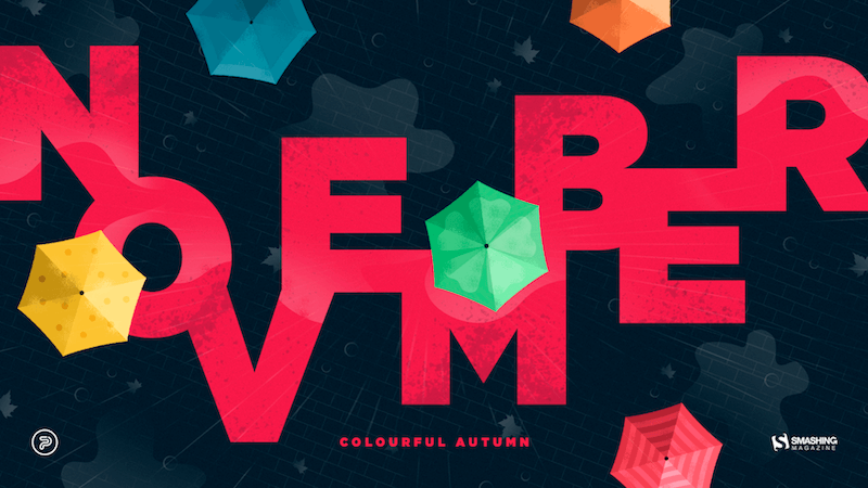
Colorful Autumn

“Autumn can be dreary, especially in November, when rain starts pouring every day. We wanted to summon better days, so that’s how this colourful November calendar was created. Open your umbrella and let’s roll!” — Designed by PopArt Studio from Serbia.
Winter Is Here

Designed by Ricardo Gimenes from Spain.

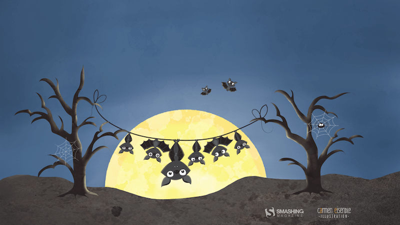
Moonlight Bats

“I designed some Halloween characters and then this idea came to my mind — a bat family hanging around in the moonlight. A cute and scary mood is just perfect for autumn.” — Designed by Carmen Eisendle from Germany.
Time To Give Thanks

Designed by Glynnis Owen from Australia.
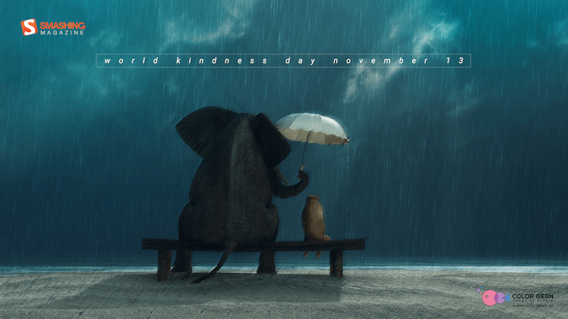
The Kind Soul

“Kindness drives humanity. Be kind. Be humble. Be humane. Be the best of yourself!” — Designed by Color Mean Creative Studio from Dubai.
Anbani

Anbani means alphabet in Georgian. The letters that grow on that tree are the Georgian alphabet. It’s very unique!” — Designed by Vlad Gerasimov from Georgia.

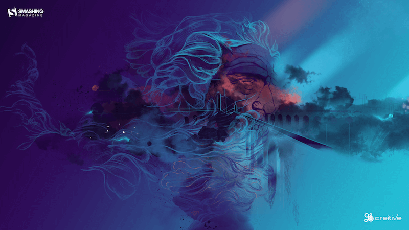
Tempestuous November

“By the end of autumn, ferocious Poseidon will part from tinted clouds and timid breeze. After this uneven clash, the sky once more becomes pellucid just in time for imminent luminous snow.” — Designed by Ana Masnikosa from Belgrade, Serbia.
Me And The Key Three

Designed by Bart Bonte from Belgium.

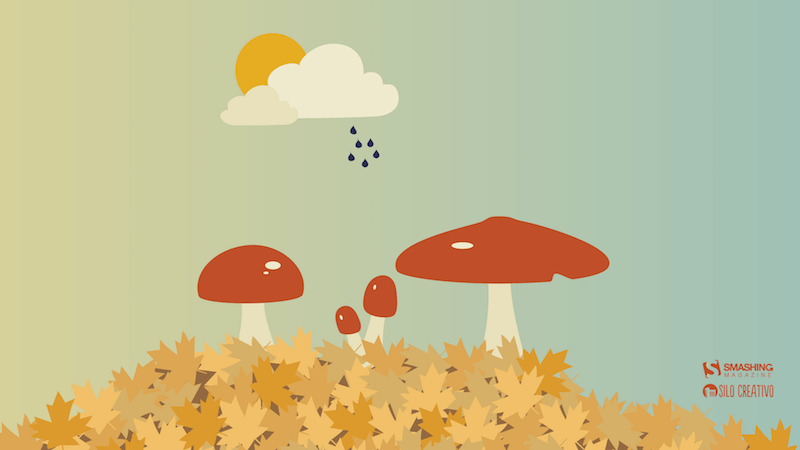
Mushroom Season

“It is autumn! It is raining and thus… it is mushroom season! It is the perfect moment to go to the forest and get the best mushrooms to do the best recipe.” — Designed by Verónica Valenzuela from Spain.
Welcome Home Dear Winter

“The smell of winter is lingering in the air. The time to be home! Winter reminds us of good food, of the warmth, the touch of a friendly hand, and a talk beside the fire. Keep calm and let us welcome winter.” — Designed by Acodez IT Solutions from India.
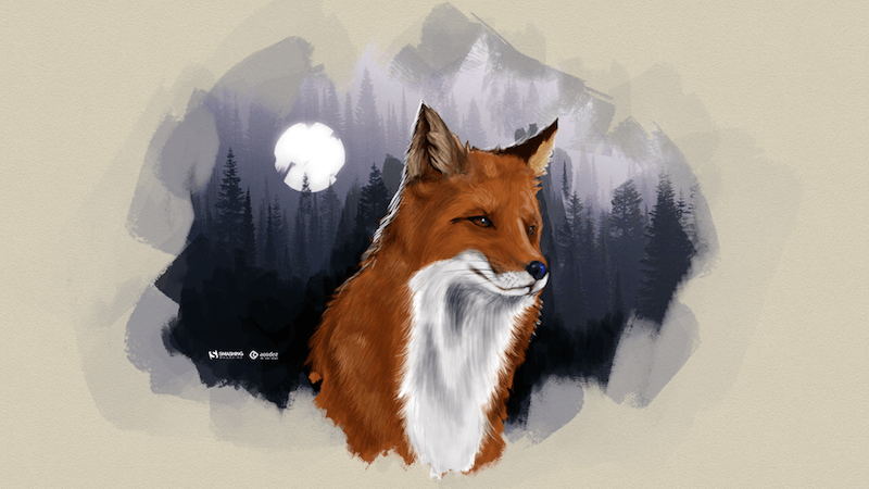
Outer Space

“We were inspired by the nature around us and the universe above us, so we created an out-of-this-world calendar. Now, let us all stop for a second and contemplate on preserving our forests, let us send birds of passage off to warmer places, and let us think to ourselves — if not on Earth, could we find a home somewhere else in outer space?” — Designed by PopArt Studio from Serbia.
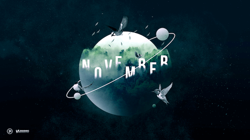
Captain’s Home

Designed by Elise Vanoorbeek from Belgium.

Holiday Season Is Approaching

Designed by ActiveCollab from the United States.

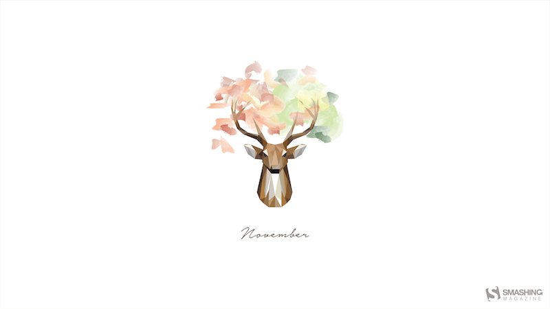
Deer Fall, I Love You

Designed by Maria Porter from the United States.
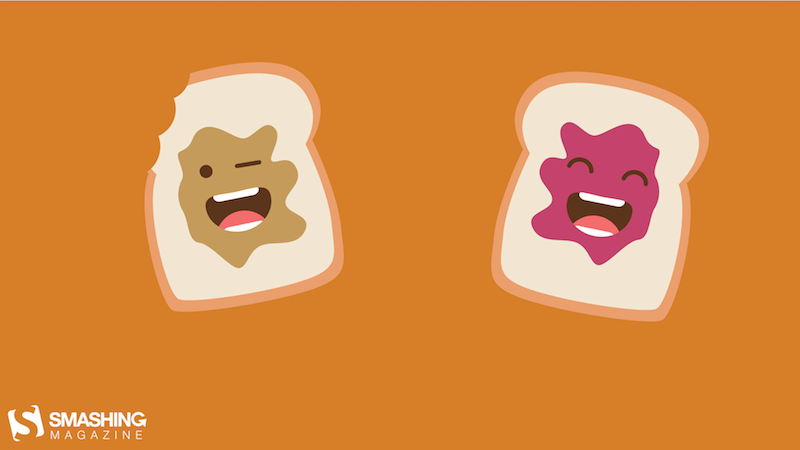
Peanut Butter Jelly Time

“November is the Peanut Butter Month so I decided to make a wallpaper around that. As everyone knows peanut butter goes really well with some jelly so I made two sandwiches, one with peanut butter and one with jelly. Together they make the best combination.” — Designed by Senne Mommens from Belgium.
International Civil Aviation Day

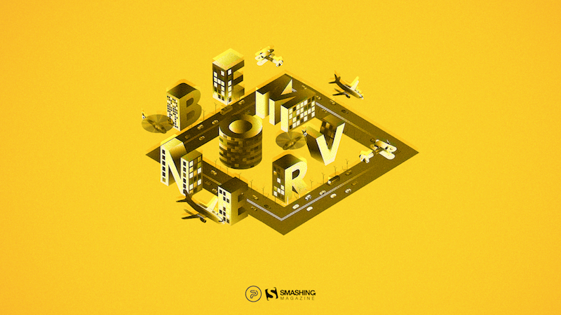
“On December 7, we mark International Civil Aviation Day, celebrating those who prove day by day that the sky really is the limit. As the engine of global connectivity, civil aviation is now, more than ever, a symbol of social and economic progress and a vehicle of international understanding. This monthly calendar is our sign of gratitude to those who dedicate their lives to enabling everyone to reach their dreams.” — Designed by PopArt Studio from Serbia.
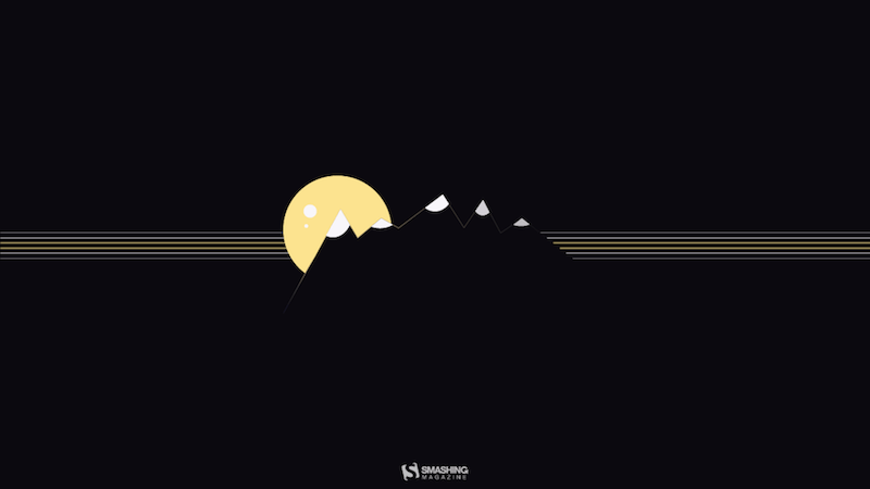
November Nights On Mountains

“Those chill November nights when you see mountain tops covered with the first snow sparkling in the moonlight.” — Designed by Jovana Djokic from Serbia.
November Fun

Designed by Xenia Latii from Germany.

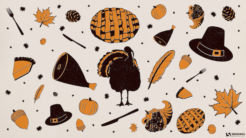
November Ingredients

“Whether or not you celebrate Thanksgiving, there’s certain things that always make the harvest season special. As a Floridian, I’m a big fan of any signs that the weather might be cooling down soon, too!” — Designed by Dorothy Timmer from the United States.
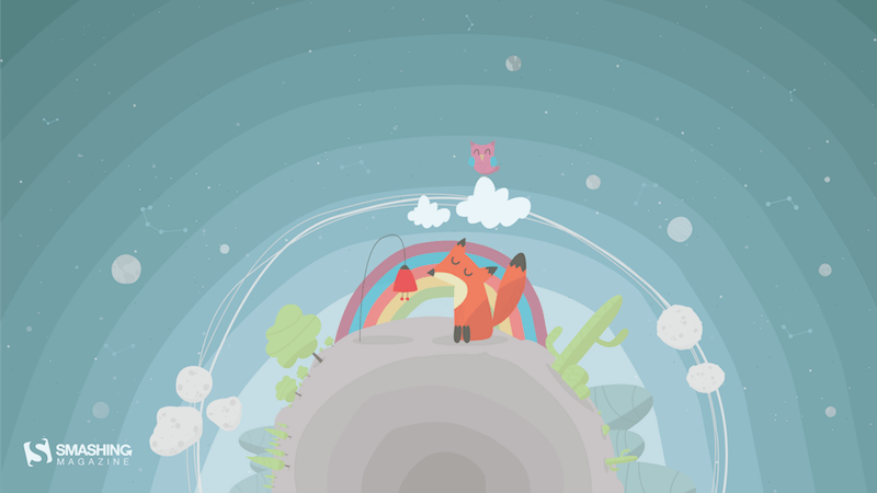
Universal Children’s Day

“Universal Children’s Day, November 20. It feels like a dream world, it invites you to let your imagination flow, see the details, and find the child inside you.” — Designed by Luis Costa from Portugal.
A Gentleman’s November

Designed by Cedric Bloem from Belgium.


Gain $200 in a week
from Articles on Smashing Magazine — For Web Designers And Developers https://ift.tt/hA7TUzX

30+ Portfolio Design Trends for 2025

Featured Imgs 23

When was the last time you updated your design portfolio? (If you’re like me, it’s probably been a while.) Maintaining a fresh portfolio is a good way to show off your skills to potential clients and can be helpful when looking back on work for annual contest entries.

If you’ve fallen behind with your portfolio design, or just need a new portfolio in general, this is a great opportunity to create something using trendy techniques and visuals.

A modern portfolio using design trends can make a great impression. A portfolio is also a representation of your skills — so design wisely! Here’s a look at some of our favorite portfolio design trends.

Personal Touch

portfolio design

A portfolio is a place to show off who you are, your style, and serve as an introduction to potential clients or employers. Make it personal.

By using language and a tone that feels like you and a photo or video that shows your personality, you can start to establish a connection online with those who visit your portfolio. People who know you personally might even say they can “really see you” in the design – literally or figuratively.

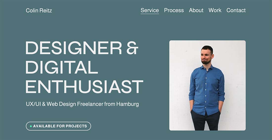
In the example above, Colin Reitz uses a fun video to help show he’s a personable, friendly, enthusiastic designer. It’s an inviting option that makes him feel approachable, a good thing for a freelancer.

Brutalist Style

portfolio design

The brutalist trend that’s popped up all over website design also applies to portfolio sites as well.

The good thing about brutalism for a portfolio is that it can give images and work more room to shine without so many effects in the design. The challenge is that it could turn off some potential connections that might not appreciate the bluntness of the design.

An “almost brutal” aesthetic is the balance that most designers go with for their portfolios.

A Curated Homepage

Michael-Collins

Michael Collins is an experienced director and design strategist who likes to work at the intersection of curiosity, reasoning, and imagination to create one of a kind user experiences and future-oriented solutions.

What stands out in his portfolio website is the way the homepage has been curated. Having a clean and simple layout that does not require too much scrolling helps in providing an easy user experience.

Unexpected Visuals

portfolio design

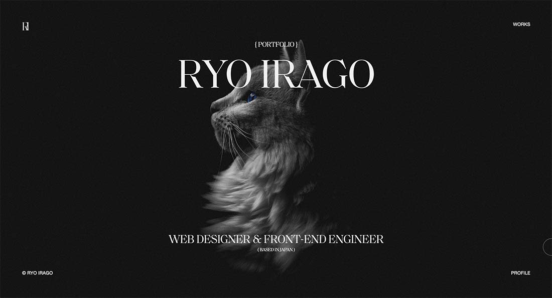
If there is a single image on the homepage of a portfolio, it tends to be of the designer or of a specific piece of work. But what if it is something completely unexpected?

That’s what designers are doing more of. They are creating interesting elements to help set their portfolios apart so that they don’t look like the sea of other portfolio sites that potentially come across hiring managers’ desks.

In the example above, Ryo Irago uses a bit of beautifully created imagery to draw you in. The design of the homepage is stunning, the image is captivating, and if nothing else you’ll likely scroll to learn more (which is exactly the intention of a portfolio design such as this).

Subtle Animation

portfolio design

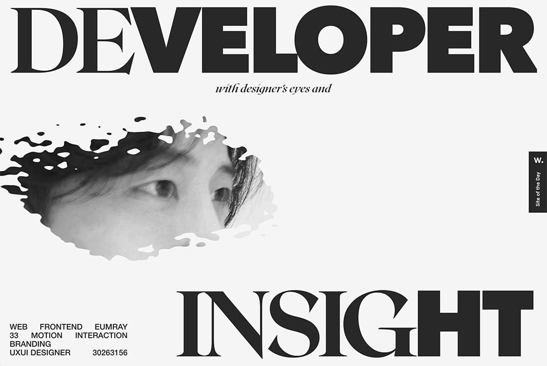
A website portfolio is a perfect place to show off some of your design skills. Use a cool technique or trendy element to create just the mood to show your design style and ability. For many designers right now, this includes using subtle animated effects – often with other bold elements – to bring attention to portfolio designs.

Eumray’s portfolio does just that with big, bold typography that explains what they do with a nifty animation with the photo. (A headshot on a portfolio website is another design trend that’s hung on for a long time.)

The use of space here and a black-and-white color scheme are also trendy elements, making this portfolio seem very in the moment. There are other subtle animations below the scroll that tie everything together beautifully as well.

Show, Don’t Tell

portfolio design

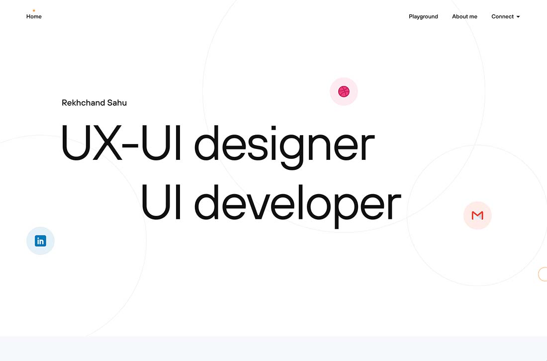
The “show, don’t tell” concept has been a big part of website design for a long time. It can work equally well for portfolio sites, by telling visitors what the design does or where to find information about their work.

Here, Rekhchand Sahu uses bouncing icons to help take you to design elements and information. The overall aesthetic is simple and easy to understand with a clear headline/hero text area.

Click on the icons for more work or scroll for a selection of pieces. The design feels modern and shows the type of style that you’ll get from this designer/developer.

Cute Illustrations

portfolio trend - Cute Illustrations

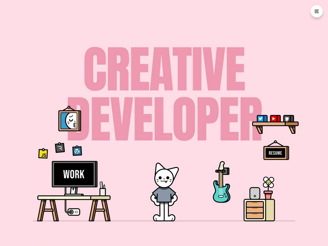
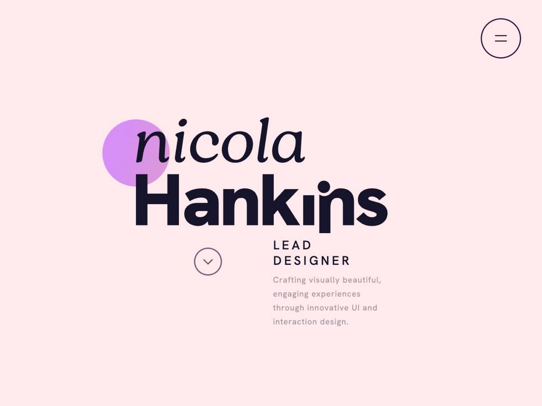
Cute illustrations are becoming increasingly popular in portfolio design as they add a touch of personality and whimsy to the presentation. These illustrations often feature playful characters, soft color palettes, and hand-drawn elements that make the design feel approachable and fun.

By incorporating charming and lighthearted illustrations, portfolio sites can establish an immediate connection with visitors, making the content more memorable. This trend works particularly well for creatives in fields like illustration, animation, or children’s media, where a friendly and engaging aesthetic can help showcase the artist’s unique style.

Incorporating cute illustrations doesn’t mean compromising on professionalism. When used thoughtfully, these elements can enhance the storytelling aspect of a portfolio, guiding users through the site with visual cues that add context and personality.

High Contrast Colors

portfolio trend - high contrast

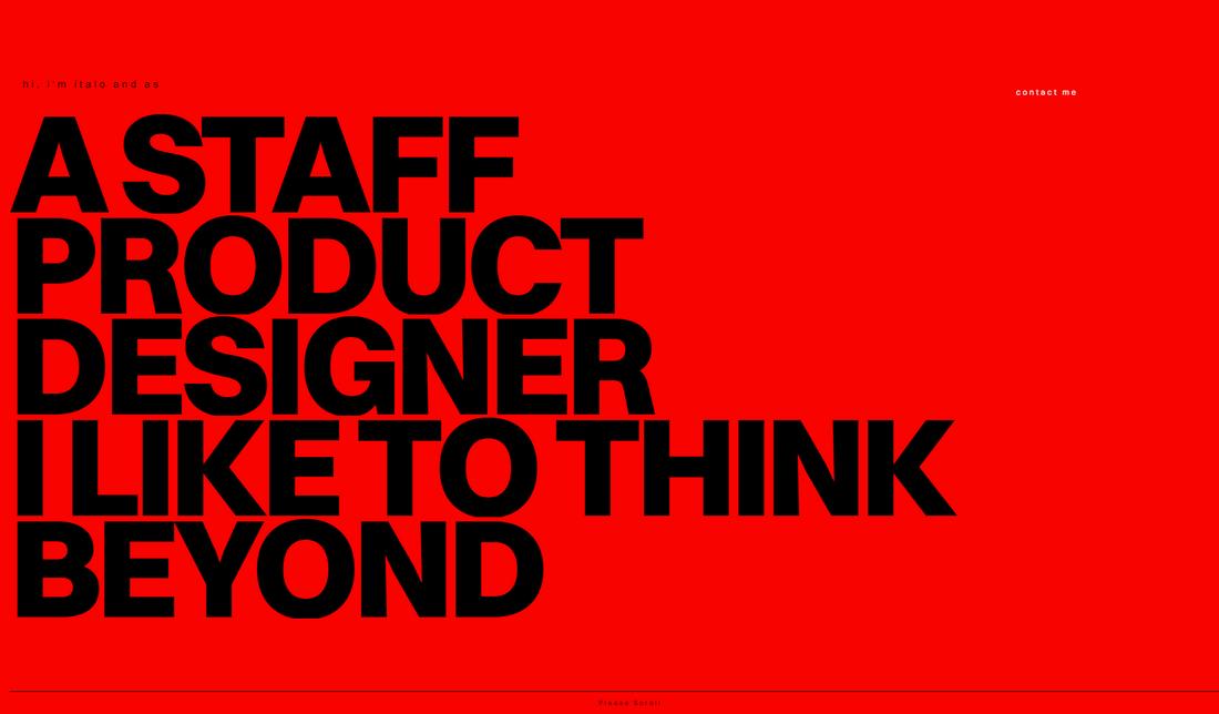
High-contrast colors make a bold statement in portfolio site design by using vivid and opposing hues to draw attention to key elements. This approach involves pairing light and dark colors, or complementary colors, to create a striking visual effect that captures the viewer’s eye. High-contrast designs are particularly effective for portfolios that want to make a memorable first impression.

Using high-contrast colors can also enhance the site’s usability by clearly differentiating sections, buttons, and calls to action. When implementing this trend, it’s important to maintain a balance to avoid overwhelming the user; choose colors that complement each other while ensuring readability is not compromised.

Text-Only Design

portfolio trend - Text-Only Design

Text-only design strips away images and illustrations to focus entirely on typography as the main visual element. This minimalistic approach relies on the power of words and fonts to make a statement, using large headings, creative layouts, and varied fonts to keep the design engaging.

Text-only portfolios can create a clean and modern look that emphasizes the content and message, making them well-suited for writers, copywriters, and content creators who want their words to take center stage. By playing with font sizes, weights, and styles, text-only designs can still achieve a dynamic and visually compelling effect without relying on imagery.

The text-only trend also offers greater flexibility for designers to experiment with spacing, alignment, and motion. For instance, animated text or interactive elements can add interest and guide the user through the site in an engaging way.

Neon Accents

portfolio trend - Neon Accents

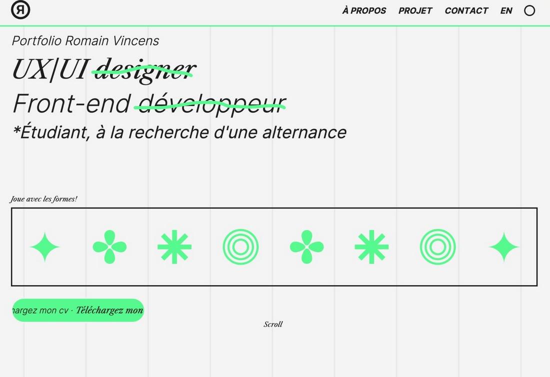
Neon accents are making a comeback in portfolio site design, adding a futuristic and energetic feel to layouts. These bright, luminous colors can be used to highlight important elements such as buttons, headings, or featured projects, drawing the eye to key areas of the site.

To make the most of neon accents without overwhelming the design, use them sparingly to add pops of color that enhance the visual hierarchy. Incorporating subtle neon effects, such as glows, gradients, or outlines, can create a sense of depth and movement, making the site feel more dynamic.

Pairing neon accents with clean layouts and neutral colors can balance the boldness, ensuring the design remains professional while still making a visual impact. Neon accents can give portfolios a cutting-edge appeal that captures attention and keeps users engaged.

Creative Layouts

portfolio trend - Creative Layouts

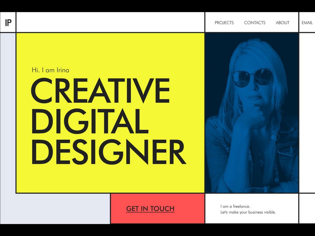
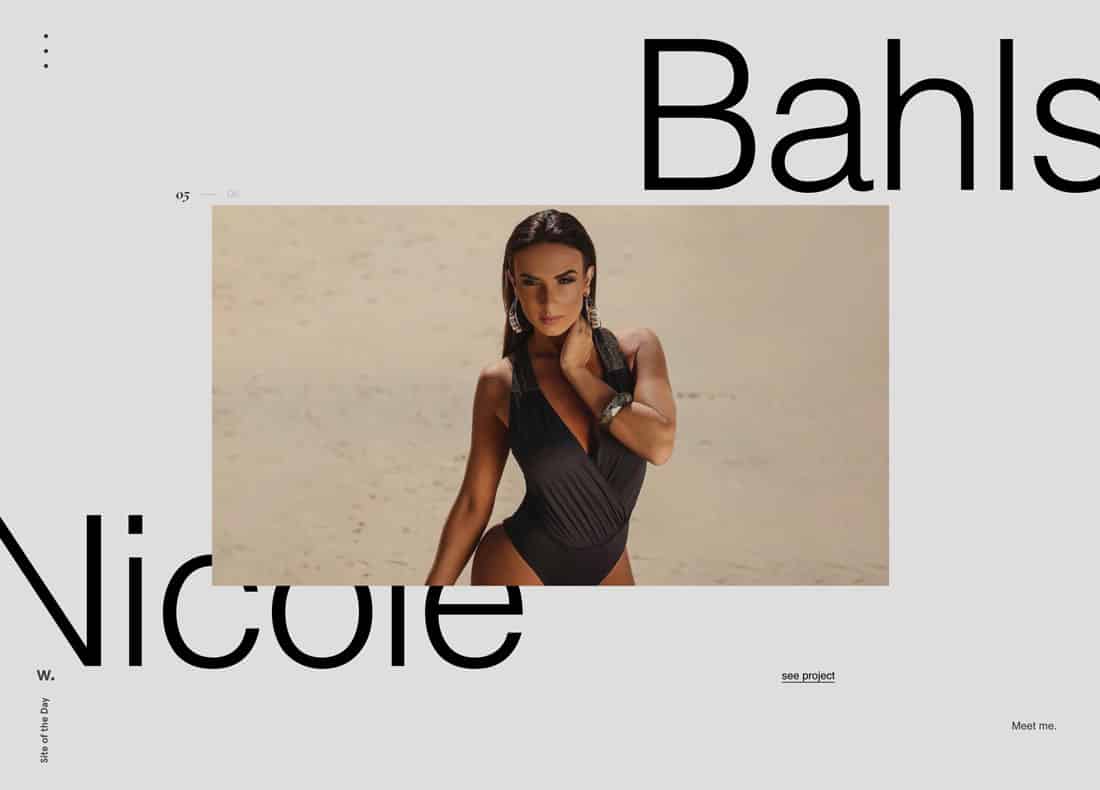
Creative layouts break away from traditional grid-based designs, offering more freedom and flexibility in the arrangement of content. By using asymmetrical layouts, overlapping elements, or unconventional scrolling effects, designers can create a unique and engaging user experience.

The key to successful creative layouts is maintaining a sense of balance while experimenting with the arrangement of elements. While the design may be unconventional, it should still guide the viewer’s eye naturally through the content, ensuring that important information is easily accessible.

Thoughtful use of whitespace, layering, and animation can add depth and visual interest without sacrificing usability. When executed well, creative layouts can transform a portfolio into a memorable and interactive experience that resonates with viewers.

3D Interactive

portfolio trend - 3D Interactive

The 3D Interactive trend in portfolio site design brings depth and realism to web experiences by incorporating three-dimensional elements that users can engage with. This approach involves using 3D models, animations, and effects that respond to user interactions, such as hover states, clicks, or scrolling.

It creates a sense of immersion that makes the portfolio feel more dynamic and engaging, as visitors can explore the content in a more interactive way. This trend is especially impactful for portfolios in industries like digital art, game design, or 3D modeling, where showcasing technical skills and creativity through interactive elements can leave a lasting impression.

To successfully implement 3D interactive elements, you should balance realism with usability, ensuring that animations and effects enhance the user experience rather than detract from it. Strategic placement of 3D components can guide users through the portfolio in an intuitive manner, while subtle animations can be used to draw attention to key content without overwhelming the visitor.

Over-the-Top Design

portfolio design

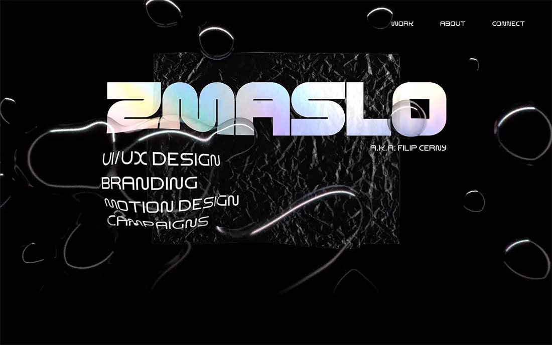
While minimal portfolio styles are popular, over-the-top portfolio designs are beginning to trend. (Likely because they are so disruptive in a sea of black and white, minimal designs.)

This portfolio uses a lot of trending elements together and it works. There’s the big hero headline with a gradient color treatment, liquid animated effects, and funky type elements.

As you scroll, the entire portfolio website has an almost brutalist feel to it with slab font choices and a dark outline. Although the design has a bit of harshness to it, there’s reason to scroll and get into the design and learn more about the designer.

Layered Graphic Elements

portfolio design

Cool layered effects, especially those that include nifty CSS effects such as parallax scrolling or hints of animation can make for fun layers.

This portfolio technique is gaining popularity and provides a good opportunity for designers to play with certain effects before deploying them on a client project.

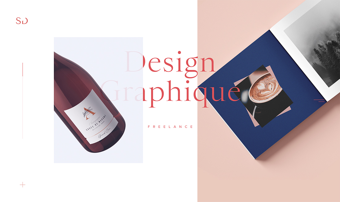
This one-page portfolio by Sophie Doukhopelnikoff uses transparencies and text elements in layers that create depth and visual interest. Having letters both behind and in front of images is rather stunning and draws you into the design. Sans serif typography lends an even more classic feel to the overall design.

Subtle Color Effects

portfolio design

You’re going to have to click through and hang out on this portfolio website for a few minutes to get the full effect of the design.

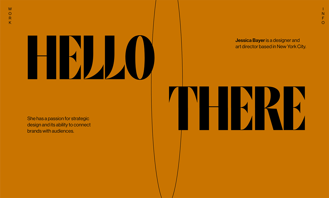
The simple “Hello There” first expands to fill the screen with other text elements that better explain the portfolio, then the background color softly changes every few seconds for a rainbow effect. It’s simple, subtle, and very beautiful.

This is a color effect that could have a lot of applications elsewhere and speaks to the creative nature of a portfolio website itself.

Super-Simple Aesthetic

portfolio design

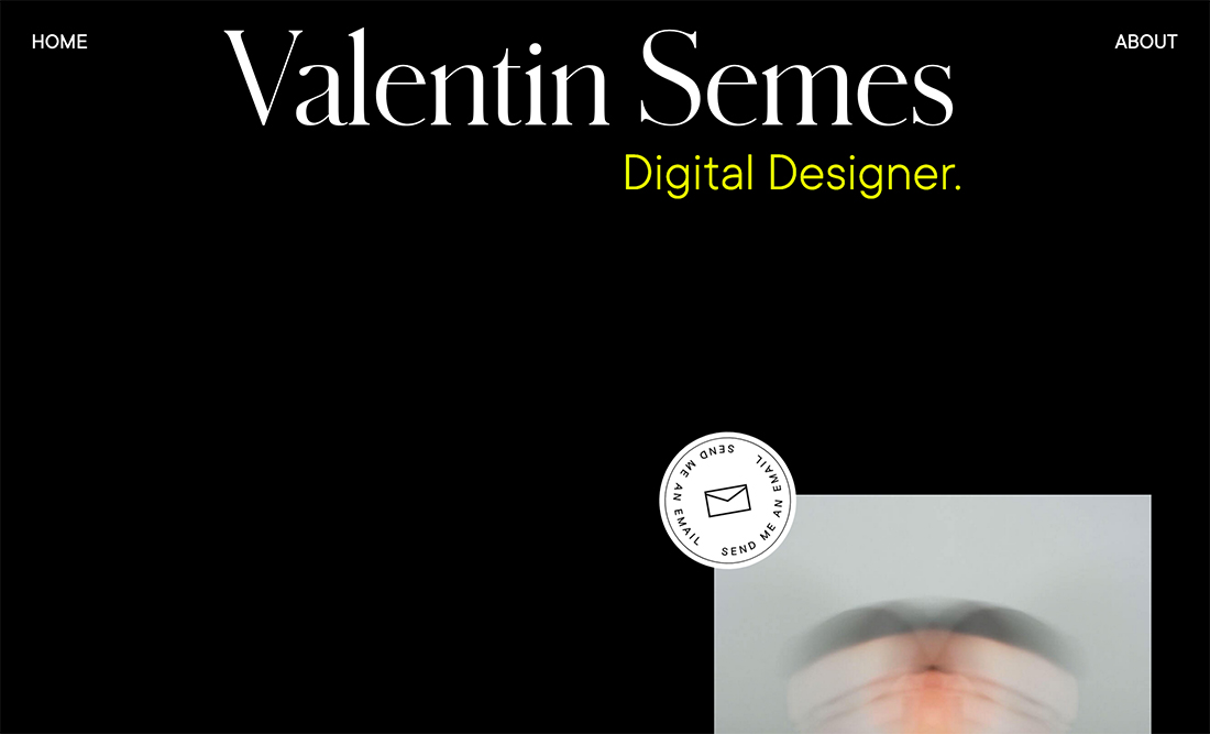
It seems like there’s a trend in portfolio design where designers don’t lead with their work. Their websites are simple and visually interesting and then lead you into their project only after a first glance.

The simple design here is sleek and intriguing. It works equally well with dark or white backgrounds and simple typography and graphic elements.

Valentin Semes makes the most of the super-simple aesthetic with neat interactive divots – pay attention to the mouse hover – to keep you moving through the design so that you see elements of the portfolio.

Magazine-Style Layouts

portfolio design

Magazine-style layouts have long been popular for blogs but can also help show off a portfolio as this trend shows.

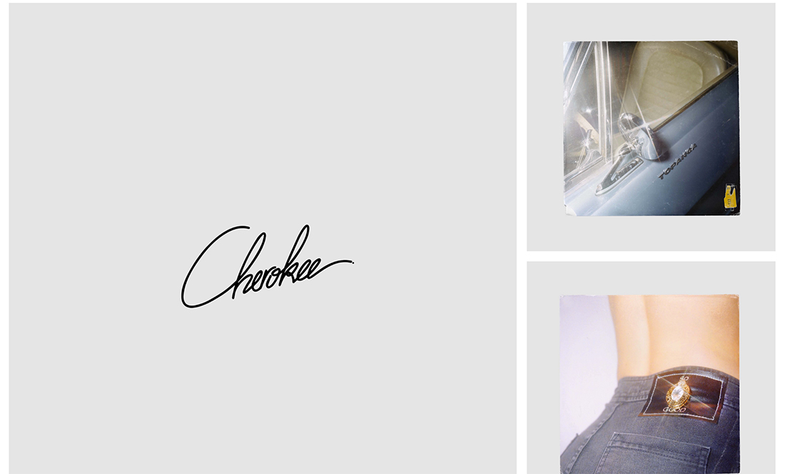
Each block can be used to highlight a different type of work or individual project in a way that gives each design room of its own.

Antoine Barres uses this format to show a variety of creative pieces in a way that makes it easy to see each design. The gray background blocks with the white grid have an incredibly classic style that gives each design even more room to shine.

Homepage Bios

portfolio design

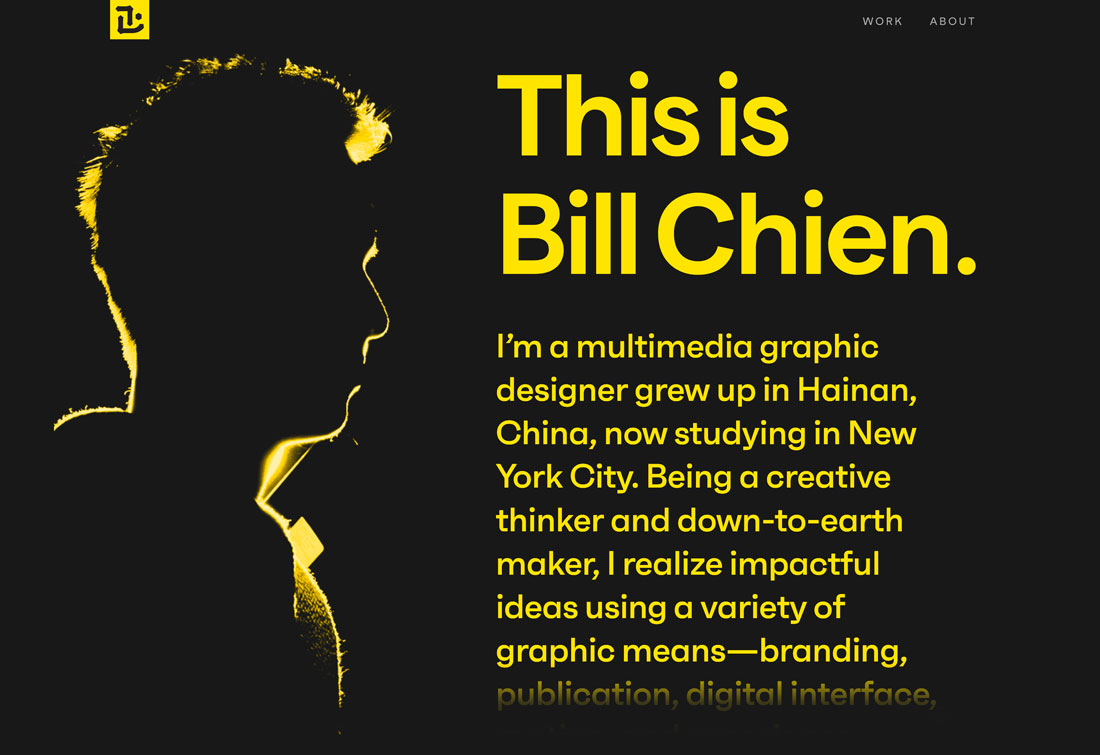
There’s no rule that your bio has to be on the About page of your portfolio website. One of the strongest trends in portfolio design is to move that bio – or at least a short version of it – to the homepage.

It’s a great way to tell people exactly what you do from the start. There will be no guessing what your portfolio is about and what type of creative you are.

It’s a place where you can create a personal statement or even highlight various projects. Bill Chien’s portfolio does this beautifully with a movie-credits-style bio that scrolls on the homepage. His bio is simple, and to the point, showing his creative mindset.

Lots of Interactivity

portfolio design

Interactive portfolios are in.

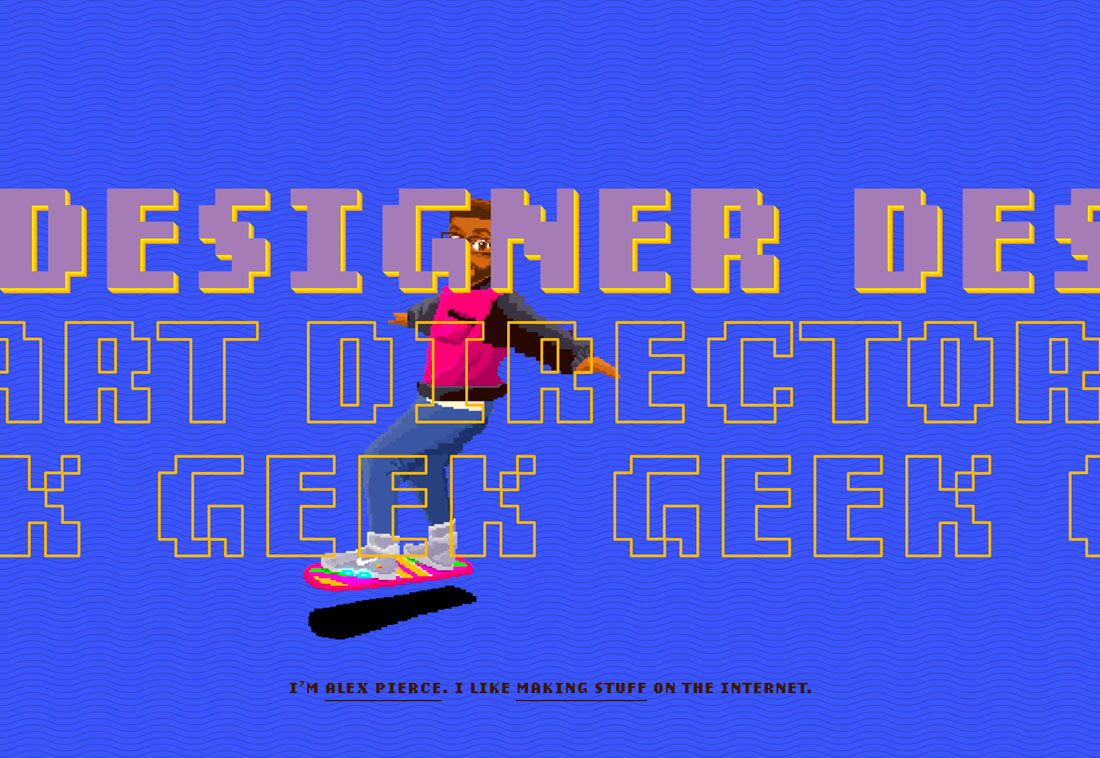
Many of these portfolio designs are visually loud, packed with movement, color, and things to click or cool changing hover states. There’s an almost limitless opportunity to use effects and design techniques.

What’s neat about a highly interactive portfolio is that it provides a place to show off some supreme UX skills.

The challenge is that sometimes the designs can get just a wee bit overwhelming. Make sure to track user behavior and engagement and if you are losing visitors, it might be worth a chance. (It can also be a good test for deploying similar techniques in other projects.)

Unusual Design Patterns

portfolio design

Portfolios that test new design patterns are also trending. Moving traditional navigation elements, obscuring text, and even experimenting with animation states are all common.

This trend might be popular because it provides an opportunity for designers to have a little playground to test techniques and effects. What’s nice about it, is that this trend pushes our idea of what is and isn’t the right way to do something.

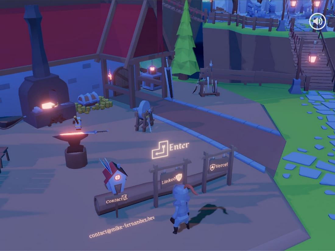
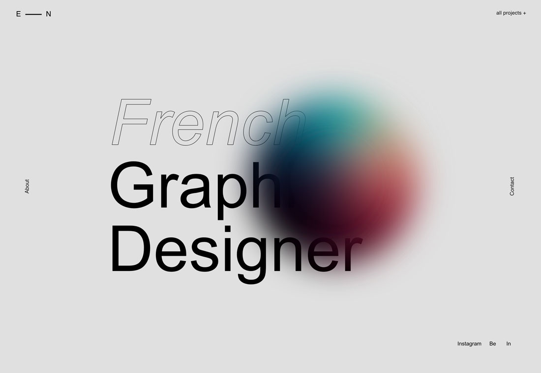
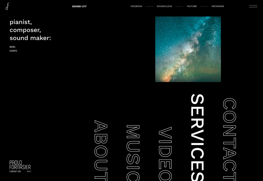
The example above uses a few visual trends and unusual patterns at the same time. There’s outline typography that’s partially obscured, an animated hover state for the color orb, and navigation that is on the vertical edges of the screen.

The portfolio trend makes you think about design norms and how you feel about them as you dive into the work.

Black and White

portfolio design

Black and white designs, often with a color accent, are huge right now.

The biggest contributing factor might be that black-and-white design patterns make it easy to see portfolio works, which are often in color. It gives the thing you want people to see greater attention when it does appear on the screen.

Paired with this black-and-white trend is another common factor. Portfolio pieces don’t appear on the homepage; users have to click through to find them.

Trendy Typography

portfolio design

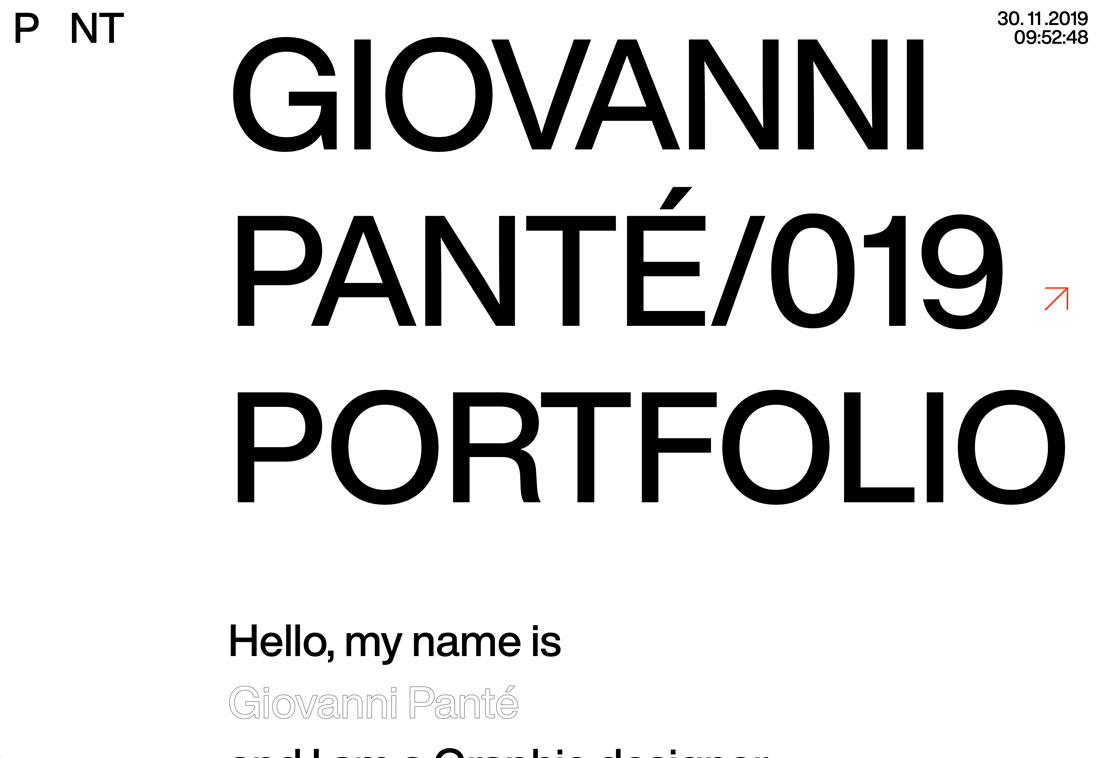
You can never go wrong with amazing typography. Whether you are using a trending type element, such as the outlines above, or simply a beautiful typeface, this trend never gets old.

Strong typography skills will help your portfolio shine and help others understand the quality of your work. This trend shows why creating a portfolio that represents the strength of your skills is important.

Potential employers and clients will often get an impression of the kind of creative you are simply by looking at your portfolio website. Almost every designer would love to be thought of as someone with strong typography skills. Using trendy typography well definitely fits the bill.

High-Performance Effects

portfolio design

Victor Costa’s portfolio is a prime example of how to create a high-performance portfolio.

Because web designers, photographers, and other creatives are using their portfolios to show off what they can do, there’s a distinct shift to more high-performance designs. (Some of which are too much for mobile displays. Make sure you have an alternative gateway if you go this route.)

These high-performance designs are packed with nifty JavaScript, animation, and effects that are designed to wow users.

Victor Costa’s portfolio is a prime example of how to create a high-performance portfolio. It opens with an option for users – standard or high-performance. The portfolio is filled with interactive elements, fades and scroll actions, and animation. These techniques match the elements he references in his bio and is not only a showcase of past work but an indicator of what else he can do for clients.

Plenty of Space

portfolio design

Something that’s been popping up in more designs across the board is making its way into portfolio design as well – plenty of space between elements and objects.

This trend seems to have roots in ensuring that items are appropriately separated on mobile devices and have plenty of tap space, but the additional space can look great on desktop screens as well. (Granted, I’ve always been a fan of white space.)

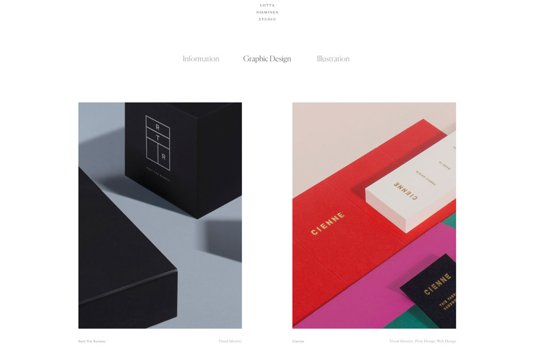
Lotta Nieminen’s portfolio is a perfect example of this design in action. The super-deep header takes up more than a third of the screen while the vertical and horizontal space between portfolio images is super wide. Each element stands on its own and the exaggerated spacing gives each project room to stand on its own, which can be particularly nice for a portfolio design with the potential for so many different types of images.

Groovy UI

portfolio design

Pairing a minimally-styled design with stylish user interface effects can create quite a stunning portfolio. This combination of visual simplicity and complex interaction can delight users and keep them looking through different screens and portfolio projects.

Click through the example above to see how each portfolio project glides onto the screen with a cool ripple effect before it stops. The cursor shifts and shapes as well, denoting click elements to take users through each project in a way that’s more than just reading about how the design came together.

This is a portfolio you could spend hours with thanks to the groovy UI.

Large Typography

portfolio

Typography and text are some of the most frequently overlooked design elements when planning a project or portfolio.

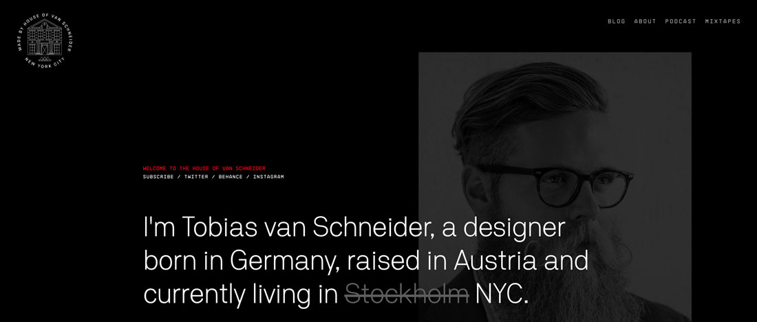
Strong typography and language can be the perfect introduction to your work (and portfolio). Most people probably know of Tobias van Schneider from his ventures as a designer or podcaster, but would you expect his portfolio home page to be mostly text?

Typography and text are some of the most frequently overlooked design elements when planning a project or portfolio. Most of us are so concerned with visuals or animation.

This example shows why so many designers are opting for portfolios that feature strong typography. It sets the right tone – you know what he does and what the site is about – before getting into the deeper visuals. (This option also highlights his strength for designs that feature a lot of text.)

Portfolios That Don’t Look Like Portfolios

…as a designer you don’t have to come up with something completely new to show off your work

One of the biggest trends in portfolio design is crafting a portfolio that looks like another type of website altogether.

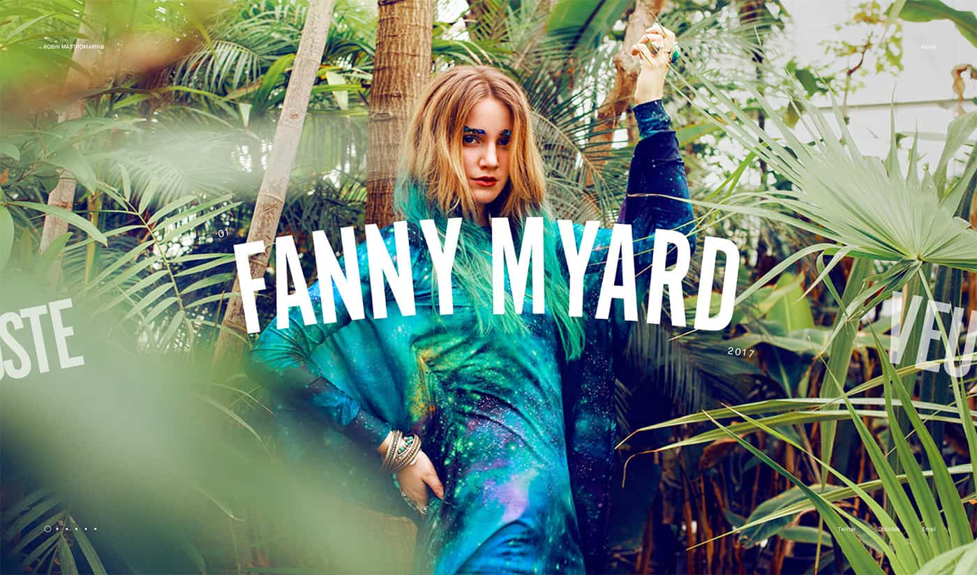
Robin Mastromarino’s portfolio looks like a website for a bar or fashion designer or professional athlete, depending on which part of the slider you view first. It’s beautiful and simple and what’s most impressive is the room each project has to shine.

Subtle cues help users understand elements of the portfolio, such as small numerals above the headline, and the date below. Plus, the slide element encourages left-to-right scrolling with partial headlines from other projects.

The other things that are so nice about this portfolio style are that as a designer you don’t have to come up with something completely new to show off your work. With big “art” for projects, completed jobs are the focus, rather than creating something completely new. (How’s that for creating something you can update quickly?)

Split-Screen Patterns

portfolio

Split-screen patterns have been trending for a while and more portfolios are using this design, even if they don’t use the functionality. It works because the pairing of elements helps drive users across the screen to take in everything in front of them.

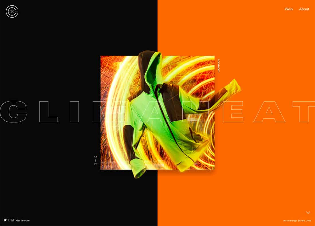
Xavier Cusso uses a split-screen design with great parallax scrolling effects to move from project to project. The color-block screen design helps emphasize that the website is his creation, while the element in the middle is the portfolio project to examine. It puts some separation between the portfolio and project designs.

This is a nice way to handle big-name projects – note the graphic for Adidas Climaheat here – while maintaining your identity in the portfolio design. (Make sure to click through and visit individual projects here; the overall portfolio design is impressive.)

Minimalism-Inspired Design

portfolio trends

The best thing about a minimalism-inspired portfolio is that it gives the design plenty of room to shine. The design of the actual portfolio becomes relatively invisible so that all the focus is on the elements that you want people to see.

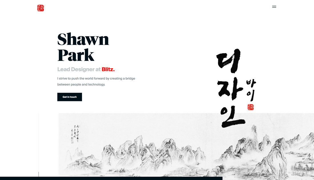
Designer Shawn Park recently wrote about how he redesigns his portfolio every year for UX Collective – I highly recommend that you go read that article here – and the current design (above) shows an evolution of design trends in itself.

Park includes iterations of his portfolio design in the post, beginning in 2013, and you can see how design trends impacted his portfolio. You can also see how this fresh minimal style makes it easier to see his work today than in previous incarnations.

Oversized Homepage Headshots

portfolio trends

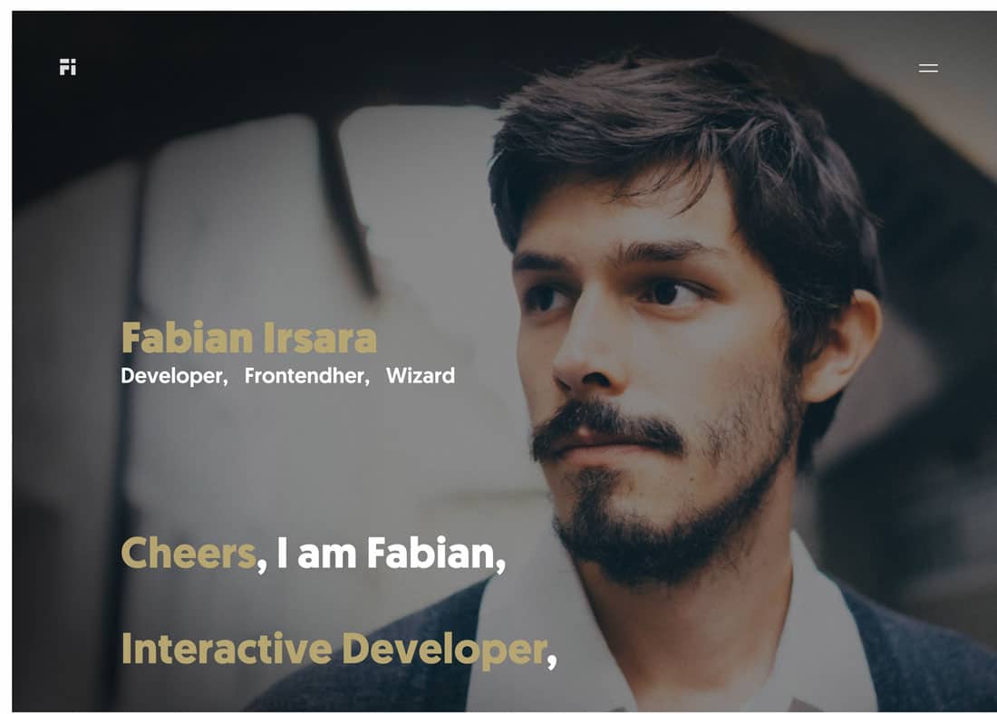
Big headshots are a big deal, particularly with developers and interaction designers.

This portfolio trend might be popular because it’s harder to visually show this work: Do you highlight code?

The trick to making this portfolio design work is a strong image. It needs to be more than a headshot; it needs to have a moodiness to it. Then pair it with strong typography to make it obvious that this is a portfolio website and what you do. Keep all of that information above the scroll for the best chance of keeping visitors moving through the design.

And a few nifty effects can’t hurt either.

Modular Grids

portfolio

One portfolio design trend that never seems to fade is the use of modular grids to show off projects. This is a great – and functional – option because you can “float” images of different projects on a single canvas.

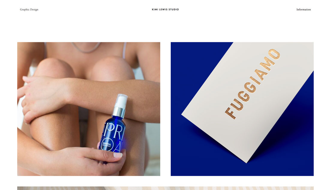
Kimi Lewis does something a little bit different with her portfolio, above. Rather than lots of small blocks to show portfolio projects, this design goes big. It mixes and matches squarer and long horizontal images in an oversized grid.

Users get a good feel for each project right from the start. Add the oversized grid images to some exaggerated spacing between elements and this portfolio might be one of the easiest to digest that I’ve seen in a while. There’s also a nifty hover animation on each image with the client name and project type to provide extra information before you click through.

Color Overlays

portfolio trends

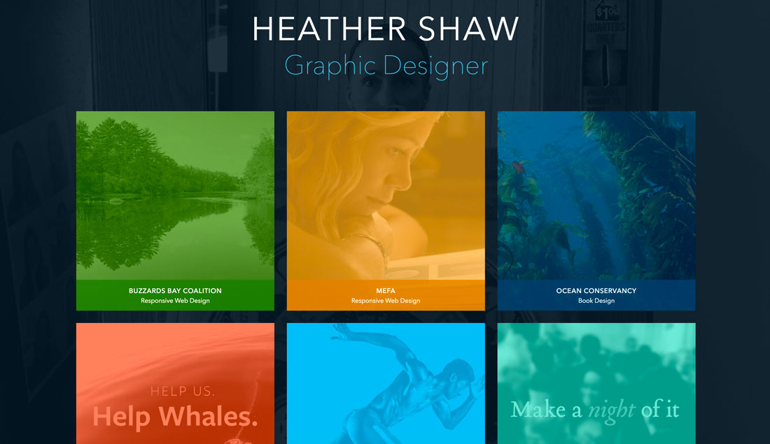
Heather Shaw’s portfolio works because each project is so different, but the color overlays give the homepage a connected feel.

One of the most challenging things about creating a portfolio is the homepage. How do you preview work or project sections in a way that will entice users to actually click through?

The answer might be to partially obscure the work. Using interesting color overlays on preview image links can be a visually engaging way to encourage clicks to individual projects. It’ll keep your homepage cleaner with a consistent look and style for different sections of the website, ensure that one page isn’t too heavy and slow to load, and provides an opportunity to highlight something about a project before the click.

Heather Shaw’s portfolio, above, works because each project is so different, but the color overlays give the homepage a connected feel. The user also knows what kind of project they are about to view thanks to labels with client names and project types right there. This is a highly navigable and easy-to-understand format that appeals visually.

Streamlined Project Showcase

mobile cards


And then there’s the opposite end of the spectrum – portfolios that have a more streamlined look and feel. There can be a benefit to only showing a handful of projects.
It ensures that users only see what you want them to focus on and not get distracted.

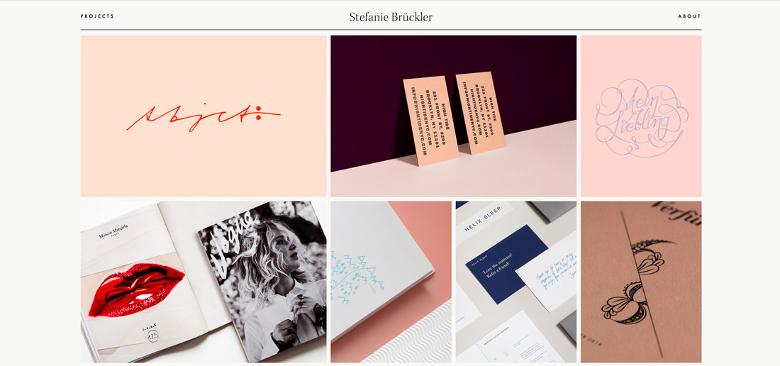
Stefanie Bruckler also uses a module grid format but with fewer items in a more contained space. Plus, it’s all below the main scroll which features a minimal business card-style design.

It has a look that’s polished and classy, setting a distinct tone for the work of this designer.

Conclusion

Still not quite ready to redesign your portfolio? While it is a creative project, this is also an investment in your business, whether you work for a company or as a freelancer.

Potential clients are looking for you before you even know they exist. A modern, trendy portfolio with your best projects can make a strong first impression.