A regular expression refresher

Category Image 080

#​701 — August 22, 2024

Read on the Web

JavaScript Weekly

Regexes Got Good: The History (and Future) of Regular Expressions in JavaScript — Regular expression support was always a little underwhelming in JS, but things have improved. Steven takes us on a tour to refresh our knowledge, as well as show off his ‘regex’ library that boosts JS regexes to a true A++ rating. Steven was co-author of O’Reilly’s Regular Expressions Cookbook and High Performance JavaScript so knows his stuff.

Steven Levithan

WorkOS: The Modern Identity Platform for B2B SaaS — WorkOS is a modern identity platform for B2B SaaS, offering flexible and easy-to-use APIs to integrate SSO, SCIM, and RBAC in minutes instead of months. It’s trusted by hundreds of high-growth startups such as Perplexity, Vercel, Drata, and Webflow.

WorkOS sponsor

Node v22.7.0 (Current) Released — Node 22.6 let you strip types from source code, but now with –experimental-transform-types you can transform TypeScript-only syntax into JavaScript before running it too. Module syntax detection is now also enabled by default.

Rafael Gonzaga

Bun v1.1.25: Now Running at 1.29 Million Requests per Second — I’m having a little fun with the title, but the latest version of the JavaScriptCore-based JS runtime has added node:cluster support and uses this to demo a high level of HTTP throughput on a ‘Hello World’ example. Support for V8’s C++ API has also landed – notable because Bun isn’t V8-based.

Ashcon Partovi

IN BRIEF:

We’ve mentioned ECMASCript 2024 a bit recently, but Pawel Grzybek has a neat and tidy overview of what’s new in the ES2024 spec.

🐝 Could Wasp be ‘the JavaScript answer to Django’ for full-stack webdev? The Wasp team certainly thinks so.

🎙️ Ryan Dahl, creator of both Node.js and Deno, went on the Stack Overflow podcast to talk about Deno’s current limitations and what’s coming in Deno 2.0.

RELEASES:

PlayCanvas Engine 2.0 – A powerful JS-based Web graphics platform.

Node v20.17.0 (LTS) – The LTS release of Node adds support for require-ing synchronous ESM graphs.

Astro 4.14 – The popular agnostic content site framework now includes an experimental API for managing site content.

pnpm 9.8, Vuetify 3.7, Neo.mjs 7.0

Join Us for ViteConf on October 3rd — Learn how the best teams are building the next generation of the web with Vite!

StackBlitz sponsor

📒 Articles & Tutorials

50 TypeScript F–k Ups Mistakes — An admittedly colorfully-titled book digging into lots of subtle mistakes you might run into with TypeScript. It’s available on Leanpub in PDF, iPad, and Kindle forms, or you can read it all directly on its GitHub repo. At least worth a skim in case you’re running into any of its points..

Azat Mardan

The Official Redux Essentials Tutorial, Redux — The long standing guide to how to use the popular Redux state container the right way with best practices has undergone a big reworking with TypeScript used throughout, new concepts added, and more coverage of RTK/React Toolkit features.

Redux Team

React is (Becoming) a Full-Stack Framework — Is React merely a frontend library? How does the backend fit in? The author shares his thoughts on what led him to start considering React as more of a full-stack solution.

Robin Wieruch

📄 Using JavaScript Generators to Visualize Algorithms Alexander G. Covic

📄 Optimizing SPA Load Times with Async Chunks Preloading Matteo Mazzarolo

📄 Using isolatedModules in Angular 18.2 Thompson and Lyding (Angular Team)

📄 How to Generate a PDF in a JavaScript App Colby Fayock

🛠 Code & Tools

Milkdown: Plugin-Driven WYSIWYG Markdown Editor Framework — A lightweight WYSIWYG Markdown editor based around a plugin system that enables a significant level of customization. It’s neat to see the docs are rendered by the editor itself. GitHub repo.

Mirone

Fuite 5.0: A Tool for Finding Memory Leaks in Web Apps — A CLI tool that you can point at a URL to analyze for memory leaks. Here’s how it works. There’s also a video tutorial.

Nolan Lawson

✂️ Cut Your QA Cycles Down to Minutes with Automated Testing — Are slow test cycles limiting your dev teams’ release velocity? QA Wolf provides high-volume, high-speed test coverage for web and mobile apps — reducing your test cycles to minutes. Learn more.

QA Wolf sponsor

LogTape: Simple Logging Library with Zero Dependencies — I’m digging this new style of library that promises support across all the main runtimes (Node, Deno, Bun) as well as edge functions and the browser devtools.

Hong Minhee

📊 Chart.js 4.4: Canvas-Based Charts for the Web — One of those libraries that feels like it’s been around forever but still looks fresh and gets good updates. Bar, line, area, bubble, pie, donut, scatter, and radar charts are all a piece of cake to render. Samples and GitHub repo.

Chart.js Contributors

Legend State: A Tiny, Fast and Modern React State System — A year ago, Jack Herrington wondered if Legend State could be ▶️ ‘the ultimate state manager’ and things have progressed a lot since, with it now boasting being the fastest React state library in town.

Jay Meistrich

Tagger: Zero Dependency, Vanilla JavaScript Tagging Library — You can play with a live demo here.

Jakub T. Jankiewicz

tinykeys 3.0: A Keybindings Library in ~650 Bytes — Keeps things as simple and sweet as possible.

Jamie Kyle

heic-to: Convert HEIC/HEIF Images to JPEG or PNG in the Browser

Hopper Gee

Cheerio 1.0 – HTML/XML manipulation library for Node.

🎨 Chroma.js 3.0 – JavaScript color manipulation library.

eta (η) 3.5 – Embedded JS template engine for Node, Deno, and browsers.

Embla Carousel 8.2 – Carousel library with fluid motion and good swipe precision.

d3-graphviz 5.6 – Graphviz DOT rendering and animated transitions.

Alpine AJAX 0.9 – Alpine.js plugin for building server-powered frontends.

Happy DOM 15.0 – JS implementation of a web browser sans UI.

Elliptic 6.5.7 – Elliptic curve cryptography in plain JS.

Poku 2.5 – Cross-platform JavaScript test runner.

💚 Use Node? Check out the latest issue of Node Weekly, our sibling email about all things relating to Node.js — from tutorials and screencasts to news and releases. We do include some Node related items here in JavaScript Weekly, but we save most of it for there.

→ Check out Node Weekly

JavaScript’s Rust tool belt

Category Image 080

#​702 — August 29, 2024

Read on the Web

JavaScript Weekly

Rspack 1.0: The Rust-Powered JavaScript Bundler — Far from being ‘yet another bundler’ with its own approach and terminology to learn, Rspack prides itself on being webpack API and ecosystem compatible, while offering many times the performance. The team now considers it production ready and encourages you to try your webpack-based projects on it.

Rspack Contributors

💡 Rspack also has a family of ancillary tools worth checking out, such as Rsdoctor, a tool for analyzing and visualizing your build process (for both Rspack and webpack!)

Front-End System Design — Learn to create scalable, efficient user interfaces in this extensive video course by Evgennii Ray. Explore the box model, browser rendering, DOM manipulation, state management, performance and much more.

Frontend Masters sponsor

How to Create an NPM Package in 2024 — Sounds simple, but there are a lot of steps involved if you want to follow best practices, introduce useful tools, and get things just right. Matt Pocock walks through the process here, and there’s a 14-minute screencast too, if you’d prefer to watch along.

Matt Pocock

IN BRIEF:

🤖 v0 is an AI-powered tool from Vercel for, originally, generating shadcn/ui-powered React components based upon prompts you supply. Now, however, it has basic Vue.js support too.

Deno 1.46 has been released and promises to be the final 1.x release before the much awaited Deno 2.0. Deno’s Node compatibility improves even more (it now supports Playwright and many more things) and ships with V8 12.9.

📊 IEEE has published its latest annual list of top programming languages. JavaScript takes third place, but TypeScript has leapt up several places to fourth.

RELEASES:

Prisma 5.19 – The popular ORM for Node.js and TypeScript adds ‘TypedSQL’, a way to write raw SQL queries in a type-safe way.

📈 billboard.js 3.13 – Popular D3 chart library adds area-step-range charts.

pnpm 9.9 – Fast, space efficient package manager.

React Email 3.0, Ember 5.11, Bun v1.1.26

📒 Articles & Tutorials

JS Dates are About to Be Fixed — Handling dates and times is famously a painful area for programmers and JavaScript hasn’t done a lot to make it easier. Libraries like Moment.js help a lot, but Iago looks at how the Temporal proposal and its features will begin to help a lot more over time.

Iago Lastra

Weekly Chats on the Art and Practice of Programming — Your home for weekly conversations with fascinating guests about how technology is made and where it’s headed.

The Stack Overflow Podcast sponsor

JavaScript Generators Explained — Jan was frustrated by the quality of documentation and articles explaining generators in JavaScript, and set out to explain things in a way that a more advanced developer could appreciate.

Jan Hesters

Implementing a React-a-Like from Scratch — While it’s unlikely you’ll actually want to do this, at least thinking about it can prove instructive as to what’s going on in React’s engine room.

Robby Pruzan

▶  How to Implement the 2048 Game in JavaScript — Ania is back with one of her usual easy to follow walkthroughs of implementing a complete game in JavaScript. This time it’s the 2048 sliding puzzle game. (Two weeks ago she did Tic-Tac-Toe as well.)

Ania Kubów

Learn Role-Based Access Control and Simplify Permissions Management — Enhance security and streamline access by managing user roles with Clerk Organizations.

Clerk sponsor

📄 The Only Widely Recognized JS Feature Ever Deprecated – Spoiler: It’s with. Trevor Lasn

📄 Generating Unique Random Numbers in JavaScript Using Sets Amejimaobari

📺 21 Talks from the Chain React 2024 Conference – A React Native event. YouTube

📄 Exposing Internal Methods on Vue Custom Elements Jaime Jones

📄 The Interface Segregation Principle in React Alex Kondov

🛠 Code & Tools

TypeScript 5.6 Release Candidate — As always, Daniel presents an epic roundup of what’s new. We’ll focus more on it next week though, as the final release is anticipated to land next Tuesday (September 3).

Daniel Rosenwasser (Microsoft)

Vuestic UI 1.10: A Vue.js 3.0 UI Framework — Features 60 customizable and responsive components and with the v1.10 release it’s gained a significant bundle size optimization, a custom compiler that improves build time performance, and other minor enhancements. GitHub repo.

Vuestic UI

✅ Bye Bye Bugs — Get 80% automated E2E test coverage for mobile and web apps in under 4 months with QA Wolf. With QA cycles complete in minutes (not days), bugs don’t stand a chance. Schedule a demo.

QA Wolf sponsor

Material UI v6: The Popular React UI Design/Component System — At ten years old, the popular design system has its latest major release. There’s a focus on improved theming, color scheme management, container queries, and React 19 support. There are revamped templates to be inspired by, too.

García, Bittu, Andai, et al.

npm-check-updates 17.0: Update package.json Dependencies to Latest Versions — That is, as opposed to the specified versions. It includes a handy -i interactive mode so you can look at potential upgrades and then opt in to them one by one.

Raine Revere

Code Hike 1.0: Turn Markdown into Rich Interactive Experiences — Aimed at use cases like code walkthroughs and interactive docs, Code Hike bridges the gap between Markdown and React when creating technical content that takes full advantage of the modern web.

Rodrigo Pombo

Calendar.js: A Calendar Control with Drag and Drop — A responsive calendar with no dependencies, full drag and drop support (even between calendars), and many ways to manage events with recurring events, exporting, holidays, and more.

William Troup

📊 Perspective 3.0 – Data visualization and analytics component. The core is written in C++ and compiled to WebAssembly where it can be used from JavaScript. Their homepage shows it off well with a live example.

json-viewer 3.5 – Display JSON data in a readable, user-friendly way.

♟️ Stockfish.js 16.1 – A JavaScript chess engine.

jest-dom 6.5 – Jest matchers to test DOM state.

Marked 14.1 – Fast Markdown compiler / parser.

Javet 3.1.5 – Java + V8. Embed JS into Java.

Pixi.js 8.3.4 – Fast 2D on WebGL engine.

Streamlining Your Business: The Power of System Integration

Featured Imgs 23

In today’s digital landscape, businesses are increasingly relying on a myriad of software systems and tools to manage their operations. However, as the number of these systems grows, so do the complexities and inefficiencies associated with them. This is where system integration comes into play. By streamlining your business through effective system integration, you can …

The post Streamlining Your Business: The Power of System Integration first appeared on Lucid Softech.

Essential Tips for Crafting an MVP: What Startups Need to Know

Featured Imgs 23

In the fast-paced world of startups, building a Minimum Viable Product (MVP) can be the key to validating your business idea, gaining early traction, and securing funding. An MVP is essentially the most stripped-down version of your product that still delivers value to your target audience. But creating an effective MVP requires more than just …

The post Essential Tips for Crafting an MVP: What Startups Need to Know first appeared on Lucid Softech.

10+ Classic Freelance Designer Mistakes to Always Avoid

Featured Imgs 23

Freelancing is a lot like managing your own business. With every client, you learn something new, and learning from mistakes is also part of that process.

However, there are some mistakes that you should always avoid at all costs. In this post, we look at some of those classic freelance designer mistakes that even the most experienced freelancers make and how to avoid them.

As they say, learning from mistakes is part of every job. But learning from other people’s mistakes is an even better way to avoid trouble. So, take note and see if you’ve made any of these mistakes in your career.

1. Skipping Contracts

Skipping Contracts
Even the smallest freelance gig should start with a good contract

Some clients will ask you to sign a contract right from the beginning. These can be NDAs (Non-Disclosure Agreements) or even service contracts. This is a sign of a good client who values professionalism. Just make sure to read these contracts thoroughly or have a lawyer look at them before signing.

However, most design clients you work with won’t ask you to sign a contract. That doesn’t mean they are unprofessional. It’s because they think it’s unnecessary for smaller projects and gigs. But they are wrong!

Even the smallest freelance gig should start with a good contract, it’s the only way you can protect yourself from clients who skip payments or overwork you beyond the scope of the project. So, when a client doesn’t send you a contract, it’s your responsibility to ask them to sign one.

It’s also worth noting that your email conversations with the client are legally binding. If it’s a short or one-off gig, getting all the facts, requirements, and payment terms explained in an email should be enough to protect yourself. But signing a detailed contract document is the best approach.

2. Not Having a Clear Project Scope

Most of the design clients that approach you won’t have a clear idea of how much work and skill is required to complete a project. And it’s up to you to explain it in detail to them. That’s where the project scope or design brief comes in.

With a clear project scope, you can showcase all the tasks, deliverables, goals, costs, and other important parts of the project in simple terms so that the client understands all the requirements of the project.

Project scope also allows you to ensure you get enough time to complete the project as well as to avoid scope creep.

3. Ignoring Client Red Flags

We get it, when you’re having a rough month without any sign of a client, you will often rush to accept the first client you get a response from. However, even during those tough times, you should take all the precautions to identify the red flags to avoid bad clients.

Most bad clients will often give you subtle telltale signs. Like when they constantly lowball your price, disregard your contracts, ignore important questions you ask, or even ask for free samples.

When you desperately need to pay your bills, you’ll ignore these red flags. But they will only lead to more trouble and conflicts in the future. So think twice before taking on these types of clients.

4. Poor Communication Skills

Poor Communication Skills

Clients can recognize unprofessional freelancers from a mile away, especially from the way you talk and write emails. When you address your client as “bro” or “mate”, you are setting yourself up for rejection.

Good communication skill is the key to building good relationships with clients. It’s important to treat your clients with respect and gratitude, rather than being overconfident or showing your ego in your conversations.

Your true self will often show when a client gives feedback and criticism on your work. Learn to handle these situations like a pro and you’ll have a successful career.

5. Forgetting to Set Boundaries

Setting boundaries with your client is just as important as your freelance contract.

If a client keeps coming back to you with more and more requests, additional tasks, and endless revisions, you know you’ve made a mistake. That’s the result of a lack of boundaries.

Setting boundaries with your client is just as important as your freelance contract. You should always outline your work ethic and include some boundaries in your contract or initial agreement.

For example, let your client know how many revisions they are entitled to, how much they have to pay for extra revisions, or even explain the hours you’re available for work.

6. Pricing Too Low

If you’re still charging the same rate you asked for five years ago for your services, you’re missing out. Clients will always come at you with a lowball offer trying to get a discount but that doesn’t mean you need to stick to the same old price.

Oftentimes, asking for a lower price can also be a mistake because the clients who are used to working with professionals will see it as a red flag.

It’s also a good idea to revise your prices every couple of years. It’s perfectly okay to raise your rates as you accumulate more experience, new skills, and knowledge. And let’s not forget inflation and taxes.

7. Missing Deadlines

Missing Deadlines

Missing deadlines and always being late to deliver is one of the biggest mistakes you can make as a beginning freelancer and if not managed you will not succeed as a freelance designer.

While it’s okay to miss a deadline once or twice, you should not let it become a habit. It will not only lose your client’s trust but it will also affect your workflow and schedule.

If you feel like you need more time to deliver a project, it’s best to ask your client for an extension on the deadline beforehand. And in the future, plan your schedule well to ask for more time and deliver early, rather than the other way around.

8. Failing to Specialize

“A jack of all trades is a master of none, but oftentimes better than a master of one”, this quote by William Shakespeare has a deep meaning. While you should always try to specialize in at least one skill, you should not limit your capabilities to that skill alone.

Whenever you need medical advice, you go to a specialist doctor.  Or when you need some work done to a specific part of your car, you go to a mechanic that specializes in that area.

The same applies to freelance designers. You should try to specialize in a skill that outperforms all the other “jack of all trades” types of designers. But you should also learn other skills related to your main specialization to make yourself indispensable.

9. Not Learning New Skills

Not Learning New Skills

Not learning new skills is just as big of a mistake as failing to specialize in your skills. Just because you are getting more work doesn’t mean you can stop learning.

For example, there are now far more advanced tools available that allow you to cut the time of your work in half as well as automate the most repetitive tasks.

Ignoring these new technologies and thinking you have it all figured out will only put you at a disadvantage. Before long, you will be replaced with another freelancer who take advantage of new skills and tools.

10. Ignoring New Trends

Graphic design is a constantly changing industry. New trends, concepts, and technologies are introduced almost every day. As a professional, it’s important to stay on top of these new design trends and not ignore them.

Especially in the past few months, there have been rapid advancements in AI tools that help create art, illustrations, and designs. It’s crucial to find a way to incorporate these tools and technologies into your workflow to stay relevant as a freelance designer.

11. Not Updating the Portfolio

Not Updating the Portfolio

With all the work and a busy schedule, it’s easy to forget about maintaining your graphic design portfolio. But don’t forget that your portfolio is the key component in every proposal you send to a client. And it’s also the way clients can discover your work.

So, set aside a few minutes each week or even once a month to update your portfolio. Make sure to showcase your best projects, clients, and designs with details to win over new clients.

12. Using Outdated Software

Imagine having to work on a project that requires Figma when the only software you use is Photoshop CS3. Using old and outdated software is a huge problem among freelance designers and it needs to stop.

Yes, new software can be expensive these days but don’t forget that your entire career depends on these software as well. Besides, there are now far better alternatives to Photoshop and other expensive software that you can use as well.

In Conclusion

No one is perfect and things won’t go perfectly with every client you work with. If you ask any successful freelancer, they will list dozens of mistakes they’ve made in the past. That’s part of being a freelancer.

Hopefully, with the help of this list, you’ll be able to avoid some of the most common mistakes almost every freelance designer tends to make.

Sticky Headers And Full-Height Elements: A Tricky Combination

Category Image 080

I was recently asked by a student to help with a seemingly simple problem. She’d been working on a website for a coffee shop that sports a sticky header, and she wanted the hero section right underneath that header to span the rest of the available vertical space in the viewport.

Here’s a visual demo of the desired effect for clarity.

Looks like it should be easy enough, right? I was sure (read: overconfident) that the problem would only take a couple of minutes to solve, only to find it was a much deeper well than I’d assumed.

Before we dive in, let’s take a quick look at the initial markup and CSS to see what we’re working with:

<body>
<header class=”header”>Header Content</header>
<section class=”hero”>Hero Content</section>
<main class=”main”>Main Content</main>
</body>

.header {
position: sticky;
top: 0; /* Offset, otherwise it won’t stick! */
}

/* etc. */

With those declarations, the .header will stick to the top of the page. And yet the .hero element below it remains intrinsically sized. This is what we want to change.

The Low-Hanging Fruit

The first impulse you might have, as I did, is to enclose the header and hero in some sort of parent container and give that container 100vh to make it span the viewport. After that, we could use Flexbox to distribute the children and make the hero grow to fill the remaining space.

<body>
<div class=”container”>
<header class=”header”>Header Content</header>
<section class=”hero”>Hero Content</section>
</div>
<main class=”main”>Main Content</main>
</body>

.container {
height: 100vh;
display: flex;
flex-direction: column;
}

.hero {
flex-grow: 1;
}

/* etc. */

This looks correct at first glance, but watch what happens when scrolling past the hero.

See the Pen Attempt #1: Container + Flexbox [forked] by Philip.

The sticky header gets trapped in its parent container! But.. why?

If you’re anything like me, this behavior is unintuitive, at least initially. You may have heard that sticky is a combination of relative and fixed positioning, meaning it participates in the normal flow of the document but only until it hits the edges of its scrolling container, at which point it becomes fixed. While viewing sticky as a combination of other values can be a useful mnemonic, it fails to capture one important difference between sticky and fixed elements:

A position: fixed element doesn’t care about the parent it’s nested in or any of its ancestors. It will break out of the normal flow of the document and place itself directly offset from the viewport, as though glued in place a certain distance from the edge of the screen.

Conversely, a position: sticky element will be pushed along with the edges of the viewport (or next closest scrolling container), but it will never escape the boundaries of its direct parent. Well, at least if you don’t count visually transform-ing it. So a better way to think about it might be, to steal from Chris Coyier, that “position: sticky is, in a sense, a locally scoped position: fixed.” This is an intentional design decision, one that allows for section-specific sticky headers like the ones made famous by alphabetical lists in mobile interfaces.

See the Pen Sticky Section Headers [forked] by Philip.

Okay, so this approach is a no-go for our predicament. We need to find a solution that doesn’t involve a container around the header.

Fixed, But Not Solved

Maybe we can make our lives a bit simpler. Instead of a container, what if we gave the .header element a fixed height of, say, 150px? Then, all we have to do is define the .hero element’s height as height: calc(100vh – 150px).

See the Pen Attempt #2: Fixed Height + Calc() [forked] by Philip.

This approach kinda works, but the downsides are more insidious than our last attempt because they may not be immediately apparent. You probably noticed that the header is too tall, and we’d wanna do some math to decide on a better height.

Thinking ahead a bit,

What if the .header’s children need to wrap or rearrange themselves at different screen sizes or grow to maintain legibility on mobile?
What if JavaScript is manipulating the contents?

All of these things could subtly change the .header’s ideal size, and chasing the right height values for each scenario has the potential to spiral into a maintenance nightmare of unmanageable breakpoints and magic numbers — especially if we consider this needs to be done not only for the .header but also the .hero element that depends on it.

I would argue that this workaround also just feels wrong. Fixed heights break one of the main affordances of CSS layout — the way elements automatically grow and shrink to adapt to their contents — and not relying on this usually makes our lives harder, not simpler.

So, we’re left with…

A Novel Approach

Now that we’ve figured out the constraints we’re working with, another way to phrase the problem is that we want the .header and .hero to collectively span 100vh without sizing the elements explicitly or wrapping them in a container. Ideally, we’d find something that already is 100vh and align them to that. This is where it dawned on me that display: grid may provide just what we need!

Let’s try this: We declare display: grid on the body element and add another element before the .header that we’ll call .above-the-fold-spacer. This new element gets a height of 100vh and spans the grid’s entire width. Next, we’ll tell our spacer that it should take up two grid rows and we’ll anchor it to the top of the page.

This element must be entirely empty because we don’t ever want it to be visible or to register to screen readers. We’re merely using it as a crutch to tell the grid how to behave.

<body>
<!– This spacer provides the height we want –>
<div class=”above-the-fold-spacer”></div>

<!– These two elements will place themselves on top of the spacer –>
<header class=”header”>Header Content</header>
<section class=”hero”>Hero Content</section>

<!– The rest of the page stays unaffected –>
<main class=”main”>Main Content</main>
</body>

body {
display: grid;
}

.above-the-fold-spacer {
height: 100vh;
/* Span from the first to the last grid column line */
/* (Negative numbers count from the end of the grid) */
grid-column: 1 / -1;
/* Start at the first grid row line, and take up 2 rows */
grid-row: 1 / span 2;
}

/* etc. */

This is the magic ingredient.

By adding the spacer, we’ve created two grid rows that together take up exactly 100vh. Now, all that’s left to do, in essence, is to tell the .header and .hero elements to align themselves to those existing rows. We do have to tell them to start at the same grid column line as the .above-the-fold-spacer element so that they won’t try to sit next to it. But with that done… ta-da!

See the Pen The Solution: Grid Alignment [forked] by Philip.

The reason this works is that a grid container can have multiple children occupying the same cell overlaid on top of each other. In a situation like that, the tallest child element defines the grid row’s overall height — or, in this case, the combined height of the two rows (100vh).

To control how exactly the two visible elements divvy up the available space between themselves, we can use the grid-template-rows property. I made it so that the first row uses min-content rather than 1fr. This is necessary so that the .header doesn’t take up the same amount of space as the .hero but instead only takes what it needs and lets the hero have the rest.

Here’s our full solution:

body {
display: grid;
grid-template-rows: min-content 1fr;
}

.above-the-fold-spacer {
height: 100vh;
grid-column: 1 / -1;
grid-row: 1 / span 2;
}

.header {
position: sticky;
top: 0;
grid-column-start: 1;
grid-row-start: 1;
}

.hero {
grid-column-start: 1;
grid-row-start: 2;
}

And voila: A sticky header of arbitrary size above a hero that grows to fill the remaining visible space!

Caveats and Final Thoughts

It’s worth noting that the HTML order of the elements matters here. If we define .above-the-fold-spacer after our .hero section, it will overlay and block access to the elements underneath. We can work around this by declaring either order: -1, z-index: -1, or visibility: hidden.

Keep in mind that this is a simple example. If you were to add a sidebar to the left of your page, for example, you’d need to adjust at which column the elements start. Still, in the majority of cases, using a CSS Grid approach is likely to be less troublesome than the Sisyphean task of manually managing and coordinating the height values of multiple elements.

Another upside of this approach is that it’s adaptable. If you decide you want a group of three elements to take up the screen’s height rather than two, then you’d make the invisible spacer span three rows and assign the visible elements to the appropriate one. Even if the hero element’s content causes its height to exceed 100vh, the grid adapts without breaking anything. It’s even well-supported in all modern browsers.

The more I think about this technique, the more I’m persuaded that it’s actually quite clean. Then again, you know how lawyers can talk themselves into their own arguments? If you can think of an even simpler solution I’ve overlooked, feel free to reach out and let me know!

WordPress Roundup: August 2024

Featured Imgs 23

Welcome to the WordPress Roundup, your monthly digest of the latest news and updates from the WordPress community. We bring you essential WordPress developments for all experience levels each month, keeping you informed about the latest core updates and upcoming releases. Whether you’re a seasoned developer, a dedicated site owner, or launching your first WordPress

The post WordPress Roundup: August 2024 appeared first on WP Engine.

WP Engine Appoints Samuel Monti as its Chief Financial Officer

Featured Imgs 23

AUSTIN, Texas—SEPT. 5, 2024—WP Engine, a global web enablement company providing premium products and solutions for websites built on WordPress, today announced the hiring of a new Chief Financial Officer, Samuel (“Sam”) Monti. In his new role, Monti is responsible for the leadership and management of all aspects of WP Engine’s financial organization, including corporate

The post WP Engine Appoints Samuel Monti as its Chief Financial Officer appeared first on WP Engine.

20+ Best Cinematic Color Grading Presets (For DaVinci, Premiere + More)

Featured Imgs 23

Cinematic color grading is all about creating mood, atmosphere, and emotion in your visual narratives. It’s what separates ordinary footage from the breathtaking scenes you see in blockbuster films.

However, mastering color grading can be a complex and time-consuming process. That’s why high-quality presets are a game-changer, offering an efficient way to apply sophisticated looks to your videos with just a few clicks.

In this post, we’ve compiled a selection of the best cinematic color grading presets for popular platforms like DaVinci Resolve, Premiere Pro, and more. Each preset is carefully chosen for its ability to deliver stunning, film-like quality across a variety of styles, from dramatic and moody tones to vibrant, colorful palettes.

Check out the collection below and be sure to download the free LUTs as well.

30 CINEMATIC LUTS for Color Grading

This is a must-have collection of cinematic color grading presets offering 30 professional cinematic color looks designed for any Rec709 color space videos. It also includes a LUT converter for Vlog, Dlog, and Slog to Rec709. Utilize them to infuse color grading effects into your clips, enhancing the visual storytelling. A video tutorial accompanies this pack, simplifying the process for beginners.

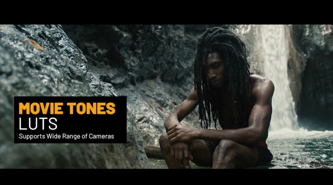
Movie Tones Cinematic Color LUTs

This is an impressive array of color grading presets designed to add that bold, movie-like look to your footage. These color grading LUTs can transform your video content into a cinematic masterpiece with a simple click. The LUTs offer color tones ideal for enhancing visual storytelling.

Movie LUTs Color Presets

You can use this cinematic color grading preset pack to achieve Hollywood-movie-like color grading for photos and videos. Compatible with popular software like Adobe Premiere Pro, Adobe After Effects, Davinci Resolve, and Final Cut Pro, these presets work perfectly with any FPS and resolution as well as drone cameras.

Bold Cinematic Color Presets

This pack of cinematic color grading presets includes versatile LUTs, ideal for photo and video, including drone footage. They function with any FPS and resolution, require no plugins, and are compatible with many popular software, including Adobe Premiere Pro, After Effects, Davinci Resolve, and Final Cut Pro. Easy to use, they can enhance numerous media projects, from production videos to special events.

Cinematic Wedding Color LUTs

A creative color grading preset pack perfect for enhancing wedding videos. This LUTs pack helps to achieve cinematic color grading quickly, bringing a professional touch to your footage. It’s a practical solution for adding depth and charm to precious memories, making them even more memorable. This tool is simple to use yet impactful, guaranteed to elevate your wedding videos.

Cinematic Movie Color LUTs

A unique creative cinematic color grading preset bundle that adds a colorful cinematic touch to your projects. Offering a collection of different color profiles, it ensures your work stands out with aesthetically appealing and professional-looking visuals. It’s incredibly versatile and user-friendly, making it perfect for film enthusiasts and content creators aiming for a high-quality cinematic look.

Film Color Grading LUTs Pack

This color grading preset pack is ideal for rendering a cinematic touch to your visuals. It offers color look-up tables (LUTs) specially designed for film-like color grading looks. These presets are an investment that simplifies your post-production process, enhancing your visuals with the texture and depth of professional film aesthetics.

Cinematic Film Color Grading Presets

A creative collection of color grading presets that provides cinematic color Look-Up Tables (LUTs). This bundle offers modern cinematic visual styles, enhancing your videos with the rich, dramatic tones often associated with professional cinema projects. It’s a great asset for adding a touch of Hollywood flair to your film and video creations.

Modern Cinematic Film LUTs

A creative resource that offers bold cinematic color grades to your films. It transforms your footage into a visually stunning cinematic experience, capturing the essence of tried-and-true film aesthetics. With this asset, creating a compelling visual narrative becomes seamless and straightforward. It’s an essential tool to elevate your film production.

Classic Film Cinematic Color Grading LUTs

This is a creative color grading preset pack that offers a vintage touch to your visuals. These cinematic color Look-Up Tables (LUTs) allow you to transform the color and tone of your media, mimicking the timeless appearance of classic films. A great tool for enhancing your projects with nostalgia-inducing, cinematic flair.

Cinematic Film LUTs Pack

A creative color grading preset pack designed to enhance your visuals with bright cinematic color grades. The presets are highly recommended for elevating the overall aesthetics of your footage, giving you professional-grade cinematic looks in a user-friendly package. Perfect for filmmakers and content creators seeking to level up their projects.

Aerial Cinematic LUTs for Drone Videos

This LUTs pack is designed to transform drone footage into captivating cinematic stories. This pack, tailored for Final Cut Pro X and Apple Motion, includes 21 expertly created LUTs. Incorporating them into your work is straightforward, thanks to the user-friendly controls of the editing software. They help to enhance storytelling with stunning color grading.

Slog2 Cinematic and Standard Color LUTs

An ideal color grading preset collection for enhancing your wide dynamic range videos. These creative tools allow you to achieve that coveted cinematic look, elevating the visual storytelling of your content. Simple to use yet powerful, they promise to transform your footage, adding depth, mood, and captivating color tones to your creative projects.

Blast Cinematic Movie LUTs

Spruce up your videos with this cinematic movie LUTs pack. This pack features 25 cinematic LUTs and 42 “Log to Rec 709” LUTs perfect for films, social videos, presentations, and more. Adding a tasteful color grading to your work is as easy as drag-and-drop, no matter the resolution. Boasting improved modern and stylish visuals, this pack is a true game-changer.

Cinematic Color Grading LUTs Pack

An exciting collection of color grading presets that transforms your video footage with a film-style look. This pack contains unique cinematic LUTs that give your projects an amazing, visually striking dimension. It’s ideal for filmmakers and videographers seeking to elevate their storytelling abilities through immersive, cinema-quality aesthetics.

Vibrant Cinematic Color LUTs

Give your videos a cinematic edge with this professional LUTs collection. Designed specifically for DaVinci Resolve, this pack of 24 high-quality lookup tables enhances colors, boosts contrast, and lends a professional polish to your film projects. Turn ordinary footage into a visual delight and create cinematic masterpieces effortlessly with these LUTs.

70 Cinematic Color Grading LUTs

This bundle offers an easy way to bring professional, film-like aesthetics to your video content. Compatible with various editing software and cameras, these presets enable an outstanding color grading potential with just a few clicks. Whether it’s footage for YouTube, an independent film, or music videos, these LUTs can utterly transform and enhance your visuals.

1000 Cinematic Color Presets Bundle

This color grading preset pack delivers a variety of LUTs to transform your videos into cinematic works of art. Offering 1000 unique presets spread across categories like cinematic, vintage, and travel, the bundle supports popular video editors, including Premiere Pro and After Effects. Beyond color grading, the bundle provides 15 unique VHS looks, 5 old film looks, and light leaks to add a retro touch to your content.

Free Cinematic Color Grading Presets

70 FREE LUTs for Cinematic Color Grading

This is a collection of 70 color-grading LUTs for videos. It includes a wide variety of color looks, including cinematic looks, to give your video projects a professional look. There are also 17 LUTs for enhancing Log footage.

48 FREE Custom LUTs for Log Footage

A hand-crafted bundle of color-grading LUTs for improving and optimizing log footage. This pack includes 48 different LUTs for making your videos look professional. They feature vintage and cinematic filters as well.

29 Free LUTs for Videos

This video LUTs bundle also comes with a mixed collection of color grading presets for both optimizing and enhancing your videos. It includes 29 different LUTs that feature high-quality color looks and filters.

Free Cinematic LUTs for Photos & Videos

This free LUTs pack is designed to give a cinematic look and feel to your videos and photos. It includes several color-grading LUTs with professional-looking filters that will instantly enhance your videos with a more dramatic look.