10 SEO Habits That Will Increase Website Traffic

Featured Imgs 23

Everyone wants more website traffic, right? But are you doing all the little things that help boost search engine ranking with every new image upload or content update?

Creating the right habits from the start will keep your website in tip-top shape and hopefully result in bonus points from the Google algorithm.

The good news is that this list is packed with actionable, everyday tips. Start with a solid website framework and then employ these techniques with every update to get on the path to creating great SEO habits that won’t be tough to maintain.

1. Write for Humans, Not Search Engines

Write for Humans, Not Search Engines

You will come across all kinds of advice, tips, and SEO strategies in your search for improving your website but don’t forget the main purpose of your website—serve people!

When preparing your content strategy, always prepare it with a human-first approach. Research for topics that help solve the problems people are having and aim to fill the gaps and areas that lack quality content. And publish content that you can be proud of, even several years after publishing them.

Even when optimizing your content for keywords, remember not to create keyword-stuffed garbage that serves no one. If a person comes to your website by searching for “how to do an oil change in a car”, make sure to provide the right information with clear instructions. And don’t take 2,000 words to get to the point.

2. Google E.E.A.T

E.E.A.T, which stands for Experience, Expertise, Authoritativeness, and Trustworthiness, is the quality rater guidelines Google uses to analyze the quality and effectiveness of the content available on a website.

google eeat

Google uses this framework to list only the most reliable and high-quality websites on its search results pages for every term people search for. Needless to say, it’s crucial that you also follow this framework when creating content.

It basically means you should stick to your area of expertise when sharing informative content. After all, a food blog sharing advice on how to do an oil change in a car wouldn’t make sense.

3. Keywords vs Key-Phrases

We used to search in very specific and short keywords for a long time. But today, most people search through AI assistants like Siri and Google Gemini by speaking to their phones.

As a result, the old methods of optimizing content for keywords may not work anymore. Instead, aim to optimize your content for key phrases or search phrases.

answerthepublic

AnswerThePublic is a great tool for this task to find effective key phrases.

4. Create Quality Content

SEO

Good search rankings start with quality content. There’s a reason marketers say “content is king.”

Quality content includes text, images, video and elements that users want to interact with. It can be fun or informative, a game or e-commerce, short or long-form. There’s no truly magic formula; they key is that content relates to what your website is about and is well constructed and composed. And then write killer headlines to match, so that users can find this great content.

Quality content includes text, images, video and elements that users want to interact with.

Characteristics of quality content include:

  • Content that is rooted in data or factual information. It should be easy to read – think around an eighth-grade level and free from grammatical errors.
  • Content should relate to your website or brand goals. Don’t write about ponies and unicorns if your website is about baseball. The connection should be obvious.
  • Content is shareable on social media, and users interact with it. While this concept doesn’t help you in the creation of content, it can be a measuring stick as to what types of content work for you and your users.
  • Content should have enough length – the best estimate seems to be about 300 words or more per page – to actually say something of value.
  • Content should establish your credibility and authority in your field. Testimonials, case studies, and reviews are a good place to start.

5. Link to Reputable Sources

SEO

Don’t cram your content with meaningless links just to build a history; use links that are meaningful and add actual value to the story you are trying to tell.

Certain domains have more credibility and authority than others, so opt for those links.

A good set of links includes internal links – you want users to move around within your website – as well as external links. Aim for a mix of both types (where applicable on each page).

And think about the kinds of websites you are linking to. Do they also relate to your type of product, brand or business? Those links are valuable. Unrelated links are a waste of your time.

The authority of those links is equally important. Certain domains have more credibility and authority than others, so opt for those links. Here’s a guideline for authoritative rank:

  1. .gov
  2. .edu
  3. .org
  4. .com
  5. .everything else

Try to include a mix of links from a mix of places. But please, don’t cram the content with too many links; users will abandon the page. (Don’t forget social media. Those links count as reputable sources, too!)

6. Build for Speed

SEO

Websites need to be fast. This applies to renderings on every device type. A website is only as fast as the slowest place it loads.

A big part of optimizing for speed is thinking about how to make the most of file sizes. Don’t overload your website with junk. Use icon fonts rather than images for icons, consider SVG rather than PNG for image files and stop uploading full-size images to your website. That’s just overkill.

Here are a few other things you can do:

  • Consider adding a tool that will help compress images that are too big.
  • Run Google’s PageSpeed Insights to see what issues might be bogging your website down.
  • Use a caching plugin, especially if you are running on WordPress.
  • Opt for asynchronous scripts.
  • Ditch unused plugins, tools and code that can weigh your website down.

7. Use Words for Everything

SEO

Search engines can only read words. (Right now anyway.) That means you have to tell search engines what the other types of content your website contains. What is in that video or photo?

You can do that in two ways. Use the file name to your advantage. Name the file based on what is in the image or video.

Descriptive image file names look like this: <img src=”dog-playing-fetch.jpg” alt=”dog playing fetch”/>. The source is the actual file name (use hyphens between words) and the alt is a similar description without hyphens between words.

Here’s another trick. Tell search engines exactly what is in the video on your website by embedding a video on a page with a transcription of the content in the video.

8. Don’t Duplicate, Update!

SEO

Many websites have a tendency to use the same boilerplate copy over and over and over on multiple pages. Why are you doing that? If the copy needs to be on every page, put it in the footer. Problem solved!

If the copy is popped on pages to boost SEO because it is stuffed with keywords or to add to content, stop. Google is dinging you for all that duplication.

If you have content that is static, or mostly static, just update it and reshare links. Don’t duplicate posts. (This happens more commonly than you might think.)

9. Practice Internal Linking

Internal linking is just as important as linking to other authoritative sites and building backlinks to your website. It’s all about linking to other useful pages on your website through existing pages.

This not only enhances your content for SEO by showcasing authority but also helps retain users on your website for longer periods of time by encouraging them to explore more about the topic.

Experts suggest that building internal links to unpopular pages on your website also helps improve their rankings on search engines.

10. Do Content Audits

Nothing stays the same on the Internet for too long. Even the most ever-green content you create will be outdated after a while. So, it’s a good practice to do a content audit of your website from time to time.

A content audit involves fully analyzing your website and its content to identify outdated content and then developing a strategy to update them. This usually includes everything from updating your website’s user interface, SEO keywords, written copy, images, and more.

Conclusion

If you are starting today with these habits and maybe haven’t been diligent about SEO in the past, consider going back to correct missteps on older pages. Make it a goal to go back and use the proper header, alt and meta tags on pages that you want users to see.

Remember to run Google’s PageSpeed Insights on your website periodically to see what issues might be bogging your website down. And create content that users want to engage with; nothing will boost SEO and drive traffic like stellar information.

Creative Commons photos by Unsplash.

Innovative Solutions for Global Issues How Tech is Making a Difference

Featured Imgs 23

As the world faces a myriad of complex challenges, from climate change and resource scarcity to healthcare disparities and educational inequalities, technology is playing an increasingly vital role in developing innovative solutions. By harnessing the power of cutting-edge technologies, societies around the globe are addressing these global issues more effectively than ever before. Here’s a …

The post Innovative Solutions for Global Issues How Tech is Making a Difference first appeared on Lucid Softech.

What’s Old is New

Featured Imgs 23

I collect a bunch of links in a bookmarks folder. These are things I fully intend to read, and I do — eventually. It’s a good thing bookmarks are digital, otherwise, I’d need a bigger coffee table to separate them from the ever-growing pile of magazines.

The benefit of accumulating links is that the virtual pile starts revealing recurring themes. Two seemingly unrelated posts published a couple months apart may congeal and become more of a dialogue around a common topic.

I spent time pouring through a pile of links I’d accumulated over the past few weeks and noticed a couple of trending topics. No, that’s not me you’re smelling — there’s an aroma of nostalgia in the air., namely a newfound focus on learning web fundamentals and some love for manual deployments.

Web Developers, AI, and Development Fundamentals

Alvaro Montero:

Ultimately, it is not about AI replacing developers, but about developers adapting and evolving with the tools. The ability to learn, understand, and apply the fundamentals is essential because tools will only take you so far without the proper foundation.

ShopTalk 629: The Great Divide, Global Design + Web Components, and Job Titles

Chris and Dave sound off on The Great Divide in this episode and the rising value of shifting back towards fundamentals:

Dave: But I think what is maybe missing from that is there was a very big feeling of disenfranchisement from people who are good and awesome at CSS and JavaScript and HTML. But then were being… The market was shifting hard to these all-in JavaScript frameworks. And a lot of people were like, “I don’t… This is not what I signed up for.”

[…]

Dave: Yeah. I’m sure you can be like, “Eat shit. That’s how it is, kid.” But that’s also devaluing somebody’s skillset. And I think what the market is proving now is if you know JavaScript or know HTML, CSS, and regular JavaScript (non-framework JavaScript), you are once again more valuable because you understand how a line of CSS can replace 10,000 lines of JavaScript – or whatever it is.

Chris: Yeah. Maybe it’s coming back just a smidge–

Dave: A smidge.

Chris: –that kind of respecting the fundamental stuff because there’s been churn since then, since five years ago. Now it’s like these exclusively React developers we hired, how useful are they anymore? Were they a little too limited and fundamental people are knowing more? I don’t know. It’s hard to say that the job industry is back when it doesn’t quite feel that way to me.

Dave: Yeah, yeah. Yeah, who knows. I just think the value in knowing CSS and HTML, good HTML, are up more than they maybe were five years ago.

Just a Spec: HTML Finally Gets the Respect It Deserves

Jared and Ayush riffin’ on the first ever State of HTML survey, why we need it, and whether “State of…” surveys are representative of people who work with HTML.

[…] once you’ve learned about divs and H’s 1 through 6, what else is there to know? Quite a lot, as it turns out. Once again, we drafted Lea Verou to put her in-depth knowledge of the web platform to work and help us craft a survey that ended up reaching far beyond pure HTML to cover accessibility, web components, and much more.

[…]

You know, it’s perfectly fine to be an expert at HTML and CSS and know very little JavaScript. So, yeah, I think it’s important to note that as we talk about the survey, because the survey is a snapshot of just the people who know about the survey and answer the questions, right? It’s not necessarily representative of the broad swath of people around the world who have used HTML at all.

[…]

So yeah, a lot of interest in HTML. I’m talking about HTML. And yeah, in the conclusion, Lea Verou talks about we really do have this big need for more extensibility of HTML.

In a more recent episode:

I’m not surprised. I mean, when someone who’s only ever used React can see what HTML does, I think it’s usually a huge revelation to them.

[…]

It just blows their minds. And it’s kind of like you just don’t know what you’re missing out on up to a point. And there is a better world out there that a lot of folks just don’t know about.

[…]

I remember a while back seeing a post come through on social media somewhere, somebody’s saying, oh, I just tried working with HTML forms, just standard HTML forms the first time and getting it to submit stuff. And wait, it’s that easy?

Yeah, last year when I was mentoring a junior developer with the Railsworld conference website, she had come through Bootcamp and only ever done React, and I was showing her what a web component does, and she’s like, oh, man, this is so cool. Yeah, it’s the web platform.

Reckoning: Part 4 — The Way Out

Alex Russell in the last installment of an epic four-part series well worth your time to fully grasp the timeline, impact, and costs of modern JavsaScript frameworks to today’s development practices:

Never, ever hire for JavaScript framework skills. Instead, interview and hire only for fundamentals like web standards, accessibility, modern CSS, semantic HTML, and Web Components. This is doubly important if your system uses a framework.

Semi-Annual Reminder to Learn and Hire for Web Standards

Adrian Roselli:

This is a common cycle. Web developers tire of a particular technology — often considered the HTML killer when released — and come out of it calling for a focus on the native web platform. Then they decide to reinvent it yet again, but poorly.

There are many reasons companies won’t make deep HTML / CSS / ARIA / SVG knowledge core requirements. The simplest is the commoditization of the skills, partly because framework and library developers have looked down on the basics.

The anchor element

Heydon Pickering in a series dedicated to HTML elements, starting alphabetically with the good ol’ anchor <a>:

Sometimes, the <a> is referred to as a hyperlink, or simply a link. But it is not one of these and people who say it is one are technically wrong (the worst kind of wrong).

[…]

Web developers and content editors, the world over, make the mistake of not making text that describes a link actually go inside that link. This is collosally unfortunate, given it’s the main thing to get right when writing hypertext.

AI Myth: It lets me write code I can’t on my own

Chris Ferndandi:

At the risk of being old and out-of-touch: if you don’t know how to write some code, you probably shouldn’t use code that Chat GPT et al write for you.

[…]

It’s not bulletproof, but StackOverflow provides opportunities to learn and understand the code in a way that AI-generated code does not.

What Skills Should You Focus on as Junior Web Developer in 2024?

Frontend Masters:

Let’s not be old-man-shakes-fist-at-kids.gif about this, but learning the fundamentals of tech is demonstrateably useful. It’s true in basketball, it’s true for the piano, and it’s true in making websites. If you’re aiming at a long career in websites, the fundamentals are what powers it.

[…]

The point of the fundamentals is how long-lasting and transferrable the knowledge is. It will serve you well no matter what other technologies a job might have you using, or when the abstractions over them change, as they are want to do.

As long as we’re talking about learning the fundamentals…

The Basics

Oh yeah, and of course there’s this little online course I released this summer for learning HTML and CSS fundamentals that I describe like this:

The Basics is more for your clients who do not know how to update the website they paid you to make. Or the friend who’s learning but still keeps bugging you with questions about the things they’re reading. Or your mom, who still has no idea what it is you do for a living. It’s for those whom the entry points are vanishing. It’s for those who could simply sign up for a Squarespace account but want to understand the code it spits out so they have more control to make a site that uniquely reflects them.

Not all this nostalgia is reserved only for HTML and CSS, but for deploying code, too. A few recent posts riff on what it might look like to ship code with “buildless” or near “buildless” workflows.

Raw-Dogging Websites

Brad Frost:

It is extraordinarily liberating. Yes, there are some ergonomic inefficiencies, but at the end of the day it comes out in the wash. You might have to copy-and-paste some HTML, but in my experience I’d spend that much time or more debugging a broken build or dependency hell.

Going Buildless

Max Böck in a follow-up to Brad:

So, can we all ditch our build tools soon?

Probably not. I’d say for production-grade development, we’re not quite there yet. Performance tradeoffs are a big part of it, but there are lots of other small problems that you’d likely run into pretty soon once you hit a certain level of complexity.

For smaller sites or side projects though, I can imagine going the buildless route – just to see how far I can take it.

Manual ’till it hurts

Jeremy Keith in a follow-up to Max:

If you’re thinking that your next project couldn’t possibly be made without a build step, let me tell you about a phrase I first heard in the indie web community: “Manual ‘till it hurts”. It’s basically a two-step process:

  1. Start doing what you need to do by hand.
  2. When that becomes unworkable, introduce some kind of automation.

It’s remarkable how often you never reach step two.

I’m not saying premature optimisation is the root of all evil. I’m just saying it’s premature.


That’s it for this pile of links and good gosh my laptop feels lighter for it. Have you read other recent posts that tread similar ground? Share ’em in the comments.


What’s Old is New originally published on CSS-Tricks, which is part of the DigitalOcean family. You should get the newsletter.


from CSS-Tricks https://ift.tt/c7EQXyz
Gain $200 in a week
via Read more

Pitch Deck Design: 10 Tips to Stand Out

Featured Imgs 23

A good pitch deck is designed for specifically one thing – to help your startup get funding from investors. But how do you stand out from the crowd, and make a memorable impression?

There’s a delicate balance to creating a deck with just enough slides to entice potential funders, without providing so much information that they are overwhelmed.

Most pitch decks contain less than 20 slides. So how do you create a pitch deck design that stands out? Here are our ten tips to help you get started.

1. Pick a Template or Palette

In most cases, a simple template is the best option.

Whether you are designing a pitch deck from scratch or starting with a template, you need to stick to a visual theme. Slides should have a consistent color and type palette as well as design elements, such as page number or a header/footer.

Streamline your deck to a handful of slide types that fit your content so that the design is consistent from the first to the final slide.

In most cases, a simple pitch deck template is the best option. Look for something with darker text on a light or white background. This color combination is easy to read on screens or in darker rooms when projected onto a wall. (It also makes for easy printing if you want to provide a handout copy to meeting participants.)

2. Use Your Branding

pitch deck design

Use your brand throughout so that it starts to stick with the people you are talking to.

By the time you are ready to talk with investors, you should have a simple brand established. This includes a logo or wordmark and basic color palette. It should also include a list of keywords that you use to talk about your business.

Use all of this in your pitch deck. As you create a slide design, make sure the template incorporates your colors and branding.

These visual elements can make a lasting impression. Make it count.

And don’t make this mistake. Too often, pitch decks “save” the branding as a surprise for the end of the presentation. Don’t. Use your brand throughout so that it starts to stick with the people you are talking to. Give them more opportunity to fall in love with your idea, brand, and company.

3. Include Charts to Simplify Content

Pitch decks are packed with heavy content, including plenty of numbers.

Use charts to simplify this content. Are you experiencing revenue growth? Chart it. A chart is an easy way to see and understand that information quickly. Plus, bar and pie charts are easy to create. (Just make sure to label everything clearly.)

Bonus tip: You can also use pie charts to highlight statistics, again making a text element more visual and understandable.

4. Use Stellar Images

pitch deck design

Don’t feel like you have to have an image on every slide if they get repetitive.

Put forth the effort to get some great images for your pitch deck. Not stock images. Actual photos of your team, product or service.

You know that people are more likely to engage with an image than text and that goes for memory as well. A good image will stand out in someone’s memory longer than a slide full of words.

The challenge is that not everyone has a visual product or service. That’s where you’ll have to be a little more creative, show the team in action or create a diagram or illustration.

Don’t feel like you have to have an image on every slide if they get repetitive. Get a few images that best represent what you are selling with the pitch deck and stick to those. Scatter them strategically throughout the pitch deck.

5. Organize with Icons

pitch deck design

Another visual element to consider is icons. These small illustrations can help organize complex ideas and provide visual flow throughout a single slide or the entire design.

Pick an icon set that matches your visual theme and use them to break up the copy, create a grouping, and keep the visual flow moving.

6. Try Tiled Layouts for Complex Information

pitch deck design

When it comes to presenting complex information, consider a modular tiled layout style. Titles can help you break down information into smaller, more digestible parts.

These bite-sized bits can eliminate the need for using multiple slides for a handful of facts or figures as well.

Design tiles with color blocks or use icons in each to establish different pieces of content visually.

7. Use Professional Headshots for Team Members

pitch deck design

If you plan to include images of your team in the pitch deck (many companies do), invest in professional headshots so that photos are consistent and represent your startup brand well.

This isn’t to say they have to be boring. Photos with personality are acceptable, but all team headshots should be in the same style with similar coloring and backgrounds.

Think about the type of investor you are trying to get money from, what type of photo would appeal to them? Consider that for the style of your team headshots or group photo.

8. Create a Type Hierarchy

pitch deck design

Just like with any other type of design, create a hierarchy for text elements.

  • Title
  • Header
  • Secondary header or subhead
  • Main body text
  • Bulleted text
  • Captions
  • Infographic text
  • Footer text

9. Design with Contrast in Mind

pitch deck design

Every element in your pitch deck should include plenty of contrast against the background and other elements. Avoid the temptation to use a template where everything has a similar color or contrast, while these might look great on a screen, they can present readability issues and don’t often render well when projected or printed.

It’s important to balance modern design with readability. It is vital that potential investors understand everything about your startup company when they view the pitch deck. Don’t let “overdesigned” slides get in the way.

10. Get Creative with Text-Heavy Slides

pitch deck design

There are some content types and information that will just seem heavy.

The history of your company or business trends, lists or SWOT analyses can get a little overwhelming on a slide. Use more visual formats with less focus on every actual work to communicate this information.

Try slides that use word cloud, timeline formats or XY graphs to present text-heavy or complex information in a more visual way. Even though these slides will still be somewhat thick, they’ll be easier to visually digest.

Conclusion

When creating your pitch deck, remember to keep your business goals in mind. Everything about the deck shows potential investors that you understand your company and business.

The design of your presentation communicates this as well. A professional, easy to understand deck is just one tool in the path of growing your startup.

How To Build Custom Data Visualizations Using Luzmo Flex

Featured Imgs 23

This article is a sponsored by Luzmo

In this article, I’ll introduce you to Luzmo Flex, a new feature from the Luzmo team who have been working hard making developer tooling to flatten the on-ramp for analytics reporting and data visualization.

With Luzmo Flex, you can hook up a dataset and create beautifully crafted, fully customizable interactive charts that meet your reporting needs. They easily integrate and interact with other components of your web app, allowing you to move away from a traditional “dashboard” interface and build more bespoke data products.

While many charting libraries offer similar features, I often found it challenging to get the data into the right shape that the library needed. In this article, I’ll show you how you can build beautiful data visualizations using the Google Analytics API, and you won’t have to spend any time “massaging” the data!

What Is Luzmo Flex?

Well, it’s two things, really. First of all, Luzmo is a low-code platform for embedded analytics. You can create datasets from just about anything, connect them to APIs like Google Analytics or your PostgreSQL database, or even upload static data in a .csv file and start creating data visualizations with drag and drop.

Secondly, Luzmo Flex is their new React component that can be configured to create custom data visualizations. Everything from the way you query your data to the way you display it can be achieved through code using the LuzmoVizItemComponent.

What makes Luzmo Flex unique is that you can reuse the core functionalities of Luzmo’s low-code embedded analytics platform in your custom-coded components.

That means, besides creating ready-to-use datasets, you can set up functions like the following out-of-the-box:

  • Multi-tenant analytics: Showing different data or visualizations to different users of your app.
  • Localization: Displaying charts in multiple languages, currencies, and timezones without much custom development.
  • Interactivity: Set up event listeners to create complex interactivity between Luzmo’s viz items and any non-Luzmo components in your app.

What Can You Build With Luzmo Flex?

By combining these off-the-shelf functions with flexibility through code, Luzmo Flex makes a great solution for building bespoke data products that go beyond the limits of a traditional dashboard interface. Below are a few examples of what that could look like.

Report Builder

A custom report builder that lets users search and filter a dataset and render it out using a number of different charts.

Filter Panel

Enable powerful filtering using HTML Select inputs, which will update each chart shown on the page.

Wearables Dashboard

Or how about a sleep tracker hooked up to your phone to track all those important snoozes?

When to Consider Luzmo Flex vs Chart Libraries

When building data-intensive applications, using something like Recharts, a well-known React charting library, you’ll likely need to reformat the data to fit the required shape. For instance, if I request the top 3 page views from the last seven days for my site, paulie.dev, I would have to use the Google Analytics API using the following query.

import dotenv from 'dotenv';
import { BetaAnalyticsDataClient } from '@google-analytics/data';
dotenv.config();

const credentials = JSON.parse(
  Buffer.from(process.env.GOOGLE_APPLICATION_CREDENTIALS_BASE64, 'base64').toString('utf-8')
);

const analyticsDataClient = new BetaAnalyticsDataClient({
  credentials,
});

const [{ rows }] = await analyticsDataClient.runReport({
  property: properties/${process.env.GA4&#95;PROPERTY&#95;ID},
  dateRanges: [
    {
      startDate: '7daysAgo',
      endDate: 'today',
    },
  ],
  dimensions: [
    {
      name: 'fullPageUrl',
    },
    {
      name: 'pageTitle',
    },
  ],
  metrics: [
    {
      name: 'totalUsers',
    },
  ],
  limit: 3,
  metricAggregations: ['MAXIMUM'],
});

The response would look something like this:

[
  {
    "dimensionValues": [
      {
        "value": "www.paulie.dev/",
        "oneValue": "value"
      },
      {
        "value": "Paul Scanlon | Home",
        "oneValue": "value"
      }
    ],
    "metricValues": [
      {
        "value": "61",
        "oneValue": "value"
      }
    ]
  },
  {
    "dimensionValues": [
      {
        "value": "www.paulie.dev/posts/2023/11/a-set-of-sign-in-with-google-buttons-made-with-tailwind/",
        "oneValue": "value"
      },
      {
        "value": "Paul Scanlon | A set of: \"Sign In With Google\" Buttons Made With Tailwind",
        "oneValue": "value"
      }
    ],
    "metricValues": [
      {
        "value": "41",
        "oneValue": "value"
      }
    ]
  },
  {
    "dimensionValues": [
      {
        "value": "www.paulie.dev/posts/2023/10/what-is-a-proxy-redirect/",
        "oneValue": "value"
      },
      {
        "value": "Paul Scanlon | What Is a Proxy Redirect?",
        "oneValue": "value"
      }
    ],
    "metricValues": [
      {
        "value": "23",
        "oneValue": "value"
      }
    ]
  }
]

To make that data work with Recharts, I’d need to reformat it so it conforms to the following data shape.

[
  {
    "name": "Paul Scanlon | Home",
    "value": 61
  },
  {
    "name": "Paul Scanlon | A set of: \"Sign In With Google\" Buttons Made With Tailwind",
    "value": 41
  },
  {
    "name": "Paul Scanlon | What Is a Proxy Redirect?",
    "value": 23
  }
]

To accomplish this, I’d need to use an Array.prototype.map() to iterate over each item, destructure the relevant data and return a key-value pair for the name and value for each.

const data = response.rows.map((row) => {
  const { dimensionValues, metricValues } = row;

  const pageTitle = dimensionValues[1].value;
  const totalUsers = parseInt(metricValues[0].value);

  return {
    name: pageTitle,
    value: totalUsers,
  };
});

And naturally, if you’re reformatting data this way in your application, you’d also want to write unit tests to ensure the data is always formatted correctly to avoid breaking your application… and all of this before you even get on to creating your charts!

With Luzmo Flex, all of this goes away, leaving you more time to focus on which data to display and how best to display it.

The First Steps to Building Bespoke Data Products

Typically, when building user interfaces that display data insights, your first job will be to figure out how to query the data source. This can take many forms, from RESTful API requests to direct database queries or sometimes reading from static files. Your next job will be figuring out when and how often these requests need to occur.

  • For data that rarely changes: Perhaps a query in the build step will work.
  • For data that changes regularly: A server-side request on page load.
  • For ever-changing data: A client-side request that polls an API on an interval.

Each will likely inform your application’s architecture, and there’s no single solution to this. Your last job, as mentioned, will be wrangling the responses, reformatting the data, and displaying it in the UI.

Below, I’ll show you how to do this using Luzmo Flex by using a simple example product.

What We’re Building: Custom Data Visualizations As Code

Here’s a screenshot of a simple data product I’ve built that displays three different charts for different reporting dimensions exposed by the Google Analytics API for page views for my site, paulie.dev, from the last seven days.

You can find all the code used in this article on the following link:

Getting Started With Luzmo

Before we get going, hop over to Luzmo and sign up for a free trial. You might also like to have a read of one of the getting started guides listed below. In this article, I’ll be using the Next.js starter.

Creating a Google Analytics Dataset

To create data visualization, you’ll first need data! To achieve this using Luzmo, head over to the dashboard, select Datasets from the navigation, and select GA4 Google Analytics. Follow the steps shown in the UI to connect Luzmo with your Google Analytics account.

With the setup complete, you can now select which reporting dimensions to add to your dataset. To follow along with this article, select Custom selection.

Lastly, select the following using the search input. Device Category, Page Title, Date, and Total users, then click Import when you’re ready.

You now have all the data required to build the Google Analytics dashboard. You can access the dataset ID from the URL address bar in your browser. You’ll need this in a later step.

If you’ve followed along from either of the first two getting started guides, you’ll have your API Key, API Token, App server, and API host environment variables set up and saved in a .env file.

Install Dependencies

If you’ve cloned one of the starter repositories, run the following to install the required dependencies.

npm install

Next, install the Luzmo React Embed dependency which exports the LuzmoVizItemComponent.

npm install  @luzmo/react-embed@latest

Now, find page.tsx located in the src/app directory, and add your dataset id as shown below.

Add the access object from the destructured response and pass access.datasets[0].id onto the LuzmoClientComponent component using a prop named datasetId.

// src/app/page.tsx


+ import dynamic from 'next/dynamic';

import Luzmo from '@luzmo/nodejs-sdk';
- import LuzmoClientComponent from './components/luzmo-client-component';
+ const LuzmoClientComponent = dynamic(() => import('./components/luzmo-client-component'), {
  ssr: false,
});


const client = new Luzmo({
  api_key: process.env.LUZMO_API_KEY!,
  api_token: process.env.LUZMO_API_TOKEN!,
  host: process.env.NEXT_PUBLIC_LUZMO_API_HOST!,
});

export default async function Home() {
  const response = await client.create('authorization', {
    type: 'embed',
    username: 'user id',
    name: 'first name last name',
    email: 'name@email.com',
    access: {
      datasets: [
        {
-          id: '<dataset_id>',
+          id: '42b43db3-24b2-45e7-98c5-3fcdef20b1a3',
          rights: 'use',
        },
      ],
    },
  });

-  const { id, token } = response;
+  const { id, token, access } = response;

-  return <LuzmoClientComponent authKey={id} authToken={token} />;
+  return <LuzmoClientComponent authKey={id} authToken={token} datasetId={access.datasets[0].id} />;
}

And lastly, find luzmo-client-component.tsx located in src/app/components. This is where you’ll be creating your charts.

Building a Donut Chart

The first chart you’ll create is a Donut chart that shows the various devices used by visitors to your site.

Add the following code to luzmo-client-component.tsx component.

// src/app/component/luzmo-client-component.tsx

'use client';

+ import { LuzmoVizItemComponent } from '@luzmo/react-embed';

interface Props {
  authKey: string;
  authToken: string;
+  datasetId: string;
}

- export default function LuzmoClientComponent({ authKey, authToken}: Props) {
+ export default function LuzmoClientComponent({ authKey, authToken, datasetId }: Props) {

+  const date = new Date(new Date().getTime() - 7 * 24 * 60 * 60 * 1000).toISOString(); // creates a date 7 days ago

  console.log({ authKey, authToken });

  return (
    <section>
+    <div className='w-1/2 h-80'>
+      <LuzmoVizItemComponent
+        appServer={process.env.NEXT_PUBLIC_LUZMO_APP_SERVER}
+        apiHost={process.env.NEXT_PUBLIC_LUZMO_API_HOST}
+        authKey={authKey}
+        authToken={authToken}
+        type='donut-chart'
+        options={{
+          title: {
+            en: Devices from last 7 days,
+          },
+          display: {
+            title: true,
+          },
+          mode: 'donut',
+          legend: {
+            position: 'bottom',
+          },
+        }}
+        slots={[
+          {
+            name: 'measure',
+            content: [
+              {
+                label: {
+                  en: 'Total users',
+                },
+                column: '<column id>', // Total users
+                set: datasetId,
+                type: 'numeric',
+                format: '.4f',
+              },
+            ],
+          },
+          {
+            name: 'category',
+            content: [
+              {
+                label: {
+                  en: 'Device category',
+                },
+                column: '<column id>', // Device category
+                set: datasetId,
+                type: 'hierarchy',
+              },
+            ],
+          },
+        ]}
+        filters={[
+          {
+            condition: 'or',
+            filters: [
+              {
+                expression: '? >= ?',
+                parameters: [
+                  {
+                    column_id: '<column id>', // Date
+                    dataset_id: datasetId,
+                  },
+                  date,
+                ],
+              },
+            ],
+          },
+        ]}
+      />
+    <div/>
    </section>
  );
}

There’s quite a lot going on in the above code snippet, and I will explain it all in due course, but first, I’ll need to cover a particularly tricky part of the configuration.

Column IDs

You’ll notice the filters parameters, measure, and category content all require a column id.

In the filters parameters, the key is named column_id, and in the measure and category, the key is named column. Both of these are actually the column IDs from the dataset. And here’s how you can find them.

Back in the Luzmo dashboard, click into your dataset and look for the “more dots” next to each column heading. From the menu, select Copy column id. Add each column ID to the keys in the configuration objects.

In my example, I’m using the Total users for the measure, the Device category for the category, and the Date for the filter.

If you’ve added the column IDs correctly, you should be able to see a rendered chart on your screen!

… and as promised, here’s a breakdown of the configuration.

Initial Props Donut chart

The first part is fairly straightforward. appServer and authKey are the environment variables you saved to your .env file, and authKey and authToken are destructured from the authorization request and passed into this component via props.

The type prop determines which type of chart to render. In my example, I’m using donut-chart, but you could choose from one of the many options available, area-chart, bar-chart, bubble-chart, box-plot, and many more. You can see all the available options in the Luzmo documentation under Chart docs.

<LuzmoVizItemComponent
  appServer={process.env.NEXT_PUBLIC_LUZMO_APP_SERVER}
  apiHost={process.env.NEXT_PUBLIC_LUZMO_API_HOST}
  authKey={authKey}
  authToken={authToken}
  type='donut-chart'

The one thing I should point out is my use of Tailwind classes: w-1/2 (width: 50%) and h-80 (height: 20rem). The LuzmoVizItemComponent ships with height 100%, so you’ll need to wrap the component with an element that has an actual height, or you won’t be able to see the chart on the page as it could be 100% of the height of an element with no height.

Donut Chart Options

The options object is where you can customize the appearance of your chart. It accepts many configuration options, among which:

  • A title for the chart that accepts a locale with corresponding text to display.
  • A display title value to determine if the title is shown or not.
  • A mode to determine if the chart is to be of type donut or pie chart.
  • A legend option to determine where the legend can be positioned.

All the available configuration options can be seen in the Donut chart documentation.

options={{
  title: {
    en: `Devices from last 7 days`,
  },
  display: {
    title: true,
  },
  mode: 'donut',
  legend: {
    position: 'bottom',
  },
}}

Donut Chart Slots

Slots are where you can configure which column from your dataset to use for the category and measure.

Slots can contain multiple measures, useful for displaying two columns of data per chart, but if more than two are used, one will become the measure.

Each measure contains a content array. The content array, among many other configurations, can include the following:

  • A label and locale,
  • The column id from the dataset,
  • The datasetId,
  • The type of data you’re displaying,
  • A format for the data.

The format used here is Python syntax for floating-point numbers; it’s similar to JavaScript’s .toFixed() method, e.g number.toFixed(4).

The hierarchy type is ​​the Luzmo standard data type. Any text column is considered as an hierarchical data type.

You can read more in the Donut chart documentation about available configuration options for slots.

slots={[
  {
    name: 'measure',
    content: [
      {
        label: {
          en: 'Total users',
        },
        column: '<column id>', // Total users
        set: datasetId,
        type: 'numeric',
        format: '.4f',
      },
    ],
  },
  {
    name: 'category',
    content: [
      {
        label: {
          en: 'Device category',
        },
        column: '<column id>', // Device category
        set: datasetId,
        type: 'hierarchy',
      },
    ],
  },
]}

Donut Chart Filters

The filters object is where you can apply conditions that will determine which data will be shown. In my example, I only want to show data from the last seven days. To accomplish this, I first create the date variable:

const date = new Date(new Date().getTime() - 7 * 24 * 60 * 60 * 1000).toISOString();

This would produce an ISO date string, e.g., 2024-08-21T14:25:40.088Z, which I can use with the filter. The filter uses Luzmo’s Filter Expressions, to determine if the date for each row of the data is greater than or equal to the date variable. You can read more about Filter Expressions in Luzmo’s Academy article.

filters={[
  {
    condition: 'or',
    filters: [
      {
        expression: '? >= ?',
        parameters: [
          {
            column_id: '<column id>', // Date
            dataset_id: datasetId,
          },
          date,
        ],
      },
    ],
  },
]}
Building a Line Chart

The second chart you’ll be creating is a Line chart that displays the number of page views on each date from the last seven days from folks who visit your site.

Initial Props Line Chart

As with the Donut chart, the initial props are pretty much the same, but the type has been changed to line-chart.

<LuzmoVizItemComponent
  appServer={process.env.NEXT_PUBLIC_LUZMO_APP_SERVER}
  apiHost={process.env.NEXT_PUBLIC_LUZMO_API_HOST}
  authKey={authKey}
  authToken={authToken}
  type='line-chart'

Line Chart Options

The options for the Line chart are as follows, and the mode has been changed to line-chart.

options={{
  title: {
    en: `Site visits from last 7 days`,
  },
  display: {
    title: true,
  },
  mode: 'grouped',
}}

Line Chart Slots

The slots object is almost the same as before with the Donut chart, but for the Line chart, I’m using the date column from the dataset instead of the device category, and instead of category, I’m using the x-axis slot type. To ensure I’m formatting the data correctly (by day), I’ve used level 5. You can read more about levels in the docs.

slots={[
  {
    name: 'measure',
    content: [
      {
        label: {
          en: 'Total users',
        },
        column: '<column id>', // Total users
        set: datasetId,
        type: 'numeric',
        format: '.4f',
      },
    ],
  },
  {
    name: 'x-axis',
    content: [
      {
        label: {
          en: 'Date',
        },
        column: '<column id>', // Date
        set: datasetId,
        type: 'datetime',
        level: 5,
      },
    ],
  },
]}

Line Chart Filters

I’ve used the same filters as I used in the Donut chart.

Building a Bar Chart

The last chart you’ll be creating is a Bar chart that displays the number of page views for the top ten most viewed pages on your site.

Initial Props Bar Chart

As with the Donut and Line chart, the initial props are pretty much the same, but the type has been changed to bar-chart.

<LuzmoVizItemComponent
  className='w-full h-80'
  appServer={process.env.NEXT_PUBLIC_LUZMO_APP_SERVER}
  apiHost={process.env.NEXT_PUBLIC_LUZMO_API_HOST}
  authKey={authKey}
  authToken={authToken}
  type='bar-chart'

Bar Chart Options

The options for the Bar chart are a little more involved. I’ve included some styling options for the border-radii of the bars, limited the number of results to 10, and sorted the data by the highest page view count first using the sort by measure and direction options.

options={{
  title: {
    en: `Page views from last 7 days`,
  },
  display: {
    title: true,
  },
  mode: 'grouped',
  bars: {
    roundedCorners: 5,
  },
  limit: {
    number: 10,
  },
  sort: {
    by: 'measure',
    direction: 'desc',
  },
}}

Line Chart Slots

As with the Line chart, I’ve used an axis for one of the columns from the dataset. In this case, it’s the y-axis which displays the page title.

slots={[
  {
    name: 'measure',
    content: [
      {
        label: {
          en: 'Total users',
        },
        column: '<column id>', // Total users
        set: datasetId,
        type: 'numeric',
        format: '.4f',
      },
    ],
  },
  {
    name: 'y-axis',
    content: [
      {
        label: {
          en: 'Page title',
        },
        column: '<column id>', // Page title
        set: datasetId,
        type: 'hierarchy',
      },
    ],
  },
]}

Bar Chart Filters

I’ve used the same filters as I used in the Donut and Line chart.

What’s Next

As you can see, there are plenty of types of charts and customization options. Because this is just an “ordinary” React component, you can very easily make it configurable by an end user by allowing options to be set and unset using HTML input elements, checkbox, select, date, and so on.

But for me, the real power behind this is not having to mutate data!

This is particularly pertinent when displaying multiple charts with different reporting dimensions. Typically, this would require each to have their own utility function or reformatting method. That said, setting column IDs and dataset IDs is a little fiddly, but once you have the component hooked up to the dataset, you can configure and reconfigure as much as you like, all without having to rewrite data formatting functions.

If you’re interested in bringing data to life in your application and want to get it done without the usual headaches, book a free demo with the Luzmo team to learn more!

How Much Should You Charge for Design Services?

Featured Imgs 23

It might be one of the most asked questions among freelance designers: what do you charge clients?

There can be so many variables in setting rates that you can stick to, and you have to make a choice between hourly and fixed options. Either way, a good pricing strategy can help you get the clients you want and earn a solid income from freelance work.

After you figure out pricing. Which is a challenge for almost anyone!

How Much Do Other Designers Charge?

The easiest way to figure out your rates is to see how much other designers are charging for their services.

indeed designer rates

Indeed, one of the largest online job boards, has a salary explorer tool that shows you the hourly rates and the salaries of professionals in each industry. The site allows you to browse the rates based on your country and even provides pricing data for different cities.

If you’re a freelancer, this is a great place to start your search for the ideal rate.

glassdoor designer rates

If you’re joining a company, agency, or seeking a full-time role, Glassdoor is the best place to learn about the salaries of other designers. Here you can explore the salaries submitted by fellow designers and even let you filter them based on your years of experience, industry, and more. Payscale is another website that provides similar information.

But don’t stop there. You can also ask directly from other designers. Use forums and sites like Reddit to ask other designers how much they are charging for different types of services. You’d be surprised how helpful the designer community can be.

It’s important to remember that these average rates are calculated based on the pricing data submitted by designers with various levels of experience and skills.

It will be difficult to find your exact number by looking at these websites. But, they will at least help you find a ballpark number to get started.

Set an Hourly Rate, for Starters

freelance prices

For most freelancers, setting an hourly rate is the place to start. It provides a baseline comparison to other freelancers in the market and is something clients can understand, as long as they are flexible with hours worked and pricing.

You can use time tracking software to keep up with exactly how much time you spend on projects – as long as you actually remember to use it and have solid focus while working on projects.

An hourly rate is great if you work at a moderate pace, take on projects that don’t shift a lot in time (clients don’t love getting revised pricing estimates) and like the flexibility of this time accounting method. On the other hand, some designers find that hourly rates hold them back because they can finish projects quickly and hours worked is not the only price consideration.

Be Competitive

If you decide to charge the same rates other designers are charging, it will be very difficult to land clients, unless you already have a good reputation.

In the beginning, it’s important to ask for a competitive rate that will position you above other designers. That doesn’t mean you need to charge cheaper and lower. You can still charge the same rates by providing more value.

For example, including additional tasks or services for free with your existing services is a great way to get the attention of the clients.

Consider Value-Based Pricing

If you’re an experienced designer with a variety of skill sets, years’ worth of knowledge, and success stories to back your claims, you should consider using a value-based pricing model.

This pricing strategy involves charging a rate based on the outcome of the project. For example, if you’re working on an advertising campaign for a high-profile client, you can charge them 10-20% of the sales they generate from the designs you make for them.

Most clients won’t be open to this type of pricing model and that will provide you with an even better opportunity to ask for a higher hourly rate or project price.

TheFutur YouTube channel has a great roleplay video that shows how this strategy plays out.

Know Your Costs

Your rate needs to reflect your costs plus take-home cash for yourself. Remember to include elements like taxes, rent and lights, software and other supplies when pricing projects. You need to be able to cover all costs before you’ll ever make any money as a freelancer.

The first thing you need to do is create a budget for your monthly and yearly expenses. This will help you find a yearly income goal. Simply put, it’s a way to figure out how much you need to earn.

Then figure out how many hours you are willing to work. This is an important factor that will help determine your hourly rate or even fixed rates for projects. If you’re willing to work longer hours, you’ll be able to charge competitive rates.

Again, income goals and work hours all depend on your skill set, experience, and location.

Price Hourly or by the Project

The alternative to hourly pricing is project pricing. Project pricing is preferred by a lot of designers who have been freelancing for a while.

This might be the best case for project pricing out there from Jake Jorgovan for Career Foundry:

When you charge based on the project, you are tying the price of the project to the client’s end result. The end result is all that the client cares about.

Shifting the focus of my freelancing away from the time I worked and toward the value I delivered changed everything. It completely changed my income potential and how much I made.

Setting project rates is a little trickier. Everyone does it a little differently. (Jorgovan even suggests making it up… kind of.)

Over the years, I have developed a little more of a strategy based on market and industry rates, creative flexibility with the project, client budget and potential long-term value, timeline and how I “feel about it” from the start.

  • Market and industry rates: What are others charging for similar services in your market? I tend to price well below agency pricing – I am a team of one and can’t provide the round the clock services of a full team – and in the middle of what other freelancers in my market charge based on how long I’ve been in the business.
  • Creative flexibility: The dirty secret is that I charge a little more for dud projects. No client will ever know who they are, but I do quote a little lower for a project that I really want to stretch my creative muscles. It helps me grow and expands my portfolio for later. The routine stuff gets more routine pricing.
  • Client budget and value: An accountant once said to me, charge every client what they are willing to pay. It took a while to really get this, but it all comes back to value. What is the project worth to them? The client is coming to you for your value and expertise. Price accordingly to show that your work is valuable. (A $5 logo never said “value” to anyone.)
  • Timetable: A project with a super-fast turn around is worth more to a client than something they need in 6 months. Think about scheduling to ensure that you can get it in and get it done on time. Think about whether you will have to price more to account for other projects getting bumped back.
  • The “feel:” Check your gut when you meet with a client for the first time. Do they know what they want? Or will they waffle? Clients that will require a lot of hand-holding along the way will take a lot more of your time for the same work. You should probably charge a little more here.

The biggest problem with project rates is that sometimes you’ll get it wrong. There are projects that will suck up your time and frustrate you to no end because you just estimated wrong. If this happens frequently, then you are an hourly rate kind of freelancer. If it only happens once in a while, project rates can be a great option.

Pro tip: Use a combination of project and hourly rates. Opt for hourly rates for small projects (or friends and family if you dare work with them) that will come in under $250. This includes simple logo design, a business card or poster for clients that you know and will almost always take the design as is with a few minor revisions. Use project rates for anything that requires a lot of setup or time, such as website redesigns, branding or large packets of information.

Include Contingencies

freelance prices

No matter what pricing structure you use, make sure to include a scope for each project and room for contingencies in the estimate.

Include some rules with client estimates to keep scope creep from eating away at potential earnings.

Include guidelines for:

  • What exactly the project entails, such as one website design with up to 10 pages.
  • Number of revisions included.
  • Rate for changes beyond the scope.
  • Payment guidelines; this is vital for big projects or large timelines where you might need to get some of the money up front.
  • Any additional fees, such as late charges, processing later or maintenance or upsells.

So What Should I Actually Charge?

bonsai-rate-calculator

As you can figure from all the information above, there’s no magic formula.

Price too low and you’ll worry about making enough money to pay the bills. (You can also run the risk of having too many clients because of underpricing.)

Price too high and you might have trouble getting projects.

You want to be somewhere in the middle, where you can take the clients you want and refer others elsewhere. And so much of it matters where you live and where the clients are based.

Contently has a solid database of freelance rates for writing, design and photography so you can see what people are actually getting paid. (Plus you can sort by category, rate or date.)

Bonsai also has a rates database that you can put in options such as design or development, skills, experience and location to get an idea of what hourly rates look like.

It can be tricky. The good news is that when you figure it out, you’ll know because your client mix will feel just right with a few large project, a few small projects and rewarding work.

Conclusion

OK, so maybe you did not get the exact answer you wanted. I could have told you to charge everyone $75 per hour for any project. But that would be a disservice to you.

It’s all about how you work and your client relationships. Feel them out. Understand their needs and work with clients to find just the right pricing strategy.

Freelancing 101 is an occasional series to help the increasing number of freelancers in the market. Whether you are a designer, writer, developer or wear multiple hats, we will share tips, resources and ideas to help you make the most of your small business. Is there something in particular you want to know? Let me know at carrie@designshack.net.

Creative commons photos by Death to the Stock Photo .

Tech Trends from Movies to Reality: How Sci-Fi Innovations are Becoming Real

Featured Imgs 23

Science fiction has long served as a playground for envisioning the future, presenting imaginative technologies and concepts that captivate our minds. What was once considered fantastical speculation in movies and novels is increasingly becoming a reality in today’s tech-driven world. From advanced robotics to artificial intelligence, many sci-fi innovations are making the leap from the …

The post Tech Trends from Movies to Reality: How Sci-Fi Innovations are Becoming Real first appeared on Lucid Softech.

Two Ways to Create Custom Translated Messaging for HTML Forms

Featured Imgs 23

HTML forms come with built-in ways to validate form inputs and other controls against predefined rules such as making an input required, setting min and max constraints on range sliders, or establishing a pattern on an email input to check for proper formatting. Native HTML and browsers give us a lot of “free” features that don’t require fancy scripts to validate form submissions.

And if something doesn’t properly validate? We get “free” error messaging to display to the person using the form.

These are usually good enough to get the job done, but we may need to override these messages if we need more specific error content — especially if we need to handle translated content across browsers. Here’s how that works.

The Constraints API

The Constraints API is used to override the default HTML form validation messages and allows us to define our own error messages. Chris Ferdinandi even covered it here on CSS-Tricks in great detail.

In short, the Constraints API is designed to provide control over input elements. The API can be called at individual input elements or directly from the form element.

For example, let’s say this simple form input is what we’re working with:

<form id="myForm">
  <label for="fullName">Full Name</label>
  <input type="text" id="fullName" name="fullName" placeholder="Enter your full name" required>
  <button id="btn" type="submit">Submit</button>
</form>

We can set our own error message by grabbing the <input> element and calling the setCustomValidity() method on it before passing it a custom message:

const fullNameInput = document.getElementById("fullName");
fullNameInput.setCustomValidity("This is a custom error message");

When the submit button is clicked, the specified message will show up in place of the default one.

A form field labeled "Full Name" with an input box to enter the name, a "Submit" button, and a displayed custom error message: "This is a custom error message" with a warning icon.

Translating custom form validation messages

One major use case for customizing error messages is to better handle internationalization. There are two main ways we can approach this. There are other ways to accomplish this, but what I’m covering here is what I believe to be the most straightforward of the bunch.

Method 1: Leverage the browser’s language setting

The first method is using the browser language setting. We can get the language setting from the browser and then check whether or not we support that language. If we support the language, then we can return the translated message. And if we do not support that specific language, we provide a fallback response.

Continuing with the HTML from before, we’ll create a translation object to hold your preferred languages (within the script tags). In this case, the object supports English, Swahili, and Arabic.

const translations = {
  en: {
    required: "Please fill this",
    email: "Please enter a valid email address",
 
  },
  sw: {
    required: "Sehemu hii inahitajika",
    email: "Tafadhali ingiza anwani sahihi ya barua pepe",
  },
  ar: {
    required: "هذه الخانة مطلوبه",
    email: "يرجى إدخال عنوان بريد إلكتروني صالح",
  }
};

Next, we need to extract the object’s labels and match them against the browser’s language.

// the translations object
const supportedLangs = Object.keys(translations);
const getUserLang = () => {
  // split to get the first part, browser is usually en-US
  const browserLang = navigator.language.split('-')[0];
  return supportedLangs.includes(browserLang) ? browserLang :'en';
};

// translated error messages
const errorMsgs = translations[getUserLang()];// form element
const form = document.getElementById("myForm");// button elementconst btn = document.getElementById("btn");// name input
const fullNameInput = document.getElementById("fullName");// wrapper for error messaging
const errorSpan = document.getElementById("error-span");

// when the button is clicked…
btn.addEventListener("click", function (event) {  // if the name input is not there…
  if (!fullNameInput.value) {    // …throw an error
    fullNameInput.setCustomValidity(errorMsgs.required);    // set an .error class on the input for styling
    fullNameInput.classList.add("error");
  }
});

Here the getUserLang() function does the comparison and returns the supported browser language or a fallback in English. Run the example and the custom error message should display when the button is clicked.

A form field labeled "Full Name" with a placeholder text "Enter your full name" is outlined in red with an error message saying "Please fill this" below it. There is also a "Submit" button next to the field.

Method 2: Setting a preferred language in local storage

A second way to go about this is with user-defined language settings in localStorage. In other words, we ask the person to first select their preferred language from a <select> element containing selectable <option> tags. Once a selection is made, we save their preference to localStorage so we can reference it.

<label for="languageSelect">Choose Language:</label>
<select id="languageSelect">
  <option value="en">English</option>
  <option value="sw">Swahili</option>
  <option value="ar">Arabic</option>
</select>

<form id="myForm">
  <label for="fullName">Full Name</label>
  <input type="text" id="fullName" name="fullName" placeholder="Enter your full name" required>
  <span id="error-span"></span>
  <button id="btn" type="submit">Submit</button>
</form>

With the <select> in place, we can create a script that checks localStorage and uses the saved preference to return a translated custom validation message:

// the <select> element
const languageSelect = document.getElementById("languageSelect");
// the <form> element
const form = document.getElementById("myForm");
// the button element
const btn = document.getElementById("btn");
// the name input
const fullNameInput = document.getElementById("fullName");
const errorSpan = document.getElementById("error-span");
// translated custom messages
const translations = {
  en: {
    required: "Please fill this",
    email: "Please enter a valid email address",
  },
  sw: {
    required: "Sehemu hii inahitajika",
    email: "Tafadhali ingiza anwani sahihi ya barua pepe",
  },
  ar: {
    required: "هذه الخانة مطلوبه",
    email: "يرجى إدخال عنوان بريد إلكتروني صالح",
  }
};
// the supported translations object
const supportedLangs = Object.keys(translations);
// get the language preferences from localStorage
const getUserLang = () => {
  const savedLang = localStorage.getItem("preferredLanguage");
  if (savedLang) return savedLang;

  // provide a fallback message
  const browserLang = navigator.language.split('-')[0];
  return supportedLangs.includes(browserLang) ? browserLang : 'en';
};

// set initial language
languageSelect.value = getUserLang();

// update local storage when user selects a new language
languageSelect.addEventListener("change", () => {
  localStorage.setItem("preferredLanguage", languageSelect.value);
});
// on button click
btn.addEventListener("click", function (event) {
  // take the translations
  const errorMsgs = translations[languageSelect.value];
  // ...and if there is no value in the name input
  if (!fullNameInput.value) {
    // ...trigger the translated custom validation message
    fullNameInput.setCustomValidity(errorMsgs.required);
    // set an .error class on the input for styling
    fullNameInput.classList.add("error");
  }
});

The script sets the initial value to the currently selected option, saves that value to localStorage, and then retrieves it from localStorage as needed. Meanwhile, the script updates the selected option on every change event fired by the <select> element, all the while maintaining the original fallback to ensure a good user experience.

A web form with a language selector set to Arabic, a text field for "Full Name," a "Submit" button, and an error message in Arabic that translates to "This field is required."

If we open up DevTools, we’ll see that the person’s preferred value is available in localStorage when a language preference is selected.

A screenshot of the Application tab in the Chrome DevTools interface. It shows the Storage section with "Local storage" for "http://127.0.0.1:5500" highlighted, and a key-value pair where the key is "preferredLanguage" and the value is "ar".

Wrapping up

And with that, we’re done! I hope this quick little tip helps out. I know I wish I had it a while back when I was figuring out how to use the Constraints API. It’s one of those things on the web you know is possible, but exactly how can be tough to find.

References


Two Ways to Create Custom Translated Messaging for HTML Forms originally published on CSS-Tricks, which is part of the DigitalOcean family. You should get the newsletter.


from CSS-Tricks https://ift.tt/MAR9vpu
Gain $200 in a week
via Read more

90+ Best Company Profile Templates (Word + PowerPoint) 2024

Featured Imgs 23

Creating a company profile brochure or slideshow is a big responsibility. You especially need to pay careful attention to the design, arranging content in a readable and attractive way. These company profile templates can be a huge time-saver!

Designed by professionals, these templates allow you to easily create a company profile brochure or a PowerPoint presentation without having to spend hours on perfecting the design.

We handpicked a collection of the best company profile templates for Word and PowerPoint, to help you create a modern company profile for your business. These templates are all easily customizable to boot.

What Is A Company Profile Template?

A company profile is mainly a document containing a detailed description of a company or a business made to educate customers, investors, and employees. It’s a multi-page document that includes all the details about the company, its mission, services, and more. Company profiles come in various sizes as well.

A company profile template is a template you can use to craft such documents with ease. These templates come fully formatted with paragraphs, columns, shapes, image placeholders, and more to let you easily design company profiles without having to spend hours perfecting the design.

The templates are also easily customizable. You’ll be able to edit pages, change colors, fonts, and replace images to create your own documents with just a few clicks.

Top Pick

Modern Company Profile Word Template

Modern Company Profile Word Template 2

This is the perfect template for crafting a modern and stylish company profile for any business ranging from corporate businesses to creative agencies and more.

The template comes with 28 unique page layouts, which you can easily customize to your preference. It’s available in both US Letter and A4 size as well.

Why This Is A Top Pick

This template comes with a clean and professional design and you can easily edit it using Microsoft Word. As an added bonus, it also includes an InDesign template for editing the template using the Adobe app.

Best Company Profile Word Templates

We are starting the list with the greatest Word templates you can use to create company profile brochures. Keep browsing to find the company profile PowerPoint templates.

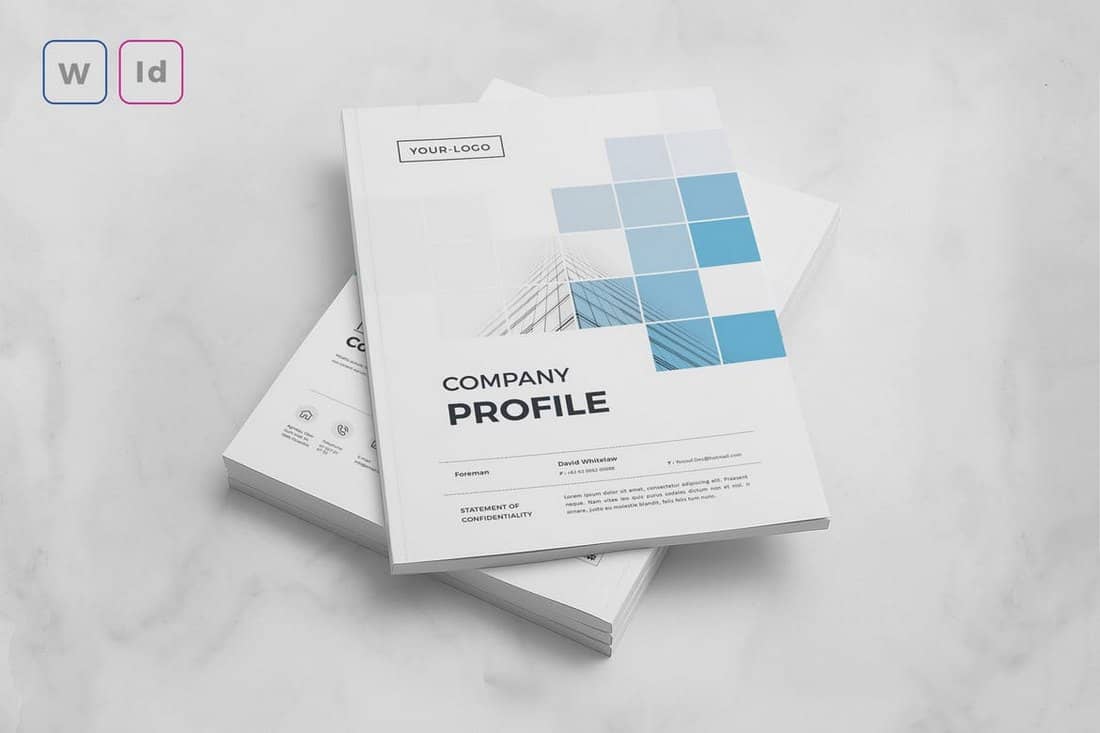
Modern Company Profile Word Template

Modern Company Profile Word Template

With this Word template, you can design a highly professional company profile to showcase your brand and business. It includes 18 page layouts with fully editable designs and colors. The template also comes in InDesign and EPS formats.

Professional Company Profile Word Template

Professional Company Profile Word Template

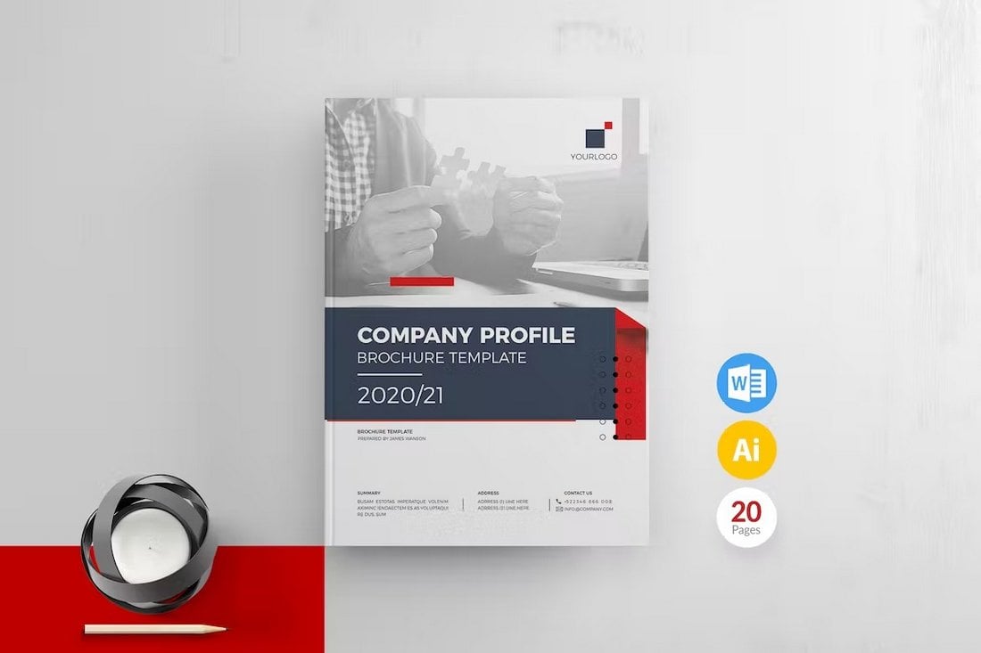
It’s simple, modern, and effective. This template comes with all the right elements for making more professional company profile brochures for your business. There are 20 unique page layouts in this template and you can fully customize them using MS Word.

Benmoo – Minimalist Company Profile Word Template

Benmoo - Minimalist Company Profile Word Template

Benmoo is a versatile and user-friendly brochure template perfect for updating your company or institution’s profile. With 20 editable pages, flexible fonts and text, and the ability to easily change colors, text, and images, it is highly customizable. Compatible with Office Word and Canva applications, it is an effective resource to articulate your company’s uniqueness.

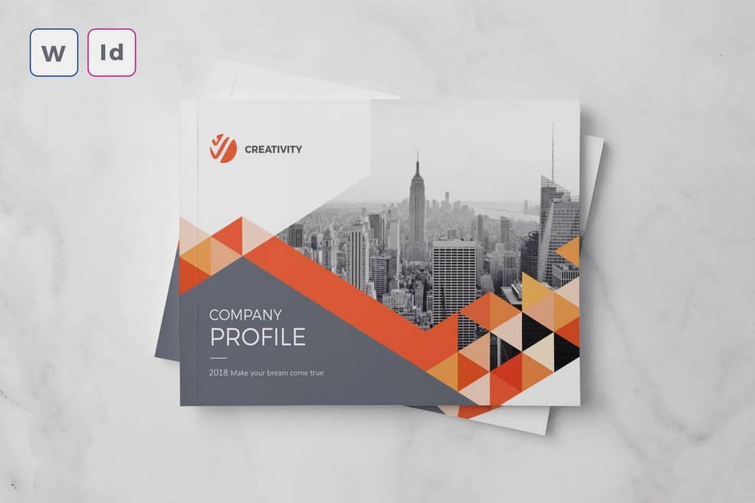
Modern Company Profile Word Template

Modern Company Profile Word Template

This is a highly versatile, professional-looking brochure template with 24 customizable pages. It is user-friendly, allowing you to alter colors and content with ease, and the layout maintains its readability regardless of the volume of content added. Compatibility with Microsoft Word, Adobe InDesign, Illustrator, and Canva ensures flexibility in design methods.

Stylish Company Profile Word Template

Stylish Company Profile Word Template

A versatile choice for creating distinctive company profiles. This A4-sized brochure template features 24 customized pages with easily editable texts, colors, objects, and images. It supports high resolution printing in 300 dpi CMYK and includes both newer and older versions of InDesign files, along with a Word Docx file.

Company Profile Template for Word and InDesign

Company Profile Template for Word and InDesign

An innovative brochure template designed to give your brand a refined appearance. Ideal for displaying your company’s history, services, and accolades, it provides an advanced layout for both Word and InDesign users. The template supports customizability across text, colors, and images.

20-Page Company Profile for Word, Canva, & InDesign

20-Page Company Profile for Word, Canva, & InDesign

This is a versatile digital brochure template. Suited for Microsoft Word, Canva, and Adobe InDesign, it boasts a customizable design that’s easy to edit and is optimized for print with CMYK color settings. Although photos aren’t provided, the available text boxes, tables, and separate layers for text, graphics, and shapes offer plenty of options to make your content shine.

Company Profile Brochure for Word

Company Profile Brochure for Word

Another stylish brochure template ready for customization in Microsoft Word and Adobe InDesign. You’ll enjoy twenty pages of editable content, with styling options and auto page numbering. This A4 size document is ideal for both digital and print use. It comes with a detailed file guide for ease of use, including instructions for text and image edits.

Professional Company Profile Word Template

Professional Company Profile Word Template

Give your business an impressive edge with this Word brochure template. Highly versatile and customizable, this template is available in Adobe InDesign files and is compatible with various versions of Adobe Indesign. It offers 20 unique layouts, organized layers, and adjustable text, colors, and images.

Visual Colony Company Profile

Visual Colony Company Profile

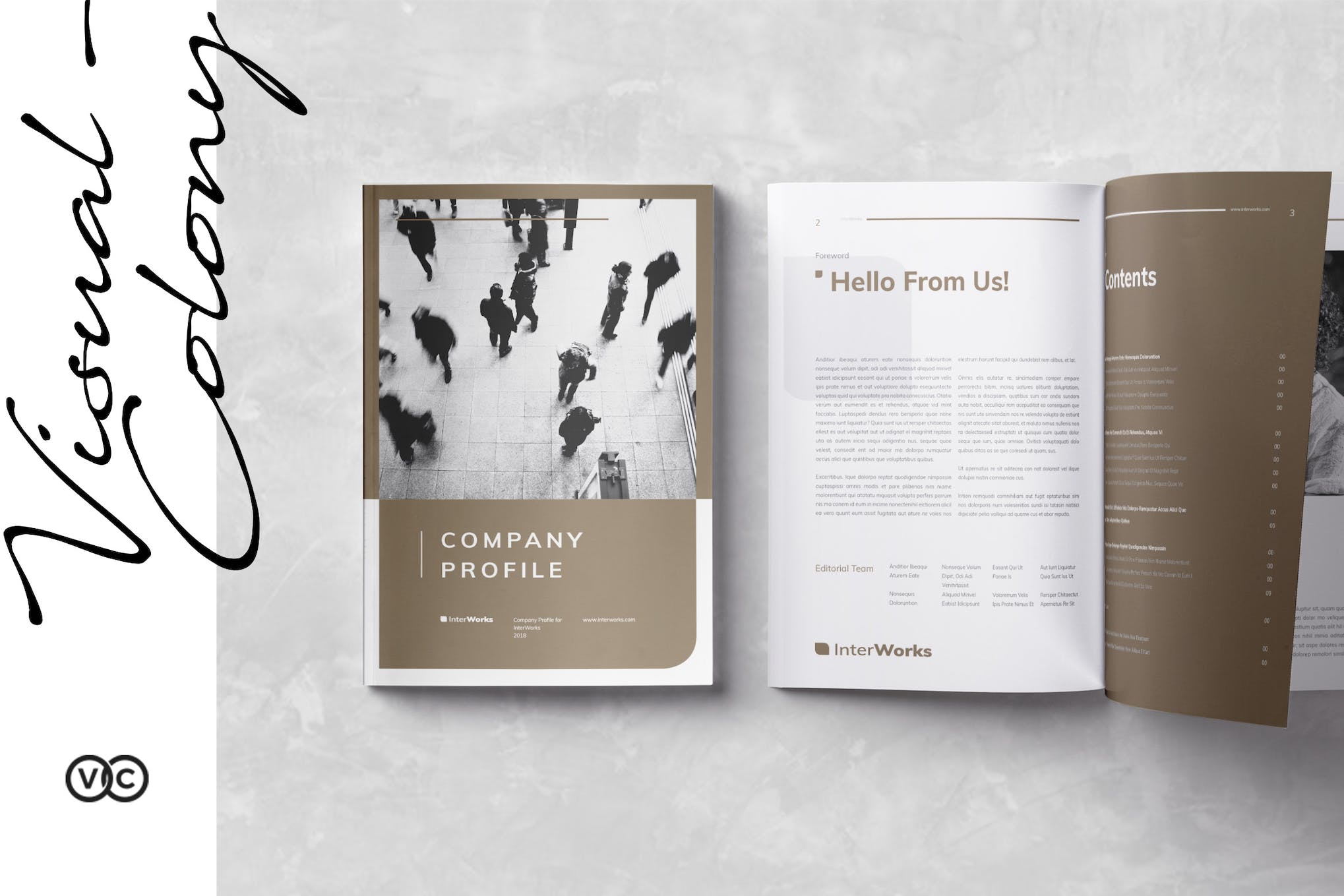
A 20-page InDesign brochure template available in US letter and A4 size. It’s compatible with various Adobe Indesign versions and features master pages, paragraph and character styles, and text, images, and backgrounds on separate layers for easy customization. A help file is included and it utilizes free fonts for convenience.

Modern Company Profile Template

Modern Company Profile Template

The Modern Company Profile Template from Visual Colony is a sleek, 20-page Indesign template compatible with CS4 onwards. It presents a unique blend of images, infographics, and text in a stylish layout, perfect for creating compelling company profiles. Available in both A4 and US Letter sizes, this template also includes master pages and a grid-based layout. Note: photos are not included.

Construction Company Profile

Construction Company Profile

The BuilderArch Construction Company Profile is a versatile, multipurpose asset useful for businesses seeking an annual report, proposal, portfolio, presentation, and more. Easy to customize, it offers adjustable fonts, colors, and backgrounds, and provides space to insert your own photos. The ready-to-print profile comes with 16 Adobe InDesign pages, additional covers, and preference for both A4 and US letter format.

Black & White Company Profile

Black & White Company Profile

The Black & White Company Profile is a versatile 20-page InDesign template, accommodating both A4 and US letter sizes. Perfect for showcasing your images, infographics and text in a stylish manner, it is ultra-flexible, working seamlessly with multiple versions of Adobe InDesign. It also features a grid-based layout and master pages, however, photographs are not included. It uses the Gothic A1 font, available for free download.

Modern Business Profile Template

Modern Business Profile Template

The Modern Business Profile Template is a professional, user-friendly InDesign template, intended for designing your own company profile. With features like paragraph styles, editable swatches, and unique layouts, it also includes 16 customizable layout pages, free fonts, and maintains a 300 DPI resolution. The template is compatible with both A4 and US Letter print sizes. Please note, this package does not include photos or mock-ups.

Simple Business Plan Word Template

Simple Business Plan Word Template

This Word template comes with a multipurpose design, allowing you to create both business plans and company profiles. It also has simple and minimalist page layouts with customizable colors, fonts, and paragraph styles. The template is available in Word and InDesign formats.

Minimal Company Profile Word Template

Minimal Company Profile Word Template

A clean and minimal design is always a good approach for making professional brochures such as company profiles. This template has such a clean and attractive design that’s ideal for business brochures. The template includes 32 pages and comes in multiple file formats, including Word and InDesign.

Company Profile Word & InDesign Template

Company Profile Word & InDesign Template

This company profile template has a stylish and professional design across all its pages. There are lots of space for adding visuals and colorful shapes too. The template comes with 20 unique page layouts in MS Word and InDesign formats.

Modern Company Profile Word Template

Modern Company Profile Word Template

The red accents used in this brochure template make each page more attractive than the next. This Word template is ideal for making company profiles for both small and corporate businesses. It includes 20 pages and comes in Word and Adobe Illustrator formats.

RUNSHELL – Company Profile Word Template

RUNSHELL Company Profile Word Template

Runshell is a simple company profile template that features minimalist page layouts with fewer visual elements. It has 24 different pages for showcasing every aspect of your company. And it comes in Word and InDesign file formats.

Word Company Profile A5 Landscape Template

Word Company Profile A5 Landscape Template

This Word company profile template uses a landscape layout and it’s available in A5 size. There are 20 unique page layouts included in this template and they all have fully editable text, colors, and graphics.

Agency & Company Profile Word Template

Agency & Company Profile Word Template

A professional brochure template with a clean design. It’s a great choice for crafting company profile documents for agencies, small businesses, corporate brands, and more. The template includes 24 unique pages and it comes in both InDesign and Word formats.

ENERGY – Word Company Profile Template

ENERGY - Word Company Profile Template

This brochure template uses a stylish page design for creating company profiles for modern brands. It has 14 unique pages with paragraph styles, editable colors, and free fonts. The brochure comes in A4 and US Letter sizes.

Business & Company Profile Word Template

Business & Company Profile Word Template

Another professional company profile template that’s ideal for various types of corporate and creative businesses. This template lets you choose from 18 page layouts and master pages to create high-quality brochures. It’s also available in Adobe InDesign format.

Professional Company Profile Word Brochure Template

Professional Company Profile Word Brochure Template

This company profile template features a minimal and professional design that allows you to create brochures for various types of businesses. It includes 20 unique page layouts with fully customizable designs. The template is available in MS Word and InDesign formats as well.

Clean Company Profile Word Template

Clean Company Profile Word Template

If you’re working on a company profile for a corporate agency, this template is perfect for creating a high-quality brochure. It comes with stylish page designs with creative paragraph styles and lots of visual elements. It also comes in Word and InDesign file formats.

Landscape A5 Company Profile Word Docx Template

Landscape A5 Company Profile Word Docx Template

Design an elegant and stylish landscape brochure using this company profile template. It features 20 page designs in A5 size. Each page can be easily customized to your preference using MS Word or InDesign.

Blue – Company Profile Word Template

Blue - Company Profile Word Template

Use this Word template to create company profiles for modern agencies, brands, and corporate businesses. It features 25 page layouts in A4 size with easily editable paragraph layouts. You can also change its colors, fonts, and graphics to your preference.

Modern Company Profile Word Template

Modern Company Profile Word Template

This company profile template comes in both MS Word and InDesign file formats. It features 16 unique page layouts complete with paragraph formatting and image placeholders. You can use this to craft modern and professional brochures for all kinds of businesses.

DIVERSE Professional Company Profile Template

DIVERSE Professional Company Profile Template

This brochure template is great for making a professional company profile for a corporate brand or agency. It includes 24 different page designs to showcase and highlight all the important facts about your business. The template is available in InDesign and MS Word formats.

Krypton – Corporate Business Profile Template

Krypton - Corporate Business Profile Template

Krypton is a multipurpose business profile template you can use to create various styles of company profile brochures. It features a minimal design with 16 different page layouts to choose from. It comes in both A4 and US Letter sizes as well.

CLEVIO – Modern Company Profile for Word

CLEVIO - Modern Company Profile for Word

Clevio is a modern company profile template you can use in MS Word and InDesign. The template features clean page layouts with attractive content formatting. There are 24 customizable page layouts in the template. And you can easily customize it to change colors, fonts, and images.

Business Proposal & Profile Word Template

Business Proposal & Profile Word Template

This is a business profile template that you could easily customize and use to make company profile brochures. It features a minimalist and clean page design that will fit in well with almost any type of brand. There are 24 page layouts in A4 and US Letter sizes.

Company Profile & Proposal Word Template

Company Profile & Proposal Word Template

This elegant and creative Word template is also crafted for making company proposals. But the page layouts are totally appropriate for making company profiles as well. This template includes 20 beautifully designed pages in A4 size.

Company Profile Brochure Word Template

Company Profile Brochure Word Template

A simple and clean Word template for crafting professional company profiles and brochures. This template comes with 16 different page designs that you can customize however you like. It’s available in InDesign format as well.

Business Plan & Profile Word Template

Business Plan & Profile Word Template

You can use this template to create both business plans and proposals. It includes 20 different page layouts in A4 size. You can easily edit each page layout to change fonts, colors, and add images. It’s available in InDesign format as well.

Elegant Company Profile & Proposal Word Template

Elegant Company Profile & Proposal Word Template

The modern and elegant design of this Word template makes it a great choice for startups and high-end brands for crafting company profiles. It has an easily editable design with 24 unique page layouts.

HEXA – Corporate Company Profile Word Template

HEXA - Corporate Company Profile Word Template

If you’re looking for a template to design a physical brochure of your company profile, this template is for you. It comes in both MS Word and InDesign file formats. And features 24 unique page layouts in A4 and US Letter sizes. You can easily customize the template to add your own images, change colors, and text as well.

BLADE – Business Profile Word Template

BLADE - Business Profile Word Template

Another company profile brochure template for Word and InDesign. This template is ideal for making business profiles for various companies and corporations. It includes 24 unique page layouts with editable paragraph styles and colors. It’s available in both US Letter and A4 sizes.

Landscape A5 Company Profile Template for Word

Landscape Company Profile Template for Word

This professional company profile template comes with a clean and simple design. Making it perfect for creating company profiles for modern agencies and corporate brands. The template is available in landscape A5 size and in MS Word format.

BIGREDS – Professional Company Profile Word Template

BIGREDS - Professional Company Profile Word Template

This company profile brochure template comes with a simple and professional design. It’s most suitable for corporate brands and companies. The template includes 24 page layouts with changeable colors and text. You can edit the template using MS Word or Adobe InDesign.

ZENETA – Agency Company Profile Template

ZENETA - Agency Company Profile Template

This beautiful and modern company profile template is designed for creative agencies in mind. It comes in both MS Word and InDesign file formats. And the template includes 14 unique page layouts you can use to craft a professional company profile brochure.

Multipurpose Company Profile Brochure Template

Multipurpose Company Profile Brochure Template

This is a multipurpose and multi-format company profile template. The template is available in PowerPoint, Keynote, InDesign, Photoshop and more to let you customize the template using any app you want.

Creative Word Company Profile Template

Creative Company Profile Word Template

This Word template features a multipurpose design, which will allow you to create brochures for different types of company profiles with ease. The template features 16 professionally designed page layouts and comes in A4 size. You can edit this template using Word and InDesign.

Minimalist Company Profile Word Template

Minimalist Company Profile Word Template

Minimalist design is a great way to showcase professionalism. This simple and clean company profile template will help you achieve that goal. It includes 16 page designs for including company information with easily editable text, colors, and images. The template is available in A4 size.

A5 Landscape Company Profile Template – Word

A5 Landscape Company Profile Template - Word

This Word template comes in A5 size and landscape design. It supports both InDesign and Word so you can easily edit and customize the template using your favorite app. The template is most suitable for creating company profiles for agencies and corporate businesses.

Company Annual Report Word Template

Company Annual Report Word Template

If you’re working on a company profile showcasing the annual progress and the report of the company, this Word template will come in handy. It features 16 page designs in A4 size, specifically crafted for making annual reports and company profiles. It’s available in Word and InDesign file formats.

Free Company Brochure Template for Word

Free Company Brochure Template for Word

This free Word template comes in a half-fold design, which makes it a great template for crafting a simple company profile to briefly summarize your business. It’s available in A3 size.

Free Business Marketing Brochure Word Template

Free Business Marketing Brochure Template

This is a free tri-fold brochure template that comes in multiple formats, including Word, Pages, InDesign, Photoshop, and more. You’ll be able to design a simple company profile brochure using this free template.

Creative Landscape Company Profile Template

Creative Landscape Company Profile Template

A creative company profile template with a landscape design. This template features a highly visual design that will allow you to create a modern and stylish company profile brochure. It can be customized with MS Word and InDesign and the template includes 18 page designs in A4 and US Letter size.

Best Company Profile PowerPoint Templates

These are some of the best PowerPoint templates for making company profile slideshows. You’ll find a lot of free templates in there too.

Cabaq – Company Profile Powerpoint Template

Cabaq - Company Profile Powerpoint Template

Cabaq is the ideal PowerPoint template for making company profile presentations for modern agencies and businesses. It features 27 colorful slides with trendy designs. There are editable charts and infographics as well.

ORBISS – Company Profile PowerPoint Template

ORBISS - Company Profile PowerPoint Template

You can use this PowerPoint template to make a data-driven company profile presentation with a stylish design. The template has 32 fully customizable slides. And it comes in both PowerPoint and Google Slides formats too.

BEUGH – Modern Company Profile PPT Template

BEUGH - Modern Company Profile PPT Template

Beugh is a company profile PowerPoint template featuring a clean and modern design. It includes 30 different slide layouts with editable vector graphics, customizable colors, fonts, and much more.

Alpha – Company Profile PowerPoint Template

Alpha Company Profile PowerPoint Template

This creative PowerPoint template is ideal for making company profile slideshows for modern marketing agencies, fintech brands, and various other businesses. The template includes 20 different slide layouts with editable colors, fonts, images, and shapes.

Sigma – Company Profile PowerPoint Presentation

Sigma Company Profile PowerPoint Presentation

If you’re working on a company profile presentation for a tech brand, NFT, or cryptocurrency-related business, this PowerPoint template is perfect for you to get a headstart in your project. It features 20 unique slide designs with fully customizable layouts.

NEOS – Company Profile PowerPoint Template

NEOS - Company Profile PowerPoint Template

Neos is a bright and colorful PowerPoint template made with modern brands and creative businesses in mind. It comes with bright yellow slide layouts, which you can easily customize to change colors. There are 32 different slides included in this template.

Creative Gray Yellow Company Profile PowerPoint Template

Creative Gray Yellow Company Profile PowerPoint Template

The bright and colorful design of this PowerPoint template makes it an ideal choice for making company profiles for modern tech companies and startups. It features 25 unique slides with editable vector graphics, an icon pack, and master slide layouts.

Real Estate Business Company Profile PowerPoint Template

Real Estate Business Company Profile PowerPoint Template

Making a professional company profile for your real estate business will be much easier when you have this PowerPoint template. It features modern and creative content layouts made specifically for showcasing your services and property listings. There are 29 slides in this template.

Black Yellow Company Profile PowerPoint Template

Black Yellow Company Profile PowerPoint Template

This PowerPoint template uses a sleek black and yellow color theme across the entire slideshow. It makes the template look quite modern and professional. The template is perfect for crafting unique company profile slideshows for agencies and corporate businesses.

Impress – Company Profile PowerPoint Presentation

Impress - Company Profile PowerPoint Presentation

Whether you want to design a company profile using a dark or light color theme, or want the freedom to customize the design with 42 different color schemes, this template has got you covered. It includes over 80 unique slides as well.

Free Basic Company Profile PowerPoint Template

Free Basic Company Profile PowerPoint Template

This free PowerPoint template comes with a very simple design and it’s ideal for making basic company profile presentations. There are 30 unique slides in the template full of shapes, icons, graphs, and tables.

Hobbits – Business Company Profile PowerPoint Template

Hobbits - Business Company Profile PowerPoint Template

Download this PowerPoint template if you want to design a modern and minimal company profile for your business. It includes 27 unique slides with changeable colors and fonts as well as editable vector graphs, infographics, and more.

Creativox – Company Profile PowerPoint Template

Creativox - Company Profile PowerPoint Template

You can use this PowerPoint template to make company profile presentations for all kinds of businesses, including digital agencies, interior design firms, SaaS startups, and more. The template includes editable graphics, customizable colors, changeable fonts, and much more.

White Red – Company Profile PowerPoint PPT

White Red Company Profile PowerPoint PPT

Another minimalist and creative company profile template for modern businesses and brands. This PowerPoint template has 30 unique slides for you to choose from. And it comes with lots of vector graphics, infographics, data charts, and a unique icon pack as well.

Raunds – Company Profile PowerPoint Template

Raunds - Company Profile PowerPoint Template

This colorful and creative PowerPoint template is perfect for making company profile presentations for digital agencies and creative brands. The template includes 30 unique slides with easily editable layouts.

Company Profile Presentation Template PPT

Company Profile Presentation Template PPT

Download this PowerPoint template to create company profile slideshows with professional designs. It includes 30 customizable slides with modern designs. You can also change its colors, fonts, and images with just a few clicks.

Purplo – Business Profile PowerPoint Template

Purplo - Business Profile Powerpoint Template

A great PowerPoint design plays a key role in creating a winning presentation. With this stylish and modern slideshow template, you can design a more effective business profile to present your brand and company. The template comes with 36 unique slide designs with editable layouts. It includes image placeholders and master slide layouts as well.

Creative – Company Profile PowerPoint Template

Creative - Company Profile Powerpoint Template

Making a presentation for a creative agency or a brand? Then this PowerPoint template will come in handy. It features a bright and attractive design that will allow you to craft an attention-grabbing slideshow to present your company profile. The template includes a total of 150 slides with 30 unique slides in 5 different color schemes.

Facile – Free Business Profile PowerPoint Template

Facile - Free Business Profile PowerPoint Template

This is a free PowerPoint template featuring a stylishly modern design. It includes 30 different slides with animations. You can use it to design various business-related presentations, including company profiles.

INDUXTRY – Company Profile PowerPoint Template

INDUXTRY - Company Profile Powerpoint Template

Induxtry is a PowerPoint template you can use to design presentations to showcase your company or business. It lets you choose from 30 unique slide layouts and customize them to make slideshows that suit your brand.

Company Profile PPT Presentation Template

Company Profile PPT Presentation Template

Another company profile PowerPoint template made with modern startups and corporate agencies in mind. This template includes 30 unique slides with master slide layouts. You can also customize each slide to your preference.

Barakuda – Free Company Profile PowerPoint Template

Barakuda - Free Company Profile PowerPoint Template

A free PowerPoint template for making company profile presentations. This template is most suitable for small agencies to showcase their services and business models. There are 28 slide layouts in this template.

Minimal Company Profile PowerPoint Template

Company Profile PowerPoint Presentation Template

If you’re looking for a simple PowerPoint template for making a clean company profile presentations, this template is made just for you. It includes a set of minimal slides that comes in 6 different pre-made color schemes.

Macari – Free Company Profile PowerPoint Template

Macari Company Profile PowerPoint Template

With this free PowerPoint template, you can design professional slideshows for making a company profile presentation. It comes with 39 unique slides with editable vector graphics and charts.

Consulting Agency Profile – Free PowerPoint Template

Consulting Agency Profile - Free PowerPoint Template

This is a free PowerPoint template you can use to create a basic company profile presentation for consulting and communication agencies. The template features 16 unique slides with customizable designs. It also comes with lots of editable graphics, maps, and a huge icon pack.

Martin – Business Profile PowerPoint Template

Martin – Business Profile PowerPoint Template

A business PowerPoint template featuring a dark and elegant design. This template is most suitable for designing company profiles and portfolio slideshows for luxury and high-end businesses. The template includes a total of 39 different slides that can be customized to your preference.

Balancer – Business PowerPoint Presentation Template

Balancer - Business PowerPoint Presentation Template

Balancer is another modern PowerPoint template you can use to make business and company profiles for all kinds of corporate brands. It comes with 30 unique slides featuring clean design and minimal layouts.

Dagon – Company Profile PowerPoint Template

Dagon - Company Profile PowerPoint Template

This colorful and stylish PowerPoint template will allow you to craft company profiles and many other business presentations with ease. It includes 39 different slides with editable graphics and vector shapes.

IDEA – Free Furniture Factory Company Profile

IDEA - Free Furniture Factory Company Profile

This is a free PowerPoint and Google Slides template you can use to design attractive slideshows for a furniture company. Of course, you can customize it to create presentations for other businesses as well. It includes 33 editable slides.

Digitech – IT & Technology Company Profile Template

Digitech - IT & Technology Company Profile Template

This company profile template is designed for businesses and brands in the tech and IT industries. It includes 37 unique slides featuring modern content layouts, editable colors, image placeholders, and master slides. You can use it to craft slideshows for various types of presentations including business showcase, portfolio, and more.

STARION – Startup Profile PowerPoint Template

STARION - Startup Profile Powerpoint Template

When talking about company profiles we can’t forget about startups. This is a unique PowerPoint template made specifically for making company profiles for startups. It not only features a colorful and stylish design but also comes with a casual design to match different types of startup concepts. The template itself includes 30 unique slides with editable designs.

Codora – Company Profile PowerPoint Template

Codora - Company Profile Powerpoint Template

A clean and minimal PowerPoint template for creating professional presentations. This template is perfect for making company profile presentations for various businesses, agencies, and brands. It lets you choose from 3 different pre-made color schemes and they are all available in light and dark themes as well.

Quick Beetle – Free Agency Profile PowerPoint Template

Quick Beetle - Free Agency Profile PowerPoint Template

You can use this free PowerPoint template to design a playful and creative presentation for a creative agency or a brand. The template features a set of colorful and beautiful slides filled with illustrations. It includes 15 unique slides and works with both PowerPoint and Google Slides.

ANTARA – Business Profile PowerPoint Template

ANTARA - Business Company & Profile PowerPoint Template

Antara is a creative PowerPoint template made specifically for crafting presentations for showcasing your business and company. The template includes 30 unique slide layouts in 5 different color schemes to choose from. It also features master slide layouts and image placeholders for easier editing.

Ovizer – Company Profile PowerPoint Template

Ovizer - Company Profile PowerPoint Template

Ovizer is a professional PowerPoint template that comes with a total of 36 slide designs. This template is also made with businesses in mind. You can easily customize its slides to create an effective presentation to highlight your business or agency.

Beexey – Free Business Profile PowerPoint Template

Beexey - Free Business Profile PowerPoint Template

This is a free business PowerPoint template you can use to create not just company profiles but many other types of professional presentations. It comes with 20 clean and modern slide designs featuring image placeholders and master slides.

Azurey – Corporate Profile PowerPoint Template

Azurey - Corporate Profile PowerPoint Template

Azurey is a modern PowerPoint template featuring a minimalist slide design. It’s perfect for designing company profiles for corporate brands. The template lets you choose from 39 different slides to create your own presentations.

Asmirah – Corporate Powerpoint Template

Asmirah - Corporate Powerpoint Template

This PowerPoint template is designed with modern corporate brands in mind. The colorful and highly visual design of this template will allow you to create more attractive presentations to showcase your company. The template features 40 different slides.

Snipship – Business PowerPoint Template

Snipship – Business PowerPoint Template

If you’re looking for a PowerPoint template with a clean and minimal layout to design a company profile presentation, this template is for you. It includes 39 slides with fully editable designs.

Ronin – Business PowerPoint Template

Ronin - Business PowerPoint Template

Ronin is a trendy and colorful PowerPoint template you can use to design company profiles and business portfolios for fashion and lifestyle brands. The template comes with master slide layouts, editable vector graphics, and much more.

Free Investment Fund Company Profile

Free Investment Fund Company Profile

Another free PowerPoint template for crafting company profile presentations for investment and financial companies. This template also comes with 34 different slides that you can easily customize to your preference.

INDUXTRY – Company Profile Powerpoint Template

INDUXTRY - Company Profile Powerpoint Template

This modern and colorful PowerPoint template is perfect for designing an effective company profile for presentations. The template includes 30 unique slide designs that can be easily customized to your preference.

Minimal Company Profile Presentation Template

Minimal Company Profile Presentation Template

This PowerPoint template features a clean and minimal design, making it a great choice for designing company profiles for modern businesses and agencies. The template comes with 30 unique slides with master slide designs.

LIBERO – Company Profile PowerPoint Template

LIBERO - Company Profile Powerpoint Template

Using a PowerPoint presentation to showcase your company profile is a great way to attract attention in meetings and conferences. This premium PowerPoint template will help you create a professional slideshow to present your company profile without an effort. It includes 30 unique slides in 5 different color schemes with image placeholders and editable designs.

Company Profile PowerPoint Template

Company Profile PowerPoint Template

This PowerPoint template comes with all the necessary slides you’ll need to make an effective company profile presentation. It includes slide designs for detailing company history, clients, objectives, finances, pricing, and much more. The template can be customized with 5 color designs and features a unique infographic as well.

MADDON – Company Profile Powerpoint Template

MADDON - Company Profile Powerpoint Template

Maddon is a PowerPoint template that comes with 30 slide designs featuring 5 different color schemes. The template is fully customizable and includes lots of editable graphics, master slides, and image placeholders for easier editing.

Clean Company Profile Presentation Template

Clean Company Profile Presentation

Another professional company profile PowerPoint template featuring a clean design. This template also lets you choose from 20 unique slide designs to create all kinds of company profile presentations.

Free Company Profile Powerpoint Presentation

Free Company Profile Powerpoint Presentation

With more than 20 unique slide designs to choose from, this free PowerPoint template will help you design a simple presentation to highlight your company profile. It includes master slide layouts and image placeholders as well.

Free Simple Company Profile PowerPoint Template

Free Simple Company Profile Presentation Template

A minimal PowerPoint template for crafting modern company profile presentations. This template comes with 20 unique slides with editable shapes and graphics. It’s also free to use.

FALCON – Company Profile Powerpoint Template

FALCON - Company Profile Powerpoint Template

Falcon is a creative PowerPoint template that comes with a total of 150 slide designs. You can choose from 5 different color schemes to create professional company profile presentations as well.

SINDE – Business Powerpoint Template

SINDE - Business Powerpoint Template

Sinde is a multipurpose PowerPoint template you can use to create all kinds of business presentations, including company profiles. The template includes 30 unique slides in 5 color schemes.

Business Pitch – PowerPoint Template

Business Pitch - Powerpoint Template

A great pitch deck is a must-have for presenting a startup or a business at an event or a meeting. This PowerPoint template is designed for creating those slideshows. It includes 30 unique slides with highly visual designs full of images, which you can easily edit and customize using drag and drop image placeholders.

QUANTUM – Company Profile PowerPoint Template

QUANTUM - Company Profile Powerpoint Template

Quantum is another powerful company profile template for making creative and modern slideshows for presenting your business. The template features a fully customizable design featuring a total of 150 slides and includes vector shapes, graphics, and much more.

Experience – PowerPoint Company Profile Template

Experience - Powerpoint Company Profile Template

This minimal and modern PowerPoint template features a complete slide deck you can use to create all kinds of company profiles for various presentations. It comes in 3 different color schemes as well as both dark and light color designs. The slide designs are easily editable as well.

Creative Company Profile PowerPoint Template

Creative Company Profile Powerpoint Template

This is a creative PowerPoint template that’s most suitable for making company profile slideshows for marketing agencies and businesses. The template comes with a total of 1200 slides featuring 5 different color variations. It’s available in both widescreen and standard sizes.

Informatics – IT Company PowerPoint Template

Informatics - IT Company PowerPoint Template

Informatics is a creative PowerPoint template designed for information and technology-related companies and businesses. The template is fully customizable and allows you to create all kinds of presentations slideshows, including company profiles. It comes with 54 unique slides with editable vector graphics, icons, and more.

AEGIS – Agency PowerPoint Template

AEGIS - Agency Powerpoint Template

Aegis is a company profile PowerPoint template made for small and corporate agencies. The template includes 30 unique slides in HD resolution and allows you to customize the slide designs with ease using its drag and drop image placeholders, editable charts, and other vector elements.

Porto & Profile PowerPoint Template

Porto & Profile Powerpoint Templatea

Porto is a multipurpose company profile PowerPoint template you can use to create both company profiles for corporations as well as to create personal profiles for creative professionals. The template includes 28 unique slides featuring portfolio slides, gallery slides, team profiles, and much more for making beautiful slideshow presentations.

Quin – Clean & Minimal Company Profile PowerPoint

Quin - Clean & Minimal Company Profile Powerpoint

This elegant and clean PowerPoint template features a total of 400 slides, allowing you to choose from 4 different color variations, easily edit images with placeholders, vector shapes, editable illustrations, and much more. This template is perfect for making a minimalist company profile presentation for modern businesses.

Check out our best Word brochure templates collection for more inspiration.

25+ Best Magazine Fonts for Stylish Titles & Cover Designs

Featured Imgs 23

Typography design is a fine balance of aesthetics and readability, and fonts play a crucial role in achieving that harmony. From sleek and modern typefaces to elegant serif fonts, the right typography can add character and distinction to your content.

In this post, we’ve gathered the best magazine fonts that will help you craft stunning, professional layouts that stand out on any print or digital platform. You’ll find fonts that excel in different aspects of magazine design, from bold and striking display fonts for headlines to clean and sophisticated fonts for body text.

Whether you’re working on a lifestyle magazine, fashion editorial, or business publication, these fonts offer the versatility and style you need to create polished, eye-catching designs.

Magazine – Elegant Serif Font

Magazine - Elegant Serif Font

This is an upscale and chic type font that adds sophistication to any branding and logo design. This multifaceted font is ideal for a variety of uses, like social media posts, packaging, photography, and invitations. Its high-level legibility ensures seamless integration across projects.

Vaqoeng – Modern Magazine Font

Vaqoeng - Modern Magazine Font

Vaqoeng offers a modern magazine and logo font that exudes elegance and authenticity. Provided in both OTF and TTF files, this distinct display font can be used to craft attractive titles for posters, book covers, magazines, and more. Vaqoeng is set to redefine your design aesthetics with its contemporary appeal and charming simplicity.

Display Magazine – Modern Title Font

Display Magazine - Modern Title Font

Brighten your creative projects with the Display Magazine font. This versatile font is perfect for both digital platforms and prints, ideal for anything from social media posts to personal projects. Similar to a Vogue magazine font, it lends a touch of sophistication to posters and branding. The set includes OTF, WOFF, and TTF files.

Biomorph – Magazine Font

Biomorph - Magazine Font

Biomorph is a versatile, newly-released sans font family, perfect for all your design needs. Ideal for branding, publishing, titles, books, and websites, Biomorph comes in a range of weights including thin, extra light, light, regular, medium, semibold, and bold. Its variety and sleek design give you the freedom to design just the way you want.

Stinker – Modern Magazine Font

Stinker - Modern Magazine Font

Stinker is an excellent choice for projects requiring a touch of elegance and style. Ideal for crafting striking logos, impressive magazine headers, or chic quotes, it offers a wealth of features including a variety of formats (TTF, OTF & WOFF), both uppercase and lowercase letters, ligatures, numerals, and punctuations, as well as regular and italic versions.

Daily Magazine – Serif Display Font

Daily Magazine - Serif Display Font

Discover our newest typography offering, Daily Magazine Serif Display Font. A sophisticated and modern choice for a multitude of creative projects, this font offers a versatile range of uses from logos to book covers and fashion branding. The design delicately balances both masculine and feminine tones making it a well-rounded choice.

The Real Magazine – Stylish Title Font

The Real Magazine - Stylish Title Font

The Real Magazine is a unique, dry-brushed marker font perfect for various applications. Use it to add flair to logos, packaging, t-shirts, posters, book covers, hipster designs, and greeting cards. It’s also ideal for any project requiring brush lettering. This stylish title font makes every creation stand out.

Aloha Magazine – Logo & Title font

Aloha Magazine - Logo & Title font

The Aloha Magazine logo and title font is a uniquely playful sans serif family boasting nine weights. Perfect for various design projects, it provides seamless typographic harmony, enhancing logos, branding, social media posts, advertisements, or product designs. The package includes Aloha Magazine .otf, .ttf, and .woff files.

Yoshida – Stylish Magazine Font

Yoshida - Stylish Magazine Font

Yoshida is an elegant, stylish magazine font that provides a distinguished look to your editorial content. Primarily intended for magazines or tabloids, it adds a classic yet fresh appeal to extended paragraphs. This font will significantly enhance readability and aesthetic appeal in your print or online publication.

CS Arthemis – Magazine Blackletter Font

CS Arthemis - Magazine Blackletter Font

CS Arthemis – Magazine Blackletter Font is a stunning blend of gothic charm and historical elegance. This Medieval display serif font features intricate design details, making it the perfect choice for projects requiring a combination of tradition, authority, and classic appeal. Ideal for luxury branding, formal invitations, and themed designs, CS Arthemis ensures your creations have a distinctive, timeless aesthetic.

Dickson – Geometric Magazine Fonts

Check out Dickson, a versatile sans font with a slim and bold style. Spanning 10 font styles, Dickson boasts of 10 straight-weight variations, perfect for any type of brand, logo, magazine, or movie. Its outlined copy ensures a modern feel to your projects while also offering multilingual support for languages including French, German, Spanish, and more for global accessibility.

Fancyou – Sharp Serif Magazine Font

Fancyou - Sharp Serif Magazine Font

Fancyou font elegantly merges vintage charm with contemporary dimensions. Its distinguishing feature lies in its sharp, stylish serifs, which are ideal for modern vintage designs. Available in eight diverse styles, this open-type format font is versatile enough for logos, websites, business cards, or branding initiatives.

Bolognia – Classic Serif Magazine Font

Bolognia - Classic Serif Magazine Font

The Bolognia is a sophisticated serif typeface, drawing inspiration from both classic and contemporary design elements. With a tall x-height, modern proportions, and contrasting strokes, Bolognia stands out in all the right ways. Versatile across six weights, it’s perfect for editorial content and headline creation that demands clarity and impact.

Merauq – Creative Magazine Font

Merauq - Creative Magazine Font

Merauq is a creative magazine font that provides strikingly harmonious typography across varied design projects. Available in 5 weights, it’s ideal for use in logos, branding, social media posts, advertisements, and product designs. The asset includes Meraq otf, ttf, and woff files, offering a great foundation for diverse and captivating designs.

RNS Miles – Trendy Magazine Font

RNS Miles - Trendy Magazine Font

RNS Miles is a versatile, modern magazine font family, featuring geometric and open forms for a harmonious, low-contrast look. It’s ideally suited for headlines and titles, with seven weights and matching italics. Extended OpenType features, like alternate glyphs and fractions, add to its utility.

Mouzambik – Narrow Magazine Font

Mouzambik - Narrow Magazine Font

Meet Mouzambik, a condensed sans-serif magazine font with a unique and intricate personality, designed to make your projects stand out. Available in regular, Inktrap, and Smooth styles, each with italics, it’s perfect for anything from headlines and branding to websites and posters. It shines in all sizes and includes an array of ligatures, alternates, and features.

Certia – Magazine Font

Certia - Magazine Font

Certia is a masterfully designed sans-serif font family boasting a blend of elegance and functionality. It includes 16 fonts, providing extensive language support for global communication needs. Ideal for editorial endeavors, branding projects, or digital interfaces, Certia maintains a consistent, readable form while exuding sophistication, closely aligning with varied design settings.

Etnier – Modern Display Magazine Font

Etnier - Modern Display Magazine Font

Etnier is a captivating modern display font perfect for magazine layouts. This sans-serif typeface offers a striking, squared appearance for superior readability. With a dynamic range of widths, italics, and a bold, robust quality, Etnier is excellent for UI, UX designs. Included in the package are 14 versatile styles available in OTF, TTF, WOFF formats.

Vangeda – Modern Serif Magazine Font

Vangeda - Modern Serif Magazine Font

The Vangeda is a modern and elegant serif font that comes in two styles: regular and italic. It has alternate and ligature glyph variations and supports multilingual input. Perfect for various design projects including logos, branding, advertising, and more, it adds a touch of sophistication to your work. Useful for both print and digital mediums, the Vangeda font is an asset to any designer.

Ricordo – Magazine Font

Ricordo - Magazine Font

Ricordo, a next-generation Magazine Font, is meticulously crafted for optimal engagement. This typeface has the flexibility to be used across all corporate tasks and a multitude of projects, from logos and headlines to digital ads. With nine weights and multiple file formats, including TTF, OTF, WOFF, and EOT.

Salmond – Clean Magazine Font

Salmond - Clean Magazine Font

Salmond is a clean, geometric, modern sans serif magazine font. With its tightly packed lettering and minimalist allure, it’s perfect for creating striking titles, brand logos, and impactful editorial work. Salmond offers six weight options, including Light, Regular, News, Medium, Semibold, and Bold.

Clover – Bold Magazine Font

Clover - Bold Magazine Font

A derivative of the Olive Typeface Family, the Clover display font is a distinctive, modern, and elegant asset delivering a bold magazine font ideal for Time Magazine-style title designs. It’s crafted with 16 versatile styles and comes in various formats like TTF, OTF, WOFF. Its strong capitals, smooth lowercase, and quirky warmth make it perfect for branding, headlines, or text overlays.

Free Magazine Fonts

Moderniz – Free Magazine Font

A beautiful, elegant display font for crafting attractive cover designs for magazine concepts. This free font comes with a stylishly bold letter design that will fit perfectly for bold magazines. It’s free to use with personal projects.

Risbeg – Free Magazine Font

Risbeg is another great free font you can use to craft magazine-style titles and headings for your design projects. This font has a professional-looking serif letter design. And it’s free to use with your personal projects.

Angrela Display – Free Magazine Font

This font is ideal for designing elegant magazine-like typography. The font comes with serif letters featuring beautiful curves and swashes. It’s free to use with personal projects.

Free Classic Magazine Font

You can download this font for free to craft stylish magazine-style titles with a classic feel. The font features a professional and minimalist design that will create a bold look for your typography. It’s free for personal use only.

Keryla – Free Magazine Font

A creative and unique font that comes with an elegant aesthetic. This font features a serif letter design with curves and serifs. The font is ideal for a modern magazine look. It’s free to use with personal projects.

Anchor Positioning Quirks

Featured Imgs 23

I am thrilled to say, that from this week onwards, the CSS-tricks Almanac has an entry for each property, function, and at-rule related to the new Anchor Positioning API! For the last month, I have tried to fully understand this new module and explain it to the best of my ability. However, anchor positioning is still a new feature that brings even newer dynamics on how to position absolute elements, so it’s bound to have some weird quirks and maybe even a few bugs lurking around.

To celebrate the coverage, I wanted to discuss those head-scratchers I found while diving into this stuff and break them down so that hopefully, you won’t have to bang your head against the wall like I did at first.

The inset-modified containing block

A static element containing block is a fairly straightforward concept: it’s that element’s parent element’s content area. But things get tricky when talking about absolutely positioned elements. By default, an absolutely positioned element’s containing block is the viewport or the element’s closest ancestor with a position other than static, or certain values in properties like contain or filter.

All in all, the rules around an absolute element’s containing block aren’t so hard to remember. While anchor positioning and the containing block have their quirks (for example, the anchor element must be painted before the positioned element), I wanted to focus on the inset-modified containing block (which I’ll abbreviate as IMCB from here on out).

There isn’t a lot of information regarding the inset-modified containing block, and what information exists comes directly from the anchor positioning specification module. This tells me that, while it isn’t something new in CSS, it’s definitely something that has gained relevance thanks to anchor positioning.

The best explanation I could find comes directly from the spec:

For an absolutely positioned box, the inset properties effectively reduce the containing block into which it is sized and positioned by the specified amounts. The resulting rectangle is called the inset-modified containing block.

So if we inset an absolutely positioned element’s (with top, left, bottom, right, etc.), its containing block shrinks by the values on each property.

.absolute {
  position: absolute;
  top: 80px;
  right: 120px;
  bottom: 180px;
  left: 90px;
}

For this example, the element’s containing block is the full viewport, while its inset modified containing block is 80px away from the top, 120px away from the right, 180px away from the bottom, and 90px away from the left.

Example of an inset-modified containing block. It's shrinked 80px from the top, 120px from the right, 180px from the bottom and 90px from the left

Knowing how the IMCB works isn’t a top priority for learning CSS, but if you want to understand anchor positioning to its fullest, it’s a must-know concept. For instance, the position-area and position-try-order heavily rely on this concept.

In the case of the position-area property, a target containing block can be broken down into a grid divided by four imaginary lines:

  1. The start of the target’s containing block.
  2. The start of the anchor element or anchor(start).
  3. The end of the anchor element or anchor(end).
  4. The end of the target’s containing block.
Example of how we can think of the containing block of an anchor element as a 3x3 asymmetrical grid

The position-area property uses this 3×3 imaginary grid surrounding the target to position itself inside the grid. So, if we have two elements…

<div class="anchor">Anchor</div>
<div class="target">Target</div>

…attached with anchor positioning:

.anchor {
  anchor-name: --my-anchor;

  height: 50px;
  width: 50px;
}

.target {
  position: absolute;
  position-anchor: --my-anchor;

  height: 50px;
  width: 50px;
}

…we can position the .target element using the position-area property:

.target {
  position: absolute;
  position-anchor: --my-anchor;
  position-area: top left;

  height: 50px;
  width: 50px;
}

The IMCB is shrunk to fit inside the region of the grid we selected, in this case, the top-left region.

Example of the inset-modified containing block of a target element at the top left of the anchor

You can see it by setting both target’s dimensions to 100%:

The position-try-order also uses the IMCB dimensions to decide how to order the fallbacks declared in the position-try-fallbacks property. It checks which one of the fallbacks provides the IMCB with the largest available height or width, depending on whether you set the property with either the most-height or most-width values.

I had a hard time understanding this concept, but I think it’s perfectly shown in a visual tool by Una Kravets on https://chrome.dev/anchor-tool/.

Specification vs. implementation

The spec was my best friend while I researched anchor positioning. However, theory can only take you so far, and playing with a new feature is the fun part of understanding how it works. In the case of anchor positioning, some things were written in the spec but didn’t actually work in browsers (Chromium-based browsers at the time). After staring mindlessly at my screen, I found the issue was due to something so simple I didn’t even consider it: the browser and the spec didn’t match.

Anchor positioning is different from a lot of other features in how fast it shipped to browsers. The first draft was published on June 2023 and, just a year later, it was released on Chrome 125. To put it into perspective, the first draft for custom properties was published in 2012 and we waited four years to see it in implemented in browsers (although, Firefox shipped it years before other browsers).

I am excited to see browsers shipping new CSS features at a fast pace. While it’s awesome to get new stuff faster, it leaves less space between browsers and the CSSWG to remake features and polish existing drafts. Remember, once something is available in browsers, it’s hard to change or remove it. In the case of anchor positioning, browsers shipped certain properties and functions early on that were ultimately changed before the spec had fully settled into a Candidate Recommendation.

It’s a bit confusing, but as of Chrome 129+, this is the stuff that Chrome shipped that required changes:

position-area

The inset-area property was renamed to position-area (#10209), but it will be supported until Chrome 131.

.target {
  /* from */
  inset-area: top right;

  /* to */
  position-area: top right;
}

position-try-fallbacks

The position-try-options was renamed to position-try-fallbacks (#10395).

.target {
  /* from */
  position-try-options: flip-block, --smaller-target;

  /* to */
  position-try-fallbacks: flip-block, --smaller-target;
}

inset-area()

The inset-area() wrapper function doesn’t exist anymore for the position-try-fallbacks (#10320), you can just write the values without the wrapper

.target {
  /* from */
  position-try-options: inset-area(top left);

  /* to */
  position-try-fallbacks: top left;
}

anchor(center)

In the beginning, if we wanted to center a target from the center, we would have to write this convoluted syntax

.target {
  --center: anchor(--x 50%);
  --half-distance: min(abs(0% - var(--center)), abs(100% - var(--center)));
	
  left: calc(var(--center) - var(--half-distance));
  right: calc(var(--center) - var(--half-distance));
}

The CWSSG working group resolved (#8979) to add the anchor(center) argument for much-needed brevity.

.target {
  left: anchor(center);
}

Bugs!

Some bugs snuck into browser implementations of qnchor positioning. For example, the spec says that if an element doesn’t have a default anchor element, then the position-area property does nothing. This is a known issue (#10500) but it’s still possible to replicate, so please, just don’t do it.

The following code…

.container {
  position: relative;
}

.element {
  position: absolute;
  position-area: center;
  margin: auto;
}

…centers the .element inside its container as we can see in this demo from Temani Afif:

Another example comes from the position-visibility property. If your anchor element is off-screen, you typically want its target to be hidden as well. The spec says the default is anchors-visible, but browsers go with always instead.

Chrome currently isn’t reflecting the spec. It indeed is using always as the initial value. But the spec’s text is intentional — if your anchor is off-screen or otherwise scrolled off, you usually want it to hide (#10425).

Anchor positioning accessibility

While anchor positioning’s most straightforward use case is for stuff like tooltips, infoboxes, and popovers, it can be used for a lot of other stuff as well. Check this example by Silvestar Bistrović, for example, where he connects elements with lines. He’s tethered elements together for decorative purposes, so anchor positioning doesn’t mean there is a semantic relationship between the elements. As a consequence, non-visual agents, like screen readers, are left in the dark about how to interpret two seemingly unrelated elements.

If we’re aiming to link a tooltip to another element, we need to set up a relationship in the DOM and let anchor positioning handle the visuals. Happily, there are APIs (like the Popover API) that do this for us, even establishing an anchor relationship that we can take advantage of to create more compelling visuals.

In a general way, the spec describes an approach to create this relationship using ARIA attributes such as the aria-details or aria-describedby, along the role attribute on the target element.

So, while we could attach the following two elements…

<div class="anchor">anchor</div>
<div class="toolip">toolip</div>

…using anchor positioning:

.anchor {
  anchor-name: --my-anchor;
}

.toolip {
  position: absolute;
  position-anchor: --my-anchor;
  position-area: top;
}

…but screen readers only see two elements next to one another without any remarked relationship. That’s a bummer for accessibility, but we can easily fix it using the corresponding ARIA attribute:

<div class="anchor" aria-describedby="tooltipInfo">anchor</div>
<div class="toolip" role="tooltip" id="tooltipInfo">toolip</div>

And now they are both visually and semantically linked together! It would just be better if could pull it off without ARIA.

Conclusion

Being confused by a new feature just to finally understand it is one of the most satisfying experiences anyone in programming can feel. While there are still some things about anchor positioning that can be (and are) confusing, I’m pleased to say the CSS-Tricks Almanac now has a deluge of information to help clarify things.

The most exciting thing is that anchor positioning is still in an early stage. That means there are many more confusing things coming for us to discover and learn!


Anchor Positioning Quirks originally published on CSS-Tricks, which is part of the DigitalOcean family. You should get the newsletter.

Why Anticipatory Design Isn’t Working For Businesses

Featured Imgs 23

Consider the early days of the internet, when websites like NBC News and Amazon cluttered their pages with flashing banners and labyrinthine menus. In the early 2000s, Steve Krug’s book Don’t Make Me Think arrived like a lighthouse in a storm, advocating for simplicity and user-centric design.

Today’s digital world is flooded with choices, information, and data, which is both exciting and overwhelming. Unlike Krug’s time, today, the problem isn’t interaction complexity but opacity. AI-powered solutions often lack transparency and explainability, raising concerns about user trust and accountability. The era of click-and-command is fading, giving way to a more seamless and intelligent relationship between humans and machines.

Expanding on Krug’s Call for Clarity: The Pillars of Anticipatory Design

Krug’s emphasis on clarity in design is more relevant than ever. In anticipatory design, clarity is not just about simplicity or ease of use — it’s about transparency and accountability. These two pillars are crucial but often missing as businesses navigate this new paradigm. Users today find themselves in a digital landscape that is not only confusing but increasingly intrusive. AI predicts their desires based on past behavior but rarely explains how these predictions are made, leading to growing mistrust.

Transparency is the foundation of clarity. It involves openly communicating how AI-driven decisions are made, what data is being collected, and how it is being used to anticipate needs. By demystifying these processes, designers can alleviate user concerns about privacy and control, thereby building trust.

Accountability complements transparency by ensuring that anticipatory systems are designed with ethical considerations in mind. This means creating mechanisms for users to understand, question, and override automated decisions if needed. When users feel that the system is accountable to them, their trust in the technology — and the brand — deepens.

What Makes a Service Anticipatory?

Image AI like a waiter at a restaurant. Without AI, they wait for you to interact with them and place your order. But with anticipatory design powered by AI and ML, the waiter can analyze your past orders (historical data) and current behavior (contextual data) — perhaps, by noticing you always start with a glass of sparkling water.

This proactive approach has evolved since the late 1990s, with early examples like Amazon’s recommendation engine and TiVo’s predictive recording. These pioneering services demonstrated the potential of predictive analytics and ML to create personalized, seamless user experiences.

Amazon’s Recommendation Engine (Late 1990s)

Amazon was a pioneer in using data to predict and suggest products to customers, setting the standard for personalized experiences in e-commerce.

TiVo (1999)

TiVo’s ability to learn users’ viewing habits and automatically record shows marked an early step toward predictive, personalized entertainment.

Netflix’s Recommendation System (2006)

Netflix began offering personalized movie recommendations based on user ratings and viewing history in 2006. It helped popularize the idea of anticipatory design in the digital entertainment space.

How Businesses Can Achieve Anticipatory Design

Designing for anticipation is designing for a future that is not here yet but has already started moving toward us.

Designing for anticipation involves more than reacting to current trends; it requires businesses to plan strategically for future user needs. Two critical concepts in this process are forecasting and backcasting.

  • Forecasting analyzes past trends and data to predict future outcomes, helping businesses anticipate user needs.
  • Backcasting starts with a desired future outcome and works backward to identify the steps needed to achieve that goal.

Think of it like planning a dream vacation. Forecasting would involve looking at your past trips to guess where you might go next. But backcasting lets you pick your ideal destination first, then plan the perfect itinerary to get you there.

Forecasting: A Core Concept for Future-Oriented Design

This method helps in planning and decision-making based on probable future scenarios. Consider Netflix, which uses forecasting to analyze viewers’ past viewing habits and predict what they might want to watch next. By leveraging data from millions of users, Netflix can anticipate individual preferences and serve personalized recommendations that keep users engaged and satisfied.

Backcasting: Planning From the Desired Future

Backcasting takes a different approach. Instead of using data to predict the future, it starts with defining a desired future outcome — a clear user intent. The process then works backward to identify the steps needed to achieve that goal. This goal-oriented approach crafts an experience that actively guides users toward their desired future state.

For instance, a financial planning app might start with a user’s long-term financial goal, such as saving for retirement, and then design an experience that guides the user through each step necessary to reach that goal, from budgeting tips to investment recommendations.

Integrating Forecasting and Backcasting In Anticipatory Design

The true power of anticipatory design emerges when businesses efficiently integrate both forecasting and backcasting into their design processes.

For example, Tesla’s approach to electric vehicles exemplifies this integration. By forecasting market trends and user preferences, Tesla can introduce features that appeal to users today. Simultaneously, by backcasting from a vision of a sustainable future, Tesla designs its vehicles and infrastructure to guide society toward a world where electric cars are the norm and carbon emissions are significantly reduced.

Over-Promising and Under-Delivering: The Pitfalls of Anticipatory Design

As businesses increasingly adopt anticipatory design, the integration of forecasting and backcasting becomes essential. Forecasting allows businesses to predict and respond to immediate user needs, while backcasting ensures these responses align with long-term goals. Despite its potential, anticipatory design often fails in execution, leaving few examples of success.

Over the past decade, I’ve observed and documented the rise and fall of several ambitious anticipatory design ventures. Among them, three — Digit, LifeBEAM Vi Sense Headphones, and Mint — highlight the challenges of this approach.

Digit: Struggling with Contextual Understanding

Digit aimed to simplify personal finance with algorithms that automatically saved money based on user spending. However, the service often missed the mark, lacking the contextual awareness necessary to accurately assess users’ real-time financial situations. This led to unexpected withdrawals, frustrating users, especially those living paycheck to paycheck. The result was a breakdown in trust, with the service feeling more intrusive than supportive.

LifeBEAM Vi Sense Headphones: Complexity and User Experience Challenges

LifeBEAM Vi Sense Headphones was marketed as an AI-driven fitness coach, promising personalized guidance during workouts. In practice, the AI struggled to deliver tailored coaching, offering generic and unresponsive advice. As a result, users found the experience difficult to navigate, ultimately limiting the product’s appeal and effectiveness. This disconnection between the promised personalized experience and the actual user experience left many disappointed.

Mint: Misalignment with User Goals

Mint aimed to empower users to manage their finances by providing automated budgeting tools and financial advice. While the service had the potential to anticipate user needs, users often found that the suggestions were not tailored to their unique financial situations, resulting in generic advice that did not align with their personal goals.

The lack of personalized, actionable steps led to a mismatch between user expectations and service delivery. This misalignment caused some users to disengage, feeling that Mint was not fully attuned to their unique financial journeys.

The Risks of Over-promising and Under-Delivering

The stories of Digit, LifeBEAM Vi Sense, and Mint underscore a common pitfall: over-promising and under-delivering. These services focused too much on predictive power and not enough on user experience. When anticipatory systems fail to consider individual nuances, they breed frustration rather than satisfaction, highlighting the importance of aligning design with human experience.

Digit’s approach to automated savings, for instance, became problematic when users found its decisions opaque and unpredictable. Similarly, LifeBEAM’s Vi Sense headphones struggled to meet diverse user needs, while Mint’s rigid tools failed to offer the personalized insights users expected. These examples illustrate the delicate balance anticipatory design must strike between proactive assistance and user control.

Failure to Evolve with User Needs

Many anticipatory services rely heavily on data-driven forecasting, but predictions can fall short without understanding the broader user context. Mint initially provided value with basic budgeting tools but failed to evolve with users’ growing needs for more sophisticated financial advice. Digit, too, struggled to adapt to different financial habits, leading to dissatisfaction and limited success.

Complexity and Usability Issues

Balancing the complexity of predictive systems with usability and transparency is a key challenge in anticipatory design.

When systems become overly complex, as seen with LifeBEAM Vi Sense headphones, users may find them difficult to navigate or control, compromising trust and engagement. Mint’s generic recommendations, born from a failure to align immediate user needs with long-term goals, further illustrate the risks of complexity without clarity.

Privacy and Trust Issues

Trust is critical in anticipatory design, particularly in services handling sensitive data like finance or health. Digit and Mint both encountered trust issues as users grew skeptical of how decisions were made and whether these services truly had their best interests in mind. Without clear communication and control, even the most sophisticated systems risk alienating users.

Inadequate Handling of Edge Cases and Unpredictable Scenarios

While forecasting and backcasting work well for common scenarios, they can struggle with edge cases or unpredictable user behaviors. If an anticipatory service can’t handle these effectively, it risks providing a poor user experience and, in the worst-case scenario, harming the user. Anticipatory systems must be prepared to handle edge cases and unpredictable scenarios.

LifeBEAM Vi Sense headphones struggled when users deviated from expected fitness routines, offering a one-size-fits-all experience that failed to adapt to individual needs. This highlights the importance of allowing users control, even when a system proactively assists them.

Designing for Anticipatory Experiences
Anticipatory design should empower users to achieve their goals, not just automate tasks.

We can follow a layered approach to plan a service that can evolve according to user actions and explicit ever-evolving intent.

But how do we design for intent without misaligning anticipation and user control or mismatching user expectations and service delivery?

At the core of this approach is intent — the primary purpose or goal that the design must achieve. Surrounding this are workflows, which represent the structured tasks to achieve the intent. Finally, algorithms analyze user data and optimize these workflows.

For instance, Thrive (see the image below), a digital wellness platform, aligns algorithms and workflows with the core intent of improving well-being. By anticipating user needs and offering personalized programs, Thrive helps users achieve sustained behavior change.

It perfectly exemplifies the three-layered concentric representation for achieving behavior change through anticipatory design:

1. Innermost layer: Intent

Improve overall well-being: Thrive’s core intent is to help users achieve a healthier and more fulfilling life. This encompasses aspects like managing stress, improving sleep quality, and boosting energy levels.

2. Middle layer: Workflows

Personalized programs and support: Thrive uses user data (sleep patterns, activity levels, mood) to create programs tailored to their specific needs and goals. These programs involve various workflows, such as:

  • Guided meditations and breathing exercises to manage stress and anxiety.
  • Personalized sleep routines aimed at improving sleep quality.
  • Educational content and coaching tips to promote healthy habits and lifestyle changes.

3. Outermost layer: Algorithms

Data analysis and personalized recommendations: Thrive utilizes algorithms to analyze user data and generate actionable insights. These algorithms perform tasks like the following:

  • Identify patterns in sleep, activity, and mood to understand user challenges.
  • Predict user behavior to recommend interventions that address potential issues.
  • Optimize program recommendations based on user progress and data analysis.

By aligning algorithms and workflows with the core intent of improving well-being, Thrive provides a personalized and proactive approach to behavior change. Here’s how it benefits users:

  • Sustained behavior change: Personalized programs and ongoing support empower users to develop healthy habits for the long term.
  • Data-driven insights: User data analysis helps users gain valuable insights into their well-being and identify areas for improvement.
  • Proactive support: Anticipates potential issues and recommends interventions before problems arise.
The Future of Anticipatory Design: Combining Anticipation with Foresight

Anticipatory design is inherently future-oriented, making it both appealing and challenging. To succeed, businesses must combine anticipation — predicting future needs — with foresight, a systematic approach to analyzing and preparing for future changes.

Foresight involves considering alternative future scenarios and making informed decisions to navigate toward desired outcomes. For example, Digit and Mint struggled because they didn’t adequately handle edge cases or unpredictable scenarios, a failure in their foresight strategy (see an image below).

As mentioned, while forecasting and backcasting work well for common scenarios, they can struggle with edge cases or unpredictable user behaviors. Under anticipatory design, if we demote foresight for a second plan, the business will fail to account for and prepare for emerging trends and disruptive changes. Strategic foresight helps companies to prepare for the future and develop strategies to address possible challenges and opportunities.

The Foresight process generally involves interrelated activities, including data research, trend analysis, planning scenarios, and impact assessment. The ultimate goal is to gain a broader and deeper understanding of the future to make more informed and strategic decisions in the design process and foresee possible frictions and pitfalls in the user experience.

Actionable Insights for Designer

  • Enhance contextual awareness
    Help data scientists or engineers to ensure that the anticipatory systems can understand and respond to the full context of user needs, not just historical data. Plan for pitfalls so you can design safety measures where the user can control the system.
  • Maintain user control
    Provide users with options to customize or override automated decisions, ensuring they feel in control of their experiences.
  • Align short-term predictions with long-term goals
    Use forecasting and backcasting to create a balanced approach that meets immediate needs while guiding users toward their long-term objectives.
Proposing an Anticipatory Design Framework

Predicting the future is no easy task. However, design can borrow foresight techniques to imagine, anticipate, and shape a future where technology seamlessly integrates with users evolving needs. To effectively implement anticipatory design, it’s essential to balance human control with AI automation. Here’s a 3-step approach to integrate future thinking into your workflow:

  1. Anticipate Directions of Change
    Identify major trends shaping the future.
  2. Imagine Alternative Scenarios
    Explore potential futures to guide impactful design decisions.
  3. Shape Our Choices
    Leverage these scenarios to align design with user needs and long-term goals.

This proposed framework (see an image above) aims to integrate forecasting and backcasting while emphasizing user intent, transparency, and continuous improvement, ensuring that businesses create experiences that are both predictive and deeply aligned with user needs.

Step 1: Anticipate Directions of Change

Objective: Identify the major trends and forces shaping the future landscape.

Components:

1. Understand the User’s Intent

  • User Research: Conduct in-depth user research through interviews, surveys, and observations to uncover user goals, motivations, pain points, and long-term aspirations or Jobs-to-be-Done (JTBD). This foundational step helps clearly define the user’s intent.
  • Persona Development: Develop detailed user personas that represent the target audience, including their long-term goals and desired outcomes. Prioritize understanding how the service can adapt in real-time to changing user needs, offering recommendations, or taking actions aligned with the persona’s current context.

2. Forecasting: Predicting Near-Term User Needs

  • Data Collection and Analysis: Collaborate closely with data scientists and data engineers to analyze historical data (past interactions), user behavior, and external factors. This collaboration ensures that predictive analytics enhance overall user experience, allowing designers to better understand the implications of data on user behaviors.
  • Predictive Modeling: Implement continuous learning algorithms that refine predictions over time. Regularly assess how these models evolve, adapting to users’ changing needs and circumstances.
  • Explore the Delphi Method: This is a structured communication technique that gathers expert opinions to reach a consensus on future developments. It’s particularly useful for exploring complex issues with uncertain outcomes. Use the Delphi Method to gather insights from industry experts, user researchers, and stakeholders about future user needs and the best strategies to meet those needs. The consensus achieved can help in clearly defining the long-term goals and desired outcomes.

Activities:

  • Conduct interviews and workshops with experts using the Delphi Method to validate key trends.
  • Analyze data and trends to forecast future directions.

Step 2: Imagine Alternative Scenarios

Objective: Explore a range of potential futures based on these changing directions.

Components:

1. Scenario Planning

  • Scenario Development: It involves creating detailed, plausible future scenarios based on various external factors, such as technological advancements, social trends, and economic changes. Develop multiple future scenarios that represent different possible user contexts and their impact on their needs.
  • Scenario Analysis: From these scenarios, you can outline the long-term goals that users might have in each scenario and design services that anticipate and address these needs. Assess how these scenarios impact user needs and experiences.

2. Backcasting: Designing from the Desired Future

  • Define Desired Outcomes: Clearly outline the long-term goals or future states that users aim to achieve. Use backcasting to reduce cognitive load by designing a service that anticipates future needs, streamlining user interactions, and minimizing decision-making efforts.
    • Use Visioning Planning: This is a creative process that involves imagining the ideal future state you want to achieve. It helps in setting clear, long-term goals by focusing on the desired outcomes rather than current constraints. Facilitate workshops or brainstorming sessions with stakeholders to co-create a vision of the future. Define what success looks like from the user’s perspective and use this vision to guide the backcasting process.
  • Identify Steps to Reach Goals: Reverse-engineer the user journey by starting from the desired future state and working backward. Identify the necessary steps and milestones and ensure these are communicated transparently to users, allowing them control over their experience.
  • Create Roadmaps: Develop detailed roadmaps that outline the sequence of actions needed to transition from the current state to the desired future state. These roadmaps should anticipate obstacles, respect privacy, and avoid manipulative behaviors, empowering users rather than overwhelming them.

Activities:

  • Develop and analyze alternative scenarios to explore various potential futures.
  • Use backcasting to create actionable roadmaps from these scenarios, ensuring they align with long-term goals.

Step 3: Shape Our Choices

Objective: Leverage these scenarios to spark new ideas and guide impactful design decisions.

Components:

1. Integrate into the Human-Centered Design Process

  • Iterative Design with Forecasting and Backcasting: Embed insights from forecasting and backcasting into every stage of the design process. Use these insights to inform user research, prototype development, and usability testing, ensuring that solutions address both predicted future needs and desired outcomes. Continuously refine designs based on user feedback.
  • Agile Methodologies: Adopt agile development practices to remain flexible and responsive. Ensure that the service continuously learns from user interactions and feedback, refining its predictions and improving its ability to anticipate needs.

2. Implement and Monitor: Ensuring Ongoing Relevance

  • User Feedback Loops: Establish continuous feedback mechanisms to refine predictive models and workflows. Use this feedback to adjust forecasts and backcasted plans as necessary, keeping the design aligned with evolving user expectations.
  • Automation Tools: Collaborate with data scientists and engineers to deploy automation tools that execute workflows and monitor progress toward goals. These tools should adapt based on new data, evolving alongside user behavior and emerging trends.
  • Performance Metrics: Define key performance indicators (KPIs) to measure the effectiveness, accuracy, and quality of the anticipatory experience. Regularly review these metrics to ensure that the system remains aligned with intended outcomes.
  • Continuous Improvement: Maintain a cycle of continuous improvement where the system learns from each interaction, refining its predictions and recommendations over time to stay relevant and useful.
    • Use Trend Analysis: This involves identifying and analyzing patterns in data over time to predict future developments. This method helps you understand the direction in which user behaviors, technologies, and market conditions are heading. Use trend analysis to identify emerging trends that could influence user needs in the future. This will inform the desired outcomes by highlighting what users might require or expect from a service as these trends evolve.

Activities:

  • Implement design solutions based on scenario insights and iterate based on user feedback.
  • Regularly review and adjust designs using performance metrics and continuous improvement practices.
Conclusion: Navigating the Future of Anticipatory Design

Anticipatory design holds immense potential to revolutionize user experiences by predicting and fulfilling needs before they are even articulated. However, as seen in the examples discussed, the gap between expectation and execution can lead to user dissatisfaction and erode trust.

To navigate the future of anticipatory design successfully, businesses must prioritize transparency, accountability, and user empowerment. By enhancing contextual awareness, maintaining user control, and aligning short-term predictions with long-term goals, companies can create experiences that are not only innovative but also deeply resonant with their users’ needs.

Moreover, combining anticipation with foresight allows businesses to prepare for a range of future scenarios, ensuring that their designs remain relevant and effective even as circumstances change. The proposed 3-step framework — anticipating directions of change, imagining alternative scenarios, and shaping our choices — provides a practical roadmap for integrating these principles into the design process.

As we move forward, the challenge will be to balance the power of AI with the human need for clarity, control, and trust. By doing so, businesses can fulfill the promise of anticipatory design, creating products and services that are not only efficient and personalized but also ethical and user-centric.

In the end,

The success of anticipatory design will depend on its ability to enhance, rather than replace, the human experience.

It is a tool to empower users, not to dictate their choices. When done right, anticipatory design can lead to a future where technology seamlessly integrates with our lives, making everyday experiences simpler, more intuitive, and ultimately more satisfying.


Gain $200 in a week
from Articles on Smashing Magazine — For Web Designers And Developers https://ift.tt/7Wt509u

120+ Best Free PowerPoint Templates (PPT) 2024

Featured Imgs 23

Not everyone can afford to buy premium PowerPoint templates to create their slideshows. But, that doesn’t mean you have to settle for a default template. There are dozens of incredible free PowerPoint templates to try out!

A great thing about the design community is that there are designers out there who willingly share their amazing work for free of charge, including gorgeous free PowerPoint templates.

To help you save some money, we scoured the web and handpicked a collection of the best free PowerPoint templates with modern and professional designs that you can use to make various types of presentations. Good luck with your presentation!

Just looking for a stylish free Powerpoint Template? No problem. Let’s dive into our collection of the best free PowerPoint templates!

What Type of Free PowerPoint Template Do You Need?

We’ve broken our collection down into different categories, so you can quickly find just the right PPT template for your project! Almost of all of these PPT templates are free, but at the start of each section you’ll see one or two premium ones, just so you have that option to choose as well.

Free Professional PowerPoint Templates

Selfone – Free Professional Presentation Template

Selfone - Free Professional Presentation Template 2

Selfone is an amazing presentation template that features lots of useful slides with professional and modern designs. There are 32 unique slides in this template and it’s ideal for making various types of slideshows for businesses, brands, and creatives. It comes in PowerPoint, Keynote, and Google Slides formats too.

Free Consulting Presentation PowerPoint Template

Free Consulting Presentation PowerPoint Template

This free PowerPoint template is great for creating presentations for consultants. It features a set of modern and stylish slides featuring image placeholders, shapes, and editable graphics.

Free Geometric Professional Presentation Template

Free Geometric Professional Presentation Template

The colorful geometric shapes are what make this PowerPoint template one of the best on our list. This template is also available in Google Slides and Keynote formats. And you can use the free version of the template to create a basic slideshow for your professional project.

Ash – Free Professional PowerPoint Template

Ash - Free Professional PowerPoint Template

Ash is a modern and stylish PowerPoint template featuring a dark color theme. This template is made with professionals in mind and it’s especially suitable for event and product presentations. The free version of the template can be used to create a simple presentation.

Free Artificial Intelligence PowerPoint Template

Free Artificial Intelligence PowerPoint Template

This free PowerPoint template is ideal for making professional presentations for showcasing startups, ideas, and products related to artificial intelligence. The template features 7 unique slides with creative charts, timelines, and more.

Free Tech Slides PowerPoint Presentation Template

Free Tech Slides PowerPoint Presentation Template

You can use this PowerPoint template to design attractive slideshows for technology-themed presentations. It comes with 10 different slide layouts with gradient colors, editable shapes, and text. You can also download it in Google Slides format.

Hendrix – Free Dark Professional PowerPoint Template

Hendrix - Free Dark Professional PowerPoint Template

Another free and professional PowerPoint template with a dark theme. This template comes in both PowerPoint and Google Slides versions. You can easily customize the slide layouts to create various types of presentations.

Pro Portfolio PPT Template

Agency Portfolio PowerPoint Template

Every business needs a presentation template for showcasing their portfolio. This PowerPoint template is perfect for that task. It comes with 50 unique slides featuring a minimalist design that effectively highlights your portfolio in every slide. The template also includes editable vector graphics, infographics, and icons.

Aesthic – Free Multipurpose PowerPoint Template

Aesthic - Free Multipurpose PowerPoint Template

It’s hard to believe that this PowerPoint template is free to download. The modern and unique design of this presentation gives it a truly professional look. It’s perfect for creating presentations for showcasing your portfolio, creative projects, and more.

Dolor – Free Professional Presentation Template

Dolor - Professional Presentation Template

This free PowerPoint template also comes with modern and professional slide design. It uses a perfect combination of visuals and minimalism to create a very attractive slide layout. You can use it for free with your creative projects.

Kitulah – Free Dark Professional PowerPoint Template

Kitulah - Free Dark Professional PowerPoint Template

The dark color theme of this PowerPoint template adds an elegant look to this entire presentation design. It’s perfect for creating slideshows for modern brands and startups.

DSGN – Free Lookbook Presentation Template

DSGN - Free Lookbook Presentation Template

This free PowerPoint template comes with 90 unique slide layouts you can use to make slideshows for creative portfolios, photography, and fashion related presentations. The template is also available in 5 color schemes and it’s free to use with your personal projects.

Enable – Free Modern PowerPoint Template

Enable - Free Modern PowerPoint Template

Enable is a modern PowerPoint template featuring a set of minimal slide designs that are most suitable for making creative and business-related presentations. The template comes with an easily editable design and image placeholders for easily replacing the images.

Look – Free Fashion PowerPoint Template

Look - Free Fashion PowerPoint Template

Look is an elegant PowerPoint template that features a highly visual design that’s most suitable for making fashion and photography related presentations. The template includes 55 unique slides and comes in two different colors.

Free Creative Portfolio PowerPoint Template

Free Creative Portfolio PowerPoint Template

If you’re looking for a stylish PowerPoint template to create a simple portfolio to showcase your work and services, this free template is perfect for you. It includes 20 unique slides that are designed to make highly visual slideshows filled with large images.

Project Proposal – Free Professional PowerPoint Template

Project Proposal - Free Professional PowerPoint Template

This is a professional PowerPoint template you can use for free to create proposals for various client and freelance projects. This template includes 19 unique slides with an icon pack, illustrations, and much more.

Resume Presentation – Free PowerPoint Template

Resume Presentation - Free PowerPoint Template

This minimal PowerPoint template is ideal for showcasing your portfolio and resume. It comes with 14 unique slides with editable vector graphics and image placeholders. The template is available in Google Slides version as well.

Free Modern Portfolio PowerPoint Template

Free Modern Portfolio PowerPoint Template

Another free portfolio PowerPoint template with a set of creative slides. This template also includes 20 unique slides with editable layouts, image placeholders, icons, and much more.

Wagner – Free Multipurpose PowerPoint Template

Wagner - Free Multipurpose PowerPoint Template

Wagner is a multipurpose PowerPoint template that comes with a modern and stylish design that allows you to design all kinds of presentations. Each slide in the template is fully customizable and features editable vector shapes and elements as well.

Minimal – Simple Free PowerPoint Template

Minimal - Simple Free PowerPoint Template

This minimal free PowerPoint template is perfect for crafting slideshow for presenting personal portfolio as well as creative agency presentations. The template is fully customizable as well.

Xara – Free PowerPoint Template

Xara - Free Powerpoint Template

Xara is a modern PowerPoint template most suitable for making minimal slideshows for business and corporate presentations. It includes 9 unique slides with editable layouts, graphics, and charts.

Red White – Free PowerPoint Template

Red White - Free Powerpoint Template

Red White is a modern free PowerPoint presentation template you can use to make slideshows for businesses, brands, and creatives. The template includes 30 unique slides with editable designs.

Free Business PowerPoint Templates

Business Cost Analysis – Free PowerPoint Template

Business Cost Analysis - Free PowerPoint Template

This is a creative PowerPoint template you can use to present your business cost analysis during meetings. It features colorful slides with attractive illustrations across 35 different slide designs.

Project Proposal – Free PowerPoint Template

Project Proposal - Free PowerPoint Template

A simple, minimal, and clean PowerPoint template for creating professional business presentations. It’s designed with project proposal slideshows in mind. You can fully customize each slide to your preference.

Monthly Strategy Meeting – Free PowerPoint Template

Monthly Strategy Meeting - Free PowerPoint Template

Use this free PowerPoint template to create a fun and playful presentation for your monthly business strategy meetings. The template includes more than 30 slides with beautiful illustrations.

Construction Company Profile – Free PowerPoint Template

Construction Company Profile - Free PowerPoint Template

This free business PowerPoint template is made with construction companies in mind. It features 30 slides with modern designs and plenty of space for showcasing your properties with photos.

Business Action Plan – Free PowerPoint Template

Business Action Plan - Free PowerPoint Template

A highly minimalist and free PowerPoint template for business presentations. This template is ideal for creating an effective action plan for your company. The template includes 20 slides.

Free Retro Pixel Business PowerPoint Template

Free Retro Pixel Business PowerPoint Template

This is a free PowerPoint template that comes with colorful and creative slide designs inspired by retro-themed pixel graphics. It includes many stylish slide designs with dark color themes for creating attractive presentations for business meetings.

Free Geometric Shapes Marketing Plan for PowerPoint

Free Geometric Shapes Marketing Plan for PowerPoint

This free PowerPoint template comes with a set of slides full of colorful geometric shapes and patterns. It’s designed with marketing agencies in mind and you can use it to create attractive marketing plans for your business meetings.

Free Content Strategy Meeting PowerPoint Template

Free Content Strategy Meeting PowerPoint Template

Create the perfect presentation for your content strategy meetings with this free PowerPoint template. It includes many beautiful slide layouts featuring gradient color backgrounds and image placeholders. You can fully customize each slide to your preference.

Free Abstract Shapes Business PowerPoint Template

Free Abstract Shapes Business PowerPoint Template

You can download this PowerPoint template for free to create modern business presentations. It has a set of minimalist slides featuring abstract shapes with rough textures.

Free Morph Business Plan PowerPoint Template

Free Morph Business Plan PowerPoint Template

This free PowerPoint template comes with more than 40 slides featuring modern backgrounds and trendy content layouts. It’s especially perfect for creating business plan slide decks and presentations.

Free Company Profile Powerpoint Template

This free company profile PowerPoint template provides a comprehensive overview of your organization in a 20-slide presentation. Designed to showcase a brand’s identity, it covers the company’s journey, from establishment to its current successes, capturing its mission, vision, and values. With customizable slides, the template features a Presentation Agenda, Financial Reports, Business SWOT Analysis, Gantt chart, various graphical charts, and a Company Timeline.

Cranford – Free Business Presentation PPT

Cranford - Free Business Presentation PPT

Cranford is a free PowerPoint template that includes a set of professional slide layouts. It’s most suitable for making modern business and agency slideshows. It comes in Google Slides and Keynote formats too.

Howard – Free Business PowerPoint Template

Howard Free Business PowerPoint Template

This PowerPoint template is also available in multiple formats. You can use it to create presentations for small businesses as well as corporate brands. There are 8 unique slides in this template.

Merville – Free Business PowerPoint Template

Merville - Free Business PowerPoint Template

Merville is a free PowerPoint template that includes very professional-looking slides. It has highly visual slides with easily editable designs. The template is suitable for all types of business presentations.

Free Business Meeting PowerPoint Template

Free Business Meeting PowerPoint Template

This is a creative PowerPoint template that comes with a set of beautiful slides. There are 24 unique slides in this template with editable graphs, timelines, mockups, and more. It’s available in Google Slides version too.

Free Creative Agency PowerPoint Template

Free Creative Agency PowerPoint Template

This is a huge PowerPoint template that includes more than 100 different slides. Of course, the full version comes at a price. But if you scroll all the way down on the page, you’ll find a free version of the template that’s also pretty great for making a simple business presentation.

Free 2022 Marketing Plan Infographic PowerPoint Template

Free 2022 Marketing Plan Infographic PowerPoint Template

This is a must-have presentation template for marketing agencies and businesses. It includes creative infographic slides you can use to showcase your marketing plan and the performance of your campaigns. It includes 32 slides and it’s available in Google Slides format too.

Free Electric Scooter Company Profile PPTX

Free Electric Scooter Company Profile PPTX

This free PowerPoint template is ideal for making company profiles. It’s especially perfect for making company profile presentations for startups and modern brands. The template includes 28 fully customizable slides with free icons and graphics.

Free Human Resource Meeting PowerPoint Template

Free Human Resource Meeting PowerPoint Template

This PowerPoint template comes with a set of professional slide designs you can use to create presentations for human resource meetings for all kinds of businesses. There are 24 unique slides included in this template and it comes in Google Slides format as well.

Free Gradient Corners Business PowerPoint Template

Free Gradient Corners Business PowerPoint Template

The elegant design of this PowerPoint template makes it a perfect choice for making business presentations. The template features 7 unique slides with colorful blue gradient corner designs.

Free Simple Business Executive PowerPoint Template

Free Simple Business Executive PowerPoint Template

You can use this free PowerPoint template to make simple presentations for corporate brands and businesses. The template includes 8 editable slides with professional layouts. It comes in Google Slides version as well.

Digital Marketing Strategy PowerPoint Template

Digital Marketing Strategy - Powerpoint Template

Using a creative and bold design in your PowerPoint slideshow is a great way to capture attention and make your presentation stand out. This beautifully designed PowerPoint template will help you achieve that goal. It comes with more than 40 slides that feature a unique design made specifically for marketing presentations. It’s also available in 2 different color themes.

Bara – Free Modern Business PowerPoint Theme

Bara - Free Modern Business PowerPoint Theme

Bara is the perfect free PowerPoint template for creating business presentations. It features a modern design and comes with easily editable slide layouts. In addition, it’s available in Keynote version as well.

Clifton Free Business Presentation Template

Clifton Free Business Presentation Template

This modern and free presentation template comes in multiple formats. You can use it to create a stylish presentation to promote business services, brands, and products as well.

Barnwell Free Business Presentation Template

Barnwell Free Business Presentation Template

Barnwell is a simple yet effective presentation template for creating business and agency slideshows. This template comes in multiple formats including PowerPoint, Keynote, and Google Slides.

Free Onboarding Meeting PowerPoint Template

Free Onboarding Meeting PowerPoint Template

This free PowerPoint template is perfect for creating a presentation for your new hire onboarding meetings. It includes 33 different slide layouts with easily editable designs. The template comes in the Google Slides version as well.

Free Multipurpose PowerPoint Presentation Template

Free Multipurpose PowerPoint Presentation Template

You can use this PowerPoint template to design clean and minimalist presentations for various business meetings. It includes 27 different slide designs you can customize to your preference.

Free Construction & Real Estate PowerPoint Template

Free Construction & Real Estate PowerPoint Template

If you’re preparing a presentation for a construction project or a real estate property, this PowerPoint template will come in handy. There are 19 unique slides in this template made specifically with construction and real estate businesses in mind.

Future – Free Business PowerPoint Template

Future - Free Business PowerPoint Template

A simple and clean PowerPoint template for making professional and business presentations. This template comes with 25 unique slide layouts featuring minimalist designs. Each slide is fully customizable and features master slide layouts as well.

Business Plan Free Powerpoint Presentation

Business Plan Free Powerpoint Presentation

This free PowerPoint template is a great choice for making slideshows for presenting your business plans and strategies in meetings. It includes 20 unique slides. You’ll need to signup for a free account on the website to download the file.

SEO Proposal – Free PowerPoint Template

SEO Proposal - Free Powerpoint Template

This creative PowerPoint template is designed specifically for digital markers and agencies. You can use this to craft an effective slideshow that wins over your marketing clients. It’s free to download and use.

Conference Pitch Deck PowerPoint Template

Conference Pitch Deck Powerpoint Template

This is a pitch deck PowerPoint template featuring a set of slides made for designing slideshows for business and conference presentations. It includes customizable vectors, diagrams, shapes, and lots more as well.

Annul Report – Free Business PowerPoint Template

Annul Report - Free Business PowerPoint Template

A free business PowerPoint template you can use to create annual report presentations for various projects and companies. This template includes 22 unique slides with easily customizable layouts.

Beexey – Free Business PowerPoint Template

Beexey - Free Business PowerPoint Template

Another modern PowerPoint template specially made for businesses and agencies. This template features 20 unique slides with icons, editable graphics, and animations.

Vision – Free Business PowerPoint Template

Vision - Free Business PowerPoint Template

Vision is a modern PowerPoint template you can use to design business and corporate presentations. The free template comes in multiple styles and color versions, which you can download individually to your preference.

Casper – Free PowerPoint Presentation Template

Casper - Free Powerpoint Presentation Template

Casper is a creative and minimalist PowerPoint template you can use to create presentations for startups and personal portfolios. The template includes 60 unique slides featuring transition animations, infographics, and more.

Minta – Business Free PowerPoint Template

Minta - Business Free Powerpoint Template

Minta is a free PowerPoint template most suitable for making slideshows for presentations related to business and marketing. It comes with 21 unique and customizable slides in widescreen layout.

Business Report Free PowerPoint Template

Business Report Free PowerPoint Template

Business Report is a professional PowerPoint template featuring 40 unique slides. The template is available in 5 color schemes and in both animated and static versions.

Annual Report – Free PowerPoint Template

Annual Report - Free PowerPoint Template

Another great free PowerPoint template made specifically for making annual report presentations. It’s most suitable for corporate and business presentations. The template is free to use with personal and business projects.

Window – Free PowerPoint Template

Window - Free PowerPoint Template

Window is a creative and minimalist PowerPoint presentation template most suitable for startups and creative agencies. The template comes with 25 unique slides filled with stylish designs and its available in 5 pre-made color schemes.

Modern Business Free PowerPoint Template

Modern Business Free PowerPoint Template

This is a free PowerPoint template you can use to craft a slideshow for a modern small business or a startup. The template features 12 unique slides featuring retina-ready and beautiful designs.

Seattle – Simple PowerPoint Presentation Template

Seattle - Simple PowerPoint Presentation Template

Seattle is a clean and simple PowerPoint presentation template that includes a set of unique slides featuring stylish graphics, shapes, and elements. You can easily customize the template to your preference as well.

Free Animated PowerPoint Templates

Shining – Creative Animated PowerPoint Template

Shining - Creative Animated PowerPoint Template

Shining is an animated PowerPoint template that comes with 30 unique slides. The slides are available in 5 different color schemes. It also features master slide layouts, animations, editable graphics, illustrations, and much more as well.

Lookbook – Free Pastel PowerPoint Template

Lookbook - Free Pastel PowerPoint Template

Lookbook is a colorful free PowerPoint template that features a set of creative slides with attractive pastel colors. This template is perfect for showcasing professional and agency portfolios. All the slides can be easily customized to change colors as well.

Voodoo – Free Animated PowerPoint Template

Voodoo - Free Animated PowerPoint Template

VooDoo is a highly professional PowerPoint template that features more than 10 unique slide designs, which feature transition animations and much more. It’s also available in both light and dark color designs.

Dark Red – Free Elegant Black Powerpoint Template

Dark Red – ELegant Black Free Powerpoint Template

This professional, yet free, PowerPoint template comes with an elegant color theme that effectively highlights its content. The template is free to download and can be customized to your preference.

Stasia – Free PowerPoint Template

Stasia - Free PowerPoint Template

Stasia is a creative and free PowerPoint template you can use with your creative and professional presentations. It comes with 13 unique slides featuring editable graphics, charts, and lots of other elements.

Free Modern PowerPoint Templates

Free Modern & Minimal PowerPoint Template

Free Modern & Minimal PowerPoint Template

You can download this PowerPoint template for free to make beautiful slideshows for company profile, portfolio, and various other professional presentations. It includes 30 unique slides with animations and transitions.

Slide Pro – Free Modern Presentation Template

Slide Pro. - Free Modern Presentation Template

The minimal and clean design of this presentation template makes it an ideal choice for modern brands and design agencies. The template has 30 different slides with editable graphics and image placeholders.

Free Project Proposal PowerPoint Presentation Template

Project Proposal PowerPoint Presentation Template

Design professional-looking project proposals that win clients using this free PowerPoint template. It features 85 different slides with fully customizable layouts. The template includes transition animations as well.

UNCO – Simple Modern PowerPoint Template

UNCO - Simple Business PowerPoint Template

This modern business PowerPointe presentation template comes with more than 60 unique slides filled with editable vector shapes, graphics, icons, and so much more for making attractive presentations for all kinds of businesses. The template also includes lots of charts and graphs you can use to visualize data and make more compelling arguments.

Pale Dawn – Free Modern Fashion PowerPoint Template

Pale Dawn - Free Modern Fashion PowerPoint Template

Pale Dawn is a very modern PowerPoint template you can use to craft presentations to promote fashion and lifestyle products. The template comes with lots of customizable slides in PowerPoint and Keynote formats.

Mass Media – Free Agency Presentation Template

Mass Media - Free Agency Presentation Template

This free PowerPoint template is made specifically for marketing and media agencies. The template includes 25 unique slide layouts featuring editable shapes, colors, and fonts. It’s available in Google Slides version as well.

Heimat – Free Modern Business Presentation Template

Heimat - Free Modern Business Presentation Template

If you’re looking for a simple PowerPoint design with a minimal content layout, this template will come in handy. It lets you choose from 33 unique slides for crafting attractive presentations for showcasing projects and plans.

Born-Ink – Free Modern Event PowerPoint Template

Born-Ink - Free Modern Event PowerPoint Template

Featuring 10 unique slide designs, this modern PowerPoint template will allow you to design effective presentations for creative agencies as well as fashion brands. The template is free to use with your personal projects.

XGDragon – Modern Presentation Template

XGDragon - Modern Presentation Template

This free template comes with lots of unique slide designs for promoting modern brands through creative design. The template is ideal for creating a lookbook-style presentation and it’s free to use with commercial projects.

Minimalistic – Free Clean PowerPoint Template

Minimalistic - Free Clean PowerPoint Template

A highly minimalist and clean PowerPoint presentation that’s most suitable for making creative and professional slideshows. The template features an easily editable design, changeable colors, and editable vectors as well.

Air – Clean Free PowerPoint Template

Air - Clean Free PowerPoint Template

Air is a minimal and free PowerPoint template featuring creative slides full of images and icons. It includes 60 different slides in Full HD resolution. All of the graphics and shapes in the template are also editable as well.

Neue Free Minimal PowerPoint Template

Neue Free Minimal PowerPoint Template

Neue is a free PowerPoint template with a minimalist design. This makes it a perfect choice for crafting creative and business presentations. The free versions of the template include multiple slides you can use with your personal projects.

TAHU – Free PowerPoint Presentation Template

TAHU - FREE PowerPoint Presentation Template

This free PowerPoint template comes with a set of creative slides you can use to design professional and business presentations. It includes many different types of slides for crafting effective slideshows, including slides for showcasing services, timelines, portfolio, and more.

Clean – Free PowerPoint Presentation Template

Clean - Free PowerPoint Presentation Template

Just as the name suggests, this free PowerPoint template features a minimal and clean design with lots of white space. It’s perfect for making professional slideshows with a content-focused design. The template is easily editable as well.

Duotone – Modern Free PowerPoint Template

Duotone - Modern Free PowerPoint Template

Duotone is a modern and colorful PowerPoint template that features a set of attractive slides with a creative duotone color effect. This template is most suitable for making presentations for creative brands and professionals. It’s available in both PowerPoint and Keynote versions and includes 18 unique slides.

London – Minimal  Free PowerPoint Template

London - Minimal Free PowerPoint Template

London is an elegant and a minimalist free PowerPoint template that comes with 21 unique slides with easy to customize drag and drop image placeholders. You can use this template to make all kinds of business and creative presentations.

Modern Minimal Free Powerpoint Template

Modern Minimal Free Powerpoint Template

This free PowerPoint template includes a set of creative slides featuring colorful designs. You can easily customize all the slides in the template however you like to change fonts, colors, and images as well.

Style – PowerPoint Presentation Template

Style - PowerPoint Presentation Template

Style is a PowerPoint presentation template designed for making lookbook-style slideshows for showcasing fashion designs. It’s perfect for promoting fashion catalogs. The template is free to use with your personal projects.

Free Creative PowerPoint Templates

Color Fun – Creative PowerPoint Template

Color FUN - Creative Powerpoint Template

Just as the name suggests, this PowerPoint template comes filled with colorful slides that will allow you to design unique and cheerful presentations to showcase your products, designs, and ideas. The template includes 50 unique slides with unlimited color options to customize the design however you want.

FUN Tastic – Free Creative PowerPoint Template

FUN Tastic - Free PowerPoint Template

This bright and colorful PowerPoint template offers a great set of slides for you to create more fun and entertaining presentation. It includes lots of creative slide designs in Full HD resolution. And you can customize them to your preference as well.

Free Neomorph PowerPoint Template

Free Neomorph PowerPoint Template

If you’re a fan of the Neomorphism design trend, this PowerPoint template is a perfect match for you. It features a bold slide design with shapes, buttons, and icons inspired by Neomorphic design. The free version of the template includes 10 unique slides.

GMTRY – Free Geometric Presentation Template

GMTRY - Free Geometric Presentation Template

This free PowerPoint template features one of the most creative slide designs on our list. The creative use of geometric shapes to design its colorful and attractive slides is simply perfect. The template is free to use with personal projects.

Curato – Free Creative Portfolio PowerPoint Template

Curato - Free Creative Portfolio PowerPoint Template

A bright and colorful PowerPoint template filled with shapes and styles. It’s perfect for showing off your best work in a portfolio. The template includes 37 unique slides with easily editable layouts.

Emotion Flashcard – Free Creative PowerPoint Template

Emotion Flashcard - Free Creative PowerPoint Template

This PowerPoint template comes with a set of creative and fun slides. It uses a lot of emoticons throughout the presentation to help you discuss emotions and mental health in a very creative way.

Kental – Free Minimal PowerPoint Template

Kental - Free Minimal PowerPoint Template

Kental is another free PowerPoint template that comes with colorful slide design. All of the slides in this template features pastel colors and comes with master slide layouts as well. This template is most suitable for creative fashion and design presentations.

Free Giant Doodles Newsletter PowerPoint Template

Free Giant Doodles Newsletter PowerPoint Template

Filled with lots of colorful doodles and illustrations, this PowerPoint template comes with 28 creative slide layouts you can customize however you like. It’s available in Google Slides version as well.

Free Creative PowerPoint Presentation Template

Free Creative PowerPoint Presentation Template

This is a free demo for a premium PowerPoint template. It includes several creative slides you can repurpose to create your own unique presentations.

Free Stylish Botanical PowerPoint Template

Free Stylish Botanical PowerPoint Template

The nature-inspired botanical theme gives this presentation template a very unique look and feel. It’s perfect for creating presentations for modern fashion and lifestyle brands.

Colors – Stylish Free PowerPoint Template

Colors - Stylish Free PowerPoint Template

Just as the name suggests, this free PowerPoint template comes with a beautiful set of slides filled with lots of colors. It’s ideal for making creative slideshows for event and entertainment related presentations as well as many others. And it includes 60 creative slides.

Happy Holi – Creative Free Powerpoint Template

Happy Holi - Creative Free Powerpoint Template

Happy Holi is a beautiful and creative PowerPoint template that comes with a colorful set of slides. Despite being named after a festival, the slides in the template feature a multipurpose design you can use to craft business, creative, and many other professional presentations.

Every – Clean & Simple PowerPoint Template

Every - Clean & Simple PowerPoint Template

Every is an elegant PowerPoint template featuring modern slide designs. It comes in both PowerPoint and Keynote file formats. Each template includes 15 unique slides in Full HD resolution.

Creative – Free Minimal PowerPoint Template

Creative - Free Minimal PowerPoint Template

This minimalist PowerPoint template comes with a creative design making it a great choice for presenting your personal portfolios and professional work. The template features drag and drop image placeholders and editable objects.

Mifridix – Free PowerPoint Presentation Template

Mifridix - Free Powerpoint Presentation Template

This free PowerPoint template comes with a beautiful and feminine slide design. Which makes it the perfect choice for crafting presentations for fashion brands, beauty products, and others.

BRONX – Free PowerPoint Presentation Template

BRONX - Free PowerPoint Presentation Template

Bronx is a creative PowerPoint presentation template that includes a modern and customizable design. You can use this template to create presentations with PowerPoint, Keynote, or even Google Slides.

Free Pitch Deck PowerPoint Templates

Free PowerPoint Pitch Deck Template

Free PowerPoint Pitch Deck Template

You can use this PowerPoint template for making creative pitch deck slideshows. It includes colorful slides with cool illustrations and shapes to give each slide a unique look and feel. There are 19 unique slides and they come in Keynote format as well.

Sales Pitch Deck Free PowerPoint Template

Sales Pitch Deck Free PowerPoint Template

Create a bold and professional pitch deck for your agency using this free PowerPoint template. It has 20 unique slides with free fonts and icon packs. The template is especially suitable for real estate agencies.

Free PowerPoint Pitch Deck Infographics

Free PowerPoint Pitch Deck Infographics

You can use this free PowerPoint template to showcase stats and data related to your product launches. It includes 32 infographic slides with various styles of layouts. They are all fully customizable.

Free Corporate Pitch Deck PowerPoint Template

Free Corporate Pitch Deck PowerPoint Template

This pitch deck presentation is made with corporate brands and agencies in mind. It features a set of professional slides with easily editable layouts. There are 20 unique slides in this template.

Free Business Opportunity PowerPoint Pitch Deck

Free Business Opportunity PowerPoint Pitch Deck

You can create an attention-grabbing pitch deck to present your business ideas and startups with this free PowerPoint template. It features 12 unique slide layouts with beautiful gradient designs. And the template can be easily customized to your preference.

Pitch Werk Template

pitch werk-Startup Pitch Deck Template For PowerPoint

Pitch Werk is a creative PowerPoint template featuring a set of stylish slides made for modern startups. It includes more than 100 unique slides which are also available in 5 different premade color schemes. The template also comes with lots of useful elements such as pricing tables, device mockups, maps, and much more.

Sneakers Shop – Free PowerPoint Pitch Deck Template

Sneakers Shop - PowerPoint Pitch Deck Template

If you’re working on a pitch deck for a sneaker startup or even an eCommerce store for a fashion product, this template is perfect for creating a winning presentation. It includes 32 unique slides.

Comersa Free Pitch Deck Presentation Template

Comersa Free Pitch Deck Presentation Template

Comersa PowerPoint template comes with a designed made specifically for crafting slideshows for business-related presentations. The template is available in PowerPoint, Keynote, and Google Slides versions as well.

Pitch Deck – Free PowerPoint Presentation Template

Pitch Deck - Free PowerPoint Presentation Template

This is the perfect free PowerPoint presentation template you can use to create pitch decks for startups, creatives, and freelancers. The template includes 22 unique slides and it’s available both with and without slide animations.

Free Conference Pitch Deck Powerpoint Template

Free Conference Pitch Deck Powerpoint Template

This free PowerPoint template is perfect for making a pitch deck for speeches and presentations you give at events and conferences. The template features a set of easily editable slide layouts with modern designs.

Free Medical PowerPoint Templates

Free Mental Health Workshop PowerPoint Template

Free Mental Health in the Workplace PowerPoint Template

You can create an effective presentation to promote good mental health in the workplace with this free template. It includes 22 unique slide layouts you can use to showcase the importance of maintaining good mental health and suggest your ideas in meetings.

Modern Medical PowerPoint Template

Modern Medical Powerpoint Template

This PowerPoint template comes with 30 unique slides featuring clean and modern designs. It also lets you choose from 5 different premade color schemes for designing various styles of slideshows. It’s perfect for making presentations for all kinds of businesses and events.

World After Corona Virus – Free PowerPoint Template

World After Corona Virus - Free PowerPoint Template

If you’re working on a presentation to talk about the recent global pandemic, this template will help you design a more compelling slideshow. It includes 31 unique slide layouts with editable graphics and icons.

Free Mental Health Thesis Presentation Template

Free Mental Health Thesis Presentation Template

This is the perfect presentation template you can use to talk about mental health topics. It features 23 unique slides with easily editable designs. The template is also available in Google Slides version.

Free Medical Presentation Template

Free Medical Presentation Template

This is a multipurpose PowerPoint template you can use to create different types of presentations related to medicine and medical facilities. The template includes editable graphics and master slide layouts as well.

Medical – Free PowerPoint Template

Medical - Free Powerpoint Template

If you’re working on a presentation for a medical related business or brand, this free PowerPoint presentation template will come in handy. The template includes 30 unique slides filled with plenty of image placeholders and graphics.

Clinical Case – Free Medical PowerPoint Template

Clinical Case - Free Medical PowerPoint Template

This free and creative PowerPoint template comes in both PowerPoint and Google Slides versions. It includes 24 beautiful slide designs filled with colorful illustrations and content formatting.

Healthcare Center – Free Medical PowerPoint Template

Healthcare Center - Free Medical PowerPoint Template

Healthcare Center is a professional and free PowerPoint template designed for medical centers and healthcare businesses. The template includes 23 unique slide design you can use to create an effective presentation.

Free Teachers & Education PowerPoint Templates

Free Social Studies for Elementary PowerPoint Template

Free Social Studies for Elementary PowerPoint Template

This educational PowerPoint template is designed for making presentations for educating social studies subjects. The template includes 35 different slides with colorful designs that will easily attract the attention of your students.

Free Elementary School PowerPoint Template

Free Elementary School PowerPoint Template

This PowerPoint template features the perfect design for making fun educational presentations for kids. It’s designed for showcasing different types of stones and it comes with lots of colorful illustrations. There are 35 different slides in this template.

Free Chinese Language Day PowerPoint Template

Free Chinese Language Day PowerPoint Template

Use this free PowerPoint template to teach the Chinese languages to kids. It features a beautiful slide design filled with adorable illustrations and colorful shapes. There are 35 unique slides included in the template with fully editable layouts.

School Bundle – Free Education PowerPoint Template

School Bundle - Free Education PowerPoint Template

If you’re looking for a creative PowerPoint template to grab the attention of your students during presentations, this free template is for you. It features a creative design across 15 different useful slide layouts.

Daniel’s Thesis – Free Education PowerPoint Template

Daniel's Thesis - Free Education PowerPoint Template

This colorful and creative PowerPoint template is perfect for creating attractive presentations to showcase your thesis, assignments, projects, and much more. The template features 24 unique slides filled with colorful graphics, shapes, and elements.

Academy at the City – Free Education PowerPoint Template

Academy at the City - Free Education PowerPoint Template

A professional PowerPoint template for promoting your school, academy, and institutions. While the template is designed with education establishments in mind, you can use it to create business presentations as well. The template includes 24 unique slides.

Education – Simple PowerPoint template

Education - Simple Powerpoint template

This is a professional PowerPoint template that includes 30 unique slide designs. Each slide is also available in 5 different color schemes. It also features editable vector graphics, image placeholders, and icons for crafting entertaining presentations more easily.

Math Lesson – Free PowerPoint Presentation Template

Math Lesson - Free PowerPoint Presentation Template

This free and creative PowerPoint template is designed for teachers for making their lessons look more engaging and fun for students. The template comes packed with creative illustrations and graphics as well.

E-Learning – Free Teachers PowerPoint Template

E-Learning - Free Teachers PowerPoint Template

Another free PowerPoint template that’s most suitable for making presentations to promote your online learning programs and courses. The template comes with 17 unique slide layouts that you can easily customize to your preference.

Master’s Thesis – Free Education PowerPoint Template

Master's Thesis - Free Education PowerPoint Template

This free PowerPoint template comes with 12 unique and editable slides you can use to effectively showcase and present your thesis projects to an audience. The template is also available in Google Slides version as well.

Free Interactive Education PPT for Teachers

Free Interactive Education PPT for Teachers

This PowerPoint template is designed with teachers in mind. It features 44 different slides you can use to create various educational presentations for classes. The slides are fully customizable and include graphs, charts, and infographics as well.

Online Notebook – Free Education PowerPoint Template

Online Notebook - Free PowerPoint Template

A free PowerPoint template you can use to create a notebook-style presentation. Both teachers and students can use this template to create notes for classes and subjects. There are 30 slide layouts in this template.

Free English Language Grammar Rules PPT

Free English Language Grammar Rules PPT

Grammar can be a boring subject to talk about. But with this colorful PowerPoint template, you can present your lessons in a more entertaining way. It includes 41 unique slides filled with adorable illustrations.

Colorful Light Bulbs Free Education PowerPoint Template

Colorful Light Bulbs Free Education PowerPoint Template

This colorful PowerPoint template has lightbulbs all over the slides. You can use it to create presentations to teach various subjects and topics. There are 39 slides in this template. And it’s available in the Google Slides version as well.

Free Church PowerPoint Templates

Free Christian Church PowerPoint Template

Free Christian Church PowerPoint Template

A beautiful presentation template made with churches in mind. It has 20 unique slide layouts with colorful and minimal designs. The template is ideal for showcasing your Christian Church projects.

Free Church Conference Powerpoint Template

Free Church Conference Powerpoint Template

A modern and elegant PowerPoint template designed specifically for making presentations for church events and conferences. The template comes with 23 slide layouts with easily editable designs and image placeholders.

Religion Lesson – Free PowerPoint Presentation

Religion Lesson - Free PowerPoint Presentation

A free PowerPoint template designed for educating students and audiences on various religious topics. It can also be used to deliver religious speeches and presentations as well. It includes 17 unique slides. Even though the template features slide designs with multiple religions, you can easily replace the images of your choice as well.

Free Infographic PowerPoint Templates

8 Free Charts PowerPoint Templates

8 Free Charts PowerPoint Templates

This template includes 8 customizable charts infographics for you to use in your presentations. The template includes pie charts, bar charts, and infographics too. It’s also available in Excel format.

12 Free Infographics Slides for PowerPoint

12 Free Infographics Slides for PowerPoint

There are 12 different infographic slides to choose from in this PowerPoint template. They are ideal for both business and research presentations. The template is free to use.

Free Internal Motivation Infographics PowerPoint Template

Free Internal Motivation Infographics PowerPoint Template

This free PowerPoint template includes 31 unique slide designs with infographics. They are designed for visualizing stats and information for motivating your teams and employees.

The Power of Feminism Infographics PowerPoint Template

The Power of Feminism Infographics PowerPoint Template

You can use this free PowerPoint template to create attractive infographic slides to promote the power of feminism. It includes more than 30 unique slide designs. And you can customize them in Google Slides as well.

PPTx Infographics

PPTx Infographics

This Powerpoint presentation template also includes 50 unique infographic slides. The slides are also available in light and dark themes as well as unlimited color options for customizing the shapes, text, and icons of the slides.

Epsilon – Free Business PowerPoint Template

Epsilon - Free Business PowerPoint Template

Epsilon is a free PowerPoint template made for small businesses. You can use it to create powerful business presentations using its slides full of charts and graphs. The template can be easily customized with multiple color options and icons.

Free Business Infographics PowerPoint Template

Animated Business Infographics PowerPoint Template

This free PowerPoint template comes with lots of editable infographics you can use to visualize your data. The template includes 8 unique slide designs that are easily customizable. It’s also available in Google Slides version as well.

Demand for Headless Increases, Finds the Latest Report by WP Engine

Featured Imgs 23

AUSTIN, Texas—SEPT. 10, 2024—WP Engine, a global web enablement company providing premium products and solutions for websites built on WordPress, today published The State of Headless 2024, a research report highlighting the widespread adoption of headless web architecture among industry leaders. The international survey found that 73% of respondents are now using headless, and nearly

The post Demand for Headless Increases, Finds the Latest Report by WP Engine appeared first on WP Engine.

Sanding UI

Featured Imgs 23

Jim hit a snag while working on a form. Placing labels next to inputs is trivial with flexbox, sure, but what happened in Jim’s case was a bit of dead-clicking between the labels and radio buttons.

The issue? Not the markup, that’s all semantic and cool. Turns out the gap he placed between the elements is non-interactive. Makes sense when you think about it, but frustrating nonetheless because it looks like a bug and feels like a bug even though there’s nothing wrong with the styles.
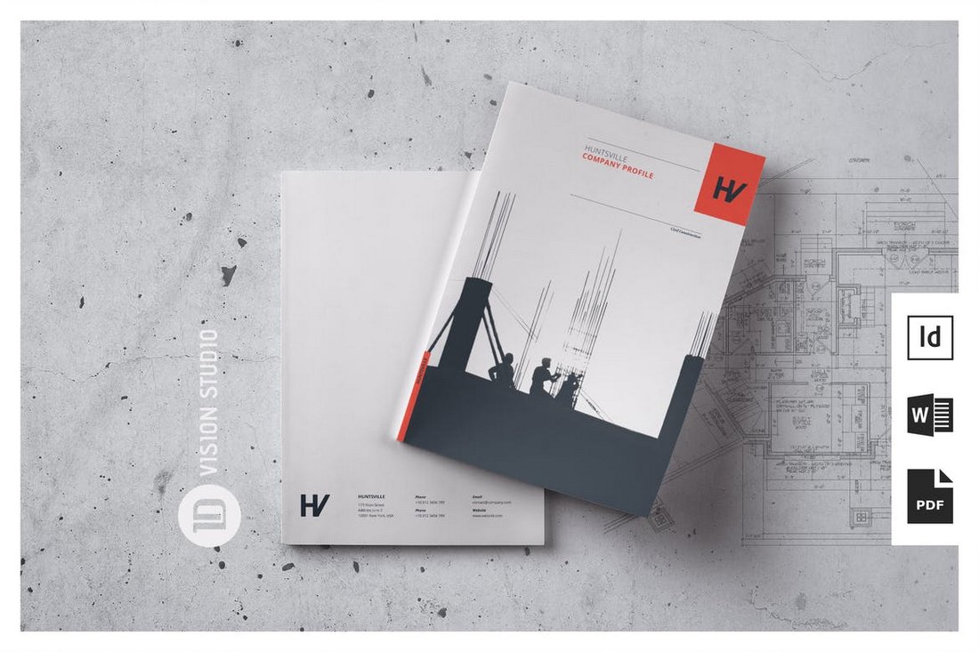
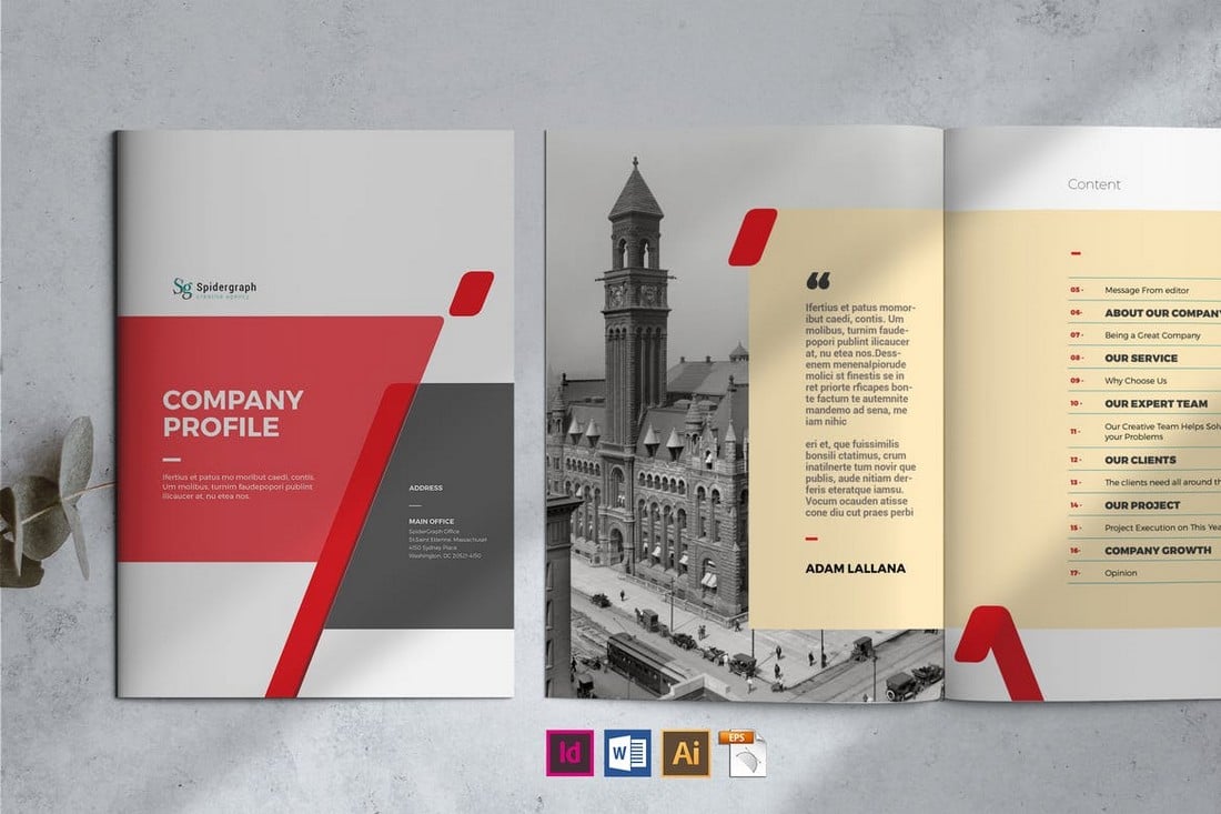
The solution’s easy enough: padding along the inside edge of the input extends its box dimensions, allowing the added space to remain interactive with visual spacing. Margin wouldn’t work since it’s akin to gap in that it pushes the element’s box instead of expanding it.

I’m linking up Jim’s article because it’s a perfect demonstration that CSS is capable of accomplishing the same thing in many ways. It’s easy to fall into the trap of “single-solution” thinking, but CSS doesn’t want anything to do with that. It’ll instead challenge you to adapt toward open-minded strategies, perhaps even defensive ones.


Sanding UI originally published on CSS-Tricks, which is part of the DigitalOcean family. You should get the newsletter.

40+ Best Training & eLearning PowerPoint Templates (Education PPTs)

Featured Imgs 23

An educated workforce is a happier workforce. That’s why it makes sense to invest in corporate training and eLearning. It’ll increase the skills, creativity and innovation of your workforce and help you keep more employees, too.

One key tool in delivering training is the presentation. Get your presentation right, and you can present important information and engage your audience.

To build presentations fast, you can use premium corporate training PowerPoint templates. You’ll find lots of free and premium training PowerPoint templates and other elearning templates across the web. In this article, we’ll share some of the best training PowerPoint templates to help you make appealing presentations.

Business Training PowerPoint Infographics

Business Training PowerPoint Infographics

This is a useful PowerPoint template for facilitating business training sessions. With over 20 unique, fully customizable infographic slides, it offers a modern, user-friendly approach to crafting informative presentations to accompany your business training and seminars.

Bentala – Employee Training PowerPoint Template

Bentala - Employee Training PowerPoint Template

Another modern PowerPoint template perfect for business training slides. With a modern, sleek design and user-friendly interface, it’s easy for anyone to produce impressive, professional-looking presentations. It includes 20 editable slides, drag-and-drop image functionality, and customizable color schemes.

Team Building Training PowerPoint Template

Team Building Training PowerPoint Template

This PowerPoint template is also suitable for training sessions, which can enhance your presentations with its sleek, modern design. Its features include 10 master slides, editable vector graphics, and a convenient drag-and-drop feature for image placement.

Online Course PowerPoint Template

Online Course PowerPoint Template

This is a thoughtfully crafted PowerPoint template for educators and online course creators. Designed for clarity and visual appeal, this comprehensive template can brilliantly outline course content, learning objectives, instructor qualifications, and enrolment details.

Team Building & Training Powerpoint Template

Team Building & Training Powerpoint Template

This is a sleek, modern PowerPoint template ideal for professional business presentations. Whether you’re pitching a startup, proposing a project, or conducting leadership training, this template is versatile, fitted with 25 editable slides and drag-drop image placeholders.

Modern Online Course Powerpoint Template

Modern Online Course Powerpoint Template

A multipurpose business presentation template, perfect for webinars, e-courses, online seminars, and much more. With its clean and professional design complemented by 36 editable slides, resizable graphics, and drag-and-drop image placeholders, it’s suitable for a variety of uses.

Lumiere – Education Course Presentation Template

Lumiere - Education Course Presentation Template

The Lumiere is a versatile PowerPoint template for various purposes such as education, coursework, technology, corporate pitches, digital marketing, start-up projects, and personal portfolios. The template’s features include 30 unique slides, editable graphics, free web fonts, and more.

e-Learning College Powerpoint Template

e-Learning College Powerpoint Template

This is a top-tier, engaging PowerPoint template tailored for educators and academic administrators. It’s ideal for presenting online learning programs at academic conferences, introducing online courses, or hosting educational workshops. This template’s professional design, high-quality graphics, and easy customization make it a great choice for anyone wishing to highlight the features and benefits of eLearning.

Human Resource Training PowerPoint Template

Human Resource Training PowerPoint Template

Take your business presentations to the next level with this PowerPoint template. Boasting 30+ unique slides in a widescreen 16:9 format, this template is versatile for various projects. With all graphics being resizable and editable, as well as an easy drag-and-drop picture placeholder, you have control over your presentation’s look.

Call Center Training PowerPoint Template

Call Center Training PowerPoint Template

This creative PowerPoint template is a uniquely designed graphic pack to elevate your presentation experience. It comes with editable charts and elements, preset color schemes, and diverse slide variations. Convenient and user-friendly, this template is ideal for illustrating every stage of your business development journey.

Employee Training Plan PowerPoint Template

Employee Training Plan PowerPoint Template

An impressive and user-friendly PowerPoint template designed to heighten business training presentations. With its unique, editable slides and preset color scheme, the template facilitates the creation of comprehensive presentations for every stage of business development.

Online Course Education Presentation

Online Course Education Presentation

This is a customizable PowerPoint template perfect for educational needs. It features a 16:9 widescreen ratio, a user-friendly master slide layout, and a complimentary font. The Eduwave template style is flexible and well-suited for both corporate and personal presentations.

Lovanda – Language Course PowerPoint Template

Lovanda - Language Course PowerPoint Template

An elegant and comprehensive PowerPoint template that helps transform your creative visions into polished realities with ease. This versatile template, perfect for numerous creative enterprises, allows you to brilliantly communicate your ideas with its 10 customizable slides, retina and full HD resolution, resizable vector elements, and more.

Business Training PowerPoint Presentation

Business Training PowerPoint Presentation

Use this PowerPoint template to streamline the creation of your slideshows, whether it’s for business training sessions or seminars. It comes equipped with editable color schemes, image placeholders, and free font, helping to elevate your content without effort.

Leadership Training PowerPoint Template

Leadership Training PowerPoint Template

This is a modern, professional, and minimalist PowerPoint template perfect for business coaches, motivational speakers, and training companies. It comes with 25 total slides, features resizable and editable graphics, and even includes drag-and-drop image placeholders.

Modern Leadership Training Presentation Template

Modern Leadership Training Presentation Template

A cutting-edge PowerPoint template designed for leadership training and business workshops. It includes 30 unique, editable slides with a light background suitable for various seminars, training events, and more.

MasterClass Training PowerPoint Template

MasterClass Training PowerPoint Template

A dynamic PowerPoint template for business training presentations. With over 30 unique, editable slides in a 16:9 widescreen format, this template allows for aesthetic coherence through its predetermined color scheme and font theme. It provides a comprehensive approach to project storytelling, catering to every phase of your business growth.

Leadership Training PowerPoint Presentation

Leadership Training PowerPoint Presentation

With a wide array of customizable, eye-catching slide designs, this PowerPoint template effortlessly meets diverse presentation needs. Its notable features include editable graphics, utilization of free web fonts, master slides-based setup, and a user-friendly drag-and-drop functionality.

Business Training PowerPoint Template

Business Training PowerPoint Template

This is a versatile PowerPoint template designed for creating professional and engaging business training presentations. It features a simple and modern theme with editable color scheme, image placeholders, and uses a free font.

Training Interview Presentation for PowerPoint

Training Interview Presentation for PowerPoint

This is the perfect PowerPoint template for constructing impressive training presentations effortlessly. Suitable for businesses, agencies, and training companies, this template will elevate your training programs in a professional way.

Jobtrain Training PowerPoint Template

training powerpoint template

Jobtrain PowerPoint template combines various design aspects and usability to make your company profile presentation more engaging. Inside the pack, you’ll find a smorgasbord of infographics, vectors, charts, and layouts that you can use inside your presentation.

Learnic – Training PowerPoint Template

training powerpoint template

This is a well-designed and modern training presentation template. It’s great for teaching and training. The team training template PPT comes with over 100 slides you can work with. You can also use the included maps, charts, and other graphics.

Ronald – Training PowerPoint Template

training powerpoint template

Roland is a professional, clean, modern, and easy-to-use presentation template. It can be used for various purposes. Roland offers you amazing convenience in terms of replacing images and fonts. Make your clients feel satisfied with this presentation template.

Time Management Training PowerPoint Template

training powerpoint template

This is one of the best PowerPoint templates for training, thanks to its crisp, minimalist design. The time management training template set includes 12 PowerPoint files and more than 60 slides. Add the finishing touches to your presentation with built-in icons and handmade infographics.

Yogadu – Training PowerPoint Template

training powerpoint template

Yogadu is an easy-to-edit set of training PowerPoint templates via drag and drop. The training template set includes 80 different slides and 10 color schemes. There are many different business templates and charts with editable shapes.

Arthur – Training PowerPoint Template

training powerpoint template

This set of corporate PowerPoint templates includes more than 60 unique training slides. There are editable charts and diagrams, making it easy to include data in your business training. This training PPT is attractive, well-designed and well-supported.

Professional Training PowerPoint Template

training powerpoint template

This is a responsive PowerPoint training template with a clean, professional design. The template set has more than 50 slides and will match your branding with unlimited colors. It also includes a variety of infographic elements such as charts and timelines, as well as editable vector icons.

Clean Training PowerPoint Template

training powerpoint template

This PowerPoint training template is a fun contemporary choice for your next presentation. This download comes with 40 unique training slides and layouts. These slides are also easy to edit and customize. Take advantage of the device mockups to help illustrate your points.

eLearning PowerPoint Template

training powerpoint template

Here’s a cool training presentation focused on education. It comes with unique slide layouts, image placeholders, and it’s based on master slides. It has plenty of white space, making it easy for your audience to follow your points. This template is perfect for your next training presentation.

Online Education PowerPoint Template

training powerpoint template

Design your presentation template quickly with this ready-made E-Learning PowerPoint Template. It has many slide layouts to choose from with stock photos and techy graphic design elements. What is the best part? You can redesign this presentation template quickly. You just have to download it, edit the content, and wow our audiences.

Versatile Training PowerPoint Template

training powerpoint template

This PowerPoint training template set is designed for online courses. It’s got an eye-catching design and includes animations. There are 51 training slides in the set. It’s easy to change colors to match your chosen color scheme with a single click. Free eLearning templates for PowerPoint usually don’t have these features.

Webinar & Ecourse PowerPoint Template

training powerpoint template

This template for Microsoft PowerPoint is a modern and sleek presentation that will give a boost to your business meetings and lectures. It contains 46 beautifully designed slides that can be easily edited and adjusted to suit all of your professional and business needs.

Online Training PowerPoint Template

training powerpoint template

This simple, elegant eLearning PowerPoint template has a clean design to suit any kind of training. It includes 50 slides that are designed and easy to edit with drag and drop. The training template PPT includes vector icons.

Online Class PowerPoint Template

training powerpoint template

This training PowerPoint presentation template will help you deliver in an online classroom. The slide deck’s layout is minimal and stylish. University also includes more than 42 unique training slides. Features like image placeholders and master slides make this an easy template to customize. It’s hard to find a training PPT template free download that can say that.

Online Training Course PowerPoint Template

training powerpoint template

Now you don’t need to spend time preparing complicated slides. Just download this presentation and replace text and images in a few clicks. It provides you with more time preparing your speech.

Elearn – Training PowerPoint Template

training powerpoint template

This training PowerPoint template comes with 16 slides. It also includes infographic elements. Use it for business training or eLearning.

iCourse – Training PowerPoint Template

training powerpoint template

This training and development PPT template is great for many subjects. If your training relates to sketching or designing, the slide templates are already set up.

Hi- Learning – Training PowerPoint Template

training powerpoint template

If you need to talk timelines, this training presentation template has the graphics you need already built in. All you’ve got to do is edit the included example, and you’re good to go.

Professional Training PowerPoint Template

training powerpoint template

This is another free Microsoft Office template featuring images of education. It’s simple to edit fonts and colors to make the training template PPT your own.

Laqu – Training PowerPoint Template

training powerpoint template

Laqu is a simple training PowerPoint template with a dark background. The dark background is suitable for many purposes, including corporate training. This technical training PPT includes 25 editable slides.

Webflow vs Squarespace: Which Website Builder Should You Use?

Featured Imgs 23

Squarespace dominated the online website-building market for quite a while. Now, more platforms, such as Webflow, are offering competitive features and functionality, challenging Squarespace and other platforms.

One of the biggest complaints Squarespace users had was its limited customizability. Webflow aims to solve that problem but at a cost.

Today, we take a closer look at these two giant platforms to see which is best. Both Webflow and Squarespace come with unique features that set them apart from each other.

Which website builder should you use to build your website? Is Webflow better than Squarespace? Which platform offers the best benefits at the right price? Let’s find out.

What is Webflow?

webflow

Webflow is a powerful website builder that allows users to easily design and build custom websites using its easy-to-use “visual website builder”. Webflow is much more flexible and customizable than most other website builder platforms.

Webflow offers features more appealing to designers where you get to create your own custom website design from scratch without coding. In fact, Webflow even has a Figma plugin that lets you convert your static designs into functional web pages.

The platform also has templates and a page builder for quickly setting up basic websites and landing pages as well, allowing users without design experience to easily make their own websites.

Best Features

Let’s look at some of the main features of Webflow.

Make Websites from Scratch

webflow designer

Webflow’s Designer tool is the highlight of the platform. Unlike page builders, this Designer tool allows you to create your own website design from scratch using a blank canvas.

It allows you to code a website with HTML, CSS, and JavaScript using a visual designer, without writing any code. You can simply drag and drop elements onto the canvas to build and customize even the tiniest detail of each web page.

Webflow’s Interactions tool also helps you to add animations and interactions to your designs, without having to write code.

The Designer tool is most suitable for web designers and developers for quickly transforming their static designs and sketches into functional websites with zero coding.

Use Templates to Build Websites

webflow page builder

For users who are not familiar with making websites from scratch, Webflow offers a page builder that can be used in combination with templates.

This tool works the same as most other page builder platforms by allowing you to choose a pre-made website template and customize it to your preference. And it offers a much more simplified way to make a website for people without web design experience.

Built-In CMS

webflow cms

The built-in Content Management System (CMS) makes things much easier to manage all of your website’s content in one place. Since it’s integrated into the Webflow’s Designer, you can even edit and customize CMS content visually.

For advanced users, Webflow’s headless CMS APIs will offer more ways to build complex websites by connecting it with third-party platforms.

More Than 1,500 Templates

webflow templates

Webflow has a massive library of over 1,500 pre-built website templates that are available in many different categories. There are templates for every type of website from portfolios to agency websites, landing pages, one-page websites, and more.

eCommerce and Localization Support

The platform includes a complete eCommerce platform for building online stores and selling products. It supports selling both digital and physical products.

With Webflow’s Localization support, you can also distribute your website in different languages to target audiences around the world.

Figma to Webflow Plugin

Webflow offers a very useful plugin for web designers who use Figma. This plugin allows you to fully transform your static website designs into web pages with just a few clicks. It not only helps save you time but also empowers designers with a code-free website-building system.

Pricing Plans

Webflow has a slightly complex pricing system. Each pricing plan has limits to how many pages and CMS items you can have on your website. As well as limitations on bandwidth and form submissions.

The $14 per month plan allows you to make a website of up to 150 pages but it doesn’t let you host any content on the CMS and only offers 10GB of bandwidth. To access the CMS, you can switch to the $23 per month plan.

The $39 per month plan lets you host up to 300 pages and lets you host up to 10,000 CMS records with 100GB bandwidth.

There is also a free plan with very limited features.

What is Squarespace?

squarespace

Squarespace is one of the most popular website builders available, which is used by 2.1% of all websites on the web. The platform is a popular choice among all sorts of businesses and professionals for its ease of use and affordable pricing plans.

Squarespace comes with a very easy-to-use drag-and-drop website builder, which you can use to customize its templates and build basic websites for everything from restaurants to barber shops, photography portfolios, and more.

Using Squarespace is simple as it allows you to build a complete website in just a few steps. And that’s what makes this platform most appealing to a wide range of audiences.

Best Features

These are some of the benefits you get with Squarespace.

Beginner-Friendly Website Builder

squarespace editor

When using Squarespace, you must choose a template to build your website. Unlike Webflow, you can’t make a website from scratch. However, that makes the process much easier for beginners.

After choosing a template for your website, you can fully customize it using the drag-and-drop editor. It’s very straightforward and lets you make any type of website without having web design or coding knowledge.

Build Websites Using AI

squarespace ai

Squarespace also introduced AI-powered features to the platform. Dubbed Design Intelligence, this AI system allows users to setup a website with the help of AI, making the process easier than ever before.

The AI system, however, does not build complete websites. You still have to add some human touch to customize the layout, color themes, and other elements of the website. You can also use this AI to write your website copy, blog posts, emails, and more.

Squarespace Fluid Engine

squarespace fluid engine

Squarespace recently introduced a new system for building more customizable websites. They call it the Fluid Engine and it offers a platform similar to Webflow’s Designer to allow you to edit and customize every element of the website design. It’s available on Squarespace 7.1.

Hundreds of Pre-Built Templates

squarespace templates

Squarespace templates library offers hundreds of different website layouts in several different categories. You can use them to build all kinds of websites.

However, most of the templates available have basic layouts and some even have slightly outdated designs.

eCommerce and Marketing Tools

You can use Squarespace to setup a basic online store to sell your services, subscriptions, and even digital products. While it’s not the best platform for hosting large-scale online stores, Squarespace offers enough features to setup a small business website with a shop on the side.

Additionally, you will also have email marketing and SEO tools for optimizing your promo campaigns and generating traffic to your website.

Pricing Plans

Squarespace pricing plans start at $16 per month, which includes a free custom domain name and the ability to accept payments.

The $23 per month plan includes access to the eCommerce tools for setting up an online store. The $28 per month and $53 per month plans extend these features for building more advanced websites with merchandising, subscriptions, and other functions.

Webflow vs Squarespace: Which is Best?

The biggest difference between Webflow and Squarespace is ease of use. Squarespace offers a much more streamlined process for easily and quickly building websites without any design or coding experience.

Webflow, on the other hand, takes it a step further by giving you a visual designer to craft websites from scratch and truly customize each element on the web pages to your liking.

Simply put, Squarespace is most suitable for users looking to setup a basic website for their business without effort. Webflow is most suitable for advanced users and designers who wish to create custom website layouts of their own.

If you’re a freelance designer or marketer, go with Webflow. If you’re a small business or a professional looking for a place to host your portfolio, use Squarespace.