If you’re looking to supercharge your design workflow this year, updating your Lightroom presets with a new, powerful collection is a good idea! Lightroom presets let you instantly fix, improve, and enhance your photos with a single click. And we’ve found the perfect set of presets just for you.
Having the right set of Lightroom presets can be a huge time-saver for designers. Everything from retouching portrait photos, to adding stunning visual effects, enhancing interior photos, optimizing HDR photos, adding retro effects, and much more is possible with the Lightroom presets we’ve included in this list.
We’re also answering the most common Lightroom preset FAQs, to help you learn more about presets, use them on desktop or mobile, and more.
What Is A Lightroom Preset?
For beginners, photo editors without a lot of time, or designers that want to create a consistent visual style for imagery, a Lightroom Preset can be a great alternative to manual editing.
A preset is a free (or paid) add-on that comes with pre-determined settings for some of the different features in Lightroom. A preset has all the settings ready to create a certain type of visual with just one click. They can save photographers, editors, and designers a lot of time while helping maintain a consistent visual style.
Need a hand getting started? Our guide on how to install and apply a Lightroom preset is a great place to begin.
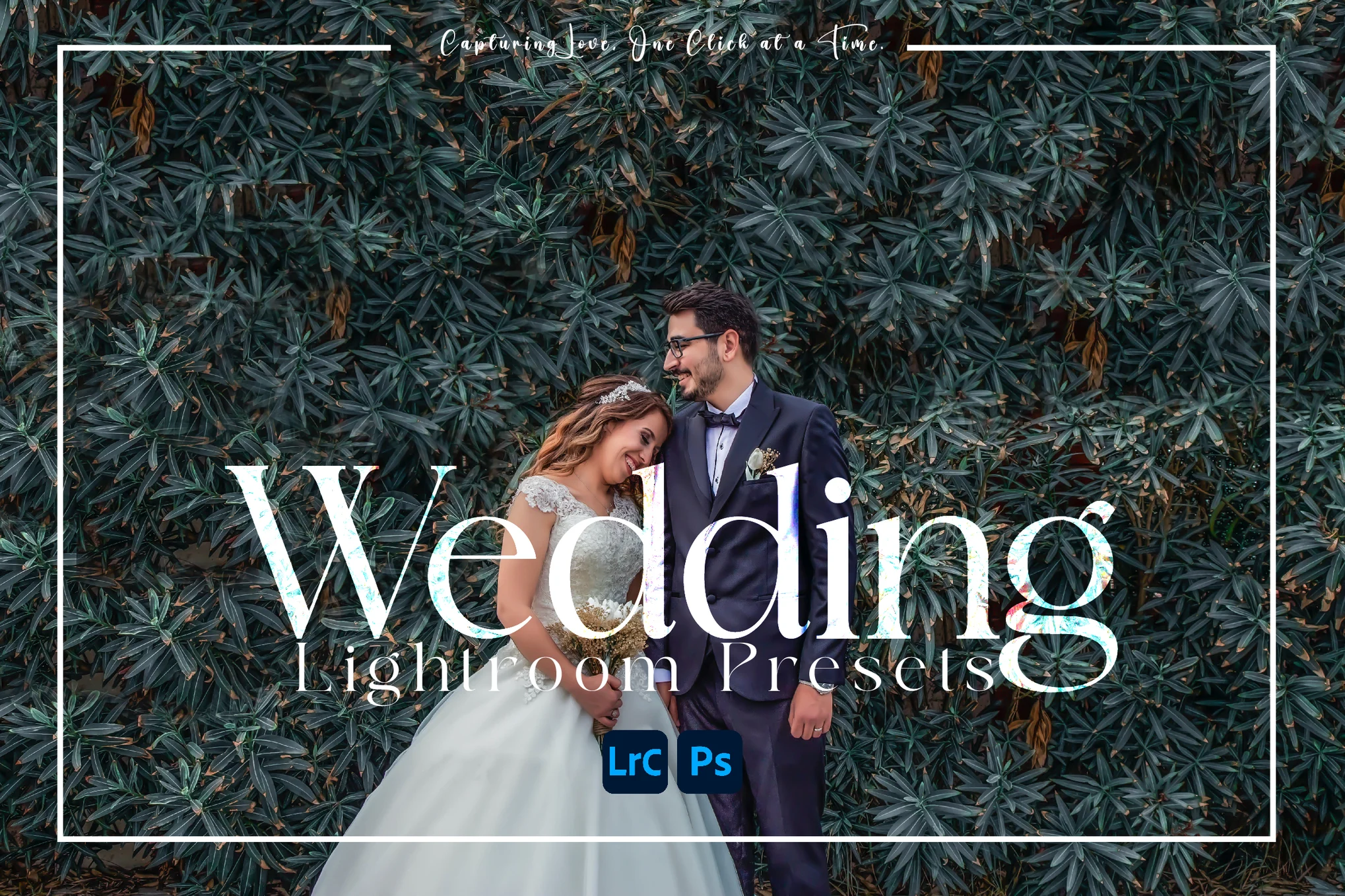
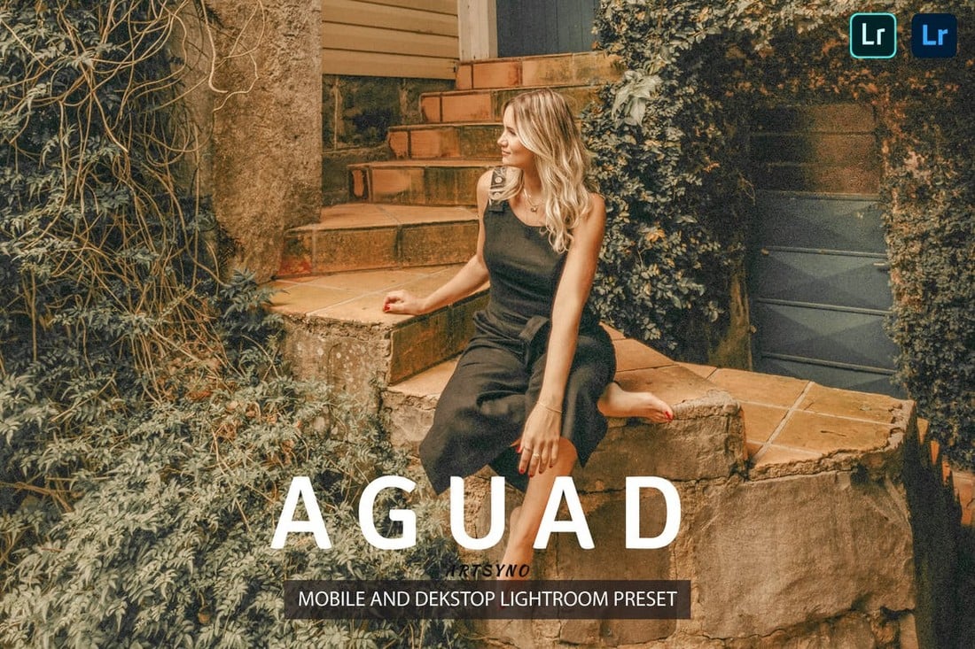
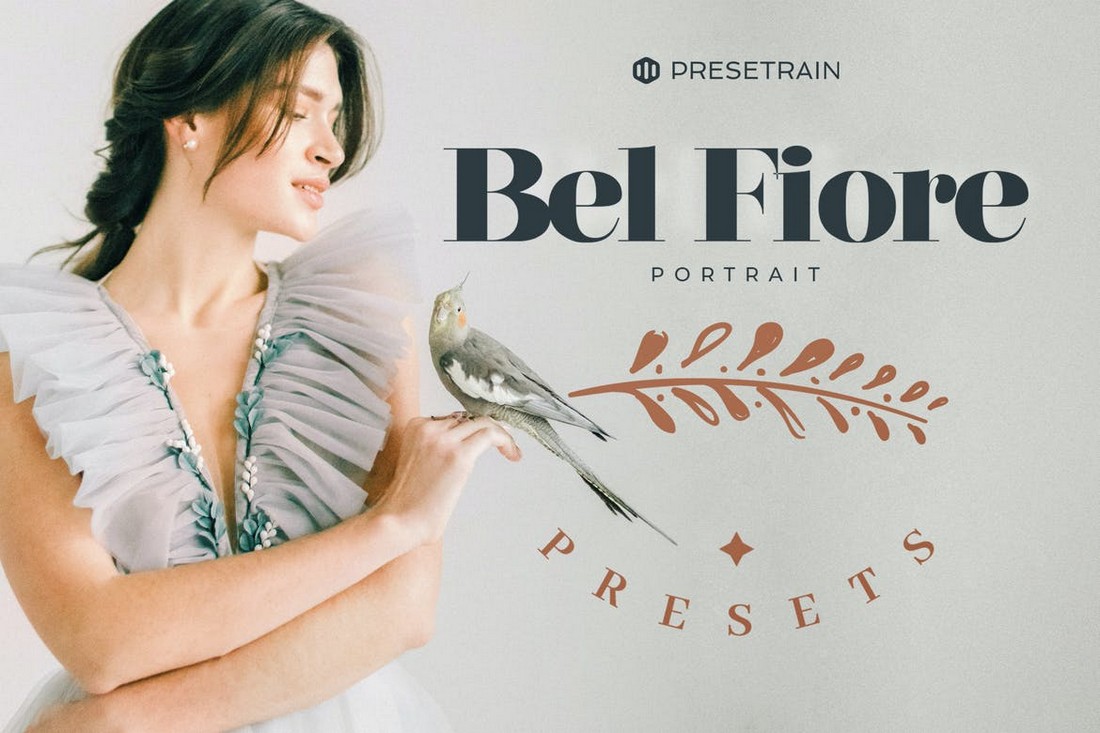
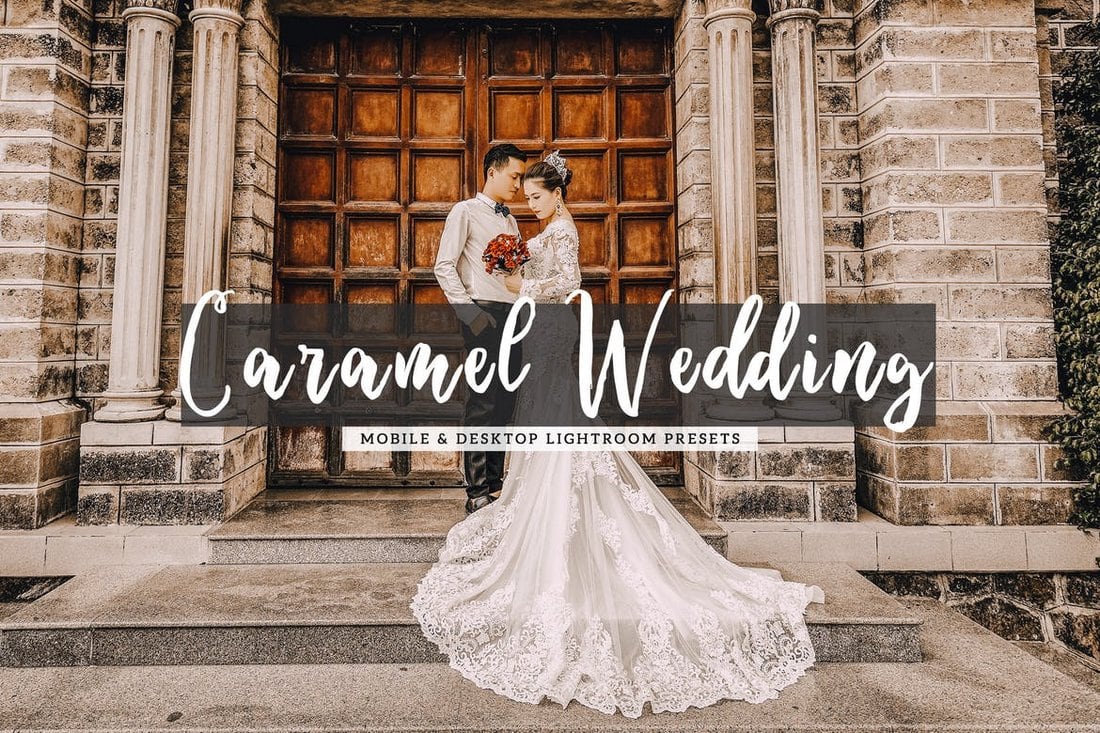
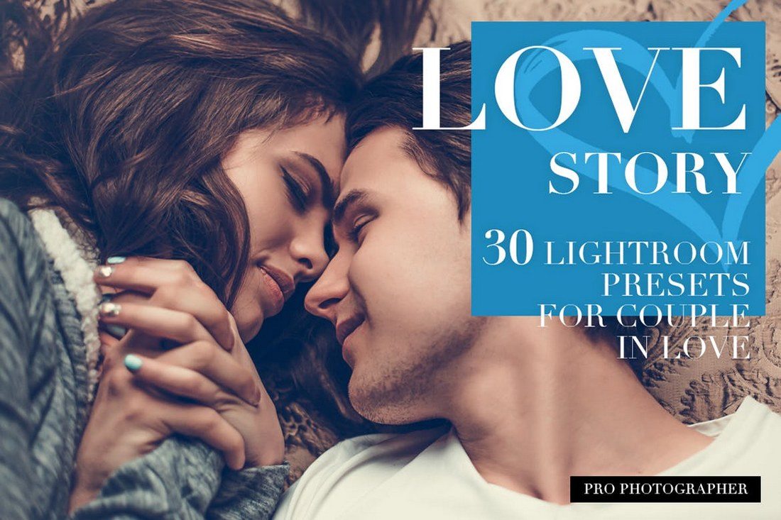
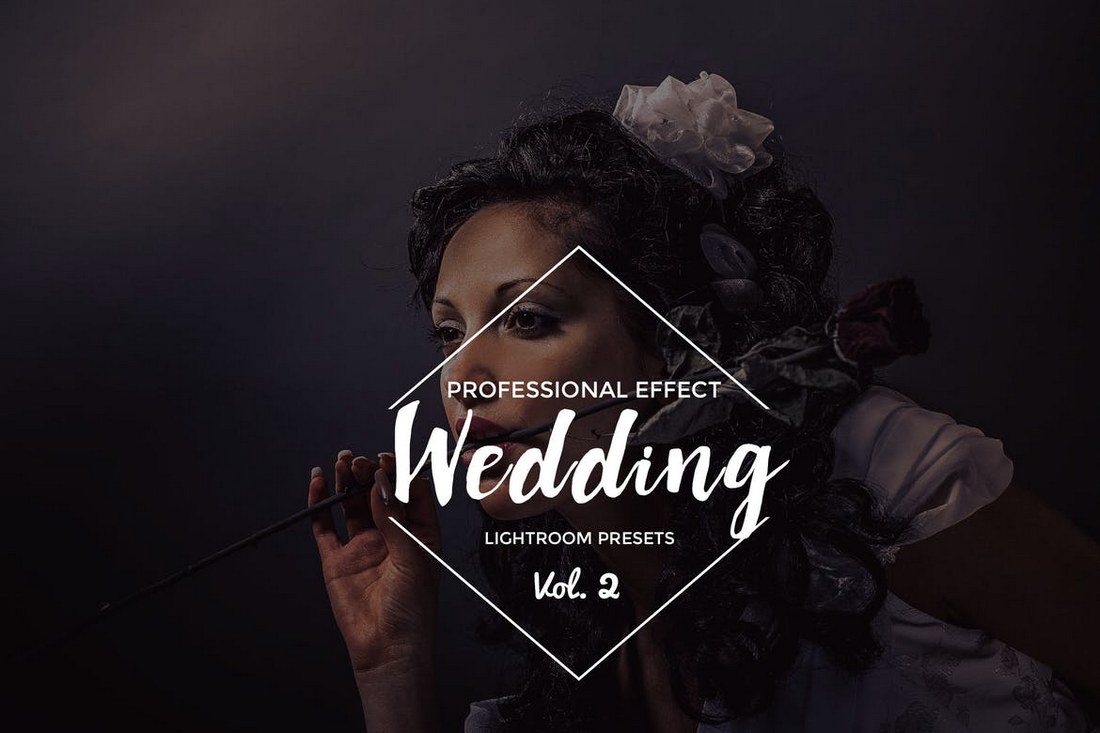
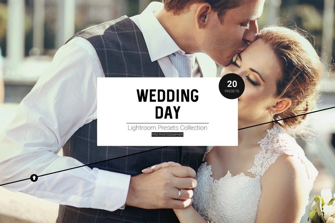
This collection of Lightroom presets is carefully designed to transform your wedding photos into meaningful narratives of your love story. Perfect for adding an authentic touch to your special day, these presets elevate your photos with warmth and elegance. The package includes 10 fully adjustable presets compatible with Adobe Lightroom 4-7, Classic, and CC.
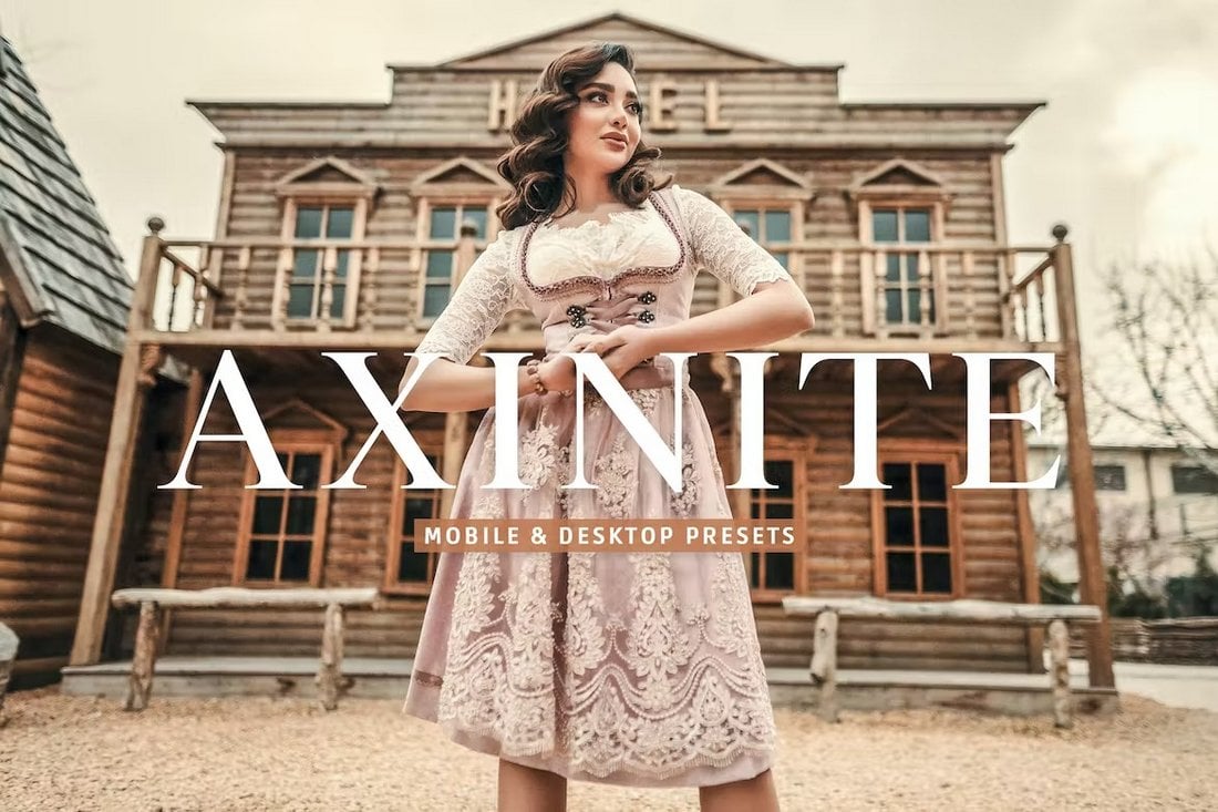
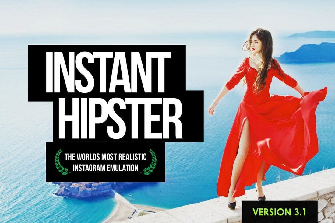
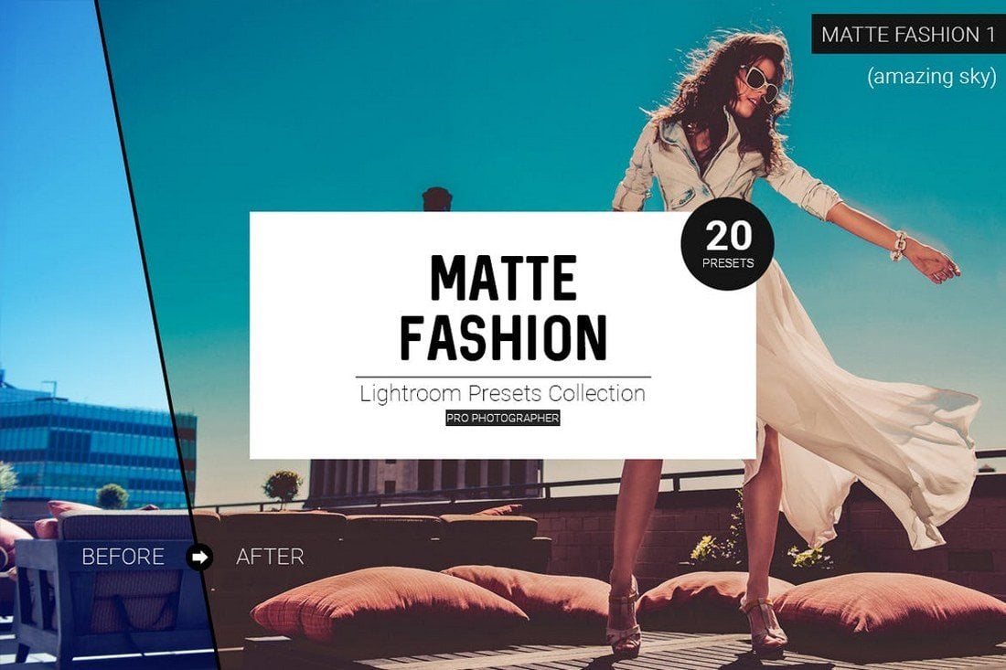
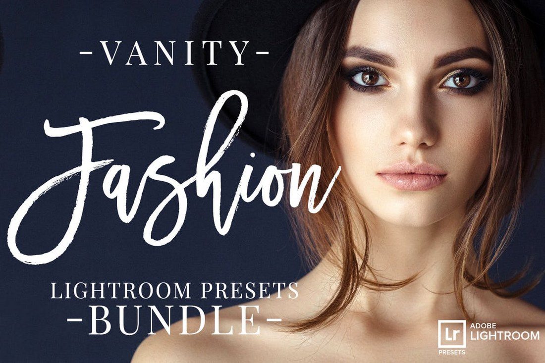
This pack of Lightroom presets is ideal for enhancing photography, fashion, or lifestyle-based content. Perfect for consistent Instagram styling and enhancing image quality, they are compatible with both mobile and desktop versions of the free Lightroom app and work with a variety of phones and professional DSLR cameras.
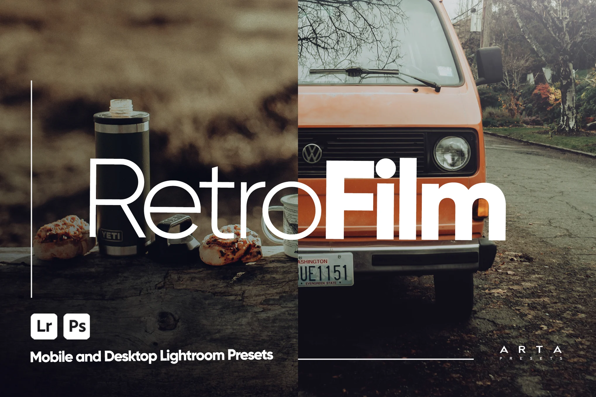
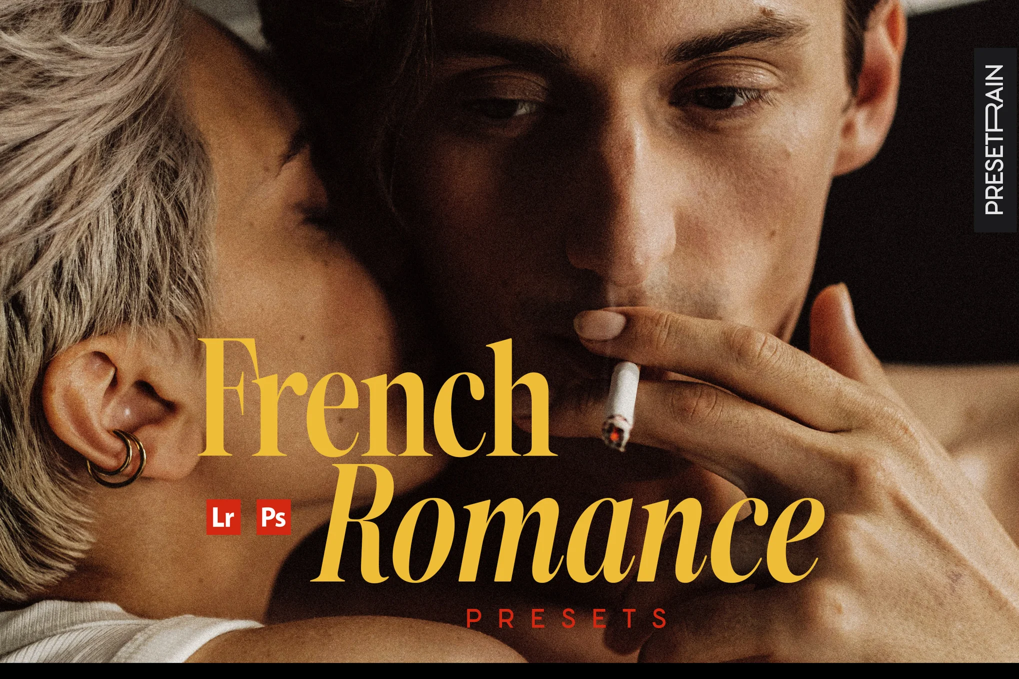
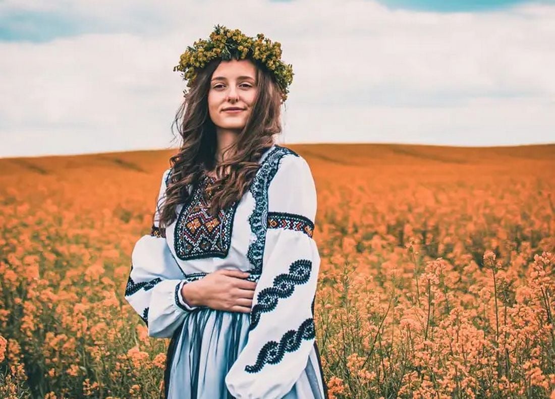
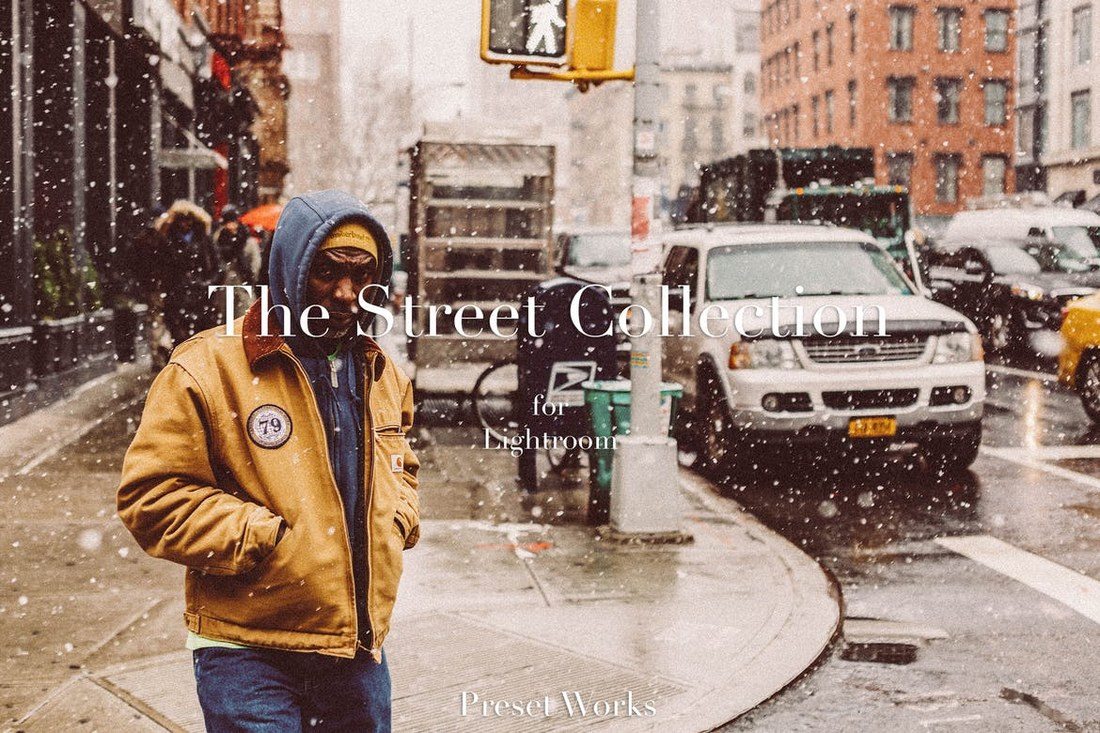
These Lightroom presets offer an uncomplicated approach to creating an artistic, film-like aesthetic in your photography and video editing. With a touch of French romanticism and fine grain detail, these presets are ideal for portraits, editorial photography, and social media content. Compatible with various software, including Lightroom, Photoshop, and DaVinci Resolve, and more.
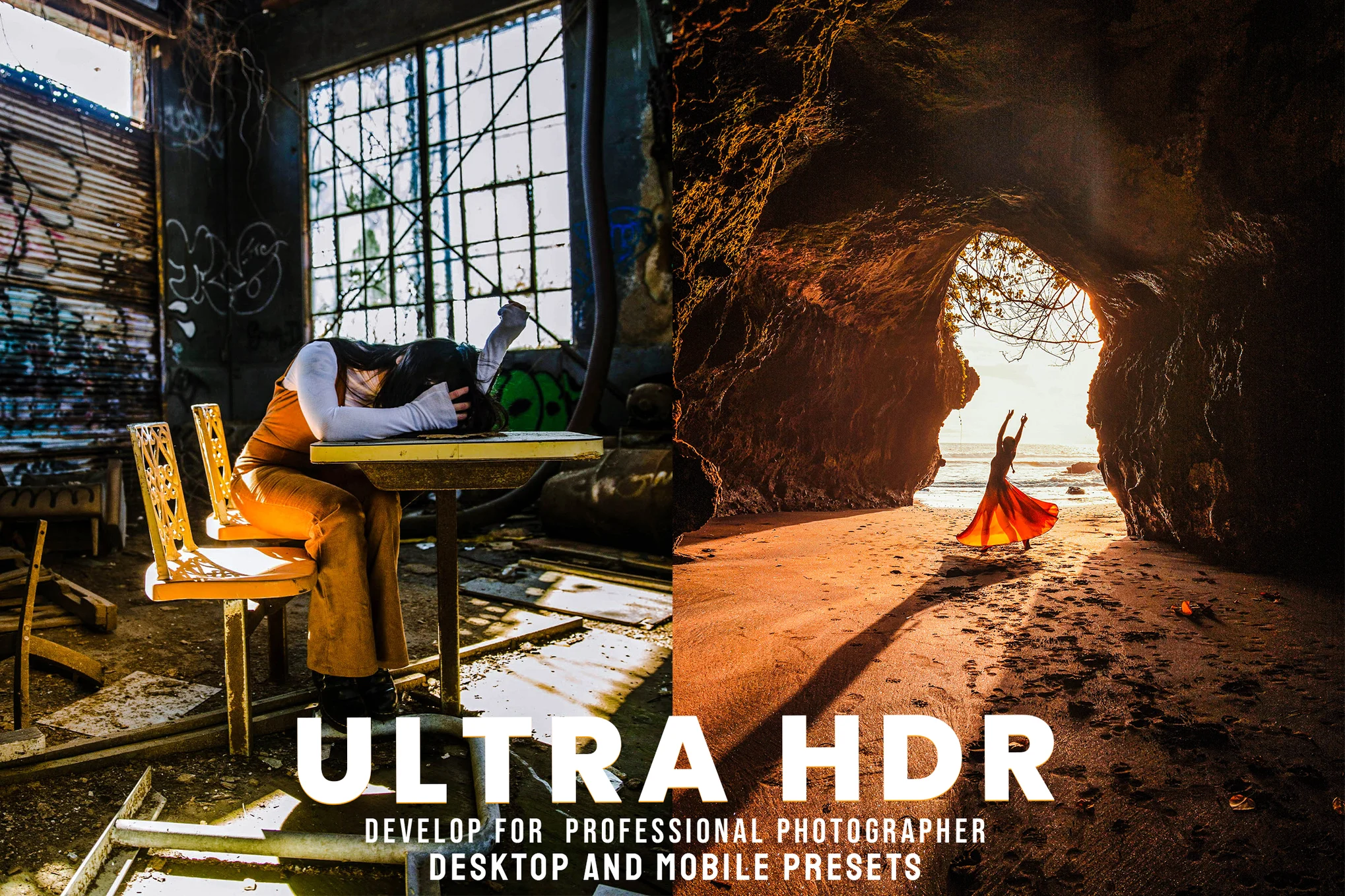
Ultra HDR is a collection of expertly developed Lightroom presets provided by seasoned photographers and designers. Perfect for improving a variety of photography styles including portrait, lifestyle, travel, and fashion, these presets are compatible with various Lightroom and Photoshop Camera Raw versions.
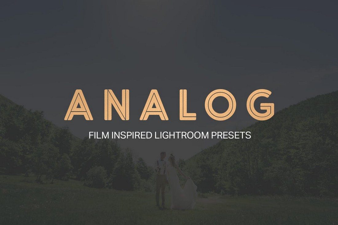
This collection of presets is designed to give your photos a filmic quality. Inspired by the movie industry, these user-friendly presets easily add emotion and relevance to your images, creating a distinctive and engaging look. The presets offers both simplicity and flexibility, making the post-processing of your photographs an effortless task.
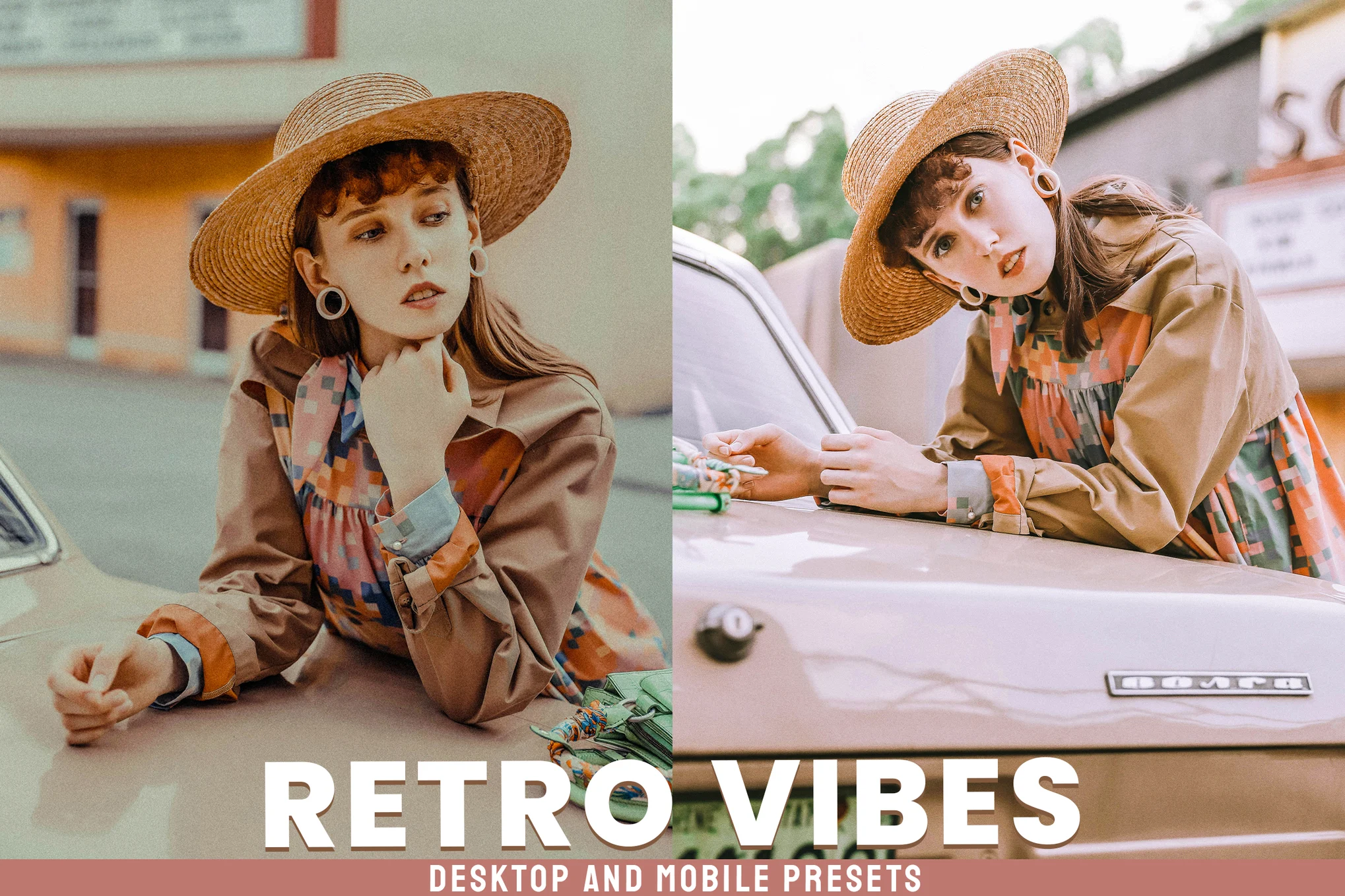
Retro Vibes Lightroom presets are designed to enhance your photos, whether they’re portraits, lifestyle, travel, or fashion images, giving them a stylish, vintage appeal reminiscent of popular Instagram aesthetics. The package comes with 30 presets compatible with different versions of Adobe Lightroom.
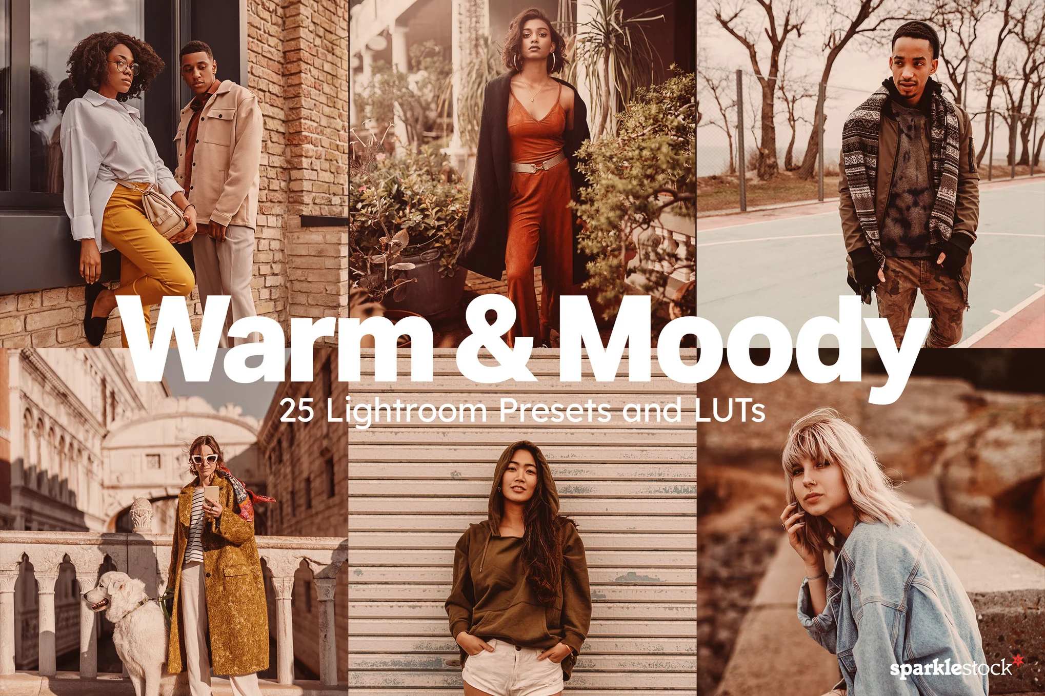
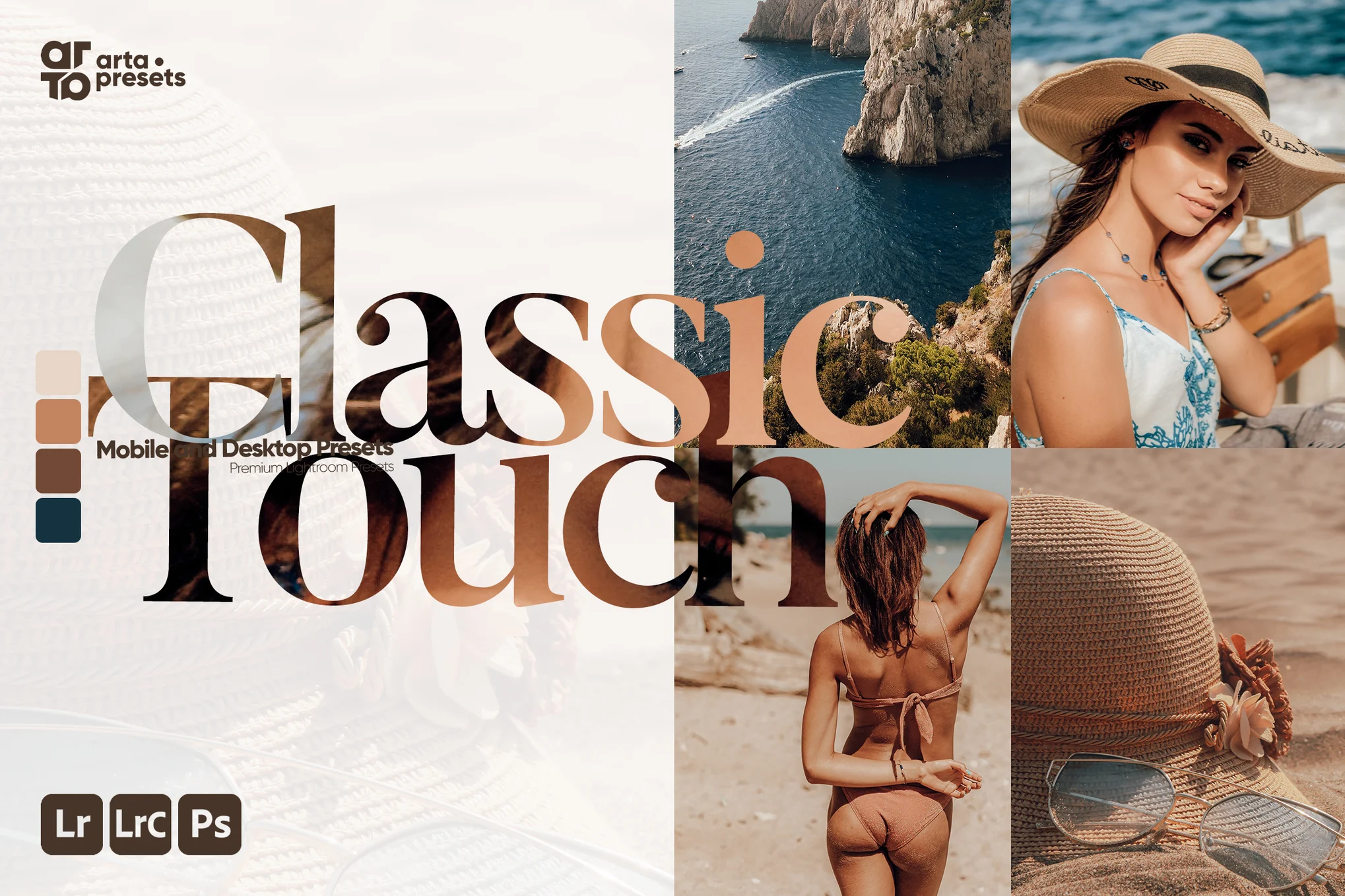
This is an essential bundle of Lightroom presets for photographers seeking to add depth to their images with warm, moody tones. These presets, available for both desktop and mobile, safeguard skin tones for natural-looking portraits. Additionally, they come with 25 LUTs (with various file types included).
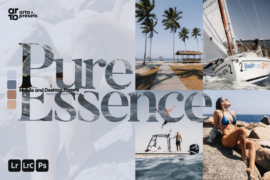
Pure Essence Lightroom presets pack is deal for lifestyle bloggers, photographers, and fashion enthusiasts, these presets provide modern, stylish colors to elevate your Instagram feed. They’re compatible with both mobile and desktop versions of Lightroom and come with a helpful text-based tutorial for easy setup.
This Lightroom presets collection is perfect for enhancing your photos, regardless of whether you’re a travel, fashion, lifestyle blogger or just someone aiming for high-quality photos. Compatible with both mobile and desktop Lightroom versions, these presets are tested across different devices, from phones to DSLRs.
This is a creative Lightroom preset collection that can significantly enhance your photos. Developed by professional photographers and designers, these presets are ideal for a range of genres including portrait, lifestyle, and travel photography. Included in the package are 10 presets.
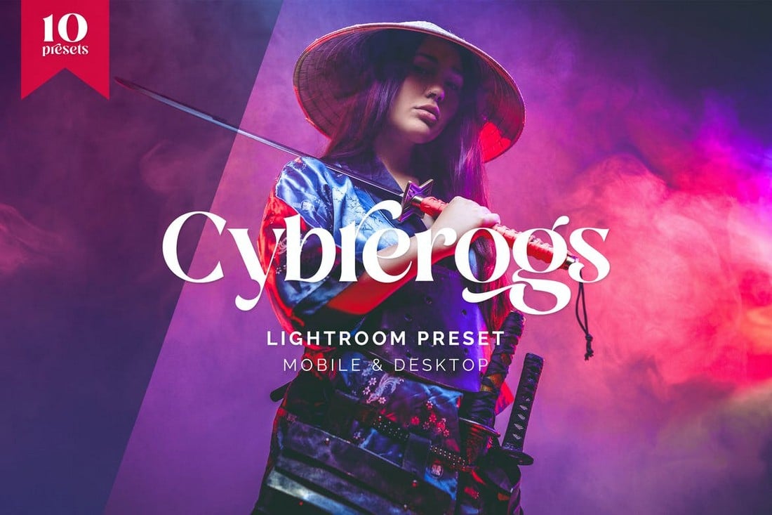
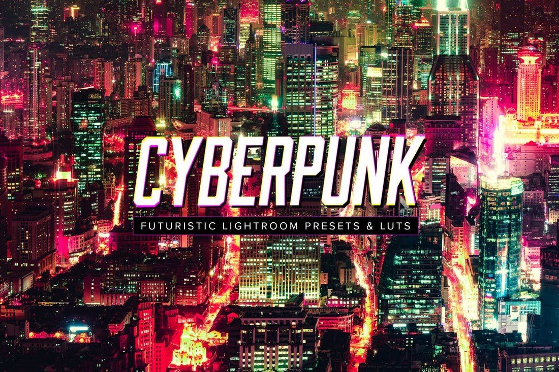
Are you looking for a way to give a Cyberpunk-style neon-colored look to your photos and graphics? Then this Lightroom preset is made just for you. It features a colorful cyberpunk effect that will completely transform your photos. You can also choose from 10 different variations of the effect.
You can use this Lightroom preset to make your portrait photos look more professional and add a bit of elegance. It includes 8 different effects that you can use in both Lightroom desktop and mobile apps.
If you’re a fan of Instagram filters, you’ll instantly fall in love with this set of Lightroom presets. It features 10 presets with various styles of effects that add beautiful Instagram-style filters to your photos. You can also customize and optimize the effects to your preference.
With this Lightroom presets kit, you can add a dark and moody look to your outdoor photography. There are 10 Lightroom presets in this pack featuring different variations of the effect that works well for both portrait and landscape photos.
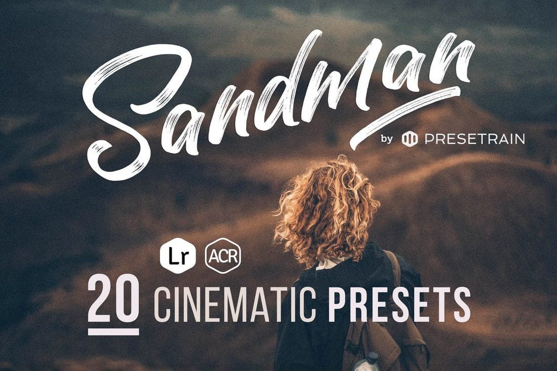
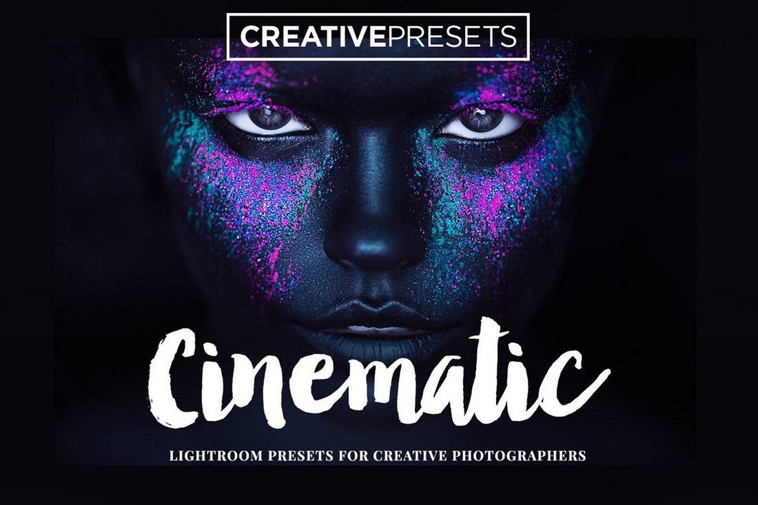
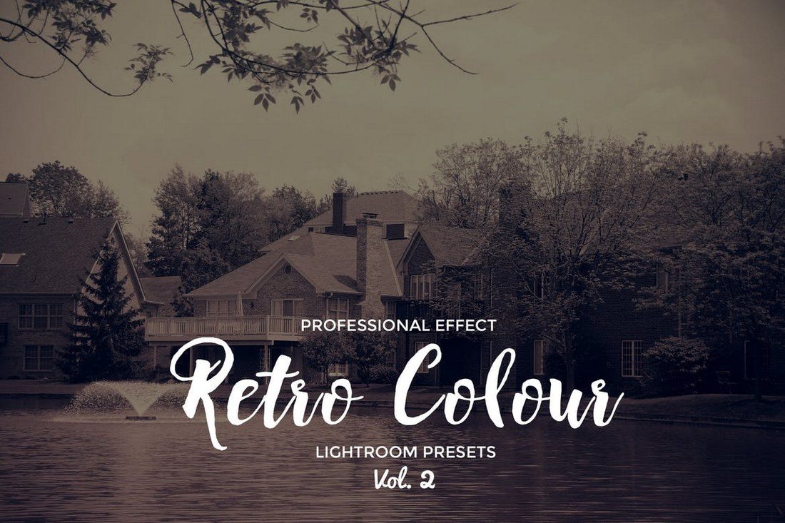
This is a free Lightroom presets that has a very professional effect. It lets you add a cinematic look and feel to your photos. It’s especially suitable for outdoor photos as it creates a subtle warm toning effect.
Adding a gloomy matte film look is sometimes the perfect way to bring out the right tone in your photography. This collection of Lightroom presets will help you achieve that goal. It includes 4 unique matte film presets.
Add bright and warm tones to your outdoor photography with this beautiful Lightroom presets collection. There are 4 different presets in this pack for both Lightroom desktop and mobile apps.
Bring out the colors in your photos to make them more vibrant with the help of this Lightroom presets collection. It features 13 creative effects for enhancing photos taken in various conditions, including nighttime photography.
The beautiful earthy tones in this Lightroom presets collection will transform your photos with an elegant and romantic feel. It’s ideal for wedding photography as well as for romantic couple photos. There are 6 different Lightroom presets in this bundle.
This Lightroom preset pack includes 6 clean and simple filters that are ideal for enhancing your indoor photography. They will simply make your indoor photos look just as good as a stock photo. The presets are compatible with both desktop and mobile versions of Lightroom.
A unique Lightroom preset that adds a classic grainy film look to make your photos look more nostalgic. It’s ideal for enhancing photos for magazines as well as for Instagram. There are 2 different presets in this pack.
Matte Blogger is a collection of Lightroom presets specially designed for Instagram bloggers. It has 10 different presets featuring matte-style filters for instantly enhancing your photos. It works with Lightroom desktop and mobile apps.
If you want to enhance your outdoor photography to make them look more professional, make sure to grab this Lightroom presets bundle. It comes with 20 different presets that are most suitable for improving outdoor, nature, and landscape photography with muted colors and desaturated looks.
You can download this Lightroom preset for free to enhance your portraits and selfies before posting on Instagram. It features a cinematic filter with an orange and teal-style colorful design.
This Lightroom presets collection is all about vibrant colors. It includes multiple presets for making your portrait and outdoor photos look more colorful. The effects are non-destructive and fully customizable as well.
This is a free Lightroom preset you can use to add a dark and moody look to your photos. It’s ideal for both portrait photos and various graphic designs. It’s designed to enhance the reds while muting other colors.
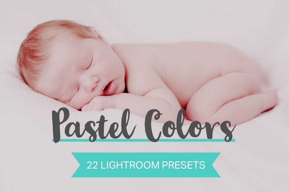
Dark Coral is a collection of beautiful Lightroom presets that feature bright pastel color effects. These are ideal for enhancing your selfies and outdoor photos. There are presets in this pack for both Lightroom desktop and mobile apps.
You can make your fashion and lifestyle photos look much prettier with these Lightroom presets. They have pink color effects with bright highlights that are perfect for Instagram selfies, fashion photoshoots, and trendy promos.
The Lightroom presets in this bundle are designed for adding a bold and dark look to your photos. It includes 4 unique presets for improving your outdoor and travel photography. The presets are compatible with Lightroom mobile app as well.
This Lightroom presets pack includes a set of unique effects for adding a moody look to your portrait photos. It works especially well with outdoor photos too. There are 13 presets in the collection with mobile and desktop versions.
You can download this vintage-themed Lightroom preset for free. It features a warm color tone for adding a nostalgic look to your photography. The preset is easily customizable as well.
This is a collection of Lightroom presets specifically designed for improving portrait photos. The pack includes 14 different presets featuring subtle and airy effects that transform the look of your photos. Each preset is fully adjustable as well.
Give your photos a cinematic vintage film look using this bundle of Lightroom presets. It comes with 20 different presets that work well with both portrait and landscape photos for adding a stylish vintage look and feel.
If you’re a travel photographer, this bundle of Lightroom presets will surely come in handy. It includes 5 unique presets that are designed for enhancing landscape photos. The presets are available in both Lightroom desktop and mobile versions.
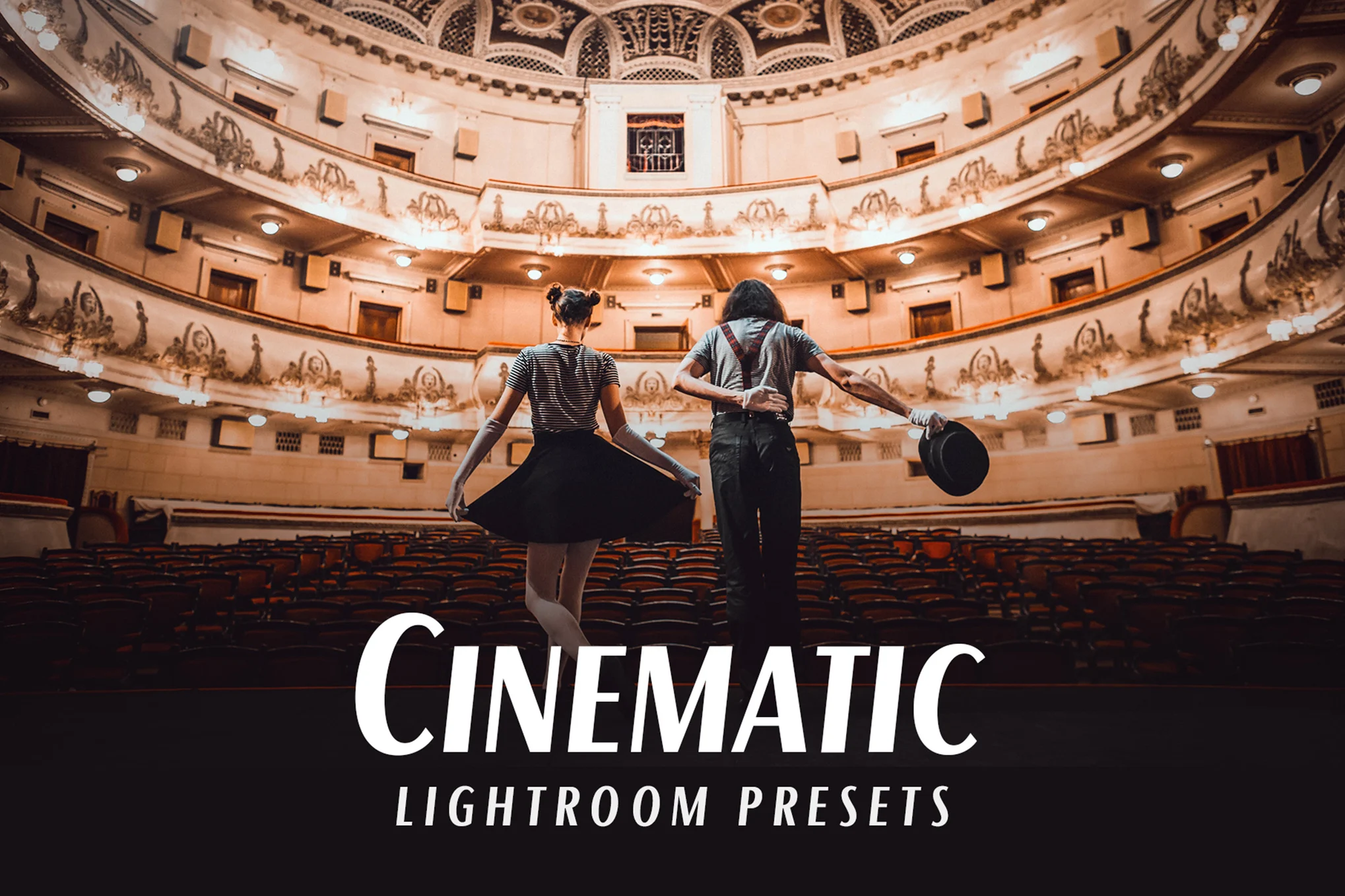
Add a gritty cinematic look to your portrait and landscape photos using this bundle of Lightroom presets. It includes 20 different presets in 4 different categories. It also comes with LUTs for improving your color grading process.
Inspired by Instagram filters, this collection of Lightroom presets feature a unique effect that makes your photos stand out from the crowd. It’s ideal for adding a subtle moody vibe to your portrait and landscape photos. The presets are compatible with Lightroom mobile and desktop apps.
This is a free Lightroom preset you can use to optimize your outdoor portrait photos. It features a light balancing effect that gives your photos a bright and airy look and feel.
Looking for a Lightroom preset to add a vintage nostalgic look to your photos? Then grab this presets bundle. It includes 20 unique Lightroom presets featuring customizable filters. As well as LUTs for color grading.
This collection of Lightroom presets are perfect for enhancing the colors of your photos to make them truly pop. It includes 13 presets you can use with both Lightroom desktop and mobile apps. There are Photoshop CameraRaw XMP files as well.
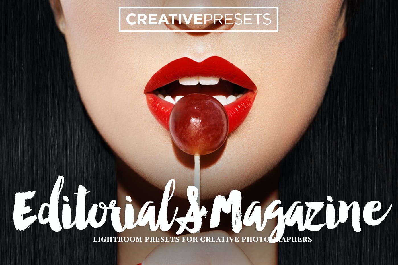
Achieve a professional editorial magazine-style look in a couple of minutes with this set of 30 Lightroom presets carefully crafted for photographers and graphic designers. The presets are non-destructive helping you retain 100% of the original images.
If you are wanting to bring a stunning light effect to your vintage pictures, this collection of 25 light leak Lightroom presets will help you do just that. Each preset has been lovingly designed to make sure your photos become Instagram-worthy in just a few clicks.
Make the pictures of your special day look all the more special with Beauty Bride, a bundle of Lightroom presets that will transform the look and feel of your wedding day photographs. The presets are versatile and can also be used for lifestyle, food, travel, newborn, and fashion photography.
Bring vibrant, dreamy, and aesthetic tones to the page with this collection of Aurora Lightroom presets, a great choice for virtually any kind of photo. The best part is that it’s available for free download. Get your hands on it now!
Needing to achieve a dark, gloomy, desaturated, black, or moody look? Check out this collection of gothic Lightroom presets that help transform your pictures into magical fantasy artworks. One of the best Lightroom presets on our list!
Grab this bundle of Lightroom presets ahead of the holiday season to prepare for all the snowy and Christmassy photos. It includes 12 presets that are made for improving outdoor portrait photos.
This free Lightroom preset can completely transform your ordinary photos to give them an HDR-like vibe. The effect fully optimizes the color and exposure to enhance even the low-light photos.
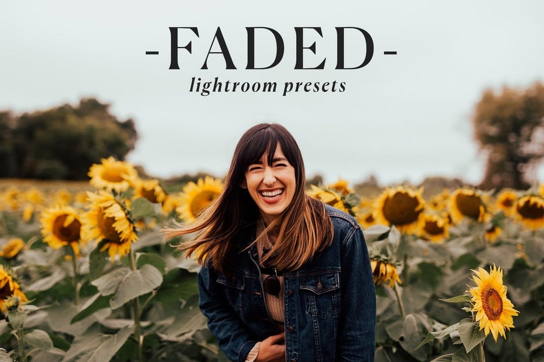
Sometimes the best way to make your photos look better is to add a subtle effect that creates a beautiful and natural look. This bundle of Lightroom presets are made for doing just that. It includes 20 different presets for adding a faded look to your outdoor and landscape photos to balance colors and contrast. The presets are easily adjustable as well.
This is a massive bundle of Lightroom presets and LUTs that lets you make your photos look like a screengrab from a Hollywood film. It includes 50 different presets, each featuring a different style of a cinematic look. The presets are available in 5 different categories and they work with both Lightroom desktop and mobile apps.
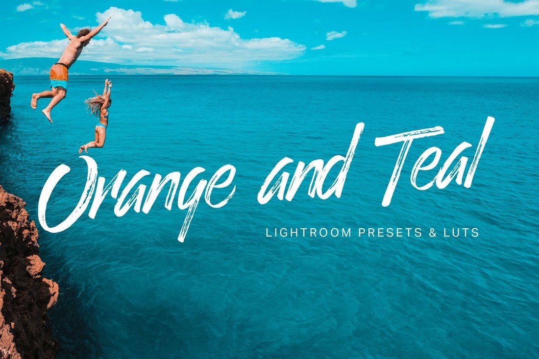
Just as the name suggests, this Lightroom preset comes with a few different versions of the popular orange and teal effect that adds a colorful filter to your photos. The bundle includes 8 different styles of the effect to match both outdoor and portrait photos. They work with Lightroom mobile version as well.
Want to make your baby photos look more adorable? Then grab this bundle of newborn Lightroom presets. It includes 50 different presets featuring various styles of tones and filters to make baby photos even cuter than they ever were. All the presets are customizable and works with mobile and desktop versions of Lightroom.
This is a free Lightroom presets that optimizes and improves your selfies and portrait photos, especially for social media platforms like Instagram and Facebook. The preset does wonders for correcting lighting and colors of your everyday life photos.
This bundle of Lightroom presets include lots of desert-themed filters and effects as well as lots of other filters for various types of photos. The pack comes with 50 different effects divided into 5 categories with light and airy, orange and teal, vintage, and many other styles of effects.
You can use the presets in this pack to create a moody and a gritty look and feel for your photos. It includes 15 different presets featuring various effects and tones. The filters are easily customizable and work with mobile and desktop versions of Lightroom app.
Add a sweet pink color filter to your selfies and portrait photos to add an attractive tone. This bundle includes 50 different presets you can choose from to quickly adjust and optimize your photos with just a few clicks. The presets are compatible with Lightroom CC 2019 and higher.
This is a must-have bundle of Lightroom presets featuring 50 different effects and filters for lifestyle bloggers and Instagram users. With these filters, you can optimize and add more style to your lifestyle photos and selfies. You can easily customize the effects to adjust their settings as well.
Another beautiful free Lightroom filter that adds a nostalgic look and feel to your photos. This Lightroom preset is perfect for optimizing landscape and outdoor photography by adding a realistic retro-vintage look. The effect is fully customizable as well.
This bundle of Lightroom presets comes with 50 different effects featuring pastel color filters. These are ideal for enhancing your photos for social media. Each preset is compatible with Lightroom desktop and mobile apps.
If you do a lot of lifestyles and outdoor photography, this Lightroom presets pack will come in handy. It includes 11 different presets made just for optimizing lifestyle photos to give them a moody effect and feeling.
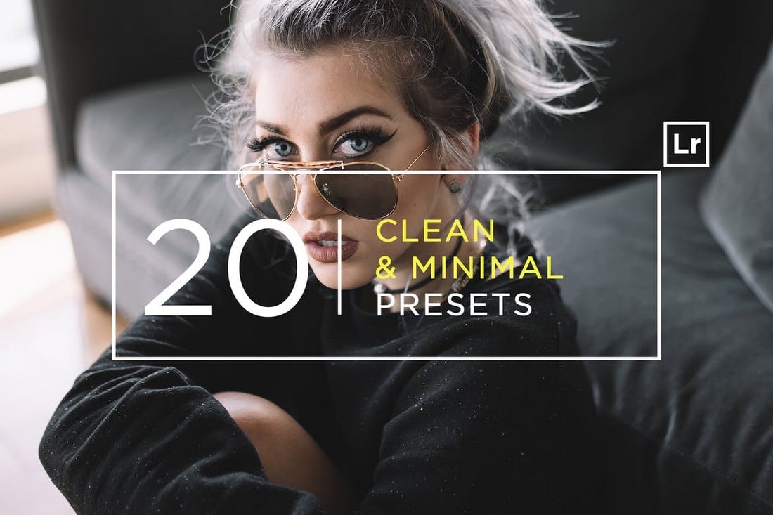
These clean and minimal Lightroom presets are made just for professional photographers and designers. They are fully optimized for enhancing the depth and the lighting of your photos. All 20 presets are easily customizable as well.
The Lightroom presets in this pack are most suitable for improving photos taken indoors. It’s especially great for interior design photography. The bundle includes 40 different presets that are compatible with both mobile and desktop versions of Lightroom.
This is a free Lightroom preset you can use to add a stylish and moody effect to your portrait photos and selfies. The filter comes in desktop and mobile versions as well.
This is a must-have pack of Lightroom presets for processing wedding photos. The bundle comes with multiple presets designed to add a moody effect to wedding photography. The presets are compatible with Lightroom 4 and higher as well as Lightroom mobile app.
A collection of high-quality Lightroom presets made for optimizing outdoor landscape photos. If you’re a photographer or a designer who works with nature photos this bundle of presets will come in handy.
Neon Tokyo is a pack of Lightroom presets designed for adding more color and highlights to nighttime photography. The pack includes 32 different effects that are compatible with both Lightroom Classic and CC.
Featuring a wide variety of effects, filters, and adjustments, this massive bundle of Lightroom presets will help you optimize and enhance all kinds of portrait and landscape photos with ease. They are compatible with Lightroom mobile as well.
Add the popular tilt-shift effect to your own photos with just a single click using this pack of Lightroom presets. It includes 12 different presets featuring tilt-shift and color enhancing effects.
This bundle of Lightroom presets includes 11 unique presets designed to help improve photos taken under indoor lighting. These presets are perfect for easily enhancing your everyday smartphone and digital camera photos.
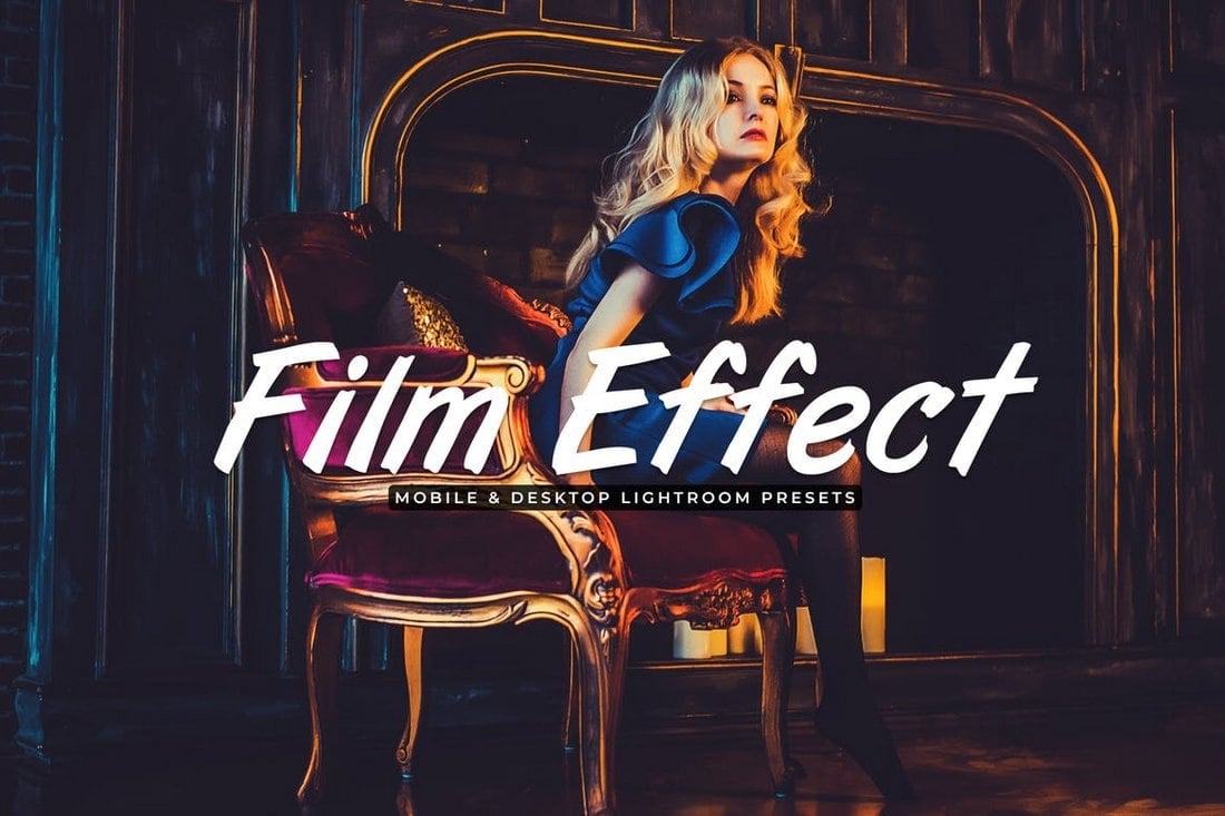
Film effect is a popular filter used in modern photography that add cinematic looks to ordinary photos. This collection of Lightroom presets is designed to recreate that same filter effect with just one-click. It comes with 11 presets that work with Lightroom 4 and higher.
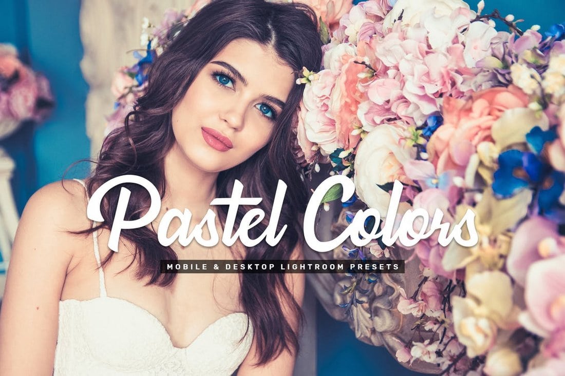
Adding a pastel color effect can greatly improve newborn, fashion, and wedding photography. Use the presets in this pack to add stylish pastel color filters to your own photos and make them look more attractive. The prests in this pack create non-destructive effects and can be easily customized to your preference.
This Lightroom preset is a professional filter that not only improves your photos by applying a subtle HDR effect but also enhances photos with toning and adjustments. The preset is easily customizable and can be applied with one-click as well.
A free high-quality Lightroom preset designed for enhancing outdoor photos. You can easily edit the effect to change the strength and it works well with lifestyle and fashion photos.
Wonderland is another professional Lightroom preset that’s ideal for improving portrait photos. This preset is free to use and it’s most suitable for natural light and outdoor portraits.
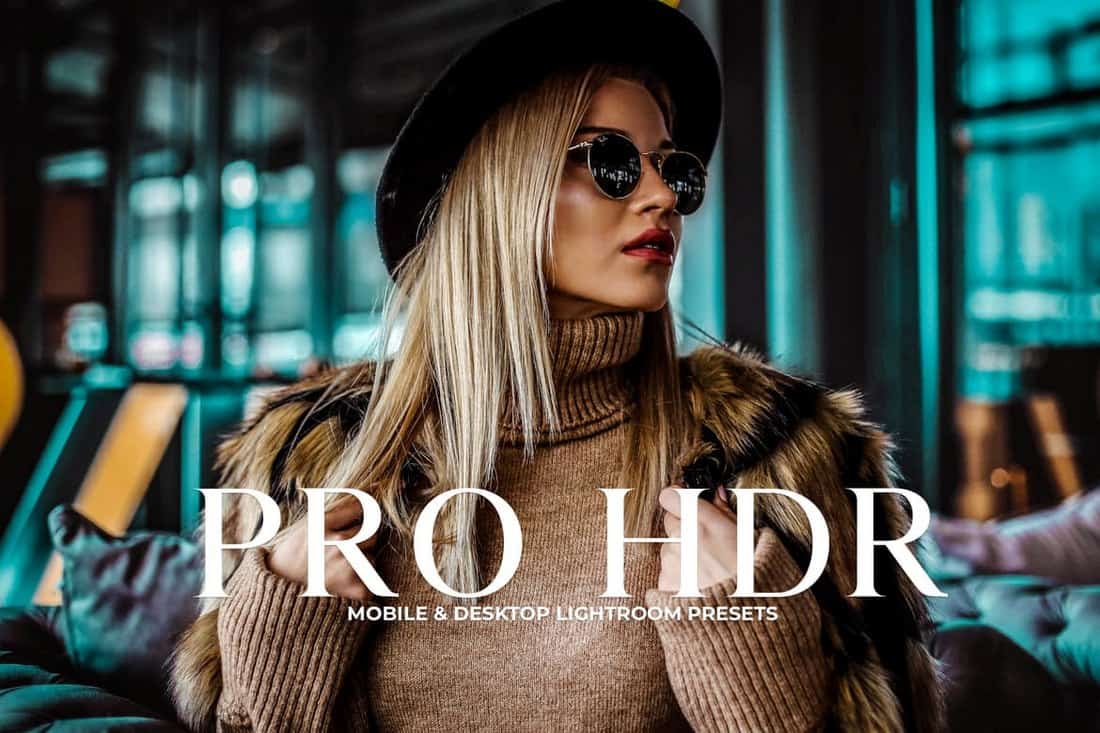
This is a collection of professional Lightroom presets that allows you to give your photos an authentic HDR look and feel without much effort. The presets in this bundle are also compatible with both the mobile and desktop versions of Lightroom app.
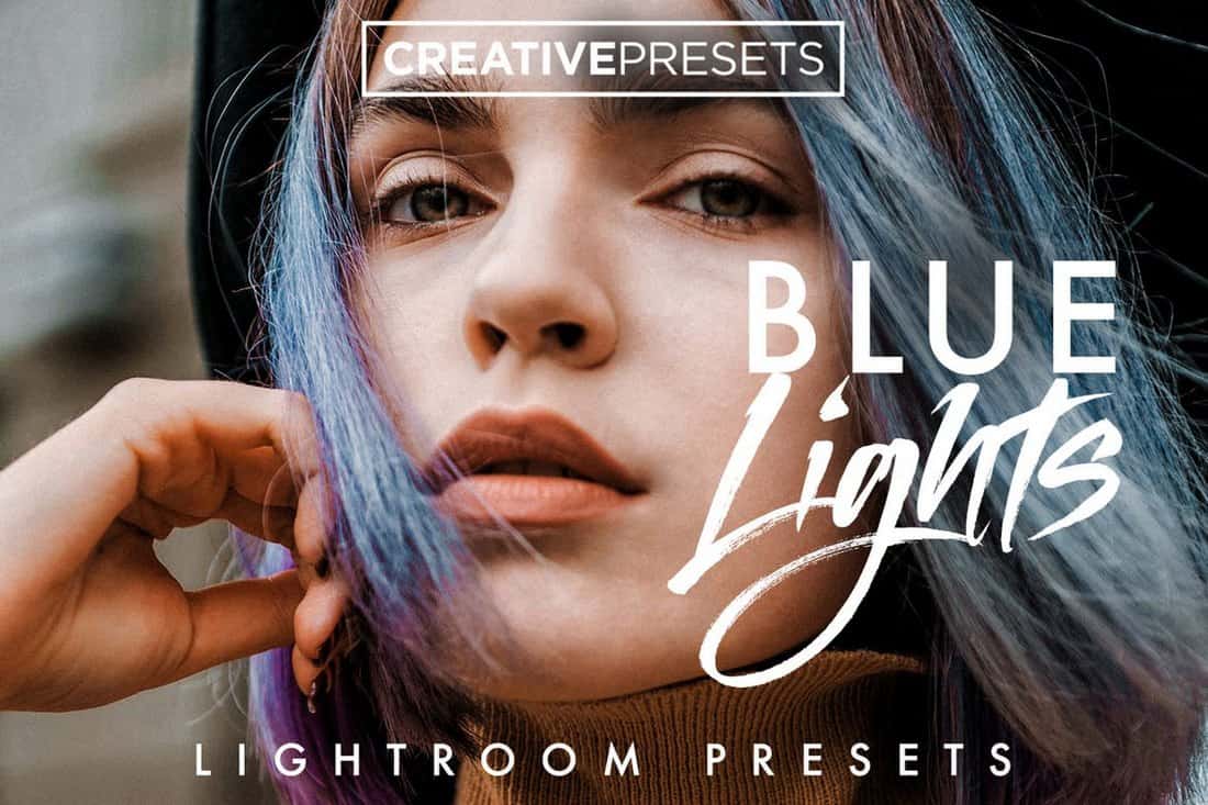
This bundle comes with 10 different Lightroom presets featuring cool blue toning effects. These effects will help give your natural light and portrait photos an attractive look and feel.
Moscow Travel is a collection of Lightroom presets designed specifically for improving your travel photos. The pack includes 9 different presets featuring various styles of Instagram-like filters.
Another bundle of Lightroom presets you can use to optimize and improve wedding photos and outdoor photos. The bundle includes 11 Lightroom presets and Photoshop action versions of the presets as well.
Designed for enhancing fashion, wedding, and couple photos, this free preset works with both desktop and mobile versions of Lightroom. You can apply the effect with just one-click as well.
If you want to make your photos look more vibrant and make the colors pop, this free Lightroom preset will come in handy. It lets you apply a dramatic and moody effect to your photos without an effort.
Create an authentic monochrome effect to enhance your portrait photos using this bundle of Lightroom presets. It comes with 11 presets compatible with Lightroom 4 and higher.
Warm and Airy is a collection of Lightroom presets you can use to instantly enhance your portrait and outdoor photos. The pack includes 11 presets that are compatible with both mobile and desktop versions of the app.
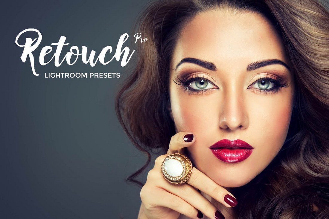
The Lightroom presets in this pack are designed to improve your workflow by helping you automate the basic retouching process. With these presets you’ll be able to retouch portraits with just a few clicks.
Golden Hour is a collection of 11 unique Lightroom presets features various styles of filters for enhancing your photos. The presets are most suitable for outdoor and landscape photos.
This collection comes with mobile and desktop Lightroom presets for enhancing your portrait and landscape photos by adding a beautiful Lomography effect. It includes 11 non-destructive effects.
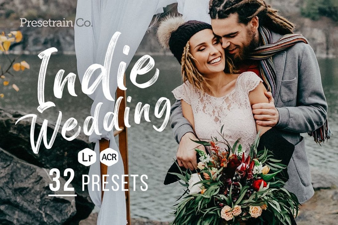
Indie Wedding is a collection of Lightroom presets created for optimizing wedding themed photography. The pack comes with 32 unique presets that allows you to optimized both outdoor and indoor photos. It also comes with Photoshop Camera Raw versions of the presets as well.
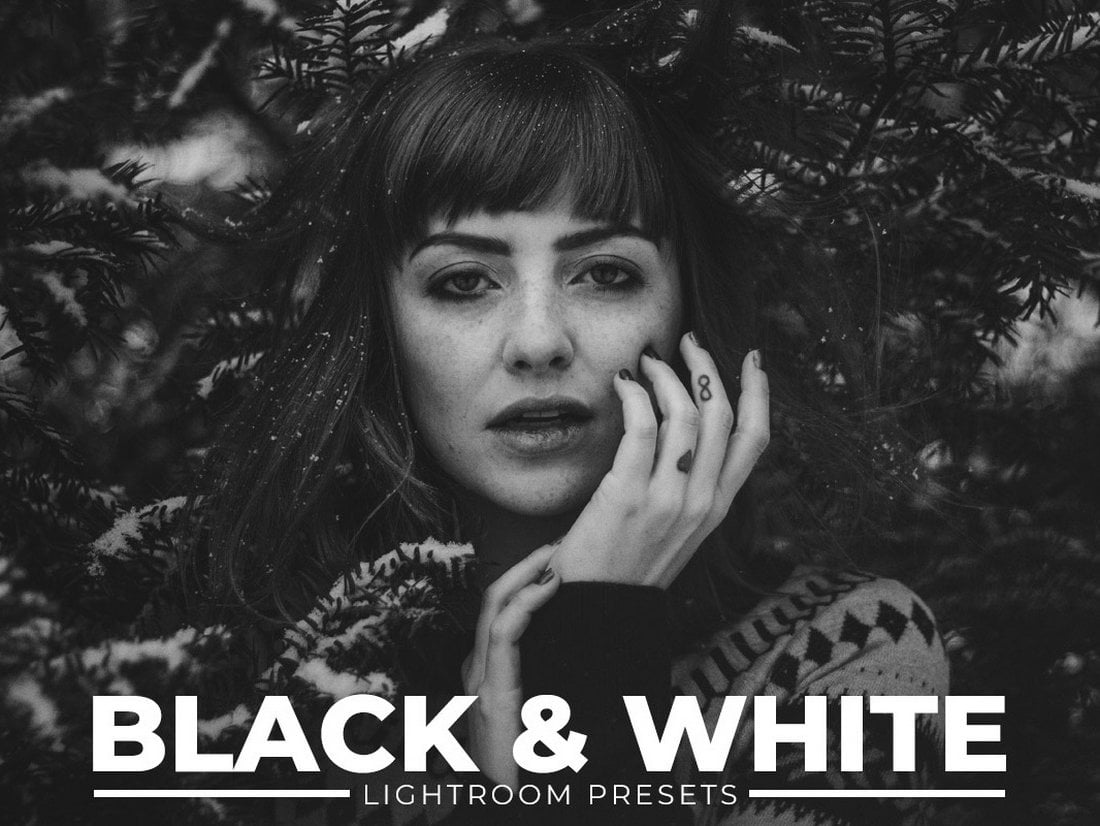
A massive bundle of 100 unique black and white Lightroom presets. The bundle is free to download and include presets with various adjustments that work with many different types of photos.
This is a free and professional Lightroom preset that features a creative film effect that transforms your photos into works of art. The filter is most suitable for portrait photos.
This pack includes 20 unique Lightroom presets made specifically for enhancing and optimizing outdoor photography in urban areas. These presets will allow you to add creative color effects to your urban photography.
The Lightroom presets in this bundle are designed inspired by the popular Bohemian Film effect. It includes 30 high-quality effects that not only optimize the photos but also enhances skin color and tone.
With this collection of Lightroom presets, you’ll be able to create a unique effect to give an authentic vintage feel to your photos. The bundle comes with 20 unique presets that works with RAW, JPEG, TIFF, DNG, and PSD.
This is truly one of a kind collection of Lightroom presets that comes with 20 unique effects. These will come in handy when creating suspense feel for your photos, especially for different themes of photoshoots.
If you’re an Instagram user and travel a lot, this bundle of Lightroom profiles is a must have. It includes 40 unique Lightroom profiles that allow you to instantly enhance your photos taken in different lighting conditions and environments.
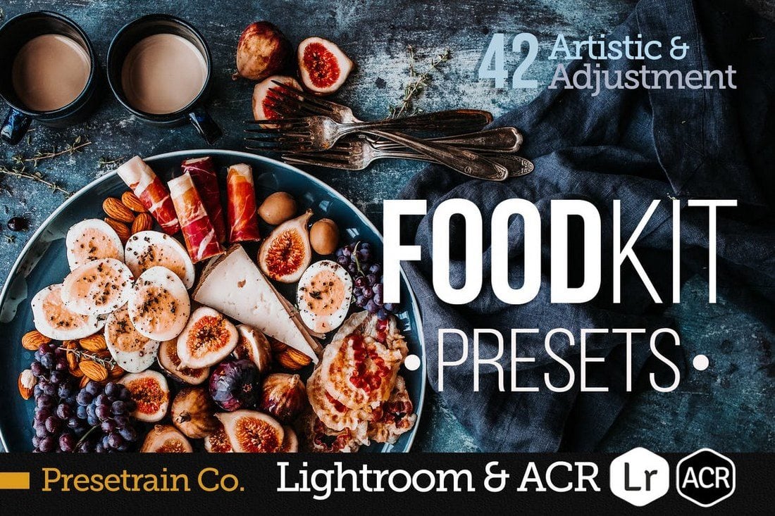
Artisan is a collection of beautiful Lightroom presets you can use to enhance your food photography. It comes with 50 different presets in both Lightroom template and Photoshop Camera Raw versions.
You can easily change the mood of your photos using this bundle of Lightroom presets, which includes 30 high-quality faded effects. The effects work with PSD, DNG, RAW, and most other file formats.
Just as the name describes, Moody is a collection of Lightroom presets that allows you to change and enhance the tone and mood of your photos. It includes 10 unique presets that works with Lightroom 4 and higher.
This is a bundle of 20 high-quality Lightroom presets designed for adding color effects and improving your travel and portrait photos. The presets are also available in ACR format for Photoshop and they work with Lightroom 5 or better.
This pack comes with 42 professional Lightroom presets to help improve your post-processing workflow. The pack includes various presets that are perfect for enhancing food photography, wedding photos, and for food bloggers as well.
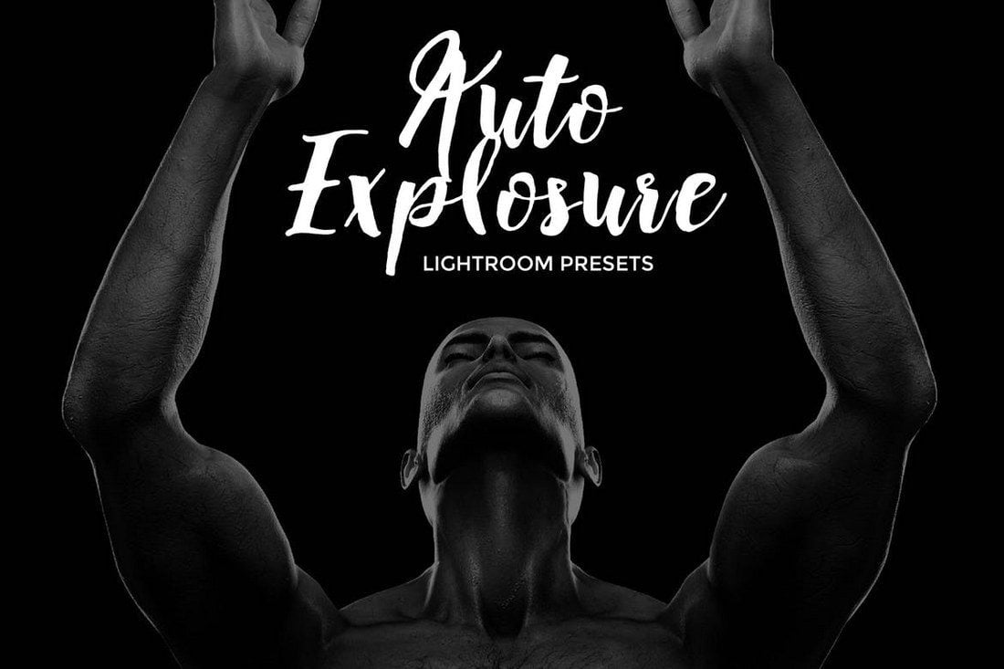
As the title suggests, this is a set of 15 Lightroom presets that are made for enhancing the brightness and contrast of your photos to achieve high-quality blacks. Except these presets enhance the photo exposure automatically. The presets works with Lightroom 4 and above.
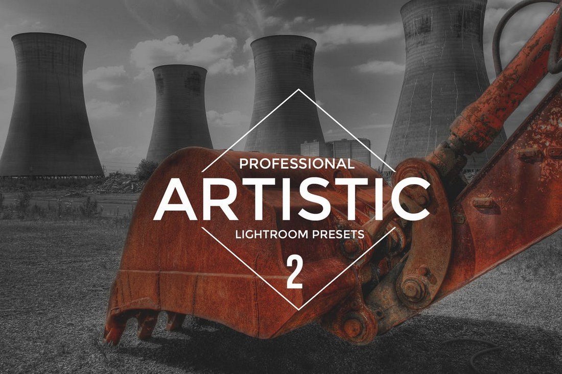
The Lightroom presets in this bundle are all highly creative effects that give your photos an artistic look. It will come in handy for both photographers and graphic designers. The pack includes 50 Lightroom presets which are compatible with Lightroom 4 or better.
If you’re a photographer or a designer who works with fashion, beauty, or lifestyle photography, this bundle of Lightroom presets are for you. It includes 23 presets for quickly enhancing your photos with professional calibration adjustments. The effects are also completely non-destructive.
This bundle features over 20 amazing presets with effects inspired by popular movies for giving your photos a cinematic look. If you like adding unique visual effects to your photos, these presets are perfect for you.
The Lightroom presets in this pack are made specifically for enhancing and improving couple photos by giving them a summer vibe. It includes 30 different presets, including BW effects, retro, matte, selfie, and more.
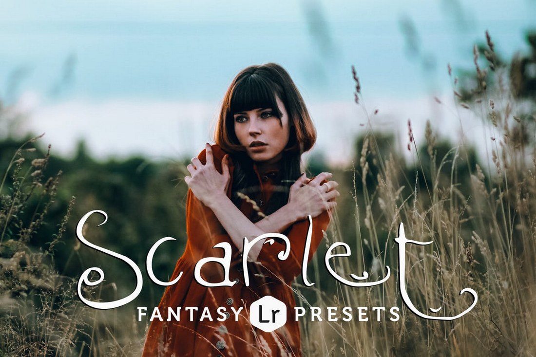
This bundle includes 15 Lightroom presets, including 5 toning presets and 11 variations. Each preset is designed to improve the natural lighting of portrait and fashion photography to give them a fantasy look and feel.
Send your photos back in time using these retro Lightroom effects. This pack comes with 17 presets compatible with Lightroom 4 or better for adding retro and vintage effects to your photos.
Inspired by old-school film photography such as Fujifilm Velvia and Kodak Gold, this pack of Lightroom presets helps you give an analog look to your photos. It comes with 15 presets with adjustable tones. The presets work with Lightroom 4 and above.
This is a set of color grading Lightroom presets that are perfect for adjusting and improving wedding and baby photography. The presets feature five strengths from subtle to strong for achieving the ideal effect and the tones are adjustable as well.
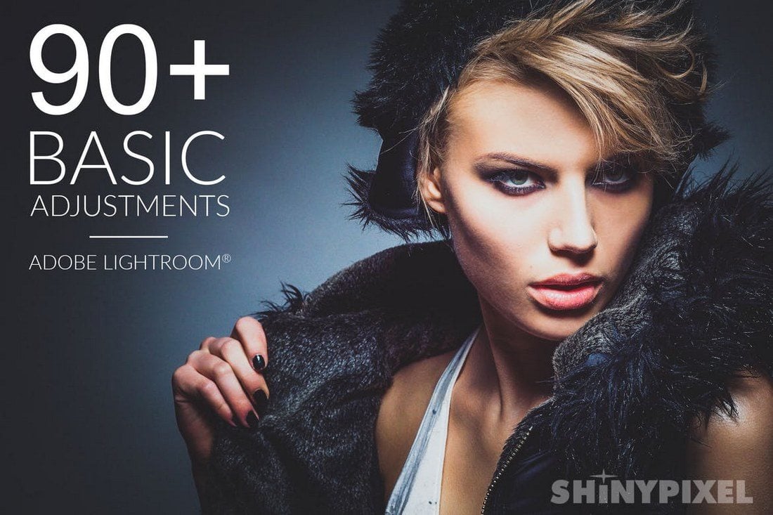
A massive bundle of over 90 different Lightroom presets for making basic adjustments to your photos without any effort. The pack includes a set of auto-presets for improving color, contrast, tone, and lets you enhance details with ease.
This bundle includes 26 fadeable Lightroom presets that gives your photos a professional-level color grading almost instantly. The presets features effects inspired by movies such as Train to Busan as well.
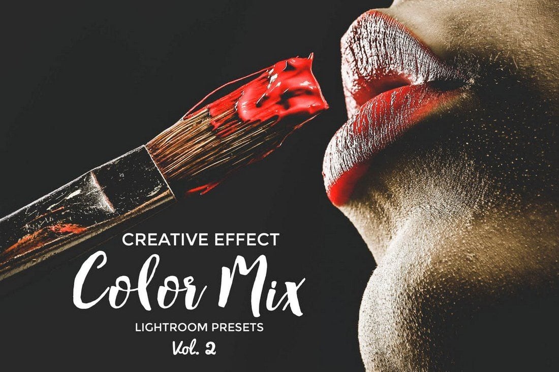
Color mix is a pack of premium quality Lightroom presets designed for retouching and enhancing photos. It includes 22 presets that are compatible with Lightroom 4 or better. The presets work with both JPEG and RAW files.
A unique pack of Lightroom presets that add a stunning moody effect to give a folklore vibe to your photos. The bundle comes with 7 different presets which are suitable for outdoor photography.
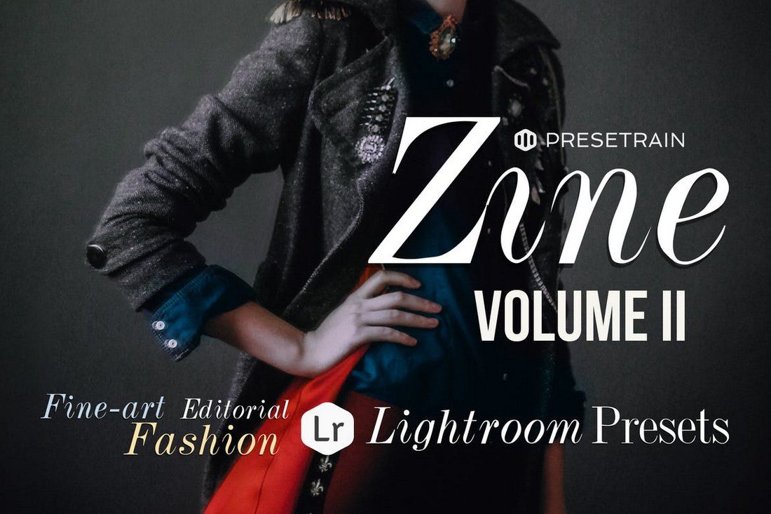
Zine is a set of Lightroom presets designed for fashion and lifestyle photography. It includes 17 unique presets to help you enhance photos instantly and add various styles of effects.
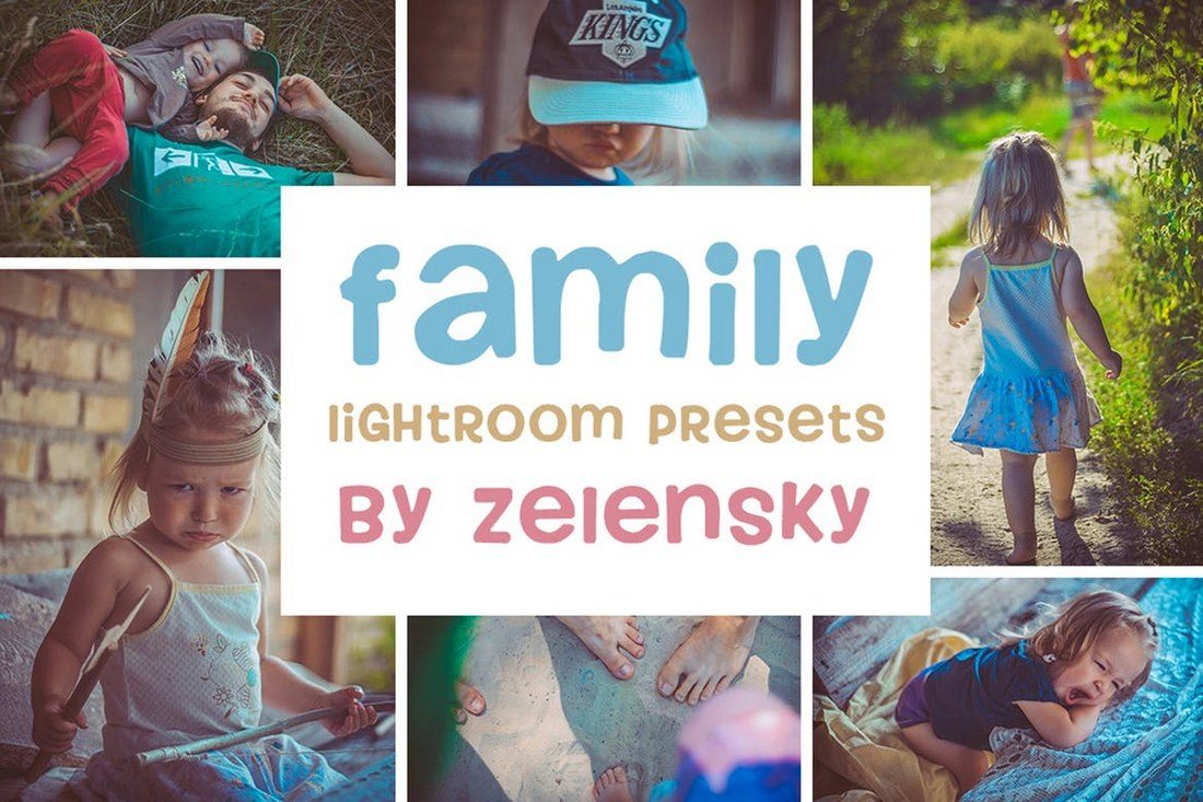
There’s no need to hire designers to enhance your family photos and make them look professional. You can use this bundle of 30 Lightroom presets to automatically improve your kids and family photos and add various effects.
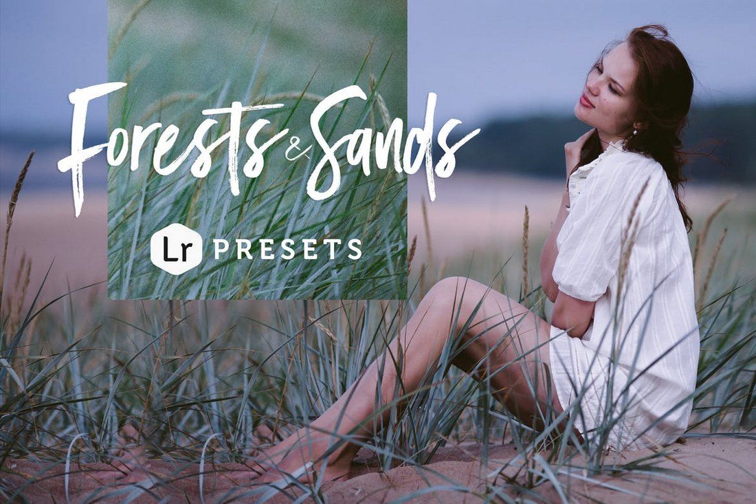
Forests & Sands is a set of Lightroom presets made for enhancing your outdoor photography. It includes 12 unique presets that gives various effects and each preset comes with several pre-made variations for adjusting lighting and camera settings.
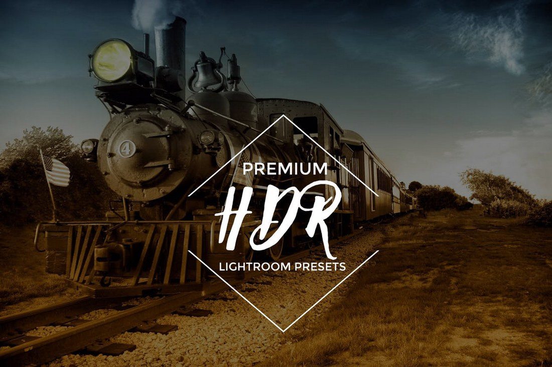
This bundle includes 20 high-quality Lightroom presets for adjusting and improving HDR photography. The presets are fully adjustable and are compatible with Lightroom 4 and above.
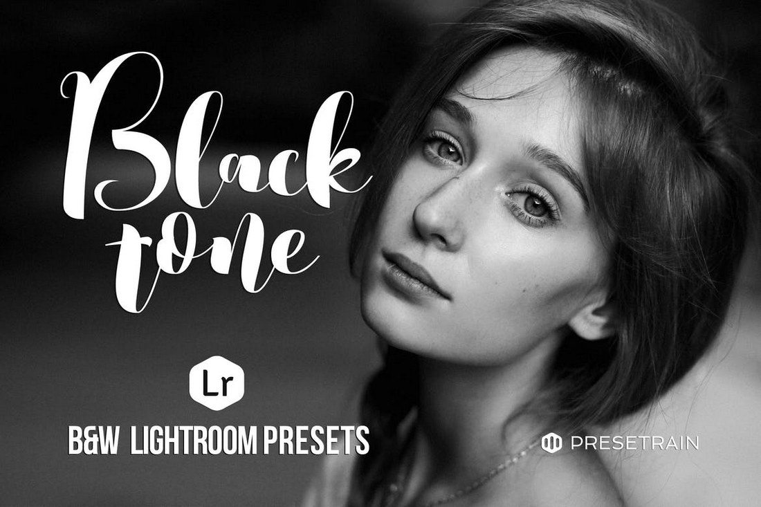
Looking for a way to achieve the perfect black and white effect? Then look no further. This pack comes with 10 professional presets that allows you to instantly achieve a high-quality B&W effect with just one-click. It’s perfect for fashion and portrait photography.
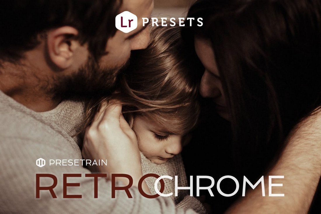
Retrochrome is a set of Lightroom presets designed for enhancing family and portrait photography. It includes 17 presets: 7 base presets and 10 different variations for achieving different levels of effects and adjustments.
Give your photos an instant hipster effect using these Lightroom presets. This bundle includes 40 different presets that feature various effects with color grading, adjustable tones, and beginner-friendly settings for adjustments.
This pack includes 22 professional Lightroom presets for adjusting and improving wedding photography. Retouching many different types of wedding photos will get much easier with these presets.
This bundle features 20 unique Lightroom presets for improving the lighting, contrast, color, and adding effects to your various types of interior photography.
Enhance and improve your street and urban photography using this pack of Lightroom presets. It comes with 13 unique presets with various effects and adjustments for giving a professional look to your photos.
Make your photos look as if they’re taken from the Blade Runner movie using these cyberpunk Lightroom effects. The bundle comes with 10 unique presets.
Yet another pack of Lightroom presets made specifically for improving wedding photos taken in various situations, including sunny, summer, and bright lighting. It includes 20 unique presets.
This is a bundle of creative Lightroom presets designed to enhance the toning of photos. It’s best for improving outdoor, couple, and family photos. It includes 20 total presets with 7 base presets.
Improve your fashion photography using this bundle of Lightroom presets. This pack comes with 20 presets for enhancing and adding effects to both outdoor and portrait photos.
A bundle of 27 Lightroom presets for adding truly artistic effects to your photos. It’s perfect for fashion and lifestyle photographers for quickly improving photos with just a single click.
This is a set of 10 Lightroom presets designed specifically to help improve your workflow by allowing you to quickly and easily process your HDR photos.
A bundle of 18 stylish color grading presets for adding various effects and enhancing your photos. These presets are also compatible with videos so you can add them to your videos using Lightroom as well.
This is a bundle full of professional Lightroom presets made specifically for retouching portraits and other types of photos. The pack includes 15 different Lightroom effects, which are compatible with Lightroom 4 or better.
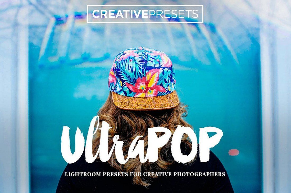
UltraPop is a pack of creative Lightroom presets that allows you to add an extra bit of color to your boring photos to make them pop. The bundle includes 20 Lightroom effects suitable for different types of photos.
If you’re a photographer or a designer working with portraits, this collection of Lightroom presets will be indispensable for you. It includes 30 professional Lightroom effects for instantly improving portrait photos.
This bundle comes with 14 Lightroom presets that adds a modern retro feel to your photos by adding a warm vintage tone. The effects are most suitable for improving landscape, portrait, and wedding photos.
This collection of Lightroom presets are ideal for photographers and designers who work with fashion photoshoots. It includes 23 Lightroom presets for optimizing your fashion and beauty photos while also preserving the original photo quality.

If you want your winter pictures to stand out, and make an impact on the audience, you need to add this collection of 8 Lightroom presets to your arsenal. The presets are perfect for holiday, travel, family, and portrait photography. Grab it now!

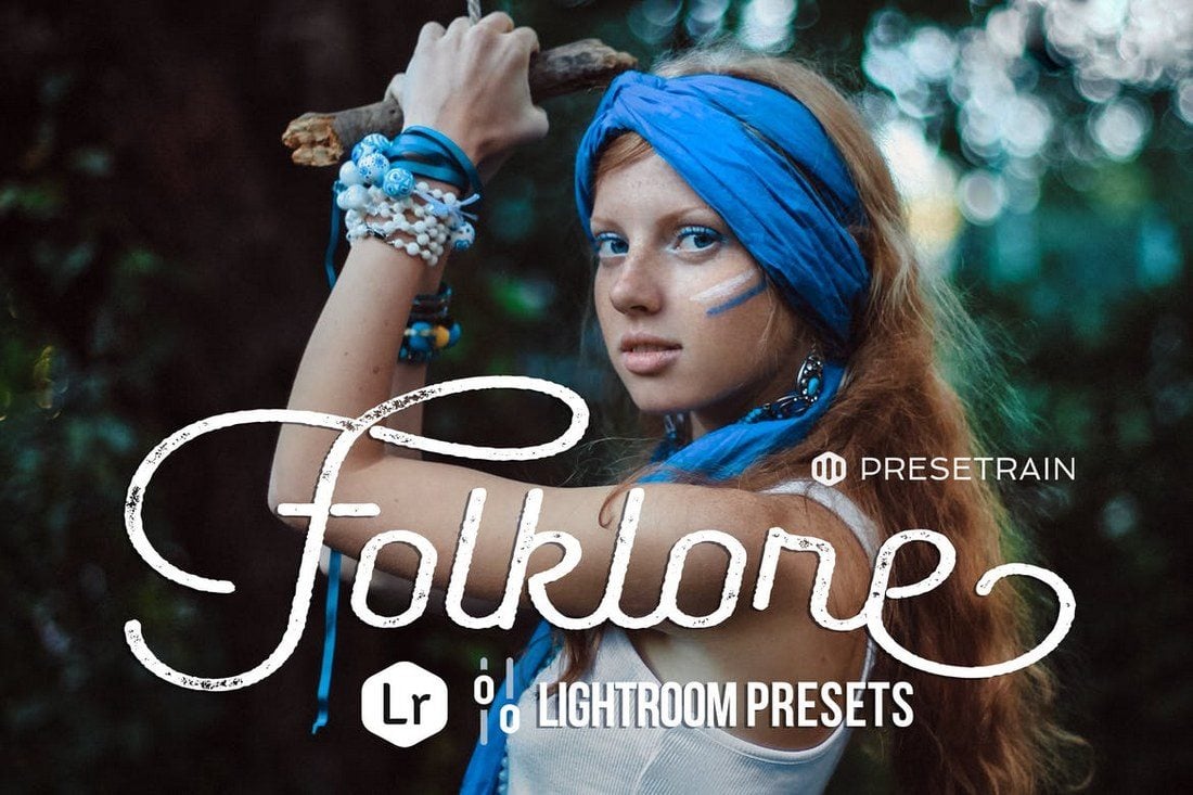
Wanting your pictures to narrate a story? Look no further than this bundle of 7 Lightroom presets that will add a moody, folk-themed accent to your photos, taking them to a whole new level of perfection. These presets work swimmingly for outdoor portraits.

If you’re after the perfect set of Lightroom presets to add a relaxed bohemian look to your wedding photography, this collection of filters is a great choice. Each of the 13 filters will add soft, moody, and natural tones to your photographs, and comes with detailed supporting documentation.

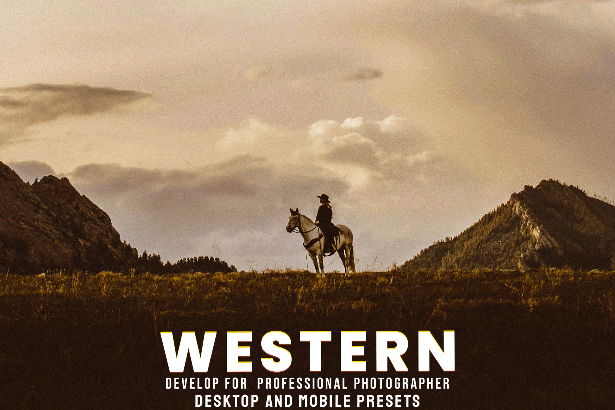
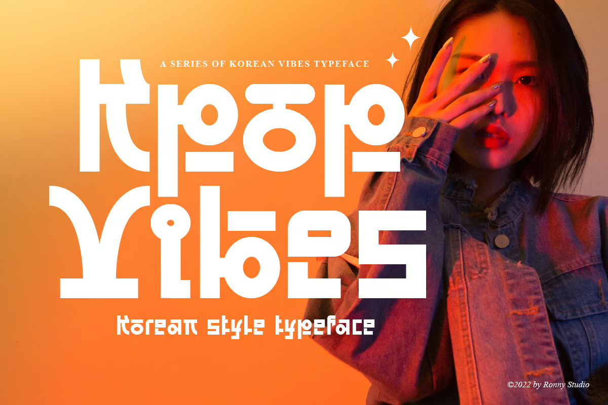
The K-Pop trend is becoming increasingly popular, so why not channel this fun and modern aesthetic into your photography with this set of 20 unique and colorful Lightroom presets? It includes four different themes – ice cream, motel, vice, and wild west – for you to mix and match.

Give your photos a beautiful toning with Santorini, a remarkably unique collection of Lightroom presets, perfectly fit for social media bloggers looking to beautify their pictures. Inside the pack, you’ll receive 10 presets suitable for professionals, and amateurs alike.
5 Common Lightroom Preset FAQs
If you’re new to Lightroom, these frequently asked questions will help you understand how to take advantage of the app using Lightroom presets.
1. How to Install & Use Lightroom Presets
Installing a preset in Lightroom CC is quite easy. Simply follow the steps below.
- Open the Lightroom CC app and open an image
- Open the Develop tab by clicking on the button on the top-right corner
- Scroll all the way down to find the Presets button and click to open the presets tab
- On the Presets tab, click on the three dots on the top of the panel and select Import Presets option from the menu
- Browse your computer to find and select your downloaded preset files and click the Import button to import the presets
Once imported, your new presets will appear in the Lightroom Presets library. Simply click on a preset to apply the effect to your photos. Then you can use the adjustment tools to optimize the effect to your preference.
2. Why Use Lightroom Presets?
When working with photos, you’ll often end up applying the same effects to multiple photos. With presets, you can automate the actions to apply the adjustments to other photos with just a single click.
Lightroom Presets help you save a lot of time and improve your workflow. Presets are also a great way to share your unique filters and effects with others.
3. How to Save & Export Lightroom Presets
If you want to save an adjustment, a filter, or an effect you’ve created with Lightroom to use later, you can easily save it as a preset as well. Here’s how to do it.
- First, make all the adjustments you want to save as a preset
- Click on the Plus icon (+) on the top-right corner of the Presets tab then select Create Preset
- On the Create Preset window, select all the settings and adjustments you want to save. Give your preset a name and click on the Create button to save your preset.
To Export a preset or share it with someone else, simply right-click on the preset you’ve created and select Show in Explorer. Find the .XMP file of your preset and copy it.
4. How to Use Lightroom Mobile Presets
Lightroom also has a very powerful mobile app, which you can use on your phone or tablet to edit photos on-the-go. You can use presets with the mobile app as well. Here’s how it works.
The easiest way to import presets in Lightroom mobile is to import the presets using the Desktop app and sync them with your mobile app using Adobe Cloud.
Or you can install Lightroom presets made specifically for the mobile app.
- First, UnZIP or Extract the files in your downloaded ZIP file. You may have to install an additional app to UnZIP files. Lightroom Mobile uses a format called .DNG for presets
- Open Lightroom Mobile app and tap on the Add Folder button and select Add Files option
- Now browse to your extracted folder and open the Lightroom Preset
- Once installed, the preset will appear in your library.
To apply the preset to photos, simply click on the Preset image >> click on the three dots button on the top-right corner >> select Copy Settings. Select all the settings you want to copy and click OK.
Now open the image you want to edit and click on the three dots button and choose Paste Settings.
5. Lightroom Classic vs Lightroom CC: Key Differences
When buying a subscription to the Adobe Lightroom app, you’ll have two options to choose from—Lightroom Classic and Lightroom CC.
Lightroom Classic is the enhanced version of the old Lightroom app. This app is optimized for Desktop users who prefer the classic user interface for faster workflow.
Lightroom CC features a modern user interface and comes with more improved features and Adobe cloud integration and access to the Lightroom Mobile app.
If you’re looking for more, be sure to check out our wedding Lightroom presets and realistic Lightroom presets collections as well.