Highlighting Over a Decade of Innovation and Contribution to the WordPress Community

Featured Imgs 23

WordCamp US, which is wrapping up today in Portland, marks another milestone in WordPress’ ongoing evolution. The event brought together enthusiastic WordPress users from near and far and featured insightful sessions, workshops, and vibrant discussions, all highlighting the exciting momentum within the WordPress community. WordPress thrives thanks to a broad spectrum of developers, builders, agencies,

The post Highlighting Over a Decade of Innovation and Contribution to the WordPress Community appeared first on WP Engine.

AI and SEO: Empowering the Digital Success of Tomorrow, Today

Featured Imgs 23

Recent advancements in artificial intelligence (AI) have sparked a new wave of innovation across numerous industries, and search engine optimization (SEO) is no exception.  With breakthroughs in natural language processing, machine learning, and most recently, generative AI technology, AI is reshaping the way businesses approach SEO strategies, helping them navigate the ever-evolving digital landscape with

The post AI and SEO: Empowering the Digital Success of Tomorrow, Today appeared first on WP Engine.

CSSWG Minutes Telecon (2024-09-18)

Featured Imgs 23

For the past two months, all my livelihood has gone towards reading, researching, understanding, writing, and editing about Anchor Positioning, and with many Almanac entries published and a full Guide guide on the way, I thought I was ready to tie a bow on it all and call it done. I know that Anchor Positioning is still new and settling in. The speed at which it’s moved, though, is amazing. And there’s more and more coming from the CSSWG!

That all said, I was perusing the last CSSWG minutes telecon and knew I was in for more Anchor Positioning when I came to the following resolution:

Whenever you are comparing names, and at least one is tree scoped, then both are tree scoped, and the scoping has to be exact (not subtree) (Issue #10526: When does anchor-scope “match” a name?)

Resolutions aren’t part of the specification or anything, but the strongest of indications about where they’re headed. So, I thought this was a good opportunity not only to take a peek at what we might get in anchor-scope and touch on other interesting bits from the telecon.

Remember that you can subscribe and read the full minutes on W3C.org. :)

What’s anchor-scope?

To register an anchor, we can give it a distinctive anchor-name and then absolutely positioned elements with a matching position-anchor are attached to it. Even though it may look like it, anchor-name doesn’t have to be unique — we may reuse an anchor element inside a component with the same anchor-name.

<ul>
   <li>
	<div class="anchor">Anchor 1</div>
	<div class="target">Target 1</div>
   </li>
   <li>
	<div class="anchor">Anchor 2</div>
	<div class="target">Target 2</div>
   </li>
   <li>
	<div class="anchor">Anchor 3</div>
	<div class="target">Target 3</div>
   </li>
</ul>

However, if we try to connect them with CSS,

.anchor {
  anchor-name: --my-anchor;
}

.target {
  position: absolute;
  position-anchor: --my-anchor;
  position-area: top right;
}

We get an unpleasant surprise where instead of each .anchor having their .target positioned at its top-right edge, they all pile up on the last .anchor instance. We can see it better by rotating each target a little. You’ll want to check out the next demo in Chrome 125+ to see the behavior:

The anchor-scope property should make an anchor element only discoverable by targets in their individual subtree. So, the prior example would be fixed in the future like this:

.anchor {
  anchor-name: --my-anchor;
  anchor-scope: --my-anchor;
}

This is fairly straightforward — anchor-scope makes the anchor element available only in that specific subtree. But then we have to ask another question: What should the anchor-scope own scope be? We can’t have an anchor-scope-scope property and then an anchor-scope-scope-scope and so on… so which behavior should it be?

This is what started the conversation, initially from a GitHub issue:

When an anchor-scope is specified with a <dashed-ident>, it scopes the name to that subtree when the anchor name is “matching”. The problem is that this matching can be interpreted in at least three ways: (Assuming that anchor-scope is a tree-scoped reference, which is also not clear in the spec):

  1. It matches by the ident part of the name only, ignoring any tree-scope that would be associated with the name, or
  2. It matches by exact match of the ident part and the associated tree-scope, or
  3. It matches by some mechanism similar to dereferencing of tree-scoped references, where it’s a match when the tree-scope of the anchor-scope-name is an inclusive ancestor of the tree-scope of the anchor query.

And then onto the CSSWG Minutes:

TabAtkins: In anchor positioning, anchor names and references are tree scoped. The anchor-scope property that scopes, does not say whether the names are tree scoped or not. Question to decide: should they be?

TabAtkins: I think the answer should be yes. If you have an anchor in a shadow tree with a part involved, then problems result if anchor scopes are not tree scoped. This is bad, so I think it should be tree scoped

<khush> sounds pretty reasonable

<fantasai> makes sense to me as far as I can understand it :)

This solution of the scope of scoping properties expanded towards View Transitions, which also rely on tree scoping to work:

khush: Thinking about this in the context of view transitions: in that API you give names and the tree scope has to be the same for them to match. There is another view transitions feature where I’m not sure if the spec says it’s tree scoped

khush: Want to make sure that feature is covered by the more general resolution

TabAtkins: Proposed more general resolution: whenever you are comparing names, and at least one is tree scoped, then both are tree scoped, and the scoping has to be exact (not subtree)

So the scope of anchor-scope is tree-scoped. Say that five times fast!

RESOLVED: whenever you are comparing names, and at least one is tree scoped, then both are tree scoped, and the scoping has to be exact (not subtree)

The next resolution was pretty straightforward. Besides allowing a <dashed-ident> that says that specific anchor is three-scoped, the anchor-scope property can take an all keyword, which means that all anchors are tree-scoped. So, the question was if all is also a tree-scoped value.

TabAtkins: anchor-scope, in addition to idents, can take the keyword ‘all‘, which scopes all names. Should this be a tree-scoped ‘all‘? (i.e. only applies to the current tree scope)

TabAtkins: Proposed resolution: the ‘all‘ keyword is also tree-scoped in the same way sgtm +1, again same pattern with view-transition-group

RESOLVED: the ‘all‘ keyword is tree-scoped

The conversation switched gears toward new properties coming in the CSS Scroll Snap Module Level 2 draft, which is all about changing the user’s initial scroll with CSS. Taking an example directly from the spec, say we have an image carousel:

<div class="carousel">
  <img src="img1.jpg">
  <img src="img2.jpg">
  <img src="img3.jpg" class="origin">
  <img src="img4.jpg">
  <img src="img5.jpg">
</div>

We could set the initial scroll to show another image by setting it’s scroll-start-target to auto:

.carousel {
  overflow-inline: auto;
}

.carousel .origin {
  scroll-start-target: auto;
}

As of right now, the only way to achieve this is using JavaScript to scroll an element into view:

document.querySelector(".origin").scrollIntoView({
  behavior: "auto",
  block: "center",
  inline: "center"
});

The last example is probably a carousel that is only scrollable in the inline direction. Still, there are doubts as far when the container is scrollable in both the inline and block directions. As seen in the initial GitHub issue:

The scroll snap 2 spec says that when there are multiple elements that could be scroll-start-targets for a scroll container “user-agents should select the one which comes first in tree order“.

Selecting the first element in tree-order seems like a natural way to resolve competition between multiple targets which would be scrolled to in one particular axis but is perhaps not as flexible as might be needed for the 2d case where an author wants to scroll to one item in one axis and another item in the other axis.

And back to the CSSWG minutes:

DavidA: We have a property we’re adding called scroll-start-target that indicates if an element within a scroll container, then the scroll should start with that element onscreen. Question is what happens if there are multiple targets?
DavidA: Propose to do it in reverse-DOM order, this would result in the first one applied last and then be on screen. Also, should only change the scroll position if you have to.

After discussing why we have to define scroll-start-target when we have scroll-snap-align, the discussion went on the reverse-DOM order:

fantasai: There was a bunch of discussion about regular vs reverse-DOM order. Where did we end up and why?
flackr: Currently, we expect that it scrolls to the first item in DOM order. We probably want that to still happen. That is why the proposal is to scroll to each item in sequence in reverse-DOM order.

So we are coming in reverse to scroll the element, but only as required so the following elements are showing as much as possible:

flackr: There is also the issue of nearest…
fantasai: Can you explain nearest?
flackr: Same as scroll into view
fantasai: ?
flackr: This is needed with you scroll multiple things into view and want to find a good position (?)
fantasai: You scroll in reverse-DOM order…when you add the spec can you make it really clear that this is the end result of the algorithm?
flackr: Yes absolutely
fantasai: Otherwise it seems to make sense

And so it was resolved:

Proposed resolution 2: When scroll-start-target targets multiple elements, scroll to each in reverse DOM order with text to specify priority is the first item

Lastly, there was the debate about the text-underline-position, that when set to auto says, “The user agent may use any algorithm to determine the underline’s position; however it must be placed at or under the alphabetic baseline.” The discussion was about whether the auto value should automatically adjust the underlined position to match specific language rules, for example, at the right of the text for vertical writing modes, like Japanese and Mongolian.

fantasai: The initial value of text-underline-position is auto, which is defined as “find a good place to put the underline”.
Three options there: (1) under alphabetical baseline, (2) fully below text (good for lots-of-descenders cases), (3) for vertical text on the RHS
fantasai: auto value is defined in the spec about ‘how far down below the text’, but doesn’t say things about flipping. The current spec says “at or below”. In order to handle language-specific aspects, there is a default UA style sheet that for Chinese and Japanese and Korean there are differences for those languages. A couple of implementations do this
fantasai: Should we change the spec to mention these things?
fantasai: Or should we stick with the UA stylesheet approach?

The thing is that Chrome and Firefox already place the underline on the right in vertical Japanese when text-underline-position is auto.

The group was left with three options:

<fantasai> A) Keep spec as-is, update Gecko + Blink to match (using UA stylesheet for language switch)
<fantasai> B) Introduce auto to text-emphasis-position and use it in both text-emphasis-position and text-underline-position to effect language switches
<fantasai> C) Adopt inconsistent behavior: text-underline-position uses ‘auto‘ and text-emphasis-position uses UA stylesheet

Many CSSWG members like Emilio Cobos, TabAtkins, Miriam Suzanne, Rachel Andrew and fantasai casted their votes, resulting in the following resolution:

RESOLVED: add auto value for text-emphasis-position, and change the meaning of text-underline-position: auto to care about left vs right in vertical text

I definitely encourage you to read at the full minutes! Or if you don’t have the time, you can there’s a list just of resolutions.


CSSWG Minutes Telecon (2024-09-18) originally published on CSS-Tricks, which is part of the DigitalOcean family. You should get the newsletter.

Autumn & Fall Design Inspiration + Tips

Featured Imgs 23

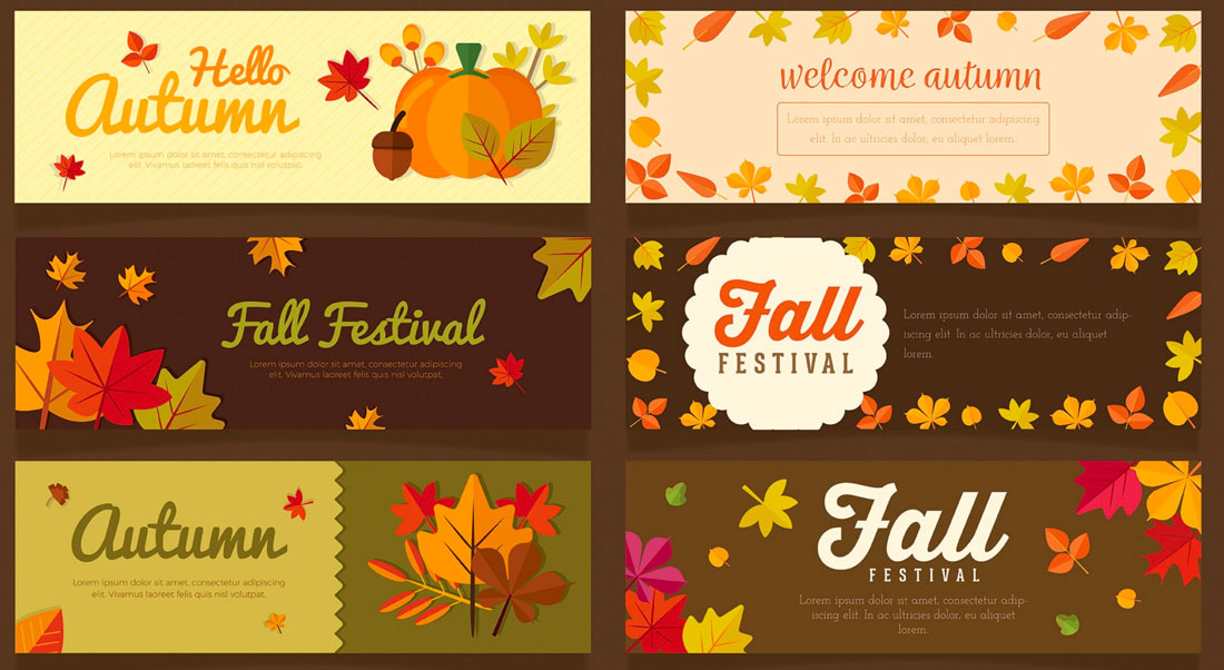
Do you change your design style seasonally? Even if you don’t plan major refreshes every time the weather changes, there are some advantages to using seasonal changes as a time to evaluate and think about design elements that might need a little tweaking.

Autumn can be one of the most inspiring times to make some of these changes. With deep colors, crisper air and that sense of energy that comes with cooler days, you might be inspired to add a touch of fall design to your projects.

Not sure where to start on your fall design refresh? We have plenty of tips, tools and design inspiration.

Switch Up Your Color Palette

fall design tips

A warm color palette matches the season well.

Fall is the perfect time to try a new selection of colors for your base palette or to accent the design.

Two great options for fall include switching to a more monotone color scheme – pick one hue and really make the most of it.

The other option is to consider a switch to warmer colors. A warm color palette matches the season well and can add new life to a project that’s been cool in color.

What’s a warm color? Warm colors occupy one half of the color wheel and are the hues that are reminiscent of the sun or fire. Reds, oranges, yellows, and pinks are warm colors. (You can learn all about warm colors here.)

Tackle a Design Trend

fall design tips

If you haven’t already implemented some of the biggest design trends of the year into projects, consider a trendy refresh for fall.

Sometimes the season can inspire a design change that’s not connected to anything, but merely a chance to mix things up and try something new. Here are a few hot design ideas to try:

  • Brutalism: This trend is the epitome of minimalism but is in no way subtle. It features almost harsh designs with distinct elements and lack of embellishment.
  • Gradients: Color gradients – from backgrounds to overlays – have been one of the biggest trends of the past 18 months. They are everywhere! Use a gradient for fall by picking a warm color combination.
  • 3D Design: With some many projects rooted in virtual and augmented reality, it’s no surprise that 3D elements are growing in popularity. This also applies to 3D text. It’s a fun trend that’s not that hard to implement.
  • Hand Drawn Elements: A specialty element that you create by hand (or has that look) can add a special touch to a project, giving it a more custom feel. Hand drawn elements can include icons, illustrations or typography.

Add Subtle (Seasonal) Animation

fall design tips

Falling leaves, a jack-o-lantern with glowing eyes or any number of other simple animations can add a fall touch to a website design.

Simple animations are an easy season add-on element that you can deploy for a short time and then remove later. They can also be that little special something that delights a user when they least expect it.

A seasonal animation can also tell users that your site is modern and current because it uses a timely design element.

Change Some of the Language

Sometimes the best element to switch up with the season is the copy. Good copywriting can help you use seasonal language or even plays on words to create just the right vibe.

Consider this: “Fall for this great deal!”

If the autumn season is already top of mind. The phrase might be clever or entice users to think about a deal or promo featured in the website design.

Pair fall language with other divots of autumn in the design for a simple, and timely refresh.

Create an Autumn Pop-Up

fall design tips

Along those same lines, you can consider a pop-up or dialog box that has a fall theme. This add-on element doesn’t require changes to the overall scheme since it is an extra design item, not a facelift of an existing one.

Use the imagery and language of the season to create a fall-inspired design that users will love.

Play On Fall Events

fall design tips

Creating a fall design theme can be as easy as playing up fall events. From football and tail-gating to holidays such as Halloween to hyping back to school season, each of these events provides a great opportunity to help visitors get in an autumnal state of mind.

Whether you choose to go with a blatant theme or use more subtle touches for the season, these elements – like many of the others featured as fall inspiration tips – create a distinct sense of timeliness that helps the design feel fresh.

Switch Up the Photography

fall design tips

Simply adding a photo to the homepage with a season feel – people in long sleeves and jackets rather than shorts and tanks – can establish an autumn mood.

Take advantage of the golden hour when it comes to lighting, which can also help set the tone for longer days and cooler air.

Seasonal photography helps put the user into the image you are creating. It helps them see themselves in the way pictured and hopefully create a stronger emotional connection that can result in more clicks and overall engagement with the design.

Look for images that have a seasonal feel with outdoor scenes that show leaves or autumn colors in the background or even event-based imagery with kids playing football or dressed for Halloween. You can see that many of these tips can be combined to create a complete fall design project.

Conclusion

Now here’s the catch to using fun fall design techniques: Don’t forget to swap them out at the end of the season if they are indeed seasonal. Some of these ideas weren’t tied to autumn per se.

It’s a good idea to consider ways to refresh and reinvigorate design projects with each new season, and fall-specific designs can be a fun (and somewhat festive) option.

Responsive Logo Design: A Beginner’s 101 Intro

Featured Imgs 23

Have you noticed how logo designs have gotten progressively simpler lately? Even some of the biggest brands with iconic logos revamped their logos by making them simpler and more minimal.

If you look closer, you’ll also notice that most brands now have multiple logos. The logo you see on the website is not the same one used on a mobile app. This is all part of the responsive logo design practice, which is an important aspect of designing logos today.

In this quick 101 intro, we introduce you to the concept of responsive logo design and why every logo designer must follow this practice when creating logos.

What is Responsive Logo Design?

what is responsive logo design

Responsive logo design is a practice designers use to create simple, scalable, and flexible logos that come in multiple forms and can be used across various platforms. A responsive logo looks good whether it’s used on a website, packaging design, large billboard, or even a small mobile device.

With a responsive logo, brands are able to create multiple variants of their logo that are dedicated to serving different audiences on various platforms. Most brands these days have at least three or four logo variants that are served across digital and print mediums.

Why it’s Important

The main goal of making a logo design responsive is to make the logos clearly visible on smaller platforms like mobile devices.

When you create complex logos with so many intricate details, it’s too difficult to transform the logo into a tiny icon on a small mobile screen. Most of the details, colors, and typography get lost and often make the logos look distorted.

This is why responsive logo designs utilize simpler designs and come in multiple variants.

Examples of Responsive Logo Design

Examples of Responsive Logo Design

In this image from 99Designs, you can see the different logo variants used by popular brands, starting with the full-scale logo and all the way down to a tiny icon.

You’ll notice how the logo design gets simpler with each variant with fewer design elements and details. Even the most complex wordmarks get stripped down into a simple symbol.

The Responsive Logos website has more great examples. It’s an interactive website you can explore to see some of the best and most popular responsive logo designs. You can see the logos change by resizing the browser screen.

How to Design Responsive Logos

There are four important aspects every responsive logo design needs to cover: scalability, flexibility, adaptability, and consistency. Here’s how you design a logo that fits all those key aspects.

1. Understand the Use Cases

Understating how and where you use your logo is the first step to creating an effective responsive logo. It’s crucial to design a logo that’s consistent across different platforms. To do that, you must explore the many use cases of your brand and products as well as where your audience comes from.

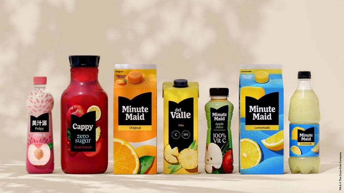
Minute Maid rebrand

Designing a responsive logo that looks great on mobile platforms and social media is not enough. If your brand has a physical product, you also have to make sure the logo fits perfectly with the packaging designs.

There are many aspects to figuring out the use cases of your logo. And that is also the key to knowing how many logo variants you need to create in order to make it responsive.

2. Create Logo Variants

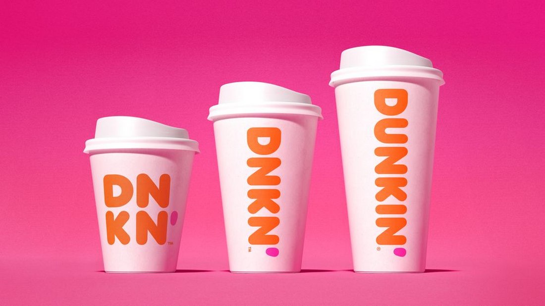
A responsive logo comes in multiple variants. The logo you create for the packaging design won’t look the same as an icon in the mobile app. Creating multiple styles of logos for each platform is the solution.

dunkin after 1

Think responsive-first when designing a logo. Know how many variants you need to create and understand where the logos will be used. It will help create a much more consistent logo design, rather than creating a logo first and then trying to convert it into a responsive design.

3. Scalability is Key

A responsive logo can be scaled up or scaled down without losing its quality and clarity. That’s not just about designing logos in vector format. It also involves creating logo variants that can be used anywhere.

uber after 2

For example, a logo variant you create for a mobile app icon should also be able to be used on a large billboard to promote that app. And it’s your job to ensure that the logo variant looks good when enlarged as it does when shrunk down to a small favicon.

4. Colors and Fonts Matter

The color palette you use for your responsive logo is also important. Ensuring the logo looks consistent across different digital platforms can be tough, especially when different devices have different types of displays and graphical settings. The same applies to typography.

fanta old vs new logo

It’s one of the reasons why most brands nowadays use highly minimalist and simplified logo designs using a very limited color palette.

5. Use a Minimalist Design

Pringles old vs new logo

A simple, minimalist logo design is much easier to scale. It will provide you with more opportunities to create logo variants that look great no matter how small or big it gets. A simple logo will also look more consistent and they are easier to recognize.

10 Tips for Effective Responsive Logo Design

Follow these tips to create better responsive logos that will stand the test of time.

1. Prioritize Legibility

Ensure your logo remains legible at smaller sizes. Avoid intricate details or overly complex typography that may become difficult to read when the logo is scaled down. Test your logo at various sizes to confirm that text and symbols remain clear.

2. Consider Horizontal and Vertical Variants

Create both horizontal and vertical versions of your logo to accommodate different layouts. A horizontal logo might work better in a website header, while a vertical version could be more suitable for a mobile app icon or social media profile.

3. Focus on the Core Symbol or Icon

When designing a responsive logo, consider how the core symbol or icon can stand alone without text. This approach is especially useful for creating icons or favicons that need to be recognizable even without accompanying brand text.

4. Use Adaptive Color Palettes

Consider how your logo’s colors will adapt to different backgrounds and environments. A responsive logo should work well in both color and monochrome formats. Ensure the logo remains visually appealing and recognizable in various color schemes.

5. Incorporate Fluid Design Principles

Fluid design allows logos to adjust naturally to different contexts. Consider how your logo’s elements can shift, resize, or rearrange based on screen size. This flexibility ensures your logo looks great on any platform without compromising its integrity.

6. Maintain Brand Consistency

While adapting your logo for different sizes and formats, ensure it remains consistent with your brand identity. All versions of the logo should share the same color palette, typography, and core design elements to maintain a cohesive brand image across all touchpoints.

7. Simplify Typography

When incorporating text into your logo, choose fonts that are clean and easily readable at smaller sizes. Avoid overly decorative fonts that may lose clarity when scaled down. Consider using a single, bold typeface that aligns with your brand’s aesthetic.

8. Leverage Negative Space

Negative space can enhance the adaptability of your logo. Clever use of negative space can help simplify your design while maintaining its visual impact. This can be particularly effective in creating a logo that remains striking, even when reduced in size.

9. Use Grid Systems

Designing your logo within a grid system can help maintain balance and proportion, making it easier to create responsive versions. Grids ensure that elements align perfectly, which is crucial when resizing your logo for different screen sizes.

10. Adapt for Social Media

Your responsive logo should be optimized for social media platforms, where square and circular formats are common. Ensure your logo looks great as a profile picture or icon by testing it within these shapes and making necessary adjustments.

Conclusion

This is only the beginning of a new evolution for logo design. As new devices like mixed reality headsets and new technologies are introduced, you will have to adopt new ways to create logo designs even for the virtual worlds and beyond.

Who knows, you might even have to create 3D versions of logos with interactive elements in the near future. As long as you create simple logos that are adaptable, you will make each logo design future-proof.

How to Understand (+ Improve) Your Website’s Carbon Footprint

Featured Imgs 23

Every time you visit a website, watch a YouTube video, or comment on a Facebook post, you make a contribution to global carbon emissions. This includes your own websites as well.

The Internet and the devices we use contribute 3.7% of global greenhouse emissions. That is the same amount contributed by the airline industry around the world and it’s expected to double in 2025.

Saving the environment and the world starts with you. One of the most important steps you can take to achieve that goal is to reduce your website’s carbon footprint.

In this post, we will walk you through the process of how a website contributes to global carbon emissions and what you can do to improve it.

What is a Website’s Carbon Footprint?

what is carbon footprint

The global carbon dioxide emissions are the leading cause of global warming. As human activities release more carbon dioxide into the atmosphere, it absorbs more of the Sun’s heat and accelerates the global warming process.

The massive data centers and server farms where your website is hosted also contribute to global carbon emissions. Every time someone visits your website, these servers have to consume more power to run your website. The heavier and more complex your website gets, the more carbon it will emit.

Why Should You Care?

Why should you bother to improve your tiny website’s carbon footprint when there are giant websites like Facebook, TikTok, and YouTube contribute more to global carbon emissions? Because change starts with you!

If you decide to make a small improvement to your website to reduce its carbon footprint, you will have made the future a better place for you and the future generations. As small as it may be, your actions can make a difference.

What Contributes to a Website’s Carbon Footprint?

Website's Carbon Footprint

There are a few things that contribute to a website’s carbon footprint. These are some of the biggest factors to consider.

Ungreen Hosting Providers

When building a website, you will often search for the cheapest and most affordable web hosting provider to get your website up and running as quickly as possible. However, this is not the best way to reduce your website’s carbon footprint.

Not every web hosting provider is environmentally friendly. Most hosting service providers are able to offer cheaper prices by using data centers that don’t run on renewable energy. And that is the biggest contributor to your website’s carbon footprint.

Large Files and Media

Websites with large image files, videos, and even fancy animations will also affect the carbon footprint. Whenever your website has to display a large image file, the servers will have to consume more power to process those requests.

Third-Party Integrations

Third-party apps that you have integrated with your website will also make a big impact on your website’s carbon footprint. If you’re using plugins or services to track metrics, show widgets, or add additional services, they will not only affect your website’s carbon emissions but also contribute to the carbon footprint of those third-party websites as well.

Scripts and Unorganized Code

The animations, widgets, buttons, and forms on your website all use various scripts to function. These complex code and scripts require extra computation power to run and they will add more to your site’s carbon footprint.

What is Your Website’s Carbon Footprint?

carbon footprint test

There is a very simple way to measure your website’s carbon footprint. You can go to the Website Carbon Calculator website and test it out.

While the results this website provides may not be 100% accurate, you can use it to have a rough understanding of how big of a carbon footprint your site has.

How to Reduce Your Website’s Carbon Footprint

Here are a few things you can do to lower your website’s carbon footprint.

1. Use Environmentally-Friendly Web Hosting

Choosing an environmentally friendly web hosting provider is the best way to reduce your website’s carbon footprint. Most web hosting providers proudly claim their hosting infrastructure is powered by renewable energy. However, the percentage of renewable energy also matters.

For example, Kinsta uses Google Cloud Platform for its infrastructure, promising a platform powered by 100% renewable energy.

Most platforms won’t disclose this information but you can use a site like Green Web Foundation to find out which hosting providers offer green web hosting services.

2. Optimize Media Files

Optimizing your images, videos, and other media files will also help reduce the energy required to deliver them to website visitors.

You can start by switching to a more lightweight image file format like WebP instead of using JPG. You can also compress videos to lower file sizes or host them on platforms that are powered by renewable energy.

3. Minify Scripts & Code

Getting rid of unnecessary scripts, third-party plugins, and code also helps. The plugins that add popups, banner ads, animations, and various other widgets will only make your website perform worse.

You can also minify your website’s scripts and code to optimize page loading speeds and reduce power consumption.

4. Reduce Unnecessary Crawling & Bots

When you add third-party services to your website that involve tracking visitors and stats, they will send website crawlers and bots more often, which also consumes server resources.

For example, Google Analytics adds lots of scripts and sends more crawlers to your website, making your website slower and consuming more power. Switching to a lightweight alternative will make a big difference.

5. Use a CDN

By using a Content Delivery Network (CDN), you can deliver your website to visitors around the world more efficiently. It will not only make your website perform faster but also help reduce the stress on hosting servers.

6. Use a Clean, Minimal Design

Using a website design with a light and minimal design will also help improve the carbon footprint. A design that uses fewer buttons, animations, and elements will consume less power to display for each visitor.

In Conclusion

Even if you can’t implement all these improvements to your website, consider making at least one or two changes. The tiniest change you make, like adding a dark mode to your website, will help reduce carbon emissions by lowering the power consumption of mobile devices and monitors.

As Mahatma Gandhi once said: “Be the change that you wish to see in the world.”