35+ Best Professional Business Report Templates (Word, PPT, InDesign)
A modern and professional design is a must-have for every business report. But what exactly does a professional business report look like?
To help you find inspiration for your business report design, we gathered a collection of the best business report templates. These templates are made by professional designers and they all feature stylish and modern designs.
You can also download and edit them to easily create business reports without having to start from scratch. There are templates in this collection in Adobe InDesign, Microsoft Word, and PowerPoint formats. And we divided the list into 3 different sections to make it easier for you to find them.
Use the quick links below to jump to each section:
- InDesign Business Report Templates
- MS Word Business Report Templates
- PowerPoint Business Report Templates
InDesign Business Report Templates
With Adobe InDesign, you can design more flexible and professional brochures for your business projects. These templates will help you get a head start in your brochure designs.
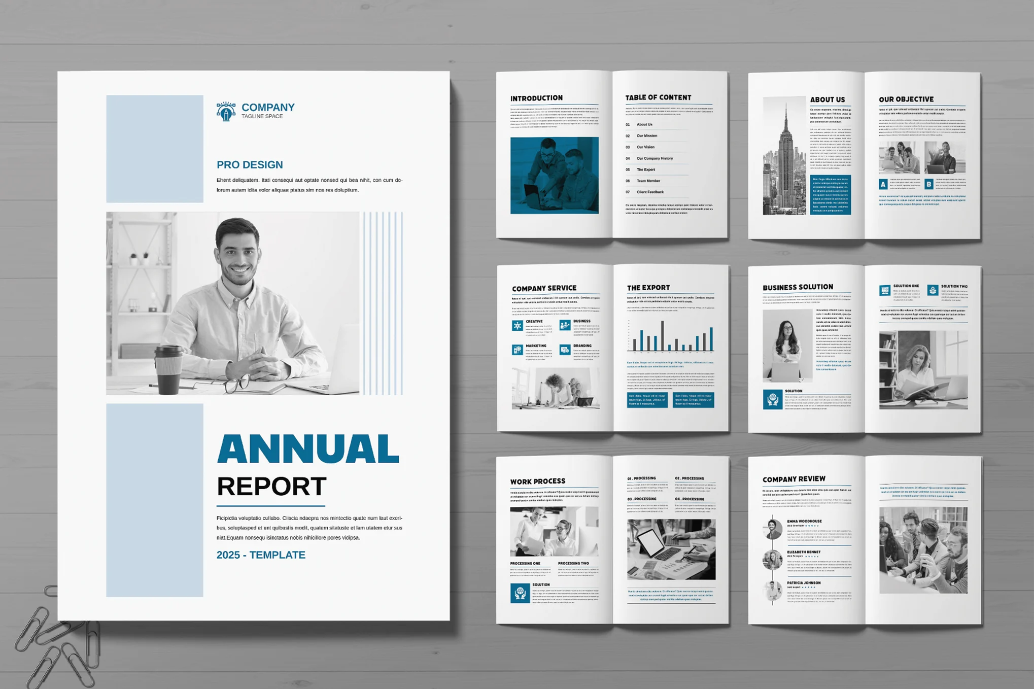
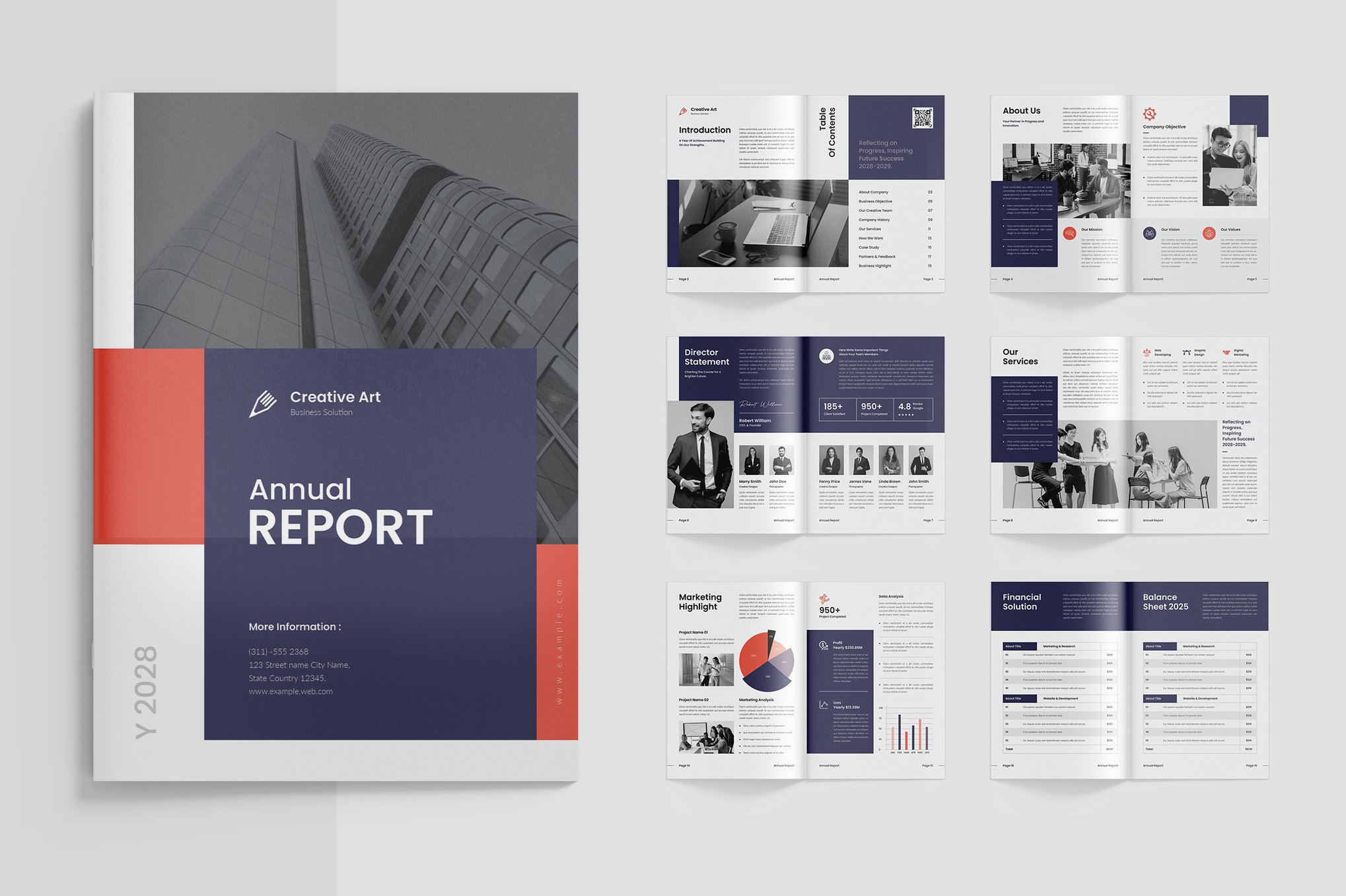
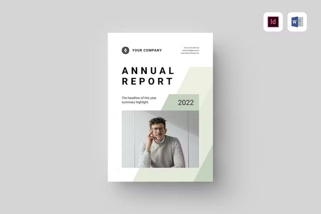
Annual Business Report Template
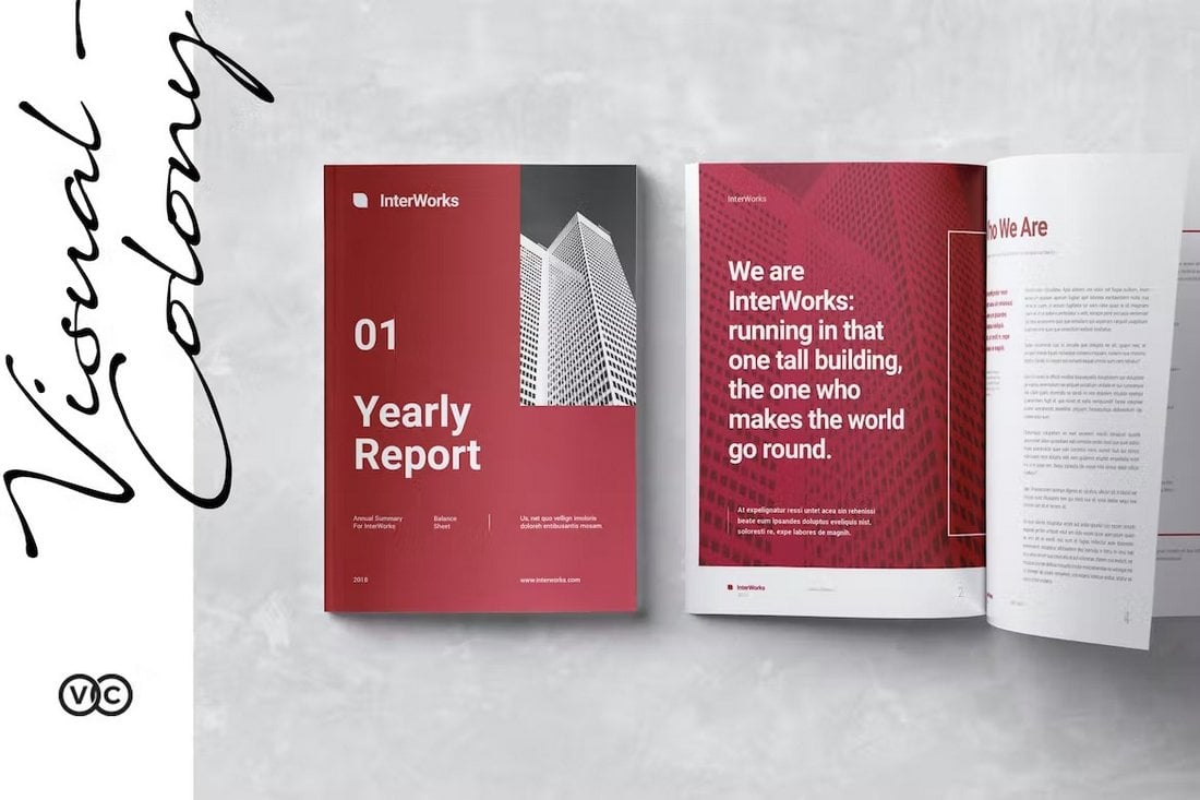
This InDesign template comes with a stylish and modern design to help you craft a professional report to showcase the business progress, stats, and data related to your yearly review. It has 16 unique pages with grid-based layouts. And you can fully customize the template to your preference as well.
Professional Business Report Template
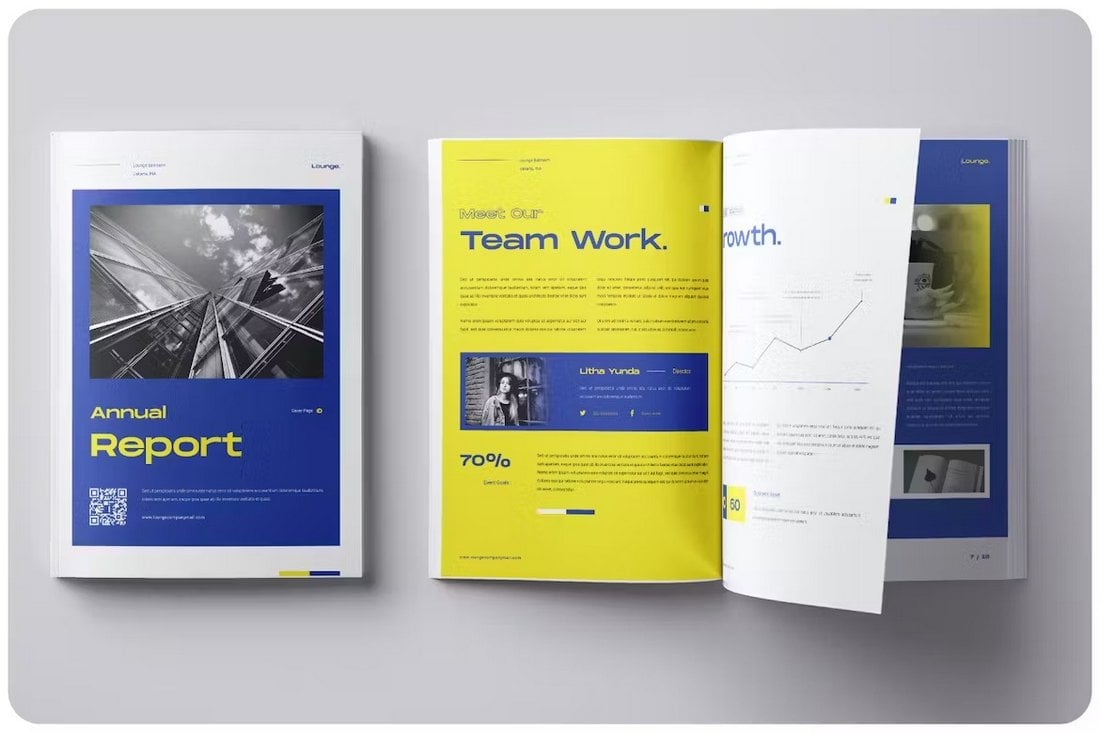
You can design an attractive and professional business report or annual report using this InDesign template. It lets you choose from 20 different pages to craft a brochure filled with visuals, charts, and graphs. The template has changeable colors, backgrounds, and free fonts.
Creative Annual Business Report Template
Use this brochure template to design more modern-looking annual and business reports. There are 16 unique pages in this template with stylish designs. You can also fully customize each page to match your business branding. It’s available in both A4 and US Letter sizes too.
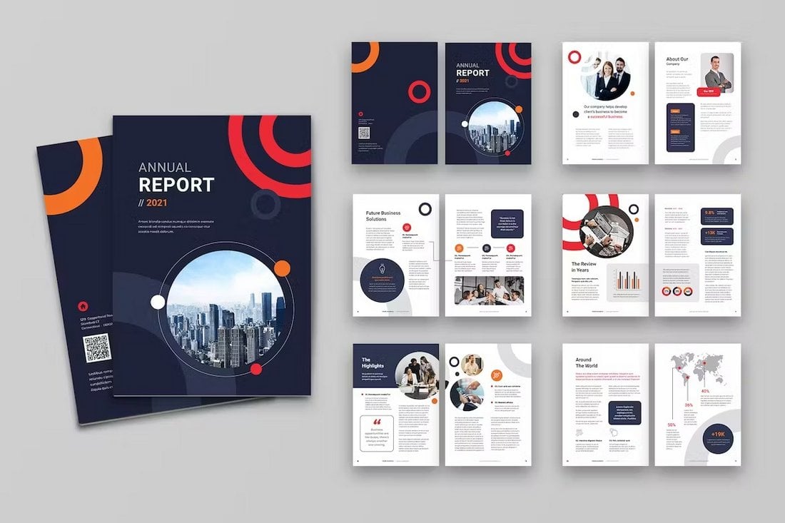
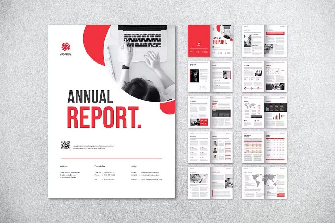
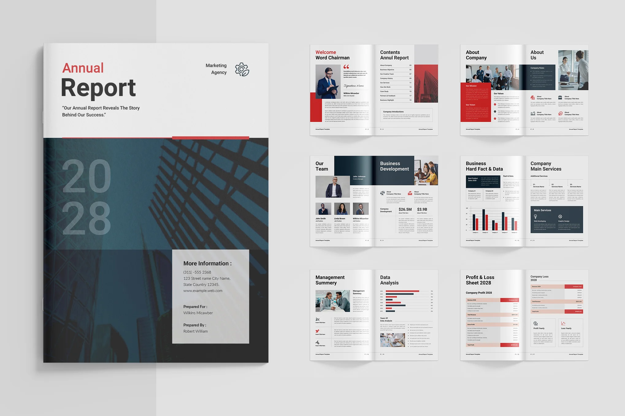
Red Corporate Annual Report for InDesign
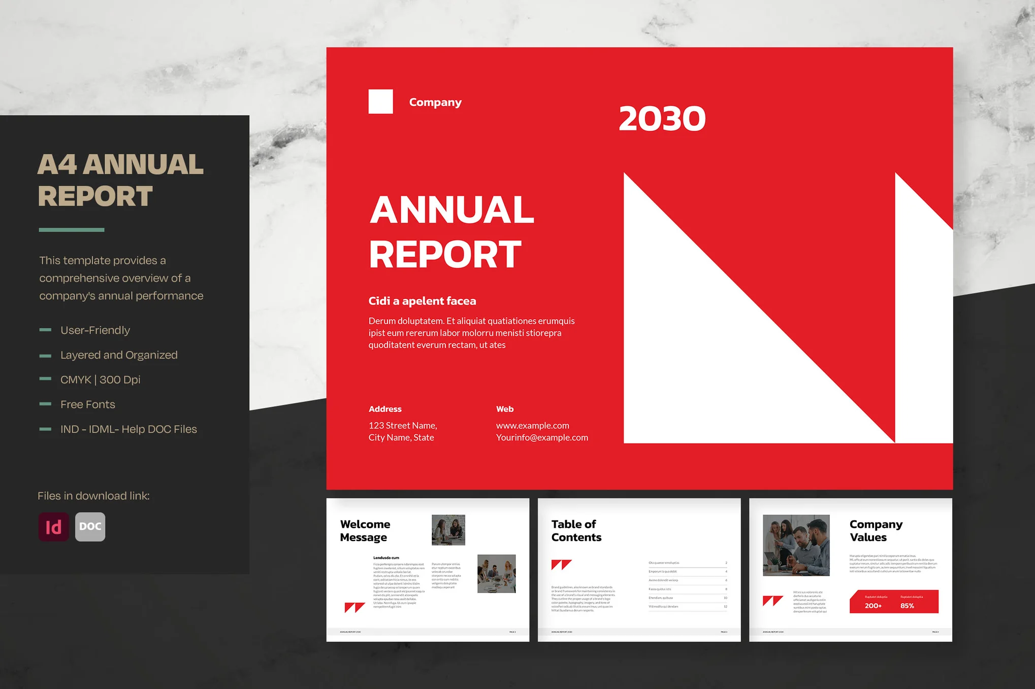
This is a slick, professional InDesign template for presenting yearly businesses’ performances. Easily customizable, it’s designed in an eye-pleasing modern style to clearly display financial data, achievements, and future projections, bolstering investment appeal.
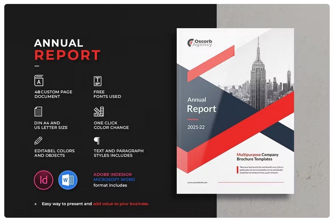
Bold Annual Report InDesign Template
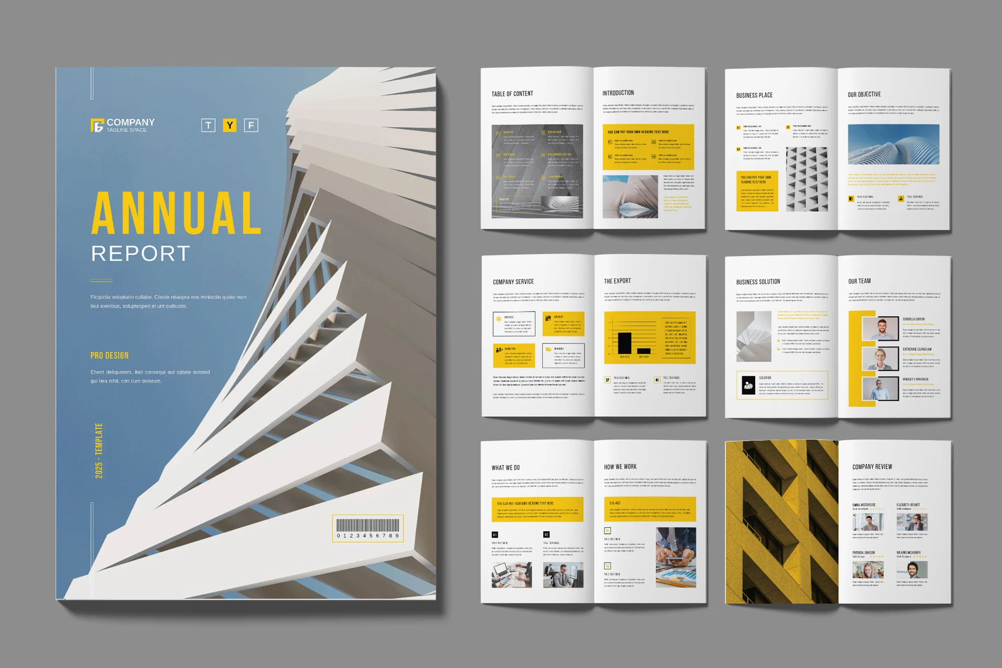
A versatile, 28-page template, compatible with Adobe InDesign CS4 and onward. The A4-sized layout is easy to customize with your own logo and brand colors. It includes a cover on the Master Page, separate layers for text and images, and paragraph and character styles.
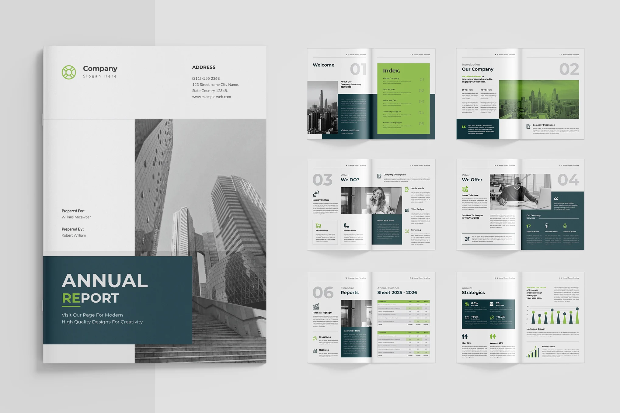
Creative Annual Report InDesign Template
This InDesign template merges style with professionalism through a refined layout, lively graphics, and purposeful typography. It makes presenting financial data and achievements engaging and compelling. Adjustable to match your needs, this template is immediately available after purchase, easy to edit, print-ready, and incorporates a free font.
Corporate Annual Report InDesign Template
This is a professional and comprehensive InDesign template to outline a company’s yearly performance concisely. With its modern design, this template showcases essential financial data, achievements, and goals in an attractive manner. This 12-page, A4 size template, which features editable content and uses CMYK color mode, is a perfect asset for businesses intending to boost investor confidence and credibility.
Minimal Annual Report InDesign Template
A professional, polished InDesign template that’s perfect for presenting a company’s financial data, accomplishments, and strategic plans. With its sleek design and modern typography, this template is designed for visual appeal, clarity, and easy customization.
Simple Corporate Annual Report for InDesign
This is a professional, modern template perfect for summarizing your company’s yearly performance. With this visually appealing and fully customizable 12-page asset, you can clearly highlight financial data, achievements, and future objectives. It’s a valuable tool to boost investor confidence and showcase your business success.
Professional Report Brochure Template
This professional report template is most suitable for designing brochures for corporate companies and agencies. It has a clean and traditional page design that has all the necessary layouts for making a complete and fully detailed business report. The template includes 36 page designs.
Colorful Business Report Template
If you prefer to take a more creative and colorful approach to your business report design, this template is perfect for you. It has a beautiful page design with trendy layouts. There are 12 different pages in this template featuring editable colors, fonts, and text. It comes in A4 size.
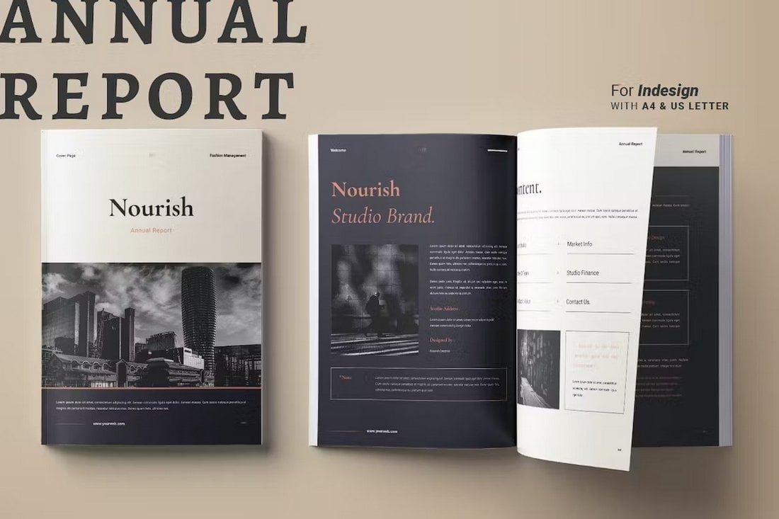
Elegant Annual Business Report Template
This is one of the most elegant and beautiful business report templates on our list. It features a stylish page design that will surely make your brochures stand out. And it’s especially suitable for high-end brands and businesses. The template comes with 16 pages in A4 and US Letter sizes.
Modern Professional Business Report Template
You can design a bold business report with a dark color theme using this professional InDesign template. It includes 20 unique page layouts with highly visual and modern designs. Of course, you can easily change the colors, fonts, and backgrounds to your preference as well.
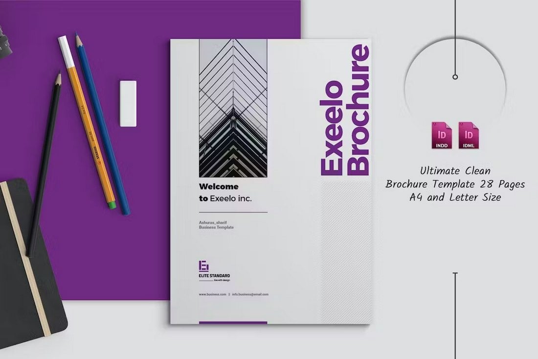
Exeelo – Professional Report Template
This InDesign template has 28 different page designs with multipurpose layouts. You can use it to make all kinds of business brochures, including various types of business reports. The template has editable colors, paragraph styles, and easy-to-replace image placeholders.
Company Report Professional Template
This business report template uses a unique metallic color theme that adds a very sophisticated look to the design. It also has modern pages with simple paragraph styles and formatting. There are 24 page layouts included in the template. Use it to design bold business reports for modern brands.
Clean Annual Business Report Template
Looking to make a minimal, clean, and professional business report brochure? Then start with this template. It gives you 20 unique pages with clean and minimal designs to help create attractive business reports for all kinds of projects. It features organized layers and free fonts too.
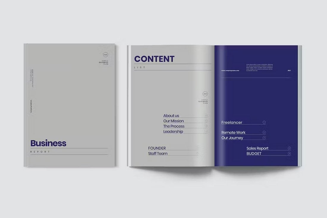
Minimal Business Report Template PDF
This brochure template comes with a minimalist page design and it’s available in InDesign and PDF formats. The template has 40 page layouts that you can customize to change fonts, colors, and more.
MS Word Business Report Templates
Microsoft Word is easy to use and it’s one of the most accessible software for professionals. Use these templates to create professional-looking business reports using your favorite word processor.
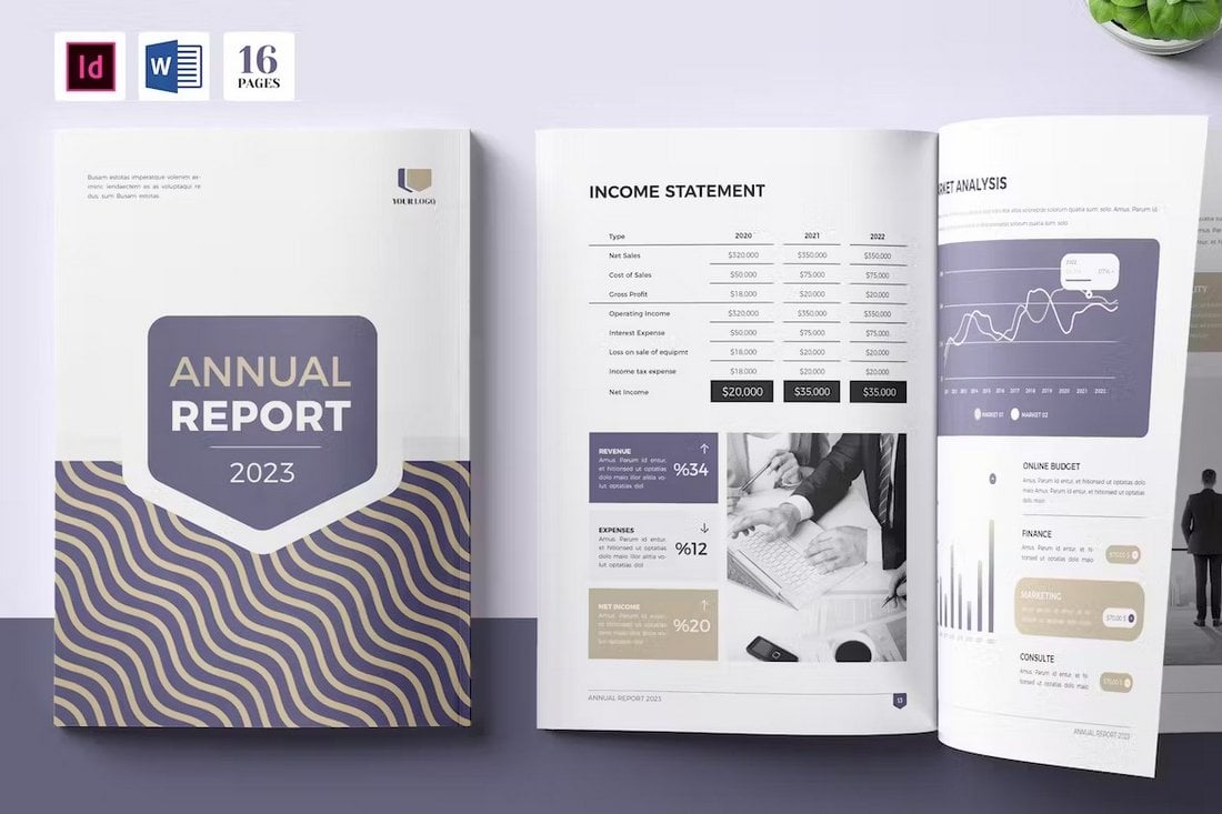
Annual Report Template Word & INDD
This brochure template is ideal for making annual reports for modern brands and businesses. It comes in both MS Word and InDesign formats with fully customizable page layouts. There are 24 different pages to choose from and each page has easily editable text, changeable colors, and image placeholders.
Business Report Template Word
A business report template with a simple and minimal design. This Word template includes 20 unique page designs that have clean layouts to effectively showcase stats and data related to your business. It’s available in A4 and US Letter sizes as well.
Business Annual Report Word Template
With 16 beautifully designed pages, this annual report template allows you to make brochures that will look more attractive and professional. It has color themes and easily customizable design elements to help you create branded brochures for all types of businesses.
Dark Gradient Annual Financial Report for Word
This Word template is perfect for your company’s financial reporting. The user-friendly design makes it easy to use and customize according to your needs. Available in MS Word and Canva formats, it features over 30 editable pages, changeable colors, texts, and images.
Annual Report Brochure Word Template
A sleek, professional Word template perfect for creating thorough annual reports. It’s carefully designed, fully customizable, and available in various formats including Adobe InDesign, Microsoft Word, and PDF. With 20 unique layouts and adaptable text, colors, and images, this template simplifies the presentation of your company’s yearly performance.
Minimal Annual Report Word Template
This Word template offers a professional layout for business reports. Easy to customize, this template boasts engaging photos, clear financial graphics, and streamlined narratives. Offering 20 distinct layouts, it includes organised layers and auto page numbering.
Simple Annual Report Word Template
A professionally crafted, easy-to-customize Word template ideal for presenting your company’s yearly progress. With areas for engaging narratives, eye-catching images, and clear financial data, it ensures your report is comprehensive and compelling. It’s compatible with Adobe InDesign and Microsoft Word, and available in both A4 and US Letter formats.
Modern Business Report Template Word
Make modern business reports with a classic design using this Word brochure template. It features a traditional page design with a highly customizable layout. There are 48 different pages to choose from. And you can use it to make bold and attractive annual reports as well.
Professional Report Word Template
A clean and minimal business report template for Microsoft Word. This template has a design that’s most suitable for corporate business brochures. It has classic content formatting that gives a professional look to each page. The template comes with 16 unique pages.
Simple Business Report MS Word & InDesign
Another minimalist business report template with a simple page design. This brochure template is ideal for business annual reports. And it has 24 flexible pages that you can customize using Word or InDesign. Everything from the colors to fonts and backgrounds is editable.
Annual Report Word Brochure Template
A professional MS Word brochure template that’s ideal for designing annual reports for modern businesses. This template has 16 page layouts. And it’s compatible with both older and new versions of Microsoft Word. The template is available in InDesign format too.
PowerPoint Business Report Templates
PowerPoint is one of the most versatile software there is. With these templates, you can create business report slideshows for presentations as well as printable documents.
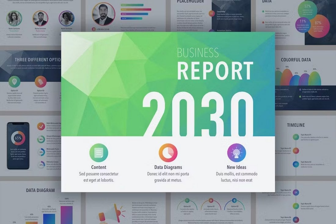
Business Report PowerPoint Template
This PowerPoint template has everything you need to make all types of business reports. It has charts, graphs, infographics, and more to design modern and colorful slides for your business report presentations. You can also customize the colors, edit the graphics, and change backgrounds to your preference too.
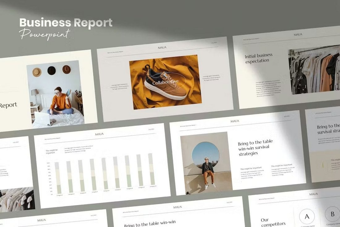
Maua – Aesthetic PowerPoint Business Report Template
Maua is a beautiful PowerPoint template with an aesthetic feel. It includes 30 unique slides that are designed for making business reports with a stylish design. This template is ideal for businesses in the fashion, beauty, and lifestyle industries.
Planen – Business Report PowerPoint Template
Another modern business report template for PowerPoint. This template comes with a professional slide design to showcase all your data and information in one place. There are 30 fully customizable slides in this template, which feature transition animations, image placeholders, editable graphics, and much more.
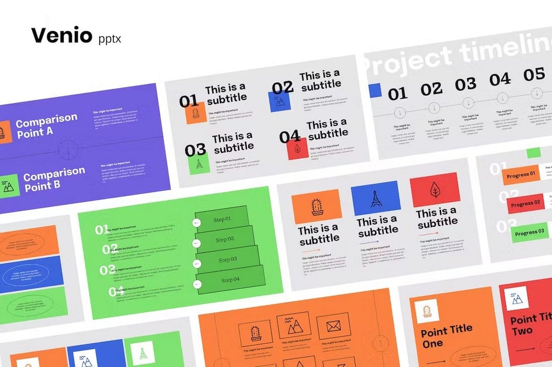
Venio – Stylish Business Report PowerPoint Template
The stylish and fresh slide design of this template will surely set your presentations apart from the rest. This template has 30 slides with trendy designs. Each slide is filled with colors and cool content formatting designs. You can also edit them to change the colors and fonts too.
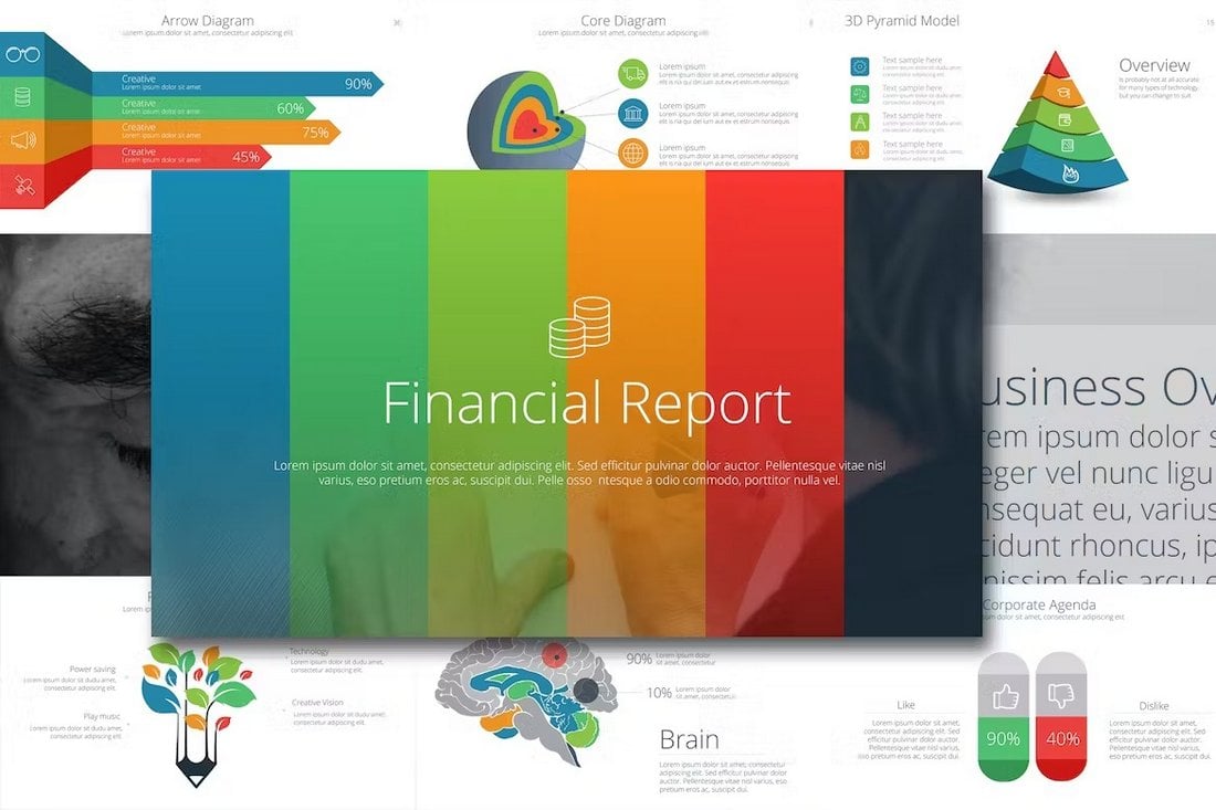
Financial Report PowerPoint Template
Grab this PowerPoint template to design professional presentations to showcase your business financial reports. There are 130 slides in this template that are available in 50 color schemes as well as in light and dark themes. It includes lots of infographics, charts, and graphs as well.
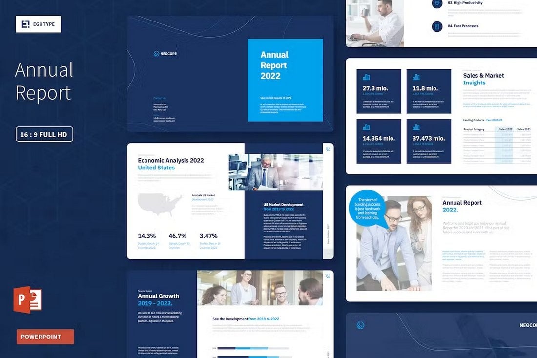
Neocore – Annual Report PowerPoint Template
You can use this PowerPoint template to design a professional presentation to showcase your business’s annual reports. It has 40 different slides with clean designs to include all the stats, data, and information related to the yearly review.
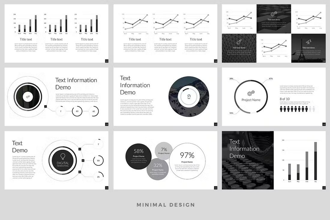
Corporate Report PowerPoint Template (500 Slides)
This is a massive PowerPoint template that includes 500 unique slides. It’s designed for making business reports for corporate brands and companies. The slides feature minimal layouts with editable charts, text, graphics, and free fonts.
20+ Best Square Fonts for Blocky Designs
Square fonts, known for their geometric precision and modern aesthetic, are perfect for projects that require a strong, edgy look.
Whether you’re working on branding, posters, website headers, or packaging, these blocky fonts deliver a clean, impactful design that stands out. They evoke a sense of strength, stability, and contemporary style, making them a favorite for tech brands, gaming designs, and any project aiming for a futuristic or industrial feel.
In this post, we’ve compiled the best square fonts that combine boldness with versatility. Each font offers something unique, whether it’s ultra-sharp edges for a striking appearance or more rounded, minimalist styles for a subtler approach. Have a look.
Higrah – Bold Square Font
Higrah is a distinctive monospace font with a square letter design. It comes with a robust, masculine aesthetic, thanks to its unique capitalization and character styles. Higrah’s square lettering can be customized to your design preferences, providing accuracy and uniqueness to your work. Ideal for titles, logos, book covers, and more.
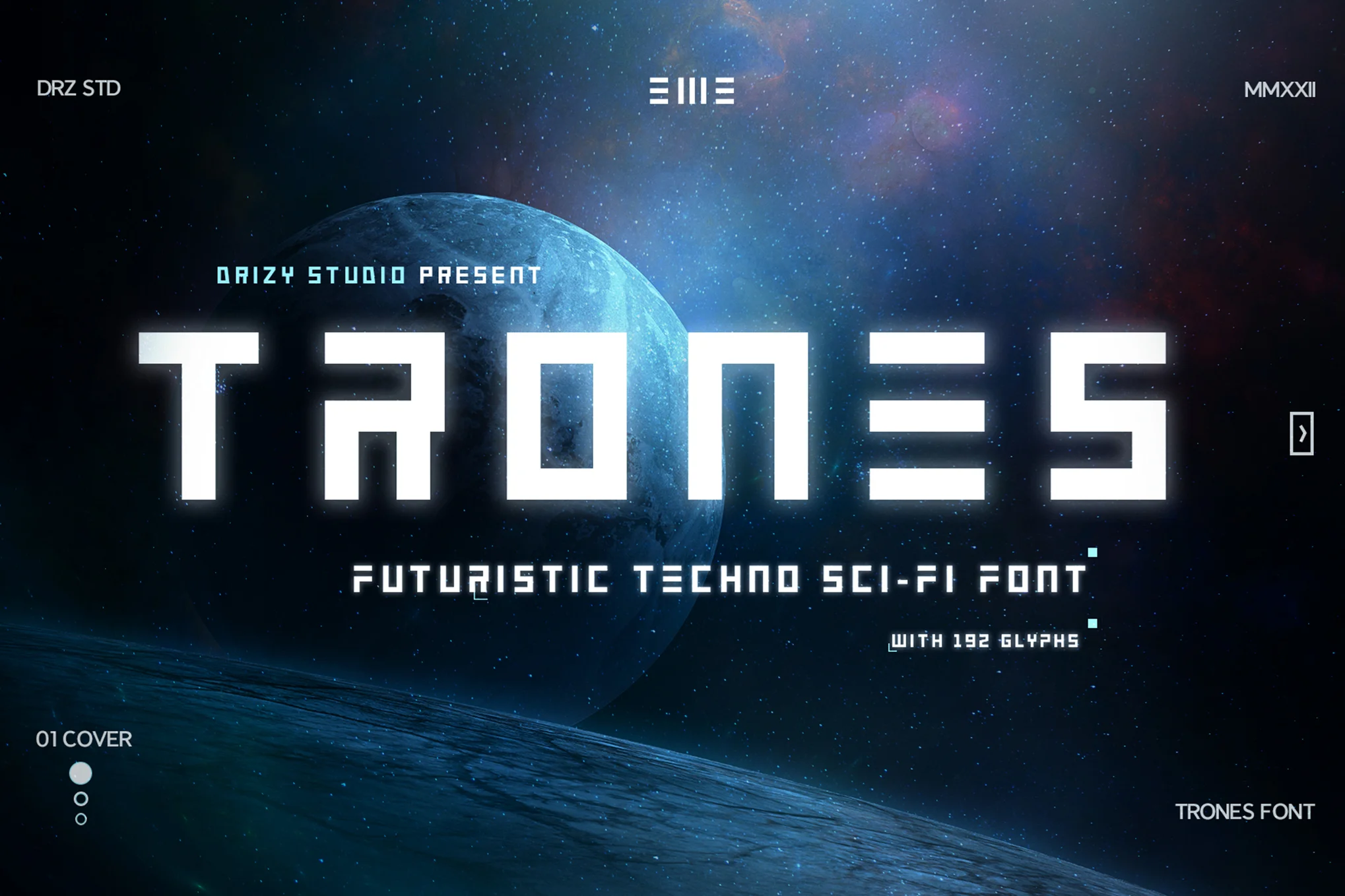
Trones – Techno Sci-Fi Font
Trones, a futuristic techno sci-fi font, adds an innovative charm to your projects, ideally suited for futuristic-themed designs. Providing comprehensive features like uppercase, lowercase, numerals, punctuations, and multilingual support, this font is easy to use and adaptable.
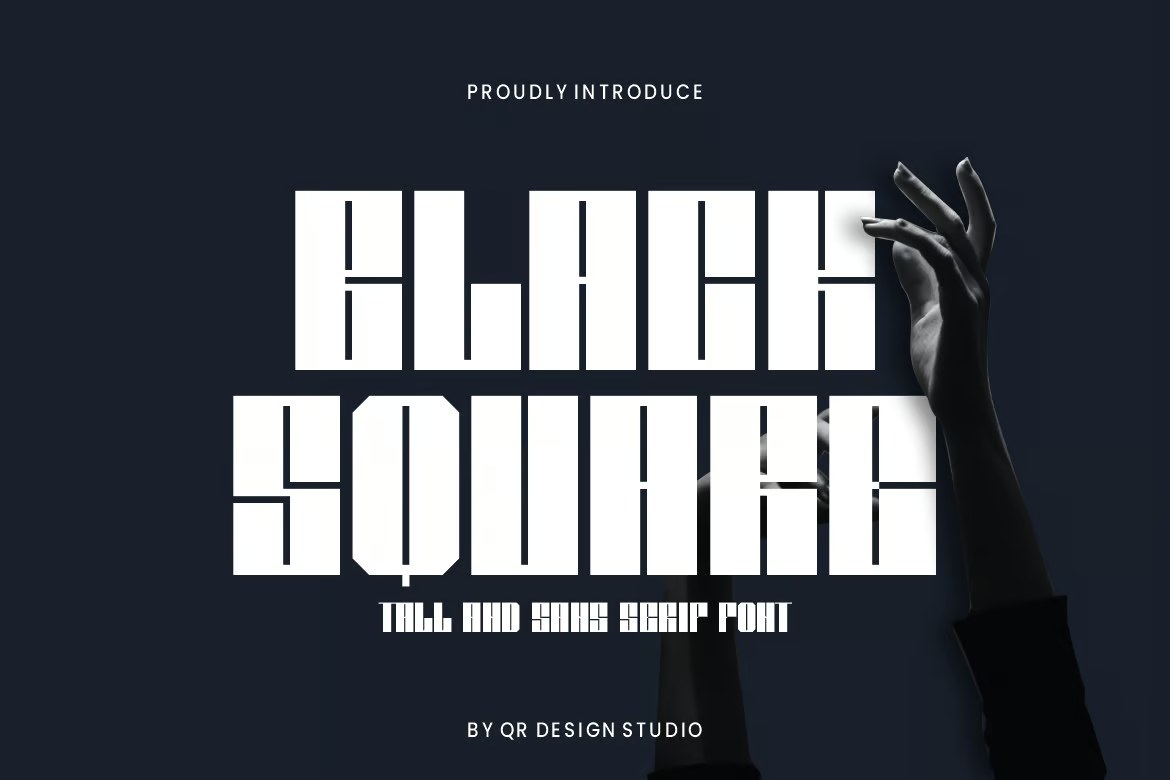
Black Square – Tall Square Font
Black Square is a striking and genuine display font that can add a bold edge to any branding initiative like logos, posters, sports merchandise, and more. Adaptable in various backdrops, it’s available in three formats: OTF, TTF, and WOFF, making it a versatile creative asset for design projects.
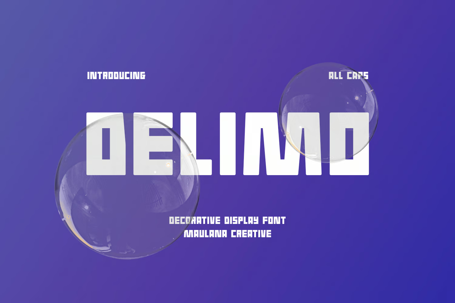
Delimo – Square Letters Font
Delimo is a playful, contemporary square display font with bold strokes and eye-catching ligatures. It comes with multiple formats, accommodating 100+ languages for a versatile range of applications. Use it for logo designs, social media, movie or book titles, or pair it with script or serif for contrast in longer text.
TAMPOOL – Creative Square Font
TAMPOOL is a dynamic creative square font with a blocky appeal. The identical, robust shape of each character lends your text a powerful impact, making it ideal for sports-themed posters, motivational prints, t-shirts, headlines, and more. Try TAMPOOL font to amplify your message and leave a lasting impression.
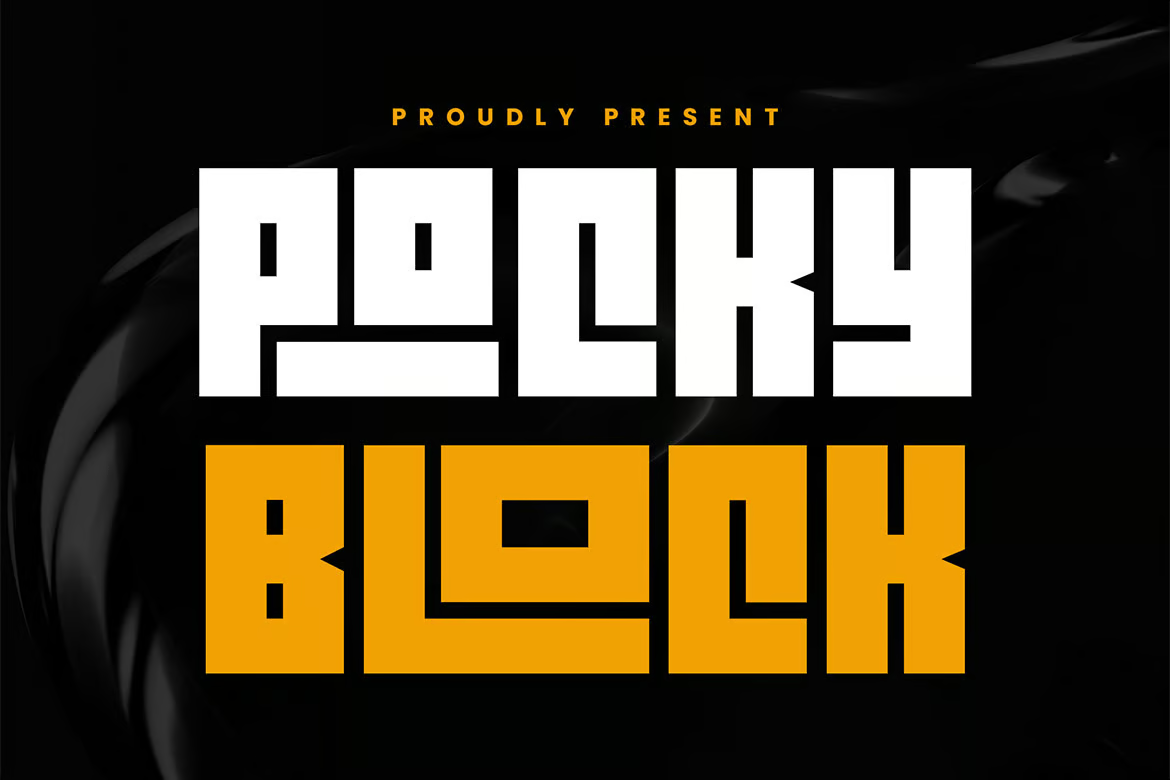
Pocky Block – Cool Block Letter Font
Introduce a daring edge to your designs with Pocky Block, a crisp and modern block letter font. Offering a sporty and assertive vibe, it’s perfect for projects themed around sports, adventure, or the future. With two styles – Regular and Slanted, and over 100+ ligatures for dynamic textual design – this bold font brings energy to stickers, posters, logos and more.
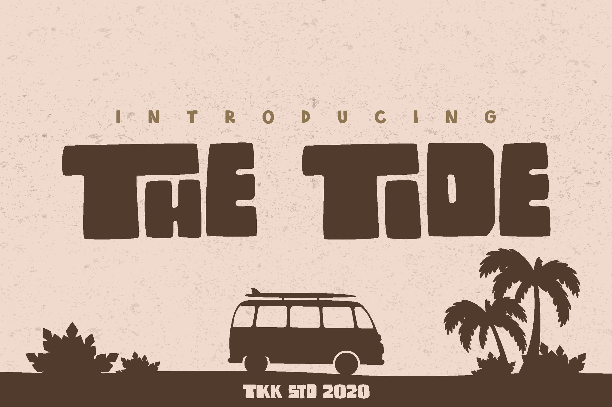
The Tide – Modern Block Letter Font
The Tide is a modern block-letter font inspired by surf and beach culture. Ideal for aquatic-themed games, posters, or YouTube covers, this font captures the rebel energy and carefree philosophy of the surfer lifestyle. The Tide font family offers basic Latin characters, numbers, and punctuation.
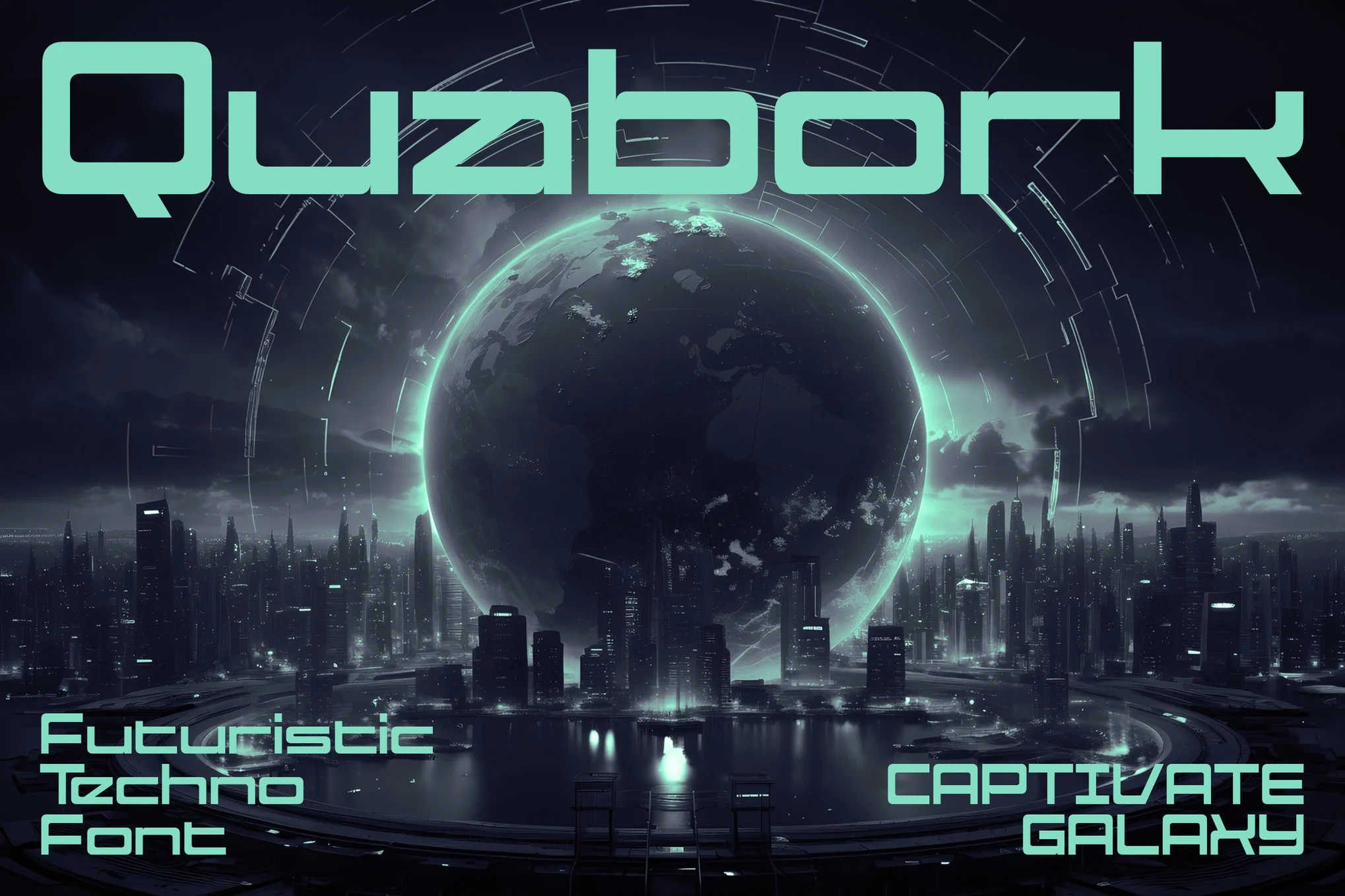
Quabork – Futuristic Square Font
With Quabork, a futuristic square font, transport yourself into a neon-drenched, pixelised space. It’s not simply a font, but an embodiment of retro-gaming arcade culture, radiating bold, blocky strokes that resemble neon lights and pulsating energy. Fully equipped with precision, Quabork comes in several formats, making it widely adaptable across platforms.
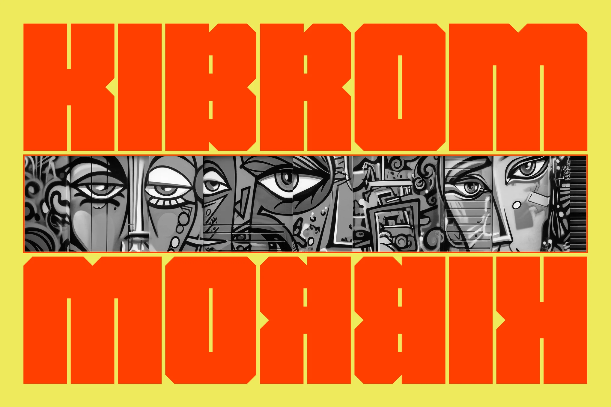
Kibrom – Urban Block Letter Fonts
Showcase the vibrant pulse of city life with Kibrom, a collection of urban block letter fonts. Kibrom draws inspiration from the gritty reality of street culture, helping your work reflect the raw, unapologetic spirit of urban landscapes. Ideal for murals and gig posters, these blocky fonts will make your creations pop.
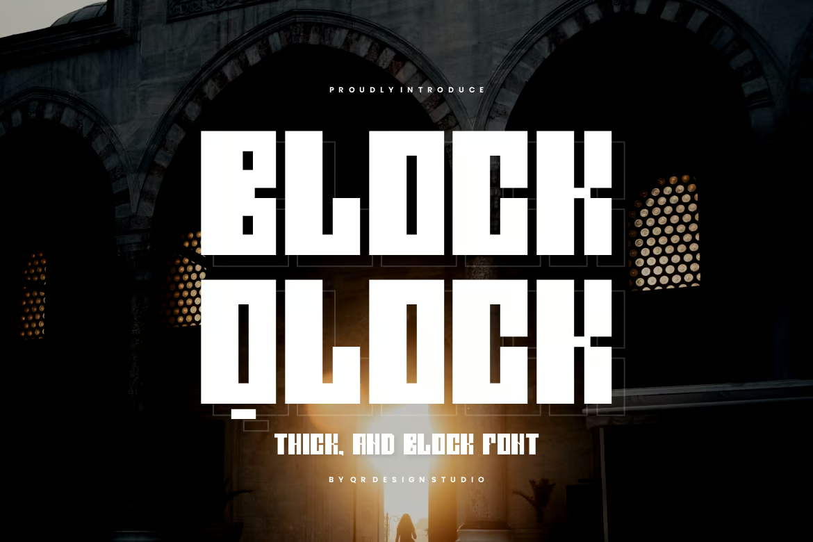
Block Qlock – Thick & Condensed Font
Block Qlock is a robust, original display font that lends itself well to various branding projects, from logos to sports merchandise and even posters. Adaptable across different contexts, it offers OTF, TTF, and WOFF formats for comprehensive coverage. With its distinct thick and condensed design, Block Qlock brings a unique edge to your creative expression.
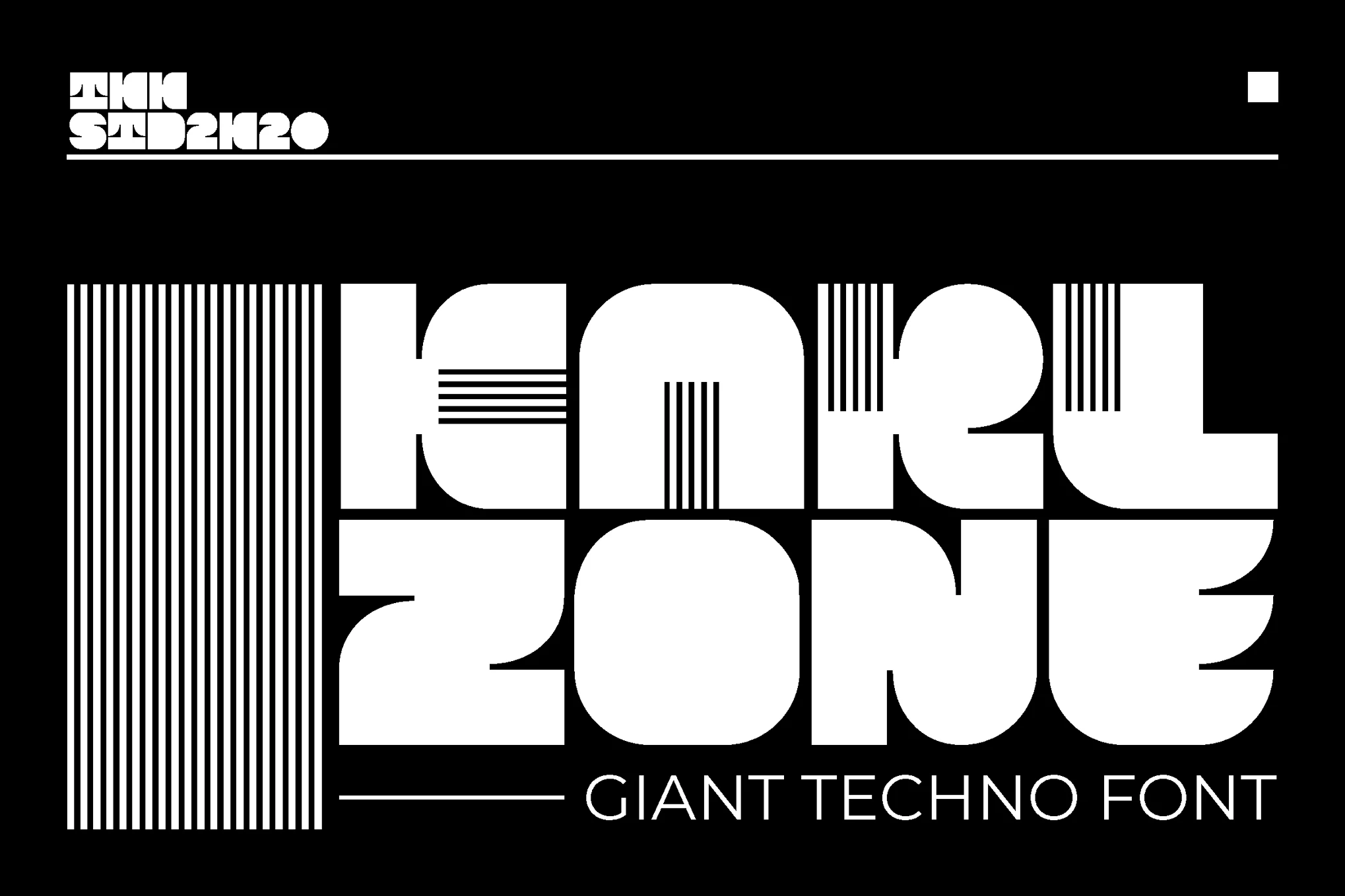
KARL zone – Modern Block Letter Font
The KARL Zone asset offers a modern block letter font that encapsulates power, speed and resilience. This bold, square font provides high impact and graphic aesthetics without compromising legibility. It’s perfect for larger prints (above 72pt), making it ideal for magazine headlines, posters, gym ads, music covers, or anywhere you want to command attention.
Knob – Modern Square Font
Presenting Knob, a modern square font with a fat and bold style that’s perfect for enhancing your designs. Ideal for use on mediums such as posters, magazines, books, vinyl, CDs, and flyers, this display typeface will make your messages stand out. The package includes otf and ttf files for convenience.
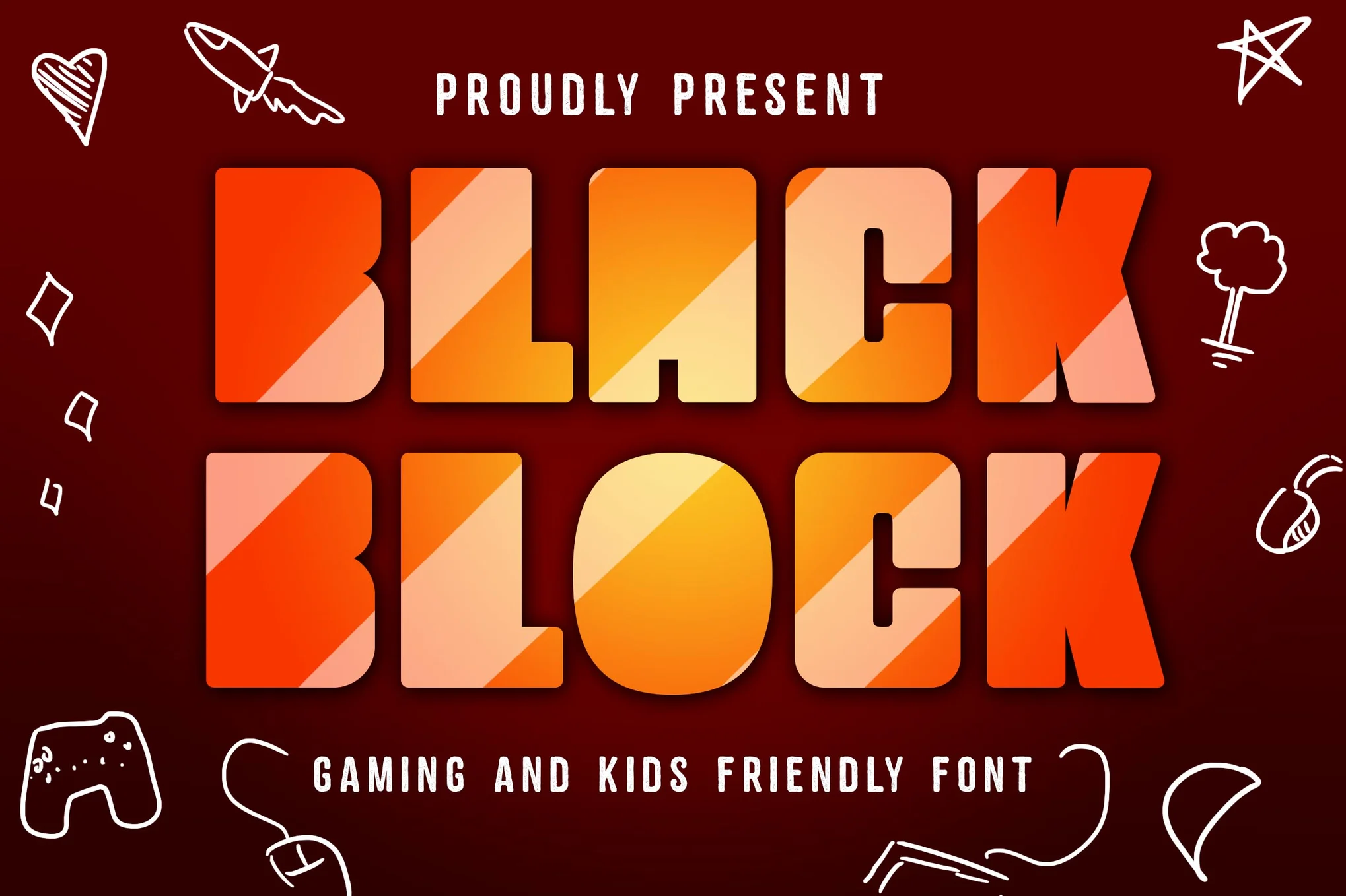
Black Block – Gaming Font
Black Block is a lively, bold font designed specifically for entertaining projects. Its blocky structure makes it the perfect fit for creating fun video games, interactive kids apps, engaging board games or even educational school materials. This unique, square font instinctively adds a playful touch to any project.
Greks Webol – Block & Bold Font
The Greks Webol is a distinct, bold display font that brings an authentic edge to your branding projects. Whether for logos, posters, or sports collateral, its blocky aesthetic works beautifully across a range of uses. The font includes uppercase and lowercase types, ligatures, numerals, punctuations, multilingual support, and an extended character set. Formats offered are OTF, TTF, and WOFF.
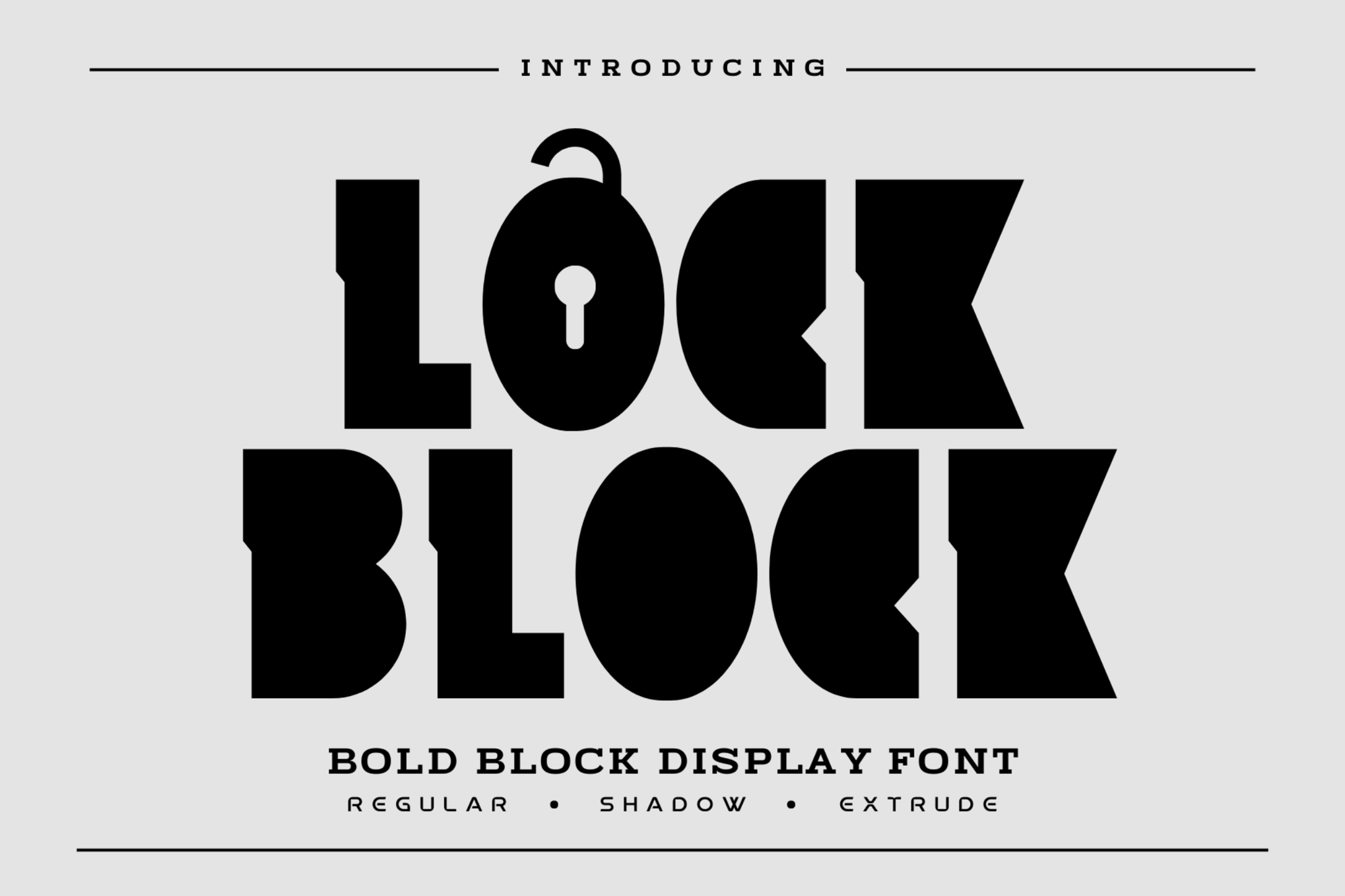
Lock Block – Block Display Font
Lock Block is another square font featuring a block style display font that amplifies the robustness in design work. Crafted with geometric shapes, its powerful aesthetic is ideal for eye-catching headlines or posters. It houses three styles including regular, extrude, and shadow, and provides multilingual support.
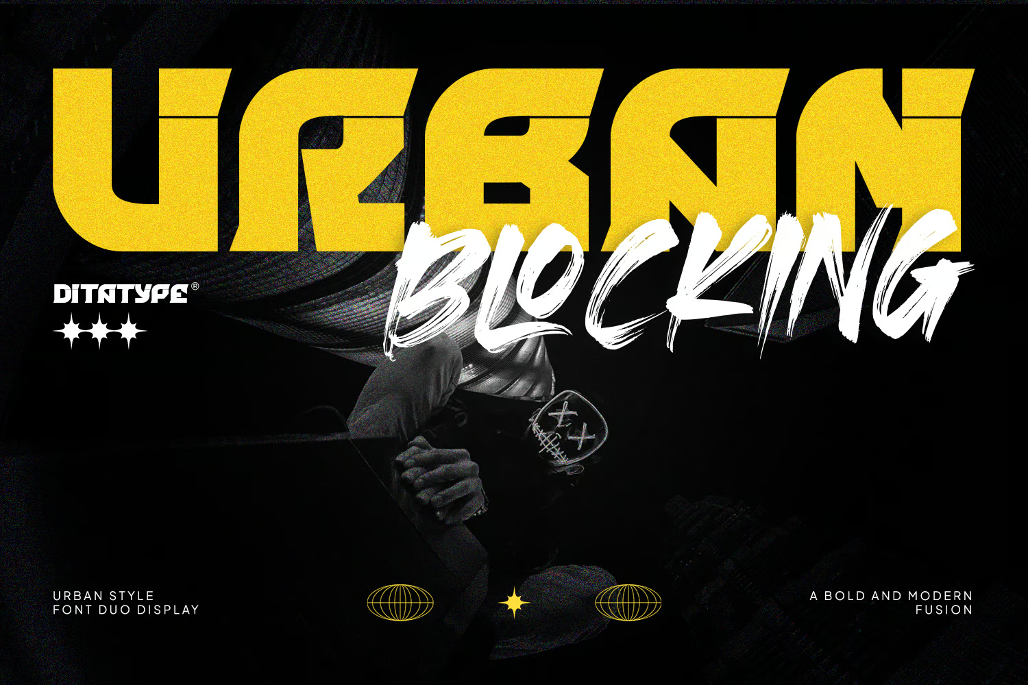
Urban Blocking – Block Letter Font
Urban Blocking is a unique, dual-font aesthetic that masterfully blends the boldness of display type with the expressiveness of brush lettering. Its block-style uppercase letters have a bold, commanding presence, counterbalanced by the lively strokes and textured edges of the brush font. These versatile fonts come with features like ligatures, stylistic sets, and multilingual support, and are suited for various design projects such as headlines, logos, and printed media.
BLOKEE – Modern Blockletter Font
Check out BLOKEE, a modern blockletter font that’s eye-catching due to its bold and striking character. With its full block upper case and striped cut lower case, BLOKEE adds a strong and effective touch to your posters. Embrace its simplicity and strength to make your presentations stand out.
ASHOKA – Classic Square Font
ASHOKA, a classic square font, delivers a unique 80s feel that commands attention and incites intrigue. More than just a standard Sans-Serif, this striking font gives a bold edge to headlines, logos, and business materials. Ideal for use in mature, provocative projects, this font enhances everything from economic posters to YouTube thumbnails.
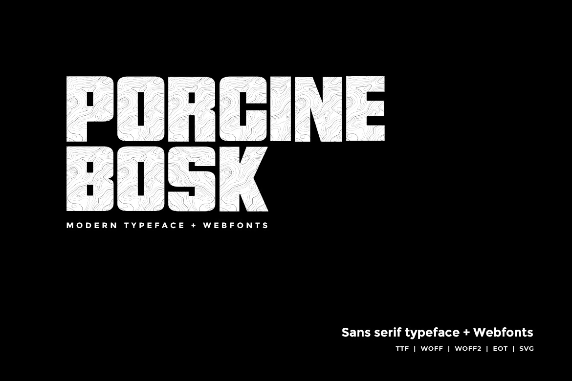
Porcine Bosk – Modern Block Letter Font
The Porcine Bosk typeface is a modern block letter font with a unique wooden texture. It is versatile and perfect for various applications such as headlines, posters, logos and web designs. Designed by Michel Iona, this Sans Serif font has a classic and decorative appeal. The pack comes with OTF, TTF, and web fonts, and even includes a font demo page.
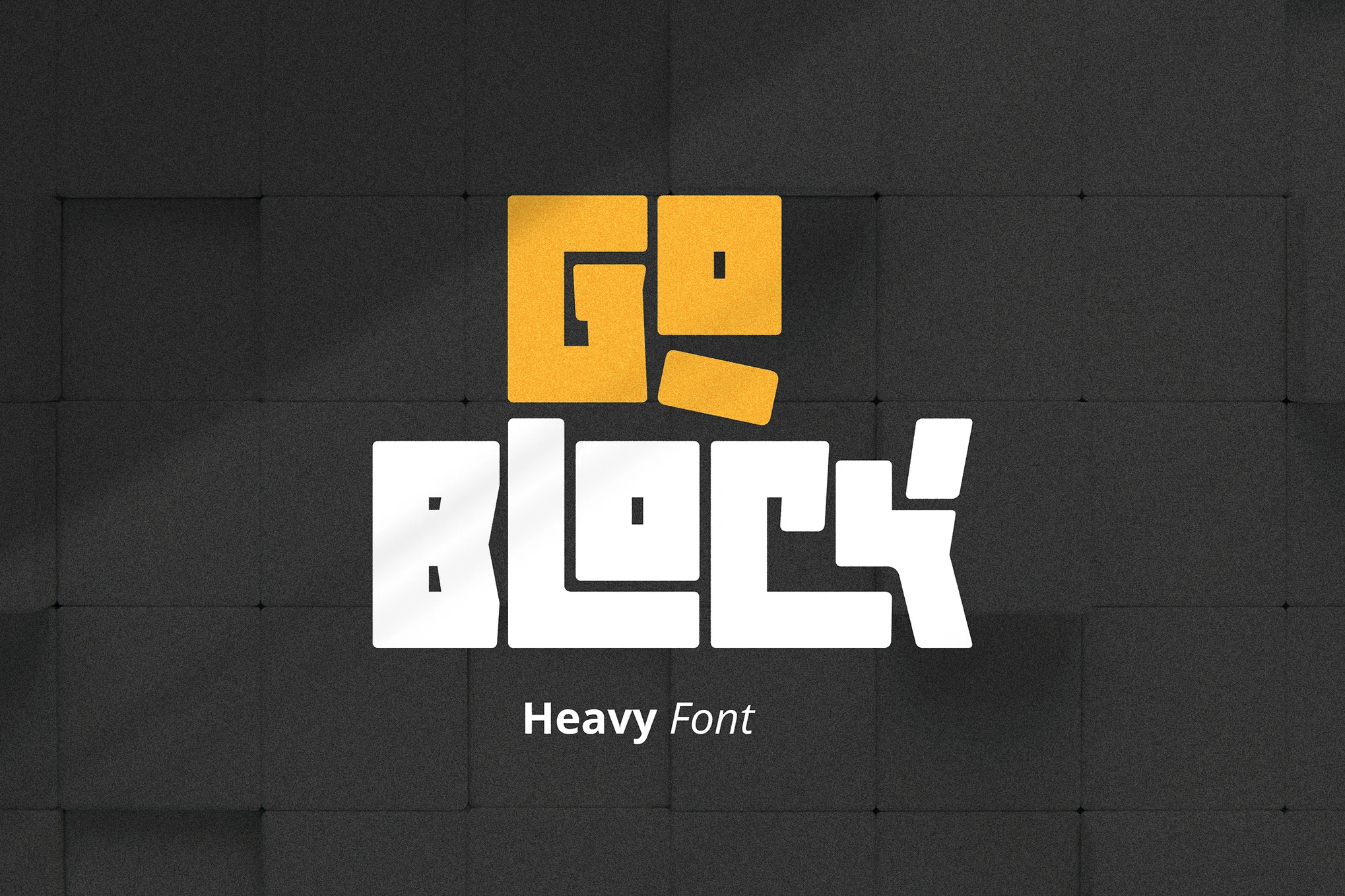
Goblock – Heavy Square Letters Font
Goblock is a powerful font that adds a bold touch to your branding. Crafted with robust strokes and detailed characters, this fat, striking font leaves a memorable impression. It strikes the perfect balance between strength and authority. Featuring Latin glyphs, uppercase and lowercase letters, numerals, punctuation, and multilingual support, it’s versatile for any use.
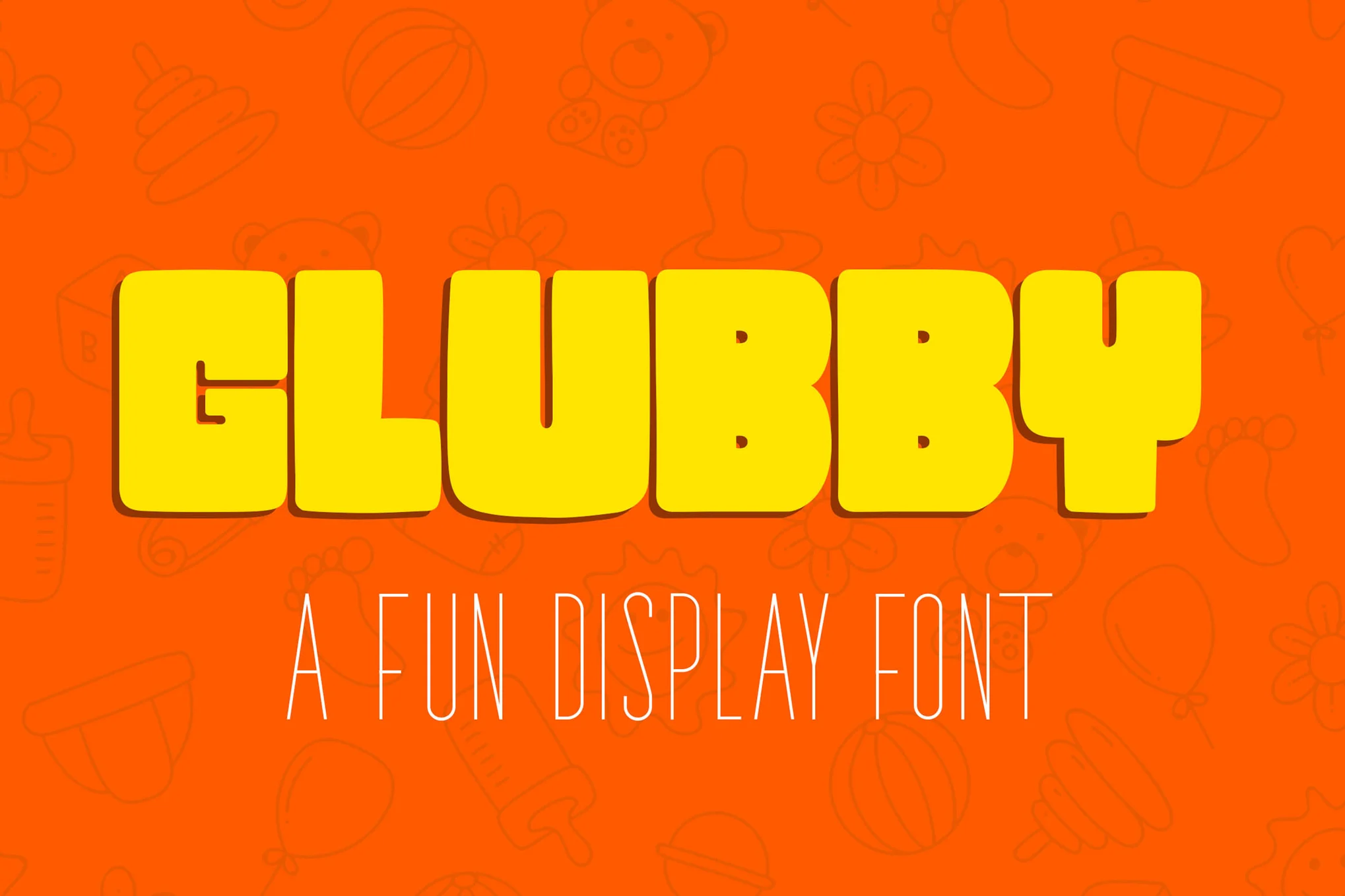
Glubby – Fun Display Font
Glubby is a distinctive display font that is sure to add a delightfully playful touch to your creative projects. Ideal for children-themed designs like posters, book covers, and headlines, this font, with its chunky and bold look, can turn large titles and letterings into kid-friendly texts. From English to Italian and Finnish, Glubby’s language versatility further enhances its appeal.
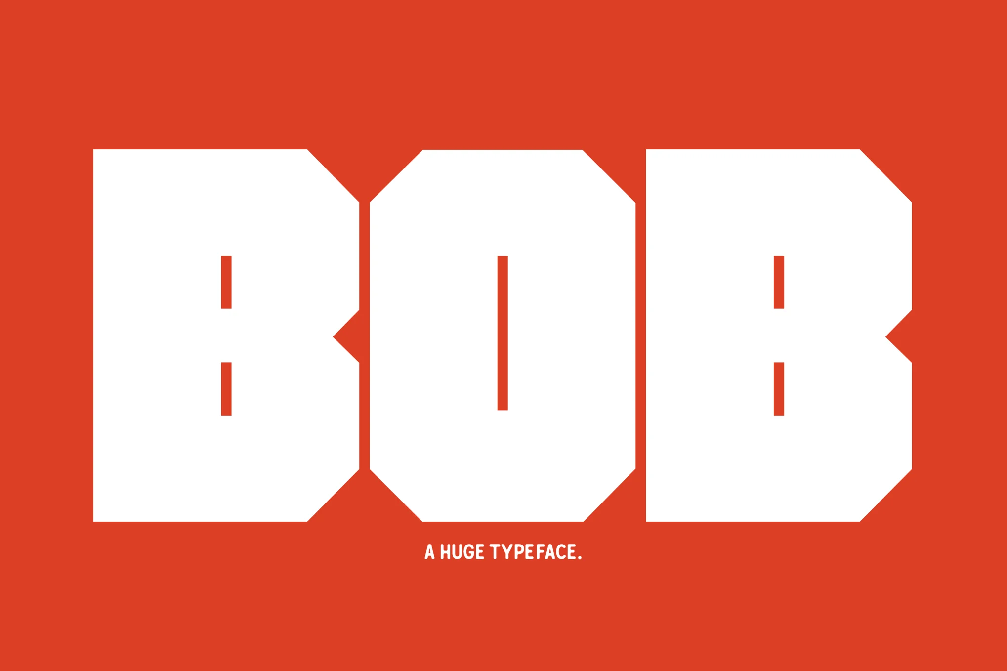
Bob – Chunky Square Letter Font
Bob is a chunky square-letter font that loves the spotlight. Ideally suited for large-scale uses like posters and prints, Bob boasts about 200 glyphs, comfortably accommodating basic Latin and more. Make room for Bob and let him add a bold and spacious edge to your projects.
Free Square Fonts
Angle Square – Free Block Letter Font
This font comes with a unique square-shaped letter design that will make your typography look modern and creative. The font features blocky letterforms and bold strokes. It’s free to use with personal projects.
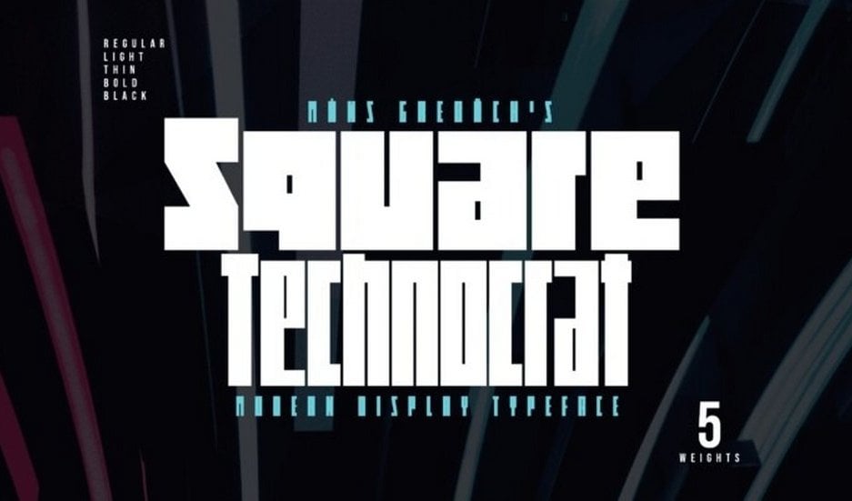
Square Technocrat – Free Square Font
This free square font comes in multiple styles. It includes blocky letters featuring narrow and condensed designs as well as in multiple weights. This font is free to use with your personal projects.
Double Square – Free Block Font
Double Square is another free block letter font you can use to craft stylish personal projects. This font also comes with square-shaped characters but also with unique textured designs.
Iamblock – Free Square Letter Font
This free block font is perfect for adding a creative look to your trendy design projects. It includes strong extruded characters with square-shaped letterforms. The font only includes uppercase letters. The font is free to use with commercial projects.
Block Stereo – Free Square Font
Block Stereo is another free font that comes with square letters. This font includes letterforms with stylish geometric shapes and an edgy look. It’s perfect for poster titles, flyers, banners, and much more. It’s free to use with personal and commercial projects.
SVG Coding Examples: Useful Recipes For Writing Vectors By Hand
Even though I am the kind of front-end engineer who manually cleans up SVG files when they are a mess, I never expected to become one of those people. You know, those crazy people that draw with code.
But here we are.
I dove deep into SVG specs last winter when I created a project to draw Calligraphy Grids, and even though I knew the basic structures and rules of SVG, it was only then that I fully tried to figure out and understand what all of those numbers meant and how they interacted with each other.
And, once you get the hang of it, it is actually very interesting and quite fun to code SVG by hand.
No <path> aheadDrawing With Math. Remember Coordinate Systems?
We won’t go into more complex SVG shapes like paths in this article, this is more about practical information for simple SVGs. When it comes to drawing curves, I still recommend using a tool like Illustrator or Affinity. However, if you are super into compounding your lines, a path is useful. Maybe we’ll do that in Part 2.
Also, this guide focuses mostly on practical examples that illustrate some of the math involved when drawing SVGs. There is a wonderful article here that goes a bit deeper into the specs, which I recommend reading if you’re more interested in that: “A Practical Guide To SVG And Design Tools.”
Illustrator, Affinity, and all other vector programs are basically just helping you draw on a coordinate system, and then those paths and shapes are stored in SVG files.
If you open up these files in an editor, you’ll see that they are just a bunch of paths that contain lots of numbers, which are coordinates in that coordinate system that make up the lines.
But, there is a difference between the all-powerful <path> and the other, more semantic elements like <rect>, <circle>, <line>, <ellipse>, <polygon>, and <polyline>.
These elements are not that hard to read and write by hand, and they open up a lot of possibilities to add animation and other fun stuff. So, while most people might only think of SVGs as never-pixelated, infinitely scaling images, they can also be quite comprehensive pieces of code.
How Does SVG Work? unit != unit
Before we get started on how SVG elements are drawn, let’s talk about the ways units work in SVG because they might be a bit confusing when you first get started.
The beauty of SVG is that it’s a vector format, which means that the units are somewhat detached from the browser and are instead just relative to the coordinate system you’re working in.
That means you would not use a unit within SVG but rather just use numbers and then define the size of the document you’re working with.
So, your width and height might be using CSS rem units, but in your viewBox, units become just a concept that helps you in establishing sizing relationships.
What Is The viewBox?
The viewBox works a little bit like the CSS aspect-ratio property. It helps you establish a relationship between the width and the height of your coordinate system and sets up the box you’re working in. I tend to think of the viewBox as my “document” size.
Any element that is placed within the SVG with bigger dimensions than the viewBox will not be visible. So, the viewBox is the cutout of the coordinate system we’re looking through. The width and height attributes are unnecessary if there is a viewBox attribute.
So, in short, having an SVG with a viewBox makes it behave a lot like a regular image. And just like with images, it’s usually easiest to just set either a width or a height and let the other dimension be automatically sized based on the intrinsic aspect ratio dimensions.
So, if we were to create a function that draws an SVG, we might store three separate variables and fill them in like this:
`<svg
  width="${svgWidth}"
  viewBox="0 0 ${documentWidth} ${documentHeight}"
  xmlns="http://www.w3.org/2000/svg"
>`;
SVG Things Of Note
There is a lot to know about SVG: When you want to reuse an image a lot, you may want to turn it into a symbol that can then be referenced with a use tag, you can create sprites, and there are some best practices when using them for icons, and so on.
Unfortunately, this is a bit out of the scope of this article. Here, we’re mainly focusing on designing SVG files and not on how we can optimize and use them.
However, one thing of note that is easier to implement from the start is accessibility.
SVGs can be used in an <img> tag, where alt tags are available, but then you lose the ability to interact with your SVG code, so inlining might be your preference.
When inlining, it’s easiest to declare role="img" and then add a <title> tag with your image title.
Note: You can check out this article for SVG and Accessibility recommendations.
<svg
  role="img"
  [...attr]
>
  <title>An accessible title</title>
  <!-- design code -->
</svg>
There is usually some mathematics involved when drawing SVGs. It’s usually fairly simple arithmetic (except, you know, in case you draw calligraphy grids and then have to dig out trigonometry…), but I think even for simple math, most people don’t write their SVGs in pure HTML and thus would like to use algebra.
At least for me, I find it much easier to understand SVG Code when giving meaning to numbers, so I always stick to JavaScript, and by giving my coordinates names, I like them immeasurable times more.
So, for the upcoming examples, we’ll look at the list of variables with the simple math and then JSX-style templates for interpolation, as that gives more legible syntax highlighting than string interpolations, and then each example will be available as a CodePen.
To keep this Guide framework-agnostic, I wanted to quickly go over drawing SVG elements with just good old vanilla JavaScript.
We’ll create a container element in HTML that we can put our SVG into and grab that element with JavaScript.
<div data-svg-container></div>
<script src="template.js"></script>
To make it simple, we’ll draw a rectangle <rect> that covers the entire viewBox and uses a fill.
Note: You can add all valid CSS values as fills, so a fixed color, or something like currentColor to access the site’s text color or a CSS variable would work here if you’re inlining your SVG and want it to interact with the page it’s placed in.
Let’s first start with our variable setup.
// vars
const container = document.querySelector("[data-svg-container]");
const svgWidth = "30rem"; // use any value with units here
const documentWidth = 100;
const documentHeight = 100;
const rectWidth = documentWidth;
const rectHeight = documentHeight;
const rectFill = "currentColor"; // use any color value here
const title = "A simple square box";
Method 1: Create Element and Set Attributes
This method is easier to keep type-safe (if using TypeScript) — uses proper SVG elements and attributes, and so on — but it is less performant and may take a long time if you have many elements.
const svg = document.createElementNS("http://www.w3.org/2000/svg", "svg"); const titleElement = document.createElementNS("http://www.w3.org/2000/svg", "title"); const rect = document.createElementNS("http://www.w3.org/2000/svg", "rect"); svg.setAttribute("width", svgWidth); svg.setAttribute("viewBox",0 0 ${documentWidth} ${documentHeight}); svg.setAttribute("xmlns", "http://www.w3.org/2000/svg"); svg.setAttribute("role", "img"); titleElement.textContent = title; rect.setAttribute("width", rectWidth); rect.setAttribute("height", rectHeight); rect.setAttribute("fill", rectFill); svg.appendChild(titleElement); svg.appendChild(rect); container.appendChild(svg);

Here, you can see that with the same coordinates, a polyline won’t draw the line between the blue and the red dot, while a polygon will. However, when applying a fill, they take the exact same information as if the shape was closed, which is the right side of the graphic, where the polyline makes it look like a piece of a circle is missing.
This is the second time where we have dealt with quite a bit of repetition, and we can have a look at how we could leverage the power of JavaScript logic to render our template faster.
But first, we need a basic implementation like we’ve done before. We’re creating objects for the circles, and then we’re chaining the cx and cy values together to create the points attribute. We’re also storing our transforms in variables.
const polyDocWidth = 200; const polyDocHeight = 200; const circleOne = { cx: 25, cy: 80, r: 10, fill: "red" }; const circleTwo = { cx: 40, cy: 20, r: 5, fill: "lime" }; const circleThree = { cx: 70, cy: 60, r: 8, fill: "cyan" }; const points =${circleOne.cx},${circleOne.cy} ${circleTwo.cx},${circleTwo.cy} ${circleThree.cx},${circleThree.cy}; const moveToTopRight =translate(${polyDocWidth / 2}, 0); const moveToBottomRight =translate(${polyDocWidth / 2}, ${polyDocHeight / 2}); const moveToBottomLeft =translate(0, ${polyDocHeight / 2});
And then, we apply the variables to the template, using either a polyline or polygon element and a fill attribute that is either set to none or a color value.
<svg
  width={svgWidth}
  viewBox={`0 0 ${polyDocWidth} ${polyDocHeight}`}
  xmlns="http://www.w3.org/2000/svg"
  role="img"
>
  <title>Composite shape comparison</title>
  <g>
    <circle
      cx={circleOne.cx}
      cy={circleOne.cy}
      r={circleOne.r}
      fill={circleOne.fill}
    />
    <circle
      cx={circleTwo.cx}
      cy={circleTwo.cy}
      r={circleTwo.r}
      fill={circleTwo.fill}
    />
    <circle
      cx={circleThree.cx}
      cy={circleThree.cy}
      r={circleThree.r}
      fill={circleThree.fill}
    />
    <polyline
      points={points}
      fill="none"
      stroke="black"
    />
  </g>
  <g transform={moveToTopRight}>
    <circle
      cx={circleOne.cx}
      cy={circleOne.cy}
      r={circleOne.r}
      fill={circleOne.fill}
    />
    <circle
      cx={circleTwo.cx}
      cy={circleTwo.cy}
      r={circleTwo.r}
      fill={circleTwo.fill}
    />
    <circle
      cx={circleThree.cx}
      cy={circleThree.cy}
      r={circleThree.r}
      fill={circleThree.fill}
    />
    <polyline
      points={points}
      fill="white"
      stroke="black"
    />
  </g>
  <g transform={moveToBottomLeft}>
    <circle
      cx={circleOne.cx}
      cy={circleOne.cy}
      r={circleOne.r}
      fill={circleOne.fill}
    />
    <circle
      cx={circleTwo.cx}
      cy={circleTwo.cy}
      r={circleTwo.r}
      fill={circleTwo.fill}
    />
    <circle
      cx={circleThree.cx}
      cy={circleThree.cy}
      r={circleThree.r}
      fill={circleThree.fill}
    />
    <polygon
      points={points}
      fill="none"
      stroke="black"
    />
  </g>
  <g transform={moveToBottomRight}>
    <circle
      cx={circleOne.cx}
      cy={circleOne.cy}
      r={circleOne.r}
      fill={circleOne.fill}
    />
    <circle
      cx={circleTwo.cx}
      cy={circleTwo.cy}
      r={circleTwo.r}
      fill={circleTwo.fill}
    />
    <circle
      cx={circleThree.cx}
      cy={circleThree.cy}
      r={circleThree.r}
      fill={circleThree.fill}
    />
    <polygon
      points={points}
      fill="white"
      stroke="black"
    />
  </g>
</svg>
And here’s a version of it to play with:
See the Pen SVG Polygon / Polyline (simple) [forked] by Myriam.
Dealing With RepetitionWhen it comes to drawing SVGs, you may find that you’ll be repeating a lot of the same code over and over again. This is where JavaScript can come in handy, so let’s look at the composite example again and see how we could optimize it so that there is less repetition.
Observations:
- We have three circle elements, all following the same pattern.
- We create one repetition to change the
fillstyle for the element. - We repeat those two elements one more time, with either a
polylineor apolygon. - We have four different
transforms(technically, no transform is a transform in this case).
This tells us that we can create nested loops.
Let’s go back to just a vanilla implementation for this since the way loops are done is quite different across frameworks.
You could make this more generic and write separate generator functions for each type of element, but this is just to give you an idea of what you could do in terms of logic. There are certainly still ways to optimize this.
I’ve opted to have arrays for each type of variation that we have and wrote a helper function that goes through the data and builds out an array of objects with all the necessary information for each group. In such a short array, it would certainly be a viable option to just have the data stored in one element, where the values are repeated, but we’re taking the DRY thing seriously in this one.
The group array can then be looped over to build our SVG HTML.
const container = document.querySelector("[data-svg-container]"); const svgWidth = 200; const documentWidth = 200; const documentHeight = 200; const halfWidth = documentWidth / 2; const halfHeight = documentHeight / 2; const circles = [ { cx: 25, cy: 80, r: 10, fill: "red" }, { cx: 40, cy: 20, r: 5, fill: "lime" }, { cx: 70, cy: 60, r: 8, fill: "cyan" }, ]; const points = circles.map(({ cx, cy }) =>${cx},${cy}).join(" "); const elements = ["polyline", "polygon"]; const fillOptions = ["none", "white"]; const transforms = [ undefined,translate(${halfWidth}, 0),translate(0, ${halfHeight}),translate(${halfWidth}, ${halfHeight}), ]; const makeGroupsDataObject = () => { let counter = 0; const g = []; elements.forEach((element) => { fillOptions.forEach((fill) => { const transform = transforms[counter++]; g.push({ element, fill, transform }); }); }); return g; }; const groups = makeGroupsDataObject(); // result: // [ // { // element: "polyline", // fill: "none", // }, // { // element: "polyline", // fill: "white", // transform: "translate(100, 0)", // }, // { // element: "polygon", // fill: "none", // transform: "translate(0, 100)", // }, // { // element: "polygon", // fill: "white", // transform: "translate(100, 100)", // } // ] const svg = document.createElementNS("http://www.w3.org/2000/svg", "svg"); svg.setAttribute("width", svgWidth); svg.setAttribute("viewBox",0 0 ${documentWidth} ${documentHeight}); svg.setAttribute("xmlns", "http://www.w3.org/2000/svg"); svg.setAttribute("role", "img"); svg.innerHTML = "<title>Composite shape comparison</title>"; groups.forEach((groupData) => { const circlesHTML = circles .map((circle) => { return<circle cx="${circle.cx}" cy="${circle.cy}" r="${circle.r}" fill="${circle.fill}" />; }) .join(""); const polyElementHTML =<${groupData.element} points="${points}" fill="${groupData.fill}" stroke="black" />; const group =<g ${groupData.transform ?transform="${groupData.transform}": ""}> ${circlesHTML} ${polyElementHTML} </g>; svg.innerHTML += group; }); container.appendChild(svg);
And here’s the Codepen of that:
See the Pen SVG Polygon / Polyline (JS loop version) [forked] by Myriam.
More Fun StuffNow, that’s all the basics I wanted to cover, but there is so much more you can do with SVG. There is more you can do with transform; you can use a mask, you can use a marker, and so on.
We don’t have time to dive into all of them today, but since this started for me when making Calligraphy Grids, I wanted to show you the two most satisfying ones, which I, unfortunately, can’t use in the generator since I wanted to be able to open my generated SVGs in Affinity and it doesn’t support pattern.
Okay, so pattern is part of the defs section within the SVG, which is where you can define reusable elements that you can then reference in your SVG.
Graph Grid with pattern
If you think about it, a graph is just a bunch of horizontal and vertical lines that repeat across the x- and y-axis.
So, pattern can help us with that. We can create a <rect> and then reference a pattern in the fill attribute of the rect. The pattern then has its own width, height, and viewBox, which defines how the pattern is repeated.
So, let’s say we want to perfectly center our graph grid in any given width or height, and we want to be able to define the size of our resulting squares (cells).
Once again, let’s start with the JavaScipt variables:
const graphDocWidth = 226;
const graphDocHeight = 101;
const cellSize = 5;
const strokeWidth = 0.3;
const strokeColor = "currentColor";
const patternHeight = (cellSize / graphDocHeight) * 100;
const patternWidth = (cellSize / graphDocWidth) * 100;
const gridYStart = (graphDocHeight % cellSize) / 2;
const gridXStart = (graphDocWidth % cellSize) / 2;
Now, we can apply them to the SVG element:
<svg
  width={svgWidth}
  viewBox={`0 0 ${graphDocWidth} ${graphDocHeight}`}
  xmlns="http://www.w3.org/2000/svg"
  role="img"
>
  <defs>
    <pattern
      id="horizontal"
      viewBox={`0 0 ${graphDocWidth} ${strokeWidth}`}
      width="100%"
      height={`${patternHeight}%`}
    >
      <line
        x1="0"
        x2={graphDocWidth}
        y1={gridYStart}
        y2={gridYStart}
        stroke={strokeColor}
        stroke-width={strokeWidth}
      />
    </pattern>
    <pattern
      id="vertical"
      viewBox={`0 0 ${strokeWidth} ${graphDocHeight}`}
      width={`${patternWidth}%`}
      height="100%"
    >
      <line
        y1={0}
        y2={graphDocHeight}
        x1={gridXStart}
        x2={gridXStart}
        stroke={strokeColor}
        stroke-width={strokeWidth}
      />
    </pattern>
  </defs>
  <title>A graph grid</title>
  <rect
    width={graphDocWidth}
    height={graphDocHeight}
    fill="url(#horizontal)"
  />
  <rect
    width={graphDocWidth}
    height={graphDocHeight}
    fill="url(#vertical)"
  />
</svg>
And this is what that then looks like:
See the Pen SVG Graph Grid [forked] by Myriam.
Dot Grid With pattern
If we wanted to draw a dot grid instead, we could simply repeat a circle. Or, we could alternatively use a line with a stroke-dasharray and stroke-dashoffset to create a dashed line. And we’d only need one line in this case.
Starting with our JavaScript variables:
const dotDocWidth = 219;
const dotDocHeight = 100;
const cellSize = 4;
const strokeColor = "black";
const gridYStart = (dotDocHeight % cellSize) / 2;
const gridXStart = (dotDocWidth % cellSize) / 2;
const dotSize = 0.5;
const patternHeight = (cellSize / dotDocHeight) * 100;
And then adding them to the SVG element:
<svg
  width={svgWidth}
  viewBox={`0 0 ${dotDocWidth} ${dotDocHeight}`}
  xmlns="http://www.w3.org/2000/svg"
  role="img"
>
  <defs>
    <pattern
      id="horizontal-dotted-line"
      viewBox={`0 0 ${dotDocWidth} ${dotSize}`}
      width="100%"
      height={`${patternHeight}%`}
    >
      <line
        x1={gridXStart}
        y1={gridYStart}
        x2={dotDocWidth}
        y2={gridYStart}
        stroke={strokeColor}
        stroke-width={dotSize}
        stroke-dasharray={`0,${cellSize}`}
        stroke-linecap="round"
      ></line>
    </pattern>
  </defs>
  <title>A Dot Grid</title>
  <rect
    x="0"
    y="0"
    width={dotDocWidth}
    height={dotDocHeight}
    fill="url(#horizontal-dotted-line)"
  ></rect>
</svg>
And this is what that looks like:
See the Pen SVG Dot Grid [forked] by Myriam.
ConclusionThis brings us to the end of our little introductory journey into SVG. As you can see, coding SVG by hand is not as scary as it seems. If you break it down into the basic elements, it becomes quite like any other coding task:
- We analyze the problem,
- Break it down into smaller parts,
- Examine each coordinate and its mathematical breakdown,
- And then put it all together.
I hope that this article has given you a starting point into the wonderful world of coded images and that it gives you the motivation to delve deeper into the specs and try drawing some yourself.


