Welcome to Press This, a podcast that delivers valuable insights and actionable tips for navigating the ever-evolving world of WordPress. In this episode, host Brian Gardner and Ryan Bracey, director of web UX at Second Melody, explore accessibility in web design, breaking down what it is and debunking common myths about it. Powered by RedCircle…
The text-box-trim and text-box-edge properties in CSS enable developers to trim specifiable amounts of the whitespace that appear above the first formatted line of text and below the last formatted line of text in a text box, making the text box vertically larger than the content within.
This whitespace is called leading, and it appears above and below (so it’s two half-leadings, actually) all lines of text to make the text more readable. However, we only want it to appear in between lines of text, right? We don’t want it to appear along the over or under edges of our text boxes, because then it interferes with our margins, paddings, gaps, and other spacings.
As an example, if we implement a 50px margin but then the leading adds another 37px, we’d end up with a grand total of 87px of space. Then we’d need to adjust the margin to 13px in order to make the space 50px in practice.
As a design systems person, I try to maintain as much consistency as possible and use very little markup whenever possible, which enables me to use the adjacent-sibling combinator (+) to create blanket rules like this:
/* Whenever <element> is followed by <h1> */
<element> + h1 {
  margin-bottom: 13px; /* instead of margin-bottom: 50px; */
}
This approach is still a headache since you still have to do the math (albeit less of it). But with the text-box-trim and text-box-edge properties, 50px as defined by CSS will mean 50px visually:
Disclaimer:text-box-trim and text-box-edge are only accessible via a feature flag in Chrome 128+ and Safari 16.4+, as well as Safari Technology Preview without a feature flag. See Caniuse for the latest browser support.
Start with text-box-trim
text-box-trim is the CSS property that basically activates text box trimming. It doesn’t really have a use beyond that, but it does provide us with the option to trim from just the start, just the end, both the start and end, or none:
Note: In older web browsers, you might need to use the older start/end/both values in place of the newer trim-start/trim-end/trim-both values, respectively. In even older web browsers, you might need to use top/bottom/both. There’s no reference for this, unfortunately, so you’ll just have to see what works.
Now, where do you want to trim from?
You’re probably wondering what I mean by that. Well, consider that a typographic letter has multiple peaks.
There’s the x-height, which marks the top of the letter “x” and other lowercase characters (not including ascenders or overshoots), the cap height, which marks the top of uppercase characters (again, not including ascenders or overshoots), and the alphabetic baseline, which marks the bottom of most letters (not including descenders or overshoots). Then of course there’s the ascender height and descender height too.
You can trim the whitespace between the x-height, cap height, or ascender height and the “over” edge of the text box (this is where overlines begin), and also the white space between the alphabetic baseline or descender height and the “under” edge (where underlines begin if text-underline-position is set to under).
Don’t trim anything
text-box-edge: leading means to include all of the leading; simply don’t trim anything. This has the same effect as text-box-trim: none or forgoing text-box-trim and text-box-edge entirely. You could also restrict under-edge trimming with text-box-trim: trim-start or over edge trimming with text-box-trim: trim-end. Yep, there are quite a few ways to not even do this thing at all!
Newer web browsers have deviated from the CSSWG specification working drafts by removing the leading value and replacing it with auto, despite the “Do not ship (yet)” warning (*shrug*).
Naturally, text-box-edge accepts two values (an instruction regarding the over edge, then an instruction regarding the under edge). However, auto must be used solo.
text-box-edge: auto; /* Works */
text-box-edge: ex auto; /* Doesn't work */
text-box-edge: auto alphabetic; /* Doesn't work */
I could explain all the scenarios in which auto would work, but none of them are useful. I think all we want from auto is to be able to set the over or under edge to auto and the other edge to something else, but this is the only thing that it doesn’t do. This is a problem, but we’ll dive into that shortly.
Trim above the ascenders and/or below the descenders
The text value will trim above the ascenders if used as the first value and below the descenders if used as the second value and is also the default value if you fail to declare the second value. (I think you’d want it to be auto, but it won’t be.)
text-box-edge: ex text; /* Valid */
text-box-edge: ex; /* Computed as `text-box-edge: ex text;` */
text-box-edge: text alphabetic; /* Valid */
text-box-edge: text text; /* Valid */
text-box-edge: text; /* Computed as `text-box-edge: text text;` */
It’s worth noting that ascender and descender height metrics come from the fonts themselves (or not!), so text can be quite finicky. For example, with the Arial font, the ascender height includes diacritics and the descender height includes descenders, whereas with the Fraunces font, the descender height includes diacritics and I don’t know what the ascender height includes. For this reason, there’s talk about renaming text to from-font.
Trim above the cap height only
To trim above the cap height:
text-box-edge: cap; /* Computed as text-box-edge: cap text; */
Remember, undeclared values default to text, not auto (as demonstrated above). Therefore, to opt out of trimming the under edge, you’d need to use trim-start instead of trim-both:
text-box-trim: trim-start; /* Not text-box-trim: trim-both; */
text-box-edge: cap; /* Not computed as text-box-edge: cap text; */
Trim above the cap height and below the alphabetic baseline
To trim above the cap height and below the alphabetic baseline:
text-box-trim: trim-both;
text-box-edge: cap alphabetic;
By the way, the “Cap height to baseline” option of Figma’s “Vertical trim” setting does exactly this. However, its Dev Mode produces CSS code with outdated property names (leading-trim and text-edge) and outdated values (top and bottom).
Trim above the x-height only
To trim above the x-height only:
text-box-trim: trim-start;
text-box-edge: ex;
Trim above the x-height and below the alphabetic baseline
To trim above the x-height and below the alphabetic baseline:
text-box-trim: trim-both;
text-box-edge: ex alphabetic;
Trim below the alphabetic baseline only
To trim below the alphabetic baseline only, the following won’t work (things were going so well for a moment, weren’t they?):
This is because the first value is always the mandatory over-edge value whereas the second value is an optional under-edge value. This means that alphabetic isn’t a valid over-edge value, even though the inclusion of trim-end suggests that we won’t be providing one. Complaints about verbosity aside, the correct syntax would have you declare any over-edge value even though you’d effectively cancel it out with trim-end:
text-box-trim: trim-end;
text-box-edge: [any over edge value] alphabetic;
What about ideographic glyphs?
It’s difficult to know how web browsers will trim ideographic glyphs until they do, but you can read all about it in the spec. In theory, you’d want to use the ideographic-ink value for trimming and the ideographic value for no trimming, both of which aren’t unsupported yet:
text-box-edge: ideographic; /* No trim */
text-box-edge: ideographic-ink; /* Trim */
text-box-edge: ideographic-ink ideographic; /* Top trim */
text-box-edge: ideographic ideographic-ink; /* Bottom trim */
text-box, the shorthand property
If you’re not keen on the verbosity of text box trimming, there’s a shorthand text-box property that makes it somewhat inconsequential. All the same rules apply.
/* Syntax */
text-box: [text-box-trim] [text-box-edge (over)] [text-box-edge (under)]?

/* Example */
text-box: trim-both cap alphabetic;
Final thoughts
At first glance, text-box-trim and text-box-edge might not seem all that interesting, but they do make spacing elements a heck of a lot simpler.
Is the current proposal the best way to handle text box trimming though? Personally, I don’t think so. I think text-box-trim-start and text-box-trim-end would make a lot more sense, with text-box-trim being used as the shorthand property and text-box-edge not being used at all, but I’d settle for some simplification and/or consistent practices. What do you think?
Credit card designs are now much more creative than they used to be. Thanks to talented designers, every bank now has its own unique credit and debit card designs with colorful and wild designs.
If you’re a designer working on a brand new credit card design, you will also need the perfect mockup to showcase your designs to your clients and on your portfolio. We handpicked this collection of credit card templates just for that purpose.
In this post, you’ll find some beautiful credit card mockups that highlight your designs in a professional way. These mockups are also ideal for showcasing other types of card designs, including membership cards for various businesses.
Check out the credit card mockup templates below and be sure to download them all. There are a few free templates in there too.
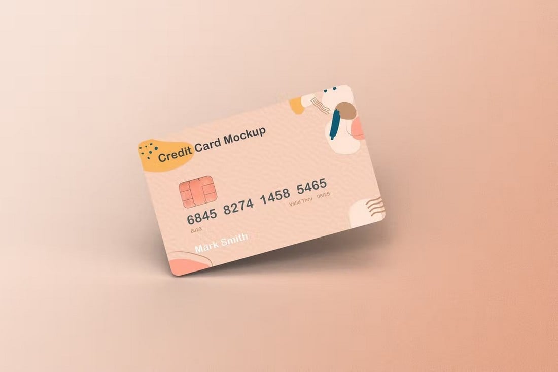
A simple and minimal mockup is the best way to show off professionalism through your design presentations. This mockup is perfect for achieving that goal. The template features a simple tilted credit card with lighting effects and editable background. It has smart objects for changing the card design as well.
Adding a bit of human touch can greatly improve your credit card presentation. With this mockup, you can show off your card design being held by a hand. It not only makes your credit card look more realistic but also offers a clear look at the design. There are 4 different mockups included in this pack.
If you want to make your credit card appear in a more realistic and creative environment, this mockup is perfect for you. It comes with a modern background design and with 4 different mockup scenes. You can also customize the background and effects to your preference.
This mockup template allows you to showcase multiple credit card designs at the same time. It’s perfect for showing off your skills in a portfolio. Or you can use it to make a nice single credit card design presentation as well. The template features well-organized layers and smart objects for easy editing.
A very useful credit card mockup that can be used for various purposes. The realistic way the hand is holding the credit card gives it a very professional look. You can use it to create advertisements, promote membership cards, social media campaigns, and more. It comes in a fully editable PSD file.
This beautiful credit card template is free to download and use. It comes as a fully customizable PSD file with smart object layers. The template is perfect for showcasing your designs on a portfolio.
With this mockup template, you can show off your credit card being held by a human hand. This template is also free to use. And it features editable backgrounds and smart objects.
This credit card mockup features a simple layout and allows you to show two card designs at the same time. The template comes in high-resolution PSD format with organized layers. It has an adjustable shadow effect too.
This mockup is ideal for showcasing privacy and security alongside your credit card designs. It features a phone and a lock with a credit card mockup. The template is easily customizable and has editable colors.
This is a collection of credit card mockups that includes multiple scenes featuring the credit cards. They all have fully customizable layouts with changeable backgrounds and smart object layers.
This credit card mockup kit includes 5 different mockup scenes for you to choose from. They are ideal for showcasing and presenting your designs to clients in a stylish and professional way.
This is a free credit card mockup template you can use to show off both sides of your credit card designs. You can also change its background to your preference.
If you’re working on an app or service related to payment security, this mockup template will definitely come in handy. It will allow you to create a cool scene depicting security and safety with custom credit card designs.
Use this mockup to show off your credit card designs in style. It includes mockups for showing the front and back sides of the credit card as well. The template is available in a high-resolution, fully layered, PSD file.
This mockup template features two credit card mockups alongside a smartphone. You can easily customize this mockup to create an amazing scene showcasing your credit card designs. The design of the smartphone is also customizable.
There are 5 unique credit card-style mockups in this bundle. They can be used to showcase many different types of membership cards, discount cards, and more. Each mockup has a different scene with editable shadows and backgrounds.
This mockup is also free to download and use. It has changeable backgrounds with a plastic card mockup that shows your designs in a slightly angled view.
This mockup template comes with a realistic look and feel that will help make your designs appear more natural and professional. The template features 3 credit cards overlapping one another. You can edit each card mockup using smart objects to place your own designs. It’s ideal for showcasing different variants of a credit card.
Another elegant and stylish credit card mockup for showcasing your modern card designs. This mockup comes with a stacked card set that you can also customize using smart object layers. The background can be changed to your preference. And it comes as a PSD file with organized layers.
This mockup is most suitable for showcasing your credit card designs on websites and social media. It includes a fully customizable mockup design where you can even change the color of the card and change the background. You can also place your own design in the mockups using smart objects.
A useful credit card mockup for banks, small businesses, and eCommerce platforms. With this mockup, you can promote your mobile apps and the payment options available on your app at the same time. The mockup comes in two different styles and they are both easily customizable.
Want to show how to balance expenses with your bank’s credit card? Then this mockup will help you spread your message more effectively. This is a collection of creative credit card mockups that shows a credit card being balanced on various objects. There are 5 different mockup designs in this bundle that come in PSD format.
You can download and use this template free of charge. It comes with a realistic design featuring a human hand holding a credit card. You can easily change the background and replace the card design as well.
This is a computer-generated card mockup that is ideal for showcasing your credit card in a technology-themed environment. The mockup is available in 5 different scenes and in 4K resolution. All free to download.
A collection of minimal and simple credit card mockups. You can use these mockups to showcase any type of credit or debit card design in a very creative way. There are mockups with multiple views and angles to choose from. And they are all easily customizable as well.
This bundle also comes with several different styles of credit card mockups. There are 9 unique mockups included in this pack that is designed for showcasing all kinds of credit cards. Each mockup comes with editable effects, smart objects, changeable backgrounds, and much more.
With this mockup template, you can showcase your credit card alongside a wallet. The hand removing the credit card from the wallet makes this mockup look more realistic and appropriate for various business promotions as well. You can also easily place your design in the mockup using smart objects.
This mockup template allows you to show off your card design next to an iPhone. It’s actually ideal for showcasing credit cards as well as membership cards. The iPhone device also works as a mockup so you can place your own designs in the device as well. Both mockups can be customized using Photoshop.
If you’re working on a high-tier credit card design, this mockup will help create the appropriate atmosphere for your card. It features a high-end luxury background that gives it a classy look. You can also customize the background color and easily replace the design using smart objects.
Believe it or not, this high-quality credit card mockup is actually free to download. It features a realistic and professional design that will surely make your credit card presentation more effective.
The dark and stylish look of this mockup gives it a certain elegant feel. It’s perfect for showing off your credit and debit card designs in websites and portfolios. The template comes in Sketch format and it’s free to download.
The effects used in this mockup design give it a very realistic-looking plastic look and feel. This makes it perfect for presenting your credit card design in a way that will win over your clients. There are 6 different mockup templates in this pack with fully customizable backgrounds and colors.
This mockup template comes with a design that allows you to showcase the front and back sides of your credit card design at the same time. It features smart objects, editable floor and wall colors, as well as organized layers.
You can use this simple and minimal mockup template to showcase your credit, debit, and membership cards in style. It’s great for presenting designs to clients as well as showcasing them in portfolios. The mockup comes in 4 different styles as well.
This mockup template allows you to show off multiple credit card designs at once. It also includes mockups for showcasing both the front and back sides of your designs. There are 3 unique PSD mockup templates in this pack.
Everyone wants more website traffic, right? But are you doing all the little things that help boost search engine ranking with every new image upload or content update?
Creating the right habits from the start will keep your website in tip-top shape and hopefully result in bonus points from the Google algorithm.
The good news is that this list is packed with actionable, everyday tips. Start with a solid website framework and then employ these techniques with every update to get on the path to creating great SEO habits that won’t be tough to maintain.
1. Write for Humans, Not Search Engines
You will come across all kinds of advice, tips, and SEO strategies in your search for improving your website but don’t forget the main purpose of your website—serve people!
When preparing your content strategy, always prepare it with a human-first approach. Research for topics that help solve the problems people are having and aim to fill the gaps and areas that lack quality content. And publish content that you can be proud of, even several years after publishing them.
Even when optimizing your content for keywords, remember not to create keyword-stuffed garbage that serves no one. If a person comes to your website by searching for “how to do an oil change in a car”, make sure to provide the right information with clear instructions. And don’t take 2,000 words to get to the point.
2. Google E.E.A.T
E.E.A.T, which stands for Experience, Expertise, Authoritativeness, and Trustworthiness, is the quality rater guidelines Google uses to analyze the quality and effectiveness of the content available on a website.
Google uses this framework to list only the most reliable and high-quality websites on its search results pages for every term people search for. Needless to say, it’s crucial that you also follow this framework when creating content.
It basically means you should stick to your area of expertise when sharing informative content. After all, a food blog sharing advice on how to do an oil change in a car wouldn’t make sense.
3. Keywords vs Key-Phrases
We used to search in very specific and short keywords for a long time. But today, most people search through AI assistants like Siri and Google Gemini by speaking to their phones.
As a result, the old methods of optimizing content for keywords may not work anymore. Instead, aim to optimize your content for key phrases or search phrases.
AnswerThePublic is a great tool for this task to find effective key phrases.
4. Create Quality Content
Good search rankings start with quality content. There’s a reason marketers say “content is king.”
Quality content includes text, images, video and elements that users want to interact with. It can be fun or informative, a game or e-commerce, short or long-form. There’s no truly magic formula; they key is that content relates to what your website is about and is well constructed and composed. And then write killer headlines to match, so that users can find this great content.
Quality content includes text, images, video and elements that users want to interact with.
Characteristics of quality content include:
Content that is rooted in data or factual information. It should be easy to read – think around an eighth-grade level and free from grammatical errors.
Content should relate to your website or brand goals. Don’t write about ponies and unicorns if your website is about baseball. The connection should be obvious.
Content is shareable on social media, and users interact with it. While this concept doesn’t help you in the creation of content, it can be a measuring stick as to what types of content work for you and your users.
Content should have enough length – the best estimate seems to be about 300 words or more per page – to actually say something of value.
Content should establish your credibility and authority in your field. Testimonials, case studies, and reviews are a good place to start.
5. Link to Reputable Sources
Don’t cram your content with meaningless links just to build a history; use links that are meaningful and add actual value to the story you are trying to tell.
Certain domains have more credibility and authority than others, so opt for those links.
A good set of links includes internal links – you want users to move around within your website – as well as external links. Aim for a mix of both types (where applicable on each page).
And think about the kinds of websites you are linking to. Do they also relate to your type of product, brand or business? Those links are valuable. Unrelated links are a waste of your time.
The authority of those links is equally important. Certain domains have more credibility and authority than others, so opt for those links. Here’s a guideline for authoritative rank:
.gov
.edu
.org
.com
.everything else
Try to include a mix of links from a mix of places. But please, don’t cram the content with too many links; users will abandon the page. (Don’t forget social media. Those links count as reputable sources, too!)
6. Build for Speed
Websites need to be fast. This applies to renderings on every device type. A website is only as fast as the slowest place it loads.
A big part of optimizing for speed is thinking about how to make the most of file sizes. Don’t overload your website with junk. Use icon fonts rather than images for icons, consider SVG rather than PNG for image files and stop uploading full-size images to your website. That’s just overkill.
Here are a few other things you can do:
Consider adding a tool that will help compress images that are too big.
Use a caching plugin, especially if you are running on WordPress.
Opt for asynchronous scripts.
Ditch unused plugins, tools and code that can weigh your website down.
7. Use Words for Everything
Search engines can only read words. (Right now anyway.) That means you have to tell search engines what the other types of content your website contains. What is in that video or photo?
You can do that in two ways. Use the file name to your advantage. Name the file based on what is in the image or video.
Descriptive image file names look like this: <img src=”dog-playing-fetch.jpg” alt=”dog playing fetch”/>. The source is the actual file name (use hyphens between words) and the alt is a similar description without hyphens between words.
Here’s another trick. Tell search engines exactly what is in the video on your website by embedding a video on a page with a transcription of the content in the video.
8. Don’t Duplicate, Update!
Many websites have a tendency to use the same boilerplate copy over and over and over on multiple pages. Why are you doing that? If the copy needs to be on every page, put it in the footer. Problem solved!
If the copy is popped on pages to boost SEO because it is stuffed with keywords or to add to content, stop. Google is dinging you for all that duplication.
If you have content that is static, or mostly static, just update it and reshare links. Don’t duplicate posts. (This happens more commonly than you might think.)
9. Practice Internal Linking
Internal linking is just as important as linking to other authoritative sites and building backlinks to your website. It’s all about linking to other useful pages on your website through existing pages.
This not only enhances your content for SEO by showcasing authority but also helps retain users on your website for longer periods of time by encouraging them to explore more about the topic.
Experts suggest that building internal links to unpopular pages on your website also helps improve their rankings on search engines.
10. Do Content Audits
Nothing stays the same on the Internet for too long. Even the most ever-green content you create will be outdated after a while. So, it’s a good practice to do a content audit of your website from time to time.
A content audit involves fully analyzing your website and its content to identify outdated content and then developing a strategy to update them. This usually includes everything from updating your website’s user interface, SEO keywords, written copy, images, and more.
Conclusion
If you are starting today with these habits and maybe haven’t been diligent about SEO in the past, consider going back to correct missteps on older pages. Make it a goal to go back and use the proper header, alt and meta tags on pages that you want users to see.
Remember to run Google’s PageSpeed Insights on your website periodically to see what issues might be bogging your website down. And create content that users want to engage with; nothing will boost SEO and drive traffic like stellar information.
As the world faces a myriad of complex challenges, from climate change and resource scarcity to healthcare disparities and educational inequalities, technology is playing an increasingly vital role in developing innovative solutions. By harnessing the power of cutting-edge technologies, societies around the globe are addressing these global issues more effectively than ever before. Here’s a …