One of the most important early design decisions you will make is what kind of background will carry a project. Should it be a single color, colorless, use trendy elements such as geometric shapes, gradients, or wood grain patterns? Or would a solid background design can help make a project shine?
Staying on trend with background design styles is important as well. A trendy background choice shows that a website design is modern and the content is new. A modern visual framework can even signal a user that you are thinking about their needs and making the most of the tools that will make their experience better.
So how do you do it? Here’s a look at background design trends and styles, with a few great options to try.
Muted Colors
Background designs have changed significantly over the years. Back in the day, most backgrounds, especially on websites, were all about chaotic images, vivid colors, and distracting videos.
Today, most backgrounds aim to create a calm and soothing environment to showcase content more efficiently. And the new muted colors trend is one of the most effective styles you can use to create such backgrounds as it allows you to create beautifully soft and calming backgrounds for all kinds of designs.
One To Try
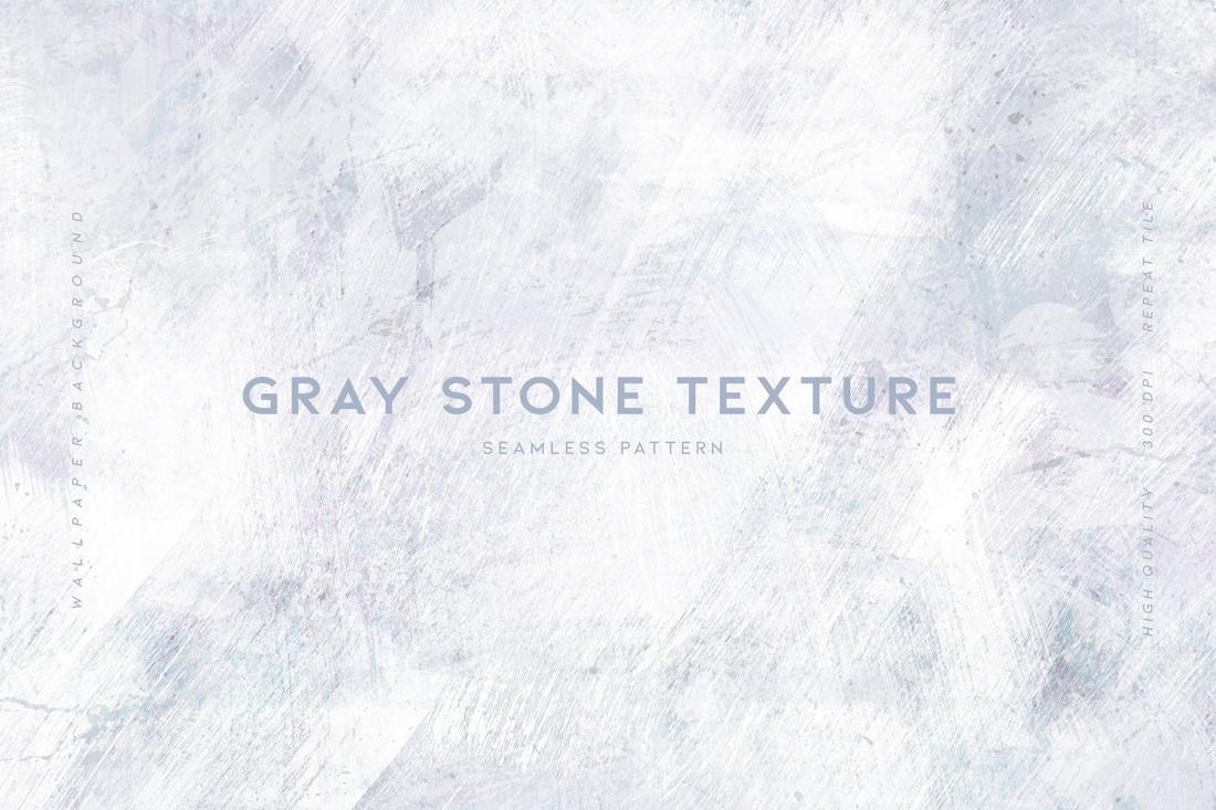
Creating a muted color background is easy. All you have to do is pick a color that matches your branding design. But to add a bit more style and make it look less bland, you can use a texture that blends well with muted colors, like this gray stone texture pack.
Retro and Vintage Vibes
A classic vintage vibe never goes out of style. Many web designers and graphic designers have been using this trend to their advantage as it’s a background style that often highlights elegance and class.
Featuring aged effects, rough textures, and art deco styles, vintage background designs are perfect for creating a bold look for branding designs as well as high-end website designs.
However, when it comes to more playful and creative projects, a retro-inspired background full of neon colors and 80s vibes is the best approach.
One To Try
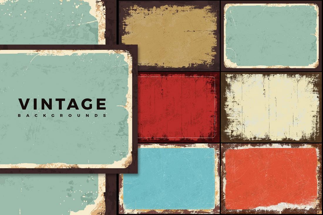
Creating a vintage background with a rust and weather effect takes some effort. This bundle of vintage grunge backgrounds will help you save time. Use it to create a gritty background for your digital and print designs.
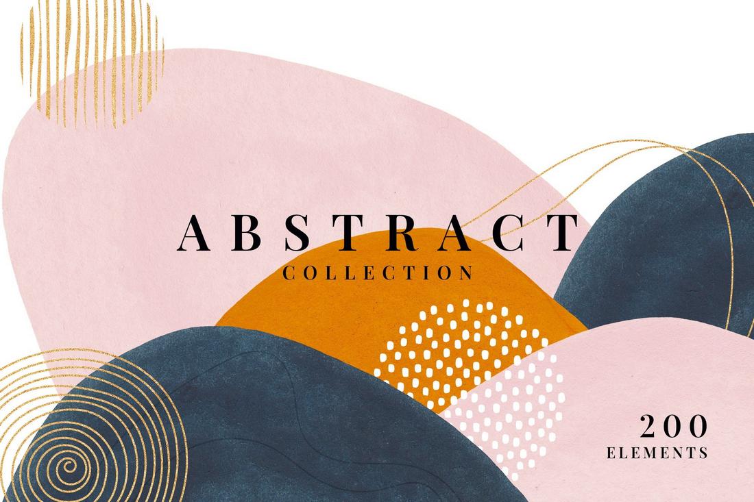
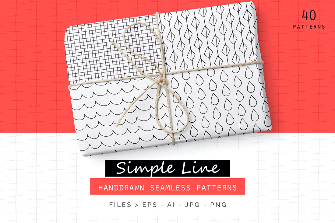
Hand-Drawn Elements
The background of a design plays a key role in creating a more personal look that not only adds a human touch but also evokes emotions in the audience. Adding creative, hand-drawn elements to a background is an effective way to achieve that goal.
Adding subtle brush strokes, playful sketches, illustrations, and icons allows you to make your backgrounds more unique and alter the overall look of the design in a positive way to make them stand out from the crowd.
One To Try
The best way to recreate this background trend is to craft unique hand-drawn elements on your own. But that could be difficult when you’re working on multiple projects. In such cases, use some items from this 200+ abstract shapes collection.
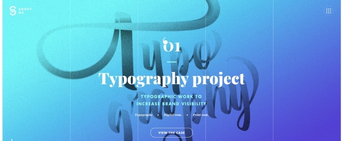
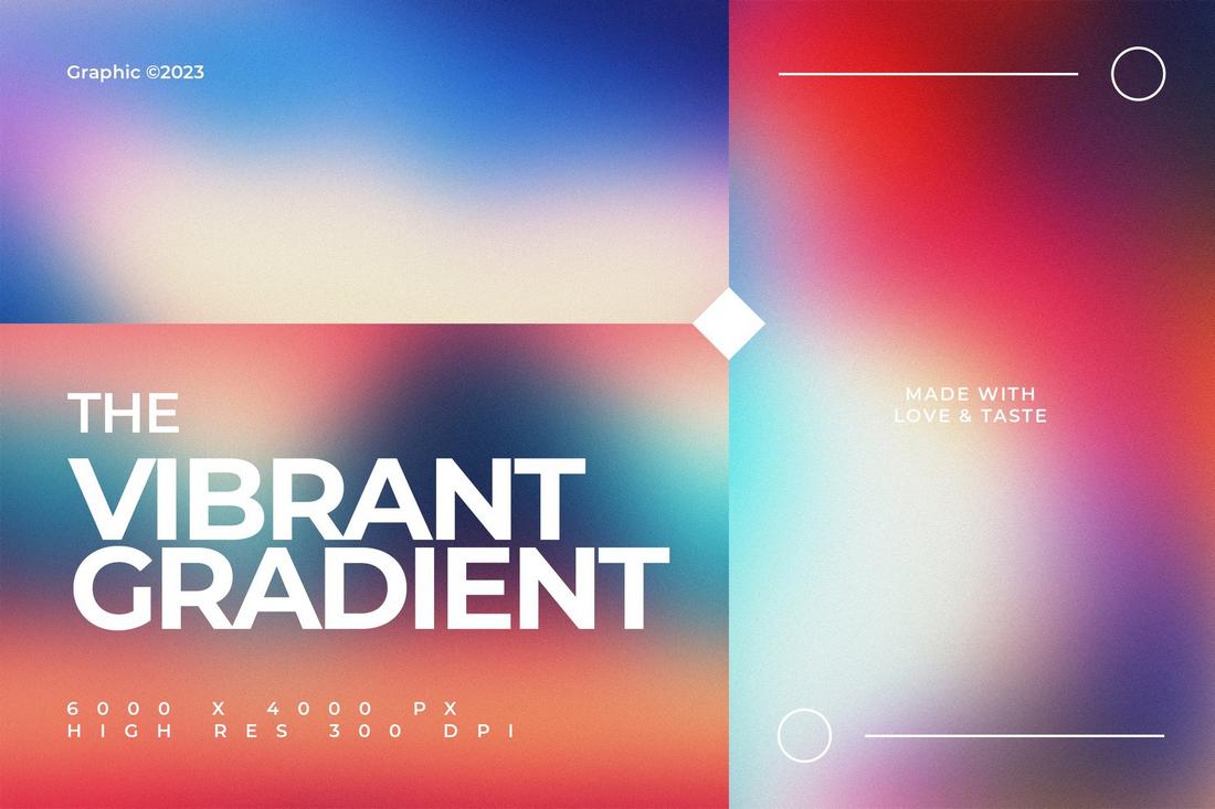
Gradient Meshes
One of the most mesmerizing background trends in website design is the colorful and creative gradient mesh design. These backgrounds feature interactive designs with gradients that change colors as you move your mouse cursor around.
This background style not only gives your website a vibrant and attractive feel but also makes it much easier to highlight the content above all else. That’s part of why this trend has been quite popular recently and we will likely see more of it throughout this year.
One To Try
You’ll need some CSS skills to recreate this style of interactive gradient meshes for websites. However, if you’re looking to add a static gradient effect, use some of the vibrant gradient backgrounds in this bundle.
Repeated Typography
Backgrounds with repeated text and titles are a new trend we’ve been seeing lately. It’s a popular trend used by web designers but it’s also often used in posters, flyers, and even social media designs as well.
Using this trend requires careful thought and planning as it makes things more difficult to create a background that doesn’t steal the attention from the content. To make it less distracting, you can adapt creative methods like using glitch effects, transparent text, and outline fonts.
One To Try
The repeated typography effect is easy to create but it would take time. The best approach is to use a pattern creator Photoshop plugin like this one. It allows you to easily create patterns from layers.
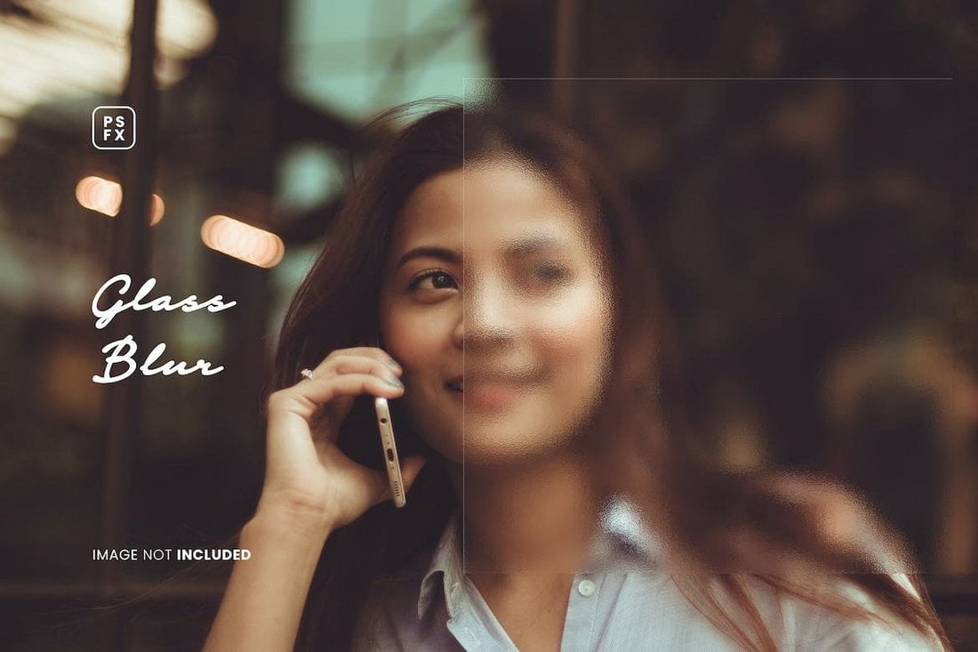
Glass Blur Effect
Adding a subtle glass blur effect to a background may look simple, but it has many benefits. It not only adds depth to the overall design but also makes it much easier to create contrast between the background and the text.
The glass blur background effect works perfectly with both image and gradient color backgrounds. However, it’s much more effective when used with gradient color backgrounds as it helps create a subtle glass-like aesthetic look for websites and graphic designs.
One To Try
Applying a simple Gaussian blur effect to an image won’t help you recreate this design style. You’ll need a glass blur effect for this one. The easiest way to create this effect is to use a glass blur Photoshop template and apply it directly to your background image.
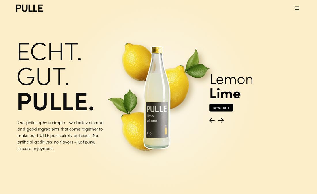
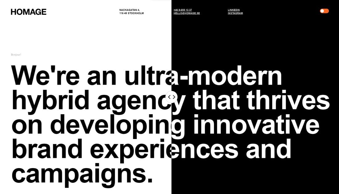
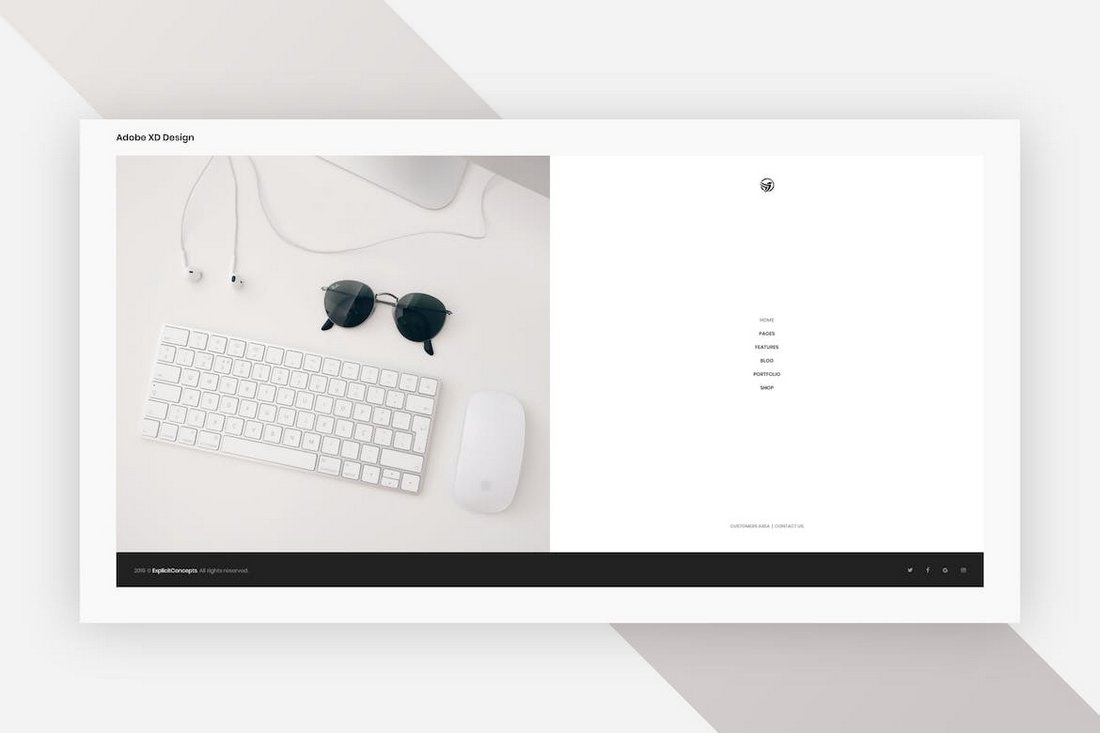
Split Background
The split background design trend differs from the popular split website layout trend. This trend involves creating backgrounds that are split into multiple sections.
But it’s not just about adding two images side by side or using two different colors. It’s about creating balance and separating sections more innovatively.
In the above example, the website uses a slider that you can move around to change the divider, which is quite interesting for boosting engagement as well.
One To Try
The best way to create this effect is to use CSS. But you can also start with a split layout template like this split homepage template for Adobe XD.
Fun Illustrations
One of the best ways to create emotionally engaging and memorable website designs is to use fun illustrations. We see handcrafted illustrations on almost every website these days but most of them are quite random and chaotic. When used properly, the illustrations give a unique personality to each and every design.
The trick is to make the illustrations fun and relatable in a subtle way. Of course, it has to blend with your overall design and theme as well.
Some websites and brands also use illustrations as a way to convey their messages in visual form. And they also use fun characters and mascots to make more memorable designs. But for backgrounds, a big, fun, and creative illustration will do the trick.
One To Try
You don’t always have to handcraft illustrations. A good illustration pack will give you plenty of options to choose from.
Glowing Effect
The neon glowing effect is something that always grabs your attention. It often works perfectly for adding a dark and moody vibe to the overall look of the design. The glowing background effect uses a similar approach but without the classic retro neon colors.
The soft, luminous light effect also creates depth and contrast between the content and the background. You’ll see this style used more commonly on technology-themed designs.
This background style works perfectly for product landing pages and for promotional adverts like flyers and posters. It creates a bright and bold look while bringing all the attention to the main content.
One To Try
The abstract modern backgrounds is a collection of high-resolution backgrounds that includes 15 different styles of images featuring glowing effects.
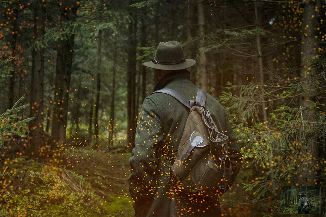
Grainy Textures
The grainy texture background style succeeds beautifully when it comes to adding a tactile feel to website designs. It creates a unique handcrafted look to digital designs with its sandy and organic textures.
The main goal of using this background style is to give a more natural, rugged, and raw look to your designs. It’s also perfect for creating a retro and nostalgic look for your digital and print designs, especially for brands that seek to achieve a more grounded aesthetic.
One To Try
You can use this grainy fabric effect Photoshop template to easily apply a grainy texture effect to your background images.
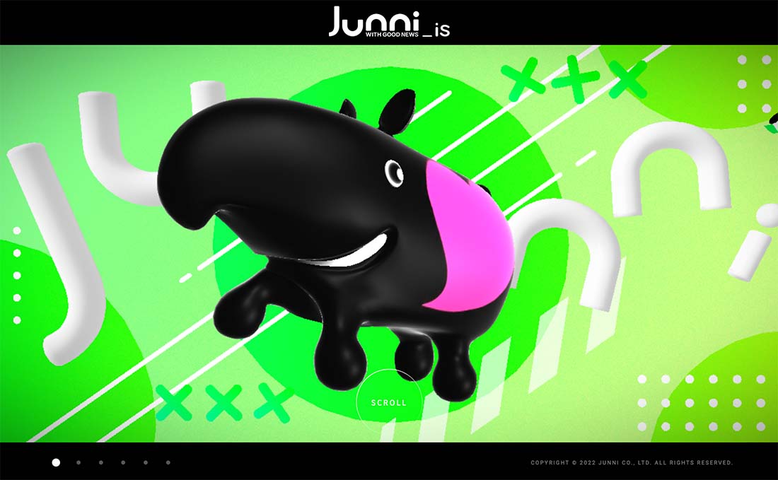
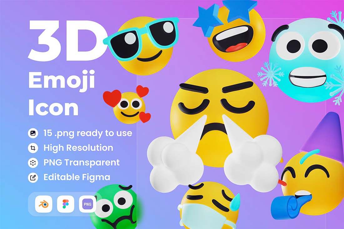
3D Illustration
Three-dimensional anything is a big trend this year. Illustrations with a 3D feel are funky and light for a design that has a certain feel.
The trick to this background style is to pick 3D elements that really work with your content. Illustrations can be a full scene or use 3D icons that create texture or a sort of repeating pattern.
This style emits a certain feel from the get-go. It is lighter and less serious than some other styles, so you want to make sure you are using it with just the right type of content. Otherwise, you could end up with an odd disconnect.
Create your own illustrations or find a UI kit with the elements you need. Add another level of visual interest with a touch of animation, such as the example above.
One To Try
Emoticon 3D Illustration is a fun option with big faces that you can drop in a background grid or with a more random placement.
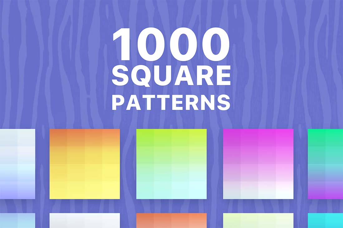
Pastel Gradient
A pastel gradient background can be soft or brilliant, but the trend is leaning more toward softer hues and subtle graduation of color.
What’s nice about this type of background is that it adds visual interest with an element of depth. The style can work with any type of content and almost every brand color combination, making it a super practical option if you want to refresh your website design.
One To Try
1000 Square Patterns includes plenty of fun repeating elements in a gradient style that can add depth to any website background.
Video
Background video is becoming more common in website design projects. Think of this as b-roll or video that’s more for visual purposes than storytelling.
Motion can help keep attention on a design a little longer or create interest with content that might be lacking visual spunk.
If you click through the example above, it uses two layers of animation – video in the background and moving text in the foreground to create a fun display with a lot of impact. The video background is a stylish contributor to this aesthetic.
One To Try
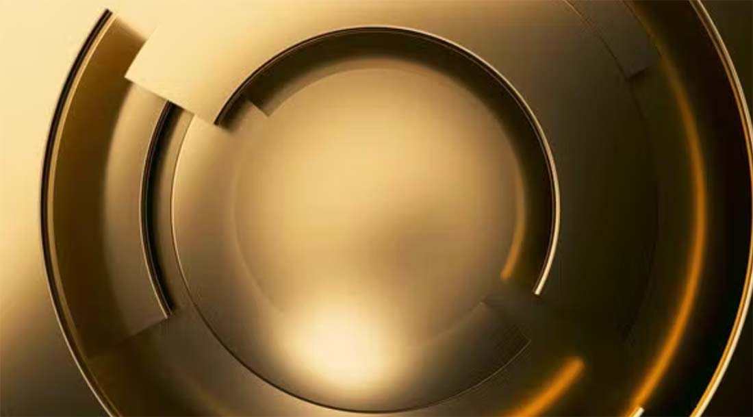
Gold Modern Business Video Background has simple motion that can work in any space.
Light Shapes
Geometric shapes can be a nice addition as a subtle layer behind other elements in a website design. Elements with thin lines and not a lot of color will create something that’s visually interesting and does not get in the way of the rest of the design.
You can take these effects to another level by using them in similar ways throughout the design and ensuring the shape and style that you use are relevant to the website content as a whole.
Don’t be afraid to use them in multiple ways as well, such as reversed out, with super subtle color, or slight animations. It’s all about creating the right feel for the design with an extra element to engage in the background.
One To Try
Simple Laine Handdrawn Patterns has thin lines that fit this design trend perfectly. Play around with size and placement to make it work for you.
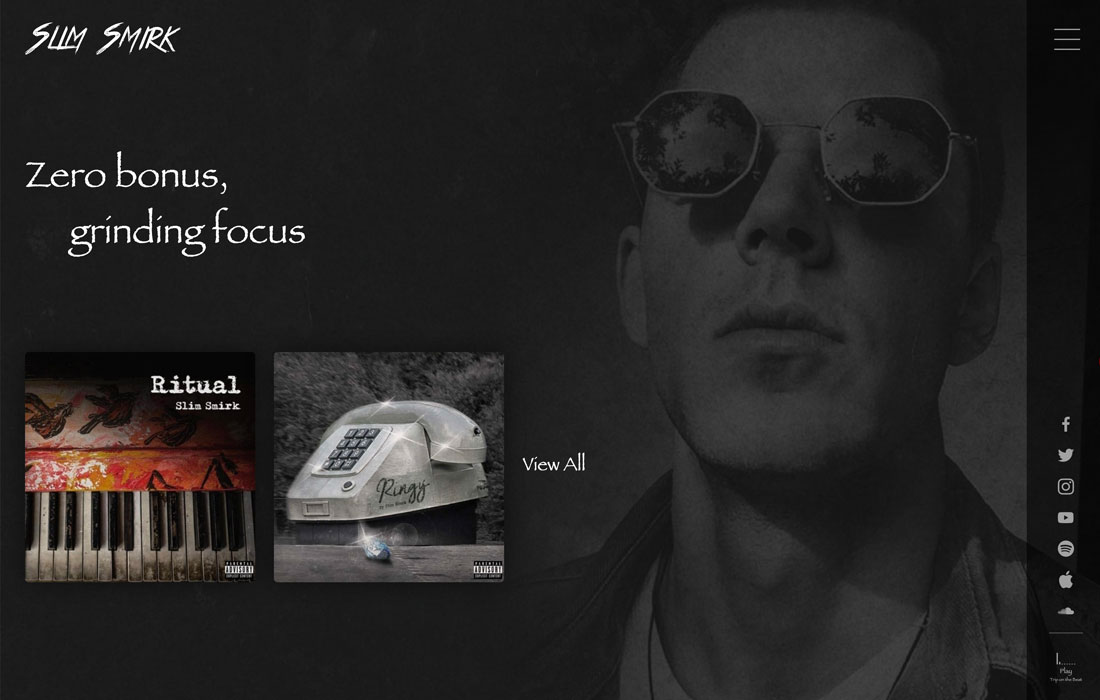
Layered Background Image
This is a background trend that we didn’t expect – photo backgrounds behind other layers, including text, other images, or videos.
These images tend to be wide-angle, easy-to -understand images that set the stage for the content on the website. They are most valuable when they provide extra information to make everything easier to understand. The challenge is that they can clutter or overwhelm the design if not done well.
Look for images that you can fade easily and content that’s easy to understand at a glance. Generally, the best options pull from the overall website color palette or include a lot of unused space that fades from one part of the background to another.
One To Try
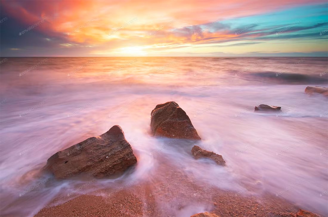
Beautiful Seascape is an example of a photo background that could work because it just establishes a sense of location and the color could be muted, if necessary. For this design trend, an image that helps create a locational element can be helpful.
Three-Dimensional Feel
Three-dimensional and tactile backgrounds draw users in because they look and feel like something real. Users can almost dive into the design and be part of what they are seeing on the screen, and there’s a strong visual appeal to that.
The modern 3D background trend is more than just shadows and shapes for depth. They also include animation and texture that enhance the realistic vibe.
The key to making a 3D background work is it has to be believable, meaning the effect replicates reality, or it has to be so far-fetched that it is obviously imaginary. There’s a delicate line there that takes practice to do exceptionally well.
One To Try
Abstract 3D Background mixes depth effects with motion for a groovy background. The elements of motion can add to a 3D background, but you have to be careful so that you don’t end up with a dizzying effect.
Layered Elements
Background and foreground elements no longer have to be completely separated on the screen. The merging of background pieces with other parts of the design can create amazing depth, contribute to a three-dimensional effect (as featured above), and help users feel like part of the design.
This background trend is an extension of merging illustration and reality in imagery that we saw trending in 2020 and 2021. Now the trend seems to be more focused on geometric shapes and color with image layers to create this depth effect in a way that’s less cartoonish.
Bright color choices can help propel these designs forward with extra elements of visual interest with shadows or other depth-building techniques.
One To Try
Background Abstract Landing Page is a good starter to create this effect. To get just the right layering of shapes and elements, start with a background element that contains shapes that you like and then add images to the mix.
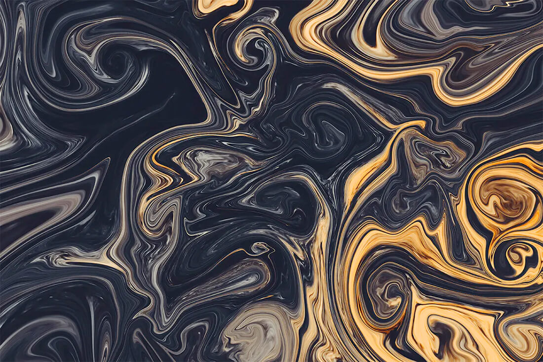
Liquid Backgrounds
Liquid backgrounds are increasingly popular because they are just so visually interesting.
You might find them in one of two ways:
- As a subtle liquid image behind other elements
- As a flowing animation in the background
Both concepts are neat to look at and even in a still liquid background, it evokes feelings of motion. The waterlike feel of a liquid animation or background often has a somewhat calming effect as well because of the natural flow on the screen.
One To Try
Liquid Backgrounds includes high-resolution backgrounds in a few color schemes. Each has an interesting texture and could work at fully saturated color or muted.
Photos with an Overlay
Background images never seem to get old and designers are playing with different ways to add contrast to images with overlays and effects that bring the whole scene together.
Overlays are interesting because there are so many different ways to do it, from full-color screens to partial overlays to adding color and other design elements on top of images.
The real key to making a photo overlay background work is using enough color to make foreground elements highly visible without hiding too much of the background image.
One To Try
Epic Photo Overlays includes some trend overlay options that both darken images and provide a dreamy effect. (This is popular on social media and starting to creep into more web projects as well.)
Thick Transparencies
In stark contrast, the trend above is using thick color transparency over an image or video. While this effect creates a lot of contrast, it almost renders the background image unreadable.
And that’s what the designer is trying to accomplish with this look. It works best in instances where artwork isn’t strong and primarily serves to provide additional texture so that the background isn’t just a solid color block.
Take care with images or videos used behind thick transparency. They shouldn’t be so interesting that people try to understand them. These images should fade into the background with ease.
One To Try
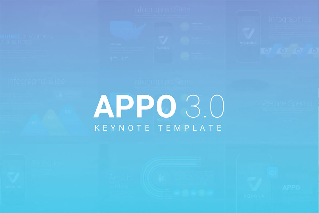
APPO 3.0 template is designed for presentations but shows what you can do with a thick transparency. Take your color or gradient way up to enhance text elements in the foreground.
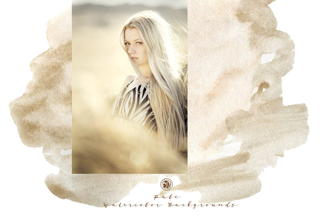
Watercolors
Watercolor backgrounds are a new take on illustrations and scenes in website design. This trend includes anything that has a bit of a hand-painted texture to it.
What’s nice about watercolors – and likely what makes them popular – is that the style has a certain softness to it that some harsher background options lack. Watercolor also has an authentic feel that communicates the uniqueness of the content you are about to explore.
Finally, watercolor styles emanate a bit of whimsy. This concept seems to be a design feeling that more projects are trying to replicate right now.
One To Try
Watercolor Backgrounds with Modern Shapes combines a couple of trends – watercolor texture with geometric shapes. The result is pretty stunning and this set of files can help you set the scene for a variety of projects.
Full Screen Video
Video has been a go-to background design element for a couple of years, but it’s being reinvented somewhat with this trend: full-screen background video.
Responsive shapes are allowing designers to scale video to fill the landing screen. Like the example above, this trend focuses on the video with minimal effects and elements surrounding it.
The almost cinematic experience draws users in and can be highly engaging with the right video clip. To make the most of this background design trend, look for a video that has a lot of movement and action.
Options To Try
Envato Elements has a solid collection of stock video – more than 500,000 clips – if you need to jumpstart a video background and don’t have anything to work with.
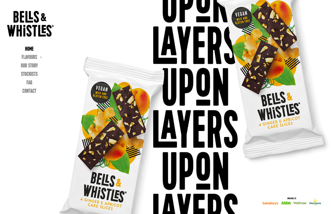
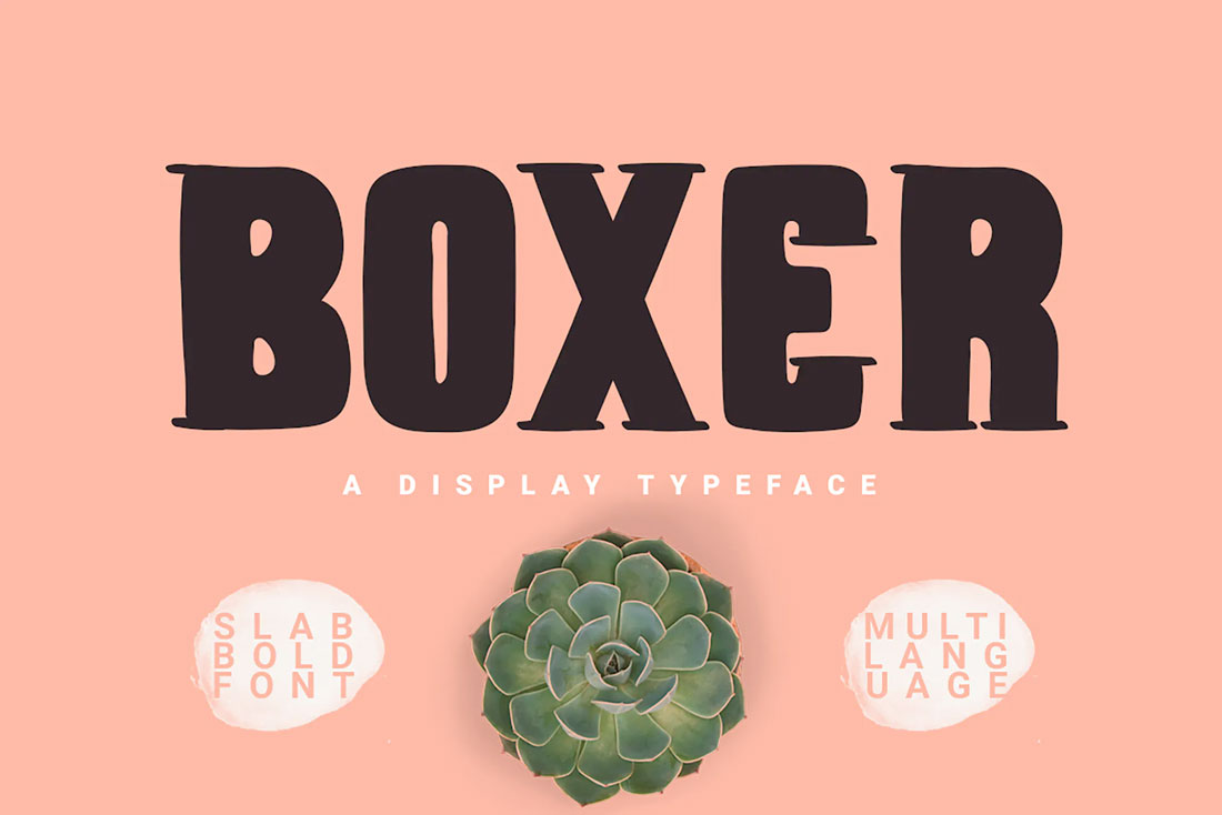
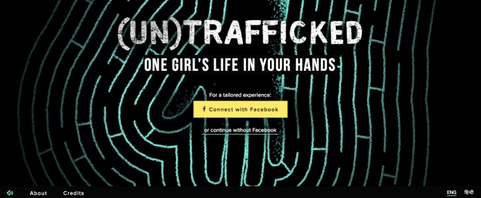
Text in the Background
You might not think about text as a background element, but it can be.
Powerful typefaces with big words can carry the background with image elements surrounding them or even encroaching into the space.
This might be one of the trickiest background trends to pull off because you need to maintain a balance between lettering, images, and responsiveness all while maintaining readability.
One To Try
Boxer Typeface is a funky, slab display typeface that’s almost made for background use thanks to thick lines.
Subtle Textures
Subtle textures in the background can add depth and dimension to a project.
There are all kinds of texture patterns to try, but the dominant trend seems to be specks (most commonly white) over a solid color.
This style of texture provides a rough element to the background and adds a feeling that the design isn’t overly polished. The best part of this trend might be that it works with practically anything and you can even partner it with other background trends. (The example above uses video and texture.)
One To Try
Procreate Texture Brushes is a cool add-on packed with subtle sand textures for users of the iPad app.
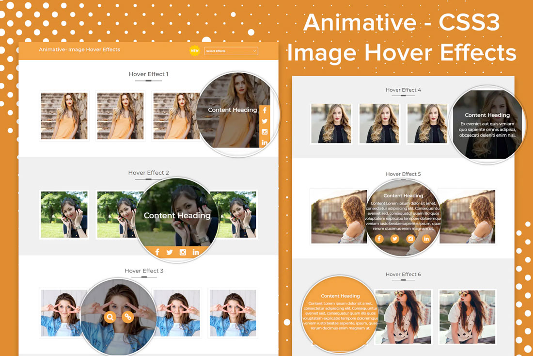
Hover Animation
Who said background images have to be static?
Perfectly placed hover actions add the right amount of movement to otherwise static backgrounds. This technique works with photos, illustrations, and even patterns or textures.
The trick is that it adds an unexpected element of delight to the user experience. Until the hover action presents itself, users don’t even know it is there.
To make the most of this background trend, create a subtle bit of motion. In the example above, the image has a little bounce when activated.
One To Try
Animative is a collection of image hover effects that you can use on your website.
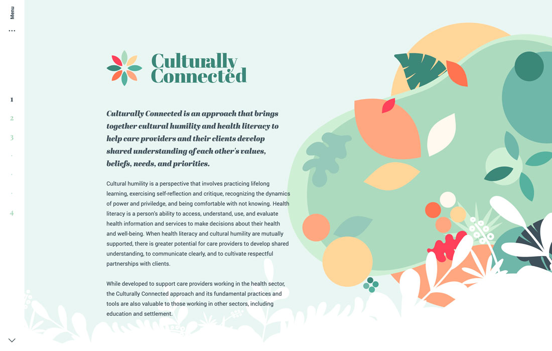
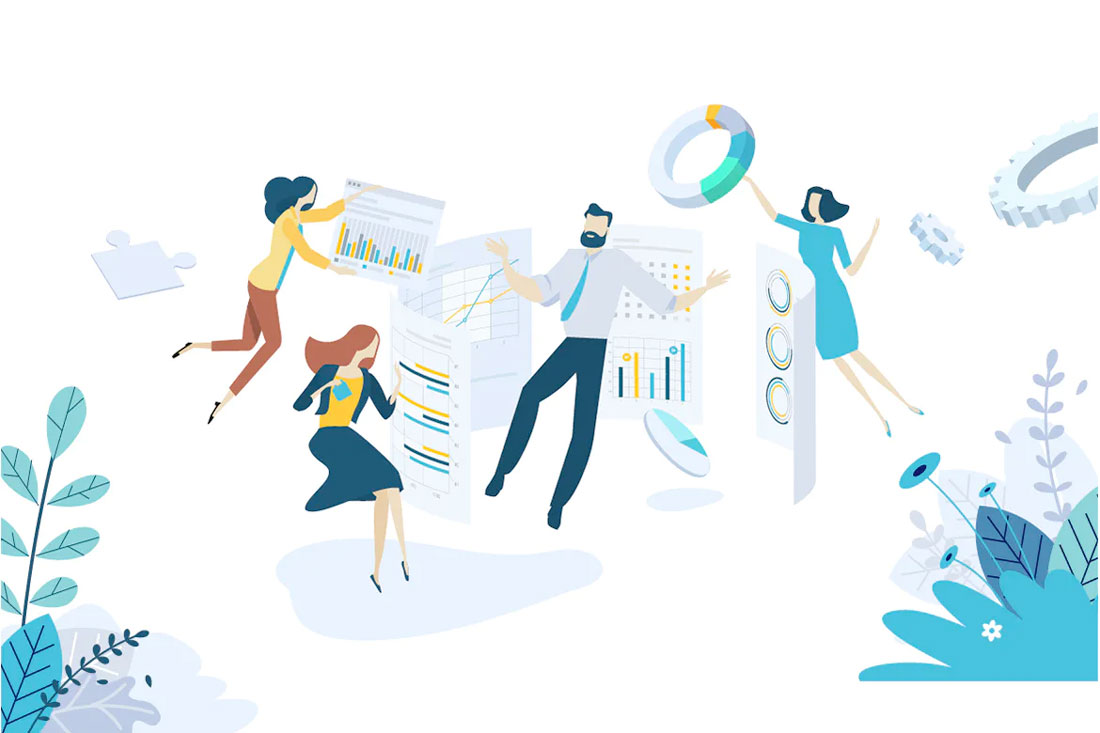
Layered, Scene Illustrations
Another background trend that’s evolving is the use of illustrations. While designers have used illustrations in the background for quite some time, these illustrations are more elaborate with layered scenes and even some animation.
An illustration can be attention-grabbing and memorable. The thing that’s difficult about an illustration is that these background designs can be rather busy, and you’ll have to carefully plan the placement and style of other elements.
The use of the illustration in the example above is almost perfect. With an off-center placement and hints of animation, it complements the text and the rest of the design well.
One To Try
Creative Flat Design Business Concept has a trending flat design with a color palette and styles that are highly usable. The creator has multiple illustration options available in this style.
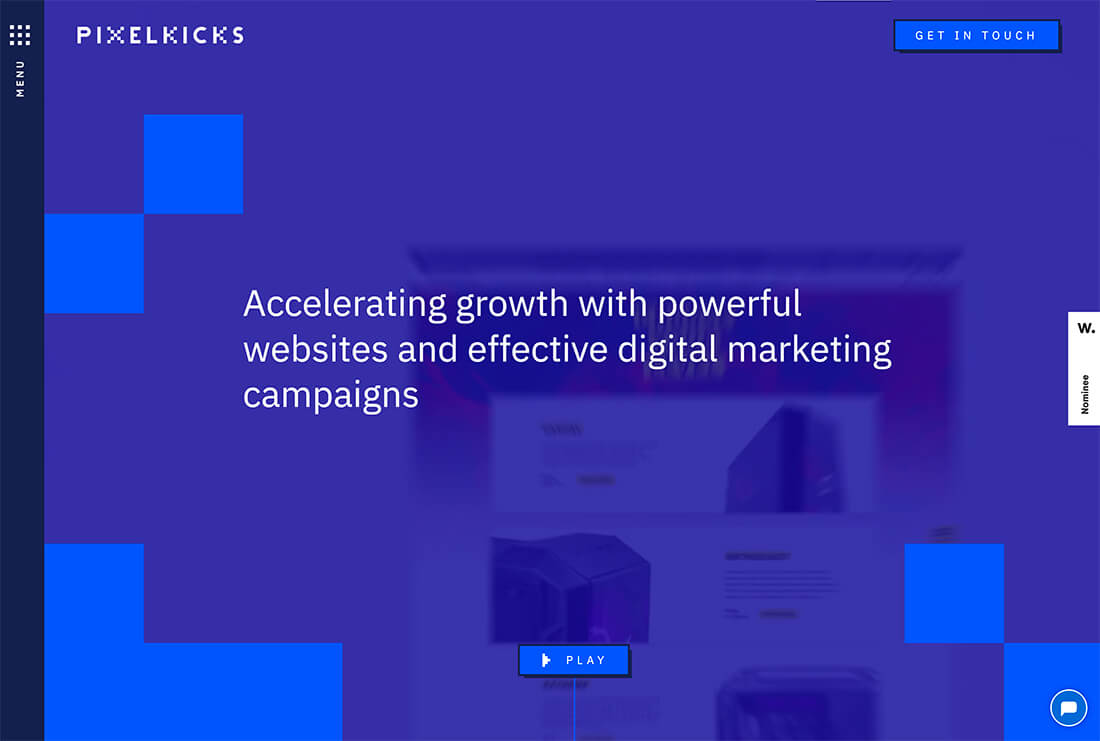
Color Block Layers
Color blocking has been a design trend that transcends disciplines. You’ll find it in fashion, home décor, and website design.
What’s great about this style for design backgrounds is that it can be bright, and with layering, visually interesting. It works with a variety of color palettes – which can be great for brands – and doesn’t create a background that’s overly complex or difficult to achieve.
Use a color-blocked layer with a bright or light background and then add a second “background” in another color. You can see this in the portfolio website example above with a white background and then individual elements in blue boxes.
Flat Color
One of the parts of flat design that have never really gone away is the colors of the style. These colors are coming back around as background colors.
Not only is the style to use bolder hues for the background, but to use them flatly. No gradients, no variation, just a solid color background in a single hue.
These backgrounds often have realistic layers on top and sometimes a border or another background behind them to create depth. (You can see this full effect from the example above with white edging around a beige background with an image on top.)
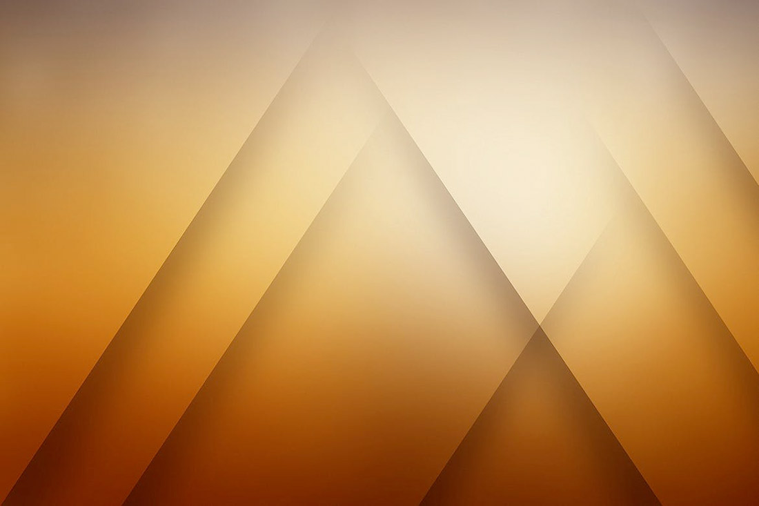
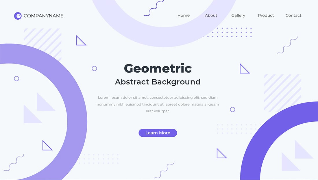
Geometric Shapes
Circles, polygons, and other geometric elements are a big part of background design in 2021.
The shapes can be reminiscent of childhood or just a fun alternative to all the flat, single-color backgrounds that had been previously trending. For a modern flair on geometry, stick to a monotone color palette and use elements with a lot of contrast to make the most of the background.
These background styles can be somewhat flashy, such as the example above, or include a muted color palette with subtle geometric undertones.
One To Try
Linear Shadow Backgrounds includes 10 large and small geo (or poly) shapes with fun colors and gradients.
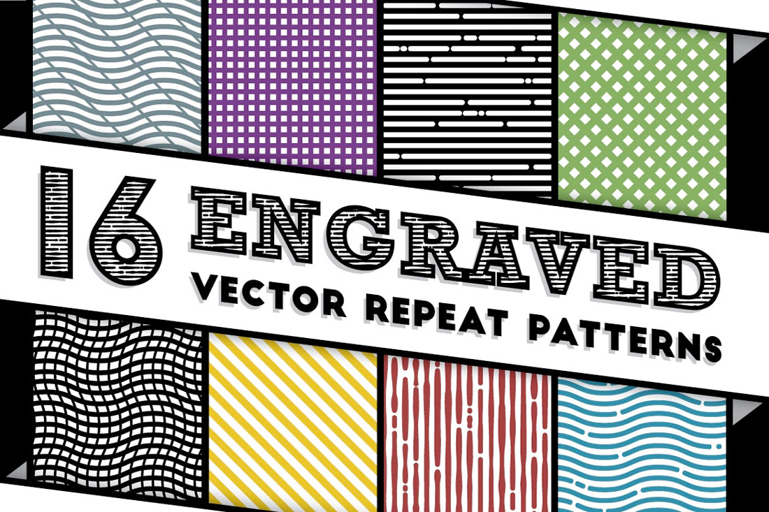
Line Patterns
From subtle curves to bold strokes, line patterns are growing in popularity as a background design element.
What makes lines work is that they mean something. The best line patterns help draw the user into the design and lead the eye to other visual elements, such as the custom line pattern in the example above.
Line patterns can be large or tiny, and both can be effective depending on the goals of your project.
One To Try
Engraved Vector Patterns includes 16 repeat patterns for backgrounds. The kit includes almost any line style you might like with straight lines, blocks and curved lines. (Repeating patterns are nice because you don’t have to worry about “seams” where patterns meet.)
Gradients
If you are at all like me, then you are one of those designers that truly has a love affair with gradients. (I can’t get enough of them.)
This trend is so flexible with background gradients that are only color, background gradients that overlay an image or video, or even animated background gradients that change color or seem to float across the design.
With so many options, it’s almost certain that you can find a workable solution that works with your color palette and design scheme.
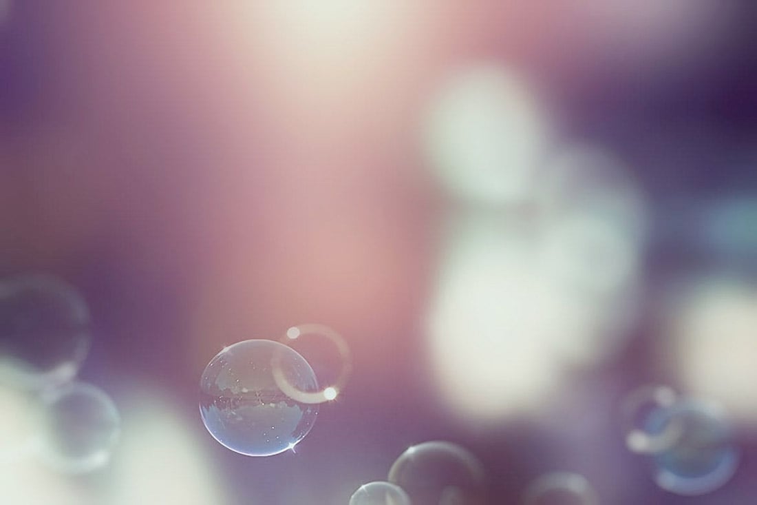
Bubbles and Blobs
While bubbles and blobs might resemble geometric shapes, they are often different in that many of these elements include some motion and the shapes are rather imperfect.
This trend tends to work in two ways as a background element:
- As an actual background with bubble or blob-shaped elements that are there only for visual interest or to add a little color to the overall design.
- As a “foreground” background element, such as the example above. Bubbles and blobs are often moving shapes that float up through the design to create a more layered effect but are “background elements” because they serve no functional role other than to help grab user attention.
One To Try
Vintage Bubble Backgrounds has a true-to-life bubble style appeal, with 10 faded bubble images.
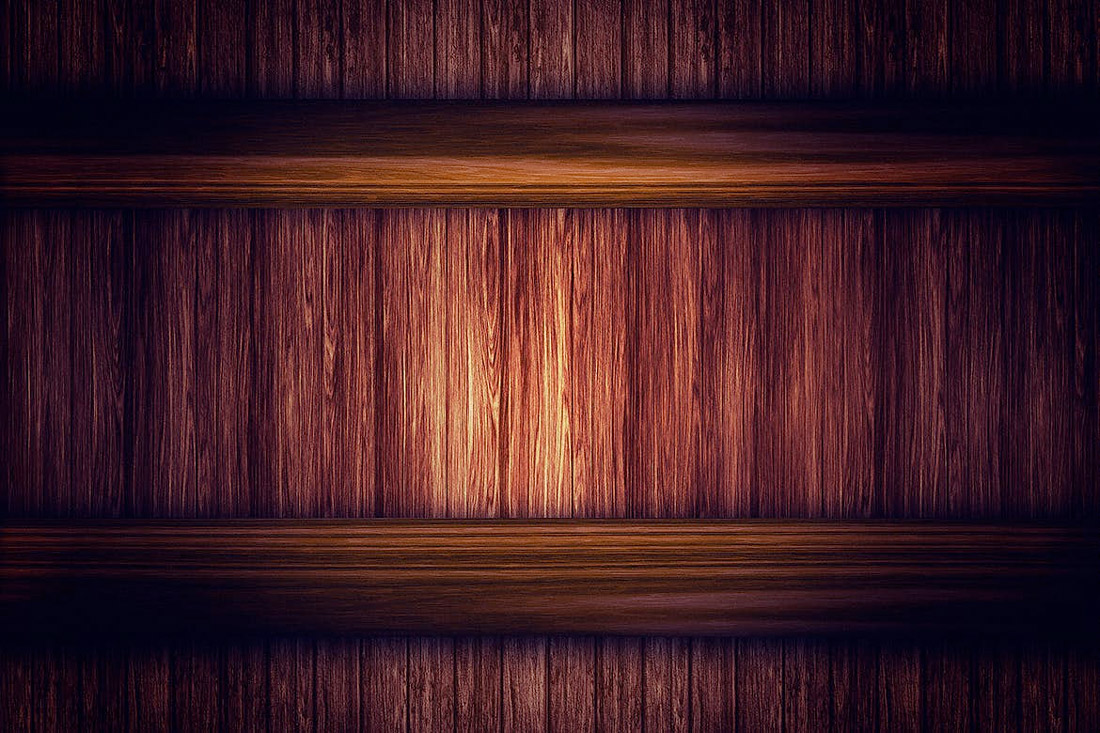
Wood Grain
Woodgrain backgrounds are popular when it comes to product photography and scene-style designs.
Both work well with this element because the wood grain background provides a natural setting that isn’t flat. It’s interesting, but not overwhelming. It provides an interesting location to help bring focus to the thing sitting in the background.
To make the most of wood grain styles, try to match the coloring of wood to foreground elements and look for planks that are wide or thin based on foreground elements as well. Try to avoid elements that fall into the “cracks” between planks.
One To Try
Wooden Backgrounds includes 10 different options with color and lighting changes with images that are more than 3,000 pixels wide.
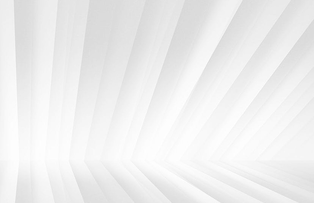
White and Gray
Light-colored – white and gray – backgrounds are a trend that continues to hang on. Mostly derived from the minimalism trend, these backgrounds are simple and easy on the user. They provide ample space and contrast for other elements on the screen.
Most white and gray backgrounds have some element of texture, such as a pale gradient, use of shadows to create separation with foreground elements, or some sort of overall pattern or texture.
One To Try
Showcase Backgrounds includes 12 background images with a light color scheme with only white a pale gray, making these a perfect fade-into-the-distance design option.
Conclusion
Change up an old design with a new background. Something as simple as changing the look of the design canvas can refresh a project.
Look for something with a touch of trendiness to add a more modern touch to your design. Plus, all of the “one to try” options above are ready to download and use.


