When setting a parent element to display: flex, its child elements align left-to-right like this:
Now, one of the neat things we can do with flexbox is change the direction so that child elements are stacked vertically on top of each other in a column. We can do that with the flex-direction property (or with the flex-flow shorthand):
Okay, cool. But how would I do something like this with CSS Grid? As in, let’s say I want all those child elements to be aligned like this:
1 3 5 7
--------
2 4 6 8
…instead of this:
1 2 3 4
--------
5 6 7 8
By default, when I set a parent element to use CSS Grid, the elements will be positioned left-to-right just like flexbox. In the example below I’m telling the grid to have 6 columns and 2 rows, then let the child elements fill up each column of the first row before they fill up the columns of the second. You know, standard line wrapping behavior.
Basically what I want here is the opposite: I want our child elements to fill up column 1, row 1 and row 2, then move on to the next column. In other words, column wrapping! I know that if I create a grid with rows and columns I could individually place those elements into those positions. Like so:
Okay, neat! This gets me what I want but it’s a giant pain having to individually set the position of each item. It feels like I’m using position: absolute and it doesn’t feel particularly smart. So what if I just wanted this layout to be done for me, so that each new child element would align into the correct spot…correctly?
What I’m asking for (I think) is this: is there a CSS Grid version of flex-direction: column?
Well, after searching around a bit, Rachel Andrew pointed me to the correct answer in her rather excellent playground, Grid by Example. And as you can see in this demo, Rachel shows us how to do just that:
Neato! Rachel does this with the grid-auto-flow property: it tells a grid container how to fill the unoccupied space with child elements. So I can do that just by writing this:
.parent {
  display: grid;
  grid-auto-flow: column;
  /* set up columns and rows here */
}
By default, child elements of a grid will fill up each column until a row is filled, then it’ll flow into the next beneath it. This is why the default for grid-auto-flow is set to row because we’re filling up rows of the grid first. But if we set it to column, then each new element will fill up all the space of column 1 before moving on to column 2, etc.
This is what the flow part of grid-auto-flow means and for the longest time I ignored the property because it seemed (don’t laugh) scary. Just reading the word grid-auto-flow is enough to make me want to shut off my laptop and walk into the ocean.
But! It’s a pretty useful property and makes a ton of sense, especially if you think of it as the CSS Grid version of flex-direction.
Great tutorial from Alex Trost (based on some demos, like this one, from Andy Barefoot) showcasing how, while CSS grid has straight grid lines across and down, you can place items across grid lines creating a staggered effect that looks pretty rad. Grid-like, but it appears to align to diagonal lines rather than horizontal and vertical lines because of the staggering. And you still get all the flexibility of grid!
Google has announced a new Transcoder API preview. The API empowers users to create consumer streaming formats for direct-to-consumer media content. This is the first Google API in a series to come that directly targets the direct-to-consumer market that has exploded in recent years, and especially accelerated during the COVID-19 pandemic.
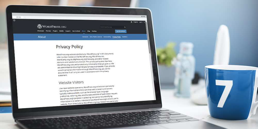
If you own a website that collects personal information through contact forms and tools such as Google Analytics, you may be legally required to provide a Privacy Policy that’s compliant with multiple privacy laws. Between forms, advertising programs, analytics, and social media integration, your typical WordPress website collects a lot of data. Disclosing everything isn’t […]
The Conservative Treehouse, a political publication hosted on WordPress.com for the past 10 years, is moving to a new host after receiving a notice from Automattic regarding violations of its Terms of Service. The site’s owner, previously identified as Florida resident Mark Bradman, claims to have a 500,000 – 1,000,000 unique readers per day. He has been ordered to find a new hosting provider and migrate the site away from WordPress.com by December 2, 2020.
Bradman followed up with Automattic to inquire about the specific infractions that put the site in violation of Automattic Ads Terms of Service. A representative from WordPress.com referred him to Section 5’s guidelines on “Prohibited Content,” and the prohibition against calls to violence in WordPress.com’s User Guidelines.
The Conservative Treehouse was characterized by The Daily Beast as “Patient Zero for a number of hoaxes that have percolated through [the] right-wing media ecosystem” after President Trump tweeted a conspiracy theory that originated on the site. Trump referenced an incident in Buffalo where police officers shoved an elderly protestor during the anti-police brutality protests that happened in June. The notion that the protester was an “ANTIFA provacateur” was originally seeded by an article on The Conservative Treehouse.
Buffalo protester shoved by Police could be an ANTIFA provocateur. 75 year old Martin Gugino was pushed away after appearing to scan police communications in order to black out the equipment. @OANN I watched, he fell harder than was pushed. Was aiming scanner. Could be a set up?
A cursory review of the past several months of posts on the anonymous blog shows it is home to a steady stream of misinformation. NewsGuard, an organization that assigns trust ratings based on transparent criteria, recommends readers proceed with caution because the website “severely violates basic journalistic standards.” The Conservative Treehouse gets a rating of 30/100 due to publishing false information and unsubstantiated conspiracy theories on numerous topics:
Because The Conservative Treehouse has published false and misleading claims, including about the COVID-19 pandemic, NewsGuard has determined that the website repeatedly publishes false content and does not gather and present information responsibly.
Bradman said he received the notification about the website being removed after publishing his post on what he calls “the COVID-19 agenda.” The conclusion of the article includes an image of a knife with the word “resist” written on it, followed by the words “whatever it takes.” The site’s comments are home to a “Rag Tag Bunch of Conservative Misfits,” as the tagline suggests, and there are more than 1,800 comments on the post announcing its upcoming move to a new host.
Despite the publication’s poor reputation, the site ranks #3,294 in the US, according to Alexa, with a largely American audience. Its owner claims to have more than 200,000 subscribers.
“We will take this challenge head-on and we will use this attack against our freedom as fuel to launch CTH 2.0, a new version of The Conservative Treehouse,” Bradman said.
There are certain common WordPress errors that leave you scratching your head on what to do. The WordPress Updating and Publishing failed error is one such error. Not only can this error occur due to multiple factors, but it also inhibits you from releasing and publishing content on your site. Imagine if you’re running a […]
Tracking changes is a quintessential copyediting feature for comparing versions of content. While we’re used to tracking changes in a word processing document, we actually have HTML elements capable of that. There are a lot of elements that we can use for this process. The main ones we’ll look at are <del>, <ins> and <mark>. But, as we’ll see, pairing them with other elements — including <u>, <aside> and custom markup — we can get the same sort of visual tracking changes features as something like Word, Google Docs, or even WordPress.
Different apps have different ways of tracking changes.
Let’s start with the <ins> element.
The <ins> designates text that should be or has been inserted. The verb tense gets a little wonky here because while the <ins> tag is suggesting an edit, it has to have, by virtue of being in the <ins> tag, already been inserted. It’s sorta like saying, “Hey, insert this things that’s technically already there.”
Notice how the browser underlines the inserted text for us. It’s nice to have that sort of visual indication, even if it could be mistaken as an underline using the <u> element, a link, or the CSS text-decoration property.
Let’s pair the insertion with the <del> element, which suggests text that should be or has been deleted.
The browser styles <del> like a strikethrough (<s>) element, but they mean different things. <del> is for content that should be removed/edited out (like that creepy seeming section above) while <s> is for content that’s no longer true or inaccurate (like the letter writer’s belief that that section would be endearing).
OK, great, so we have these semantic HTML elements and they produce some light visual indicators for content that is either inserted or deleted. But there’s something you might not know about these elements: they accept a cite attribute that can be used to annotate the change.
cite takes a properly formatted URL that provides points somewhere to find the reasons why the change was made. That somewhere could even be an anchor on the existing page.
That’s cool, but one issue is that the citation URL isn’t actually visible or clickable. We could use some CSS magic to display it. But even then, it still won’t take you to the citation when clicked… nor can it be copied.
That said, it does make semantically clear what’s part of the edit and what is not. If we wrap <ins> and <del> in a link (or even the other way around) it still is not clear whether the link is supposed to be part of the edited content or not.
But! There’s a second attribute that <ins> and <del> both share: datetime. And this is how we can indicate when an edit was made. Again, this is not immediately available to a user, but it keeps semantically clear what is part of the edit and what isn’t.
HTML’s datetime format, as a machine readable date and time, requires precision and can thus be a bit, well, cranky, But it’s general tenants aren’t too hard. It’s worth noting though that, while datetime is used on other elements, such as <time>, formatting the value in a way that doesn’t include at least a specific day, month, and year on <ins> and <del> would be problematic, obscuring the date and time of an edit rather than provide clarity.
We can make things clearer with a little more CSS magic. For example, we can reveal the datetime value on hover:
Checkboxes work too:
But good editing is far more than simply adding and deleting content. It’s asking questions and figuring out what the heck the author intended. (For me personally, it’s also about saving me from embarrassing spellling and grammar mistooks).
So, meet the <mark> element.
<mark> points out text of special interest to the reader. It usually renders as a yellow background behind the content.
If you’re the editor and want to write a note to the writer (let’s name that person Stanley Meagher) with suggestions to make Stanly’s letter more awesome (or less creepy, at the very least) and that note is large enough to warrant flow content (i.e. block level elements), then the note can be an <aside> element.
<aside class="note">Mr. Meagher, I highly recommend you remove this list of preferred cheeses and replace it with things you love about the woman you are writing to. While I'm sure there are many people for whom your list would be interesting if not welcome, that list rarely includes a romantic interest in the midst of your profession of love. Though, honestly, if she is as perfect for you as you believe, it may be the exact thing you need to test that theory.</aside>
But often you’ll want to do something inline in order to point something out or make a comment about sentence structure or word choice. Unfortunately there’s no baked in way to do that in HTML, but with a little ingenuity and some CSS you can add a note.
<span class="note">Cheesecake isn't really a "cheese"</span>
The <u> element — long an anathema to web developers for fear of confusion with a link — does actually have a use (I know, I was surprised too). It can be used to point out a misspelling (apparently squiggly and red underlines aren’t a standard browser rendering feature). It should still not be used anywhere it might be confused with an actual link and, when used, it definitely should use a color that distinguishes it from links. Red color may be appropriate to indicate an error.
<p>Please, <u>Lura</u> tell me your answer. Will you wear my mathlete letter jacket?</p>
As we’ve seen throughout this article, the browser’s default styles for the elements we’ve covered so far are certainly helpful but can also be confusing since they are barely distinguishable from other types of content. If a user does not know that the document is showing edits, then the styling may be misconstrued or misunderstood by the user. I’d therefore suggest some additional or alternate styles to help make it clear what’s going on.
ins {
  padding: 0 0.125em;
  text-decoration: none;
  background-color: lightgreen
}
del {
  padding: 0 0.125em;
  text-decoration: none;
  background-color: pink;
}
mark {
  padding: 0 0.125em;
}
.note {
  padding: 0 0.125em;
  background-color: lightblue;
}
aside.note {
  padding: 0.5em 1em;
}
u {
  text-decoration: none;
  border-bottom: 3px red dashed;
}
I ask myself the same question every time I learn something new in HTML: How can I needlessly animate this?
It would be great if we could fade up the changes so that when you clicked a checkbox the edits would fade in as well.
The notes and text in <del> tags can’t be faded in with CSS the same way that background colors and paddings can. Also, display: none results in no fading at all. Everything pops back in place, including the backgrounds. But using a combining the CSS visibility property with a set height and width value of 0 allows the backgrounds to smoothly fade in.
And there you have it: specifications and a few strategies for keeping track of edits on the web (plus an excellent example of how not to write a love letter (or, perhaps, how to write one so perfect that responding positively to it is a sign you’re soulmates).
Edit: Adrian Roselli adds some excellent accessibility information in the comments. Before you implement these ideas in production, be sure to consider those suggestions.
Hi Experts, I want to improve my website techxonic.com ranking for freelance business specifically in UAE. Your suggestions will be highly appreciated.
Twenty years ago, every Aspect of developing a website and putting it online was more complex than it is today – an enchantment of Merlin’s wand to most common folks. The term “webmaster” hasn’t aged well, but it was commonly used in a different era when tech wizards were the only people creating and managing websites. The term has become outmoded as online publishing and website building has become more user-friendly.
Google recently ran a study that showed usage of the term webmaster is in sharp decline, as web professionals now prefer more specialized terms, such as blogger, developer, SEO, or online marketer. In recognition of this change, the company is rebranding “Google Webmasters Central” to “Google Search Central.” The change will be rolled out to Google’s websites and social media within the next couple days.
In addition to the rebranding, Google is also centralizing its help information on one site and consolidating its blogs:
Moving forward, the Search Console Help Center will contain only documentation related to using Search Console. It’s also still the home of our help forum, newly renamed from “Webmasters Help Community” to “Google Search Central Community“. The information related to how Google Search works, crawling and indexing, Search guidelines, and other Search-related topics are moving to our new site, which previously focused only on web developer documentation.
The Google Webmasters blog and 13 other localized blogs are being moved to the new site for better discovery and easier language switching. Google is going to redirect current RSS and email subscribers to the new blog URL, so readers only need to update their bookmarks.
Google is also introducing a new jumping spider bot to accompany its Googlebot mascot in crawling the internet. The creature doesn’t yet have a nickname, but the company is soliciting suggestions.
CodePen is full of prototypes and loaded with full-blown art. Generative art is common, since hey, we’re working with code anyway, might as well make some of the code randomized and adjustable. There is a great project that has been around years and years that is purpose-built for giving users a UI to change values on-the-fly called dat.GUI. I once blogged about it right here on the CodePen Blog because I wanted to showcase how useful it can be for generative art Pens. While dat.GUI is still pretty cool and perfectly usable, there is a new player on the block.
To me, the API and configuration is really clear and usable. I like how it is also modernized by using stuff like <input type="range"> for the sliders rather than re-inventing that. And the focus on changing CSS custom properties is very clever. Plus, you can style the controls themselves.
I snagged it and updated my Gray Burst idea from the other day to have a stroke-width knob:
Just a little post I wrote up over at The Events Calendar blog. The idea is that a set of blocks can be grouped together in WordPress, then registered in a register_block_pattern() function that makes the group available to use as a “block pattern” in any page or post.
Block patterns are becoming upper-class citizens in the WordPress block editor. They were announced without much fanfare in WordPress 5.5 back in August, but have been given prominent real estate in the block inserter with its own tab next to blocks, including 10 or so default ones right out of the box.
Block patterns are sandwiched between Blocks and Reusable Blocks in the block inserter, which is a perfect metaphor for where it fits in the bigger picture of WordPress editing.
What I find interesting is how the blocks ecosystem is evolving. We started with a set of default blocks that can be inserted into a post. We got reusable blocks that provide a way to assemble a group of blocks with consistent content across all pages of posts. Now we have a way to do the same, but in a much more flexible and editable way. The differences are subtle, but the use cases couldn’t be more different. We’ve actually been using reusable blocks here at CSS-Tricks for post explanations, like this:
We drop some text in here when we think there’s something worth calling out or that warrants a little extra explanation.
Any reusable block can be converted to a “regular” block. The styles are maintained but the content is not. That’s been our hack-y approach for speeding up our process around here, but now that block patterns are a thing, previous reusable blocks we’ve been using now make more sense as patterns.
There’s certainly no shortage of CSS flexbox tutorials and similar content online promoting and teaching flexbox to beginners. The now-ubiquitous layout technique can be learned from a number of different resources. But I hope this CSS flexbox tutorial for beginners will be a little different.
With our integrated videos plugin, you can embed high-quality educational tutorial videos on your site’s frontend and admin!
Video tutorials are a great resource to share insightful information in an organized way for you and your users.
The Integrated Video Tutorials plugin (IVT) functions as a perfect method to improve WordPress skills, onboard new users, and reduce support requests, making it valuable for anyone with access to your site to refer to.
Included are 45+ WordPress training videos which we keep regularly updated, white-label branding, user displays, and more. Plus, you can create and have your own custom training videos, along with even customized playlists.
In this article, you will learn how to get the most out of integrated tutorials. I’ll be going over how to:
When you’re finished reading, you’ll know the best way to deploy these videos for your WordPress sites and use them to their full potential — in just a few clicks!
1. Install the Plugin and Explore the Overview of the Videos Dashboard
From The Hub dashboard, you can download the integrated videos plugin from the Plugins tab. Once you click on the integrated videos tab, you’ll get the options to Install or Download.
When downloading, there’s also a detailed description of what’s all included.
Choosing to install makes it simple. It will pull-up all of the sites you have in The Hub, and you can install it directly from here and your WordPress dashboard.
Simply click on the website that you’d like to install the video tutorials on.
Once installed, you can get a 360-degree overview of the dashboard. From here, you can view the most recently updated video, playlists, create new videos, and more.
Quickly gain access to your videos from the dashboard.
You can see the total videos you have at the top of the dashboard, the date of the last uploaded video, your most recently updated video, your newly created custom video, and the latest playlist you created.
In this example, you can see there are 49 total videos available.
In the Video section, you can quickly access all of the 45+ videos that come with the plugin, create a custom video, edit the titles, and more.
Go to any video to quickly access it.
And finally, in the dashboard, the Playlists area lets you view and edit all of your playlists.
Quickly view all your playlists by clicking on the ‘View All’ button.
It’s fast and easy to organize, access, create playlists and more — right from the dashboard.
2. Quickly Add a Custom Video
Do you need to explain something to your users that aren’t already covered in our videos? Something specific to your brand or your website? No problem! Integrated Video Tutorials lets you add custom videos quickly and easily.
From the Video section of the dashboard, get started by clicking the Add Custom Video button.
Be on the way to a custom video in one-click.
The Add Custom Video button opens up an area where you’ll select what source your custom video is hosted from. You have the options for Wistia, YouTube, and Vimeo. (Note: More options are coming very soon for Dailymotion, Amazon S3, Google Drive, and more!)
Simply choose what option you have for the video and add the link.
In this example, it’s a YouTube video.
From here, you can change the title and set a customized start & end time. Also, upload a thumbnail image if you’d like.
Want to change the title? Change it right in the title bar.
After hitting continue, add it to a playlist in a click. A drop-down menu will appear with all of your current playlists options. You can even add it to multiple playlists at one time!
When done, it’ll be all set to go when you hit Publish.
Add a video to as many playlists as you like.
It’s then displayed in the Available Videos.
The newest video shows up on top.
You can access it and edit the custom video at any time.
Next, I’ll show you how to…
3. Edit and View Videos
Quickly access your custom video to edit and view in just a few clicks. You’ll simply go to the Available Videos section, find your video, and access or edit accordingly.
Click on the gear icon next to the video you’d like to gain access to and you’ll get the options to Edit Video, Copy Shortcode, or Delete.
A dropdown menu appears with various options.
When you click Edit, you’ll get the options that were discussed earlier for custom videos. You can change the title, start & end time, and upload a thumbnail image.
Upload a custom image to go with your video.
For any of the pre-uploaded videos that come with this plugin, you have the option to Edit Title and Copy Shortcode.
The duration of time for each video is also displayed.
Preview any video by clicking on the video title in the Available Videos section.
Play the video in the preview area at any time.
Ready to publish? Use the Shortcode to embed videos. Add the shortcode to any acceptable area, and you’ll be all set.
An example of using the shortcode on a new post.
It’s as simple as that to access and edit videos!
4. Easily Create a Customized Playlist
Manage, create, delete, and customize playlists from the Playlists area. Playlists are great when you have a specific topic that includes several related areas you would like to cover in separate videos.
This section shows you how many playlists you currently have, recently created playlists, and recently updated playlists.
The playlist dashboard has everything you need to manage your playlists.
Let’s create a new playlist first. To do that, click on Create Playlist.
The Create Playlist button is on the very top of the page.
It will then prompt you to add a name, description, and – if you want – a thumbnail image.
If you don’t upload a thumbnail image, a default one will be used from the first video’s thumbnail.
Once Continue is hit, you can search for videos to add or simply click on the ones you want to include in the playlist. If you want to delete one from the list, you can do that as well in one-click.
Add as many videos as you’d like!
Your playlist will then appear with all of the other playlists you already have.
With any of the playlists, you can click on the gear icon and get the options to:
Edit
Add videos
Add visibility settings
Copy shortcode
Delete
The gear icon opens up a lot of options to your playlists.
Editing and adding videos is exactly the same as when they’re created. And if you add Visibility Settings, you can control which user roles (e.g. author) can view the playlist and the default locations for it to display.
Pick and choose what default locations will show this playlist.
Add a video at any time to a playlist quickly by clicking on the icon next to a video. You’ll then choose what playlist you want to add it to, and you can also add it to multiple playlists by checking the boxes.
Pick any amount of playlists that you’d like by checking the boxes next to each one.
And just like that, you have a customized playlist for your video tutorials.
5. Adjust Additional Settings
You can adjust additional settings for your tutorials in the Settings area in the admin. This is so you can determine how your videos should display in the admin area of your website.
In the Display Settings section, you can enable a tutorials tab in the WordPress admin sidebar in the Tutorials Tab area in one-click
Determine the location of the videos page in the admin menu. You can pick to display all the videos under the WordPress Dashboard menu item, or you can have it be a top-level menu item.
Plus, you can set the menu title that will be displayed as your tutorial videos menu in the WordPress admin sidebar.
In this example, the WP Admin sidebar will show ‘Video Tutorials’ as the tab.
The Help Videos area is where you can enable the option to have videos appear in the Contextual Help boxes. It’s based on how you set your visibility settings for your playlists.
Add videos to the Contextual Help area in one-click.
Do you want someone else to have admin access to edit playlists and videos? You can configure permissions in the Permissions area.
Simply choose which user roles can have access.
If you just want the administrator to have access, just check that box — and that’s it!
Once you change the settings, you can always adjust them at any time.
Closing Credits
As we close the credits on this post, you can see how using our integrated video tutorials is quick, easy, and beneficial. And since we already have you stocked up with over 45 useful videos to begin with, you can implement them right away!
For more information, be sure to check out our documentation. And keep tabs on what’s coming up next in our Roadmap.
Install the plugin to train and empower new WordPress users and start reducing your support costs today!
In yesterday’s twice-monthly meeting, the WordPress Themes Team made a couple of important changes to the official theme directory guidelines. They removed a requirement of some CSS classes that have long been sitting on the chopping block. They also implemented the third stage in their long-term plan to make all WordPress themes accessibility-ready.
For years, theme authors have needed to either style several WordPress classes via CSS or add empty, unused selectors. It was a bit irritating for authors who fell in the latter group. The list includes several classes like .sticky (for sticky posts) and .bypostauthor (for post author comments). Now, styling these classes are optional.
The one question mark in this decision is probably around the classes for handling left, right, and center alignment. While the newer block editor stylesheet does support these classes on the front end, it could leave end-users in the dust if they are using the classic editor and a theme author decides to drop support. Any images in posts could become misaligned. Theme authors should test this and consider any problems before deciding to remove these from their stylesheets. For the other classes, those are mostly design decisions.
This change will not be official until the Theme Check plugin is updated to allow themes without these classes through the system.
The second big change is the reignition of the push toward creating more accessible themes in the directory. All themes in the directory are now required to distinguish links in “content” areas via an underline.
When links appear within a larger body of block-level content, they must be clearly distinguishable from surrounding content (Post content, comment content, text widgets, custom options with large blocks of texts).
Links in navigation-like contexts (e.g., menus, lists of upcoming posts in widgets, grouped post meta data) do not need to be specifically distinguished from surrounding content.
The underline is the only accepted method of indicating links within content. Bold, italicized, or color-differentiated text is ambiguous and will not pass.
While this is a simple change, it is a bold one. Thus far, there has not been any pushback from theme authors on the announcement post or in the team meeting. However, some may be expected as the news trickles through the theme design community.
The one question that arose about the requirement was whether theme authors could add an option to allow end-users to opt-out of this behavior. The team said this was allowed as long as the underlined links were enabled by default.
The Road to Accessibility
In July 2019, the Themes Team made a commitment to push theme authors to make their themes more accessible. It was not a switch they were going to flip overnight. Instead, the team made a goal of implementing a new accessibility-related requirement every two months or so. These periods would give both theme authors and reviewers ample time to familiarize themselves with each change.
This is the third requirement added to the guidelines since the team implemented the plan. The team started with some low-hanging fruit and added a requirement that themes ship with a skip-to-content link. That guideline addition went over relatively smoothly. The team quickly added a new guideline requiring that visitors be able to navigate menus via keyboard.
That second guideline landed in August 2019. From the outside looking in, the project was initially going well. However, until yesterday, the team had not added any new accessibility guidelines. Over a year had passed, and the plan seemed to be grinding to a halt. Accessibility advocates were probably wondering what happened.
In a discussion with the Themes Team reps a few months ago, they were not sure when they would implement the next guideline. The project was not going as planned.
“We have not added anything else above that because theme authors are still not releasing themes with working implementations of skip links and usable keyboard navigation,” said team representative William Patton at the time. “When those two things become habitual it will be time to introduce another Aspect as a requirement. The fact that this has taken so long for authors to get this right probably indicates that we need to do better at guiding them to resources to learn how to do it and why it is important. Perhaps that is a better avenue to pursue than looking to implement additional asks of them.”
Team rep Carolina Nymark shared similar sentiments. She mentioned that underlined links were up next on the list. However, they did not have a deadline in mind yet.
“Skip links and keyboard navigation are still a headache to some extent for some authors,” said Ganga Kafle, a team representative. He said that theme authors who regularly submit themes are doing so with these requirements in mind. However, keyboard navigation remains the biggest pain point, particularly on mobile views.
“But almost all the themes we get are with skip links working properly,” he said. “That is a good thing so far. The new requirement is not so huge and tough. And I think we need to add such small things in a timely manner.”
For now, the team seems to be picking up where they left off. There is still a long path to go before the project is complete.
The best thing that theme authors can do right now is to follow all of the optional accessibility guidelines. This will prepare them for a future in which they are all required.


 If you own a website that collects personal information through contact forms and tools such as Google Analytics, you may be legally required to provide a Privacy Policy that’s compliant with multiple privacy laws. Between forms, advertising programs, analytics, and social media integration, your typical WordPress website collects a lot of data. Disclosing everything isn’t […]


 There are certain common WordPress errors that leave you scratching your head on what to do. The WordPress Updating and Publishing failed error is one such error. Not only can this error occur due to multiple factors, but it also inhibits you from releasing and publishing content on your site. Imagine if you’re running a […]