In this day and age, when social media is probably the most used form of communication, we can all benefit from some graphic design tips, even if we aren’t graphic designers. Graphic design is...
Now that WordPress 5.5 has shipped, block patterns are available in core for all users. If you have previously been relying on reusable blocks but prefer the flexibility of block patterns, you may want to convert these.
WordPress core developer Jean-Baptiste Audras has made this possible in the latest update of his Reusable Blocks Extended plugin. He posted a video demo of how the plugin converts reusable blocks to block patterns with one click.
Update! 💥 My Reusable Blocks Extended #WordPress plugin now allows users to convert reusable blocks to block patterns in one click ✨ Just hit the conversion button and your reusable blocks will be automagically converted 😎 See the 1min-demo below 👇#WP55#Gutenbergpic.twitter.com/YDBaxnA8Nw
What’s the difference between reusable blocks and block patterns?
Why might you want to convert your reusable blocks to block patterns? For users who are new to the concept, there are a few distinctions between these similar features.
Reusable blocks were designed to be a time-saving feature that allows users to save a block or group of blocks for use on other posts or pages. They can be edited but they have a certain distinction in that they are intended to look the same in all places they are used. Any changes made to a reusable block will apply to all instances of the block wherever it is used.
If a user wanted to make changes to a reusable block specific to one page, the process would involve clicking on the block’s properties and selecting “convert to regular block,” which would ensure that all edits would appear only on that specific instance of the block. It’s unlikely that most users would know how to do this without help, so this is one of the drawbacks of reusable blocks.
Block patterns are predefined block layouts that are designed to be changed. Once a pattern is inserted into the content, users can customize with their own text, images, alignments, colors, additional blocks, etc. The options are limitless and any changes made are not saved back to the original pattern. Block patterns provide a flexible starting point that gives users an idea of how blocks can be combined to make attractive layouts.
User-Created Patterns Are Coming Soon to the Block Pattern Builder Plugin
At the moment, users can create their own reusable blocks but not their own block patterns. Patterns have to be registered with code in order to appear in the pattern library. This is another reason that Audras’ one-click conversion is quite useful for users who are limited to capabilities offered in the editor’s current UI.
The ability to create block patterns inside the editor should be a feature in core. It would enable non-technical users to share their designs and creations in a more flexible format than reusable blocks provide. Until this feature is added to core – and it isn’t a guarantee- there is a plugin for that.
Justin Tadlock’s Block Pattern Builder plugin, which is available on WordPress.org, will soon be merging a pull request that adds the option to create block patterns inside the editor. It will work in a similar way to the process of adding reusable blocks. Now that block patterns are available in WordPress 5.5, this feature will be more useful to a wide range of users.
Audras’ Reusable Blocks Extended plugin, like many other amazing utilities for the editor, might be difficult to find unless you already know exactly what to search. Many times users are not even aware of the possibility of converting reusable blocks to patterns. This might also make a useful core feature but doesn’t seem likely to be a high priority at the moment. In the meantime, watch for more plugins to start extending block patterns to do interesting things now that they are available in core WordPress.
Designmodo turns 10 years old in August 2020! 🥳 All this time, I’ve never shared what happens behind the scenes here. It’s been an amazing journey – so I’ve decided to share how the company came to be what it …
Has anyone read about any studies, or has any anecdotal evidence, that might demonstrate that detailed schema.org/Person markup about an author improves the authoritativeness of an article or tutorial in Google's eyes?
As a WordPress blog and a WordPress theme author we’ve seen our fair share of confusion about the differences between WordPress.com vs WordPress.org. This is completely understandable since both run on WordPress, both use themes and plugins and both are readily available for free online. But there are major differences between the two and those […]
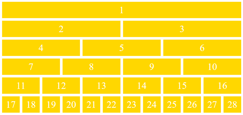
When building a new website, it’s always a good idea to sit down and think about all the content you truly want to feature. If you find that you have a lot to say, grid layouts are always a solid choice. For starters, most are responsive and will automatically adjust orientation based on the screen size each visitor is viewing it on.
But they’re also a good choice because they offer a convenient way to display a lot of information in a condensed space without being overwhelming. What follows is a list of free and premium grid layouts sourced from a variety of places including ThemeForest and CodePen, that offer flexibility and function for your website’s design.
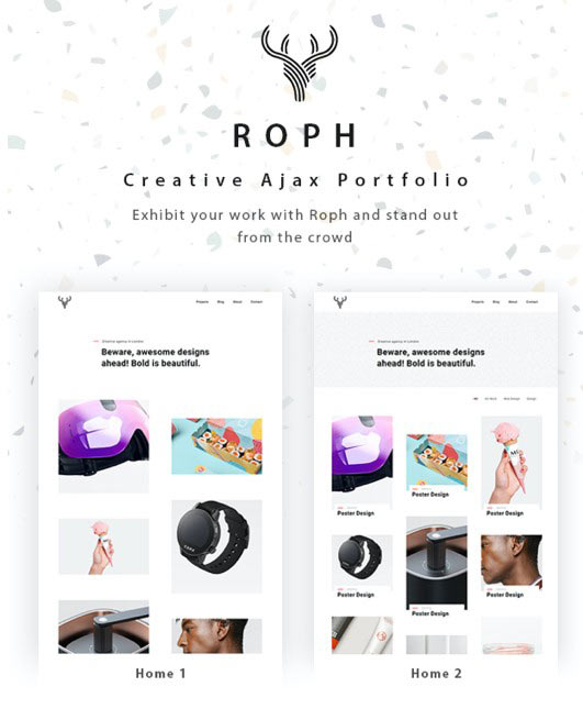
Now here’s a WordPress theme that provides a grid layout you can use in a multitude of ways. It’s designed for portfolio websites and the sky’s the limit for how you can envision using it.
This CSS Grid layout is super simple, but would definitely make it a lot easier to create a custom website capable of conveying a lot of information at once. It also supports lovely hover effects.
This is an HTML5 template that offers a stylish grid layout you can use in a variety of ways. With multiple templates, color schemes, and settings to select from, you’re sure to find something that suits your needs here.
The Flexbox and CSS Grid demo layout is ideal for showcasing info on cards across a portion of your website. Think descriptions of your services or pricing tables.
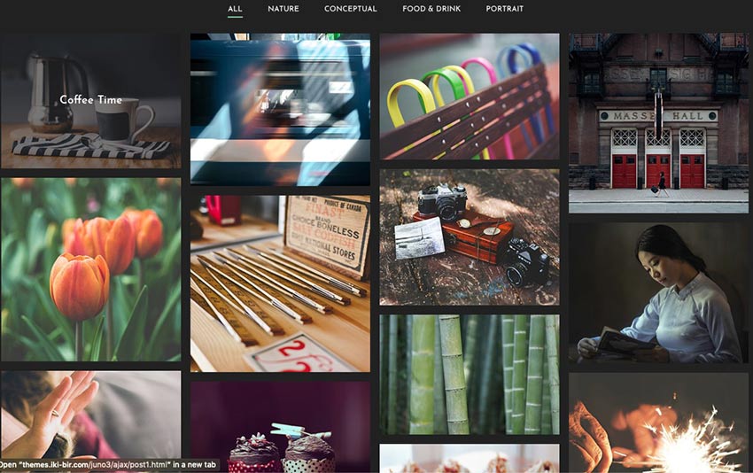
Create something monochromatic and impactful with this masonry grid layout. Use it for a portfolio, to display photography, or to create an experience.
The Flex 12 Column Grid layout is the last one on our list and another solid option. Display as much information as you need in an organized and eye-catching way, easily.
Build Your Best Website Yet with Grid Layouts
And there you have it! Another list completed. We hope it will serve you well. This collection of grid layouts feature selections that are all easy-to-use and nice to look at. Enjoy selecting one that will serve your content well.
Googlebot is crawling my AMP pages more than they are crawling my desktop pages. I have the appropriate canonical from AMP to desktop and amphtml from desktop to AMP. The desktop version also has a self-referencing canonical. Only canonical pages are in the sitemap.
This is a concern because less than 10% of our traffic is from mobile devices (unique, I know), yet it's more than 50% of our crawl budget.
The one thing that we do, which I'm not sure if this is appropriate or not, is whenever a desktop page 1 links to an internal page 2, the AMP version of page 1 links to the AMP version of page 2. Therefore, there are internal links pointing to AMP pages, but only from other AMP pages.
The other thing I was wondering is whether anyone has heard of Google serving AMP pages to desktop users behind low bandwidth connections, where they could benefit from AMP. Supposedly AMP doesn't have to be for only mobile anymore, but Google hasn't really demonstrated this. We don't get a lot of mobile traffic, but we do get a lot of third-world / low-bandwidth traffic.
Unsplash, an online image provider, has released an open image dataset. The new library currently contains over 2 million high-quality images, with 16GB of accompanying data. The accompanying data includes keyword-image conversions (in search results), community and AI-generated keywords, EXIF, location and landmarks, image categories/subcategories, user-generated collection, image views, and download statistics.
This is a great collection of icons by Corey Ginnivan that’s both free and with no attribution required when you use them. The style is super simple. Each icon looks like older versions of the icons from macOS to me because they’re cute but not too cute.
Also? The icon picker UI is slick and looks something like this today:
Oh and also, as I was looking around Corey’s personal site I noticed this lovely UI effect when you scroll —each card stacks on top of each other:
I am trying to remove an entire folder of thin content from Google to help me recover from a Panda/EAT-related penalty. I want to keep the content on the site for the benefit of users, but not waste crawl budget or have Google think that we have so many pages of thin content.
I added the folder to robots.txt quite a few months ago. While some pages are showing up as "Blocked by robots.txt", the majority of pages now show up in my coverage report as "Indexed, though blocked by robots.txt". About 2 months ago, I submitted a removal request for all URLs that begin with the prefix, but there's been no change. Google Search Console's report updates every few days, but the number of URLs that say, "Indexed, though blocked by robots.txt" is increasing, even months after the removal request for those same pages.
We’ve reached the hottest month of the summer and with the warm weather, it’s the perfect opportunity to travel. With many countries closing borders during the pandemic, why not enjoy the...
Pretty neat little website from Joan Perals, inspired by stuff like Lynn’s A Single Div. With multiple hard-stopbackground-image gradients, you don’t need extra HTML elements to draw shapes — you can draw as many shapes as you want on a single element. There is even a stacking order to work with. Drawing with backgrounds is certainly CSS trickery!
The site stores your drawing IDs in localStorage so you’ve got basic CRUD functionality right there. I bet the whole thing is a little hop away from being an offline PWA.
In 2020, a whopping 35% of the Internet is powered by WordPress, which means over 455,000,000 websites are using WordPress as their platform. The reason why WordPress is so popular is because of its ease of installation, ability to customize everything, its safety features, and ease of use for beginners. One of the most distinctive features […]
According to BreexyHill Marketing, 81% of people conduct some sort of online search before they make a large purchase. This means brands must be visible if they are to attract such buyers. Businesses have, therefore, learned the importance of SEO to improve the search engine ranking of their websites. But is that enough in such […]
…what does that % value mean here? What is it a percentage of? There’ve been so many times when I’ll be using percentages and something weird happens. I typically shrug, change the value to something else and move on with my day.
But Amelia Wattenberger says no! in this remarkable deep dive into how percentages work in CSS and all the peculiar things we need to know about them. And as is par for the course at this point, any post by Amelia has a ton of wonderful demos that perfectly describe how the CSS in any given example works. And this post is no different.
Branda gives you the power to white label WordPress, letting your brand flow from the front to the back-end of your site. In this guide, we’ll show you how to renovate your admin area with some of Branda’s most impressive features.
White labeling your WordPress site has never been easier. Branda splits every one of her features into easy to digest modules which can be activated and removed as necessary.
Branda lets you white label every Aspect of WordPress
No job is too big or small – you can customize anything from your color scheme and dashboard widgets, right down to the text labels on your login page, and the icons in your admin toolbar.
In this guide, we’ll show you not only how to completely white label the back-end of your WordPress installation using Branda, but also how to personalize and reorganize your tools and menus to ensure peak efficiency when working within your admin area.
Read on to find out how Branda can help you put your own stamp on your WordPress admin.
1. Customize Your Login Screen
When customizing your WordPress admin, it makes sense to start at the first page you’ll always see – the login screen.
Branda can help you create a completely new login screen that will impress your clients and inject some personality into your WordPress back-end.
There are seven preset templates you can select, or you can create your own from scratch.
Click ‘Start from scratch’ to create your own template.
If you start from scratch, the main changes will come in the form of your background and logo.
First up is the logo – you can either upload your own image, or import one from a URL.
You can also choose to completely hide the logo.
Once you’ve added your logo, you can choose a new background to complement it.
Just make sure your background image is a minimum of 1024px wide.
You’re free to take it even further and edit or hide the labels, display a message, or add custom error messages.
Add custom messages for users when they log in.
A few tweaks and you can completely revamp your login section.
2. Change the WordPress Logo
If you’re a developer working on a lot of sites, or if you’re trying to create a personalized experience for a new client, the ability to switch out the WordPress logo in the admin bar can make a lot of difference.
It can let you know at a quick glance which site you’re currently logged into and it can be the icing on a cake for a client that you’re trying to impress.
With Branda, it takes seconds to change the logo to something more personal.
This setting is found within Admin Area > Admin Bar.
As you can see below, it’s such a simple change but it takes white labeling WordPress to the next level.
It’s your site, so it makes sense to replace the WordPress logo with your own.
3. Rework the Admin Bar
If you find the admin bar more unsightly than useful, there are a couple of ways Branda can help you manage this.
You can remove the admin bar from your front-end if you want to quickly view your site without it getting in the way by heading to Admin Area > Admin Bar.
Untick the boxes of the user roles you wish to hide the toolbar from on the front-end.
If you don’t want to hide the toolbar completely, you can customize the items it shows.
Start by choosing the items you wish to hide:
Better still, you can apply these settings to specific user roles.
If you really dislike the toolbar, you can even go as far as removing all its links in the back-end:
Branda can help your admin area go from ‘messy’ to ‘minimalist’ in just a few clicks.
If you’d prefer an admin bar that is practical and personalized to fit your needs, you can create this by adding custom items to it.
Just below the option to hide your items, you’ll find the option to add custom ones.
Once you click to add a custom item, you will need to select a title, icon and a link destination.
There are tons of icons to choose from – you’ll be spoilt for choice.
Add a submenu if required, and set the visibility of your new menu item per user role.
You can use these settings to easily navigate to your most important pages, as well as a host of other ideas.
4. Personalize Your Widgets
With all the standard widgets active, your dashboard can begin to look a bit cluttered.
If you head into Branda and to Widgets > Dashboard Widgets, you can hide any that you don’t use.
With all these options ticked, your dashboard will be completely free of widgets.
You can then begin to repopulate your dashboard with widgets that are more useful to you, as Branda has the option to create your own custom widgets.
You can create your own unique widget and then choose which user roles will see it.
Widgets can contain notes, company updates, stock reminders – you have total freedom.
They’re so quick and easy to update.
5. Organize Your Admin Menu
Your admin menu is the heart and soul of your WordPress admin area. If you want to customize the back-end of your site, it makes sense to tailor the admin menu to your needs.
Head to Admin Area > Admin Menu > Customize Admin Menu and you will be presented with a ton of options to help you get the most out of your admin menu.
First up, you can customize each item in your admin bar per user role and can opt to hide each item.
You can also duplicate items from this menu.
When you click to edit one of the items, you are first offered the chance to rename it as well as change the CSS ID and class.
Click ‘submenu’ to change the name and IDs/classes of the submenu items.
If you scroll down a little further, you can choose a new icon from tons of presets.
You can even upload your own icons.
Once you are satisfied with how your menu item looks, it’s time to decide what happens when you click on it.
Underneath the icons, you will find the option to change the link, as well choose whether or not it opens in a new tab.
While you may not need to change the link on existing menu items, it’s handy if you create new ones.
Once you have amended your existing menu items to your taste, you can scroll to the bottom of the list to add your own custom items.
This is useful if you want shortcuts to external websites or areas of your site that take a while to navigate to.
6. Add Text to Your Footer
You can add text or even media to the bottom right of your admin area.
This could be anything from an important message or update, to your company motto, or even just your site name.
You can also make the text a link.
It’s just another quick way to break out of WordPress’ usual template and add a bit of brand/personality to your admin area.
7. Text Replacement
A handy feature found within the utilities section of Branda allows you to replace words and phrases throughout your site.
This can be especially beneficial when it comes to white labeling your admin area.
You can control whether the rules are case sensitive, and whether they apply everywhere or just on your front or back-end.
Even apply it to specific themes or plugins using the text domain option.
Using this feature, you can easily change the ‘Howdy’ message on the right-hand side of your admin bar, to something more to your taste.
You can add as many separate rules as you like.
8. Change Your Color Scheme
If you’re dedicated to truly whitelabeling and personalizing your site, then changing the color scheme should definitely be on your to-do list.
Branda comes loaded with 8 color schemes for you to choose from.
You can set the theme for each user individually or apply to all.
If your plan is to match your admin area to your brand, you can extensively edit the color schemes to your exact requirements.
Below is just a taste of how many options you have to create your own scheme.
You can color each element of your admin area separately, and tweak things such as hover and focus color.
This is ‘Ocean’, one of Branda’s preset color schemes.
WordPress Who?
Branda has so many options for customization and white labeling that you can put the same love and care into the back-end of your site as you do the front. No longer will you have to gaze upon the WordPress logo or endure every site you work on looking exactly the same from the back-end. With Branda, you can truly make each site your own.
If you’re eager to find out what else Branda can do, check out the documentation for a complete run down and visit our roadmap to see what else she’s got in store. Better yet, get Branda installed and experience the power of personalizing WordPress with Branda for yourself.


 As a WordPress blog and a WordPress theme author we’ve seen our fair share of confusion about the differences between WordPress.com vs WordPress.org. This is completely understandable since both run on WordPress, both use themes and plugins and both are readily available for free online. But there are major differences between the two and those […]