The cybersecurity research team at vpnMentor has discovered a security issue that left exposed over 123 million records containing personal information belonging to the customers of an international fitness retailer. Decathlon, a sporting goods retailer based in France, operated the ElasticSearch server at the center of the debacle.
It’s no secret that Elementor is one of the best page builders in the WordPress community today. And it’s no longer just a page builder. Elementor has evolved so much that you can design fully functioning websites even with a free, basic WordPress theme without writing a single line of code! While Elementor offers many […]
I was recently working on a modern take of the blogroll. The idea was to offer readers a selection of latest posts from those blogs in a magazine-style layout, instead of just popping a list of our favorite blogs in the sidebar.
The easy part was grabbing a list of posts with excerpts from our favorite RSS feeds. For that, we used a WordPress plugin, Feedzy lite, which can aggregate multiple feeds into a single time-ordered list — perfect for showcasing their latest offerings. The hard part was making it all look awesome.
The plugin’s default list UI is rather bland, so I wanted to style it to look like a newspaper or magazine website with a mixture of smaller and larger “featured content” panels.
This seems like an ideal case for CSS Grid! Create a grid layout for different layouts, say, one five-column layout and one three-column layout, then use media queries to switch between them at different break points. Right? But do we actually need those media queries — and all the hassle of identifying break points — when we can use grid’s auto-fit options to automatically create a fluid responsive grid for us?
The approach sounded tempting, but when I started introducing column-spanning elements, I ran into trouble with the grid overflowing on narrow screens. Media queries appeared to be the only solution. That is, until I found a workaround!
After looking at several tutorials on CSS Grid, I found that they largely fall into two camps:
Tutorials that show you how to create an interesting layout with spanned elements, but for a fixed number of columns.
Tutorials that explain how to make a responsive grid that resizes automatically, but with all of the grid items the same width (i.e. without any spanned columns).
I want to make the grid do both: create a fully responsive fluid layout that includes responsively resizing multi-column elements as well.
The beauty is that once you understand the limitations of responsive grids, and why and when column spans break grid responsiveness, it is possible to define a responsive magazine/news style layout in just a dozen lines of code plus one simple media query (or even with no media queries if you are willing to limit your span options).
Here’s a visual showing the RSS plugin right out of the box and what it’ll look like after we style it up.
This magazine-style grid layout is fully responsive with the colored featured panels adjusting dynamically as the number of columns change. The page displays around 50 posts, but the layout code is agnostic as to the number of items displayed. Ramp up the plugin to show 100 items and the layout stays interesting all the way down.
All of this is achieved using only CSS and with only a single media query to deal with a single column display on the narrowest of screens (i.e. smaller than 460px).
Incredibly, this layout only took 21 lines of CSS (excluding global content styling). However, to achieve such flexibility in such a few lines of code, I had to dig deep into the more obscure parts of some of CSS Grid and learn how to work around some of its inherent limitations.
The essential elements of the code that produce this layout is incredibly short and a testament to the awesomeness of CSS Grid:
The techniques in this article could be used equally well to style any dynamically generated content such as the output from a latest posts widget, archive pages or search results.
Creating a responsive grid
I have set up seventeen items displaying a variety of mock content — headlines, images and excerpts — which are all contained in a wrapper
The code that turns these items into a responsive grid is remarkably compact:
.archive {
  /* Define the element as a grid container */
  display: grid;
  /* Auto-fit as many items on a row as possible without going under 180px */
  grid-template-columns: repeat(auto-fit, minmax(180px, 1fr));
  /* A little spacing between articles */
  grid-gap: 1em;
}
Notice how the heights of the rows automatically adjust to accommodate the tallest content in the row. If you change the width of the Pen, you will see the items grow and shrink fluidly and the number of columns change from one to five, respectively.
The CSS Grid magic at play here is the auto-fit keyword that works hand-in-hand with the minmax() function that’s applied to grid-template-columns.
How it works
We could have achieved the five-column layout alone using this:
However, this would create five columns that grow and shrink with different screen widths, but always stay at five columns, resulting in them becoming ridiculously narrow on small screens. The first thought might be to create a bunch of media queries and redefine the grid with different numbers of columns. That would work fine, but with the auto-fit keyword, it is all done automatically.
For auto-fit to work the way we want, we need to use the minmax() function. This tells the browser how small the columns can be squeezed down to followed by the maximum width they can expand to. Any smaller, and it will automatically reduce the number of columns. Any larger, and the number of columns increases.
In this example, the browser will fit in as many columns as it can 180px wide. If there is space left over the columns will all grow equally by sharing the remaining space between them — that’s what the 1fr value is saying: make the columns equal fractions of the available width.
Drag the window out and as the available space increases the columns all grow equally to use up any additional space. The columns will keep growing until the available space allows for an additional 180px column, at which point a whole new column appears. Decrease the screen width, and the process reverses, perfectly adjusting the grid all the way down to a single column layout. Magic!
And you get all this responsiveness out of just one line of code. How cool is that?
Creating spans with “autoflow: dense”
So far, we have a responsive grid but all items the same width. For a news or magazine layout we need some content to be featured by spanning two or more columns or even, perhaps, to span all the columns.
To create multi-column spans we can add the column-span feature to the grid items we want to take up more space. For example, if we want the third item in our list to be two columns wide we can add:
.article:nth-child(3) {
  grid-column: span 2;
}
However, once we start adding spans a number of problems can arise. First, gaps may appear in the grid because a wide item may may not fit on the row, so grid auto-fit pushes it onto the next line, leaving a gap where it would have been:
The easy fix is adding grid-auto-flow: dense to the grid element which tells the browser to fill in any gaps with other items, effectively making the narrower content flow around the wider items like this:
Note that the items are now out of order, with the fourth item coming before the third item, which is double the width. There is no way round this as far as I can tell, and it is one of the limitations you have to accept with CSS Grid.
There are several ways to indicate how many columns an item should span. The easiest is to apply grid-columns: span [n] to one of the items, where n is the number of columns the element will span. The third item in our layout has grid-column: span 2, which explains why it is double the width of other items that only span a single column.
Grid lines can be specified from left-to-right using positive values (e.g. 1, 2, 3) or negative values (e.g. -1, -2, -3) to go from right-to-left. These can be used to place items on the grid using the grid-column property like this:
So, this gives us additional ways to specify a spanned item. This is especially flexible as either the start or end value can be replaced with the span keyword. For example, the three-column blue box in the example above could be created by adding any of the following to the eighth grid item:
grid-column: 3 / 6
grid-column: -4 / -1
grid-column: 3 / span 3
grid-column: -4 / span 3
grid-column: span 3 / -1
Etc.
On a non-responsive (i.e. fixed columns) grid, these all produce the same effect (like the blue box above), however, if the grid is responsive and the number of columns changes, their differences start to become apparent. Certain column spans break the layout with an auto-flowing grid, making the two techniques appear incompatible. Fortunately, there are some solutions which allow us to combine the two successfully.
First, however, we need to understand the problem.
Overflow side-scrolling problems
Here are some featured areas created using the notation above:
It all looks good at full-width (five columns) but when resized to what should be two columns, the layout breaks like this:
As you can see, our grid has lost its responsiveness and, although the container has shrunk, the grid is trying to maintain all five columns. To do so, it has given up trying to keep equal-width columns, and the grid is breaking out of the right-hand side of its container, causing horizontal scrolling.
Why is this? The problem comes about because the browser is trying to honor the explicit grid lines we named. At this width, the auto-fit grid should implicitly be displaying two columns, but our grid line numbering system contradicts this by explicitly referring to the fifth grid line. This contradiction leads to the mess. To display our implicit two-column grid correctly, the only line numbers allowed are 1, 2 and 3 and -3, -2, -1, like this:
But if any of our grid items contains grid-column references that lie outside this, such as grid line number 4, 5 or 6 (or -4, -5 or -6), the browser is getting mixed messages. On the one hand, we have asked it to automatic create flexible columns (which should implicitly give us two columns at this screen width) but we have also explicitly referred to grid lines that don’t appear in a two-column grid. When there is a conflict between implicit (automatic) columns and an explicit number of columns, grid always defers to the explicit grid; hence the unwanted columns and horizontal overflow (which has also been aptly named CSS data loss). Just like using grid line numbers, spans can also create explicit columns. So, grid-column: span 3 (the eighth grid item in the demo) forces the grid to explicitly adopt at least three columns, whereas we want it, implicitly display two.
At this point it might seem like the only way forward is to use media queries to change the grid-column values at the width where our layout breaks — but not so fast! That’s what I assumed at first. But after thinking it though a bit more and playing around with various options, I found there are a limited set of workarounds that work all the way down to two columns, leaving just one media query to cover a single column layout for the narrowest screens.
The solutions
The trick, I realized, is to only specify spans using grid lines that appear in the narrowest grid you intend to display. That is a two-column grid in this case. (We will use a media query to cover the single column scenario for very narrow screens.) That means we can safely use grid lines 1, 2 and 3 (or -3, -2 and -1) without breaking the grid.
I initially thought that meant limiting myself to a maximum span of two columns, using combinations of the following:
grid column: span 2
grid-column: 1 /3
grid-column: -3 / -1
Which remains perfectly responsive right down to two columns:
Although this works, it is rather limiting from a design perspective, and not particularly exciting. I wanted to be able to create spans that would be three, four or even five columns wide on large screens. But how? My first thought was that I would have to resort to media queries (OMG old habits die hard!) but I was trying to get away from that approach and think differently about responsive design.
Taking another look at what we can do with just 1 to 3 and -3 to -1, I gradually realized that I could mix positive and negative line numbers for the grid column’s start and end values ,such as 1/-3 and 2/-2. At first glance, this does not seem very interesting. That changes when you realize where these lines are located as you resize the grid: these spanned elements change width with the screen size. This opened up a whole new set of possibilities for responsive column spans: items that will span different numbers of columns as the screen gets wider, without needing media queries.
The first example I discovered is grid-column: 1/-1.This makes the item act like a full-width banner, spanning from the first to the last column at all column numbers. it even works down to one column wide!
By using grid-column: 1/-2, a left-aligned nearly-full-width span could be created that would always leave a one column item to the right of it. When shrunk to two columns it would shrink responsively to a single column. Surprisingly, it even works when shrunk to a single column layout. (The reason seems to be that grid will not collapse an item to zero width, so it remains one column wide, as does grid-column: 1/1.) I assumed grid-column: 2/-1 would work similarly, but aligned with the right-hand edge, and for the most part it does, except at one column display when it causes overflow.
Next I tried 1/-3 which worked fine on wider screen, showing at least three columns, and smaller screens, showing one column. I thought it would do something weird on a two-column grid as the first grid line is the same as the grid line with -3. To my surprise, it still displays fine as a single-column item.
After a lot of playing around, I came up with eleven possible grid column values using grid line numbers from the two-column grid. Surprisingly, three of these work right down to single-column layouts. Seven more work down to two columns and would only need a single media query to deal with single column display.
Here is the full list:
Responsive grid-column values, showing how they display at different screen sizes in an auto-fit grid. (Demo)
As you can see, although this is a limited subset of every possible responsive span, there are actually a lot of possibilities.
2/-2 is interesting as it creates a centered span which works all the way down to one column!
3/-1 is least useful as it causes overflow even with two-columns.
3/-3 was a surprise.
By using a variety of grid-column values from this list, it is possible to create an interesting and fully responsive layout. Using a single media query for the narrowest single-column display, we have ten different grid-column span patterns to play with.
The single-column media query is generally straightforward as well. The one on this final demo reverts to using flexbox at smaller screens:
Using :nth-child() to repeat variable length displays
The last trick I used to get my code down to two dozen lines was the :nth-child(n) selector which I used to style multiple items in my grid. I wanted my span styling to apply to multiple items in my feed, so that the featured post boxes appeared regularly throughout the page. To start with I used a comma-separated selector list, like this:
But I soon found this cumbersome, especially as I had to repeat this list for each child element I wanted to style within each article — such as the title, links and so on. During prototyping, if I wanted to play around with the position of my spanned elements, I had to manually change the numbers in each of these lists, which was tedious and error-prone.
That’s when I realized that I could use a powerful feature :nth-child pseudo-selector instead of a simple integer as I had used in the list above. :nth-child(n) can also take an equation, such as :nth-child(2n+ 2), which will target every second child element.
Here is how I used the :nth-child([formula]) to create the blue full-width panels in my grid which appear at the very top of the page, and is repeated just over half way down:
The bit in the brackets (31n + 1 ) ensures that the 1st, 32nd, 63rd, etc. child is selected. The browser runs a loop starting with n=0 (in which case 31 * 0 + 1 = 1), then n=1 (31 * 1 + 1 = 32), then n=2 (31 * 2 + 1 = 63). In the last case, the browser realizes that there is no 63rd child item so it ignores that, stops looping, and applies the CSS to the 1st and 32nd children.
I do something similar for the purple boxes which alternate down the page from right-to-left:
The first selector is for the right-hand purple boxes. The 16n + 2 makes sure that the styling applies to every 16th grid item, starting with the second item.
The second selector targets the right-hand boxes. It uses the same spacing (16n) but with a different offset (10). As a result, these boxes appear regularly on the right-hand side for grid items 10, 26, 42, etc.
When it comes to the visual styling for these grid items and their contents, I used another trick to reduce repetition. For styles that both boxes share (such as the background-color, for example) a single selector can be used to target both:
This will target items 2, 10, 18, 26, 34, 42, 50, and so forth. In other words, it selects both the left- and right-hand featured boxes.
It works because 8n is exactly half of 16n, and because the offsets used in the two separate selectors have a difference of 8 (i.e. the difference between +10 and +2 is 8)
Final thoughts
Right now, CSS Grid can be used to create flexible responsive grids with minimal code, but this does come with some significant limitations on positioning elements without the retrograde step of using media queries.
It would be great to be able to specify spans that would not force overflow on smaller screens. At the moment, we effectively tell the browser, “Make a responsive grid, please,” which it does beautifully. But when we continue by saying, “Oh, and make this grid item span four columns,” it throws a hissy-fit on narrow screens, prioritizing the four-column span request rather than the responsive grid. It would be great to be able to tell grid to prioritize responsiveness over our span request. Something like this:
.article {
  grid-column: span 3, autofit;
}
Another issue with responsive grids is the last row. As the screen width changes the last row will frequently not be filled. I spent a long time looking for a way to make the last grid item span (and hence fill) the remaining columns, but it seems you can’t do it in Grid right now. It would be nice if we could specify the item’s start position with a keyword like auto meaning, “Please leave the left-hand edge wherever it falls.” Like this:
.article {
  grid-column: auto, -1;
}
…which would make the left-hand edge span to the end of the row.
As API architectural patterns go, GraphQL — which is most definitely not RESTful — is the new darling on the block. More and more enterprises from Github to the New York Times to PayPal are working with the technology which was invented at Facebook.
Stickers are one of the many tools you can use to increase brand awareness. They’re cost-effective and get your name out there – wherever you want. To make the perfect sticker for your brand, you need to think about what it’s for, and where it’s going to be used. Then you can figure out the […]
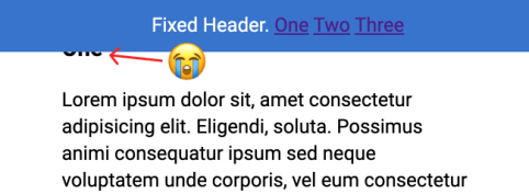
The problem: you click a jump link like <a href="#header-3">Jump</a> which links to something like <h3 id="header-3">Header</h3>. That's totally fine, until you have a position: fixed; header at the top of the page obscuring the header you're trying to link to!
Fixed headers have a nasty habit of hiding the element you're trying to link to.
There used to be all kinds of wild hacks to get around this problem. In fact, in the design of CSS-Tricks as I write, I was like, "Screw it, I'll just have a big generous padding-top on my in-article headers because I don't mind that look anyway."
But there is actually a really straightforward way of handling this in CSS now.
h3 {
  scroll-margin-top: 5rem; /* whatever is a nice number that gets you past the header */
}
We have an Almanac article on it, which includes browser support, which is essentially everywhere. It's often talked about in conjunction with scroll snapping, but I find this use case even more practical.
Here's a simple demo:
In a related vein, that weird (but cool) "text fragments" link that Chrome shipped takes you to the middle of the page instead, which I think is nice.
I want to know about the exact difference between the XM Sitemap & HTML Sitemap. I already take the help of Google but not satisfied.
Expecting a better reply from your side.
Video marketing has absolutely exploded in the last few years and for good reason. Most people prefer to consume information via video rather than read a lengthy blog post. YouTube has over 1 Billion users and has become the third-largest search engine so if it’s the best place for you to publish your videos. In […]
Devs often struggle with the design of their websites. One thing that holds their designs back the most is the way they handle type, so in this video, we’re looking at 6 simple steps for you to follow to make …
After installing WordPress, the first thing every beginner needs to learn is how to install a WordPress plugin.
In simple words, WordPress plugins are like apps for your WordPress website. They allow you to add new features to WordPress like a contact form, slideshow, shopping cart, and more.
There are thousands of free and paid plugins available for WordPress. In this step by step guide, we will show you how to install a WordPress plugin.
Before You Start
If you are using WordPress.com, then you cannot install plugins.
We often get complaints from users saying that they can’t see the plugins menu in their WordPress dashboard. It is because you are using WordPress.com, which has its limitations.
You cannot install plugins on WordPress.com unless you upgrade to their business plan. On the other hand, you can install any plugin you want on your self hosted WordPress.org website right out of the box (See the differences between self hosted WordPress.org vs WordPress.com).
That being said, now let’s take a look at how to install a WordPress plugin on your website.
How to Install a WordPress Plugin
To make it easy, we have created a video tutorial on how to install a WordPress plugin that you can watch below.
However, if you just want to follow text-instructions, then you can follow our step by step tutorial on how to install a WordPress plugin.
We have covered all three methods: installing a WordPress plugin using search, uploading a WordPress plugin, and manually installing a WordPress plugin using FTP.
Ready? Let’s get started.
Install a Plugin using WordPress Plugin Search
The easiest way of installing a WordPress plugin is to use the plugin search. The only downside of this option is that a plugin must be in the WordPress plugin directory which is limited to only free plugins.
First thing you need to visit the Plugins » Add New page inside your WordPress admin area.
You will see a screen like the one in the screenshot above. Find the plugin by typing the plugin name or the functionality you are looking for. After that, you will see a bunch of listings like the example below:
You can pick the plugin that is best for you. Since in our search, we were looking for WPForms which is the best WordPress contact form plugin, we’ll click the ‘Install Now’ button next to it.
WordPress will now download and install the plugin for you. After this, you’ll notice the ‘Install Now’ button will change into the ‘Activate’ button.
A WordPress plugin can be installed on your site, but it will not work unless you activate it. So go ahead and click on the activate button to start using that plugin on your WordPress site.
That’s all, you have successfully installed your first WordPress plugin.
The next step is to configure the plugin settings. These settings will vary for each plugin therefore we will not be covering that in this post.
Install a Plugin using the WordPress Admin Plugin Upload
Paid WordPress plugins are not listed in the WordPress plugin directory. These plugins cannot be installed using the first method.
That’s why WordPress comes with the upload method to install such plugins. We will show you how to install WordPress plugins using the upload option in the admin area.
First, you need to download the plugin from the source (which will be a zip file). Next, you need to go to WordPress admin area and visit Plugins » Add New page.
After that, click on the ‘Upload Plugin’ button on top of the page.
This will reveal the plugin upload form. Here you need to click on the ‘Choose File’ button and select the plugin file you downloaded earlier to your computer.
After you have selected the file, you need to click on the ‘Install Now’ button.
WordPress will now upload the plugin file from your computer and install it for you. You will see a success message like this after the installation is finished.
Once installed, you need to click on the Activate Plugin link to start using the plugin.
You would have to configure the settings to fit your needs. These settings will vary for each plugin therefore we will not be covering that in this post.
Manually Install a WordPress Plugin using FTP
In some rare cases, your WordPress hosting provider may have file restrictions that could limit your ability to install a plugin from the admin area.
In this situation, your best bet is to install the plugin manually using FTP.
The FTP manager method is the least friendly for beginners.
First you will need to download the plugin’s source file (it will be a zip file). Next, you need to extract the zip file on your computer.
Extracting the plugin zip file will create a new folder with the same name. This is the folder that you need to manually upload to your website using a FTP client.
You would need to access your host through the FTP manager. If you do not have your FTP username and password, then contact your WordPress hosting provider and ask them.
Open the FTP client on your computer and connect to your website using the login credentials provided by your web host. Once connected, you need to go to the /wp-content/plugins/ folder on your website.
Next, upload the folder you extracted from the zip file to the /wp-content/plugins/ folder on your web server.
After uploading the files, you need to visit the WordPress admin area and click on the Plugins link in the admin menu. You’ll see your plugin successfully installed on the plugins page.
You need to click on the Activate link below the plugin to start using it.
Upon activating, you may need to configure the plugin settings. WordPress plugins come with their own settings which differ from one plugin to another so we will not describe them here.
FAQs About Installing WordPress Plugins
As a beginners you may have few questions about installing WordPress plugins. As the largest WordPress resource site, we have heard all of them.
Here are some of the most frequently asked questions about installing WordPress plugins.
1. How do I find the best WordPress plugins to install on my website?
There are more than 55,000 WordPress plugins on the free WordPress plugin directory alone. Many more are available as premium plugins. This makes it a bit difficult for beginners to find the best plugin for the feature they need.
You can install as many WordPress plugins as you need. It is not the number of plugins that affect your website speed, but the quality of those plugins. For more information, see our article on how many WordPress plugins you should install.
5. How do I uninstall a WordPress plugin
You can uninstall a WordPress plugin by visiting the Plugins page in the WordPress admin area. If the plugin you want to remove is currently active, then first you’ll need to deactivate it. After that, you can simply click on the delete link to remove it from your website.
We hope this helped you learn how to install WordPress plugins.
You may also want to see our plugins category where we write about the best WordPress plugins that you can use to accomplish whatever you’re looking to do. Each of those articles comes with step-by-step instructions on how to set up individual plugins.
If you liked this article, then please subscribe to our YouTube Channel for WordPress video tutorials. You can also find us on Twitter and Facebook.
In the video embedded below, Jen Simmons explains how to improve image loading by using width and height attributes. The issue is that there’s a lot of jank when an image is first loaded because an img will naturally have a height of 0 before the image asset has been successfully downloaded by the browser. Then it needs to repaint the page after that which pushes all the content around. I’ve definitely seen this problem a lot on big news websites.
Anyway, Jen is recommending that we should add height and width attributes to images like so:
This is because Firefox & Chrome will now take those values into consideration and remove all the jank before the image has loaded, even when you override those values in CSS with a fluid width and thus unknown height. That means content will always stay in the same position, even if the image hasn’t loaded yet. In the past, I’ve worked on a bunch of projects where I’ve placed images lower down the page simply because I want to prevent this sort of jank. I reckon this fixes that problem quite nicely.
I don’t want every possible padding and margin and colour and flexbox configuration in the world. I just want the ones that I know I end up using in every project. So here is monica.css: my very own CSS framework, which I copy paste at the beginning of every CSS file and take it from there.
I love it when people make their own CSS starter. I like Sanitize, but even that feels like a bit much for most things I poke around at. If I was making one for myself, I'd probably steal some of this stuff from Monica. I'd definitely pull the margin off body as I find myself writing that line a lot. I'd probably steal some of that [class] stuff from Andy's. My center class would probably just be text-align and I'd give myself some other centering class for my other favorite centering: display: grid; place-items: center;.
SWIFT, a provider of global financial messaging services, is set to host a two-day hackathon at its annual African Regional Conference (ARC). The hackathon, which will take place on April 21st - 23rd in Cape Town, South Africa, will focus on developing solutions for cross-border financial services in Africa.
I got a bunch of questions from a "Head of Customer Success" at a company that does developer education recently. They had some great questions about how CodePen could be used in their online courses1. The answers might benefit anyone in this situation, so here's exactly what I was asked and what I answered.
Which would be the best plan for the online course described?
Here's one way instructors/students can use CodePen for a course. The instructor has a curriculum for the course. Part of that includes coding exercises for the students. Those coding exercises can take the form of a pre-created Pen on CodePen. Maybe like this. The students then Fork that Pen and try to complete it, and they send the instructor their attempts.
Here's another way instructors can use CodePen. They teach live using the CodePen editor. Maybe it's projected onto the front of a classroom using Presentation Mode, or the students follow along on their own computers using Professor Mode. Those two features are PRO, so the instructor would need a PRO account.
Here's another. The instructor (or school) gets a Team Account. All the students are invited as members of the Team. That makes everyone involved have a PRO account, so they can do things like make Private Pens and share uploaded assets like images. As a new cohort comes in the students can be removed from the team and new students added.
Could it be billed monthly, quarterly or annually?
We offer monthly or annual billing on any of our plans (but not quarterly).
When is it billed? (at the beginning or at the end of the month?)
We bill the second you sign up, and then at intervals based on that day. For example, if you sign up on March 14th and choose a monthly plan, you'll be charged again April 14th. If you picked a yearly plan, you'll be charged again March 14th the following year.
Is the billing variable or fixed per term?
Plans are mostly fixed. If you go with a Team Account, Teams are charged based on the number of seats, so you can increase or decrease those seats at any time and are re-billed accordingly.
Is the billing per registered users, active users?
Only Team Accounts are billed on a per-user basis. Team Accounts are $12-per-person if billed annually or $19-per-person if billed monthly. If what worked better for you was only having the instructor with a PRO account, for example, that's a single user with a single fixed cost.
Our online courses are on-demand, so is it possible to switch on and off the course according to our needs per month?
Yes, you can cancel and re-activate on a monthly basis if you choose the monthly plan.
1 - This kind of thing is sometimes a sign that the design of your site doesn't help answer these questions well enough. In this case, I'm not that worried about that. I think we do OK there, although this is good research for the next time we're tackling those areas.
A common approach to email design (and maybe app design as well) is a mobile-first approach. Since 54.58% of web traffic comes from a handheld device, it makes sense to design for smaller screens first. Responsive email design is one …
Mezo Istvan does a good job of covering the problem and a solution to it in a blog post on Medium¹.
If you tap on something that has a :hover state but you don't leave the page then, on a mobile device, there is a chance that :hover state "sticks." You'll see this with stuff like jump-links used as tabs or buttons that trigger on-page functionality.
It almost feels like we have to apologize to linking to things on Medium lately. I have no idea what you're going to experience when you get there. Will you just be able to read it? Will it be a teaser where you have to log in to read more? Will it be behind a paywall? I have no idea. In this case, hopefully, this link post has enough info in it that isn't not blocking you from learning anything.
Belvo, an open banking API provider for the Latin American market, is now live. After a successful beta program that began last fall, Belvo is fully up and running with a number of developer resources available. Its core offering, the Belvo API, aims to empower open banking in Latin America.


 It’s no secret that Elementor is one of the best page builders in the WordPress community today. And it’s no longer just a page builder. Elementor has evolved so much that you can design fully functioning websites even with a free, basic WordPress theme without writing a single line of code! While Elementor offers many […]