Lonely Planet, a publisher of travel guides and eBooks, has announced plans to provide access to over 8,000 city guides via API. The Australia based travel company hopes that providing API access to their catalog of content will help grow a thriving partner program.
One particular pattern [for loading non-critical CSS] I’ve seen is the preload/polyfill pattern. With this approach, you load any stylesheets as preloads instead, and then use their onload events to change them back to a stylesheet once the browser has them ready.
So you're trying to make your stylesheet more async, but it causes two big problems:
You've kicked up the priority of the downloading higher than any other asset.
You've blocked the HTML parser too (because of the polyfill as an inline script).
Firefox does something fancy to avoid problem #2 in this particular case, but it affects every other browser.
I've never had good luck with fancy techniques to trick the browser into theoretically better downloading/rendering patterns. I'm kind of a stylesheets in the head, scripts at the end of the body kinda guy, but I know the web is a complicated place. In fact, in a quick peek, I see that Jetpack is inserting an inline script into my <head>, so that would affect my loading too, except they load it with an obfuscated type until later scripts execute and change it, probably to avoid this exact problem.
Anyway, Tim's advice:
• If you’re using loadCSS with the preload/polyfill pattern, switch to the print stylesheet pattern instead.
• If you have any external stylesheets that you’re loading normally (that is, as a regular stylesheet link), move any and all inline scripts that you can above it in the markup
• Inline your critical CSS for the fastest possible start render times.
Yesterday, the Gutenberg team released version 7.6 of the plugin. Most of the work in this update went toward the upcoming full-site editing feature. The team continues to pump out new dynamic, placeholder blocks for post data. The biggest user-facing feature was the addition of a rotating list of tips in the block inserter.
Version 7.5, released two weeks ago, was the last major release of the plugin that will have features to land in WordPress 5.4, which is currently scheduled for release on March 31. However, bug fixes from 7.6 were ported to the most recent WordPress 5.4 beta updates.
Version 7.6 does not include as many major feature additions as earlier releases. Aside from experimental work on full-site editing, it primarily includes bug fixes.
The announcement post boasts a considerable speed improvement in loading time and keypress events. In comparison to version 7.5, loading time was reduced to 7.7 seconds from 8.5 seconds and keypress event speed was reduced to 48.59 milliseconds from 55.45 milliseconds. These tests are run against a post of approximately 36,000 words and 1,000 blocks.
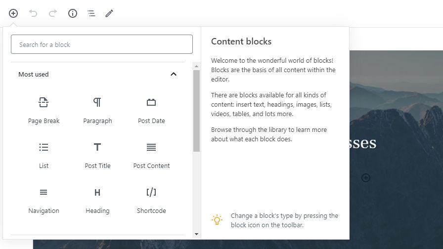
Rotating Tips In Block Inserter
Block inserter tip section now rotates messages.
In the past, the block inserter had a single tip at the bottom right that read, “While writing, you can press / to quickly insert new blocks.” It was a useful tip, but it was easy to ignore because it never changed. After seeing the same message a couple dozen times, it had become little better than wasted space.
Version 7.6 creates a rotating list of tips. Each time a user opens the inserter, a new tip appears. At the moment, the list only contains five messages but more are sure to come in the future.
There are open tickets to add contextual tips based on block search queries and block-specific tips. Both of those tickets could continue to help users learn the block system and provide a path for block creators to teach users how to use custom blocks.
Currently, the list of tips is static. However, it may be possible for plugin authors to extend it in the future. I’m already contemplating writing a plugin to replace the tips with quotes from Joss Whedon’s Firefly.
Full Steam Ahead with Full-Site Editing
Growing list of post data blocks for full-site editing.
Gutenberg 7.6 added four new dynamic, placeholder blocks related to post data: featured image, tags, comments count, and comments form. This brings the total to around 12 blocks for full-site editing, which is still a few dozen short of where the platform will need to be before the feature is ready. Most work thus far has gone toward building out blocks that handle post data. Eventually, the team will need to expand to other areas that will need block representation on the front end.
Theme authors looking to test out full-site editing should make sure to check out the block-based theme experiments repository, which continues to see regular updates.
Users can now set the heading level of the site title block. It can also be set to a paragraph. However, it does not include all of the design settings, such as text size or colors, that would come with a regular paragraph block. This is a good first step in recognizing the various ways the site title block will be used, but it will need to evolve into a much more robust block to allow users to do all the things they will eventually want to do with the site title.
At this point, it is hard to gauge what full-site editing will look like. Everything is experimental. It only covers the most basic use cases. I am still cautious about its potential. On the other hand, I am ready to skip ahead a year and see how it all turns out. Every plugin update brings us a step closer, but it is tough waiting to see what the bigger picture looks like as it comes together.
When designing a new website, there’s a long list of specifications and requirements you have to fulfill. It’s just the nature of web design these days. And at the top of that list sits responsive web design.
Thankfully, high-quality WordPress themes like BeTheme make it insanely easy to check off all the technical requirements you’re expected to meet — including responsive design. But why does it matter so much?
Well, for starters, more than half of all website traffic takes place on mobile according to data from StatCounter.
While desktop has put up a good fight for a couple years, mobile has prevailed as the winner. It will continue to do so, too, considering how much more convenient it is to access the web from the palm of one’s hand.
Plus, Google has made it clear that it rewards responsive web designs and mobile-friendly websites with better search rankings, so there’s no hiding from it now.
Responsive web design is a must.
Just keep in mind that following the rules for good mobile design doesn’t mean you ignore desktop users. By prioritizing the mobile experience, you can design more beautiful and efficient websites for all users.
Let’s look at some examples that demonstrate how to do this well.
Responsive web designs that encourage leaner desktop experiences
Just because you have more space to work with when designing for desktop users doesn’t mean you need to make the most of every pixel.
In fact, as Internet-enabled devices have grown smaller in size, it’s encouraged many designers to create leaner and more efficient experiences on desktop.
Take the website for designer/developer Rob Grabowski, for example.
This is how his website appears on a mobile screen:
With minimized logo and navigation out of the way, this allows the focus to remain on his photo and welcome message. Desktop visitors encounter the same thing:
This consistency in design is great because it enables visitors to seamlessly transition from viewing a website on one device to another (which happens often).
Mobile web designs that improve the decision-making process
Consumers today struggle with an overabundance of choice. It might be easier to find that thing or service they’re looking for, but that doesn’t make choosing between similar options any easier.
One of the benefits of responsive design is that it forces web designers to create websites in a modular fashion so that, as the screen size shrinks, each section falls in line beneath the others.
In turn, this makes it easier for customers to review options one-by-one. BeRepair, one of the 500+ pre-built sites from BeTheme, demonstrates this point really well:
This is one of the services offered. Notice how the responsive layout allows the visitor to really focus on the details before them and not get distracted by too much information.
This works well for other types of websites. Take, for instance, the BeRestaurant pre-built desktop site:
It’s a great-looking restaurant website. The mobile counterpart looks just as great, but minimizes the distractions so the core elements can really shine:
Rather than try to fit the menu to the right of the food images, the responsive website maintains the integrity of the original design by tucking it into the hamburger menu icon in the top-right.
Again, this is all about giving your visitors the ability to pause and really focus on the key actions you’re asking them to take. A navigation bar in full view would only distract from that.
Responsive designs that cut out the excess
Think about the last time you went to an art gallery or museum and the kinds of paintings you encountered:
The landscape murals that have a central focus but beautiful details surrounding it.
The portraits with a singular focus that’s chock-full of intimate details.
What’s cool about responsive websites is that they allow us to display the same web page in both formats.
Desktop screens thereby display landscape murals and mobile screens display portraits. But it’s important to know where the excess is in the desktop view so you can trim it back enough to make the mobile experience worthwhile.
For instance, this is the desktop site for BeITService:
This is a great looking hero banner on the home page. It’s well-balanced, the colors are carefully chosen, and the message is crystal-clear.
This is a good example of how smart designers have become when it comes to choosing responsive images for websites.
Here’s that same image and banner from above, but now displayed on mobile:
The image may not appear in full, but there’s nothing lost in this translation from desktop to mobile. What’s more, the message remains front and center.
On desktop, it shows an elaborate background graphic that enhances the overall design. On mobile, however, it turns into this:
Even with the image now reduced and placed at the bottom, it’s still a striking design that allows the message to really shine through.
Another great example is BeTutor. This is how the desktop version looks like:
Here we have the main title and some more info using smaller text. In order not to cramp the mobile view, the design omits the extra content and focuses on the primary message:
The mobile view stays uncluttered without loosing any of the important subject matter that reveals the type of service offered.
Responsive websites that leverage their space
While a small screen requires reducing content in most of the cases, some responsive web designs leverage the space and use the different ratio to their advantage.
While the desktop version focuses on their main tagline, the mobile version makes use of the vertical space and shows more content, giving the mobile visitor an option to learn more about the company right away:
So a mobile design don’t necessarily have to show less content in order to work well.
The mobile screen ratio allows for making use of the vertical space, like it’s shown in this example of BeCosmetics. Check out the desktop view:
The mobile view has more vertical space so the introductory content can be shown along with the button that invites the user to explore all products:
Once again, these examples demonstrate that less space doesn’t need to mean less useful content for the mobile website user.
Responsive websites that enhance readability
When laying out text on a desktop website, you have to be careful about how much you show to a reader at once. Put too many words on a line or not include enough spacing between letters, and your visitors might skip reading it altogether.
It’s a tricky balance to maintain and usually requires visual elements to balance out the text. Take, for example, the BeDanceSchool site:
Thanks to the funky designs and eye-catching graphics around the text, it’s easy for visitors to focus on the content and read it all the way through.
This won’t work on mobile though, which is why it’s important to understand the strengths of each screen size. Here you can see how that same text from above should be handled on mobile:
The design is paired back immensely so that all the visitor can see is the content. But that’s okay because the text is still beautifully styled which helps keep attention.
That said, text presented to mobile visitors doesn’t always have to be so heavily styled. If you select the right font size and type, you can create something that’s readable and engaging just as Base Coat does:
Just be mindful of the vertical length of text on mobile. While it might be easy to see where it ends on desktop, it can seem daunting on mobile if it appears to go on and on.
Mobile sites that put a spotlight on visual content
Responsive web designs aren’t just useful for websites with lots of text. Because of the way content responds to smaller screen sizes, visual storytelling elements look great on mobile, too.
Here’s what visitors see on the BeBand website on desktop:
Mobile screens don’t have the ability to play with balance as in the example above, but they do have the ability to shine a spotlight on the images you’ve chosen:
Websites that contain eye-catching images like this one would certainly benefit from responsive web design.
It’s not just static images that this works with either. The Scott Resort, for example, invites first-time visitors to watch a video:
Regardless of what kind of device the visitor is on, the video automatically conforms to the width of the screen.
This is the video on desktop:
And this is the video on mobile:
With a mobile responsive design, you really allow your content to adapt to the device and experience your users want.
Mobile responsive sites that collect more leads
Although more website traffic comes from mobile devices, it’s still quite difficult to get mobile users to convert as much as they do on desktop. That’ll come with time, but we’re not there just yet.
In the meantime, your responsive site needs to be prepared to capture leads whenever it can to improve those conversion rates.
This “Newsletter” section stands out beautifully on the homepage. And because it’s so convenient (e.g. it’s light on text and requires only one field be filled out), it’s likely to get a ton of subscribers.
This is how that same subscriber form appears on mobile:
Again, it’s really well done — and the smaller, dedicated space on mobile might be an even more effective way to catch the attention of potential subscribers.
So, if you can design your responsive site to collect visitors’ email addresses, you’ll empower them to reconnect with your website from their preferred device. As a result, you can increase the number of conversions it gets.
Responsive web designs for the win
When WordPress users go looking for a theme to design their website with, they look for qualities like:
Ease of use
Cost efficiency
Features
Customizability
Overall design quality
It’s easy to take responsive web designs for granted because we see them everywhere, but, the truth is, not every WordPress theme is built with the mobile user in mind.
BeTheme is different. Each of its 500+ pre-built sites comes with mobile responsiveness baked in.
So, when you use BeTheme, you can spend less time stressing over how to make your website look like the responsive designs above and more time getting your new website online and in front of consumers.