The Accidental Side Project

Featured Imgs 23

Drew McLellan puts the chairs up on the tables, sweeps the floor, and closes off our season, and indeed the entire 24 ways project with a look back at what it’s meant to run this site as a site project, and what impact side projects can have on the work we do. Will the last one out turn off Christmas the lights?


Brought to you by The CSS Layout Workshop. Does developing layouts with CSS seem like hard work? How much time could you save without all the trial and error? Are you ready to really learn CSS layout?


Fifteen years ago, on a bit of a whim, I decided it would be fun to have a Web Standards version of something like the Perl Advent calendar. A simple website with a new tip or trick each day leading the readers through December up until Christmas.

I emailed a bunch of friends that kept web design and development themed blogs (remember those?) suggesting the idea and asking if they’d like to contribute. My vision had been that each post would be a couple of paragraphs of information. A small nugget of an idea, or a tip, or a suggestion. What happened was something really amazing. I began to receive really insightful blog posts containing some of the most valuable writing I’d seen online all year.

Look at this piece from Ethan Marcotte on Centered Tabs with CSS, or this detailed piece on scripting block quotes from Jeremy Keith. I was blown away, and the scene was set.

Screenshot of the original 24 ways site
Part of the original design. Photo by Bert Heymans.

Collaboration

What I hadn’t anticipated in 2005 was that this little side project would turn into a fixture of the industry calendar, would introduce me to a raft of field experts, and would have me working with an eclectic team of collaborators for fifteen long seasons.

And that last point is crucial. I’ve by no means produced this alone. Rachel Andrew has been a constant supporter in helping each year to see the light of day and producing our ebooks. After a couple of years, Brian Suda stepped in to help me plan and select authors. In 2008, I managed to persuade Tim Van Damme to replace my very basic site design with something altogether more fitting. In 2010, Anna Debenham came on board initially to help with the production of articles, but rapidly became a co-producer working with me on all aspects of the content. Owen Gregory joined up that same year to help with the proofing and editing of articles, and for many years did a fantastic job writing the home page article teasers, which are now but a shadow of their former selves.

Screenshot of the 2008 24 ways site
Tim Van Damme’s 2008 redesign.

Also in 2010, we produced a book in collaboration with Five Simple Steps and raising funds in the memory of Remy and Julie’s daughter, Tia Sharp.

Photo of the cover of the 24 ways book
The Five Simple Steps 24 ways book. Photo by Patrick Haney.

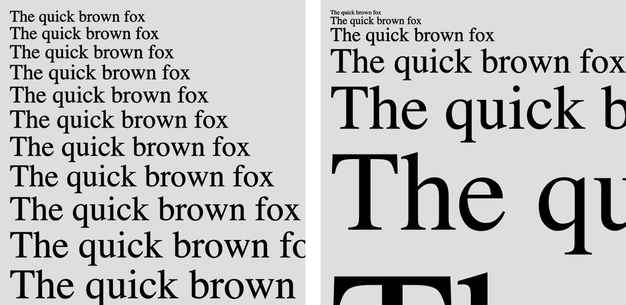
In 2013, Paul Robert Lloyd stepped up to the plate to provide us with the design you see today, which not only subtly shifts colours between each day, but across the years as well. Compare the reds of 2005 to the purples of 2019, and the warm tones of a Day 1 to its correspondingly cool Day 24. It’s a terrific piece of work.

Screenshot showing the colour differences between a Day 1 article and a Day 24 article.
Paul Robert Lloyd’s design plays subtly with colour shifts.

In 2014 we won a Net Award for Best Collaborative Project at a fancy ceremony in London. Many past authors were there, and as it was an aware for our collaborative efforts, we all posed with the glassware for photos.

A montage of 24 ways authors posing with our Net Award trophy
We all went to a right fancy do.

Looking back, looking forward

But even I, Sea Captain Belly Button am not enough of a navel gazer to just be writing an article just about this website. As we draw our fifteenth and final year to a close, it’s important to reflect on what can be learned. Not from the articles (so much!) or from the folly of committing to a nightly publishing schedule for a month every year for fifteen years (don’t do it!) but from the value in starting something not because you have to, but just because you want to. From scratching an itch. From working with a friend just because you love spending time with them. Or for doing something because you see the opportunity for good.

As web designers and developers, we have the opportunity to turn the skills we use in our profession to so many different purposes. In doing so you never know what good might come from it.

Seeing the good

This week I asked around to find out what good others have seen from their side projects. Long time 24 ways contributor Simon Willison had this to say:

Simon went onto explain how it was a website side project that got him his first job in tech. After that, his personal blog lead him to getting a job at Lawrence Journal-World where he created Django. On his honeymoon, Simon and his new wife (and 24 ways contributor) Natalie Downe created Lanyrd, and Simon’s more recent Datasette project landed him a JSK Fellowship at Stanford. That’s an impressive record of side projects, for sure.

Others had similar stories. My good friend Meri Williams is currently CTO of challenger bank Monzo, as well as being a trustee at Stonewall and Chair of The Lead Developer conference.

Again, an impressive list of achievements, and I’m sure both Simon and Meri would have eventally found other routes to their individual success, but the reality is they did it through side projects. Through being present and active, contributing a little to their communities, and receiving so much more back in return.

Of course, not all projects have to be directly related to the web or software to be fulfilling. Of course they don’t. Mark Small and Jack Shoulder embraced their love of a good rear end and created MuseumBums, informally cataloging perfect posteriors for your perusing pleasure. On its success, Mark says:

Jack adds:

I had so many heartwarming responses to my request for stories, I really recommend you go over to the thread on Twitter and read it. It’s been one of my favourite set of replies in a long time.

Focussing on what’s important

As the years progressed, more and more publications sprang up both at Christmas and throughout the year with how-to articles explaining techniques. As a natural response, 24 ways started mixing up solution-based articles with bigger picture takes on a wider range of topics, but always with a practical takeaway to impress your friends.

After the embarrassment of white dudes that dominated the early years, we actively sought to open the opportunity to write to a wider and more diverse range of experts. While I don’t think we ever got as much racial diversity in our lineup as I would have liked to have achieved, I’m very proud that each season has been closely gender-balanced since 2012. This is something that was never forced or remotely hard to achieve, all it took was an awareness of the potential for bias.

Calling time

With all the benefits that side projects can bring, it’s also important to be mindful of downsides. Not every project will take flight, and those that do can also start to consume valuable time. That’s fine while it’s fun and you’re seeing the benefits, but it’s neither fun or healthy long-term to have no time away from something that might otherwise be your job.

Spending time with family, friends, and loved ones is equally important especially at this time of year. Just as anyone who does a lot of sport or fitness will tell you about the value of rest days between your activities to let the body recover, time away from ‘work’ is important to do the same for your brain.

Having run this site every Christmas for 15 seasons, it’s time to take a breather and give it a rest. Who knows if we might return in the future, but no promises. It’s been a good run, and an absolute privilege to provide this small tradition to the community I love.

So from me and the whole 24 ways family, Happy Christmas to all, and to all a good night.

Anna and Drew at the 2014 Net Awards dinner
Anna and Drew at the 2014 Net Awards dinner.

About the author

Drew McLellan is a developer and content management consultant from Bristol, England. He’s the lead developer for the popular Perch and Perch Runway content management systems, and public speaking portfolio site Notist. Drew was formerly Group Lead at the Web Standards Project, and a Search Innovation engineer at Yahoo!. When not publishing 24 ways, he keeps a personal site about web development, takes photos, tweets a lot and tries to stay upright on his bicycle.

More articles by Drew

Four Ways Design Systems Can Promote Accessibility – and What They Can’t Do

Featured Imgs 23

Amy Hupe prepares a four bird roast of tasty treats so we can learn how the needs of many different types of users can be served through careful implementation of components within a design system.


Design systems help us to make our products consistent, and to make sure we’re creating them in the most efficient way possible. They also help us to ensure our products are designed and built to a high quality; that they’re not only consistent in appearance, and efficiently-built, but that they are good. And good design means accessible design.

1 in 5 people in the UK have a long term illness, impairment or disability – and many more have a temporary disability. Designing accessible services is incredibly important from an ethical, reputational and commercial standpoint. For EU government websites and apps, accessibility is also a legal requirement.

With that in mind, I’ll explain the four main ways I think we can use design systems to promote accessible design within an organisation, and what design systems can’t do.

1. Bake it in

Design systems typically provide guidance and examples to aid the design process, showing what best practice looks like. Many design systems also encompass code that teams can use to take these elements into production. This gives us an opportunity to build good design into the foundations of our products, not just in terms of how they look, but also how they work. For everyone.

Let me give an example.

The GOV.UK Design System contains a component called the Summary list. It’s used in a few different contexts on GOV.UK, to summarise information. It’s often used at the end of a long or complex form, to let users check their answers before they send them, like this:

A table with contact information in it.

Users can review the information and, if they’ve entered something incorrectly, they can go back and edit their answer by clicking the “Change” link on the right-hand side. This works well if you can see the change link, because you can see which information it corresponds to.

In the top row, for example, I can see that the link is giving me the option to change the name I’ve entered because I can see the name label, and the name I put in is next to it.

However, if you’re using a screen reader, this link – and all the others – will just say “change”, and it becomes harder to tell what you’re selecting. So to help with this, the GOV.UK Design System team added some visually-hidden text to the code in the example, to make the link more descriptive.

A screenshot of the table form component with the HTML beneath it. The span element is highlighted, and it has the classname of govuk-visually-hidden.

Sighted users won’t see this text, but when a screen reader reads out the link, it’ll say “change name”. This makes the component more accessible, and helps it to satisfy a Web Content Accessibility Guidelines (WCAG 2.1) success criterion for links which says we must “provide link text that identifies the purpose of the link without needing additional context”.

By building our components with inclusion in mind, we can make it easier to make products accessible, before anyone’s even had to think about it. And that’s a great starting point. But that doesn’t mean we don’t have to think about it – we definitely do. And a design system can help with that too.

2. Explain it

Having worked as the GOV.UK Design System’s content designer for the best part of 3 years, I’m somewhat biased about this, but I think that the most valuable aspect of a design system is its documentation.

(Here’s a shameless plug for my patterns Day talk on design system documentation earlier this year, if you want to know more about that.)

When it comes to accessibility, written documentation lets us guide good practice in a way that code and examples alone can’t.

By carefully documenting implementation rules for each component, we have an opportunity to distribute accessible design principles throughout a design system. This means design system users encounter them not just once, but repeatedly and frequently, in various contexts, which helps to build awareness over time.

For instance, WCAG 2.1 warns against using colour as “the only visual means of conveying information, calling an action, prompting a response or distinguishing a visual element”. This is a general principle to follow, but design system documentation lets us explain how this relates to specific components.

Take the GOV.UK Design System’s warning buttons. These are used for actions with serious, often destructive consequences that can’t easily be undone – like permanently deleting an account.

A red button with the text 'Delete account'.

The example doesn’t tell you this, but the guidance explains that you shouldn’t rely on the red colour of warning buttons to communicate that the button performs a serious action, since not all users will be able to see the colour or understand what it signifies.

Instead, it says, “make sure the context and button text makes clear what will happen if the user selects it”. In this way, the colour is used as an enhancement for people who can interpret it, but it’s not necessary in order to understand it.

Making the code in our examples and component packages as accessible as possible by default is really important, but written documentation like this lets us be much more explicit about how to design accessible services.

3. Lead by example

In our design systems’ documentation, we’re telling people what good design looks like, so it’s really important that we practice what we preach.

Design systems are usually for members of staff, rather than members of the public. But if we want to build an inclusive workplace, we need to hold them to the same standards and ensure they’re accessible to everyone who might need to use them – today and in the future.

One of the ways we did this in my team, was by making sure the GOV.UK Design System supports users who need to customise the colours they use to browse the web. There are a range of different user needs for changing colours on the web. People who are sensitive to light, for instance, might find a white background too bright. And some users with dyslexia find certain colours easier to read than others.

My colleague, Nick Colley, wrote about the work we did to ensure GOV.UK Design System’s components will work when users change colours on GOV.UK. To ensure we weren’t introducing barriers to our colleagues, we also made it possible to customise colours in the GOV.UK Design System website itself.

Screenshot of the GOV.UK website with green and white text and black background.

Building this flexibility into our design system helps to support our colleagues who need it, but it also shows others that we’re committed to inclusion and removing barriers.

4. Teach it

The examples I’ve drawn on here have mostly focused on design system documentation and tooling, but design systems are much bigger than that. In the fortuitously-timed “There is No Design System”, Jina reminds us that tooling is just one of the ways we systematise design:

…it’s a lot of people-focused work: Reviewing. Advising. Organizing. Coordinating. Triaging. Educating. Supporting.”

To make a design system successful, we can’t just build a set of components and hope they work. We have to actively help people find it, use it and contribute to it. That means we have to go out and talk about it. We have to support people in learning to use it and help new teams adopt it. These engagement activities and collaborative processes that sit around it can help to promote awareness of the why, not just the what.

At GDS, we ran workshops on accessibility in the design system, getting people to browse various web pages using visual impairment simulation glasses to understand how visually impaired users might experience our content. By working closely with our systems’ users and contributors like this, we have an opportunity to bring them along on the journey of making something accessible.

We can help them to test out their code and content and understand how they’ll work on different platforms, and how they might need to be adjusted to make sure they’re accessible. We can teach them what accessibility means in practice.

These kinds of activities are invaluable in helping to promote accessible design thinking. And these kinds of lessons – when taught well – are disseminated as colleagues share knowledge with their teams, departments and the wider industry.

What design systems can’t do

Our industry’s excitement about design systems shows no signs of abating, and I’m excited about the opportunities it affords us to make accessible design the default, not an edge case. But I want to finish on a word about their limitations.

While a design system can help to promote awareness of the need to be accessible, and how to design products and services that are, a design system can’t make an organisation fundamentally care about accessibility.

Even with the help of a thoughtfully created design system, it’s still possible to make really inaccessible products if you’re not actively working to remove barriers. I feel lucky to have worked somewhere that prioritises accessibility. Thanks to the work of some really brilliant people, it’s just part of the fabric at GDS. (For more on that work and those brilliant people, I can’t think of a better place to start than my colleague Ollie Byford’s talk on inclusive forms.)

I’m far from being an accessibility expert, but I can write about this because I’ve worked in an organisation where it’s always a central consideration. This shouldn’t be something to feel lucky about. It should be the default, but sadly we’re not there yet. Not even close.

Earlier this year, Domino’s pizza was successfully sued by a blind customer after he was unable to order food on their website or mobile app, despite using screen-reading software. And in a recent study carried out by disability equality charity, Scope, 50% of respondents said that they had given up on buying a product because the website, app or in-store machine had accessibility issues.

Legally, reputationally and most importantly, morally, we all have a duty to do better. To make sure our products and services are accessible to everyone. We can use design systems to help us on that journey, but they’re just one part of our toolkit.

In the end, it’s about committing to the cause – doing the work to make things accessible. Because accessible design is good design.


About the author

Amy is a content specialist and design systems advocate who’s spent the last 3 years working as a Senior Content Designer at the Government Digital Service.

In that time, she’s led the content strategy for the GOV.UK Design System, including a straightforward and inclusive approach to documentation.

In January, Amy will continue her work in this space, in her new role as Product Manager for Babylon Health’s design system, DNA.

More articles by Amy

Usability and Security; Better Together

Featured Imgs 23

Divya Sasidharan calls into question the trade-offs often made between security and usability. Does a secure interface by necessity need to be hard to use? Or is it the choice we make based on years of habit? Snow has fallen, snow on snow.


Security is often synonymous with poor usability. We assume that in order for something to be secure, it needs to by default appear impenetrable to disincentivize potential bad actors. While this premise is true in many instances like in the security of a bank, it relies on a fundamental assumption: that there is no room for choice.

With the option to choose, a user almost inevitably picks a more usable system or adapts how they interact with it regardless of how insecure it may be. In the context of the web, passwords are a prime example of such behavior. Though passwords were implemented as a way to drastically reduce the risk of attack, they proved to be marginally effective. In the name of convenience, complex, more secure passwords were shirked in favor of easy to remember ones, and passwords were liberally reused across accounts. This example clearly illustrates that usability and security are not mutually exclusive. Rather, security depends on usability, and it is imperative to get user buy-in in order to properly secure our applications.

Security and Usability; a tale of broken trust

At its core, security is about fostering trust. In addition to protecting user accounts from malicious attacks, security protocols provide users with the peace of mind that their accounts and personal information is safe. Ironically, that peace of mind is incumbent on users using the security protocols in the first place, which further relies on them accepting that security is needed. With the increased frequency of cyber security threats and data breaches over the last couple of years, users have grown to be less trusting of security experts and their measures. Security experts have equally become less trusting of users, and see them as the “the weakest link in the chain”. This has led to more cumbersome security practices such as mandatory 2FA and constant re-login flows which bottlenecks users from accomplishing essential tasks. Because of this break down in trust, there is a natural inclination to shortcut security altogether.

Build a culture of trust not fear

Building trust among users requires empowering them to believe that their individual actions have a larger impact on the security of the overall organization. If a user understands that their behavior can put critical resources of an organization at risk, they will more likely behave with security in mind. For this to work, nuance is key. Deeming that every resource needs a similarly high number of checks and balances diminishes how users perceive security and adds unnecessary bottlenecks to user workflows.

In order to lay the foundation for good security, it’s worth noting that risk analysis is the bedrock of security design. Instead of blindly implementing standard security measures recommended by the experts, a better approach is to tailor security protocols to meet specific use cases and adapt as much as possible to user workflows. Here are some examples of how to do just that:

Risk based authentication

Risk based authentication is a powerful way to perform a holistic assessment of the threats facing an organization. Risks occur at the intersection of vulnerability and threat. A high risk account is vulnerable and faces the very real threat of a potential breach. Generally, risk based authentication is about calculating a risk score associated with accounts and determining the proper approach to securing it. It takes into account a combination of the likelihood that that risk will materialize and the impact on the organization should the risk come to pass. With this system, an organization can easily adapt access to resources depending on how critical they are to the business; for instance, internal documentation may not warrant 2FA, while accessing business and financial records may.

Dynamically adaptive auth

Similar to risk based auth, dynamically adaptive auth adjusts to the current situation. Security can be strengthened and slackened as warranted, depending on how risky the access point is. A user accessing an account from a trusted device in a known location may be deemed low risk and therefore not in need of extra security layers. Likewise, a user exhibiting predictive patterns of use should be granted quick and easy access to resources. The ability to adapt authentication based on the most recent security profile of a user significantly improves the experience by reducing unnecessary friction.

Conclusion

Historically, security failed to take the user experience into account, putting the onus of securing accounts solely on users. Considering the fate of password security, we can neither rely on users nor stringent security mechanisms to keep our accounts safe. Instead, we should aim for security measures that give users the freedom to bypass them as needed while still protecting our accounts from attack. The fate of secure systems lies in the understanding that security is a process that must constantly adapt to face the shifting landscape of user behavior and potential threats.


About the author

Divya is a web developer who is passionate about open source and the web. She is currently a developer experience engineer at Netlify, and believes that there is a better workflow for building and deploying sites that doesn’t require a server—ask her about the JAMstack. You will most likely find her in the sunniest spot in the room with a cup of tea in hand.

More articles by Divya

There Is No Design System

Featured Imgs 23

Jina Anne silences the night to talk about how we talk about Design Systems. Can the language we use impact the effectiveness of the solution? Fear not, if mighty dread has seized your troubled mind. Design systems of great joy we bring to you and all mankind.


Ooh, clickbaity title. Why on earth would I, a self-proclaimed “design systems advocate”, say there is no design system? Yes, I’m being a little tongue-in-cheek. Maybe I just wanted an excuse to use the “there is no spoon” gif. But I do have an actual point, so bear with me.

Keanu Reeves as Neo in The Matrix, realizes, “there is no spoon”.

Design systems as a “thing” vs design systems as a methodology

Recently I tweeted my thoughts on why I have been tending to use design systems in plural form (rather than using an article like “a” or “the” in front of it). During my time at Salesforce when our team was called “Design Systems” and my role was “Lead Designer, Design Systems”, I would get asked “Why is it plural? We only have one.”.

My thoughts:

Lately, I’ve been thinking a lot about the way we talk about design systems, including the confusion and negativity that can come along with it. Amélie Lamont gave a talk in 2018 called “The Language of Design”, and in it, she talked about the way we talk about design systems and design itself from a “jargony point of view”. She argues that design is technically problem-solving.

I definitely agree. People get caught up in “design” as the actual role or action of designing and have even taken issue with the term “design systems” for this very reason (and have suggested it be more focused on code). I don’t think it really does us a good service to just swap out one role for the other. And… is it even about the role?

For other folks, which I include myself, we see design as a larger effort that involves the end-user experience (which includes usability, accessibility, performance, etc) as well as having a huge impact on the business. This includes code.

But really, it should all be focused on people. I like Mina Markham’s definition of what makes for good art direction in design systems:

Art direction is progressive. Localized. Cross-functional. Inclusive. Systematic.

Mina Markham

You’ll notice that the emphasis of what she speaks about is on people.

So in the design systems work we do, you often think of a style guide. Or a component library. Or a Sketch UI Kit. And there are arguments on whether either of those things can be called a design system if it doesn’t include this other thing or that other thing. We even talk about whether design systems are products or are more of a service. My take? The word “design” and “system” used in combination together literally just means to systemize your design (and in my world view that is more about the overall experience). And so if for you that means a Sketch UI Library, then you do you! My point is I think there is too much focus on the deliverables in the first place.

I touched on this briefly very recently:

Something I’ve been thinking a lot about is how much time we spend on making beautiful design system websites. I love looking at them. They’re great. But as our design and engineering tools get closer and closer together, will we come to a point where we don’t need the website? Can our tools surface suggestions for better accessibility, localization, performance, and usability, because our design system is baked into the tools? Just a thought.

Quote from post in Smarter Design Systems Tools
Keanu Reeves’ famous “whoa” reaction.

Invisible Design Systems?

So this is something I am striving for in 2020 — in what ways can we improve our collaboration, remove any proverbial gaps between design and engineering (not just bridge them), and have more meaningful conversations around the work we do? I don’t have any wrong or right answers here, but I am looking forward to seeing this progress in our field.

Design tools are bringing in smarter, automated ways to check for color contrast and other accessibility issues that can be detected early on. Sketch just announced their Assistant feature planned for 2020, which will check for your visual design discrepancies. And some design tools are using real code to be used in your product.

Engineering tools are advancing every day as well. I was just attending Flutter Interact recently, which was an event held by Google about their Flutter UI toolkit. It previously enabled you to get apps built for native platforms like Android and iOS, from one code base, and now has also announced their support for desktop and web. The push at this year’s event was focused on making this approachable for creatives (with their integrations into tools like Adobe XD. It really does feel like design and engineering tools are coming closer and closer together. And that’s all really cool and exciting.

However, I have to tell you: a lot of the time that I’m working in design systems, I’m not even touching a design tool. Or coding. Rather, it’s a lot of people-focused work: Reviewing. Advising. Organizing. Coordinating. Triaging. Educating. Supporting. That’s a lot of invisible systems work right there. (I use “invisible” here to mean there is not a direct tangible object in some of this work, though it all does serve the end-user through the product outcomes).

Designed objects are the fruit of invisible systems.

Amélie Lamont

This definitely is not me saying “don’t build a style guide” or “don’t make a Sketch UI Kit”. Use whatever works best for your organization. But this essentially is a plea to always put the focus on the people using your products. And, think about design systems as more of a methodology. A shining example of this way of designing systems is the newly released Encore from Spotify. I had the opportunity to see this revealed at Design Systems London, and they just published a post on it recently.

What’s different about Encore is that it isn’t a single monolithic thing. It’s a framework that brings Spotify’s existing design systems under one brand—a “system of systems.”

Source: Reimagining Design Systems at Spotify

This design systems work is not about one style guide website and instead focuses on the needs across several systems that are connected. Design Tokens help this to be a reality. Needless to say, I’m a big fan.

Keanu Reeves gives a thumbs up

Love for your community

When you’re doing design systems work in your organization, you are actually building a community. This can involve shared language and nomenclature, an aligned purpose, and better, closer collaboration. It doesn’t have to be a “style police” situation (I actually very much dislike the term “governance”). This can be a joint effort – working together to share the ownership of design systems together.

I was a big fan of the pairing model that we had at Salesforce when I was there. The work we did in design systems informed the work our product designers did. But then the work that the product designers did, in turn, informed the work we did in design systems. It was a very cyclical model and combined Nathan Curtis’s observed models of the Centralized Team and the Federated Contributors.

From my experience, I have found that great design systems teams have hybrid skillsets. Whether that is having actual hybrid designer/engineers on the team, or just ensuring that those skillsets are represented across the team, it’s important to have the perspectives of design, engineering, product, content, accessibility, and more.

I think that part of a designer’s role – and not even a designer. Anybody who uses the design system by nature of what a design system is – it’s the conglomeration of all the disciplines. Some code, some design, some product knowledge, some writing. And what that means is I think everybody on the team has to approach it with some humility.

Dan Mall

Kim Williams spoke recently in her talk, Start with your Brand Purpose, on Design Systems Love:

Love is patient. With design systems, …it’s a marathon and not a sprint. …this is a long game and it is a labor of love. And love is kind. We support everyone through change. Internally change is so hard. How do you help engineers work in a different way, how do you help PMs think strategically and embrace a new definition of analytical, how do you make in-roads with marketing so that they’re comfortable with you talking about brand and that you’re comfortable with marketing talking about user experience? How do you really, really build those relationships up through empathy. …the onus is on us to educate, to facilitate, to help others understand, to speak the language, to be that bridge, to be that connector, to be that catalyst for our companies. It always trusts, always hopes, always perseveres. Never fails. I love this because there’s a resiliency that we need to have, a resilience when we go through this.

Kim Williams

I love, love, love that.

And so while I still think it’s fun to explore new tools and get really excited about certain processes, at the end of the day, (in my most humble opinion), the best design systems teams are not just hybrid teams — they are also teams that work and supports each other really well, thus producing amazing user-centered work.

So, my suggestion for the coming year is to perhaps move away from thinking of design systems as an actual thing (especially when it comes to the negative perception of spending time on them) and more as a way of working better, more efficiently, and more creatively so that we can build great experiences for our users. I like to repeat in my work, Design Systems are for people, because it is a call to cherish, support, and empower the people you serve (both internally and externally).

Happy holidays!

Keanu excited about puppies.

About the author

Jina is a design systems advocate and coach. At Amazon, Jina was Senior Design Systems Lead. At Salesforce, she was Lead Designer on the Lightning Design System. She led the CSS architecture and style guide for the Apple Online Store. She’s also worked at GitHub, Engine Yard, Crush + Lovely, and Memphis Brooks Museum of Art, and more. She developed projects with W3C, Mass.gov, FedEx, etc.

Jina coauthored Design Systems Handbook, Fancy Form Design, and The Art & Science of CSS. She’s published several articles. She’s spoken at conferences including Adobe MAX. Print Magazine featured Jina as a leading San Francisco creative.

More articles by Jina

A Modern Typographic Scale

Featured Imgs 23

Rob Weychert reaches for the top notes to sing us a song of typographic scale. A little attention to scale and to the mathematics will help you to hit a high note with your designs this Christmas and beyond.


I’ve been studying music theory this year. While some of its core concepts were already familiar to me, much of their specifics were not. Or so I thought. A funny thing happened when I was learning the major scales.

While playing through a song I had written some years before, I started picking it apart to see how it correlated with the theory I was learning. I had composed the melody without any thought to what the specific notes were, but as I started to transcribe them, a pattern quickly emerged: all the B’s and E’s were flat and the rest of the notes were natural. Lo and behold, long before my music theory studies began, I had written a song in B♭ major. My ears already knew how the major scales worked even if my brain didn’t. (If you know how “do re mi fa so la ti do” is supposed to sound tonally, then your ears know, too.)

When music is composed to a scale, it sounds “right” to us. And just as our ears appreciate harmony and melody with a rational basis, our eyes can appreciate the same concepts applied to spatial relationships.

Have you ever struggled with sizing type in a design project, especially when you need more than just one or two sizes? Have you ever despaired at the number of ad-hoc type sizes on your site spiraling out of control over time? It could be that you’ve been composing the typographic equivalent of a cacophonous symphony. And the first thing any composer will tell you to do is to get that thing on a scale.

Meet the typographic scale

You don’t need to know music theory to work with a typographic scale. You only need to know that a scale is a range of values with an established mathematic relationship. For a typographic scale, that relationship is frequently a steady interval between type sizes. Depending on what you need your type to do, the interval might be fixed (e.g. each size is two pixels bigger than the size before it) or it might be proportional (e.g. each size is twice as big as the size before it). I personally rarely find fixed intervals useful, so I’ll be focusing on proportional intervals.

The most important thing to understand about proportional intervals is thankfully not complicated: The bigger the intervals are, the more drastic the size differences will be in your scale. If your layout calls for contrast, a bigger interval might be the way to go. If you’re aiming for something more nuanced, go smaller. But keep these things in mind:

  • There is such a thing as too much nuance: if a size on your scale is virtually indistinguishable from the sizes adjacent to it, it defeats the purpose of using a scale.
  • On the flip side, too much contrast renders the sizes’ proportional relationship moot. At a certain point, massive display type is arguably more graphic than textual.
  • More is less. The more sizes you use, the less they’ll mean.
A small interval (left, 1.1) offers a smoother range of sizes; a large interval (right, 1.8) offers more contrast.

Setting up the scale variables

The quickest way to get a scale up and running when working on the web is to drop its values into some CSS variables. The naming convention I typically use begins with --scale0, which is the body text size. The size below it is --scale-1 (as in “scale minus one”), the size above it is --scale1, and so on. Keeping the names relative to each other like this helps me move around the scale intuitively as I use it. If, say, --scale4 isn’t big enough for my h1, I can move up to --scale5 or --scale6, and I always know exactly how many steps away from the body text I am. Here’s a first pass at a simple set of scale variables using an interval of 1.5:

:root {
  --scale-2: 7.1px;  /* 10.7 ÷ 1.5 */
  --scale-1: 10.7px; /* 16 ÷ 1.5   */
  --scale0: 16px;    /* body text  */
  --scale1: 24px;    /* 16 × 1.5   */
  --scale2: 36px;    /* 24 × 1.5   */
}

I can use these variables with any CSS property that accepts a numeric value, like so:

p { font-size: var(--scale0); }

Rooting around in rems

I’m off to a good start. However, those px values are a little too absolute for my liking. If I convert them to rems, it’ll give my scale more flexibility. rem stands for “root em.” 1rem is equivalent to the html element’s text size, which in most browsers defaults to 16px. Crucially, though, users can adjust that size in their browser settings, and using rems in my CSS will respect those preferences.

:root {
  --scale-2: 0.4rem;  /* 0.7rem ÷ 1.5 */
  --scale-1: 0.7rem;  /* 1rem ÷ 1.5   */
  --scale0: 1rem;     /* body text    */
  --scale1: 1.5rem;   /* 1rem × 1.5   */
  --scale2: 2.25rem;  /* 1.5rem × 1.5 */
}

Another benefit of the relative nature of rems: I tend to use larger text sizes on large viewports and smaller text sizes on small viewports. Rather than adjusting dozens or hundreds of typographic CSS declarations per breakpoint, I can shift the whole scale up or down merely by adjusting the font-size on the html element:

html { font-size: 100%; }     /* 1rem = 16px */

@media screen and (min-width: 25em) {
  html { font-size: 112.5%; } /* 1rem = 18px */
}

Calculating with calc()

My scale is coming along. Its variables’ intuitive names make it easy for me to use, and its rem values respect the user’s browser preferences and allow me to easily shift the size of the entire scale at different viewport sizes. But my setup still isn’t optimized for one very important adjustment: the interval, which is currently 1.5. If 1.5 isn’t quite working for me and I want to see how an increase or decrease will affect the scale, I need to do the math all over again for every step in the scale every time I adjust the interval. The bigger the scale, the more time that will take. It’s time to put down the abacus and get calc() involved.

:root {
  --int: 1.5;
  --scale0: 1rem;
  --scale-1: calc(var(--scale0) / var(--int));
  --scale-2: calc(var(--scale-1) / var(--int));
  --scale1: calc(var(--scale0) * var(--int));
  --scale2: calc(var(--scale1) * var(--int));
}

My interval now has its very own variable, called --int. calc() determines each scale size by multiplying the preceding size by --int. Now that every size is ultimately dependent on --scale0’s value, --scale0 must appear first in the list. Since the sizes smaller than --scale0 are going down rather than up, their values require division rather than multiplication.

Scaling the scale

I can now quickly and easily tweak my scale’s interval by adjusting --int until the proportions are just right, but if I want to add more sizes to the scale, I need to add more variables and calc() values. This isn’t too big of a deal, but if I want to double or triple the number of sizes, it’s kind of a headache. Luckily, this is the sort of thing Sass is really good at. In the following code, adjusting the first four Sass variables at the top of :root will quickly spin up a set of CSS variables like the scale above, with any interval (proportional or fixed) and any number of scale sizes:

:root {
  $interval: 1.5;    // Unitless for proportional, unit for fixed
  $body-text: 1rem;  // Must have a unit
  $scale-min: -2;    // Unitless negative integer
  $scale-max: 2;     // Unitless positive integer

  --int: #{$interval};
  --scale0: #{$body-text};

  @if $scale-min < 0 {
  // Generate scale variables smaller than the base text size
    @for $i from -1 through $scale-min {
      @if type-of($interval) == number {
        @if unitless($interval) {
          --scale#{$i}: calc(var(--scale#{$i + 1}) / var(--int));
        } @else {
          --scale#{$i}: calc(var(--scale#{$i + 1}) - var(--int));
        }
      }
    }
  }
  @if $scale-max > 0 {
    // Generate scale variables larger than the base text size
    @for $i from 1 through $scale-max {
      @if type-of($interval) == number {
        @if unitless($interval) {
          --scale#{$i}: calc(var(--scale#{$i - 1}) * var(--int));
        } @else {
          --scale#{$i}: calc(var(--scale#{$i - 1}) + var(--int));
        }
      }
    }
  }
}

Go forth and scale

Typographic scales have been an indispensable part of my work for many years, and CSS variables and calc() make setup, adjustments, and experimentation easier than ever. I hope you find these techniques as useful as I do!


About the author

Rob Weychert is a Brooklyn-based designer. He helps shape the reading experience at ProPublica and has previously helped make books at A Book Apart, games at Harmonix, and websites at Happy Cog. In his free time, he obsesses over music and film. Despite all this, he is probably best known as a competitive air guitarist.

More articles by Rob

Five Interesting Ways to Use Array.reduce() (And One Boring Way)

Featured Imgs 23

Chris Ferdinandi turns the heat down low and lets the sauce reduce while we take a look at how to add spice to our source with a sprinkling of Array.reduce(). Just a little ingenuity with the humblest of functions.


Of all the modern array methods, the one I had the hardest time wrapping my head around was Array.reduce().

On the surface, it seems like a simple, boring method that doesn’t do much. But below its humble exterior, Array.reduce() is actually a powerful, flexible addition to your developer toolkit.

Today, we’re going to look at some cool things you can do with Array.reduce().

How Array.reduce() works

Most of the modern array methods return a new array. The Array.reduce() method is a bit more flexible. It can return anything. Its purpose is to take an array and condense its content into a single value.

That value can be a number, a string, or even an object or new array. That’s the part that’s always tripped me up – I didn’t realize just how flexible it is!

The syntax

The Array.reduce() accepts two arguments: a callback method to run against each item in the array, and a starting value.

The callback also accepts two arguments: the accumulator, which is the current combined value, and the current item in the loop. Whatever you return is used as the accumulator for the next item in the loop. On the very first loop, that starting value is used instead.

var myNewArray = [].reduce(function (accumulator, current) {
  return accumulator;
}, starting);

Let’s look at some examples to make this all tangible.

1. Adding numbers together

Let’s say you had an array of numbers that you wanted to add together. Using Array.forEach(), you might do something like this:

var total = 0;

[1, 2, 3].forEach(function (num) {
  total += num;
});

This is the cliche example for using Array.reduce(). I find the word accumulator confusing, so in this example, I’m calling it sum, because that’s what it is.

var total = [1, 2, 3].reduce(function (sum, current) {
  return sum + current;
}, 0);

Here, we pass in 0 as our starting value.

In the callback, we add the current value to the sum, which has our starting value of 0 on the first loop, then 1 (the starting value of 0 plus the item value of 1), then 3 (the sum value of 1 plus the item value of 2), and so on.

Here’s a demo.

2. Combining multiple array methods into Array.map() and Array.filter() into a single step

Imagine you had an array of wizards at Hogwarts.

var wizards = [
  {
    name: 'Harry Potter',
    house: 'Gryfindor'
  },
  {
    name: 'Cedric Diggory',
    house: 'Hufflepuff'
  },
  {
    name: 'Tonks',
    house: 'Hufflepuff'
  },
  {
    name: 'Ronald Weasley',
    house: 'Gryfindor'
  },
  {
    name: 'Hermione Granger',
    house: 'Gryfindor'
  }
];

You want to create a new array that contains just the names of wizards who are in Hufflepuff. One way you could do that is by using the Array.filter() method to get back just wizards whose house property is Hufflepuff. Then, you’d use the Array.map() method to create a new array containing just the name property for the remaining wizards.

// Get the names of the wizards in Hufflepuff
var hufflepuff = wizards.filter(function (wizard) {
  return wizard.house === 'Hufflepuff';
}).map(function (wizard) {
  return wizard.name;
});

With the Array.reduce() method, we can get the same array in a single pass, improving our performance. You pass in an empty array ([]) as the starting value. On each pass, you check to see if the wizard.house is Hufflepuff. If it is, you push it to the newArr (our accumulator in this example). If not, you do nothing.

Either way, you return the newArr to become the accumulator on the next pass.

// Get the names of the wizards in Hufflepuff
var hufflepuff = wizards.reduce(function (newArr, wizard) {
  if (wizard.house === 'Hufflepuff') {
    newArr.push(wizard.name);
  }
  return newArr;
}, []);

Here’s another demo.

3. Creating markup from an array

What if, instead of creating an array of names, we wanted to create an unordered list of wizards in Hufflepuff? Instead of passing an empty array into Array.reduce() as our starting value, we’ll pass in an empty string ('') and call it html.

If the wizard.house equals Hufflepuff, we’ll concatenate our html string with the wizard.name wrapped in an opening and closing list item (li). Then, we’ll return the html to become the accumulator on the next loop.

// Create a list of wizards in Hufflepuff
var hufflepuffList = wizards.reduce(function (html, wizard) {
  if (wizard.house === 'Hufflepuff') {
    html += '<li>' + wizard.name + '</li>';
  }
  return html;
}, '');

Add an opening and closing unordered list element before and after Array.reduce(), and you’re ready to inject your markup string into the DOM.

// Create a list of wizards in Hufflepuff
var hufflepuffList = '<ul>' + wizards.reduce(function (html, wizard) {
  if (wizard.house === 'Hufflepuff') {
    html += '<li>' + wizard.name + '</li>';
  }
  return html;
}, '') + '</ul>';

See it in action here.

4. Grouping similar items in an array together

The lodash library has a groupBy() method takes a collection of items as an array and groups them together into an object based on some criteria.

Let’s say you want an array of numbers.

If you wanted to group all of the items in numbers together based on their integer value, you would do this with lodash.

var numbers = [6.1, 4.2, 6.3];

// returns {'4': [4.2], '6': [6.1, 6.3]}
_.groupBy(numbers, Math.floor);

If you had an array of words, and you wanted to group the items in words by their length, you would do this.

var words = ['one', 'two', 'three'];

// returns {'3': ['one', 'two'], '5': ['three']}
_.groupBy(words, 'length');

Creating a groupBy() function with Array.reduce()

You can recreate that same functionality using the Array.reduce() method.

We’ll create a helper function, groupBy(), that accepts the array and criteria to sort by as arguments. Inside groupBy(), we’ll run Array.reduce() on our array, passing in an empty object ({}) as our starting point, and return the result.

var groupBy = function (arr, criteria) {
  return arr.reduce(function (obj, item) {
    // Some code will go here...
  }, {});
};

Inside the Array.reduce() callback function, we’ll check to see if the criteria is a function, or a property of the item. Then we’ll get its value from the current item.

If there’s no property in the obj with that value yet, we’ll create it and assign an empty array as its value. Finally, we’ll push the item to that key, and return the object as the accumulator for the next loop.

var groupBy = function (arr, criteria) {
  return arr.reduce(function (obj, item) {

    // Check if the criteria is a function to run on the item or a property of it
    var key = typeof criteria === 'function' ? criteria(item) : item[criteria];

    // If the key doesn't exist yet, create it
    if (!obj.hasOwnProperty(key)) {
      obj[key] = [];
    }

    // Push the value to the object
    obj[key].push(item);

    // Return the object to the next item in the loop
    return obj;

  }, {});
};

Here’s a demo of the completed helper function.

Special thanks to Tom Bremer for helping me make some improvements to this one. You can find this helper function and more like it on the Vanilla JS Toolkit.

5. Combining data from two sources into an array

Remember our array of wizards?

var wizards = [
  {
    name: 'Harry Potter',
    house: 'Gryfindor'
  },
  {
    name: 'Cedric Diggory',
    house: 'Hufflepuff'
  },
  {
    name: 'Tonks',
    house: 'Hufflepuff'
  },
  {
    name: 'Ronald Weasley',
    house: 'Gryfindor'
  },
  {
    name: 'Hermione Granger',
    house: 'Gryfindor'
  }
];

What if you had another data set, an object of house points each wizard has earned.

var points = {
  HarryPotter: 500,
  CedricDiggory: 750,
  RonaldWeasley: 100,
  HermioneGranger: 1270
};

Imagine you wanted to combine both sets of data into a single array, with the number of points added to each wizard’s data in the wizards array. How would you do it?

The Array.reduce() method is perfect for this!

var wizardsWithPoints = wizards.reduce(function (arr, wizard) {

  // Get the key for the points object by removing spaces from the wizard's name
  var key = wizard.name.replace(' ', '');

  // If the wizard has points, add them
  // Otherwise, set them to 0
  if (points[key]) {
    wizard.points = points[key];
  } else {
    wizard.points = 0;
  }

  // Push the wizard object to the new array
  arr.push(wizard);

  // Return the array
  return arr;

}, []);

Here’s a demo combining data from two sources into an array.

6. Combining data from two sources into an object

What if you instead wanted to combine the two data sources into an object, where each wizard’s name was the key, and their house and points were properties? Again, the Array.reduce() method is perfect for this.

var wizardsAsAnObject = wizards.reduce(function (obj, wizard) {

  // Get the key for the points object by removing spaces from the wizard's name
  var key = wizard.name.replace(' ', '');

  // If the wizard has points, add them
  // Otherwise, set them to 0
  if (points[key]) {
    wizard.points = points[key];
  } else {
    wizard.points = 0;
  }

  // Remove the name property
  delete wizard.name;

  // Add wizard data to the new object
  obj[key] = wizard;

  // Return the array
  return obj;

}, {});

Here’s a demo combining two data sets into an object.

Should you use Array.reduce() more?

The Array.reduce() method has gone from being something I thought was pointless to my favorite JavaScript method. So, should you use it? And when?

The Array.reduce() method has fantastic browser support. It works in all modern browsers, and IE9 and above. It’s been supported in mobile browsers for a long time, too. If you need to go back even further than that, you can add a polyfill to push support back to IE6.

The biggest complaint you can make about Array.reduce() is that it’s confusing for people who have never encountered it before. Combining Array.filter() with Array.map() is slower to run and involves extra steps, but it’s easier to read. It’s obvious from the names of the methods what they’re supposed to be doing.

That said, there are times where Array.reduce() makes things that would be complicated more simple rather than more complicated. The groupBy() helper function is a good example.

Ultimately, this is another tool to add to your toolkit. A tool that, if used right, can give you super powers.


About the author

Chris Ferdinandi helps people learn vanilla JavaScript. He believes there’s a simpler, more resilient way to make things for the web.

Chris is the author of the Vanilla JS Pocket Guide series, creator of the Vanilla JS Academy training program, and host of the Vanilla JS Podcast. His developer tips newsletter is read by thousands of developers each weekday.

He’s taught developers at organizations like Chobani and the Boston Globe, and his JavaScript plugins have been used used by Apple and Harvard Business School. Chris Coyier, the founder of CSS-Tricks and CodePen, has described his writing as “infinitely quote-worthy.”

Chris loves pirates, puppies, and Pixar movies, and lives near horse farms in rural Massachusetts. He runs Go Make Things with Bailey Puppy, a lab-mix from Tennessee.

More articles by Chris

Building a Dictaphone Using Media Recorder and getUserMedia

Featured Imgs 23

Chris Mills brushes up his shorthand and shows how the MediaStream Recording API in modern browsers can be used to capture audio directly from the user’s device. Inching ever closer to the capabilities of native software, it truly is an exciting time to be a web developer.


The MediaStream Recording API makes it easy to record audio and/or video streams. When used with MediaDevices.getUserMedia(), it provides an easy way to record media from the user’s input devices and instantly use the result in web apps. This article shows how to use these technologies to create a fun dictaphone app.

A sample application: Web Dictaphone

An image of the Web dictaphone sample app - a sine wave sound visualisation, then record and stop buttons, then an audio jukebox of recorded tracks that can be played back.

To demonstrate basic usage of the MediaRecorder API, we have built a web-based dictaphone. It allows you to record snippets of audio and then play them back. It even gives you a visualisation of your device’s sound input, using the Web Audio API. We’ll just concentrate on the recording and playback functionality in this article, for brevity’s sake.

You can see this demo running live, or grab the source code on GitHub. This has pretty good support on modern desktop browsers, but pretty patchy support on mobile browsers currently.

Basic app setup

To grab the media stream we want to capture, we use getUserMedia(). We then use the MediaRecorder API to record the stream, and output each recorded snippet into the source of a generated <audio> element so it can be played back.

We’ll first declare some variables for the record and stop buttons, and the <article> that will contain the generated audio players:

const record = document.querySelector('.record');
const stop = document.querySelector('.stop');
const soundClips = document.querySelector('.sound-clips');

Next, we set up the basic getUserMedia structure:

if (navigator.mediaDevices && navigator.mediaDevices.getUserMedia) {
   console.log('getUserMedia supported.');
   navigator.mediaDevices.getUserMedia (
      // constraints - only audio needed for this app
      {
         audio: true
      })

      // Success callback
      .then(function(stream) {

      })

      // Error callback
      .catch(function(err) {
         console.log('The following `getUserMedia` error occured: ' + err);
      }
   );
} else {
   console.log('getUserMedia not supported on your browser!');
}

The whole thing is wrapped in a test that checks whether getUserMedia is supported before running anything else. Next, we call getUserMedia() and inside it define:

  • The constraints: Only audio is to be captured for our dictaphone.
  • The success callback: This code is run once the getUserMedia call has been completed successfully.
  • The error/failure callback: The code is run if the getUserMedia call fails for whatever reason.

Note: All of the code below is found inside the getUserMedia success callback in the finished version.

Capturing the media stream

Once getUserMedia has created a media stream successfully, you create a new Media Recorder instance with the MediaRecorder() constructor and pass it the stream directly. This is your entry point into using the MediaRecorder API — the stream is now ready to be captured into a <Blob>, in the default encoding format of your browser.

const mediaRecorder = new MediaRecorder(stream);

There are a series of methods available in the MediaRecorder interface that allow you to control recording of the media stream; in Web Dictaphone we just make use of two, and listen to some events. First of all, MediaRecorder.start() is used to start recording the stream once the record button is pressed:

record.onclick = function() {
  mediaRecorder.start();
  console.log(mediaRecorder.state);
  console.log("recorder started");
  record.style.background = "red";
  record.style.color = "black";
}

When the MediaRecorder is recording, the MediaRecorder.state property will return a value of “recording”.

As recording progresses, we need to collect the audio data. We register an event handler to do this using mediaRecorder.ondataavailable:

let chunks = [];

mediaRecorder.ondataavailable = function(e) {
  chunks.push(e.data);
}

Last, we use the MediaRecorder.stop() method to stop the recording when the stop button is pressed, and finalize the Blob ready for use somewhere else in our application.

stop.onclick = function() {
  mediaRecorder.stop();
  console.log(mediaRecorder.state);
  console.log("recorder stopped");
  record.style.background = "";
  record.style.color = "";
}

Note that the recording may also stop naturally if the media stream ends (e.g. if you were grabbing a song track and the track ended, or the user stopped sharing their microphone).

Grabbing and using the blob

When recording has stopped, the state property returns a value of “inactive”, and a stop event is fired. We register an event handler for this using mediaRecorder.onstop, and construct our blob there from all the chunks we have received:

mediaRecorder.onstop = function(e) {
  console.log("recorder stopped");

  const clipName = prompt('Enter a name for your sound clip');

  const clipContainer = document.createElement('article');
  const clipLabel = document.createElement('p');
  const audio = document.createElement('audio');
  const deleteButton = document.createElement('button');

  clipContainer.classList.add('clip');
  audio.setAttribute('controls', '');
  deleteButton.innerHTML = "Delete";
  clipLabel.innerHTML = clipName;

  clipContainer.appendChild(audio);
  clipContainer.appendChild(clipLabel);
  clipContainer.appendChild(deleteButton);
  soundClips.appendChild(clipContainer);

  const blob = new Blob(chunks, { 'type' : 'audio/ogg; codecs=opus' });
  chunks = [];
  const audioURL = window.URL.createObjectURL(blob);
  audio.src = audioURL;

  deleteButton.onclick = function(e) {
    let evtTgt = e.target;
    evtTgt.parentNode.parentNode.removeChild(evtTgt.parentNode);
  }
}

Let’s go through the above code and look at what’s happening.

First, we display a prompt asking the user to name their clip.

Next, we create an HTML structure like the following, inserting it into our clip container, which is an <article> element.

<article class="clip">
  <audio controls></audio>
  <p>_your clip name_</p>
  <button>Delete</button>
</article>

After that, we create a combined Blob out of the recorded audio chunks, and create an object URL pointing to it, using window.URL.createObjectURL(blob). We then set the value of the <audio> element’s src attribute to the object URL, so that when the play button is pressed on the audio player, it will play the Blob.

Finally, we set an onclick handler on the delete button to be a function that deletes the whole clip HTML structure.

So that’s basically it — we have a rough and ready dictaphone. Have fun recording those Christmas jingles! As a reminder, you can find the source code, and see it running live, on the MDN GitHub.


This article is based on Using the MediaStream Recording API by Mozilla Contributors, and is licensed under CC-BY-SA 2.5.


About the author

Chris Mills manages the MDN web docs writers’ team at Mozilla, which involves spreadsheets, meetings, writing docs and demos about open web technologies, and occasional tech talks at conferences and universities. He used to work for Opera and W3C, and enjoys playing heavy metal drums and drinking good beer.

More articles by Chris

A History of CSS Through Fifteen Years of 24 ways

Featured Imgs 23

Rachel Andrew guides us through a tour of the last fifteen years in CSS layout, as manifested in articles here on 24 ways. From the days when Internet Explorer 6 was de rigueur, right up to the modern age of evergreen browsers, the only thing you can be sure of is that the web never stands still for long.


I’ve written nine articles in the 15 years of 24 ways, and all but one of those articles had something to do with CSS. In this last year of the project, I thought I would take a look back at those CSS articles. It’s been an interesting journey, and by reading through my words from the last 15 years I discovered not only how much the web platform has evolved - but how my own thinking has shifted with it.

2005: CSS layout starting points

Latest web browser versions: Internet Explorer 6 (at this point 4 years old), IE5.1 Mac, Netscape 8, Firefox 1.5, Safari 2

Fifteen years ago, my contributions to 24 ways started with a piece about CSS layout. That article explored something I had been using in my own work. In 2005, most of the work I was doing was building websites from Photoshop files delivered to me by my design agency clients. I’d built up a set of robust, tried-and-tested CSS layouts to use to implement these. My starting point when approaching any project was to take a look at the static comps and figure out which layout I would use:

  • Liquid, multiple column with no footer
  • Liquid, multiple column with footer
  • Fixed width, centred

At that point, there were still many sites being shipped with table-based layouts. We had learned how to use floats to create columns some four years earlier, however layout was still a difficult and often fragile thing. By developing patterns that I knew worked, where I had figured out any strange bugs, I saved myself a lot of time.

Of course, I wasn’t the only person thinking in this way. The two sites from which the early CSS for layout enthusiasts took most of their inspiration, had a library of patterns for CSS layout. The Noodle Incident little boxes is still online, glish.com/css is sadly only available at the Internet Archive.

This thinking was taken to a much greater extreme in 2011, when Twitter Bootstrap launched and starting with an entire framework for layout and much more became commonplace across the industry. While I understand the concern many folk have about every website ending up looking the same, back in 2005 I was a pragmatist. That has not changed. I’ve always built websites and run businesses alongside evangelizing web standards and contributing to the platform. I’m all about getting the job done, paying the bills, balancing that with trying to make things better so we don’t need to make as many compromises in the future. If that means picking from one of a number of patterns, that is often a very reasonable approach. Not everything needs to be a creative outpouring.

Today however, CSS Grid Layout and Flexbox mean that we can take a much more fluid approach to developing layouts. This enables the practical and the creative alike. The need for layout starting points - whether simple like mine, or a full framework like Bootstrap - seems to be decreasing, however in their place comes an interest in component libraries. This approach to development partly enabled by the fact that new layout makes it possible to drop a component into the middle of a layout without blowing the whole thing up.

2006: Faster Development with CSS Constants

Latest web browser versions: Internet Explorer 7, Netscape 8.1, Firefox 2, Safari 2

My article in 2006 was once again taken from the work I was doing as a developer. I’ve always been as much, if not more of a backend developer than a frontend one. In 2006, I was working in PHP on custom CMS implementations. These would also usually include the front-end work. Along with several other people in the industry I’d been experimenting with ways to use CSS “constants” as we all seemed to call them, by processing the CSS with our server-side language of choice.

The use case was mostly for development, although as a CMS developer, I could see the potential of allowing these values to be updated via the CMS. Perhaps to allow a content editor to change a color scheme.

Also in 2006, the first version of Sass was released, created by Hampton Catlin and Natalie Weizenbaum. Sass, LESS and other pre-processors began to give us a more streamlined and elegant way to achieve variables in CSS.

In 2009, the need for pre-processors purely for variables is disappearing. CSS now has Custom Properties - something I did not foresee in 2006. These “CSS Variables” are far more powerful than swapping out a value in a build process. They can be changed dynamically, based on something changing in the environment, rather than being statically set at build time.

2009: Cleaner Code with CSS3 Selectors

Latest web browser versions: Internet Explorer 8, Firefox 3.5, Safari 4, Chrome 3

After a break from writing for 24 ways, in 2009 I wrote this piece about CSS3 Selectors, complete with jQuery fallbacks due to the fact that some of these selectors were not usable in Internet Explorer 8.

Today these useful selectors have wide browser support, we also have a large number of new selectors which are part of the Level 4 specification. The changes section of the Level 4 spec gives an excellent rundown of what has been added over the years. Browser support for these newer selectors is more inconsistent, MDN has an excellent list with the page for each selector detailing current browser support and usage examples.

2012: Giving Content Priority with CSS3 Grid Layout

Latest web browser versions: Internet Explorer 10, Firefox 17, Safari 6, Chrome 23

My 2012 piece was at the beginning of my interest in the CSS Grid Layout specification. Earlier in 2012 I had attended a workshop given by Bert Bos, in which he demonstrated some early stage CSS modules, including the CSS Grid Layout specification. I soon discovered that there would be an implementation of Grid in IE10, the new browser shipped in September of 2012 and I set about learning how to use Grid Layout. This article was based on what I had learned.

The problem of source versus visual order

As a CMS developer I immediately linked the ability to lay out items and prioritize content, to the CMS and content editors. I was keen to find ways to allow content editors to prioritize content across breakpoints, and I felt that Grid Layout might allow us to do that. As it turned out, we are still some way away from that goal. While Grid does allow us to separate visual display from source order, it can come at a cost. Non-visual browsers, and the tab order of the document follow the source and not the visual display. This makes it easy to create a disconnected and difficult to use experience if we essentially jumble up the display of elements, moving them away from how they appear in the document. I still think that an issue we need to solve is how to allow developers to indicate that the visual display should be considered the correct order rather than the document order.

The Grid Specification moved on

Some of the issues in this early version of the grid spec were apparent in my article. I needed to use a pre-processor, to calculate the columns an element would span. This was partly due to the fact that the early grid specifications did not have a concept of the gap property. In addition the initial spec did not include auto-placement and therefore each item had to be explicitly placed onto the grid. The basics of the final specification were there, however over the years that followed the specification was refined and developed. We got gaps, and auto-placement, and the grid-template-areas property was introduced. By the time Grid shipped in Firefox, Chrome, and Safari many of the sticky things I had encountered when writing this article were resolved.

2015: Grid, Flexbox, Box Alignment: Our New System for Layout

Latest web browser versions: Edge 13, Firefox 43, Safari 9, Chrome 47

Grid still hadn’t shipped in more browsers but the specification had moved on. We had support for gaps, with the grid-row-gap, grid-column-gap and grid-gap properties. My own thinking about the specification, and the related specifications had developed. I had started teaching grid not as a standalone module, but alongside Flexbox and Box Alignment. I was trying to demonstrate how these modules worked together to create a layout system for modern web development.

Another place my thinking had moved on since my initial Grid article in 2012, was in terms of content reordering and accessibility. In July of 2015 I wrote an article entitled, Modern CSS Layout, Power and Responsibility in which I outlined these concerns.

Some things change, and some stay the same. The grid- prefixed gap properties were ultimately moved into the Box Alignment specification in order that they could be defined for Flex layout and any other layout method which in future required gaps. What I did not expect, was that four years on I would still be being asked about Grid versus Flexbox:

“A question I keep being asked is whether CSS grid layout and flexbox are competing layout systems, as though it might be possible to back the loser in a CSS layout competition. The reality, however, is that these two methods will sit together as one system for doing layout on the web, each method playing to certain strengths and serving particular layout tasks.”

2016: What next for CSS Grid Layout?

Latest web browser versions: Edge 15, Firefox 50, Safari 10, Chrome 55

In 2016, we still didn’t have Grid in browsers, and I was increasingly looking like I was selling CSS vaporware. However, with the spec at Candidate Recommendation, and it looking likely that we would have grid in at least two browsers in the spring, I wrote an article about what might come next for grid.

The main subject was the subgrid feature, which had by that point been removed from the Level 1 specification. The CSS Working Group were still trying to decide whether a version of subgrid locked to both dimensions would be acceptable. In this version we would have declared display: subgrid on the grid item, after which its rows and columns would be locked to the tracks of the parent. I am very glad that it was ultimately decided to allow for one-dimensional subgrids. This means that you can use the column tracks of the parent, yet have an implicit grid for the rows. This enables patterns such as the one I described in A design pattern solved by subgrid. At the end of 2019, we don’t yet have wide browser support for subgrid, however Firefox has already shipped the value in Firefox 71. Hopefully other browsers will follow suit.

Level 2 of the grid specification ultimately became all about adding support for subgrid, and so we don’t yet have any of the other features I mentioned in that piece. All of those features are detailed in issues in the CSS Working Group Github repo, and aren’t forgotten about. As we come to decide features for Level 3, perhaps some of them will make the cut.

It was worth waiting for subgrid, as the one-dimensional version gives us so much more power, and as I take a look back over these 24 ways articles it really underlines how much of a long game contributing to the platform is. I mentioned in the closing paragraph of my 2016 article that you should not feel ignored if your idea or use case is not immediately discussed and added to a spec, and that is still the case. Those of us involved in specifying CSS, and in implementing CSS in browsers care very much about your feedback. We have to balance that with the need for this stuff to be right.

2017: Christmas Gifts for Your Future Self: Testing the Web Platform

Latest web browser versions: Edge 16, Firefox 57, Safari 11, Chrome 63

In 2017 I stepped away from directly talking about layout, and instead published an article about testing. Not about testing your own code, but about the Web Platform Tests project, and how contributing to the tests which help to ensure interoperability between browsers could benefit the platform - and you.

This article is still relevant today as it was two years ago. I’m often asked by people how they can get involved with CSS, and testing is a great place to start. Specifications need tests in order to progress to become Recommendations, therefore contributing tests can materially help the progress of a spec. You can also help to free up the time of spec editors, to make edits to their specs, by contributing tests they might otherwise need to work on.

The Web Platform Tests project has recently got new and improved documentation. If you have some time to spare and would like to help, take a look and see if you can identify some places that are in need of tests. You will learn a lot about the CSS specs you are testing while doing so, and you can feel that you are making a useful and much-needed contribution to the development of the web platform.

2018: Researching a Property in the CSS Specifications

Latest web browser versions: Edge 17, Firefox 64, Safari 12, Chrome 71

I almost stayed away from layout in my 2018 piece, however I did feature the Grid Layout property grid-auto-rows in this article. If you want to understand how to dig up all the details of a CSS property, then this article is still useful.

One thing that has changed since I began writing for 24 ways, is the amount of great information available to help you learn CSS. Whether you are someone who prefers to read like me, or a person who learns best from video, or by following along with a tutorial, it’s all out there for you. You don’t have to rely on understanding the specifications, though I would encourage everyone to become familiar with doing so, if just to be able to fact check a tutorial which seems to be doing something other than the resulting code.

2019: And that’s a wrap

Latest web browser versions: Edge 18, Firefox 71, Safari 12, Chrome 79

This year is the final countdown for 24 ways. With so many other publications creating great content, perhaps there is less of a need for an avalanche of writing in the closing days of each year. The archive will stay as a history of what was important, what we were thinking, and the problems of the day - many of which we have now solved in ways that the authors could never have imagined at the time. I can see through my articles how my thinking evolved over the years, and I’m as excited about what comes next as I was back in 2005, wondering how to make CSS layout easier.


About the author

Rachel Andrew is a Director of edgeofmyseat.com, a UK web development consultancy and creators of the small content management system, Perch; a W3C Invited Expert to the CSS Working Group; and Editor in Chief of Smashing Magazine. She is the author of a number of books including The New CSS Layout for A Book Apart and a Google Developer Expert for Web Technologies.

She curates a popular email newsletter on CSS Layout, and is passing on her layout knowledge over at her CSS Layout Workshop.

When not writing about business and technology on her blog at rachelandrew.co.uk or speaking at conferences, you will usually find Rachel running up and down one of the giant hills in Bristol, or attempting to land a small aeroplane while training for her Pilot’s license.

More articles by Rachel

Microbrowsers are Everywhere

Featured Imgs 23

Colin Bendell gets into the minutia of microbrowsers - the small previews of your site that are pervasive all around the web and through social media apps and search engines whenever an item of content on your site is referenced.


You’ve seen it everywhere - that little thumbnail preview of a website mentioned in a tweet, the expanded description in a Slack channel, or in WhatsApp group chat.

Chat message with Preview Link

Link Preview vs. Real Website

Figure 1: The preview shown in a group chat provides a hint of what the real webpage looks like

These link previews are so commonplace that we hardly pay any attention to how our site design might be impacting the generated preview. Yet, these previews can be the most influential part for attracting new audiences and increasing engagement - possibly more than SEO. Even more alarming is that most web analytics are blind to this traffic and can’t show you how these Microbrowsers are interacting with your site.

As we close out the year, here are five essential questions and ideas that every web dev should know about Microbrowsers.

1. What are Microbrowsers? How are they different from “normal” browser?

We are all very familiar with the main browsers like Firefox, Safari, Chrome, Edge and Internet Explorer. Not to mention the many new browsers that use Chromium as the rendering engine but offer unique user experiences like Samsung Internet or Brave.

In contrast, Microbrowsers are a class of User-Agents that also visit website links, parse HTML and generate a user experience. But unlike those traditional browsers, the HTML parsing is limited and the rendering engine is singularly focused. The experience is not intended to be interactive. Rather the experience is intended to be representational - to give the user a hint of what exists on the other side of the URL.

Creating link previews is not new. Facebook and Twitter have been adding these link previews in posts for nearly a decade. That used to be the primary use case. Marketing teams created backlog items to adopt different microdata - from Twitter Cards and Open Graph annotations for Facebook. LinkedIn likewise embraced both Open Graph and OEmbed tags to help generate the previews

<meta name="description" content="seo description long">
<meta name="keywords" content="seo keyword list">

<link rel="shortcut icon" href="favicon.ico" 
                          type="image/x-icon">
<link rel="icon" href="favicon_32.png" sizes="32x32">
<link rel="icon" href="favicon_48.png" sizes="48x48">
<link rel="icon" href="favicon_96.png" sizes="96x96">
<link rel="icon" href="favicon_144.png" sizes="144x144">

<meta property="og:title" content="Short title here" />
<meta property="og:description" content="shortish description" />
<meta name="twitter:title" content="Short title here">
<meta name="twitter:description" content="shortish description">

<meta property="og:image"
      content="https://res.cloudinary.com/.../hero-img.png" />

<meta name="twitter:image:src"
      content="https://res.cloudinary.com/.../hero-img.png">

As group chats and other collaboration tools have become more prevalent, we have seen many features from the big social media platforms emerge. Particularly in recent years we’ve seen the adoption of the link unfurling behaviour in these chat platforms. Rather than reinventing the wheel, each platform looks for pre-existing microdata to generate the preview.

But which data should be used? How should this be arranged? As it turns out, each platform behaves slightly differently; presenting information in slightly different ways.

The Same URL Previewed With Different Browsers

Figure 2: The same amazon link shared in iMessage (left), Hangouts and WhatsApp (right)

2. If Microbrowsers are everywhere, why don’t I see them in my analytics reports?

It’s easy to miss the traffic from Microbrowsers. This is for a number of reasons:

First, page requests from Microbrowsers don’t run JavaScript and they don’t accept cookies. The Google Analytics <script> block won’t be run or executed. And all cookie will be ignored by the rendering agent.

Second, if you were to do a log analysis based on HTTP logs from your CDN or web stack, you would see a relatively small volume of traffic. That is assuming you can identify the User-Agent strings. Some of these Microbrowsers impersonate real browsers and others impersonate Facebook or twitter. For example, iMessage uses the same User-Agent string for all these requests and it hasn’t changed since iOS 9.

User-Agent: Mozilla/5.0 (Macintosh; Intel Mac OS X 10_11_1) 
             AppleWebKit/601.2.4 (KHTML, like Gecko) 
             Version/9.0.1 Safari/601.2.4 
             facebookexternalhit/1.1  
             Facebot Twitterbot/1.0

Finally, many platforms - particularly Facebook Messenger and Hangouts use centralized services to request the preview layout. This, in contrast to WhatsApp and iMessage where you will see one request per user. In the centralized consumer approach your web servers will only see one request, but this one request might represent thousands of eyeballs.

3. Microbrowser are probably more important than google bot

We all know the importance of having our web sites crawled by search engines like googlebot. These bots are the lifeblood for lead generation and for discovering new users.

However, the real gold for marketers is from word-of-mouth discussions. Those conversations with your friends when you recommend a TV show, a brand of clothing, or share a news report. This is the most valuable kind of marketing.

Last year when assembling the data for Cloudinary’s State of the Visual Media report, I discovered that there was a very prominent usage pattern over the USA holiday season. During thanksgiving, all the way to Black Friday, the rate of link sharing skyrocketed as group chats shared deals and insights.

Zooming out (and normalizing for time-of-day), we can see that there is a daily cadence of link sharing and word of mouth referrals. It probably isn’t a shock to see that we predominantly share links in Slack between Monday and Friday, while WhatsApp is used all week long. Likewise, WhatsApp is most often used during our ‘break’ times like lunch or in the evening after we put the kids to bed.

Link Sharing on WhatsApp v. Slack

While the link preview is increasingly common, there are two user behaviours to balance:

  • Users can be skeptical of links sent via SMS and other chats. We don’t want to be fooled into clicking a phishing links and so we look for other queues to offer validation. This is why most platforms use the preview while also emphasize the website url host name.

Example of Suspicious Link?

  • Skimming. I’m sure you’ve had the experience coming out of a meeting or grocery store to find a group chat with 100 messages. As you scroll to catch up on the conversation, links can easily be skipped. In this way, users expect the preview to act as a summary to tell them how important it is to visit the link.

Good Summary Link Preview

Figure 4: Nielsen Norman Group summarizes the research in a dynamic image preview

Good Summary Link Preview

Figure 5: A mockup of how an ecommerce product could create compelling previews showcasing colors, stock and price in the preview

4. Microbrowsers are not real browsers (they just play one on TV)

As I previously mentioned, Microbrowsers pretend to be a browser in that they send the right HTTP headers and often send impersonating User-Agent strings. Yet, there are several characteristics that a web dev should be aware of.

First, Microbrowsers try to protect the User’s privacy. The user hasn’t decided to visit your site yet, and more importantly, the user is having a private conversation. The fact that your brand or website is mentioned should just make your ears burn, but you shouldn’t be able to listen in to the conversation.

For this reason, all Microbrowsers:

  • don’t execute JavaScript - so your react application won’t work
  • ignore all cookies - so your A/B or red/green cookies will be ignored
  • some will follow redirects, but will quickly time out after a few seconds and give up trying to expand the link.
  • there won’t be a referer: HTTP header when the user clicks the link for the full browser. In fact, a new user will appear as ‘direct’ traffic - as though they typed in the url.

Second, Microbrowsers have a very small brain and very likely don’t use an advanced network algorithm. Most browsers will use a tokenizer to parse the HTML markup and send requests to the network stack asynchronously. Better yet, browsers will do some analysis of the resources needed before sending the async request to the network.

Based on observational experimentation, most platforms simply use a glorified for loop when parsing the HTML and often request the resources synchronously. This might be ok for fast wifi experiences, but it can cause inconsistent experiences on flaky wifi.

For example, iMessage will discover and load all <link rel="icon" > favicon, all <meta property="og:image" images, and all <meta name="twitter:image:src" before deciding what to render. Many sites still advertise 5 or more favicon sizes. This means that iMessage will download all favicons regardless of size and then not use them if it decides to instead render the image.

For this reason the meta markup that is included is important. The lighter the content, the more likely it will be to be rendered.

5. Markup Matters

Since Microbrowsers are simple-brained browsers, it is all the more important to produce good markup. Here are a few good strategies:

  • It’s almost 2020, you only need one favicon size. Remove all the other <link rel="shortcut icon" and <link rel="icon" references.
  • Based on observational experimentation, the most commonly recognized microdata tags for preview are the Open-Graph tags. When the OG and twitter card tags are missing, the default SEO <meta name="description" is used. However, since the description is often nonsensical SEO optimized phrases, users’ eyes will likely glaze over.

Example of text heavy link preview

  • On that note, use good descriptive text
  • Provide up to three <meta property="og:image" images. Most platforms will only load the first one, while others (notably iMessage) attempts to create a collage.

iMessage Single v. Multiple Image Collage

Figure 6: Amazon uses User-Agent detection which results in many link previews using the description meta tag.

  • Use <meta property="og:video* with progressive (not streaming) video experiences. Link Unfurl
<meta property="og:type" content="video.other">
<meta property="og:video:url" 
               content="https://shoesbycolin.com/blue.mp4">
<meta property="og:video:secure_url" 
               content="https://shoesbycolin.com/blue.mp4">
<meta property="og:video:type" content="video/mp4">
<meta property="og:video:width" content="1280">
<meta property="og:video:height" content="720">
  • Don’t use UA sniffing to hide the <meta> tags. Sites like Amazon do this to try and show only Facebook/Twitter the microdata annotated website. But this can cause problems for some Microbrowsers that don’t use the same impersonation convention. The result is a simple link without a preview.
  • Use the opportunity to tell your product story or summarize your ideas.

Summary

As more of our conversations happen in group chats and slack channels, link previews are an important way for you to engage users before they start the journey on your site. Unfortunately, not all websites present good or compelling previews. (And now that you know what to look for, you won’t be able to unsee bad examples - I’m sorry). To help users take the leap and visit your site, we need to make sure that all our pages are annotated with microdata. Better yet, we can use these previews to create compelling visual summaries.


About the author

Colin is part of the CTO Office at Cloudinary and co-author of the O’Reilly book High Performance Images. He spends much of his time at the intersection of high volume data, media, browsers and standards. He recently helped the community effort writing chapters in the Web Almanac on Media and CDNs. You can find him on tweeting @colinbendell and at blogging at https://bendell.ca

More articles by Colin

Design Tokens and Component Based Design

Featured Imgs 23

Stuart Robson rolls up his sleeves and begins to piece together the jigsaw puzzle that is design tokens and component based design. Starting with the corners, and working around the edges, Stu helps us to piece together a full picture of a modern design system.


If you stare at your twitter feed long enough, it can look like everyone is talking about Design Systems. In some cases you could be persuaded to think how shallow the term can go.

“Isn’t this what we called Style Guides?”, “Here’s my React Design System”, “I’ve just updated the Design System in Sketch”

To me, they are some and all of these things. Over the last 4 years of consulting with two clients on their Design System, my own view has changed a little.

If you dig a little deeper into Design Systems twitter you will probably see the term “Design Tokens” pop up at least once a day somewhere. Design Tokens came out of work that was being done at Salesforce with Jina and others who pioneered the creation of Design Tokens as we know them today – creating the first command line tool in Theo that had started the adoption of Design Tokens to the wider Design Systems Community.

A cool term but, what are they?

If you look at your client work, your companies site, the project you’re working on you should notice some parts of the page have a degree of consistency: the background colour of your form buttons is the same colour as your link text, or your text has the same margin, or your card elements have the same spacing as your media object.

These are design decisions, and they should be littered across the overall design of your project. These decisions might start off in a Sketch file and make their way into code from detailed investigation of a Sketch file, or you may find that the design evolves from your design application once it gets into code.

These design decisions can change, and to keep them synchronised across design and development in applications, as well as a larger documentation site in your Design System, is going to take some effort.

This is where Design Tokens come in, and I find the best way to succinctly reiterate what they are is via the two following quotes…

“Design Tokens are an abstraction for everything impacting the visual design of an app/platform.”
– Sönke Rohde

…and

“We use them in place of hard-coded values in order to maintain a scale-able and consistent visual system.”
– Jina

There are several global design decisions that we can abstract to create a top level design token – Sizing, Font Families, Font Styles, Font Weights, Font Sizes, Line Heights, Border Styles, Border Colours, Border Radius, Horizontal Rule Colours, Background Colours, Gradients, Background Gradients, Box Shadows, Filters, Text Colours, Text Shadow, Time, Media Queries, Z Index, Icons – these can all be abstracted as required.

So, spicy Sass variables?

We can look at Design Tokens as an abstraction of CSS, sort of like Sass variables, but spicier. Looking at them like this we can see that they are (in either .yaml or .json) a group of related key value pairs with more information that can be added as needed.

The great thing with abstracting design decisions outside of your CSS pre-processor is that you’re not tying those decisions to one platform or codebase.

As a crude example, we can see here that we are defining a name and a value that could then become our color, background-color, or border-color, and more.

# Colours
# -------
- name: color-red
  value: #FF0000
- name: color-green
  value: #00FF00
- name: color-blue
  value: #0000FF
- name: color-white
  value: #FFFFFF
- name: color-black
  value: #000000

These can then generate our Sass variables (as an example) for our projects.

$color-red: #FF0000 !default;
$color-green: #00FF00 !default;
$color-blue: #0000FF !default;
$color-white: #FFFFFF !default;
$color-black: #000000 !default;

Why are they so good

Ok, so we now know what Design Tokens are, but why do we need them? What makes them better than our existing solutions (css pre-processors) for defining these design decisions?

I think there are 5 really good reasons why we all should start abstracting these design decisions away from the CSS that they may live in. Some of these reasons are similar to reasons some developers use a pre-processor like Sass, but with added bonuses.

Consistency

Much like using a CSS pre-processor or using CSS custom properties, being able to define a background colour, breakpoint, or font-size in more than one place using the same key ensures that we are using the Sass values across the entire product suite we are developing for.

Using our Design Tokens in their generated formats, we can be sure to not end up with 261 shades of blue.

Maintainability

By using a pre-processor like Sass, or using native CSS custom properties, we can already have maintainable code in our projects. Design Tokens also do this at the abstracted level as well.

Scalability

“Design Tokens enable us to scale our Design across all the permutations.”
– Jina

At this point, we’re only talking about abstracting the design decisions for use in CSS. Having Design Tokens allows design to scale for multiple brands or multiple projects as needed.

The main benefit of Design Tokens in regards to scalability is the option that it gives us to offer the Design Tokens for other platforms and frameworks as needed. With some of the tools available, we can even have these Tokens shared between applications used by designers and developers.

Your marketing site and your iOS application can soon share the same design decisions codified, and you can move towards creating an Android app or web application as required.

Documentation

If we abstract the design decisions from one platform specific programming language it would be no good if it wasn’t made to be easily accessible.

The tools and applications available that are mentioned later in this article can now create their own documentation, or allow you to create your own. This documentation is either hosted within a web-based application or can be self-hosted with the rest of your Design Systems documentation.

Most of the command line tools go further and allow you do add more details that you wish to convey in the documentation, making it as unique as it is required for your project.

Empowerment

When you abstract your design decisions to Design Tokens, you can help empower other people on the project. With the tools available today, and the tools that are just around the corner, we can have these design decisions determined by anyone on the team.

No-one necessarily needs to understand how to set up the codebase to update the colour slightly. Some of the tools I mention later on allow you to update the Design Tokens in the browser.

Design Systems are already “bridging the gap” between design and development. With Design Tokens and the tooling available, we can create better team relationships by closing that gap instead.

Some of the benefits of creating and using Design Tokens are the same as using a pre-processor when it comes to authoring CSS. I feel the added bonuses of being able to empower other team members and document how you use them, as well as the fundamental reasoning in that they can be platform agnostic, are all great “selling points” to why you need to start using Design Tokens today.

Tools

There are several tools available to help you and your team to create the required files from your abstracted Design Tokens:

Command Line Tools

There are several tools available on the command line that can be used as part of, or separate to, your development process.

These tools allow you to define the Design Tokens in a .json or .yaml file format which can then be compiled into the formats you require.

Some have built in functions to turn the inputted values to something different when compiled – for example, turning hexadecimal code that is a Design Token into a RGB value in your .css file. These command line tools, written in JavaScript, allow you to create your own ways in which you want things transformed.

My current client has certain design decisions for typography in long form content (font size, weight, line height and margins) which need to be together to make sense. Being able to write JavaScript to compile these design decisions into an independent Sass map for each element allows us to develop with assurance that the long form content has the correct styling.

WYSIWYG Tools

WYSIWYG (What You See Is What You Get Tools) have been around for almost as long as we have been able to make websites. I can just about remember using Dreamweaver 2, before I knew what a <table> was.

When browsers started to employ vendor prefixes to new CSS for their browsers, a flurry of online WYSIWYG tools came with it built in. They’re still there, but the industry has moved on.

Design Tokens also have a few WYSIWYG tools available. From simpler online tools that allow you to generate the correct Sass variables needed for your design decisions to tools that store your decisions online and allow you to export them as npm packages.

These types of tools for creating Design Tokens can help empower the team as a whole, with some automatically creating documentation which can easily be shared with a url.

Retrofitting Tools

If you are starting from scratch on a new re-design or on a new project that requires a Design System and Tokens, the many of the tools mentioned above will help you along your way. But what if you’re in the middle of a project, or you have to maintain something and want to start to create the parts required for a Design System?

Luckily there are several tools and techniques to help you make a start.

One new tool that might be useful is Superposition. Currently in private beta with the public release set for Q1 of 2020 Superposition helps you “Extract design tokens from websites and use them in code and in your design tool.”

Entering your domain gives you a nice visual documentation of your sites styles as Design Tokens. These can then be exported as Sass Variables, CSS Custom Properties, JavaScript with the team working on exports to iOS and Android.

If you have an existing site, this could be a good first step before moving to one of the other tools mentioned above.

You could also make use of CSSStats or Project Wallace’s Analysis page that I mentioned earlier. This would give you an indication of what Design Tokens you would need to implement.

Component Based Design

So, we’ve created our Design Tokens by abstracting the design decisions of brand colours, typography, spacing and more. Is that as far as we can go?

Levels of Design Decisions

Once we have created our first set of Design Tokens for our project, we can take it that little bit deeper. With command line tools and some of the applications available, you can link these more global decisions to a more deeper level.

For example, you can take your chosen colours and make further design decisions on the themes of your project, such as what the primary, secondary, or tertiary colours are or what your general component and layout spacing will be.

With this, we can go one step further. We could also define some component specific design decisions that can then be compiled for the developer to use. Invest in time to check over the designs with a fine toothcomb and make sure you are using the correct Sass variable or CSS custom property for that component.

If you are going more than one or two levels of design decision making, you can compile each set of these Design Tokens to your Sass variables which can then be used as required. So you can provide: global, theme, component level Sass variables which can be used in the project. Or you could choose to only compile what you need for the components you are creating.

Variables, Maps, Custom Properties

Some of the tools available for creating and maintaining your Design Tokens allow you to compile to certain programming languages.

With my current client work, I am making use of Sass variables, Sass maps, and CSS custom properties. The Design Tokens are compiled into one or more of these options depending on how they will be used.

Colours are compiled as global Sass variables, inside of a couple of Sass maps and CSS custom properties. Our macro layout breakpoints are defined as a single Sass map.

If we know we are creating a component that has the ability to be themed, we can make use of CSS custom properties to reduce the amount of CSS we need to override, and also allow us to inline things that can be changed via a CMS as required. Which leaves us using Sass variables for parts of a component that won’t change. We are using Sass maps differently still. As mentioned, we generate a Sass map containing the design decisions for each element of text, and we can use long form text. This Sass map is then compiled into separate CSS declarations as needed using Sass mixins.

I find the beauty of being able to make use of the global, themed, and component level design decisions by compiling them into various formats (that essentially become CSS) and that gives us more power in authoring components.

Creating Consistent Utility Classes

As you have created your more global generic design decisions, you can create your own small set of utility classes.

Using a pre-processor like Sass you can define a set of mixins and functions that can take your Design Tokens that have been compiled down into variables and maps and generate separate classes for each design decision.

By making tokens available to all digital teams, we can enable them to create custom experiences that are aligned to current visual standards when a component does not (or will not) exist in the design system. Maya King

In creating utility classes with Design Tokens (using something like Sass) you have consistency with the overall Design System for times when you or a team need to create a one-off component for a project.

These exceptions tend to be something that won’t make it as part of the overall Design System, but it still needs that look and feel.

Having classes available that we can guarantee use the generic, global design decisions from the Design Tokens means these one-off components should be well on their way to have the overall look and feel of the project, and will get any updates with little to no additional overhead.

Wrapping Up

I think we are starting to see the potential of using Design Tokens as Design Systems become even more popular. I think that, from this overview, we can see how they can help us close the gap that still exists in places between the designers and developers on the team. They can help empower people who do not code to make changes that can be automatically updating live work.

I think you can start now. You may not have or need what you could term “a fully-fledged Design System” but this small step will help move towards one in the future and give you instant benefits of consistency and maintainability now. If you want more Design Tokens, as well as the links that are dotted around this article I also maintain a GitHub repo of Awesome Design Tokens which I try to keep updated with links to tools, articles, examples, videos, and anything else that’s related to Design Tokens.


About the author

Stuart Robson is a freelance front-end developer and design systems advocate who curates the design systems newsletter - news.design.systems

More articles by Stuart

Art Direction and the New WordPress Editor

Featured Imgs 23

Mel Choyce explores how the new WordPress editor (also know as Gutenberg) can be used to create more carefully art directed posts. Like gifts carefully arranged beneath the Christmas tree, it’s the contents that matters but the presentation that sells.


The New York Times release of Snowfall in 2012 took the web industry by storm. Media-rich and captivating, its design evoked wonder, fear, and desperation in the face of an avalanche. Snowfall was one of the first great art directed digital experiences in this era of the modern web (Space Jam, obviously, being one of the great experiences of the era prior).

“Art direction combines art and design to evoke a cultural and emotional reaction. …Art direction is about evoking the right emotion, it’s about creating that connection to what you’re seeing and experiencing.”

Art Direction and Design by Dan Mall

Art direction isn’t a new concept. Pick up any magazine or print publication — designers have long been creating evocative media experiences. Then the web came and messed that up. Fonts and even colors were limited at first, especially if you wanted to create something using semantic HTML rather than Flash. Early HTML and CSS didn’t offer great ways to create dynamic layouts like you’d see in a magazine. Floats, am I right?

A lot’s changed in the past decade. We have reliable ways to serve fonts, opening up vast typographic possibilities. CSS features like Flexbox and Grid allow for complex layouts. Plus, our hardware is getting better and better. We live in exciting times.

Behind the curve

But not everyone’s kept up. For most of its history, the WordPress editor was a text-first writing experience, shining with simple blogs but falling flat in the face of a complex website. Want some columns on your page? Well, there’s a plugin for that, it lets you write some pseudo-code WordPress called shortcodes, and yeah you just need to wrap your columns in this code in your editor… Or, uh, maybe you could hand-code a template for your theme that offers three columns of widget areas and put everything in there? Or maybe…

You get the point.

The new WordPress editor (codenamed “Gutenberg”) introduces the concept of blocks, like building blocks or bricks or LEGO. Rather than needing to hand-code anything, you have an interface for editing all sorts of content, even the aforementioned former nightmare of columns. Blocks can come with placeholders, so you can fill-in-the-blanks rather than having to build from scratch.

The new WordPress block editor allows me to focus on the best way of presenting my content instead of focusing on how I’m going to technically enter the content. The block editor allows my designer brain to think more creatively. I can go about creating an appropriate emotional reaction for a site’s content, rather than focusing on implementation.

Block it to me

The building blocks of the new editor (text, media) are the same, but the new ways to combine and build upon those blocks makes for a better art direction experience.

New to the WordPress editor is the Media and Text block, which combines — you guessed it — media and text into a new way to approach layouts.

This is the foundation of the new WordPress editor. Take atomic pieces, and combine them to make whole sections and layouts. Best yet, no fumbling with floats if you want to put some text next to an image!

Do you want to build a website?

Let’s imagine I’m building a website for a non-profit that rescues black cats. They offer adoption services, run a fostering program, and take in abandoned, feral, or other cats in need. The primary goal of the site is to connect people to the rescue organization. Raising awareness and soliciting donations are secondary, but still important factors.

Because so much of a person’s experience with WordPress is contingent on their particular setup — themes, plugins, and admin customizations — I’ve decided to keep this site pretty light.

The Twenty Twenty Theme

WordPress releases a new default theme pretty much every year. This year’s theme, Twenty Twenty, was built with Gutenberg in mind. It supports optional features like color schemes and wider block alignments. The design is clean and modern, and offers some additional customization options. I think it’s a good choice for this website.

Columns

While there’s no internal grid system in WordPress (yet!), the Columns block comes close to allowing complex layouts within a post or page. With it, you can start to break out of one column and think more like a print designer.

The most straightforward layout we could do is a familiar pattern on the web — three feature columns consisting of a heading, some text, and a button.

To accomplish this, I loaded up the editor and started planning.

First, I added a group block to contain my columns, and provide a background color. (The columns block does not currently support background colors, but it might in the future.)

I want my columns to stand out from the white background of the page, so I opt for a light grey.

Within the group, I placed my Column block, which features a convenient placeholder to help me pick which layout I want:

A screen with the title 'choose layout', with some layout wireframes that can be selected below.

I opt for the three column option.

From here, it’s easy to build out my section — headings, paragraphs, and buttons are all existing blocks I can plop right into my columns:

Edit mode with three column blocks

It looks really good on the front-end of my site, too:

Three columns, with the headings, Adopt, Foster and Save, with a call to action under each heading.

This is all fairly straightforward, but by changing up a couple columns widths and some sizing, I can get something that looks more dynamic and draws attention to the adoption process, which is the most important feature:

The layout of the columns has been changed so that 'Adopt' is very wide, and Foster and Save are smaller.

I could even add an image, change up my background color to match, and nest “Foster” and “Save” into another set of columns beneath “Adopt”:

The layout of the columns has been changed again, with a large image of a black cat taking up half the space.

All of this from the same set of blocks, yet each variation strikes a different impact. …And, you know, feels a little less like this:

But if I wanted to start looking like that, uh, second example — I can!

Media and Text

The aforementioned Media and Text block is a great building block for some eye-catching, informational parts of my homepage.

A two by two layout with an image and some text.

Galleries

To break up all that text content and get my site looking less like it’s for a startup, how about adding even more cute cats in between? You can never have too many cat photos on the internet.

CoBlocks is a fantastic plugin that adds new blocks to WordPress, among them the icon block I used above, as well as a couple of different gallery layouts. I think carousels are terrible when they’re used for showcasing features or content, but I think they’re a good gallery format, and having something horizontal means my cats aren’t taking up too much space (unlike my own black cat, who likes to hog all my leg room in bed).

A gallery block with the heading 'meet some of our cats' and a large photo of a black cat below it. The cat has yellow eyes and pointy ears.
My favorite thing about this block is that, even though it’s fully-featured, it’s still 100x less of a chaotic mess than any other slider plugin I’ve experienced in WordPress.

CoBlocks comes with Carousel, Collage, Masonry, Offest, and Stacked gallery blocks. The default Gallery block in WordPress is also pretty good — much better than it used to be.

Buttons

Alright, where am I? I have my intro columns featuring the primary information about site, some informational text, lots of cute cat photos, more informational text… I think my homepage is shaping up. I just need one final element: a donation section. Can’t take care of those kitties without some cash.

The only way to integrate payments into WordPress is to either link to a third party platform, or use a plugin. I’ve used ActBlue quite a bit when making candidate websites, so I’m going to pretend that this site uses a third party service that, like ActBlue, lets me link to specific donation increments off-site.

WordPress has a Buttons block underway that lets you add a row of buttons, without needing to rely on another block like Columns, but in the meantime, CoBlocks has an equivalent block I can use for now.

A donate call to action with a bright blue background. There are 4 buttons with different donation amounts.

Great. It’s got a bold color, and I can link to a couple different donation increments.

But it could really use… something, you know, that draws the eye even more?

Shape Divider

CoBlocks has another great block, Shape Divider, which lets you add a decorative border that sits nicely above or below any container element, like the group block I’m using here. It comes with a variety of shape styles, like hills, rounded, and pointed. I settle on waves, which includes some overlapping transparencies along the top. It’s different from the rest of my page, but in a good way — it’s a subtle way for that section to stand out.

The same donate call to action, with a wavy top to the section.

With that final block, my homepage is almost done. I just want to touch on two more blocks that can be used to improve the design: the Separator block, and the Spacer block.

Separator

Separator inserts an <hr /> into the page, with some minimal styles to make it look nice. Themes can then add new styles, or restyle the default to get some fancy alternatives, like this:

A fancy line divider.

The Separator block is a great way to break up sections in a page.

Spacer

The Spacer block is an abomination, but I love it. It’s just an empty space. Think spacer gif, but spacer div. It’s terrible, but oh, oh so useful. I can increase space between elements without having to write any custom CSS. It empowers folks that are visual, but not technical. Combine it with Columns and you can almost pretend that you’re using a grid!

(It is, at the very least, hidden from screen readers.)

Okay but what does it look like?

With those in place, let’s check out my homepage.

The full website with all the blocks in the article being used. There's an unsightly gap between the top of the footer and the bottom of the blue donation call to action block.

Almost perfect. It’s bold, streamlined, and features plenty of cute cats. The only issue that caught my eye is the gap of white between the page content and the footer, which I can fix with some CSS added into WordPress’s Customizer tool:

.home .footer-nav-widgets-wrapper {
    margin-top: 0;
}

Not too bad, considering this is the first bit of CSS I’ve had to write for my homepage layout.

The gap between the footer and the donation section has been removed.
Much better.

How about the old editor?

Out of curiosity, I tried to recreate my homepage using the Classic Editor plugin, which restores the old WordPress editing interface. Since I used some of my favorite plugins on my block editor site, I decided it was only fair to leverage plugins on my classic site. I installed
Shortcodes Ultimate, a plugin offering over 60 shortcodes to improve the WordPress editor. It has a good shortcode picking interface, great documentation, and in my opinion, is one of the best shortcode plugins the WordPress community has to offer.

This wasn’t fun. No shortcode interface will make the experience worth it to me, when I could use Gutenberg. One misplaced bracket, and I’ve borked my site. It takes a whole lot of time. And, I almost always need to write a bunch of custom styles to get it to work with my theme.

An animated gif of a woman wearing white gloves, with her fingers pointing to her head in a pistol gesture, and the text 'I hate my self and I want to die'. The text is surrounded by hearts and there's a rainbow in the background.
Yes, this is a LiveJournal icon I’ve had saved for like, 16 years.

With our homepage complete, let’s move on to some interior pages. There are a couple other blocks, and combinations of blocks, that can help me build out the rest of my site.

Cover Block

One of the earliest complex blocks offered in the new WordPress editor was the “Cover” block, which can be used for banners and hero images:

A block with a heading, some text and a button. The background is blue and pink and there's a semi-transparent image of runners.

Originally, it only allowed you to add an image or video, headings, and paragraphs, but the requirements have recently been loosened so you can add whatever blocks you like. This can lead to some unique layout possibilities.

Take, for example, a “Teams” section on our About page. We could use columns to make a simple layout, like this:

A screenshot from an about page with photos of people in a circle.

But if we have better images, we could explore using Cover to create more visual impact:

The same about page content, but the photos are now background images with the text overlayed on them.

Let’s say we didn’t have any staff images, or they’re all poor quality and weirdly cropped, which is… not an usual occurrence! We can forego images altogether and instead, use the new gradient picker in Cover and use that to create visual impact:

The same content, but there are no images on the background – just a blue gradient.

Explore third-party blocks

Like CoBlocks’s gallery blocks, many third-party WordPress plugins can enhance your site and allow you to create a better experience for your visitors.

Accordions

Let’s say this rescue organization has some FAQs. Rather than creating a wall-of-text, we could use an accordion block to organize the content for easier browsing:

A page of FAQs where the answers are collapsed in an accordian.
Accordion Block from CoBlocks

Grids

If columns aren’t adequate for achieving the layout you’re looking to build, you could try the Grids plugin by Evolve, which comes with a “build your own grid” feature:

Some illustrations of grids, with the heading 'Create unique grid layouts with the Grids plugin by Evolve. Try it out yourself!'

I can use this block to make a more visually interesting landing page for the “Get Involved” section, which only exists to link out to its child pages:

A 'Get Involved' page with sections shown as blocks.

Typography

You can also use plugins like CoBlocks and Kioken Blocks to customize your site’s typography, opening up the possibilities for a truly from-scratch site design. And I have to admit, as someone who makes web software, the idea of giving full typographic control to users terrifies me… but as a designer, I absolutely love this feature! 😅

A custom typography block, where the size, letterspacing and font can be customised.

With these tools, it won’t take long to finish my website.

Tons of new possibilities

Mix and match to create beautiful, art-directed experiences using blocks. You can look for plugins that support and build on the new editor, or specifically download individual blocks in the new WordPress block directory (just beta launched!).

Unsure of how to combine blocks to make an impact? A couple of plugins like Atomic Blocks, Kioken Blocks, and Ultimate Addons for Gutenberg include pre-curated layouts you can quickly add to your own sites. These layouts are already art directed, so you can choose the one that creates the biggest impact on your own audience.

Explore, and share your results!


About the author

Mel Choyce is a wicked awesome product designer based in Boston, Massachusetts. Not only is Mel a WordPress Core Committer and former Release Lead, she is a regular core contributor and speaks frequently at WordCamps on design, typography, and user experience.

When Mel isn’t designing products at Automattic, she enjoys cold brew coffee, craft beer, and rocking out in her band. Say hi to her on Twitter at @melchoyce, and visit her site at choycedesign.com.

More articles by Mel

Making Distributed Working Work

Featured Imgs 23

Anna Debenham harnesses up the huskies and puts them to work to figure out how teams distributed across multiple locations can work effectively to all pull in the same direction. With modern workforces distributed from north pole to south, can they all be kept running in step?


Four years ago, I started working at a small startup called Snyk that’s based in two locations – London and Tel Aviv. The founders made it clear they wanted to grow headcount in both locations at the same rate, and for the design and engineering skillsets between the two offices to be evenly spread. We’re now at over 200 people and we’re still staying true to that vision, but only by completely changing how we were used to working.

The trend for fully distributed teams is on the rise – companies like InVision and GitLab have entirely remote employees. Snyk is somewhere in between, with small hubs of global team members in homes and shared offices globally alongside our main London, Tel Aviv, Boston, Ottawa and Bay Area offices.

Our R&D teams are based entirely in London or Tel Aviv, with a few employees working around Europe. Rather than have Team A working in one office and Team B working in another, we’ve deliberately designed it so that no R&D team at Snyk has all its members in one location. We could design our teams to be all co-located so that everyone’s in the same room, but we don’t.

When I explain this setup to people, I’ll often get a response of bewilderment – why do it this way? It sounds like a pain! Increasingly though, the reaction is positive – usually from people who’ve worked in a distributed team before where departments are split neatly between locations. They’ve experienced an “us vs them” culture, with work being thrown over the fence to designers or engineers in different timezones. They’ve been at the mercy of the decision makers who are all in the head office. This is exactly what we wanted to avoid. We wanted the company to feel like one team, across many locations.

It’s not perfect – I do miss the things that working in the same location brings such as collaborating on a whiteboard, or having planning documents stuck on the wall for the team to refer to. Pre-distributed working, I used to sit next to a designer and we’d bounce ideas off each other. Now I have to make the extra effort to schedule something in. Managing people remotely is also tough – I can’t easily see that a team member is having a bad day and make them a cup of tea.

But on the whole, it works pretty well for us. The time difference between London and Tel Aviv is a comfy 2 hours, and in Tel Aviv, the week runs from Sunday to Thursday, meaning there’s just a single day in the week when all our teams aren’t working. This makes the week feel like the ebb and flow of a tide – my Mondays are very busy, but on Fridays, half the team is off so there are barely any meetings – ideal for deep focus time.

So how do we make this distributed-but-also-co-located hybrid thing work?

Level the playing field

Firstly, that “us vs them” mentality I mentioned is the key thing to avoid to maintain a positive distributed work culture. Avoid the term “remote team”, as that has a sense of otherness. Instead, refer to your team as “distributed”. It’s such a small change that has the effect of bringing everyone onto the same level.

Also, consider your video conferencing etiquette – if you’ve got a large part of your team in one location, with just one or two members who are dialling in, you could end up with a very one-sided conversation. The room with the most people in it has a habit of forgetting the person they can’t easily see. Even if you’re in the same room, dial in individually so that everyones faces are the same size, and you’re addressing all the participants rather than just those in the same room as you.

Invest in tools that help communication

Early on, we invested in tools that would help make communication between locations as seamless as possible. I’m not talking about those screens with wheels that follow co-workers around a room to recreate a manager breathing down their neck (although now I think of it…). I’m talking about the familiar ones like Slack, Zoom and Notion.

Use a single tool where possible to reduce friction between teams so there’s no confusion as to whether you’re having a call over Google Hangouts, Zoom, Skype or whatever else is fashionable to use this year. Same with meeting notes – keep them in one place rather than scattered across Dropbox, Email and Google Docs.

Remote pair programming has also got a lot easier. We used ScreenHero before it got acquired and lost its remote control functionality – but there are some great alternatives out there like USE Together. You might also have collaboration tools built into your code editor, like Visual Studio’s Live Share, and Atom’s Teletype.

If teams are complaining about bad audio, don’t skimp – invest in better microphones, speakers and sound-proofing. You won’t get the benefits of working as a distributed team if there’s a barrier between communication. Ensure the internet is stable in all locations. Also, it sounds basic but make sure teams have somewhere to take a call in the first place, particularly 1:1s which shouldn’t be done in the open. Previous places I’ve contracted at had people dialling into meetings in stairwells, shower rooms and even toilet cubicles. Take care not to make the experience of working in a distributed team end up harming the experience of working in an office.

Open a window

For as long as we’ve had offices, we’ve had a fixed camera and TV screen setup between them that acts as a “window” between locations. The camera is on all the time, and we turn the microphone on once a day for standup (or whenever someone wants to say hi). When I turn on the TV in the morning, I can see the Tel Aviv office already working. At midday, our Boston office comes online, followed shortly after by our Ottawa office. It’s incredible what a difference this has made to make us feel more like one office.

a photo of two TV screens side by side displaying video streams from different offices.
We’ve positioned one of the cameras next to our dining area so we can eat together. Another camera is honed in on a dog bed in the corner of the office (sometimes there’s a dog in it!).

Distributed meetings

With the time differences and weekday shift, there’s a condensed timeframe in which we can collaborate. It’s not as bad as it could be (I pity my fellow Londoners who work for companies based in California), but the hours between 9am and 4pm Monday to Thursday for us are at a premium. This means the meetings we have need to be a good use of everyone’s time. When we can’t find a time that works for everyone, we record the meeting. But even if everyone can make it, we still take notes.

The notebook brand Field Notes have a slogan “I’m not writing it down to remember it later, I’m writing it down to remember it now.”. This is a reminder that it’s not always the notes themselves that are useful, but the act of taking them. Where they’re really powerful is when you share them in real time. In Kevin Hoffman’s book ‘Meeting Design’, he recommends the notetaker shares their screen while taking notes so that everyone can participate in making sure those notes are accurate. Having the notes on the screen also helps focus the conversation – particularly if you have an agenda template to start with. It means you’ve got a source of truth for someone who mis-remembers a conversation, and you’ve got something to look back on in the next meeting so you don’t repeat yourselves.

Another tip we’ve taken from Kevin’s book is to have a kanban board for standing meetings, where everyone can add a topic. That way, you always have a backlog of topics to discuss in the meeting. If there aren’t any, you can cancel the meeting!

A list of discussion topics split across 4 columns – to discuss, discussing, action needed and discussed.
We use Notion’s kanban template for our sync meeting notes. Anyone can add a topic before (or during) the meeting and we go through each of them in order. We add notes and action points to the topic card.

Don’t get into bad habits when you’re lucky enough to be sharing a single space – keep documenting conversations and decisions in the same way you would with a distributed team, so that future you can remember, and future team members can gather that context.

Team bonding

I always think the best way to bonding with people is over a meal – isn’t that what Christmas dinner is great for? As a distributed team, we can’t do that. We could try and recreate it (even just for the comedy value), but it’s really not the same. We have to try something different.

Enter Eurovision. For those of you outside Europe, imagine a cheesy pop song contest where each country performs their own song and everyone votes for the winner. This year, it was held in Tel Aviv, so dozens of us sat down to watch the live stream. We set up a Eurovision Slack channel and shared our horror in real time.

A Eurovision Slack channel with a discussion about one of the performances. (Everyone is horrified.)

But Eurovision only happens ones a year, so we’ve extended shared experiences into multiple “hobby” Slack channels: we have one for food fans (#fun-foodies), football fans (#fun-footies), and even sourdough fans (#fun-sourdough). There’s also a weekly “drink and sync” where office-less team members join a video call and chat over a beer, coffee, or juice depending on the time of day for those that dial in. One team runs a movie club where they choose a video that’s relevant to their team’s work (such as a conference talk) and watch it together at the same time.

Onboarding new team members can feel quite impersonal if their manager isn’t in the same office. Starting your first day in an office full of strangers, where the only interaction with your manager is over a video call can feel daunting. And as a manager, I get anxious about my new hire’s first day – was there someone there to greet them and show them where they sit? Was everything set up for them? Did they have someone to eat lunch with? So we’ve been rolling out an “onboarding buddy” scheme. This is someone local who can help the new hire settle in to their new surroundings. It’s someone to chat to, share a coffee with, and generally look out for them.

We also use a Slack app called Donut which pairs employees up for informal chats to get to know each other. You get paired with someone random in the company and it helps you schedule a call with them. This is to encourage cross-pollination across teams and locations.

What distributed teamwork has taught us

There’s a lot that we’ve learnt about working well as a distributed team. We try and recreate the good things about sharing a physical space, and make them feel just as natural in the digital space, while also compensating for the lack of intimacy from being thousands of miles apart.

Mel Choyce’s 24 ways article Surviving—and Thriving—as a Remote Worker stresses the value of remote working, and the long term benefits it has had.

Working remotely has made me a better communicator largely because I’ve gotten into the habit of making written updates.

I think in a lot of ways, the distance has brought us closer. We make more of an effort to check in on how each other is doing. We document as much as we can, which really helps new hires get up to speed quickly.

By identifying what we find valuable about working in the same room, and translating that to work across locations, we find collaboration easier because we’re no longer strangers to each other. We might not be able to have those water-cooler moments in the physical realm, but we’ve done a good job of replicating that online.


About the author

Anna Debenham lives in London and is a Product Manager at Snyk.

She’s the author of Front-end Style Guides, and when she’s not playing on them, she’s testing as many game console browsers as she can get her hands on.

More articles by Anna

Gift Giving to the World (Wide Web)

Featured Imgs 23

Frances Berriman asks us to give the gift of consideration to those who are using the web on constricted devices such as low-end smart phones or feature phones. Christmas is a time of good will to all, and as Bugsy Malone reminds us, you give a little love and it all comes back to you.


If I was given the job of Father Christmas with all my human limitations, apparently it would take me something like 6 months at non-stop full speed to deliver gifts to every kid on the planet. The real Father Christmas has the luxury of magic when it comes to delivering millions of gifts in just one night, but the only magical platform at my disposal is the world wide web, so I propose switching to digital gift cards and saving the reindeer feed.

300 million people are set to come online for the very first time in 2020, and a majority of those will be doing so via mobile phones (smart- and feature-phones). If we want those new users to have a great time online, spending those gift cards, we need to start thinking about their needs and limitations.

Suit up

We might not be hopping on the sleigh for these deliveries, but let’s suit up for the journey and get the tools we need to start testing and checking how our online gift-receivers will be enjoying their online shopping experience.

Of course, the variety of phones and OSs out there is huge and varied, but we have a few options out there to get a sense for the median. Here’s a few suggestions on where to start:

  • Never has there been a better time to advocate at your workplace for a device testing suite or lab.
  • You can also just pick up a low-end phone for a few bucks and spend some real time using it and getting a sense for how it feels to live with it every day. May I suggest the Nokia 2 or the Moto E6 - both very representative devices of the sort our new visitors will be on.
  • You’ve also got WebPageTest.org at your disposal, where you can emulate various phones and see your sites rendered in real-time to get a sense of what an experience may look like for your users.
  • You’ll also want to set yourself some goals. A performance budget, for example, is a good way to know if the code you’re shipping hits the mark in a more programmatic way.

Gift wrap

Many of us began our internet lives on desktop machines, and thanks to Moore’s law, these machines have been getting ever more powerful every year with more CPUs and memory at our disposal. The mobile phone landscape somewhat resets us on what hardware capacity is available on the client-side of our code, so it’s time to lighten the load.

What we see in the landscape of phones today is a huge spread of capabilities and CPU speeds, storage capacity and memory. And the gap between the haves and the have-nots is widening, so we have a huge task to deal with in meeting the needs of such a varied audience.

As far as possible, we should try to:

  • Keep processing off the client - do anything you can server-side. Consider a server-side render (hold the <script>, thanks) for anything relatively static (including cached frequent queries and results) to keep client-side JavaScript to the minimum. This way you’re spending your CPU, not the user’s.
  • Avoid sending everything you have to to the end user. Mobile-first access also means data-plan-first access for many, which means they may be literally paying in cold-hard cash for everything you send over the wire – or may be experiencing your site over a degraded “4G” connection towards the end of the month.
  • Aggressively cache assets to prevent re-downloading anything you’ve sent before. Don’t make the user pay twice if they don’t have to.
  • Progressively load additional assets and information as the user requests them, rather than a big upfront payload, that way you’re giving the end user a little more choice about whether they want or need that extra data set.

This is all to say that as web developers, we have a lot more control over how and when we deliver the meat of our products - unlike native apps that generally send the whole experience down as one multi-megabyte download that our 4G and data-strapped users can’t afford.

Make a wish

Finally, it’s time for your gift recipients to go out onto the web and find whatever their greatest wish is. For many, that’s going to begin when they first turn on their phone and see all those enticing icons on their home screen. Opening a browser may not be their first port of call.

They’ll be primed to look for sites and information through the icon-heavy menu that most mobile OSs use today, and they will be encouraged to find new experiences through the provided app store interface.

The good news is that web experience can be found in many modern app-stores today.

For example, if you build an app using Trusted Web Activities, the Google Play Store will list your web site right alongside native apps and allow users to install them on their phones. Samsung and Microsoft have similar options without the extra step of creating a TWA - they’ll list any Progressive Web App in their stores. Tools like Microsoft’s PWA Builder and Llama Pack are making this easier than ever.

If your users are primed to search for new experiences via a search engine instead, then they’ll benefit from the work you’ve put in to list them in app stores regardless, as PWAs are first and foremost about making websites mobile-friendly, regardless of point of sale. A PWA will provide them with offline support, service works, notifications and much more.

We do have a grinch in this story, however.

Apple’s iOS explicitly does not allow your website to be listed in their app store, so sadly you’ll have a harder time reaching those users. But it is possible! Fortunately, iOS isn’t as all-dominating world wide as it is in the tech community, selling only around 10-15% of smartphones out in the world.

The best present

The WWW is a wonderful gift that we received over 30 years ago and, as web developers, we get to steward and share this truly global, open, platform with millions of people every day. Let’s take care of it by building and sharing experiences that truly meet the needs of everyone.


About the author

Frances Berriman is a San Francisco-based British-born designer and web developer who blogs at fberriman.com. She’s done all sorts of things, but has a special soft spot for public sector projects, and has worked for the Government Digital Service, building GOV.UK, Code for America, Nature Publishing and the BBC and is currently Head of UX and Product Design at Netlify.

More articles by Frances

Z’s Still Not Dead Baby, Z’s Still Not Dead

Featured Imgs 23

Andy Clarke digs deep into snow to find ways flat design can be brought back to life in CSS with the use of techniques to create a sense of depth. Like spring after an everlasting winter, perhaps it’s time to let a different style of design flourish. What a relief.


A reaction to overly ornamental designs, flat design has been the dominant aesthetic for almost a decade. As gradients, patterns, shadows, and three-dimensional skeuomorphism fell out of fashion, designers embraced solid colours, square corners, and sharp edges.

Anti-skeuomorphism no doubt helped designers focus on feature design and usability without the distraction of what some might still see as flourishes. But, reducing both product and website designs to a bare minimum has had unfortunate repercussions. With little to differentiate their designs, products and websites have adopted a regrettable uniformity which makes it difficult to distinguish between them.

Still, all fashions fade eventually. I’m hopeful that with the styling tools we have today, we’ll move beyond flatness and add an extra dimension. Here are five CSS properties which will bring depth and richness to your designs.

To illustrate how you might use them, I’ve made this design for the 1961 Austin Seven 850, the small car which helped define the swinging sixties.

Three variations of my big Mini design
The original Mini. Red, (British Racing) green, blue designs.

Transparency with alpha values

The simplest way to add transparency to a background colour, border, or text element is using alpha values in your colour styles. These values have been available in combination with RGB (red, green, blue) for years. In RGBA, decimal values below 1 make any colour progressively more transparent. 0 is the most transparent, 1 is the most opaque:

body {
  color: rgba(255, 0, 153, .75); 
}
Illustration of alpha values
Alpha values allow colour from a background to bleed through.

Alpha values also combine with HSL (hue, saturation, lightness) to form HSLA:

body {
  color: hsla(0, 0, 100, .75);
}

Currently a Working Draft, CSS Color Module Level 4 enables alpha values in RGB and HSL without the additional “A”:

body {
  color: rgb(255, 0, 153, .75);
  /* color: hsl(0, 0, 100, .75); */
}

This new module also introduces hexadecimal colours with alpha values. In this new value, the last two digits represent the transparency level, with FF producing 100% opacity and 00 resulting in 100% transparency. For the 75% opacity in my design, I add BF to my white hexadecimal colour:

body {
  color: #ffffffbf;
}

Although there’s already wide support for hexadecimal, HSL, and RGB with alpha values in most modern browsers, the current version of Microsoft Edge for Windows has lagged behind. This situation will no doubt change when Microsoft move Edge to Chromium.

2. Use opacity

Using the opacity property specifies the amount of opacity of any element (obviously) which allows elements below them in the stacking order to be all or partially visible. A value of 0 is most transparent, whereas 1 is most opaque.

Illustration of opacity
Opacity tints images with colour from elements behind them.

This property is especially useful for tinting the colour of elements by allowing any colour behind them to bleed through. The British Motor Corporation logo in the footer of my design is solid white, but reducing its opacity allows it to take on the colour of the body element behind:

[src*="footer"] {
  opacity: .75; 
}

You might otherwise choose to use opacity values as part of a CSS filter. 0% opacity is fully transparent, while 100% is fully opaque and appears as if no filter has been applied. Applying a CSS filter is straightforward. First, declare the filter-function and then a value in parentheses:

[src*="footer"] {
  filter: opacity(75%); 
}

3. Start blending

Almost universally, contemporary browsers support the same compositing tools we’ve used in graphic design and photo editing software for years. Blend modes including luminosity, multiply, overlay, and screen can easily and quickly add depth to a design. There are two types of blend-mode.

background-blend-mode defines how background layers blend with the background colour behind them, and with each other. My layered design requires three background images applied to the body element:

body {
  padding: 2rem;
  background-color: #ba0e37;
  background-image:
    url(body-1.png),
    url(body-2.png),
    url(body-3.png);
  background-origin: content-box;
  background-position: 0 0;
  background-repeat: no-repeat;
  background-size: contain;
}
Illustration of three background images
From left: Three background images. Far right: How images combine in a browser.

You can apply different background-blend modes for each background image. Specify them in the same order as your background images and separate them with a comma:

body {
  background-blend-mode: multiply, soft-light, hard-light;
}
Illustration of six background-blend-mode variations
Six background-blend-mode variations.

When I need to apply an alternative colour palette, there’s no need to export new background assets. I can achieve results simply by changing the background colour and these background-blend modes.

The red version of my design
Backgrounds blend behind this brilliant little car.

Sadly, there’s not yet support for blending modes in Edge, so provide an alternative background image for that browser:

@supports not (background-blend-mode: normal) {
  body {
    background-image: url(ihatetimvandamme.png); 
  }
}

mix-blend-mode, on the other hand, defines how an element’s content should blend with its ancestors.

Illustration of mix-blend-mode
From left: Screen, overlay, and soft-light mix-blend-mode.

To blend my Mini image with the background colours and images on the body, I add a value of hard-light, plus a filter which converts my full-colour picture to greyscale:

[src*="figure"] {
  filter: grayscale(100%);
  mix-blend-mode: hard-light; 
}

You can also use mix-blend-mode to add depth to text elements, like this headline and large footer paragraph in a green and yellow version of my design:

.theme-green h1,
.theme-green footer p:last-of-type {
  color: #f8Ef1c;
  mix-blend-mode: difference;
}
Illustration of mix-blend-mode on text
Text elements blend to add interest in my design.

4. Overlap with CSS Grid

Whereas old-fashioned layout methods reinforced a rigid structure on website designs, CSS Grid opens up the possibility to layer elements without positioning or resorting to margin hacks. The HTML for my design is semantic and simple:

<body>

<p>You’ve never seen a car like it</p>

<h1><em>1961:</em> small car of the year</h1>

<figure>
  <img src="figure.png" alt="Austin Seven 850">
  <figcaption>
    <ul>
      <li>Austin Super Seven</li>
      <li>Morris Super Mini-Minor</li>
      <li>Austin Seven Cooper</li>
      <li>Morris Mini-Cooper</li>
    </ul>
  <figcaption>
</figure>

<footer>
  <p>Today’s car is a Mini</p>
  <p>Austin Seven 850</p>
  <img src="footer.png" alt="Austin Seven 850">
<footer>

</body>

I begin by applying a three-column symmetrical grid to the body element:

@media screen and (min-width : 48em) {

  body {
    display: grid;
    grid-template-columns: 1fr 1fr 1fr; 
  }

}
Grid lines over my design
Three-column symmetrical grid with column and row lines over my design.

Then, I place my elements onto that grid using line numbers:

body > p {
  grid-column: 1 / -1; 
}

h1 {
  grid-column: 1 / 3; 
}

figure {
  grid-column: 1 / -1; 
}

footer {
  display: contents; 
}

footer div {
  grid-column: 1 / 3; 
}  

[src*="footer"] {
  grid-column: 3 / -1;
  align-self: end; 
}

As sub-grid has yet to see wide adoption, I apply a second grid to my figure element, so I may place my image and figcaption:

figure {
  display: grid;
  grid-template-columns: 1fr 3fr; 
}

figcaption {
  grid-column: 1; 
}

[src*="figure"] {
  grid-column: 2; 
}
Comparison of two versions of my design
Left: This conventional alignment lacks energy. Right: Overlapping content adds movement which makes my design more interesting overall.

Previewing the result in a browser shows me the energy associated with driving this little car is missing. To add movement to my design, I change the image’s grid-column values so it occupies the same space as my caption:

figcaption {
  grid-column: 1;
  grid-row: 3; 
}

[src*="figure"] {
  grid-column: 1 / -1; 
  grid-row: 3;
  padding-left: 5vw; 
}

5. Stack with z-index

In geometry, the x axis represents horizontal, the y axis represents vertical. In CSS, the z axis represents depth. Z-index values can be either negative or positive and the element with the highest value appears closest to a viewer, regardless of its position in the flow. If you give more than one element the same z-index value, the one which comes last in source order will appear on top.

Visualisation of z-index
Visualisation of z-index illustrates the depth in this design.

It’s important to remember that z-index is only applied to elements which have their position property set to either relative or absolute. Without positioning, there is no stacking. However, z-index can be used on elements placed onto a grid.

Illustration of my final design
All techniques combined to form a design which has richness and depth.

As the previous figure image and figcaption occupy the same grid columns and row, I apply a higher z-index value to my caption to bring it closer to the viewer, despite it appearing before the picture in the flow of my content:

figcaption {
  grid-column: 1;
  grid-row: 3;
  z-index: 2; 
}

[src*="figure"] {
  grid-column: 1 / -1; 
  grid-row: 3;
  z-index: 1; 
}

Z’s not dead baby, Z’s not dead

While I’m not advocating a return to the worst excesses of skeuomorphism, I hope product and website designers will realise the value of a more vibrant approach to design; one which appreciates how design can distinguish a brand from its competition.


I’m incredibly grateful to Drew and his team of volunteers for inviting me to write for this incredible publication every year for the past fifteen years. As I closed my first article here on this day all those years ago, “Have a great holiday season!” Z’s still not dead baby, Z’s still not dead.


About the author

Andy Clarke is one of the world’s best-known website designers, consultant, speaker, and writer on art direction and design for products and websites. Andy founded Stuff & Nonsense in 1998 and for 20 years has helped companies big and small to improve their website and product designs. Andy’s the author of four web design books including ‘Transcending CSS,’ ‘Hardboiled Web Design’ and ‘Art Direction for the Web’. He really, really loves gorillas.

More articles by Andy

It’s Time to Get Personal

Featured Imgs 23

Laura Kalbag discusses the gift of personal data we give to Big Tech when we share information on its platforms, and how reviving ye olde personal website can be one way to stay in control of the content we share and the data we leak. Christmas is a time for giving, but know what you’re giving to whom.


Is it just me or does nobody have their own website anymore? OK, some people do. But a lot of these sites are outdated, or just a list of links to profiles on big tech platforms. Despite being people who build websites, who love to share on the web, we don’t share much on our own sites.

Of course there are good reasons people don’t have their own websites. For one, having your own site is something of a privilege. Understanding hosting packages, hooking up a domain name, and writing a basic HTML page are not considered the most difficult challenges for a web designer or developer – but they often require intimidating choices, and the ability to wield that knowledge with confidence tends to come with repeated experience.

Buying a domain and renting web hosting doesn’t cost much, but it does cost money, and not everyone can afford that as an ongoing commitment. Building and maintaining a site also takes time. Usually time nobody else is going to pay you for doing the work. Time you could be be spending making the money you need to pay the bills, or time you could be spending with your family and friends.

A personal website also creates personal pressure. Pressure to have things worth sharing. Pressure to be cool and interesting enough for a personal site. Pressure to have a flashy design, or a witty design, or the cleverest and cleanest code. Pressure to keep the site updated, not look like you lost interest, or stopped existing after your site was last updated in 2016.

We are sharing

Most of us share loads of expressive and personal stuff with each other: status updates, photos, videos, code snippets, articles and tutorials. Some people only do these things in social contexts, like those who live on Instagram. Some only in workplace contexts, like the performative professionalism of LinkedIn. And plenty of people mix the two together, like those of us who mix dog photos and tech news on Twitter.

Many of us find sharing what we learn, and learning from each other, to be one of the few joys of working in the web community. One of the reasons web design and development as practices are accessible to people regardless of their background is because of those who believe sharing back is a fundamental element of community. A lot of us taught ourselves how to design and code because of those who shared before us. Our work often depends on free and open frameworks and packages. Our practices evolve at a rapid rate because we share what we’ve learned, our successes and our failures, to benefit others who are working towards the same goals.

But we’re sharing on other people’s platforms

Big Tech has given us a load of social platforms, and the content we’ve shared on those platforms has made them valuable. These platforms are designed to make it easy and convenient to share our thoughts and feelings. And they don’t cost us any money. The social nature of the platforms also make us feel validated. One button press for a like, a love, a star, a share, and we feel appreciated and connected. And it’s all for free. Except it isn’t.

It’s not news anymore that the vast majority of the web is funded by extracting and monetising people’s personal information. Shoshana Zuboff coined the term “surveillance capitalism” to describe this model. Aral Balkan calls it “people farming.” Essentially it means when we are not paying for mainstream tech with money, we are paying for it with our privacy. And sometimes we can pay for tech with money and still have our privacy eroded. (I call this the “have-your-cake-and-eat-it-too model” or the “Spotify model”.)

Many—usually cis, white, heterosexual—people in the tech industry believe that this “privacy tradeoff” is worthwhile. While they have a financial incentive in the continuation of this model, and are not necessarily the worst harmed when their privacy is weakened, their privilege has made them short-sighted. There are many people who are harmed by a model that reinforces stereotypes, discriminates against race, gender and disability, and shares vulnerable people’s information with exploitative corporations and authoritarian governments.

We’re not just making decisions about our own privacy, either. By using a script that sends site visitor information back to somebody else’s server, we’re making our visitors vulnerable. By using an email provider that extracts personal information from our emails, we’re making our contacts vulnerable. By uploading photos of our friends and families to platforms that create facial recognition databases, we’re making our loved ones vulnerable.

Making technology that respects the rights of the people using it isn’t a fun responsibility to take on. It’s also a challenging exercise to weigh our convenience and privilege against exposing other people to harm when life feels difficult already. But we can’t sit back and expect other people/overseers/charities/ombudsmen/deities to fix our communities or industries for us. We’ve got to do some of the work, pay some of the costs, and take responsibility for ourselves. Especially if we are people who can afford it or have the time. We can’t keep prioritising our conveniences over the safety of other people.

One small way to get our independence and agency back from exploitative platforms is to build personal websites to share on instead. Of course, it’s a tiny tiny step. But it’s a step to taking back control, and building a web that neither relies upon, nor feeds, the harms of Big Tech.

Personal websites give us independence and agency

Personal doesn’t have to mean individualistic. Your website might be your own blog, portfolio or hobby project, but it could also be for your community, local team or cause. It could be all about a person, or anonymous. You could use it to showcase other people’s work that you appreciate, such as links to articles you’ve found valuable.

A website doesn’t have to be a fancy work of art that’ll be written up in a hundred publications, a website is just an HTML page. You can even add some CSS if you want to show off.

A home (or an office)

When people ask where to find you on the web, what do you tell them? Your personal website can be your home on the web. Or, if you don’t like to share your personal life in public, it can be more like your office. As with your home or your office, you can make it work for your own needs. Do you need a place that’s great for socialising, or somewhere to present your work? Without the constraints of somebody else’s platform, you get to choose what works for you.

Screenshot of Miriam Suzanne’s website.
Miriam Suzanne’s site is an example of bringing together a variety of work from different disciplines in one feed with loads of personality.

Your priorities

For a long time, I’ve been giving talks about being conscious of the impacts of our work. But when I talk about the principles of small technology or the ethical design manifesto, people often tell me how impossible it is take a stand against harmful practices at their job.

Personal sites give you the freedom to practice the design and development you care about, without the constraints of your boss’s bad business model or your manager’s questionable priorities. We can create accessible and inclusive sites that don’t exploit our visitors. We can experiment and play to work out what really matters to us. If we don’t like our personal site, we can start again from scratch, iterate, change, keep working to make it better.

screenshot of Susan Lin’s homepage.
I asked on Twitter for examples of great personal websites, and Mel Choyce recommended Susan Lin’s incredible site which demonstrates how a personal site can show personality and a stunning aesthetic while also covering the professional stuff.

Your choice of design

Your own personal website means you choose the design. Rather than sharing on a blogging platform like Medium, we can make our design reflect our content and our principles. We don’t need to have ads, paywalls or article limits imposed on us.

Screenshot of Tatiana Mac’s homepage.
When people ask me for examples of beautiful accessible and inclusive websites, I often point them in the direction of Tatiana Mac’s site – a striking and unique design that couldn’t be further from the generic templates offered up by platforms.

No tracking

It does rather defeat the point of having a personal website, if you then hook it up to all the tracking mechanisms of Big Tech. Google Analytics? No thanks. Twitter follow button? I’d rather not. Facebook Like button? You must be joking. One of the benefits of having your own personal site is that you can make your personal site a tracking-free haven for your site’s visitors. All the personal websites I’ve shared here are tracking-free. Trust me, it’s not easy to find websites that value their visitors like this!

Screenshot of Karolina Szczur’s homepage.
One brilliant example of this is Karolina Szczur’s (also gorgeous) site which even includes a little “No tracking” bit of copy in the footer where other sites would often include a privacy policy detailing all the tracking they do.

Staying connected

A personal website doesn’t mean an antisocial website. Charlie Owen’s site comprises a feed of her notes, checkins, likes, replies, reposts and quotes, along with her longer-form posts and talks.

Screenshot of Charlie Owen’s homepage.

If you want to go hardcore, you can even run your own social platform instance. I have my own Mastodon instance, where I can post and socialise with other people in the “fediverse,” all from the comfort and control of my own domain.

Screenshot of my Mastodon instance.

Freedom from the popularity contest (and much of the harassment)

There’s value to being sociable, but one of the perks of having your own personal site is freedom from follower counts, likes, claps, and other popularity contests that reduce your self-expressions into impressions. It’s nice to know when people like your work, or find it valuable, but the competition created from chasing impressive numbers results in unequal power structures, clickbait, and marginalised people having their work appropriated without credit. A personal site means your work can still be shared but is also more likely to stay in that location, at the same URL, for much longer. You also get the final say over who can comment on your work in your own space. Wave goodbye to the trolls, they can go mutter to themselves under their own bridges.

Your choice of code

As I mentioned earlier, your website doesn’t have to be anything more than an HTML page. (Just think how fast that would load!) With your own personal site, you get to choose what code you want to write (or not write) and which frameworks you want to use (or not use).

As an individual or a small group, you don’t need to worry about scale, or accommodating as many users as possible. You can choose what works for you, even what you find fun. So I thought I’d share with you the whats and whys of my own personal site setup.

Your choice of setup

I use iwantmyname to buy domain names and Greenhost for web hosting. (Greenhost kindly provides Small Technology Foundation with free hosting, as part of their Eclipsis hosting for “Internet freedom, liberation technology developers, administrators and digital rights activists.” You don’t get many benefits in this line of work, so I treasure Greenhost’s/Open Technology Fund’s kindness.)

My blog has ten years’ worth of posts, so I rely on a content management system (CMS) to keep me organised, and help me write new posts with as little fuss as possible. Two years ago, I moved from WordPress to Hugo, a static site generator. Hugo is fine. I wrote my own theme for Hugo because I can, and also because I value accessible HTML and CSS. The setup works well for a personal site.

Now my website is just a self-hosted static site, it’s noticeably faster. Importantly, I feel I have more ownership and control over my own site. The only third-party service my site needs is my web host. As it’s “serverless”, my site also doesn’t have the security risks associated with a server-side CMS/database.

Nowadays, static sites and JAMstack (JavaScript, APIs, Markup -stack) are ultra trendy. While static sites have the aforementioned benefits, I worry about the APIs bit in the JAMstack. With static site generators, we (can, if we want) take out a number of the privacy, security and performance concerns of serverside development, only to plug them all back in with APIs. Every time we use a third-party API for critical functionality, we become dependent on it. We add weakness in the deployment process because we rely on their uptime and performance, but we also become reliant on the organisations behind the API. Are they a big tech platform? What are we paying for their service? What do they get out of it? Does it compromise the privacy and security of our site’s visitors? Are we lending our loyalty to an organisation that causes harm, or provides infrastructure to entities that cause harm?

For all we speak of interoperability and standards, we know we’re unlikely to move away from a shady service, because it’s too deeply embedded in our organisational processes and/or developer conveniences. What if we don’t create that dependent relationship in the first place?

It’s why I use Site.js. Site.js is a small tech, free and open, alternative to web frameworks and tools of Big Tech. I use Site.js to run my own secure (Site.js provides automatic trusted TLS for localhost) development and production servers, and rapidly sync my site between them. It has no dependence on third-parties, no tracking, and comes as a single lightweight binary. It only took one line in the terminal to install it locally, and the same line to install it on my production server. I didn’t need to buy, bolt on or configure an SSL certificate. Site.js took care of it all.

In development, I use Site.js with Hugo to run my site on localhost. To test across devices, I run it on my hostname with ngrok (a tunnelling app) to expose my development machine.

screenshot of my Terminal showing Site.js’s status messages followed by Hugo’s status messages.
My site running locally with Site.js and Hugo.

Site.js also provides me with ephemeral statistics, not analytics. I know what’s popular, what’s 404ing, and the referrer, but my site’s visitors are not tracked. The stats themselves are accessible from a cryptographically secure URL (no login required) so I could share this URL with whoever I wanted.

Screenshot of my site’s statistics showing 56491 requests, my top 3 requests are RSS feeds, followed by my homepage. It’s noticeable that robots.txt and feed/ URLs are red because those requests result in 404.
Stats for my site since my server was last restarted on the 27th of November. My site is most popular when people are requesting it via… RSS. I’m not sharing the URL with you because I’m embarrassed that I still haven’t sorted my web fonts out, or made an alias for the /feed URL. I’m not having you check up on me…

For those who want the dynamic functionality often afforded by third-party APIs, Site.js enables you to layer your own dynamic functionality on top of static functionality. We did this for Small Technology Foundation’s fund page. We wanted our patrons to be able to fund us without us relying on a big tech crowdfunding platform (and all the tracking that comes along with it). Aral integrated Stripe’s custom checkout functionality on top of our static site so we could have security for our patrons without relinquishing all our control over to a third party. You can even build a little chat app with Site.js.

Every decision has an impact

As designers and developers, it’s easy to accept the status quo. The big tech platforms already exist and are easy to use. There are so many decisions to be made as part of our work, we tend to just go with what’s popular and convenient. But those little decisions can have a big impact, especially on the people using what we build.

But all is not yet lost. We can still build alternatives and work towards technology that values human welfare over corporate profit. We’ve got to take control back bit by bit, and building our own personal websites is a start.

So go on, get going! Have you already got your own website already? Fabulous! Is there anything you can do to make it easier for those who don’t have their own sites yet? Could you help a person move their site away from a big platform? Could you write a tutorial or script that provides guidance and reassurance? Could you gift a person a domain name or hosting for a year?

Your own personal site might be a personal thing, but a community and culture of personal sites could make a significant difference.


About the author

Laura Kalbag is a British designer living in Ireland, and author of Accessibility For Everyone from A Book Apart. She’s one third of Small Technology Foundation, a tiny two-person-and-one-husky not-for-profit organisation. At Small Technology Foundation, Laura works on a web privacy tool called Better Blocker, and initiatives to advocate for and build small technology to protect personhood and democracy in the digital network age.

More articles by Laura

It All Starts with a Humble <textarea>

Featured Imgs 23

Andy Bell rings out a fresh call in support of the timeless concept of progressive enhancement. What does it mean to build a modern JavaScript-focussed web experience that still works well if part of the stack isn’t supported or fails? Andy shows us how that might be done.


Those that know me well know that I make a lot of side projects. I most definitely make too many, but there’s one really useful thing about making lots of side projects: it allows me to experiment in a low-risk setting.

Side projects also allow me to accidentally create a context where I can demonstrate a really affective, long-running methodology for building on the web: progressive enhancement. That context is a little Progressive Web App that I’m tinkering with called Jotter. It’s incredibly simple, but under the hood, there’s a really solid experience built on top of a minimum viable experience which after reading this article, you’ll hopefully apply this methodology to your own work.

The Jotter Progressive Web App presented in the Google Chrome browser.

What is a minimum viable experience?

The key to progressive enhancement is distilling the user experience to its lowest possible technical solution and then building on it to improve the user experience. In the context of Jotter, that is a humble <textarea> element. That humble <textarea> is our minimum viable experience.

Let me show you how it’s built up, progressively real quick. If you disable CSS and JavaScript, you get this:

The Jotter Progressive Web App with CSS and JavaScript disabled shows a HTML only experience.

This result is great because I know that regardless of what happens, the user can do what they needed to do when the loaded Jotter in their browser: take some notes. That’s our minimum viable experience, completed with a few lines of code that work in every single browser—even very old browsers. Don’t you just love good ol’ HTML?

Now it’s time to enhance that minimum viable experience, progressively. It’s a good idea to do that in smaller steps rather than just provide a 0% experience or a 100% experience, which is the approach that’s often favoured by JavaScript framework enthusiasts. I think that process is counter-intuitive to the web, though, so building up from a minimum viable experience is the optimal way to go, in my opinion.

Understanding how a minimum viable experience works can be a bit tough, admittedly, so I like to use a the following diagram to explain the process:

Minimum viable experience diagram which is described in the next paragraph.

Let me break down this diagram for both folks who can and can’t see it. On the top row, there’s four stages of a broken-up car, starting with just a wheel, all the way up to a fully functioning car. The car enhances only in a way that it is still mostly useless until it gets to its final form when the person is finally happy.

On the second row, instead of building a car, we start with a skateboard which immediately does the job of getting the person from point A to point B. This enhances to a Micro Scooter and then to a Push Bike. Its final form is a fancy looking Motor Scooter. I choose that instead of a car deliberately because generally, when you progressively enhance a project, it turns out to be way simpler and lighter than a project that was built without progressive enhancement in mind.

Now that we know what a minimum viable experience is and how it works, let’s apply this methodology to Jotter!

Add some CSS

The first enhancement is CSS. Jotter has a very simple design, which is mostly a full height <textarea> with a little sidebar. A flexbox-based, auto-stacking layout, inspired by a layout called The Sidebar is used and we’re good to go.

Based on the diagram from earlier, we can comfortably say we’re in Skateboard territory now.

Add some JavaScript

We’ve got styles now, so let’s enhance the experience again. A user can currently load up the site and take notes. If the CSS loads, it’ll be a more pleasant experience, but if they refresh their browser, they’re going to lose all of their work.

We can fix that by adding some local storage into the mix.

The functionality flow is pretty straightforward. As a user inputs content, the JavaScript listens to an input event and pushes the content of the <textarea> into localStorage. If we then set that localStorage data to populate the <textarea> on load, that user’s experience is suddenly enhanced because they can’t lose their work by accidentally refreshing.

The JavaScript is incredibly light, too:

const textArea = document.querySelector('textarea');
const storageKey = 'text';

const init = () => {

  textArea.value = localStorage.getItem(storageKey);

  textArea.addEventListener('input', () => {
    localStorage.setItem(storageKey, textArea.value);
  });
}

init();

In around 13 lines of code (which you can see a working demo here), we’ve been able to enhance the user’s experience considerably, and if we think back to our diagram from earlier, we are very much in Micro Scooter territory now.

Making it a PWA

We’re in really good shape now, so let’s turn Jotter into a Motor Scooter and make this thing work offline as an installable Progressive Web App (PWA).

Making a PWA is really achievable and Google have even produced a handy checklist to help you get going. You can also get guidance from a Lighthouse audit.

For this little app, all we need is a manifest and a Service Worker to cache assets and serve them offline for us if needed.

The Service Worker is actually pretty slim, so here it is in its entirety:

const VERSION = '0.1.3';
const CACHE_KEYS = {
  MAIN: `main-${VERSION}`
};

// URLS that we want to be cached when the worker is installed
const PRE_CACHE_URLS = ['/', '/css/global.css', '/js/app.js', '/js/components/content.js'];

/**
 * Takes an array of strings and puts them in a named cache store
 *
 * @param {String} cacheName
 * @param {Array} items=[]
 */
const addItemsToCache = function(cacheName, items = []) {
  caches.open(cacheName).then(cache => cache.addAll(items));
};

self.addEventListener('install', evt => {
  self.skipWaiting();

  addItemsToCache(CACHE_KEYS.MAIN, PRE_CACHE_URLS);
});

self.addEventListener('activate', evt => {
  // Look for any old caches that don't match our set and clear them out
  evt.waitUntil(
    caches
      .keys()
      .then(cacheNames => {
        return cacheNames.filter(item => !Object.values(CACHE_KEYS).includes(item));
      })
      .then(itemsToDelete => {
        return Promise.all(
          itemsToDelete.map(item => {
            return caches.delete(item);
          })
        );
      })
      .then(() => self.clients.claim())
  );
});

self.addEventListener('fetch', evt => {
  evt.respondWith(
    caches.match(evt.request).then(cachedResponse => {
      // Item found in cache so return
      if (cachedResponse) {
        return cachedResponse;
      }

      // Nothing found so load up the request from the network
      return caches.open(CACHE_KEYS.MAIN).then(cache => {
        return fetch(evt.request)
          .then(response => {
            // Put the new response in cache and return it
            return cache.put(evt.request, response.clone()).then(() => {
              return response;
            });
          })
          .catch(ex => {
            return;
          });
      });
    })
  );
});

What the Service Worker does here is pre-cache our core assets that we define in PRE_CACHE_URLS. Then, for each fetch event which is called per request, it’ll try to fulfil the request from cache first. If it can’t do that, it’ll load the remote request for us. With this setup, we achieve two things:

  1. We get offline support because we stick our critical assets in cache immediately so they will be accessible offline
  2. Once those critical assets and any other requested assets are cached, the app will run faster by default

Importantly now, because we have a manifest, some shortcut icons and a Service Worker that gives us offline support, we have a fully installable PWA!

Wrapping up

I hope with this simplified example you can see how approaching web design and development with a progressive enhancement approach, everyone gets an acceptable experience instead of those who are lucky enough to get every aspect of the page at the right time.

Jotter is very much live and in the process of being enhanced further, which you can see on its little in-app roadmap, so go ahead and play around with it.

Before you know it, it’ll be a car itself, but remember: it’ll always start as a humble little <textarea>.


About the author

Andy Bell is an independent designer and front-end developer who’s trying to make everyone’s experience on the web better with a focus on progressive enhancement and accessibility.

More articles by Andy

Iconography of Security

Featured Imgs 23

Molly Wilson and Eileen Wagner battle the age old Christmas issues of right and wrong, good and evil, and how the messages we send through iconography design can impact the decisions users make around important issues of security. Are you icons wise men, or are they actually King Herod?


Congratulations, you’re locked out! The paradox of security visuals

Designers of technology are fortunate to have an established visual language at our fingertips. We try to use colors and symbols in a way that is consistent with people’s existing expectations. When a non-designer asks a designer to “make it intuitive,” what they’re really asking is, “please use elements people already know, even if the concept is new.”

Lots of options for security icons

We’re starting to see more consistency in the symbols that tech uses for privacy and security features, many of them built into robust, standardized icon sets and UI kits. To name a few: we collaborated with Adobe in 2018 to create the Vault UI Kit, which includes UI elements for security, like touch ID login and sending a secure copy of a file. Adobe has also released a UI kit for cookie banners.

A screenshot of an activity log.
Activity log from the Vault Secure UI Kit, by Adobe and Simply Secure.
A screenshot of a bright green cookie alert banner.
Cookie banner, from the Cookie Banner UI Kit, by Adobe.

Even UI kits that aren’t specialized in security and privacy include icons that can be used to communicate security concepts, like InVision’s Smart Home UI Kit. And, of course, nearly every icon set has security-related symbols, from Material Design to Iconic.

Five icons related to security, including a key, shield and padlock.
Key, lock, unlock, shield, and warning icons from Iconic.
Ten icons related to security, including more shields and padlocks.
A selection of security-related icons from Material Design.
A screenshot of a shield graphic being used in different apps.
Security shields from a selection of Chinese apps, 2014. From a longer essay by Dan Grover.

Many of these icons allude to physical analogies for the states and actions we’re trying to communicate. Locks and keys; shields for protection; warning signs and stop signs; happy faces and sad faces. Using these analogies helps build a bridge from the familiar, concrete world of door locks and keyrings to the unfamiliar, abstract realm of public- and private-key encryption.

A photo of a set of keys.
flickr/Jim Pennucci
A screenshot of a dialog from the GPG keychain app.
GPG Keychain, an open-source application for managing encryption keys. Image: tutsplus.com

When concepts don’t match up

Many of the concepts we’re working with are pairs of opposites. Locked or unlocked. Private or public. Trusted or untrusted. Blocked or allowed. Encouraged or discouraged. Good or evil. When those concept pairs appear simultaneously, however, we quickly run into UX problems.

Take the following example. Security is good, right? When something is locked, that means you’re being responsible and careful, and nobody else can access it. It’s protected. That’s cause for celebration. Being locked and protected is a good state.

An alert with a shield icon with a green tick that says 'account locked'.
“Congratulations, you’re locked out!”

Whoops.

If the user didn’t mean to lock something, or if the locked state is going to cause them any inconvenience, then extra security is definitely not good news.

Another case in point: Trust is good, right? Something trusted is welcome in people’s lives. It’s allowed to enter, not blocked, and it’s there because people wanted it there. So trusting and allowing something is good.

An alert with a download icon asking the user whether to trust this file, followed by an alert with a green download icon saying 'success'
“Good job, you’ve downloaded malware!”

Nope. Doesn’t work at all. What if we try the opposite colors and iconography?

An alert with a download icon asking the user whether to trust this file, followed by an alert with a red download icon saying 'success'

That’s even worse. Even though we, the designers, were trying both times to keep the user from downloading malware, the user’s actual behavior makes our design completely nonsensical.

Researchers from Google and UC Berkeley identified this problem in a 2016 USENIX paper analyzing connection security indicators. They pointed out that, when somebody clicks through a warning to an “insecure” website, the browser will show a “neutral or positive indicator” in the URL bar – leading them to think that the website is now safe. Unlike our example above, this may not look like nonsense from the user point of view, but from a security standpoint, suddenly showing “safe/good” without any actual change in safety is a pretty dangerous move.

The deeper issue

Now, one could file these phenomena under “mismatching iconography,” but we think there is a deeper issue here that concerns security UI in particular. Security interface design pretty much always has at least a whiff of “right vs. wrong.” How did this moralizing creep into an ostensibly technical realm?

Well, we usually have a pretty good idea what we’d like people to do with regards to security. Generally speaking, we’d like them to be more cautious than they are (at least, so long as we’re not trying to sneak around behind their backs with confusing consent forms and extracurricular data use). Our well-intentioned educational enthusiasm leads us to use little design nudges that foster better security practices, and that makes us reach into the realm of social and psychological signals. But these nudges can easily backfire and turn into total nonsense.

Another example: NoScript

“No UX designer would be dense enough to make these mistakes,” you might be thinking.

Well, we recently did a redesign of the open-source content-blocking browser extension NoScript, and we can tell you from experience: finding the right visual language for pairs of opposites was a struggle.

NoScript is a browser extension that helps you block potential malware from the websites you’re visiting. It needs to communicate a lot of states and actions to users. A single script can be blocked or allowed. A source of scripts can be trusted or untrusted. NoScript is a tool for the truly paranoid, so in general, wants to encourage blocking and not trusting. But:

“An icon with a crossed-out item is usually BAD, and a sign without anything is usually GOOD. But of course, here blocking something is actually GOOD, while blocking nothing is actually BAD. So whichever indicators NoScript chooses, they should either aim to indicate system state [allow/block] or recommendation [good/bad], but not both. And in any case, NoScript should probably stay away from standard colors and icons.”

So we ended up using hardly any of the many common security icons available. No shields, no alert! signs, no locked locks, no unlocked locks. And we completely avoided the red/green palette to keep from taking on unintended meaning.

Navigating the paradox

Security recommendations appear in most digital services are built nowadays. As we move into 2020, we expect to see a lot more conscious choice around colors, icons, and words related to security. For a start, Firefox already made a step in the right direction by streamlining indicators for SSL encryption as well as content blocking. (Spoilers: they avoided adding multiple dimensions of indicators, too!)

The most important thing to keep in mind, as you’re choosing language around security and privacy features, is: don’t conflate social and technical concepts. Trusting your partner is good. Trusting a website? Well, could be good, could be bad. Locking your bike? Good idea. Locking a file? That depends.

Think about the technical facts you’re trying to communicate. Then, and only then, consider if there’s also a behavioral nudge you want to send, and if you are, try to poke holes in your reasoning. Is there ever a case where your nudge could be dangerous? Colors, icons, and words give you a lot of control over how exactly people experience security and privacy features. Using them in a clear and consistent way will help people understand their choices and make more conscious decisions around security.


About the author

Molly Wilson is a designer by training and a teacher at heart: her passion is leveraging human-centered design to help make technology clear and understandable. She has been designing and leading programs in design thinking and innovation processes since 2010, first at the Stanford d.school in Palo Alto, CA and later at the Hasso-Plattner-Institut School of Design Thinking in Potsdam, Germany. Her work as an interaction designer has focused on complex products in finance, health, and education. Outside of work, talk to her about cross-cultural communication, feminism, DIY projects, and visual note-taking.

Molly holds a master’s degree in Learning, Design, and Technology from Stanford University, and a bachelor’s degree magna cum laude in History of Science from Harvard University. See more about her work and projects at http://molly.is.

Eileen Wagner is Simply Secure’s in-house logician. She advises teams and organizations on UX design, supports research and user testing, and produces open resources for the community. Her focus is on information architecture, content strategy, and interaction design. Sometimes she puts on her admin hat and makes sure her team has the required infrastructure to excel.

She previously campaigned for open data and civic tech at the Open Knowledge Foundation Germany. There she helped establish the first public funding program for open source projects in Germany, the Prototype Fund. Her background is in analytic philosophy (BA Cambridge) and mathematical logic (MSc Amsterdam), and she won’t stop talking about barbershop music.

More articles by Molly Wilson & Eileen

Beautiful Scrolling Experiences – Without Libraries

Featured Imgs 23

Michelle Barker appears as one of a heavenly host, coming forth with scroll in hand to pronounce an end to janky scrolljacking! Unto us a new specification is born, in the city of TimBL, and its name shall be called Scroll Snap.


Sponsor: Order any Standard paperback(s) and get a surprise gift card in the box for YOU. While supplies last, from your pals at A Book Apart!


One area where the web has traditionally lagged behind native platforms is the perceived “slickness” of the app experience. In part, this perception comes from the way the UI responds to user interactions – including the act of scrolling through content.

Faced with the limitations of the web platform, developers frequently reach for JavaScript libraries and frameworks to alter the experience of scrolling a web page – sometimes called “scroll-jacking” – not always a good thing if implemented without due consideration of the user experience. More libraries can also lead to page bloat, and drag down a site’s performance. But with the relatively new CSS Scroll Snap specification, we have the ability to control the scrolling behaviour of a web page (to a degree) using web standards – without resorting to heavy libraries. Let’s take a look at how.

Scroll Snap

A user can control the scroll position of a web page in a number of ways, such as using a mouse, touch gesture or arrow keys. In contrast to a linear scrolling experience, where the rate of scroll reflects the rate of the controller, the Scroll Snap specification enables a web page to snap to specific points as the user scrolls. For this, we need a fixed-height element to act as the scroll container, and the direct children of that element will determine the snap points. To demonstrate this, here is some example HTML, which consists of a <div> containing four <section> elements:

<div class="scroll-container">
  <section>
    <h2>Section 1</h2>
  </section>
  <section>
    <h2>Section 2</h2>
  </section>
  <section>
    <h2>Section 3</h2>
  </section>
  <section>
    <h2>Section 4</h2>
  </section>
</div>

Scroll snapping requires the presence of two main CSS properties: scroll-snap-type and scroll-snap-align. scroll-snap-type applies to the scroll container element, and takes two keyword values. It tells the browser:

  • The direction to snap
  • Whether snapping is mandatory

scroll-snap-align is applied to the child elements – in this case our <section>s.

We also need to set a fixed height on the scroll container, and set the relevant overflow property to scroll.

.scroll-container {
  height: 100vh;
  overflow-y: scroll;
  scroll-snap-type: y mandatory;
}

section {
  height: 100vh;
  scroll-snap-align: center;
}

In the above example, I’m setting the direction in the scroll-snap-type property to y to specify vertical snapping. The second value specifies that snapping is mandatory. This means that when the user stops scrolling their scroll position will always snap to the nearest snap point. The alternative value is proximity, which determines that the user’s scroll position will be snapped only if they stop scrolling in the proximity of a snap point. (It’s down to the browser to determine what it considers to be the proximity threshold.)

If you have content of indeterminate length, which might feasibly be larger than the height of the scroll container (in this case 100vh), then using a value of mandatory can cause some content to be hidden above or below the visible area, so is not recommended. But if you know that your content will always fit within the viewport, then mandatory can produce a more consistent user experience.

See the Pen Simple scroll-snap example by Michelle Barker (@michellebarker) on CodePen.

In this example I’m setting both the scroll container and each of the sections to a height of 100vh, which affects the scroll experience of the entire web page. But scroll snapping can also be implemented on smaller components too. Setting scroll snapping on the x-axis (or inline axis) can produce something like a carousel effect.

In this demo, you can scroll horizontally scroll through the sections:

See the Pen Carousel-style scroll-snap example by Michelle Barker (@michellebarker) on CodePen.

The Intersection Observer API

By implementing the CSS above, our web page already has a more native-like feel to it. To improve upon this further we could add some scroll-based transitions and animations. We’ll need to employ a bit of Javascript for this, using the Intersection Observer API. This allows us to create an observer that watches for elements intersecting with the viewport, triggering a callback function when this occurs. It is more efficient than libraries that rely on continuously listening for scroll events.

We can create an observer that watches for each of our scroll sections coming in and out of view:

const sections = [...document.querySelectorAll('section')]

const options = {
  rootMargin: '0px',
  threshold: 0.25
}

const callback = (entries) => {
  entries.forEach((entry) => {
    if (entry.intersectionRatio >= 0.25) {
      target.classList.add("is-visible");
    } else {
      target.classList.remove("is-visible");
    }
  })
}

const observer = new IntersectionObserver(callback, options)

sections.forEach((section, index) => {
  observer.observe(section)
})

In this example, a callback function is triggered whenever one of our sections intersects the container by 25% (using the threshold option). The callback adds a class of is-visible to the section if it is at least 25% in view when the intersection occurs (which will take effect when the element is coming into view), and removes it otherwise (when the element is moving out of view). Then we can add some CSS to transition in the content for each of those sections:

section .content {
  opacity: 0:
}

section.is-visible .content {
  opacity: 1;
  transition: opacity 1000ms:
}

This demo shows it in action:

See the Pen Scrolling with Intersection Observer by Michelle Barker (@michellebarker) on CodePen.

You could, of course, implement some much more fancy transition and animation effects in CSS or JS!

As an aside, it’s worth pointing out that, in practice, we shouldn’t be setting opacity: 0 as the default without considering the experience if JavaScript fails to load. In this case, the user would see no content at all! There are different ways to handle this: We could add a .no-js class to the body (which we remove on load with JS), and set default styles on it, or we could set the initial style (before transition) with JS instead of CSS.

Position: sticky

There’s one more CSS property that I think has the potential to aid the scroll experience, and that’s the position property. Unlike position: fixed, which locks the position of an element relative to the nearest relative ancestor and doesn’t change, position: sticky is more like a temporary lock. An element with a position value of sticky will become fixed only until it reaches the threshold of its parent, at which point it resumes relative positioning.

By “sticking” some elements within scroll sections we can give the impression of them being tied to the action of scrolling between sections. It’s pretty cool that we can instruct an element to respond to it’s position within a container with CSS alone!

Browser support and fallbacks

The scroll-snap-type and scroll-snap-align properties are fairly well-supported. The former requires a prefix for Edge and IE, and older versions of Safari do not support axis values. In newer versions of Safari it works quite well. Intersection Observer similarly has a good level of support, with the exception of IE.

By wrapping our scroll-related code in a feature query we can provide a regular scrolling experience as a fallback for users of older browsers, where accessing the content is most important. Browsers that do not support scroll-snap-type with an axis value would simply scroll as normal.

@supports (scroll-snap-type: y mandatory) {
  .scroll-container {
    height: 100vh;
    overflow-y: scroll;
    scroll-snap-type: y mandatory;
  }

  section {
    height: 100vh;
    scroll-snap-align: center;
  }
}

The above code would exclude MS Edge and IE, as they don’t support axis values. If you wanted to support them you could do so using a vendor prefix, and using @supports (scroll-snap-type: mandatory) instead.

Putting it all together

This demo combines all three of the effects discussed in this article.

Summary

Spending time on scroll-based styling might seem silly or frivolous to some. But I believe it’s an important part of positioning the web as a viable alternative to native applications, keeping it open and accessible. While these new CSS features don’t offer all of the control we might expect with a fully featured JS library, they have a major advantage: simplicity and reliability. By utilising web standards where possible, we can have the best of both worlds: Slick and eye-catching sites that satisfy clients’ expectations, with the added benefit of better performance for users.


About the author

Michelle is a Lead Front End Developer at Bristol web agency Atomic Smash, author of front-end blog CSS { In Real Life }, and a Mozilla Tech Speaker. She has written articles for CSS Tricks, Smashing Magazine, and Web Designer Magazine, to name a few. She enjoys experimenting with new CSS features and helping others learn about them.

More articles by Michelle