The fitness sector is at the intersection of tradition and technology in an era driven by digital breakthroughs. As the fitness industry develops, one thing is certain: gyms that want to survive in this fast-paced...
In the digital world we live in, the importance of mobile devices in everyday life is undeniable. Websites, therefore, must be versatile in adapting to the diverse sizes and resolutions of these devices. Adaptive web...
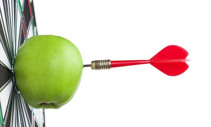
Web design trends come and go. Some trends stick around for a while, while others quickly fade into obscurity. As a business owner or web developer, jumping on the latest trend bandwagon is tempting. However, blindly following web design trends …
Designing a proper website is like establishing a proper communication with your clients. They are not always going to remember your services in details, but a well-designed website will stick into their minds, for a long time. The same rule is applicable when you are planning to work on the icon creations. Icons are the...
A proper graphic design can enhance your business overnight. Now, the graphic designers have multitude of tools, which they are ready to master. It does not matter whether they are using Photoshop or Illustrator, it is mandatory for them to learn ways to use the tools well, for better results. And with little help, they...
Customized t-shirts are liked by the youngsters a lot. They often wear t-shirts with witty one-liners, logos of football teams and many other things. With the T-shirt business becoming more and more user-centric, it is imperative that customers have a design tool that can be used for creating designs on t-shirts with ease. Unlike complex...
When it comes to building the website for your small business, it goes without saying that its’ design should be aesthetically appealing. But, this doesn’t mean that you should get carried away. Some of us get so caught up with website design that we forget the fundamental purpose of our sites – to convert traffic...
Web design trends keep evolving. New design trends emerge, some of them stay for years while others come and go in a flash. Web design is a dynamic field, trends change very rapidly. New design trends appear because of the evolving needs of the users. As a web designer, you have to be aware of ... Read more
Whether you are after a logo for your business, website or perhaps just a personal blog, coming up with a great design is not as simple as most would think. The process of moving from concept to finished design is time consuming and requires the consideration of many different elements before the final result is...
These funky, fresh binder designs will guide you to the middle ground of utility and uniqueness. Binders aren’t just for homework anymore. They are used for a myriad of purposes, which include portfolios, business proposals, and marketing materials. And like those school day binders, they weren’t cool unless the design showed it. It’s now time...
Innovation is an oft-repeated term, be it Graphic designing or Web Designing. This is the reason many people tend to bemuse themselves with these two concepts and end up evolving a complex website that is hard to sell. Zero website traffic is always the result of minds working on developing something outside their area of...
The thought of making a project design using monochromatic colors could be intimidating at first, but take heed, because it can lead to compelling aesthetics and visuals. Monochromatic colors are always a hot concept and work well with different design projects. In this article, we’ll explore the unique beauty of monochromatic colors and understand why...
Mary Dyson produces nitty gritty research on the long-accepted notion that shorter line lengths are more legible than longer ones. The study finds that shorter lines do not necessarily lead to faster reading. If you’re looking for a definitive answer to use in your next design review debate, though, no dice. The big finding is that long lines don’t slow things down as much as previously thought, not that they’re better or worse.
But there’s so much more meat in here that I found much more interesting, mostly because I’m largely ignorant on the topic and gained a dollop of context on writing, legibility, and behavior.
Things like…
There’s a term for transitioning between lines of text
It’s return sweeps. You know, like your eye hits the Return key at the end of the line and sweeps to the start of the next line. Then, there are undershoots. The idea is that eyes may not sweep to the exact start of the next line, instead stopping a bit short.
Those little rapid eye movements between words and phrases? Those are called saccades. I had to look that up.
The impact of undershoots is what’s being challenged
The previous research we’ve relied on for years comes from 1940(!), a time when we obviously were more concerned with paper pages than bright digital displays. Longer lines, it said, increased the likelihood that eyes undershoot during a return sweep, and undershooting results in a regression that results in a 130ms to 250ms delay where the brain needs to get its bearings. The report refers to that as undersweep-fixation.
We can still process words during undersweep-fixation
This report cites a 2019 study that tried to correct undershoots by bolding the first word at the start of each new line, sort of like an anchor that naturally draws the eye closer to the left margin.
The 2019 study did find that the bolded words did decrease undershot return sweeps But despite that, reading speed did not improve. That’s the impetus for challenging the long-held assumption that shorter is better.
Mary explains further:
In seeking to reconcile why longer line lengths may not slow down reading on screen but do so when reading print, I outlined some differences, e.g. visual angle, time spent scrolling. But although physical differences between reading from screen and reading print still exist, we now have direct evidence to explain why longer lines were read at least as fast as shorter lines. Readers can process words during the brief fixation when undershooting the start of the new line. This saves time in subsequent processing. Now we might also acknowledge that there is greater consistency between the range of optimal line lengths for print and screen.
Where does this leave us today?
Well, nowhere closer to a clear answer we can use in our day-to-day work. But it’s good to dust off our collection of design and copywriting best practices and know that line length is less of a constraint than perhaps it has been.
Again, none of this tells us whether long or short lines are better. Mary ends her report by saying she cannot definitely recommend using longer lines of text because there are clear because there are still some factors at play, including:
Shorter lines are more effective for people with dyslexia.
More questions about return sweeps and undershooting need to be answered.
Several other studies indicate that users prefer shorter lines and judge longer lines as more difficult to read.
In this day and age, many of us spend our lives swiping and scrolling through our socials. And, in addition to being a constant source of information and entertainment, Instagram, Pinterest, TikTok and other social media sites can also provide …
Donnie D’Amato built a whole site around the thesis that “digital designers still expect to use the grid while experienced layout engineers have moved beyond it.” The idea isn’t that we should never literally use display: grid; but rather that strict adherence to an overall page grid isn’t necessary. Brad’s reaction was interesting, as someone in and out of a lot more projects than I am:
One of the most frequent, confusing conversations w/ designers is “No, the pink lines that overlay design comps aren’t all that helpful for how things actually work in the browser.”
[…] throw your transparent pink 12-column grids in the trash can.
Donnie feels this is all in the spirit of responsive design, and I’m inclined to agree, except that browser technology has evolved quite a bit since the coining of responsive design and it might be time to call it something new. “Content-driven design” is one of Donnie’s headers and that’s a nice phrase.
This all resonated with Michelle as well:
CSS layout features like flexbox and Grid enable us to build more flexible layouts that prioritise content. We talk about intrinsic and extrinsic sizing in CSS — sizing based on both content and context. The promised container queries specification will put even more power in the hands of developers. But it feels to me like the design process is still stuck in the past.
[…] you should truly consider all other options before using a [browser window size] breakpoint. Ask, is the component expected to always be related to the page size (headers, modals, etc.)? Then a breakpoint might be acceptable. However, components that are placed deep within the page should not be using breakpoints to inform their layout.
Here’s a really good ol’ post from way back in 2015 all about the nine states of design and how we should think all the edge cases whenever we’re building interfaces. Vince Speelman writes:
Modern UI teams are designing components first; Interfaces are merely the thoughtful composition of components. This leaves an often glaring hole for users on “the unhappy path” — The places where users may, intentionally or not, stray from your idealized flow. As we learn to craft systems rather than pages, we must invest effort into shaping these often missed states of design and create with a component lifecycle that can support everyone. Here’s the lifecycle as I see it:
Nothing state
Loading
None
One
Some
Too many
Incorrect
Correct
Done
During the design process I think everyone (including me!) tends to focus on the ideal state of a component or interface, often leaving the extremely important edge cases forgotten until the last moment. I think I need to stick this list to my screen so I don’t forget it in my next project.
There are over half a million fonts in the world. While most of the web is built upon a handful of popular font types, there’s lots of room to pick a unique path. Since fonts are also visual elements, you …